Winter Wonder art journal page
Posted: February 1, 2021 Filed under: A blizzard, Art Journal, Brusho, Classes, Dies, fir tree, Heather lowercase die set, online class, Penny Black, Pink Fresh studio, Skis 'n' sled, Snow time, winter trees, winter wardrobe | Tags: Brusho, online class, Penny Black creative dies, Pink Fresh studio 6 Comments
After my son and I finished filming the stop animation intro for my Winter Wonder online class I didn’t know what to do with the painted background and all the die cuts we’d used. They lay on a tray still in their snowy formation for a few months gathering dust until I realised I could keep the scene if I transferred it to my art journal.
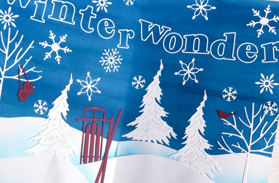
The initial spread was bigger than art journal page so I cut down the watercoloured background panel, cut new snowdrifts out of lighter weight cardstock and added ink blending to help them stand out. I saved the trees, sled, skis, mitts, snowflakes and bird all cut using the Penny Black dies listed below and glued them on. Yes the gluing almost finished me but I persevered and even glued the outline letters from Pink Fresh studio. I found that I do have a glue pen that works if you are patient and take note that enough glue if coming out.
If you haven’t scene the stop motion animation it is part of the promo for my WINTER WONDER class which teaches my methods for making cards with a northern winter theme. I’ll include the promo below just for fun and in case you’re new around here.
The scene shown in the journal page is mirrored outside right now; we have plenty of snow, we’ve been skiing and enjoying winter wonder all around us. Back in October-November when we filmed the class there was little to no snow!
Supplies
(Compensated affiliate links used when possible)
Stockings are hung
Posted: January 29, 2021 Filed under: brick wall, Christmas sentiments, Darkroom Door, Dies, knitting, layered Xmas wreath die set, Penny Black, stockings, Woodgrain | Tags: Darkroom Door stamps, Darkroom Door stencils, Penny Black creative dies, Ranger archival inks, Ranger Distress inks 6 Comments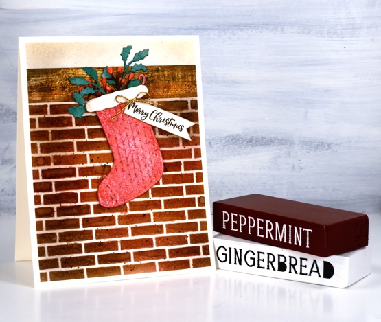
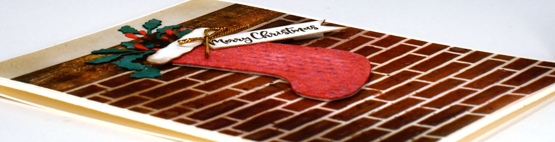
When I was making knitted panel cards a few weeks back I thought I should create a knitted stocking card at the same time. I also decided to try and make at least one, but hopefully more than one Christmas card each month. Usually I don’t feel like making Christmas cards after Christmas but I’m happy to right now so I made this little stocking and hung it by the chimney with care.
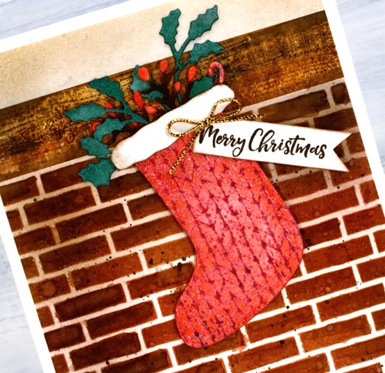
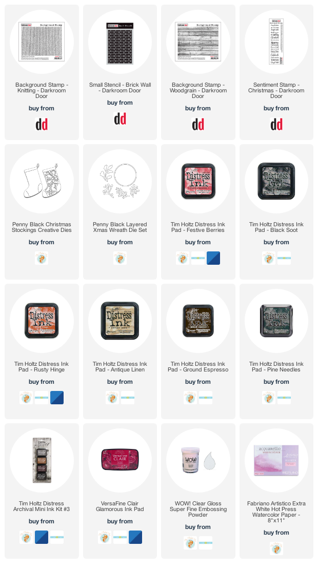
I stamped the Darkroom Door knitting pattern in versafine clair ‘glamorous’ ink, embossed in clear powder then painted over it with festive berries distress ink. I cut out a stocking with one of the Penny Black Christmas Stocking dies. To fill the stocking I cut foliage from watercolour paper using the PB layered wreath set then coloured the die-cuts with festive berries, pine needles and ground espresso distress inks. The stocking needed a bit more trim so I cut out a white cloud shape to and blended some brown ink around the edges.
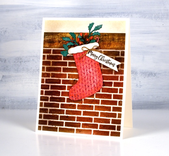
To create a chimney I used a stencil and a stamp from Darkroom Door, the woodgrain stamp for the mantle and brick wall stencil for the bricks. I worked on hot pressed watercolour paper for both so I could blend distress inks and add watermarks. I stamped the wood with ground espresso archival ink so it wouldn’t blend then painted and blended ground espresso, black soot and rusty hinge distress inks over the top. I blended the same three distress inks through the stencil then spritzed some water over it before lifting the stencil. I blended some of the bricks with a paintbrush and added some black soot splatter.
The mortar around the bricks looked too white so I blended antique linen ink over the whole panel and used some to blend above the mantel too. To finish of the card I added a gold bow and a sentiment from the DD Christmas sentiment strip stamp.
So that’s one Christmas card done so far in 2021! Do you make Christmas cards all year?
Supplies
(Compensated affiliate links used when possible)
Alcohol ink + foil
Posted: January 28, 2021 Filed under: Alcohol Ink, all the birthdays, Concord & 9th, Metropolitan, Penny Black, poppy edger | Tags: Concord & 9th, Penny Black creative dies, Penny Black stamps, pinata alcohol ink, Ranger Alcohol Ink 11 Comments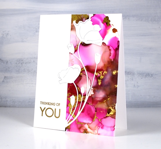
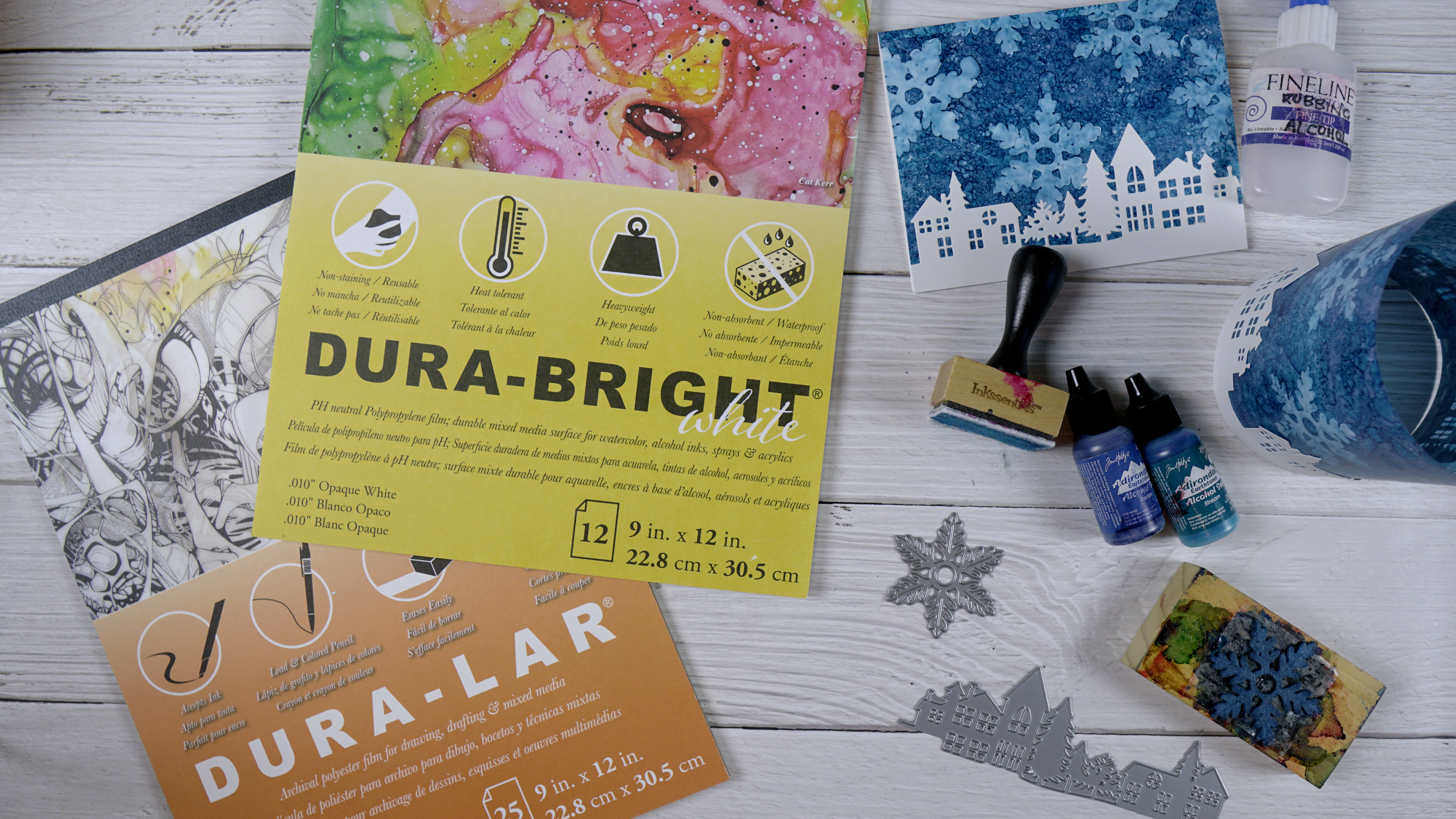
When I get the alcohol inks out I always have a stack of panels at the end of the session. Some sit around and never amount to much but others wait for inspiration to hit. This one was created on white craft plastic (Grafix dura-bright white) with ginger and burgandy Ranger alcohol inks and Pinata magenta. I added gold foil using the minc well after the inks had dried.
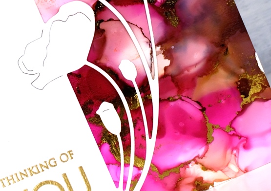
Sometimes it is possible to make the foil stick soon after finishing the inking. There is a sweet spot as far as letting the ink dry enough that it is not gooey but not so much that it is dry to touch. The sections that will hold the foil are the ‘seams’ between colours where the ink is thicker. If you press foil on these areas when they are a bit tacky you can get it to stick with just a bit of burnishing. If the panel has dried it sometimes possible to get foil to stick by running the panel through a minc or laminator using some heat. This can be risky as sometimes the foil sticks to more of the panel than you expected.
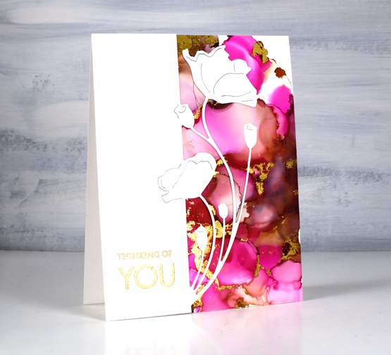
When I ran this panel through the minc I was happy with most of the foiling but there were a few sections that didn’t look great so I just used the part that looked good and covered the rest with this pretty poppy edger from Penny Black. I finished the card with a gold embossed sentiment from the PB ‘only you’ set.
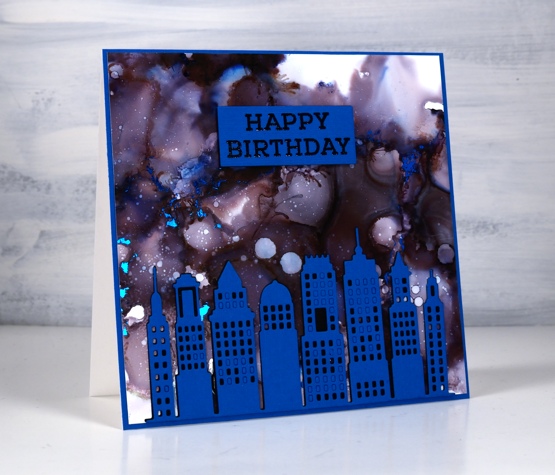
This second panel amazes me because it was created with only black alcohol ink plus rubbing alcohol. The blue and burgandy tones appeared when the black ink was diluted. Cool huh? I pressed the blue foil onto this panel at just the right time to get it to stick when the seams were tacky. It is hard to get it to show in the photo but there are small sections of blue foil here and there across the sky.
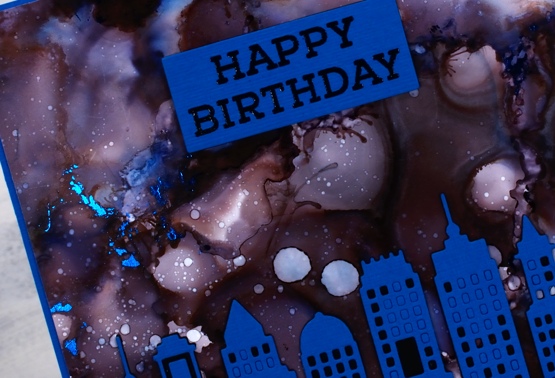
The inking on both panels was pretty experimental, a drop here and there some rubbing alcohol and tilting and blowing the ink to make a random pattern. I cut the Penny Black metropolitan die from both black and blue cardstock then stacked blue on black without removing all the window cut outs. I ended up using spray adhesive on the back of the blue die cut because gluing is not my gifting.
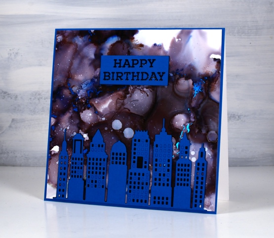
The sentiment is from the Concord & 9 ‘all the birthdays set stamped in black and embossed in clear then stacked up on two layers of black cardstock. More alcohol inks next week; I’m having fun.
Supplies
(Compensated affiliate links used when possible)
For some reason the images did not want to display on this list but if you click the word Supplies, above, you will get to the complete list.
Snowflake Skies – Video
Posted: January 27, 2021 Filed under: Alcohol Ink, grafix, neighbourhood border, Penny Black | Tags: grafix, grafix craft plastic, Penny Black creative dies, Ranger Alcohol Ink 5 Comments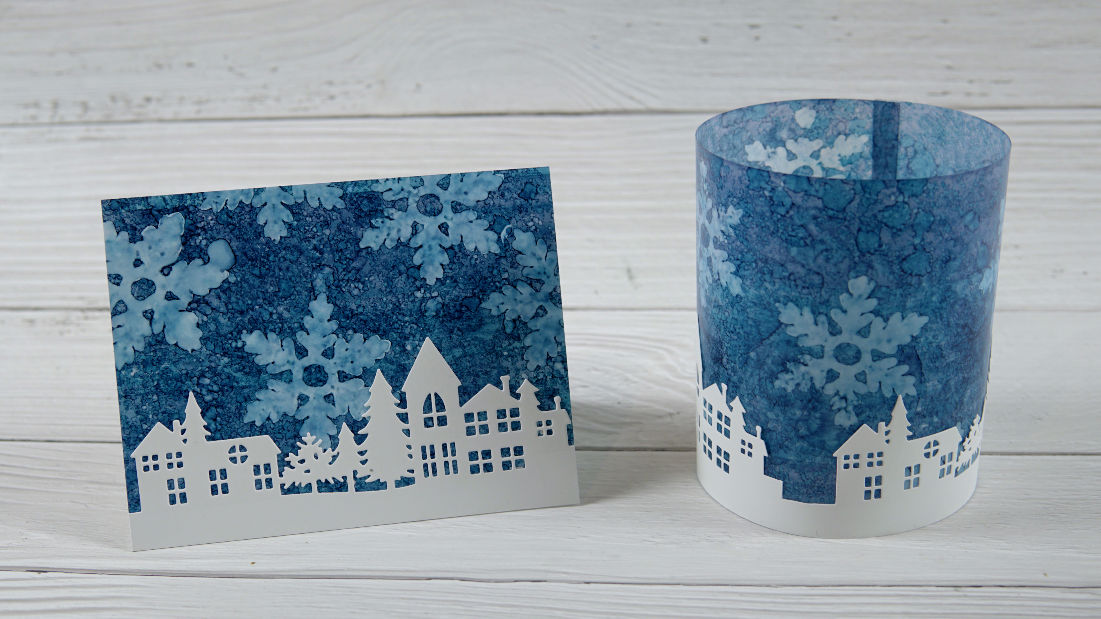
I teamed up with Grafix to create a couple of snowy projects on their Duralar plastic films. The card you see on the left and below was inked on white craft plastic, also know as DuraBright white. It is totally opaque and has a bit of weight to it. For the votive wrap I used Dura-Lar matte film which is lighter weight and has a frosted transparent appearance which was what I wanted so the light from a votive would shine through.
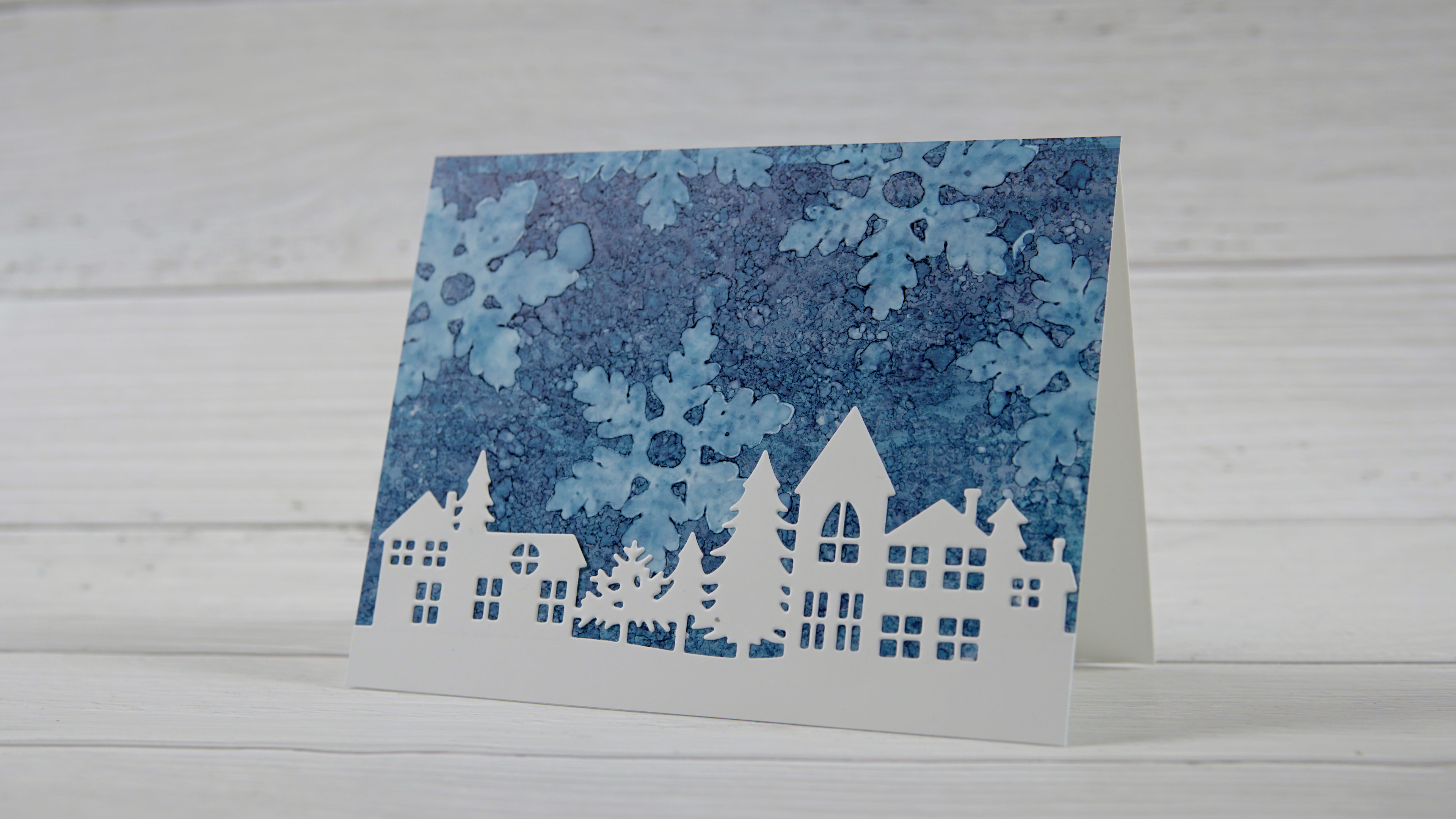
I used stream and denim alcohol inks and felt to apply the inks to the plastic films. To create the snowflake patterns I die-cut a Penny Black snowflake from felt and stuck it to the wooden back from a old stamp. You can see the whole process in the video below.
I cut the Penny Black neighborhood border from Dura-Bright white for both the votive and the card.
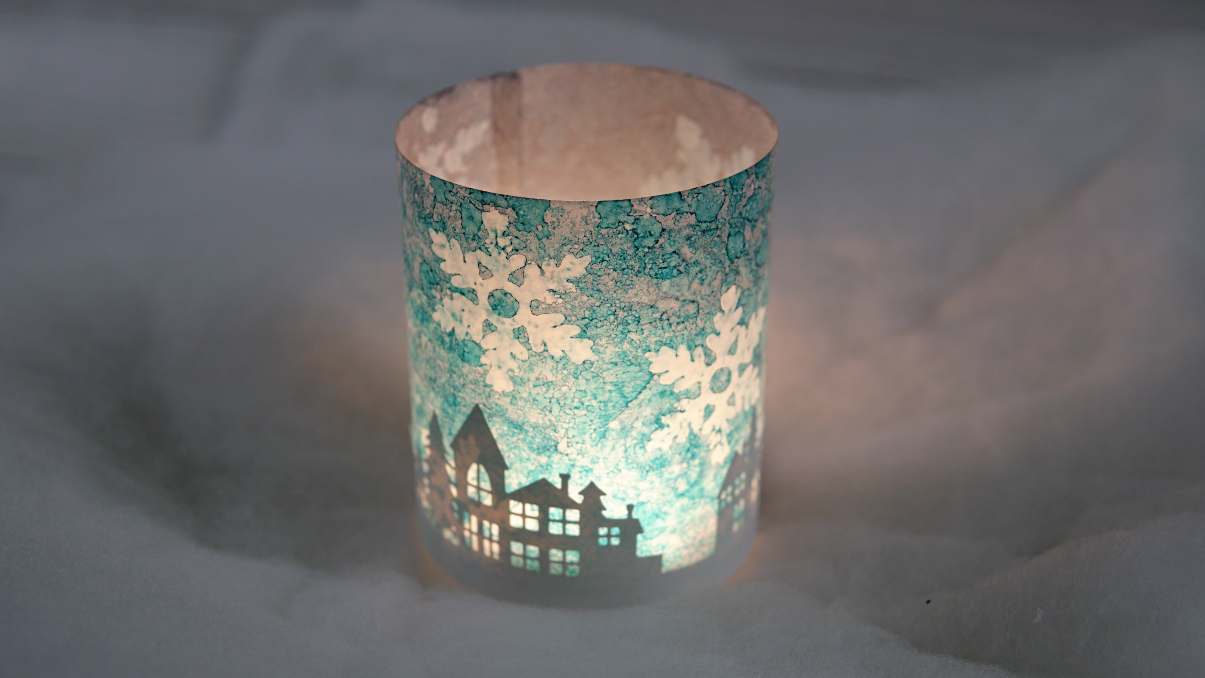
You can see in the video and the photo above how the colours in the votive surround look different with a light inside; I guess it would depend too whether your battery votive candle was a white one or more of a yellow glow.
I’m really enjoying working with the Dura-bright white for alcohol ink projects and will be trying more techniques on the Dura-Lar matte in the future. If you are looking for the bright white remember it also goes by the name white craft plastic. Crop A While might have some and Deserres does carry it.
I’ve been working on a few different alcohol ink techniques so there will be more cards to share and another video next week.
Supplies
(Compensated affiliate links used when possible)
Wish upon a star
Posted: January 22, 2021 Filed under: Celebrations, Dies, Penny Black, We R Memorykeepers | Tags: Papertrey ink, Penny Black creative dies 14 Comments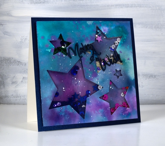
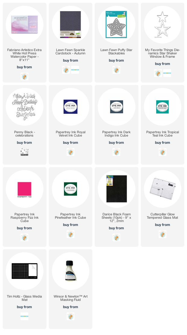
Shaker cards are very very rare around here: I think I’ve only put one on the blog before today. I bought the nesting star dies recently on whim (I think they are discontinued but other companies make similar dies ). This card is for a little girl who turns five next week so I thought a little shimmer and shake might be fun.
I had the plan in my head with a starry sky watercolour panel for either the front of the shaker panel or the background then decided both would be best. I had pretty micro beads in six different colours so I thought it would be cool to co-ordinate the sequins, beads and inks.
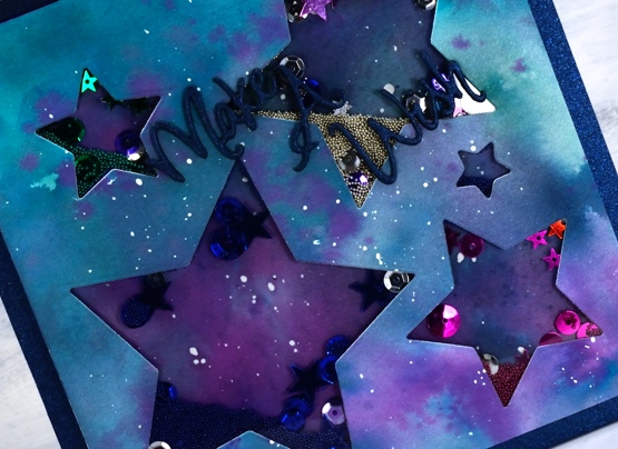
Making the watercolour panels was very straightforward; I smooshed Papertrey ink cubes on the glass mat, spritzed shimmer spray (homemade water + gold pearlex powder) on the inks then swiped the panel through the ink several times until it was mostly covered. I finished the coverage using a paintbrush to add ink here and there. There was masking fluid already on the panel before I started so that added to the night sky look.
Once I started doing the ‘shaker card’ steps I remembered why I don’t make shaker cards. For me this one had an extreme fiddliness factor! I will happily spend hours no-line watercolouring an intricate flower but taping around all the points of five stars to seal the shaker area of each one was above and beyond! But then I put the micro beads, sequins and stars in each section, attached the watercoloured background, turned it over and…happy sigh, it was as cute as I’d hoped.
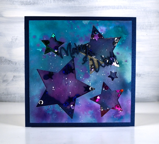
I won’t describe the process for making a shaker card; I think you would be better off watching a video from someone who has made more than two! I know there are many ways to build them up but my layers were: die-cut star watercolour layer, acetate layer, foam layer with star die-cuts then watercolour background layer. When I had all the layers stuck together I attached it to a square of shimmer blue cardstock and die cut the PB ‘make a wish’ sentiment from the same cardstock three times for stacking. I realise now I should have cut it from a brighter colour but the glue is stuck!
I’m happy with how it turned out and I love how it shakes (the micro beads move a lot while the sequins cling to the acetate) but I think it might be another five years before I make another one. How about you, do you whip up the occasional shaker card?
Supplies
(Compensated affiliate links used when possible)
Woolly Wishes
Posted: January 18, 2021 Filed under: A2 layers, Additional A2 layers, Darkroom Door, Karin brushmarkers, knitting, Penny Black, Waffle Flower | Tags: Darkroom Door stamps, Karin brushmarkers, Penny Black creative dies, Tsukineko Memento inks, WOW embossing powders 6 Comments
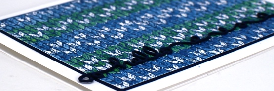
This is the first knitting project I have done in years! I keep meaning to pull out some needles and wool to see if it hurts my hands to knit. I have a little stash of wool and plenty of different sized needles and I used to knit while watching tv. My last project was never finished then my hands became quite sore so I haven’t tried again.
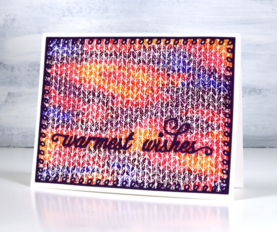
When I first saw this Darkroom Door knitting stamp I couldn’t believe how realistic it looked when stamped and coloured. I stamped with versamark and embossed in clear powder on hot pressed watercolour paper for both cards. On the panel above I used Karin brushmarkers (amber, lilac, violet blue, magenta) to colour random shapes over the panel just like you get when you knit multicoloured yarn. I spritzed lighlly over the panel with water to get the colours to blend just a little.
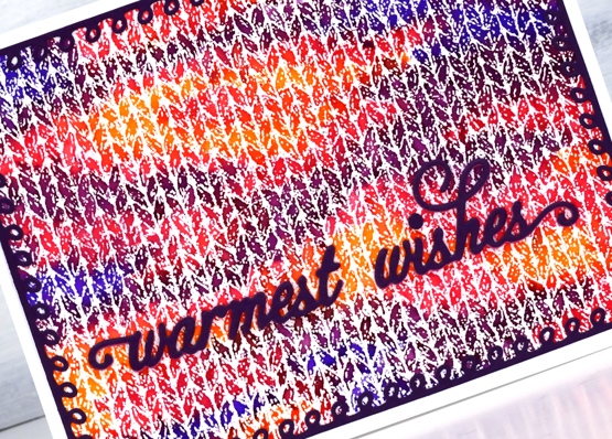
I knew just the dies to use to complete the card. Penny Black has a set of looped frame dies which look a little like knitting stitches and the PB warmest wishes die is made of small curly letters that look like loops of wool. I cut both from purple cardstock with double sided adhesive on the back.
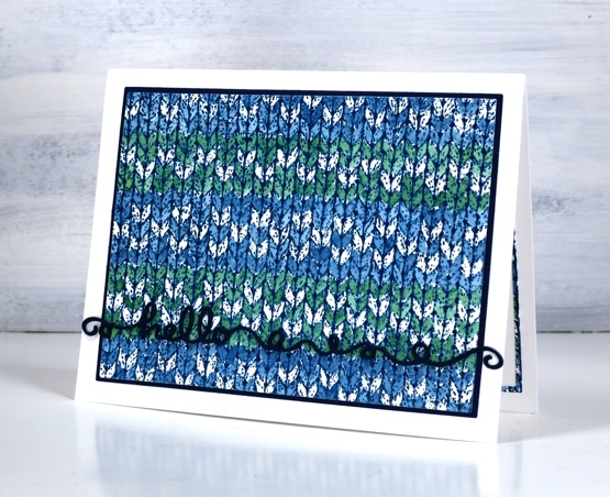
The second card features a simple pattern painted over the embossing with nautical blue and cottage ivy memento inks smooshed on my glass mat. I wanted to do a fancy snowflake pattern but decided I should start with something simple. Just as well as I missed a whole line of the pattern I was trying to do. This time I matted the panel with dark blue cardstock and stacked three layers of the ‘hello’ from the Penny Black ‘doodles’ die set which also looks a bit like yarn.
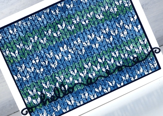
I had to make the knitting panel smaller to fit on the matching piece of blue cardstock so I re-cut it with the WaffleFlower A2 layer dies and saved the slim outline to glue inside the card. I will definitely be playing with the DD knitting stamp again because I want to colour a fancy fairisle type pattern. It will also show up in a small role on a card coming up later in the month.
I am happy to be back blogging again after my short break; I’ve missed chatting with you. I wish I could say I achieved all my planning and preparation goals but that is far from the truth. I think maybe my expectations were set a bit too high! Today’s cards feature the knitting stamp that had been sitting waiting patiently for some ink for months. I could have continued to stamp and play this image for days but I limited myself to one day so I could move onto other things. Is your year off to a good start, have you had some creative time already?
Supplies
(Compensated affiliate links used when possible)
2020’s favourite posts
Posted: December 31, 2020 Filed under: Arteza, Brusho, Coloured pencil, Darkroom Door, Finetec paints, Hand painted, Penny Black, watercolour real brush pens | Tags: Darkroom Door stamps, Darkroom Door stencils, distress oxide inks, Faber-Castell Albrecht Durer Watercolour pencils, Faber-Castell Polychromos Colour Pencil, Finetec artist mica watercolour paint, Penny Black stamps, Ranger Distress inks 6 CommentsI looked through the stats for 2020 to see which posts were viewed the most. It is not necessarily an accurate indicator of favourites but it is fun to look back and see what appealed. I’ve included a link to the original post next to every photo. I’m featuring only cards I made and posted this year. Here they are in no particular order.
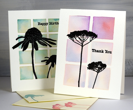
Back in January I used Darkroom Door stencils as a guide to paint watercolour backgrounds for silhouette stamping with DD stamps.
In February as I was preparing to teach a class using pearlescent paints on black watercolour paper I created this embossed and painted card. The class didn’t happen but the plan is still in my mind for either an online or in-person class hopefully some time in 2021.
This card and the next favourite feature the same Penny Black stamp and no-line watercolour technique. I used distress inks and markers for the watercolouring on this one.
Same stamp as shown above, Unforgettable from Penny Black but this time watercoloured with Arteza real brush pens.

This lilac card along with three other colour schemes featured the ‘lovely lilacs‘ stamp from Penny Black and there is a video tutorial as well.
Another video post once again with Arteza watercolour brush pens this time with Penny Black’s nature’s glory stamp.

Now this one is a little different, pencil colouring on kraft cardstock, again with a video. 2020 has definitely seen me create the most videos!
This one is also one of my favourites so it is nice to see it as a reader favourite too. It is the second post in the top ten to feature the lovely lilacs stamp from PB.

I’m happy to see one of my hand painted pieces in the favourites. This is a brusho & cling wrap painting I did after watching a CeeCee Creations video.
Another video post made the top ten, this one featuring die cut distress oxide painted leaves. This is the only one not featuring flowers.
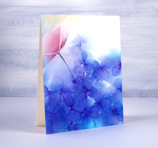
This one just missed out on the top ten so I’m adding it here at the end because I think it might be my favourite of the year. It’s a brusho and cling wrap panels that made me think of hydrangeas so I turned the random patterns into massed flowers.
Thank you for dropping it to read my posts this year. I love sharing the details of my cards, journal pages and creative adventures. In a year when face to face interactions have been limited I have been encouraged over and over by the comments and conversations here on my blog.
It has been my best year ever for producing you tube videos and also the year I fulfilled a long time dream of producing online classes. Again thank you for your support in those endeavours.
I’m looking forward to sharing more creative pursuits on the blog with you in 2021, there will be watercolour and stamping (of course!) but also alcohol ink art, gel printing, lettering and journaling. I hope you are safe and well where you are and pray that 2021 will be a year of health and happiness for you.
Pretty fantastic
Posted: December 29, 2020 Filed under: fragments, Giraffe, glasses, Penny Black, perspective, Pink Ink Designs | Tags: Paper Rose, Penny Black creative dies, Penny Black stamps, Pink Ink Designs 4 Comments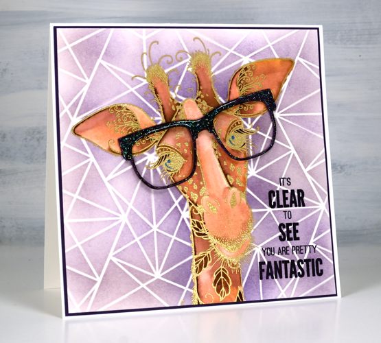
Children’s cards are something of a rarity for me but this one ended up being so much fun I might try them more often. I’ve had this gold embossed giraffe image sitting round for a while. The stamp, from Pink Ink Designs is called ‘giraffe’, no surprises there! It’s a large stamp so I cropped a bit of the neck off so it would fit on a 6×6 card.
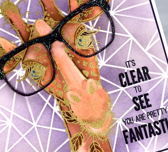
I used Staedtler watercolour markers and papertrey ink cubes to watercolour the giraffe and the amethyst ink cube for the blended background. I decided on the stencil background after I’d finished watercolouring the giraffe so I cut a giraffe shaped mask and positioned it over the giraffe while I used blending brushes and the Paper Rose studio ‘fragments’ stencil.
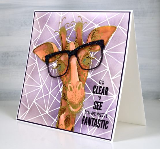
The giraffe stamp set comes with a pair of glasses stamp but I went bigger and sparklier with a die cut from Penny Black. I embossed the purple glasses in clear sparkle powder first then clear gloss ultra high to seal the sparkle and make them shiny. The sentiment is from the PB set ‘perspective’. Pink Ink Designs has some beautiful big animal and fantasy stamps. They totally captured my imagination when I saw them. I’ve already shared a card with the dragon stamp and have one with a sea turtle still to come. Not my usual themes that’s for sure.
Supplies
(Compensated affiliate links used when possible)
No-line Watercolour with Karin brushmarkers
Posted: December 21, 2020 Filed under: frozen vista, Karin brushmarkers, Penny Black, poinsettia poem | Tags: Fabriano Watercolour Paper, Karin brushmarkers, Papertrey ink, Penny Black stamps, Tsukineko Versafine inks 8 Comments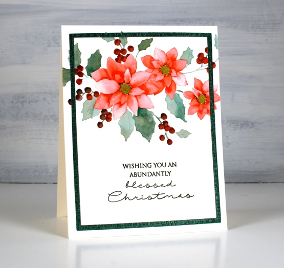
I’m happy to be teaming up with the Foiled Fox again to bring you some more Karin brushmarker experimenting, this time I put them to work on no-line watercolour. I was pretty sure they would do a good job and I wasn’t disappointed. I also discovered that Papertrey Ink’s ‘soft stone‘ ink works well as a base stamping ink for no-line watercolour. To begin I stamped the same Penny Black poinsettia poem stamp on two pieces of hot pressed watercolour paper. On the design above I used only three Karin brush markers (red 209, teal 377 and henna 105) When colouring the leaves I inverted the red marker tip to tip with the teal before colouring to create the more browny green you see on the leaves.
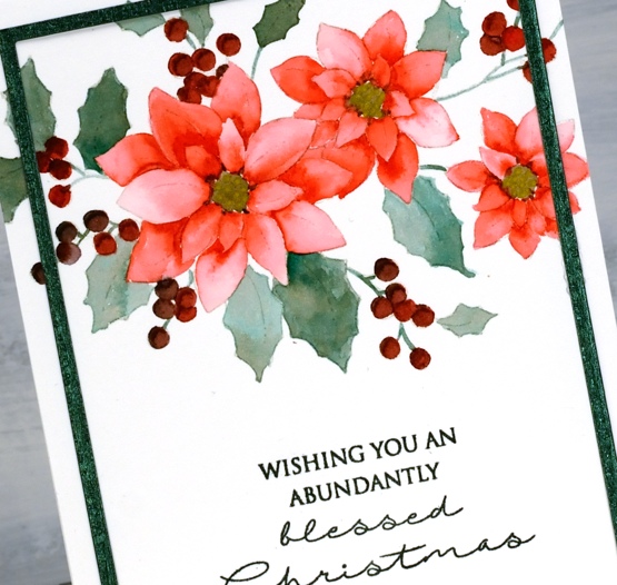
I painted the petals one by one as is usually the case with no-line watercolour and I used the Red 209 marker. I used a slightly different methods for each card. On the above panel I barely touched the marker to the paper in each petal then blended the ink with water to fill the petal. On the panel below I painted a petal with water first then added a dot or two from the marker which flowed into the wet area. The effect is similar but the petals are paler where I applied water first and marker second.

On the second card I used magenta 170, lush green 228 and sepia 074. Once again I did a bit of tip to tip colour blending for the leaves and berries. It takes a bit of trial and error plus some scrap paper for testing to get the right mix of colour when doing the tip to tip blends. After adding ink to a marker tip the first strokes of colour will be the most intense and as you continue to apply ink to paper the intensity will decrease as the colour returns to its original tone. Make sure you visit the Foiled Fox blog where I provide even more detail about today’s projects.

I used a textured shimmer green cardstock to create a die-cut frame for the card at the top of the post. It is easy to cut a narrow frame by using two rectangle dies from the Waffleflower A2 layer dies. For the second card I used mulberry cardstock to create a co-ordinating mat and stamped with both versafine clair tulip red & chianti to stamp the sentiment in a matching colour. When I don’t have the exact ink colour for a sentiment I try a combination of two inks, something a stamp positioner makes quite straight forward. I stamped the sentiment on the first card with my beloved memento northern pine ink. The sentiments are from Penny Black sets, Christmas feeling and frozen vista.
Supplies
(Compensated affiliate links used when possible)
Bethlehem scenes with Karin brushmarkers
Posted: December 17, 2020 Filed under: Ink to Paper, Karin brushmarkers, lighting the way, Penny Black, three kings, Uncategorized | Tags: Ink to Paper, Karin brushmarkers, Penny Black creative dies, Penny Black stamps 2 Comments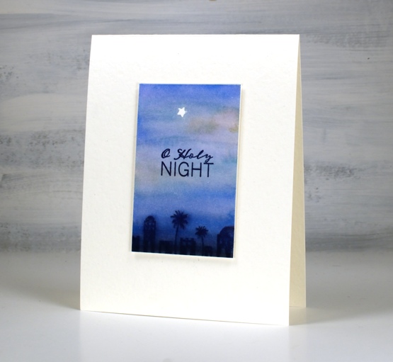
I’ve continued to experiment with the Karin brushmarkers from the Foiled Fox, this time using them for watercolour backgrounds. These three backgrounds feature combinations of rosewood 272, cyan 207, royal blue 045 and black 030.
I tried different methods of applying the marker to the hot pressed watercolour paper and found that to achieve smooth transitions from one colour to the next it was better to touch the markers to wet paper. It still worked applying the marker first then the water but I prefer the very soft blends made when the paper was already wet. I don’t think I will often use the markers for backgrounds as it probably uses up ink at a faster rate but little scenes like the one above did not require much application.
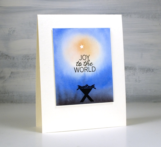
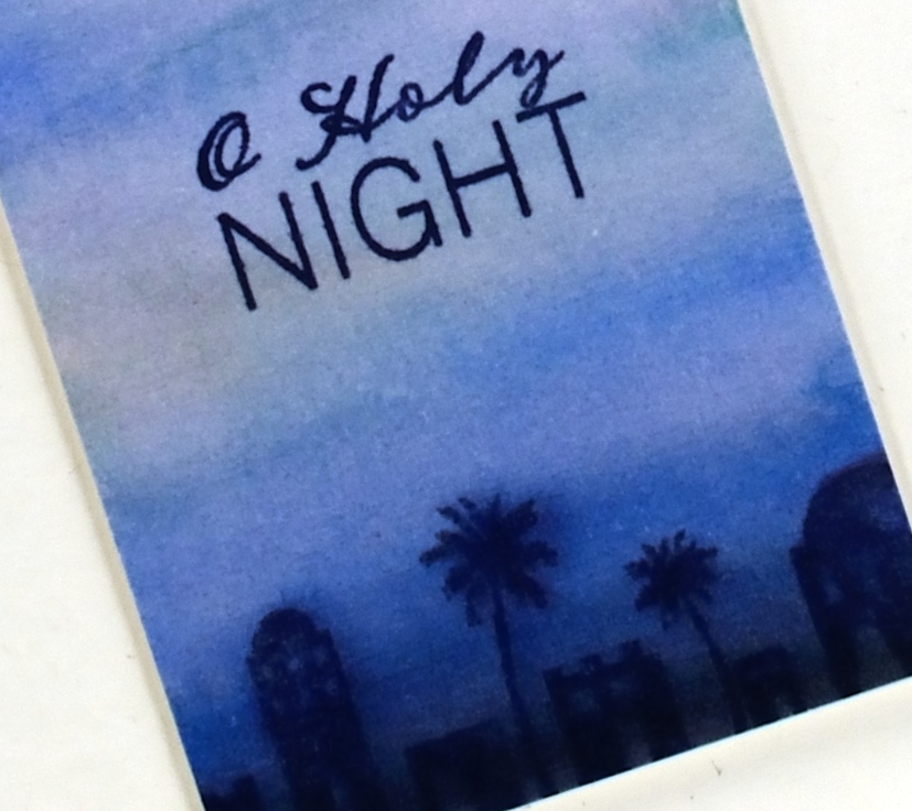
The tiny star was masked by die cutting a star (PB Xmas tree border set) from frog tape (painter’s tape for delicate surfaces) then positioning it firmly on the panel before painting. I stamped the manger above in versafine clair nocturne once the panel was totally dry.
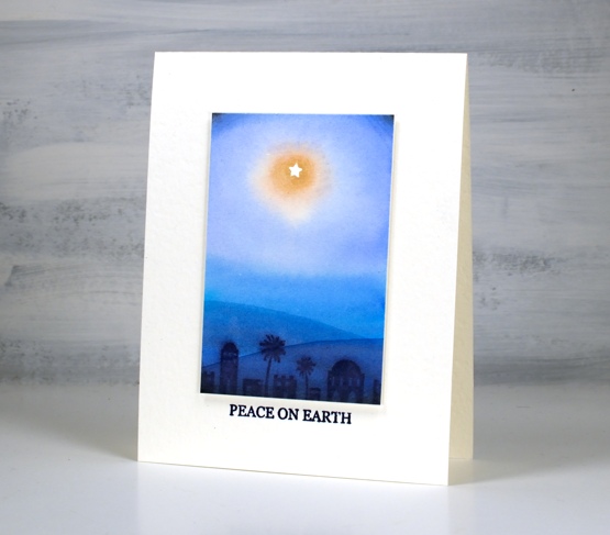
To get a soft image of the Bethlehem stamp I stamped it in chipped sapphire distress ink while the background was still slightly wet. On the panel above I took a wet paint brush and painted a hill shape across the lower part of the panel waited then painted another one even lower down. I didn’t need to add any ink the paint brush just dragged ink from the Bethlehem image. I popped up each panel with two pieces of cardstock, attached it to a white luxe card base then added sentiments from the Ink to Paper Be Merry Mini set.
The current Christmas card designs are looking minimal for two reasons, I still need quite a few cards and I like simple and elegant!
Supplies
(Compensated affiliate links used when possible)