Lattice Blooms
Posted: May 1, 2023 Filed under: Brusho, Echidna Studios, lattice blooms, Paper Rose, Taylored Expressions | Tags: Brusho, distress oxide inks, Echidna Studios, Paper Rose, Taylored Expressions 3 Comments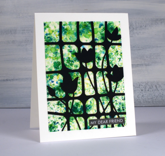
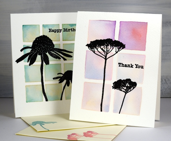
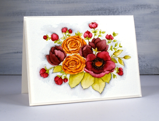
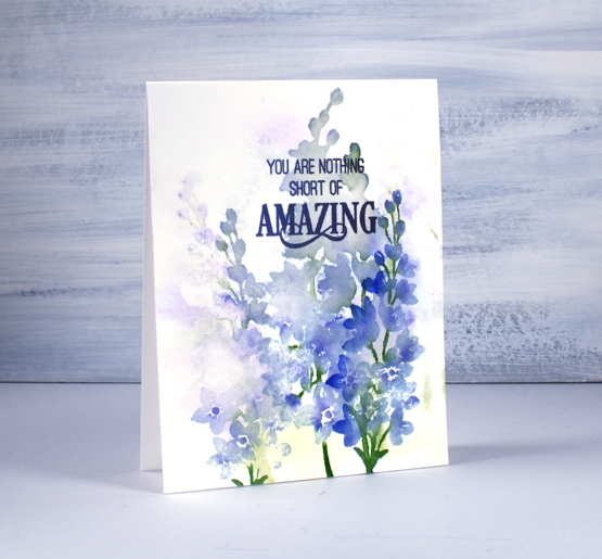
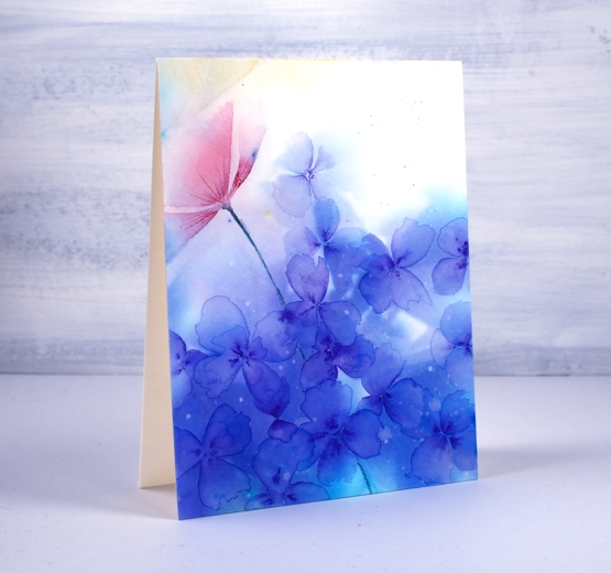
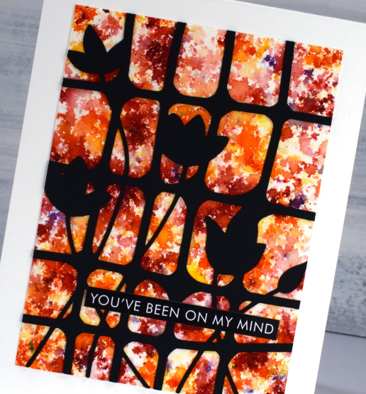
If you have used them you will have recognised at once that this is a brusho background and so is the next card with yellow, orange and red. To create a background like this with brusho you have to be patient and watch the brusho powder slowly react with spritzed water from above. If you don’t spritz enough water the powder stays dry; if you spritz too much water the diluted powders all run together giving you a blended background but not a confetti one like you see here. I worked on a panel of hot pressed watercolour paper and sprinkled brusho sparingly over it before spritzing with water.
The lattice with blooms cut from black cardstock is another image I designed to be cut or printed. So far I have just used it on the cards featured today but I will also be using it as a stencil on my gel plate. The digital file can be found in the Echidna Studios etsy store.
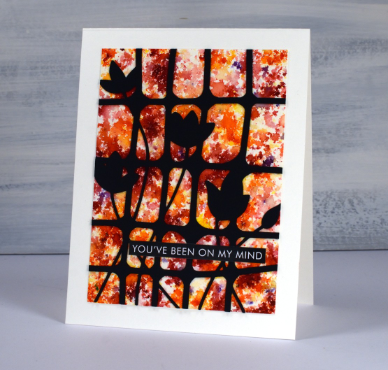
To complete both brusho cards I used sentiments cut from the Paper Rose Studio ‘so extra’ supporting sentiments panels. There are loads of words and phrases to choose from.
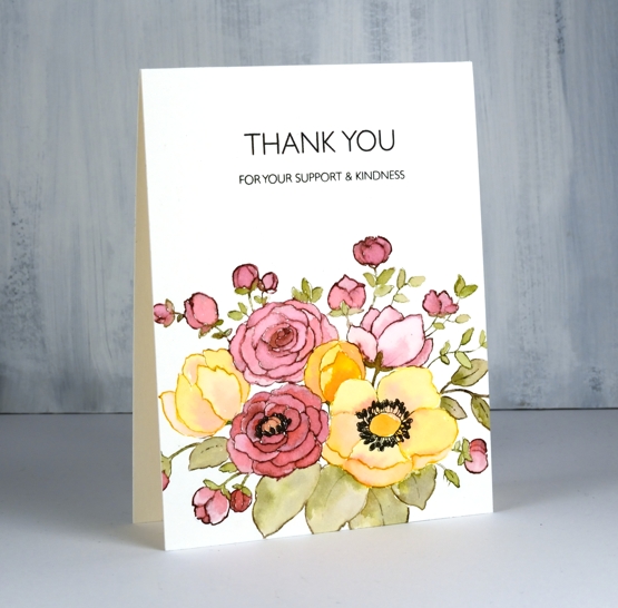
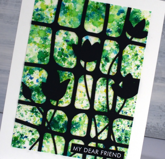
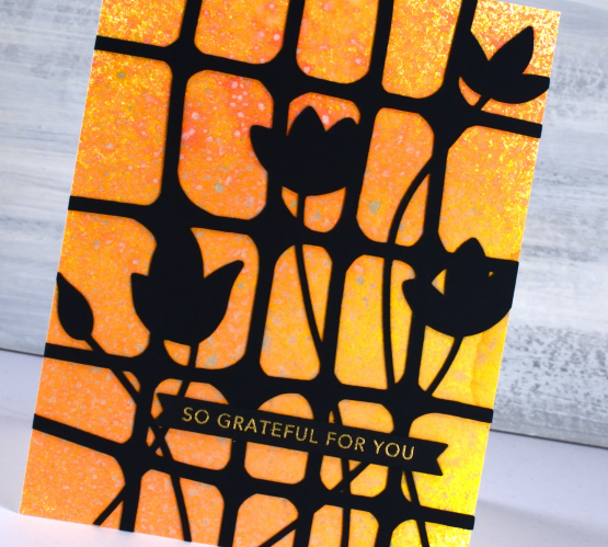
The card below also has a watercolour background but this one was done with oxide sprays. I have only recently dipped my toe in the oxide spray pool (just picture that literally for a minute!) With many oxide inks and many many distress sprays I didn’t think I needed the oxide sprays as well. To be clear I only have seven but with those seven I can get some very pretty backgrounds. Because the oxide formula reacts with water it also reacts with other sprays when you layer them. The pigments make them less transparent so the effect is quite speckly as you can see in the close up.

I cut the lattice blooms bigger for this card so it stretches from edge to edge. The card is finished with a Taylored Expressions sentiment strip embossed with gold. Those sentiment strips are still one of the cleverest ideas I’ve seen in stamp and die design.
(Compensated affiliate links from Foiled Fox, Ecstasy Crafts & Scrap n Stamp)
1 Bike + 3 Oxide Inks
Posted: March 11, 2022 Filed under: Simply Graphic, spring bike | Tags: distress oxide inks, Simply Graphic 4 Comments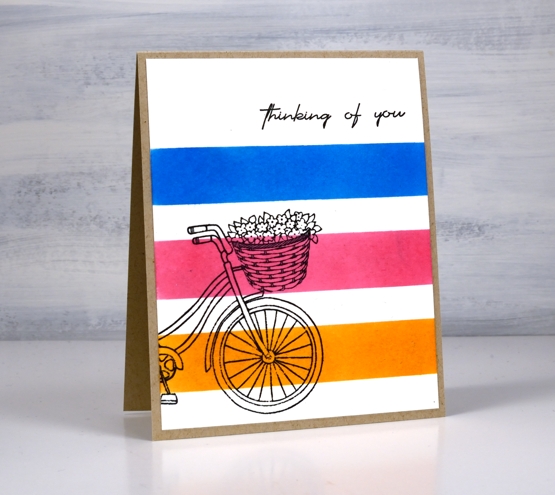
I am over on the Foiled Fox blog today with these sweet new stamps from Simply Graphic. The Foiled Fox has just brought in a lovely selection of cool stamps and dies from Simply Graphic and they shared a video on Wednesday introducing them all.
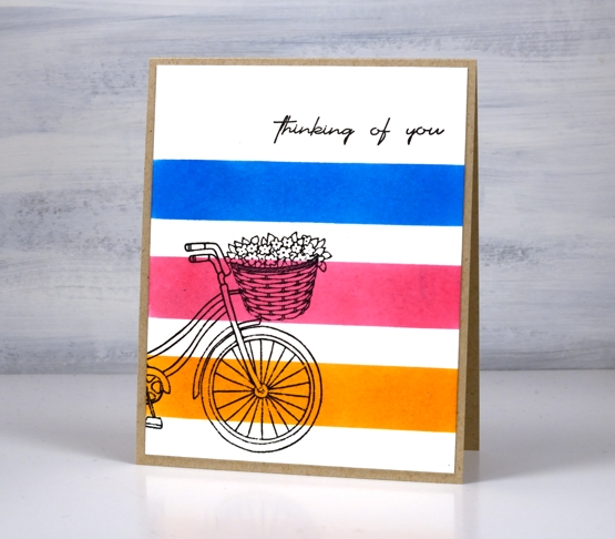
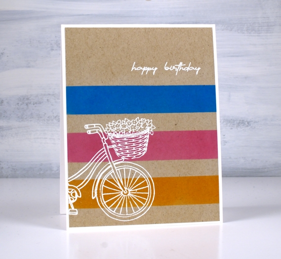
I went simple and graphic with my first two card layouts by blending oxide inks in stripes on both white and kraft cardstock. I stamped the ‘Spring Bike’ stamp in versafine clair nocturne above and embossed with Brutus Monroe alabaster powder below. I love how the white pops on kraft.
I thought I had finished after these two cards but the three oxide inks, rusty hinge, picked raspberry and salty ocean all wanted me to try a watercolour technique. I embossed the bike in clear powder on watercolour paper then smooshed the inks on my glass mat, spritzed with water, then swiped some watercolour paper through the inks several times to fill it with colour.
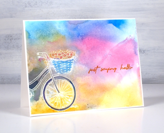
You can see I did get some grey and brown in the mix but I thought it worked well to define the bike and suggest some ground behind. When I saw how it looked on half the tire I mixed some more and painted the whole tire. I also filled the basket with blue but other than that the inks landed where they landed!
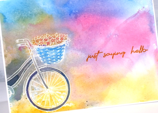
I finished all the cards with sentiments from the ‘English sentiments’ set. What sweet simple stamps these are. Make sure you visit the Foiled Fox to see the rest of their Simply Graphic selection.
Supplies
(Compensated affiliate links used when possible)
Doodle on Kraft
Posted: February 23, 2022 Filed under: Art Journal, Hand drawn | Tags: Art Journal, distress oxide inks, Hand drawn 6 Comments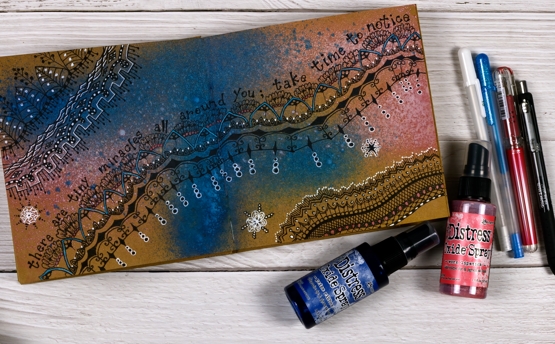
As you know I’ve been enjoying the 6″x 6″ white Dina Wakley journal; I have two on the go now full of experiments and ideas for my upcoming Art Journal Adventure workshop. Ranger has also made a kraft journal the same size so yes, I had to try it.
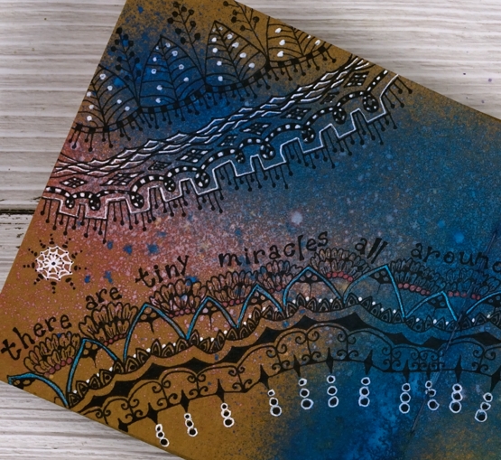
As you can see in these photos working on a kraft background tones down the colours used on top. I could paint the pages white before starting but I am interested in experimenting with kraft backgrounds for now. I also bought a few distress oxide sprays the other day. I love the traditional distress sprays but hadn’t tried the oxide sprays before. They are a good match for the kraft journal as a little ink soaks in while plenty of pigment sits on the surface.
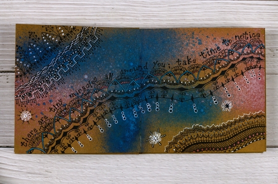
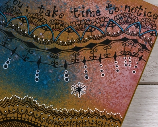
I used prize ribbon and worn lipstick sprays on this page then doodled with a black gel pen. For inspiration I looked at zentangle pages I’d saved on pinterest and instagram and adapted them to spread across the pages. I also found pink and blue metallic gel pens from years ago and did some colouring in. I used a white gel pen to highlight parts of my design.
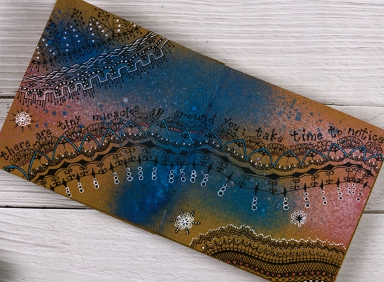
As I worked I wanted to make everything brighter to compensate for the brown background but that is an experiment for another page. If I had started my doodling in white the overall effect would be brighter but I like the opacity of the black.

I found the quote in a book I am currently reading and it seemed to fit my meandering pattern.
The art journal workshops that were originally planned for January have been rescheduled in late February and early March. You can find out more on my classes page or on the Crop A While website where you can register for either the March 4th or 12th workshop.
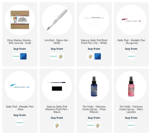
Supplies
(Compensated affiliate links used when possible)
Enjoy the Journey Journal page
Posted: July 23, 2021 Filed under: Art Journal, Darkroom Door, gel press, nomad, scratches, vintage car, World Map | Tags: Art Journal, Darkroom Door stamps, distress oxide inks, gel press, gel printing, Ranger archival inks, Ranger Distress inks 3 Comments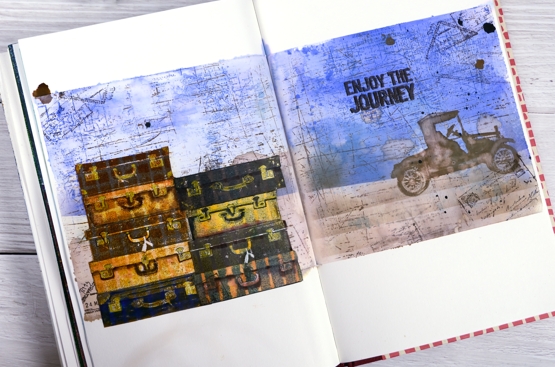
This week I have shared a gel plate video and a series of cards made with prints and leftovers from that gel printing session. If you look closely at this journal page you will see a couple more prints put to use.
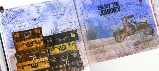
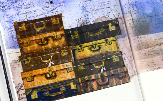
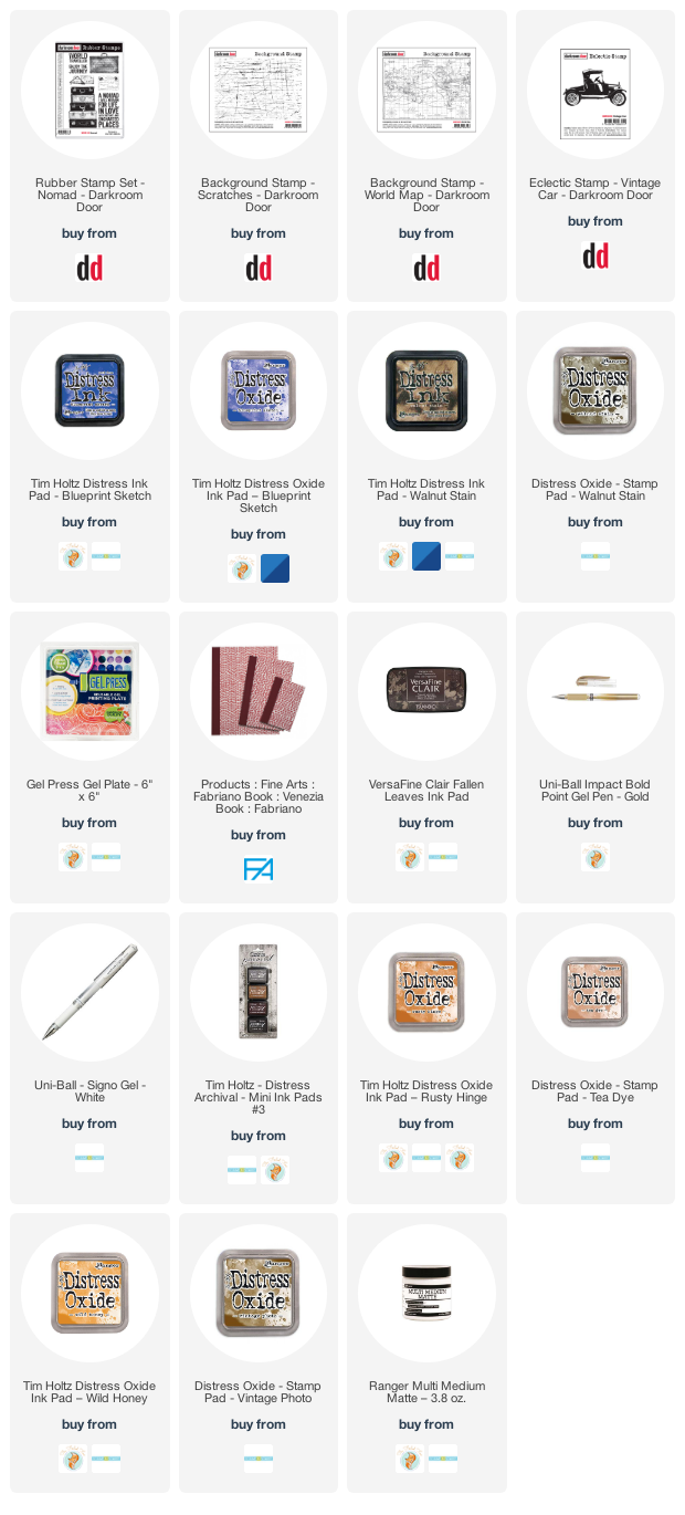
The Darkroom Door set, Nomad, recently arrived in my mailbox and the main reason I chose it was the pile of suitcases. I own one old suitcase which belonged to my grandmother; it houses the ‘dress up’ collection. It is not unlike the third one in the left hand stack. The stamp set also has a single suitcase, some passport stamps and two sentiments, one included on this page.
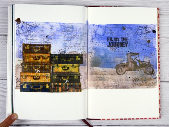
To add even more vintage-ness to the vintage suitcases I stamped them on a grid and striped prints from the gel printing session. I used corrugated cardboard to make the patterns on the gel plate originally. I stamped the suitcases in archival inks then added extra colour with distress inks and gel pens. To create the background I smooshed blueprint sketch distress inks on a piece of acetate, spritzed water over the ink then transferred it to the masked journal pages. With the blue protected I blended a brown base, also with distress inks. Over the top of the inking I added some impressions with the DD world map and scratches background stamps. To balance the suitcases I added the vintage car and sentiment on the right hand side.
Maybe these pages came from my longing to be out and about seeing new and old places, or a longing to be poking around antique and thrift stores. The latter will probably happen before the former.
Are you longing for a trip somewhere? Are you thinking near or far?
Supplies
(Compensated affiliate links used when possible)
Mixed Media-ish
Posted: May 17, 2021 Filed under: daisy delight, Darkroom Door, French Script, scratches, scripty, Stampin Up, you are everything | Tags: Brutus Monroe, Darkroom Door stamps, distress oxide inks, Stampin Up, Tsukineko Versafine inks 5 Comments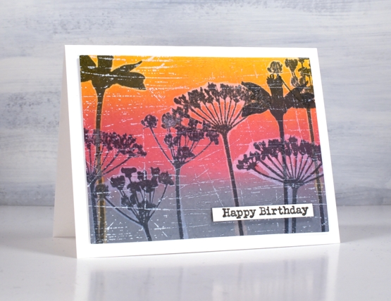
I have in my workroom a few new items to try but with one thing and another I haven’t had a chance. I recently bought two new pads of paper, one is rice paper and the other is mixed media paper from Fabriano, that’s the one I used for today’s cards. I’m very taken with Fabriano 100% cotton watercolour paper so I wanted to see what I thought of the mixed media.
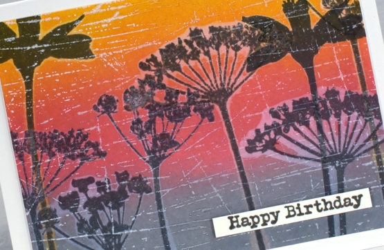
It is quite a while since I’ve done anything with my oxide inks so I pulled them out to make a blended background. After blending I did some water-stamping with both the DD ‘daisy delight’ background stamp and the floral silhouettes from the DD ‘you are everything’ set. The paper worked brilliantly for both steps. After drying the panels I stamped again with versafine clair inks and, as I hadn’t moved the stamps, the inked images landed inside the watermark images.
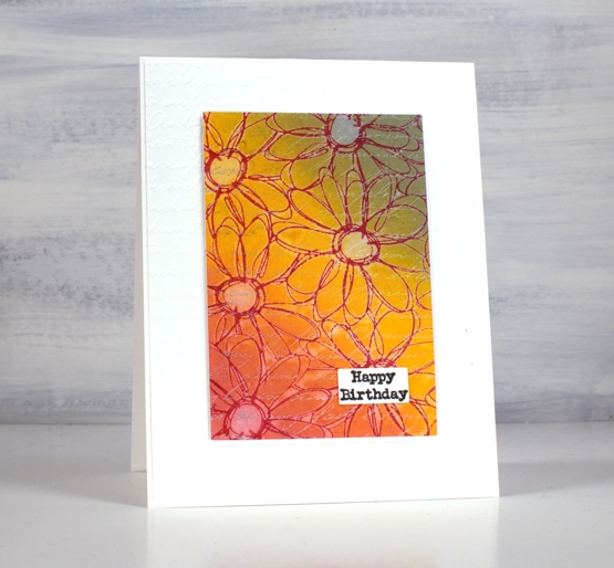
I dried all the stamping with a heat tool before adding background stamps over the top for added texture. I used white ink for both the DD ‘French script’ stamp and the DD ‘scratches’ stamp. The daisy stamp ended up with a double dose of script when I embossed a white base layer with the SU ‘scripty embossing folder.
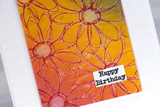
I gave both cards a little birthday label and pronounced the mixed media paper a success. Of course I will put it through it’s paces with gel printing and a few other processes but so far so good.
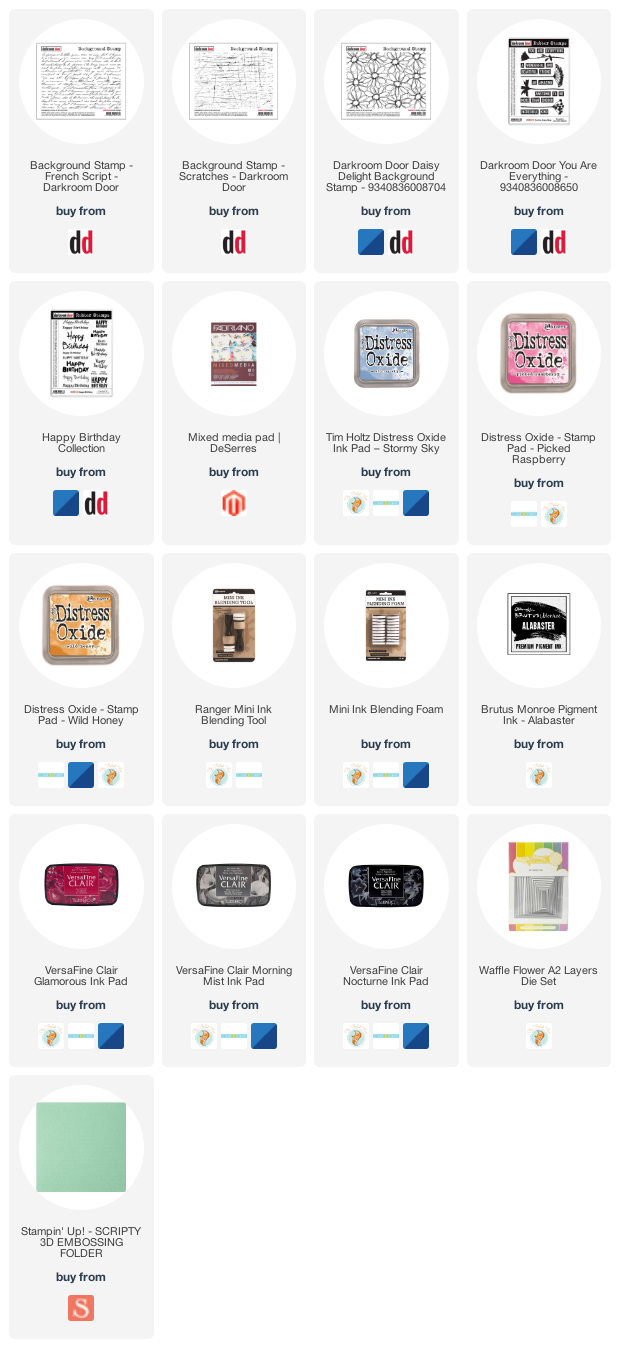
Supplies
(Compensated affiliate links used when possible)
2020’s favourite posts
Posted: December 31, 2020 Filed under: Arteza, Brusho, Coloured pencil, Darkroom Door, Finetec paints, Hand painted, Penny Black, watercolour real brush pens | Tags: Darkroom Door stamps, Darkroom Door stencils, distress oxide inks, Faber-Castell Albrecht Durer Watercolour pencils, Faber-Castell Polychromos Colour Pencil, Finetec artist mica watercolour paint, Penny Black stamps, Ranger Distress inks 6 CommentsI looked through the stats for 2020 to see which posts were viewed the most. It is not necessarily an accurate indicator of favourites but it is fun to look back and see what appealed. I’ve included a link to the original post next to every photo. I’m featuring only cards I made and posted this year. Here they are in no particular order.
Back in January I used Darkroom Door stencils as a guide to paint watercolour backgrounds for silhouette stamping with DD stamps.
In February as I was preparing to teach a class using pearlescent paints on black watercolour paper I created this embossed and painted card. The class didn’t happen but the plan is still in my mind for either an online or in-person class hopefully some time in 2021.
This card and the next favourite feature the same Penny Black stamp and no-line watercolour technique. I used distress inks and markers for the watercolouring on this one.
Same stamp as shown above, Unforgettable from Penny Black but this time watercoloured with Arteza real brush pens.
This lilac card along with three other colour schemes featured the ‘lovely lilacs‘ stamp from Penny Black and there is a video tutorial as well.
Another video post once again with Arteza watercolour brush pens this time with Penny Black’s nature’s glory stamp.
Now this one is a little different, pencil colouring on kraft cardstock, again with a video. 2020 has definitely seen me create the most videos!
This one is also one of my favourites so it is nice to see it as a reader favourite too. It is the second post in the top ten to feature the lovely lilacs stamp from PB.
I’m happy to see one of my hand painted pieces in the favourites. This is a brusho & cling wrap painting I did after watching a CeeCee Creations video.
Another video post made the top ten, this one featuring die cut distress oxide painted leaves. This is the only one not featuring flowers.
This one just missed out on the top ten so I’m adding it here at the end because I think it might be my favourite of the year. It’s a brusho and cling wrap panels that made me think of hydrangeas so I turned the random patterns into massed flowers.
Thank you for dropping it to read my posts this year. I love sharing the details of my cards, journal pages and creative adventures. In a year when face to face interactions have been limited I have been encouraged over and over by the comments and conversations here on my blog.
It has been my best year ever for producing you tube videos and also the year I fulfilled a long time dream of producing online classes. Again thank you for your support in those endeavours.
I’m looking forward to sharing more creative pursuits on the blog with you in 2021, there will be watercolour and stamping (of course!) but also alcohol ink art, gel printing, lettering and journaling. I hope you are safe and well where you are and pray that 2021 will be a year of health and happiness for you.
Oxide Leaves Video
Posted: September 25, 2020 Filed under: Dies, fall foliage, golden delight, Penny Black, pumpkin & leaves, Tutorial | Tags: distress oxide inks, Fabriano Watercolour Paper, Penny Black creative dies, Penny Black stamps, video 5 Comments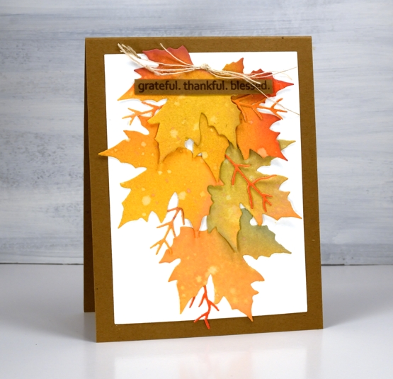
There is no denying it anymore, autumn is in the air and on the trees and definitely in the cards. This week the weather has been lovely, the sun has shone and the frost warnings have gone. Can’t complain.
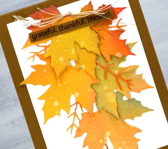
I really am a seasonal stamper; I’m inspired by what is going on outside in the world. With a few exceptions, like Christmas card prep, I like to stamp what I see in the garden and surrounds. The leaves on my trees are beginning to turn, nothing spectacular yet and nothing to rake (yay) but the signs are there. I chose oxide inks to blend several three coloured panels which I then cut up into leaves. The process and chit chat is all in the video below.
After the video was completed I looked at the wreath and decided it needed some brighter pops of colour and luckily I had some enamel dots which matched exactly. I added them before taking the photos below.
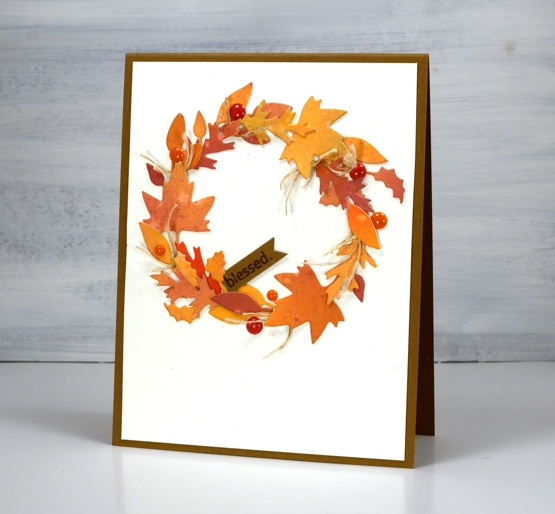
I really enjoy arranging all the elements on die cut cards like the two I’ve shared today but the gluing drives me a little crazy. Sometimes I use double sided adhesive but if the die cuts are not going to be sitting flat that doesn’t really work. If you have any suggestions for attaching fiddly little die cuts please leave them in the comments; I’d love to know. You might notice I try not to include much gluing in the video because it doesn’t make for very entertaining viewing.
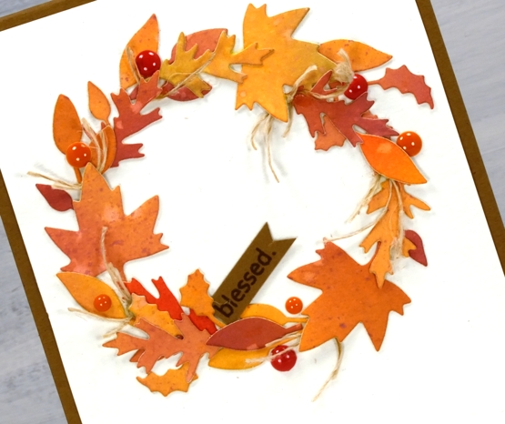
I hope you are surrounded by some fall beauty where you are or perhaps enjoying some spring sunshine in the southern hemisphere.
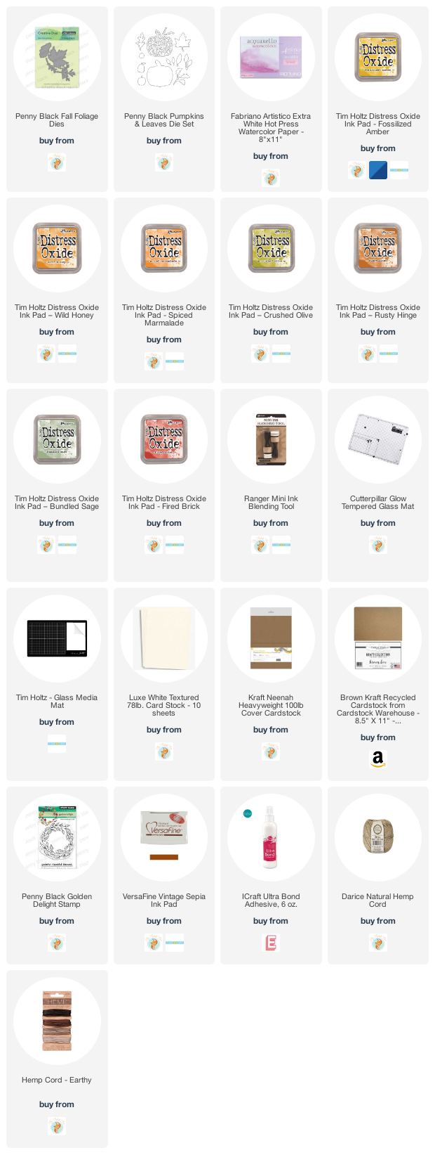
Supplies
Sunflower journal page
Posted: September 23, 2020 Filed under: Art Journal, brick wall, Darkroom Door, French Script, Leaves, mesh, plaid, Stencils, stone, sun, tickets, wildflowers | Tags: Art Journal, Darkroom Door stamps, Darkroom Door stencils, distress oxide inks, dylusions paint 6 Comments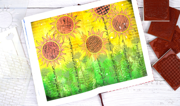
I’ve dones some more experimenting in my art journal with Darkroom Door stencils and stamps. As with some of my previous pages I finished and wished I done a few things differently but on the whole I was happy with the bright, happy look.
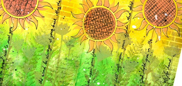
I began by taping the edges of the double page with painter’s tape which helps keep the pages flattish and creates a clean frame for the design. I painted the pages with absorbant ground in case I wanted to do some watercolour techniques then, when it was dry I painted the top of the page with dylusions pure sunshine paint and the bottom of the page with a mix of dylusions lemon zest & blue lagoon.
I blended oxide inks through the new small sun stencil to make sunflowers, the small wildflowers stencil to make stems and extra flowers and the brick stencil to fill in background. I also traced inside the flower stencil with a black gel pen to make the flowers stand out a little more.
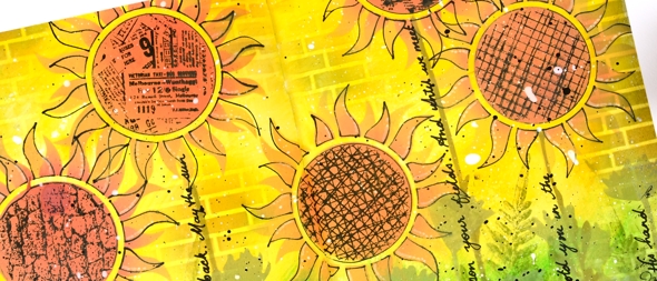
Although I worked mainly with stencils I filled the centre of the sunflowers with texture stamps, added extra leaves around the stems with a fern stamp from the ‘leaves’ set and stamped some script along the lower edge of the page. After adding all the different textures to the centre of the sunflowers, I wished I used the ticket one on all the flowers; it really does look the cutest.
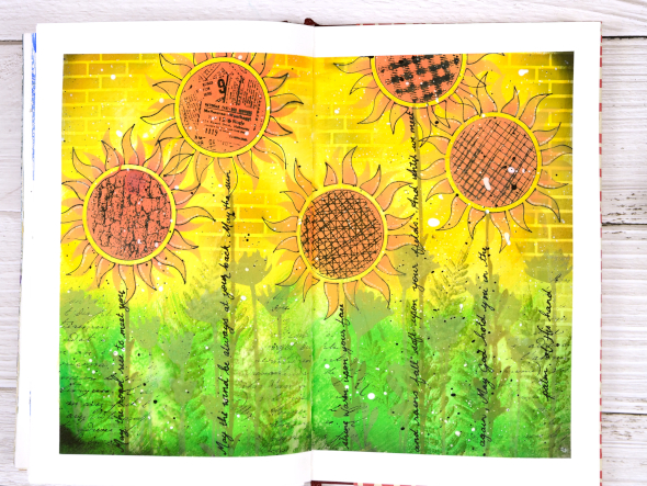
I added splatters of black and white gessos over the panel and wrote the words of the ‘Irish Blessing’ along the sunflower stems. It was the line ‘may the sun shine warm upon your face’ that I thought fitted with the page but decided to include the whole blessing.
There is a collection of fabulous new stamps and stencils in the latest Darkroom Door release so pop over and check them out. You will be seeing more of them around here over the next few weeks.
Supplies

Stencils and oxides
Posted: July 20, 2020 Filed under: Designs by Ryn | Tags: Concord & 9th, Designs by Ryn, distress oxide inks 6 Comments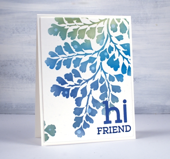
This is the first time I’ve used this beautiful stencil. I ordered it from a Canadian artist, Designs by Ryn. I love how delicate the maidenhair fern design is.
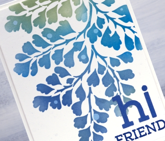
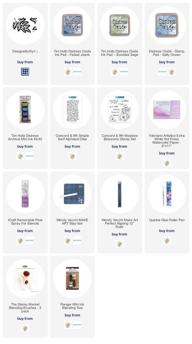
It was also the first time I have used pixie spray which is designed to keep stencils from moving on your paper while you apply ink or another medium. I followed the instructions on the spray bottle and then blended through the stencil onto hot pressed watercolour paper with oxide inks. It worked brilliantly. I used Ranger blending tools for this card but switched to blending brushes for the next card.
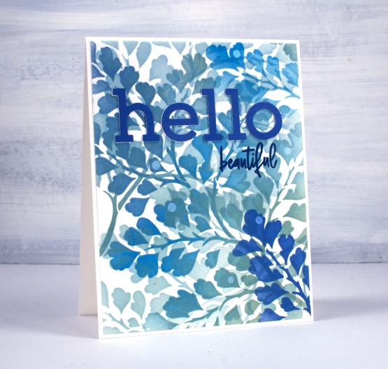
For both cards I used salty ocean, bundled sage and faded jeans distress oxide inks. When blending on the panel above I moved the stencil several times and the adhesive from the pixie spray continued to hold it. I didn’t clean the brush between colours which gave me a range of teal tones as I moved from bundled sage to the blue inks. This one might look a bit messy but I love all the layering of pattern and colour.
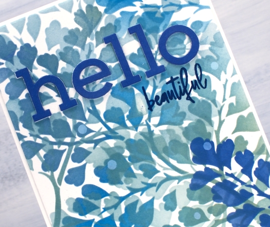
I blended faded jeans oxide ink on a piece of watercolour paper so I could cut letters from an exact match of blue then popped up the ones above on a layer of white letters. The letters are die cut with C&9 ‘simple serif alphabet dies’ and the words are from the C&9 set ‘meadow blossoms’. The little circles are watermarks made by adding a drop of water, leaving it for a minute then dabbing it up with a paper towel.
I also tried a journal page using similar techniques but took it a step too far! I will try again though, because the potential was there for a pretty spread. I made one more panel while I had the oxides and stencil out but I have another plan in mind for that one.
Supplies
Coffee with a friend
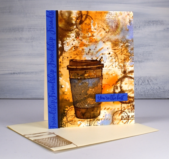
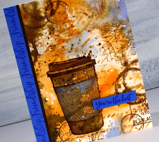
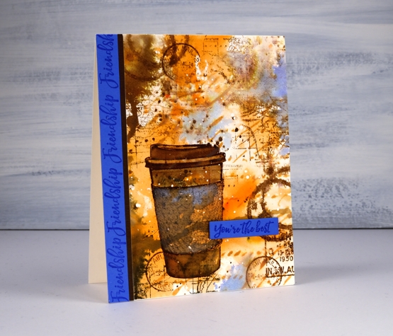
Posted: April 22, 2020 Filed under: coffee time, Darkroom Door, global postmarks, handwritten script, World Map | Tags: Brusho, Darkroom Door stamps, Darkroom Door stencils, distress oxide inks, Ranger Distress inks 6 CommentsAre you missing the coffee shops? I’m sure you are missing your friends and perhaps you are missing coffee with friends. This one is for a friend of mine who loves her coffee!
I began with a piece of hot pressed watercolour paper and splattered a few drops of masking fluid over the whole thing. Once the masking fluid was dry I sprinkled sandstone brusho on my glass mat, spritzed the brusho with water and swiped this panel through it. It took a few swipes before I had an orange and brown abstract background. I added some dark brown brusho on one side and spritzed that to make it blend and spread a bit. Once I’d dried that I blended through the new Darkroom Door ‘handwritten script’ stencil with rusty hinge oxide ink.
At this point the panel was very much just an abstract background so I stamped the cup from DD ‘coffee time’ in gathered twigs distress ink and blended the stamping with some water and extra ink. The set also has a coffee cup stain stamp so I added that here and there, spritzing it to make it blurry. I stamped some postmarks from the ‘global postmarks’ set because I can’t help myself.
Unfortunately the coffee cup did not stand out enough from the background and the background itself looked incomplete. DD world map stamp and blueprint sketch distress ink came to the rescue. I stamped the world map several times on the panel in gathered twigs ink and then, to break up the orange and brown monopoly, I added some blueprint sketch ink in just a few places. I found some blue cardstock that matched the blue and stamped ‘friendship’ and ‘you’re the best’ from the DD ‘friendship’ strip of sentiments to finish the card. Oh, and I added a thin strip of brown cardstock separating the blue from the patterned panel.
I’m glad I didn’t give up on this panel; it is just the thing for my friend who I will enjoy a coffee with again one day.

