Tulips & more tulips
Posted: February 21, 2024 Filed under: Echidna Studios, sennelier watercolours, tulip background, tulip set, Watercolour | Tags: digital stamps, Echidna Studios, Faber-Castell Albrecht Durer Watercolour pencils, Faber-Castell Polychromos Colour Pencil, Fabriano Watercolour Paper, sennelier watercolours 11 Comments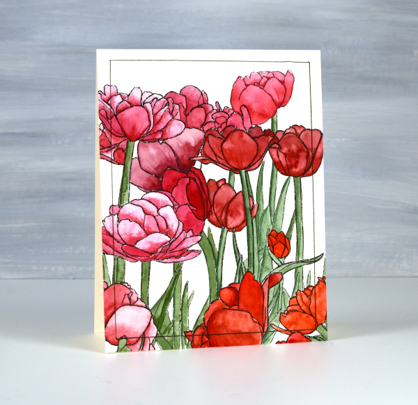
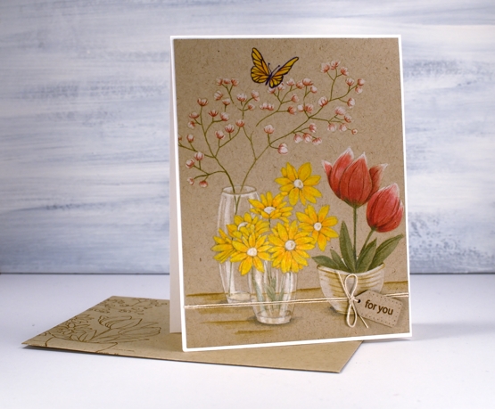
If there are tulips already blooming where you live you must let me know in the comments! It will be another two or three months before they bloom around here. All the more reason to have some blooming here on the blog. The group you see on the card above are part of a new digital stamp called ‘tulip background‘ from Echidna Studios. The whole image is a landscape oriented design and I printed it on hot pressed watercolour paper to be 8½” wide which gave me plenty of choice when deciding which part to use on a portrait oriented card.

I used Sennelier watercolours to paint the design using various mixes of four different reds and pinky red paints. I also used one of the reds to give the green paint a more muted realistic tone. Once I had painted all the tulips and stems I used polychromos pencils to add extra shading and shadow. This is a technique I learnt from Kathy Racoosin and it always adds to the finished panel. I ruled a narrow black line around the panel to frame it.

The flowers below are from a co-ordinating digital set simply called ‘tulip set‘ also from Echidna Studios. The set includes three individual tulips. I didn’t paint this one, my daughter did, using watercolour pencils. She also fussy cut each of the three tulips to create a pretty layered arrangement. This post includes an affiliate link to The Foiled Fox, if you use it I receive a small commission at no extra cost to you.

Old Stone Doorway
Posted: February 3, 2023 Filed under: Echidna Studios, old stone doorway, sennelier watercolours, Simply Graphic, Watercolour | Tags: Echidna Studios, Faber-Castell Albrecht Durer Watercolour pencils, Ranger archival inks, sennelier watercolours, Simply Graphic 12 Comments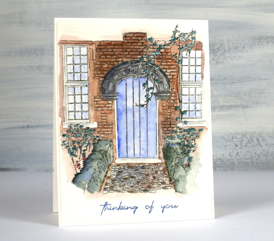
Isn’t this a sweet front path and door? It makes me want to head inside or wander around the garden. This digital stamp is another design by my daughter which is available in her etsy store, Echidna Studios. I printed it on Arches cold press watercolour paper. You know I generally use Fabriano hot press watercolour paper but I am trying to ‘use what I have’ so I pulled out the Arches for a change. I like how the texture of the paper adds texture to the front of the house.
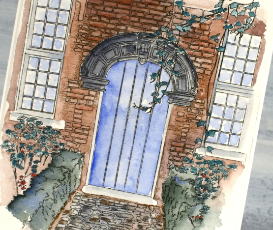
Using my Sennelier watercolour paints I painted a wash of brown over the brickwork, blue over the door and grey for the stonework. I also mixed a bluey green for the hedges. Next I switched to watercolour pencils and added shading to the bricks and stones, coloured the leaves and painted from the tip of my pencils to make the window and door frames grey and the reflections light blue. The sentiment is from Simply Graphic and is stamped in prize ribbon sketch archival ink
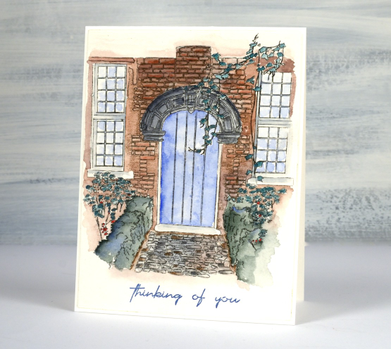
I almost stopped a couple of times as I wasn’t happy with the colours I had chosen and the lack of detail in the washes. I did keep going though and it pulled together. One thing that helps is that I didn’t use too many colours and I like the way the watercolour fades away at the edges. There are little white patches where I didn’t touch up the painting and I think they work too in adding a highlight here and there. I have printed another one out because a red brick house might also be fun to do.
The designer of this stamp is coming over for dinner tonight so I will ask where this door is in real life…
(Compensated affiliate links used when purchasing from Foiled Fox)

Let Heaven and Nature Sing
Posted: November 19, 2021 Filed under: CAS, nature sings, Penny Black | Tags: Faber-Castell Albrecht Durer Watercolour pencils, Fabriano Watercolour Paper, Penny Black stamps, Ranger Distress inks 9 Comments
This sweet bird is one of four in the Penny Black set ‘Nature Sings’. It is my plan to make a similar card with all four birds. I returned to a very clean and simple style for this one utilising some masking, blending and watercolour.
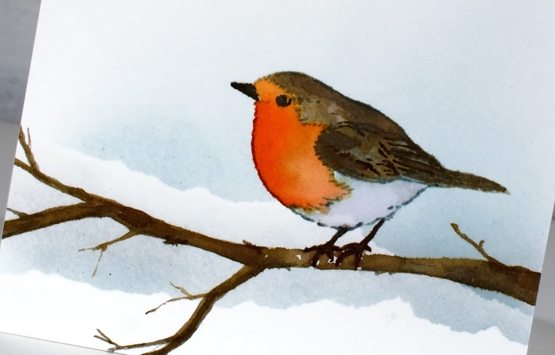
I worked on hot pressed watercolour paper because I knew I would watercolour the bird. Before stamping I tore a post-it note mask and lay it across the panel then blended speckled egg ink above it. I stamped the bird in soft stone papertrey ink then watercoloured with a few distress inks. The colours are listed below. The bird was floating in mid air so I drew a branch with a watercolour pencil then painted it with distress inks so he would have somewhere to perch. At this point I added a second area of masked blending to the background.
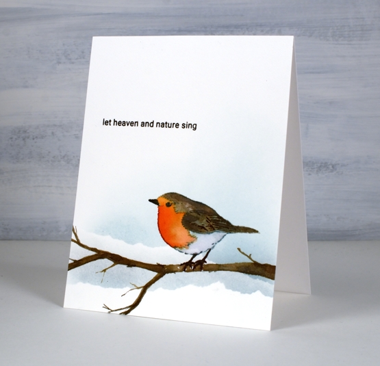
To finish off I stamped one of the sentiments from the same set in fallen leaves versafine clair ink. It just so happens that the CAS Christmas Card challenge this month is Christmas Critters so I am in!

Supplies
(Compensated affiliate links used when possible)
Gilded Wheat
Posted: September 20, 2021 Filed under: gilded wheat, Penny Black, Stampin Up, subtle | Tags: Faber-Castell Albrecht Durer Watercolour pencils, Penny Black stamps, Ranger Distress inks, Stampin Up 14 Comments
This beautiful wheat stalk, ‘gilded wheat’ is new from Penny Black. You know that feeling when you think maybe a project is complete but you’re not sure so you keep going? I had that feeling after I had finished stamping, painting and highlighting the wheat stalks. I just wasn’t sure whether to add a background or not.
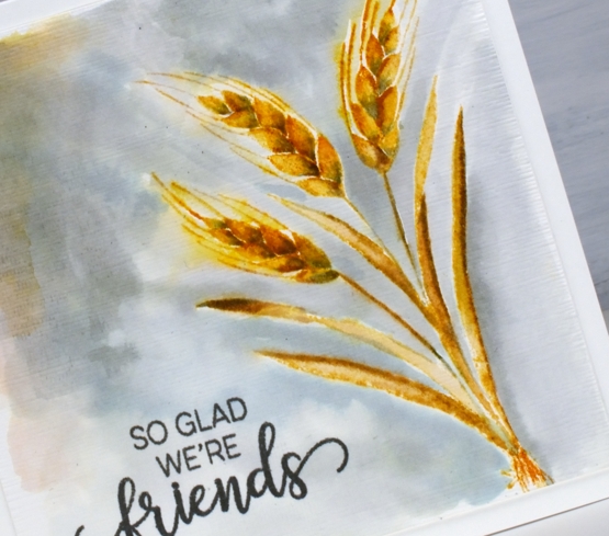
I stamped the wheat in scattered straw and wild honey distress inks then blended with a paint brush. To add shadow to the sides of the leaves and the base of the wheat berries I used iced spruce ink. After painting I switched to watercolour pencils and added more shadow with a similar grey-green spruce colour.
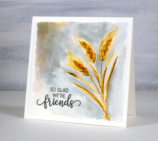
I could have stopped there and not added the background painting which is kind of patchy but I liked the contrast of the gold colours and the grey so I kept going. Before putting the card together I stamped a sentiment from the PB ‘choose happy’ set and ran the panel through the die cutting machine in the SU ‘subtle’ embossing folder. Sometimes people ask me how I settle on my colour combos; this one was inspired by the small leaves at the top of the previous card. Who knew grey and gold would be so happy together?
Supplies
(Compensated affiliate links used when possible)

2020’s favourite posts
Posted: December 31, 2020 Filed under: Arteza, Brusho, Coloured pencil, Darkroom Door, Finetec paints, Hand painted, Penny Black, watercolour real brush pens | Tags: Darkroom Door stamps, Darkroom Door stencils, distress oxide inks, Faber-Castell Albrecht Durer Watercolour pencils, Faber-Castell Polychromos Colour Pencil, Finetec artist mica watercolour paint, Penny Black stamps, Ranger Distress inks 6 CommentsI looked through the stats for 2020 to see which posts were viewed the most. It is not necessarily an accurate indicator of favourites but it is fun to look back and see what appealed. I’ve included a link to the original post next to every photo. I’m featuring only cards I made and posted this year. Here they are in no particular order.
Back in January I used Darkroom Door stencils as a guide to paint watercolour backgrounds for silhouette stamping with DD stamps.
In February as I was preparing to teach a class using pearlescent paints on black watercolour paper I created this embossed and painted card. The class didn’t happen but the plan is still in my mind for either an online or in-person class hopefully some time in 2021.
This card and the next favourite feature the same Penny Black stamp and no-line watercolour technique. I used distress inks and markers for the watercolouring on this one.
Same stamp as shown above, Unforgettable from Penny Black but this time watercoloured with Arteza real brush pens.

This lilac card along with three other colour schemes featured the ‘lovely lilacs‘ stamp from Penny Black and there is a video tutorial as well.
Another video post once again with Arteza watercolour brush pens this time with Penny Black’s nature’s glory stamp.

Now this one is a little different, pencil colouring on kraft cardstock, again with a video. 2020 has definitely seen me create the most videos!
This one is also one of my favourites so it is nice to see it as a reader favourite too. It is the second post in the top ten to feature the lovely lilacs stamp from PB.

I’m happy to see one of my hand painted pieces in the favourites. This is a brusho & cling wrap painting I did after watching a CeeCee Creations video.
Another video post made the top ten, this one featuring die cut distress oxide painted leaves. This is the only one not featuring flowers.
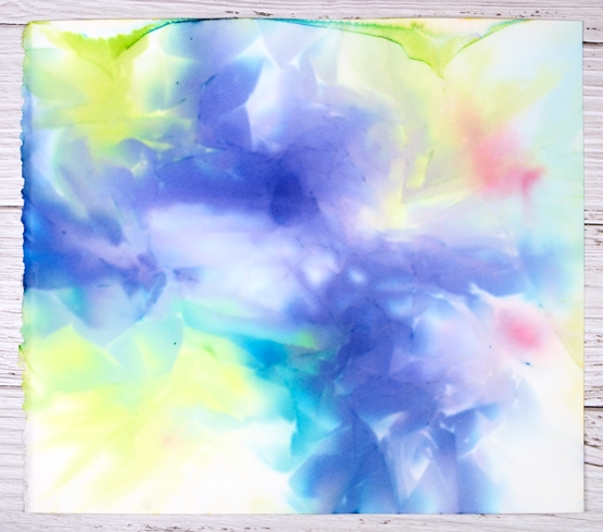
This one just missed out on the top ten so I’m adding it here at the end because I think it might be my favourite of the year. It’s a brusho and cling wrap panels that made me think of hydrangeas so I turned the random patterns into massed flowers.
Thank you for dropping it to read my posts this year. I love sharing the details of my cards, journal pages and creative adventures. In a year when face to face interactions have been limited I have been encouraged over and over by the comments and conversations here on my blog.
It has been my best year ever for producing you tube videos and also the year I fulfilled a long time dream of producing online classes. Again thank you for your support in those endeavours.
I’m looking forward to sharing more creative pursuits on the blog with you in 2021, there will be watercolour and stamping (of course!) but also alcohol ink art, gel printing, lettering and journaling. I hope you are safe and well where you are and pray that 2021 will be a year of health and happiness for you.
Pumpkin Season
Posted: September 15, 2020 Filed under: homeward, pumpkin season, Stamped Landscapes | Tags: distress markers, Faber-Castell Albrecht Durer Watercolour pencils, Fabriano Watercolour Paper, Penny Black stamps, Ranger archival inks, Ranger Distress inks 2 Comments
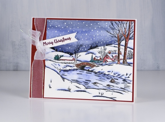
This lovely blue wheelbarrow filled with pumpkins is one of the new autumn products from Penny Black. It’s called ‘pumpkin season’ and I paired it with an older PB scenic stamp, ‘homeward’.
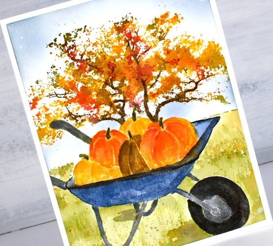
I worked on the wheelbarrow first while keeping it in my stamp positioner. I stamped the barrow in faded jeans archival ink, the base in hickory smoke archival and the pumpkins in fossilized amber archival. That gave me a base print to add to with distress inks which I could blend with water and a paintbrush. Still with the stamp in the positioner I inked different section with distress ink cubes and markers to build up the colours bit by bit. Once I was sure I didn’t have to stamp any more on the barrow I removed the panel, stamped the barrow on masking paper and masked the barrow in order to finish my scene.

With the panel back in the positioner and the barrow masked I stamped the ‘homeward’ scenic stamp over the top with ground espresso, spiced marmalade, barn door , peeled paint and wild honey inks. I blended the grass area immediately after stamping so I could extend the ground with peeled paint ink to fill the space around the wheel and base of the barrow.
I built up the colour of the tree with repeat stampings spritzed with water. Once the stamping and blending was complete I painted some shadows under the barrow with peeled paint ink and added some extra definition to the pumpkins with watercolour pencils. I blended the sky around the tree with stormy sky ink and a blending brush.
We harvested most of our tomatoes yesterday even though they are still green so now I am looking up green tomatoes recipes. The fried ones sound appealing (just like in the Fanny Flagg book) and a zucchini and green tomato relish could be good too.
Supplies
Painting atmosphere
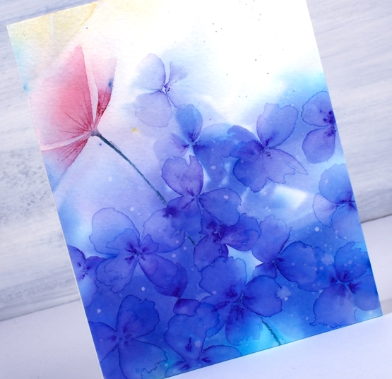
Posted: July 29, 2020 Filed under: Brusho, Coliro paints, Darkroom Door, Finetec paints, Hand painted, Leaves, tall flowers, Wings | Tags: Brusho, Darkroom Door stamps, Faber-Castell Albrecht Durer Watercolour pencils, Fabriano Watercolour Paper, Hand painted 27 CommentsI’ve done some more playing with watercolours and clingwrap. Quite a lot of playing actually; it’s addictive. I don’t even remember if the panel above was painted initially with brusho powders or pan watercolours or both. I do know I started with a large piece of cold pressed watercolour paper taped to a glass mat. I wet the panel then added the paint and let it move around and blend a little before I placed the cling wrap on top. I did remember to take a photo of the panel after it had dried and I’d removed the cling wrap. The card above which looks a bit like some hydrangea flowers was painted on the bottom right corner below.
The butterfly card below was made from the top left corner of the large panel and the flower card was made from the top right corner. I did work on the bottom left corner but didn’t end up liking what I’d made.


For the butterfly card I used a stamp from Darkroom Door ‘wings’ set and stamped it on the panel in blueprint sketch distress ink. After stamping I blended the ink plus some pearlescent paint from a finetec palette to fill the butterfly’s wings. It’s not obvious in the photo but the wings shimmer.
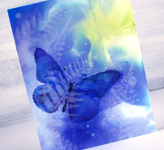
Once the butterfly was dry I did some water stamping using a fern stamp from the DD ‘leaves ‘ set.

The flowers are from the DD ‘tall flowers’ set and were stamped in festive berries, mowed lawn and wild honey distress inks. I also added gold paint to the flower centre. You can see some more water stamped ferns and some second generation stamping with the flowers also. The little circles on all three cards were made just by adding some droplets of water, letting them sit on the panel then dabbing them up with a paper towel.
The card above with the purple flowers doesn’t feature any stamping, the patterns made by the cling wrap made me think of a hydrangea flower head so I painted a bunch of little flowers using a purple watercolour pencil to draw centres then a paintbrush and water to blend the pencil into petals. While the petals were still wet I used the pencil again to add some darker areas in the centres.
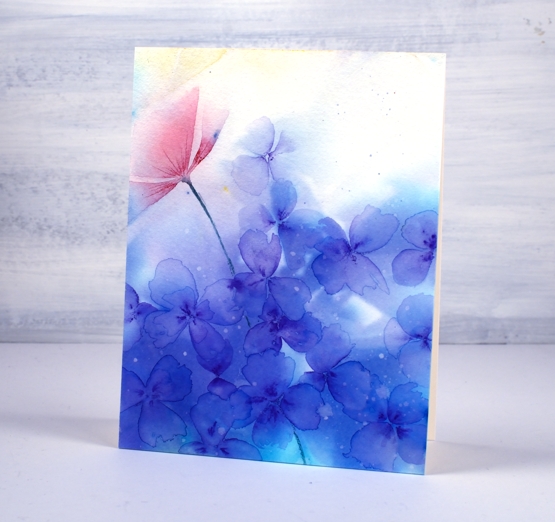
The red shape on the left hand side looked a bit like a flower so again I used a watercolour pencil to add a bit more colour and followed the lines left by the cling wrap.
Whether painting or stamping over the panel, I love the patterns and play of light and dark in the background; I think it creates atmosphere. Have I finished with this technique now I hear you ask? No, definitely not. Have you tried it?
Supplies
Winter Days
Posted: November 19, 2018 Filed under: hometown Christmas, winter days | Tags: Faber-Castell Albrecht Durer Watercolour pencils, Penny Black stamps 4 Comments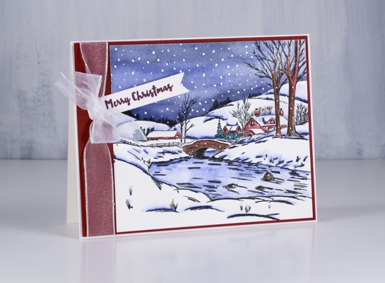
It doesn’t look quite like this yet but we have snow and it is staying on the ground… for now. I stamped this pretty scene from Penny Black’s ‘winter days’ transparent set in black versafine clair ink on hot pressed watercolour paper then coloured with watercolour pencils.
I limited my pencil choices to two dark blues, a black, a green, a red and a brown. There are dots of snow in the stamp so after painting the sky I dotted over the stamped snow with a white gel pen and added some over the rest of the scene also. I used Kathy Racoosin’s shadow trick of adding some black pen here and there where there would be shadows. (eg. the edges of the river, under the eaves on the buildings and the trees on the horizon). I am still enjoying colouring as often as possible for The Daily Marker 30 day colouring challenge.

My panel wasn’t a square nor was it my usual 4¼ “x 5½ ” size but I wanted the usual A2 size I matted it with a wide red mat which left room for some organza ribbon. I stamped a partial sentiment from the ‘hometown Christmas’ set and tucked in under the bow.
If you’d like to see a beautiful and quite different take on this stamp pop on over to Susie Lessard’s blog here.
Supplies
Stamps: winter days, hometown Christmas (PB)
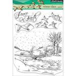
Inks: nocturne, chianti versafine clair

Paper: hot pressed watercolour, deep red cardstock

Pencils: Faber Castell Albrecht Dürer watercolour pencils
Pens: white gel pen, black micron pen
Also: white organza ribbon with shimmery edges
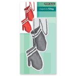
Mittens
Posted: November 13, 2018 Filed under: Christmas mittens | Tags: Faber-Castell Albrecht Durer Watercolour pencils, Faber-Castell Polychromos Colour Pencil, Penny Black stamps, Ranger Distress inks, WOW embossing powders 7 Comments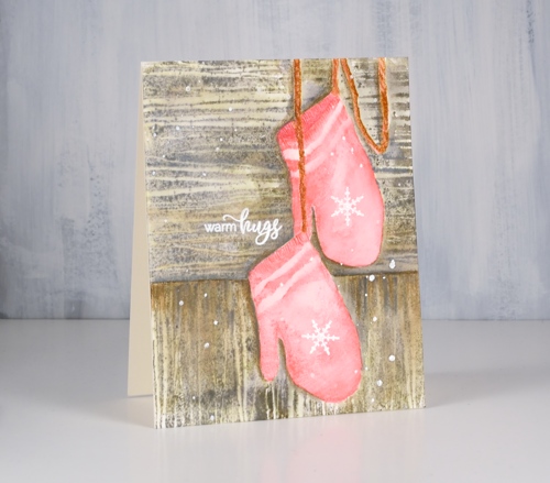
I have mentioned Kathy Racoosin’s 30 day colouring challenge a few times lately. It is definitely a no stress, no fuss, no obligation challenge which I have participated in before. Kathy, would be the first one to tell you there is no preparation necessary and I agree. However, I am enjoying it more this time around because I did do a little stamping in advance. I sat down at my work table a few days before the challenge began and stamped a bunch of images. I embossed some, stamped some in waterbased dye ink and a few in waterproof black ink. I basically created a little stack of images I could reach for and colour when I had the chance. It has helped me to be more involved this time. Sometimes I work on a panel until it is finished, other times, as in the case of these mittens, I colour it bit by bit or mitt by mitt!

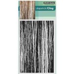
I stamped the red mittens on hot pressed watercolour paper in worn lipstick distress inks and the cord in rusty hinge distress ink. I painted over the stamping with water to blend the pink ink to a smoother colour and to soften the stark white of the stripes. I added shading and little lines on the edges of the mittens and texture to the cord with watercolour pencils.

I decided the red mittens would be hanging against a wall or fence outside so I stamped and cut a mask of the mittens, covered them and stamped the woodgrain stamp from the PB set ‘tall timbers’ first one way then again at right angles in weathered wood and frayed burlap distress inks. As with the mittens I blended over the stamping with water and added extra colour from watercolour pencils especially around one side of the mitts to look like shadow. To finish the panel I stamped some snowflakes on the mitts, a sentiment and also splattered some embossing fluid before embossing it all with white powder.

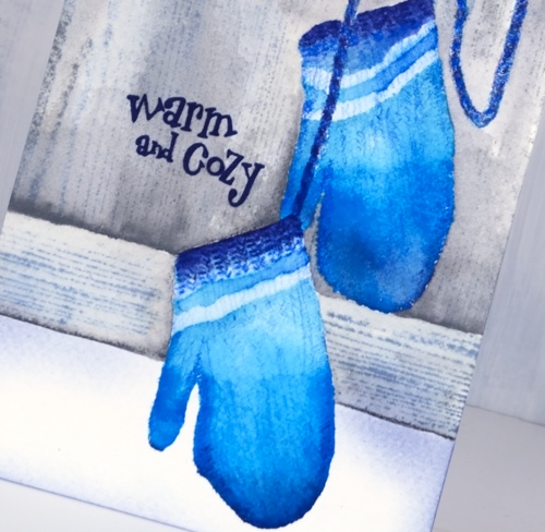
I followed a similar process with the blue mittens but stamped them initially in three blue distress inks (broken china, salty ocean and chipped sapphire). I blended the stamping with water then, when it was dry, added details with coloured pencils. I wanted them to look knitted so I drew a pattern to look like rib at the cuffs then some lines and shading on the rest of the mitts.
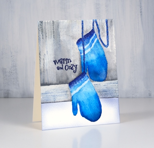
Once again I added a woodgrain background this time by masking the lower portion of the panel before stamping the woodgrain from the PB ‘inspiring’ set then more masking to stamp it horizontally across the card. The sentiments for both cards are from the PB ‘smile all season’ set.
Warm & cosy wishes everyone!
Supplies
Stamps: Christmas mittens, inspiring, tall timbers, smile all season
Paper: hot & cold pressed watercolour paper, neenah cream
Inks: worn lipstick, rusty hinge, broken china, salty ocean, chipped sapphire, frayed burlap, weathered wood, hickory smoke


Also: white embossing powder
.
Pencils: Albrecht Durer watercolour pencils, Polychromos pencils (Faber Castell)
.
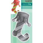
Oh What Fun!
Posted: November 7, 2018 Filed under: elf stocking, holly sprig | Tags: Alexandra Renke cardstock, Faber-Castell Albrecht Durer Watercolour pencils, Penny Black stamps, Ranger Distress inks 11 Comments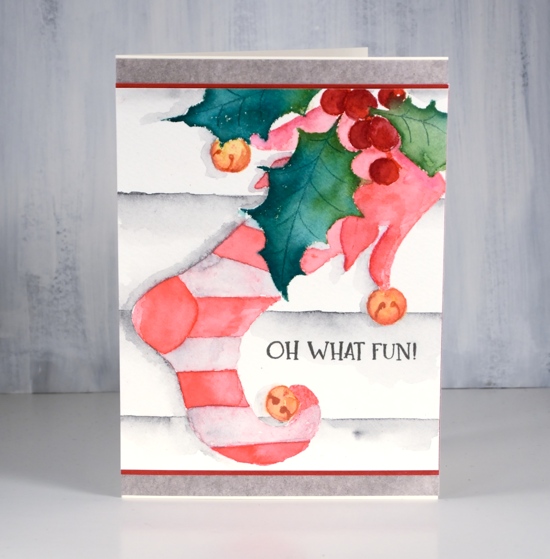
I was surprised how much fun I had colouring this stocking stamp. I worked on it on Saturday afternoon when it was wet and dreary outside; I lit a fire in my fireplace and brought colouring supplies up from my workroom so I could have a comfy cosy afternoon of colouring inspired by Kathy Racoosin’s 30 day colouring challenge.
Before colouring I’d used a stamp positioner to stamp the holly sprig stamp first in pine needles, mowed lawn and festive berries distress ink. I blended the leaves with a wet brush and let them dry. I cut a mask to cover the holly branch then stamped the stocking over the top in worn lipstick distress ink. Other than painting the leaves straight after they were stamped, all the other stamping was a base for watercolour pencil colouring.
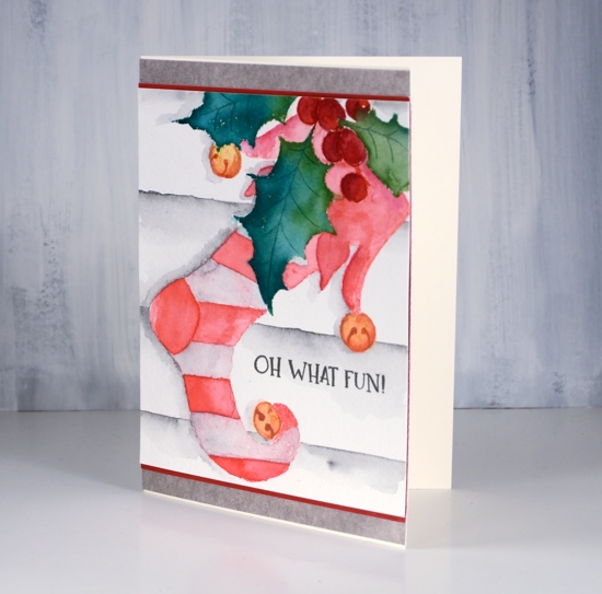
Because my base stamping was pink I decided to stay with a red and white colour scheme. I used a couple of red watercolour pencils and a paint brush to do half the stripes and the decorative top of the stocking. Rather than colour with the pencils straight on the watercolour panel, I picked up pigment from the pencils with a wet brush and painted over the stamping. I toyed with the idea of red and purple stripes but I’m glad I chose a very pale earth green which blended with the pink ink to look pale pink. I messed up a stripe at the top but I’m hoping the recipient won’t notice that!
For the berries I used darker red pencils and the bells a mustard and a rusty brown pencil. I added a background by ruling a few lines in medium grey watercolour pencil then blending and painting more grey below each line. I painted a grey shadow to the left of the stocking and leaves.
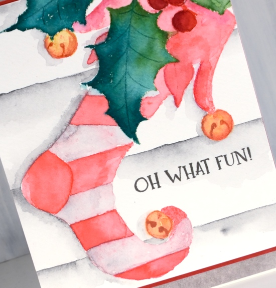
As usual I gave no thought to a sentiment until all my painting was completed and then of course I wasn’t sure where to put a sentiment or whether to have one at all. I hadn’t really paid attention to the size of my panel either so I had to do some creative matting to turn it into a card that would fit into the size of envelope I had. So as you can see, no, I don’t plan all the details of my cards in advance!
Supplies
Stamps: elf stocking, Christmas sentiments


Paper: Neenah cream, hot pressed watercolour, red, Alexandra Renke mud


Inks: pine needles, mowed lawn, worn lipstick distress inks, festive berries distress marker & smokey gray versafine ink

Pencils: Faber Castell Albrecht Dürer watercolour pencils
Tools: MISTI, T-ruler, masking paper