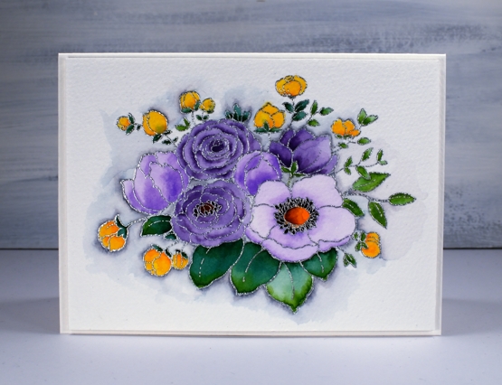
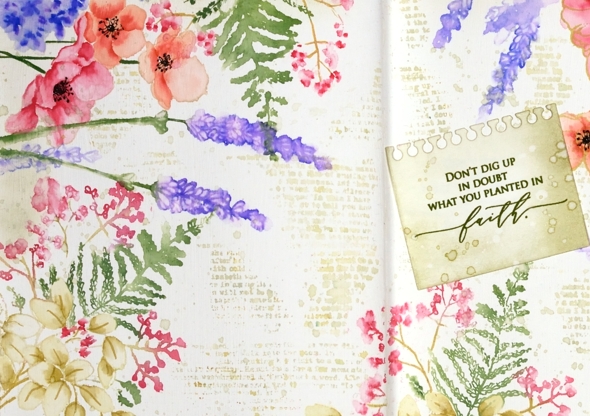
Faith & floral journal page
Posted: February 16, 2021 Filed under: A Pocket Full, Art Journal, Arteza, Footnotes, illustrious, Penny Black, springtime sigh, tranquil buds, watercolour real brush pens | Tags: Art Journal, Arteza, Penny Black creative dies, Penny Black stamps 6 Comments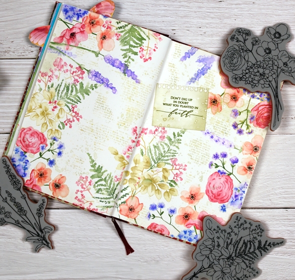
I know it is not spring yet, in fact it is still very winter where I am; we’ve had some of our coldest days and nights just in the last few days. Maybe because it’s so cold now is a nice time to muse about spring.
Sometimes I have a plan for a journal page, other times I work it out as I go along. To begin this one I painted absorbant ground on the journal double page. It is a base preparation a bit like gesso which makes the paper act a little more like watercolour paper. I should probably just switch to a journal with watercolour paper pages but I stubbornly want to keep adding to the this one.
Once the base dried I stamp the Penny Black ‘springtime sigh’ stamp in one corner then coloured with Arteza real brush pens. The colouring is not precise, the surface doesn’t react the same as watercolour paper but I found blending with very little water gave me the most control.

I stamped first with Gina K skeleton leaves amalgam ink which I have used for no-line watercolour in the past but it remained too distinct on the journal page so I switched to antique linen which worked a bit better. I restamped and coloured springtime sigh several times then decided I wanted fewer little flowers to colour! I switched to the new Penny Black ‘illustrious’ stamp which co-ordinated well. I don’t know for sure but I wonder if both stamps were drawn by the same artist, the scale and style is similar.

When stamping the ‘illustrious’ stamp I was able to ink most of the stamp with Arteza real brush pens which cut down on the colouring. I still used antique linen ink on the large open leaves then blended with a marker to shade the leaves. When I had almost framed the double page spread I switched to the PB ‘tranquil buds’ stamp to add some lavender.
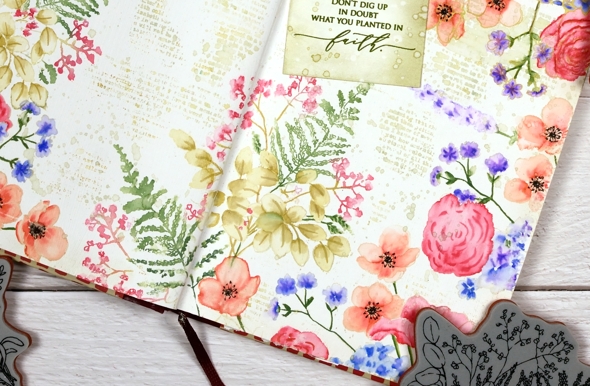
Next came the tricky stage when I had to decide what was happening with the empty area of the journal page. Writing, stamping, hand lettering or empty space were all options. I decided a bit of ‘filler’ in the shape of a text stamp would be nice and instead of the large script one I often use I chose the smaller typed text stamp from the PB ‘footnotes’ set. I stamped it here, there and everywhere in old paper ink, often spritzing with water before stamping so it just stamped a blurry pattern. I also added splatter then chose a phrase from the new PB ‘inspirational sentiments’ set.
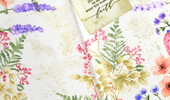
Is that cute notebook die-cut covering a failed stamping attempt? Yes it is but I’m quite happy with that because the notebook page looks sweet. I cut it with a die from the PB ‘a pocket full’ set. I love how this page turned out even though I had no idea at the beginning it would progress this way. That’s the beauty of a journal page.
Supplies
(Compensated affiliate links used when possible)
Hydrangeas
Posted: August 7, 2020 Filed under: Arteza, hydrangea, it's your birthday, Papertrey Inks, Penny Black, Studio Katia, watercolour real brush pens | Tags: Arteza, Papertrey ink, Penny Black creative dies, Penny Black stamps, real brush pens, Studio Katia 10 Comments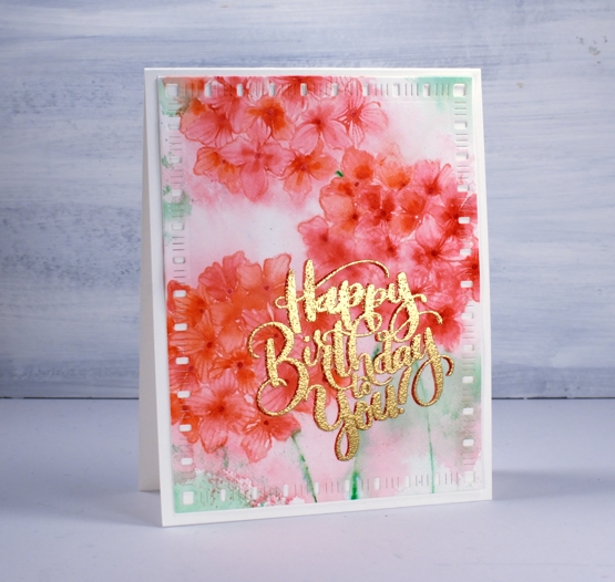
When I tried a bit of hydrangea painting the other day it got me thinking about hydrangea stamps and I’m not sure if I have ever inked this PB one before. As you know I tend to go for the blues and purples (like my mother before me) but I decided to go more for the pinky red you can find in some hydrangeas. As you can see I didn’t end up with pinky red; I have orangy red which I have never seen on a hydrangea! My mother always wanted her hydrangeas to be blue, purple or pink so she and my dad added something to the soil to make that happen.
Before I began stamping I scribbled rouge pink and punch pink Arteza real brush pens on my glass mat, spritzed it with water then swiped my hot pressed watercolour panel through it. I dried the panel before beginning the stamping. In the stamp positioner I inked the hydrangea first with Papertrey ‘pale peony’ ink then dabbed the arteza pens on the stamp as well to get a variegated print. I spritzed then stamped and repeated the process to get three hydrangeas. To colour inside the petals I used three arteza pens (rouge pink, punch pink, apricot) to dab a little colour then blended to fill the petals with a paintbrush and water.
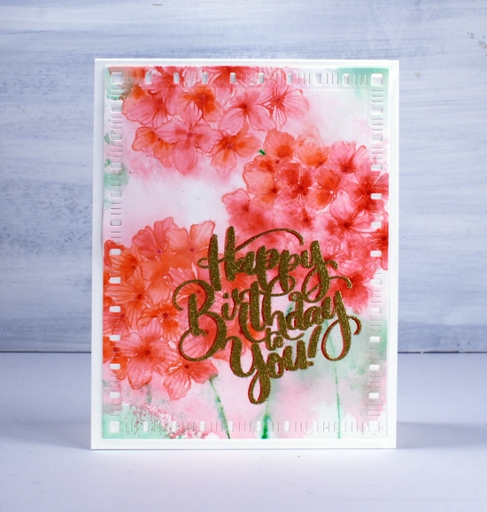
I decided to try a fancy drop shadow greeting and it kind of worked; don’t look too closely. I stamped first in versafine clair tulip red, dried that, powdered it with the anti-static-thingy, dried it again and powdered it again and then moved the panel ever so slightly left before stamping with versamark and embossing with gold. Despite all my efforts gold powder still stuck to the supposedly dry tulip red ink. As a fix I used a red marker to make the shadow to the left a little more prominent. Then in another fit of fanciness I cut the panel with a dainty dashes die. I don’t know what came over me! Maybe it’s because it’s Friday or maybe it’s because I am getting increasingly excited about opening my online class on Monday.

Thank you to all of you who have signed up already; I am thrilled by the response so far. If you don’t know what I am talking about pop over here and find out!
Supplies
Stamping with Arteza Real Brush pens
Posted: April 17, 2020 Filed under: Arteza, nature's glory, Penny Black, Tutorial, Watercolour, watercolour real brush pens | Tags: Arteza, Fabriano Watercolour Paper, Penny Black stamps, Tutorial, video 10 Comments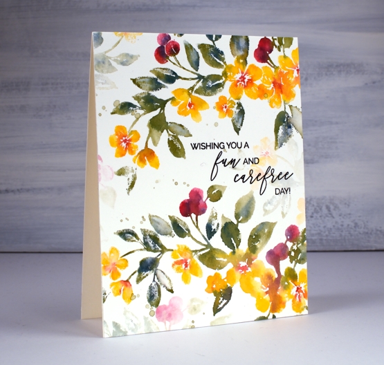
Hi there, this pretty stamp, ‘nature’s glory’ is making its second appearance on the blog and I’ve paired it up with Arteza real brush pens. I did all the inking with the brush pens and made a video to give you an idea of the process. One of the tricky steps when creating watercolour cards with stamps is when, where and how much water to add, hopefully the video will give you an idea.
You probably noticed in the video the way the brush pen bristles were able to easily get into small sections of the stamp so I could ink the flowers, berries and leaves. I spritzed the stamp before pressing onto the hot pressed watercolour paper so the inks would blend on the stamp rather than me blending them on the paper. I love the softness of the blends including the areas that get more water and the ones that look a little dry because they got less water.
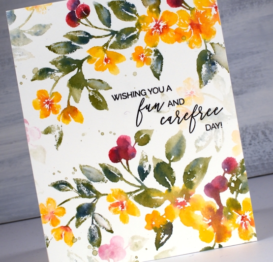
The soft background leaves and flowers were all stamped with ink left on the stamp after doing the bold images. The ink is certainly intense enough that an extra spritz of water is all you need in order to stamp the pale images that appear to be further back between the branches. Dabbing these pale images with a paper towel after stamping makes them even paler and removes any liquid sitting on the surface.

I even had enough ink on the stamp to get a pale print on my envelope then finished with splatter as you know I like to do.
The card below was done with the same stamping technique but I created the soft coloured background at the beginning of my process. I scribbled the blue, yellow and green pens on my glass mat first, spritzed with water then swiped the hot pressed watercolour panel through the ink picking up sections of diluted colour which I dried before transferring the panel to my stamp positioner to do all the flowers. If you are wondering about the sentiment, it is for one of my friends who was told this by a student! When she relayed the experience to me I knew it had to become a card. I did a bit of partial stamping with MFT ‘birdie brown greeting stamps’ then cut the letters b, a, b, y from dark green cardstock (I know it looks black ) with MFT ‘little lowercase dies’.
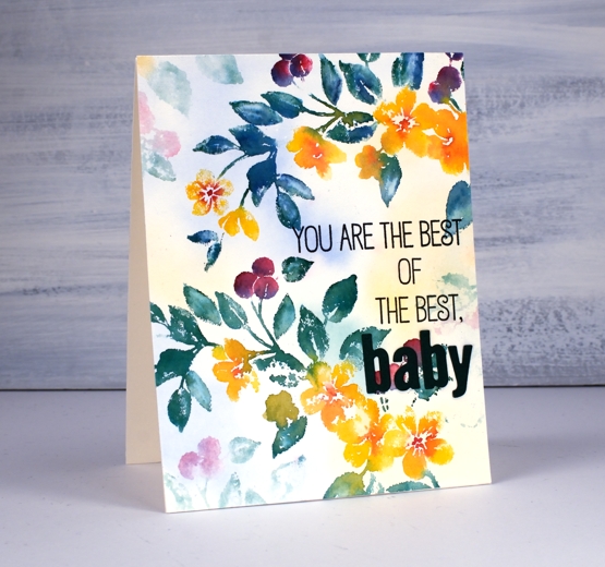
If you are a teacher connecting with your students on line, encouraging them and trying to come up with methods that work in the current situation please know I think you are the best of the best…baby!
Supplies
Springtime Sigh
Posted: April 6, 2020 Filed under: Arteza, Penny Black, springtime sigh, watercolour real brush pens, wings & vases | Tags: Arteza, Penny Black stamps, real brush pens 3 Comments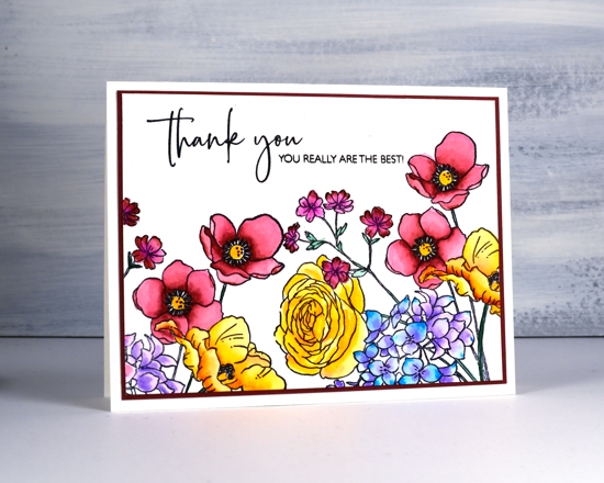
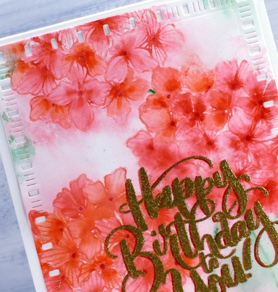
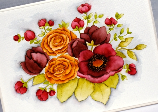
The Penny Black stamp featured on the above card is called ‘springtime sigh’. I think I can admit to a few springtime sighs lately, mostly appreciative sighs I might add. The days are warmer, the snow is disappearing and I saw the promise of a daffodil, a star flower and a tulip out in the garden yesterday.
To achieve the layout above I stamped springtime sigh twice on hot pressed watercolour paper then coloured with Arteza real brush pens and blended with water. I didn’t note down the names of the different pens I used but I kept the number small. Rather than add an orange to the mix I added red to the yellow poppy petals and I blended from dark to light with one red pen on the red blooms. After colouring I matted with a co-ordinating colour and added a two part sentiment from PB ‘million thanks’ set. If you have been wondering whether some Arteza real brush pens should come and live at your house make sure you use the coupon code they provided so my readers could have a 10% discount HeatherTelford1 (here are affiliate links for the Arteza US store and EU store.) I did a review of the pens on YouTube; you can see me try some of my favourite techniques
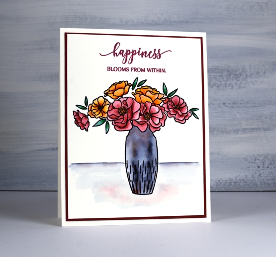
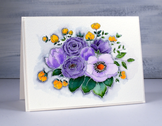
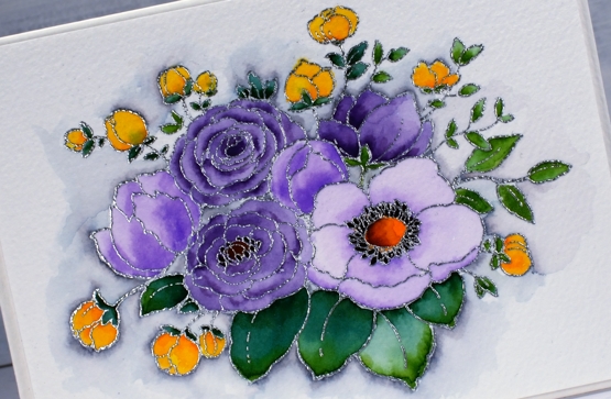
The flower arrangement above is from the PB transparent set ‘wings & vases’. Once again I stamped with versafine clair nocturne then coloured with Arteza real brush pens. I love the variation of colour from the gray markers when diluted. I used a gray (sorry not sure which one) marker for the vase and added a little blush red at the top. To ground the vase I created background line by drawing a single line in gray or black which I then diluted with water and again dropped in a little red as if it was reflecting the blooms.
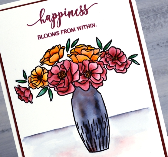
I finished the card with a co-ordinating mat and sentiment, this time from ‘blooming sentiments’.
Now before you go, Penny Black is hosting a big giveaway and to cheer and encourage. Head over to the Penny Black blog to see how to enter to win a $100 shopping spree!
Supplies

The Ride
Posted: April 1, 2020 Filed under: Arteza, Penny Black, the ride, watercolour real brush pens | Tags: Arteza, Penny Black stamps 10 Comments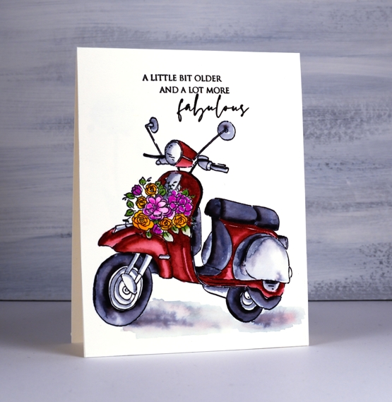
I have another card featuring colouring with Arteza real brush pens today. I completed several cards weeks ago as I tried out the pens but waited until now to feature them on the blog because I wanted to group them with the product review I did with the Arteza pens. The review shows me trying some of my favourite techniques with the pens. Even if you haven’t watched the review video you probably won’t be surprised to hear I was happy with the results on this scooter. You know I don’t tend to branch out much from the ‘nature themed’ projects; it’s trees and flowers, flowers and trees 80% of the time round here. This cute scooter did grab me though, so I made it part of my brush pen trials.
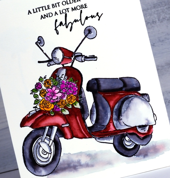
The scooter is stamped in versafine clair nocturne. When it came to the colouring I did not take the time to make sure all the highlights and shadows were in the right place; I just made sure there were some highlights and shadows! I stuck with three main colours, the ‘blush red’ I used for the splendiferous tulips, elephant gray and noir, then added in a pink, an orange and a green for the little flower arrangement on the front.
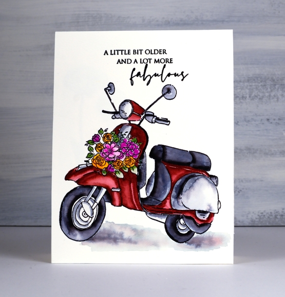
I coloured one section at a time blending with water then letting it dry while moving on to a non-adjacent section. The shadow was done with a few swipes of grey pen, diluted and then a touch of blush red dropped in. Those flowers were a bit high on the fiddliness factor scale for me but I persevered. I know they’re only little but when the flowers get too small my eyesight and my patience doesn’t like it. The cute sentiment is from ‘carefree wishes’.
If you do get inspired to try the Arteza real brush pens (or anything else Arteza for that matter) here is a discount code for you HeatherTelford1 and here are affiliate links for the Arteza US store and EU store. Using these links means at no extra cost to you I receive a small commission. Arteza has a giveaway happening right now too so you could win a little spending spree (and by little I mean $100!) Check it out here
At the risk of experiencing your utter disbelief I want you to know I have another video for you on Friday! Stay home, stay healthy and stay hopeful everyone.
Supplies
Splendiferous
Posted: March 31, 2020 Filed under: Arteza, Penny Black, splendiferous, watercolour real brush pens | Tags: Arteza, Penny Black stamps 7 Comments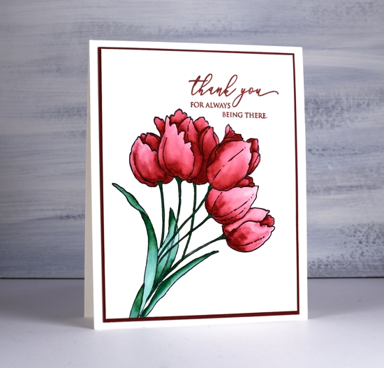
This bunch of tulips is called ‘splendiferous’ which sums up their elegance well I think. ‘Splendiferous’ does sound a little bit like a made up word so I had to look it up and check. It is in fact a real word a bit like fantabulous, also a real word. I stamped these splendiferous tulips in nocturne versafine clair ink then coloured them with Arteza real brush pens. I posted a video a few days ago about the real brush pens, here’s the link if you’d like to see me trying them out on my favourite watercolour techniques.
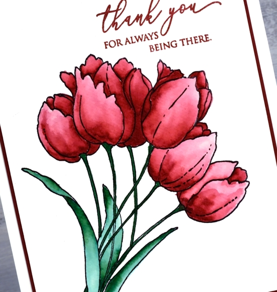
I blended the colouring with water after stamping them with versafine, a waterproof ink. Even though the petals have quite a variation of pink tones it was all done with one real brush pen, the blush red, from the 96 set. I coloured near the base of the petals or edges in shadow then blended the colour with water to fill the petal. I tried to work one petal at a time so the depth of colour in one section would not spread into an area I wanted lighter.
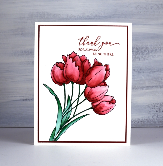
The leaves are also coloured with only one brush pen, emerald green. Once again I blended with water to get the variation of colour. The sentiment from ‘magical friendship’ is a lovely one and is stamped in versafine crimson red. To finish the card I matted in red and attach to a cream card base. I mentioned the other day that Arteza provided a discount code for my readers to use and then I forgot to provide it!! It is HeatherTelford1 and is worth 10% off. Arteza is also hosting a giveaway right now, you can find out how it works on their youtube channel.
As I mentioned yesterday I am very happy to be connecting with you in the comments. If you would also like to connect through snail mail, please use the ‘CONTACT ME‘ button to send me your name and address. I will put a card in the mail to you.
Supplies
Arteza Watercolour Real Brush Pens
Posted: March 27, 2020 Filed under: Arteza, Penny Black, unforgettable, watercolour real brush pens | Tags: Arteza, Penny Black stamps 16 Comments
Today’s blog post is a little different from the usual. The cards in today’s post are coloured with Arteza Watercolour Real Brush pens. Arteza contacted me and asked if I would be interested in doing a product review video for them. I’ve seen Arteza products popping up on many blogs and youtube channels so I was interested to try them out. They sent me Watercolour Real Brush Pens, an Expert Watercolour Pad and a set of six Water Brushes Pens.
To see how I used them check out the video below. It is a long one because I put the products through their paces with a bunch of my favourite techniques. I did speed up the footage through out the video so I could show you all that I tried. Believe me you would not have wanted me to leave it at normal speed! If you want to slow something now that is an option on Youtube.
The video isn’t a how-to for today’s cards but there is footage of some of the process included. You may find some other techniques you’d like to try in my review also. Just so you know I have two more videos in process which are more project tutorial style. I’m trying to keep the inspiration coming as we all cope with our quarantine situations.
I was very happy with the results using the brush pens, watercolour pad and waterbrushes, but the real brush pens are the main focus of my review. I was particularly impressed with the results when I did no-line watercolour with the real brush pens. It can be a tricky technique but the pens made it easier in my opinion.
The range of colours in the set of 96 is wonderful and the intensity of the colour means a little goes a long way. I have cards coloured with the real brush pens which will be appearing on my blog in the next few weeks.
Arteza gave me a coupon code to share with you in case you are interested in trying the products and there are affiliate links below. The coupon code is HeatherTelford1. At no extra cost to you I will receive a small commission. (The Arteza products appear on the list twice, top ones are first ones are US, last ones EU)