
Herbal Thank yous
Posted: July 11, 2022 Filed under: coriander, Footnotes, Penny Black, Simply Graphic, thyme & rosemary | Tags: Penny Black stamps, Simply Graphic 5 Comments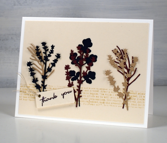
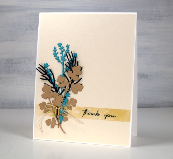
I have teamed up with the Foiled Fox again to bring you some sweet herbal die-cuts. The little stems are from Simply Graphic. The coriander stem is a single die; the thyme and the rosemary are in a pack together.
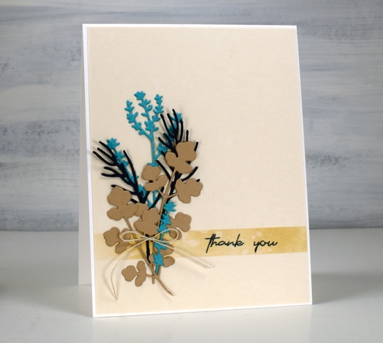
Both cards have a fairly neutral colour scheme with the contrast coming from the turquoise cardstock and the mulberry (which looks brighter in real life)
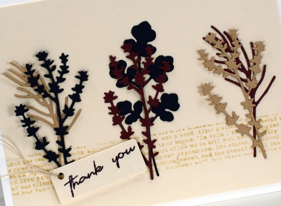
I used ink and stamping to create a ‘ribbon’ across the base of the beige panels. I masked the area then blended ink on one card and stamped text on the other.
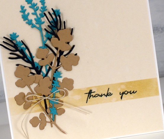
The twine details continue the neutral theme and the panels are attached to white cardbases.
There are more details on the Foiled Fox blog and more lovely nature dies from Simply Graphic in their store. I hope you pop over and enjoy a browse in both blog and store.
Now a post including two herb themed cards would not be complete without some chit chat about my herb pots would it? I have three large galvanized tubs for my herbs and the crop is growing very well. Despite the slow start to summer I have had oodles of basil along with oregano, rosemary, parsley, lavender, sage, mint and Thai basil. I picked enough basil for a homemade pesto the other night and was very proud of myself!
Let me know if you make any favourite recipes with homegrown herbs.
Supplies
(Compensated affiliate links used when possible)
Aromatic
Posted: June 13, 2022 Filed under: aromatic, Footnotes, Penny Black | Tags: Fabriano Watercolour Paper, Penny Black stamps, Ranger Distress inks 12 Comments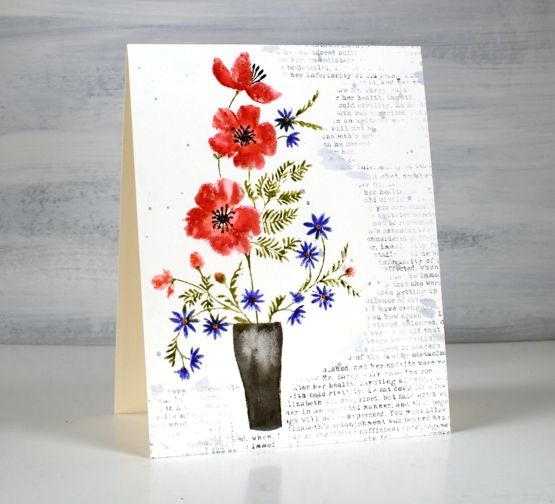
Today’s card is a companion in style to my two previous Penny Black floral cards. All three feature PB cling stamps and some sort of background filler. For this one I used a text stamp from the PB clear set, ‘footnotes’.
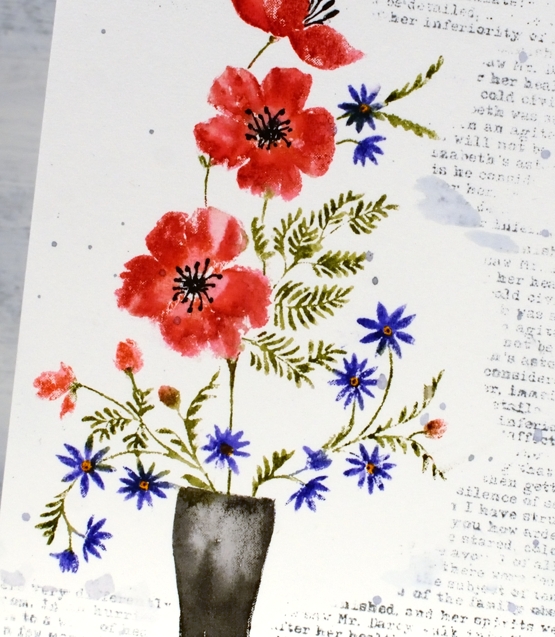
I used both distress ink pads and markers to ink the ‘Aromatic’ stamp while in the stamp positioner. To fit the image on my panel of hot pressed watercolour paper I masked at the base to make the vase a little shorter. The foliage and little flowers are so delicate I did not add any water blending after stamping but I did blend the red flowers and the vase with a paintbrush and water.
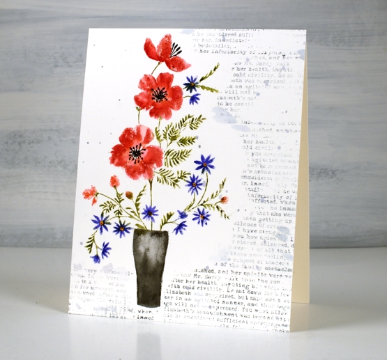
The text is stamped in weathered wood distress ink, a nice bluey-grey and splattered with the same ink. The text is actually from Pride and Prejudice which I am re-reading at the moment. While we had no power I noticed I had a copy on my e-reader so I started reading it; no bedside lamp required! Even though I know it well I am enjoying the conversations. After all who can resist hearing, ‘I am all astonishment!’ Are you a re-reader?
Supplies
(Compensated affiliate links used when possible)
Vintage Candlelight
Posted: December 21, 2021 Filed under: candlelight, Footnotes, Karin brushmarkers, Penny Black | Tags: Fabriano Watercolour Paper, Karin brushmarkers, Penny Black stamps, Ranger Distress inks 5 Comments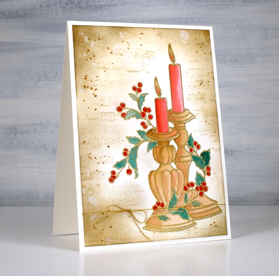
It has been a while since I created a vintage style card but the pretty ‘candlelight’ stamp from Penny Black has worked well for this technique. I embossed the image on hot pressed watercolour paper in gold powder then used Karin brush markers to paint the candles and foliage before switching to distress inks for the background.
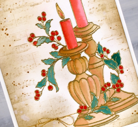
It probably wont surprise you that I used a limited palette for the colouring. I used a mix of red-209 and magenta red-170 to paint the candles, a mix of rosewood-272 and magenta red for the candle sticks, a mix of rosewood and lush green-228 for the leaves and straight red for the berries.
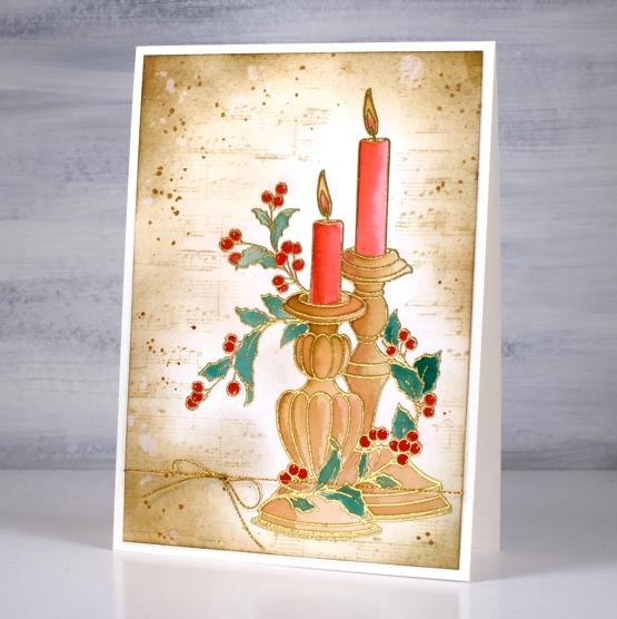
As usual I had not planned my background before I started but the colours on the candlesticks already looked vintage so I blended antique linen around the edges of the panel first then blended right up to the stamping. I stamped the music stamp from the PB set ‘footnotes’ in vintage photo then added more blending and splatter with the same ink. The stamp is tall so the card is A6 (4½” x 6¼”).
As the days are so short right now I am enjoying lighting candles and sometimes the fire. Hope things are cosy where you are.
Supplies
(Compensated affiliate links used when possible)
Faith & floral journal page
Posted: February 16, 2021 Filed under: A Pocket Full, Art Journal, Arteza, Footnotes, illustrious, Penny Black, springtime sigh, tranquil buds, watercolour real brush pens | Tags: Art Journal, Arteza, Penny Black creative dies, Penny Black stamps 6 Comments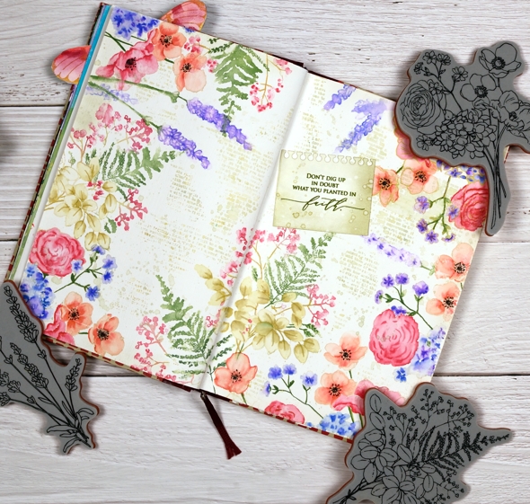
I know it is not spring yet, in fact it is still very winter where I am; we’ve had some of our coldest days and nights just in the last few days. Maybe because it’s so cold now is a nice time to muse about spring.
Sometimes I have a plan for a journal page, other times I work it out as I go along. To begin this one I painted absorbant ground on the journal double page. It is a base preparation a bit like gesso which makes the paper act a little more like watercolour paper. I should probably just switch to a journal with watercolour paper pages but I stubbornly want to keep adding to the this one.
Once the base dried I stamp the Penny Black ‘springtime sigh’ stamp in one corner then coloured with Arteza real brush pens. The colouring is not precise, the surface doesn’t react the same as watercolour paper but I found blending with very little water gave me the most control.

I stamped first with Gina K skeleton leaves amalgam ink which I have used for no-line watercolour in the past but it remained too distinct on the journal page so I switched to antique linen which worked a bit better. I restamped and coloured springtime sigh several times then decided I wanted fewer little flowers to colour! I switched to the new Penny Black ‘illustrious’ stamp which co-ordinated well. I don’t know for sure but I wonder if both stamps were drawn by the same artist, the scale and style is similar.

When stamping the ‘illustrious’ stamp I was able to ink most of the stamp with Arteza real brush pens which cut down on the colouring. I still used antique linen ink on the large open leaves then blended with a marker to shade the leaves. When I had almost framed the double page spread I switched to the PB ‘tranquil buds’ stamp to add some lavender.
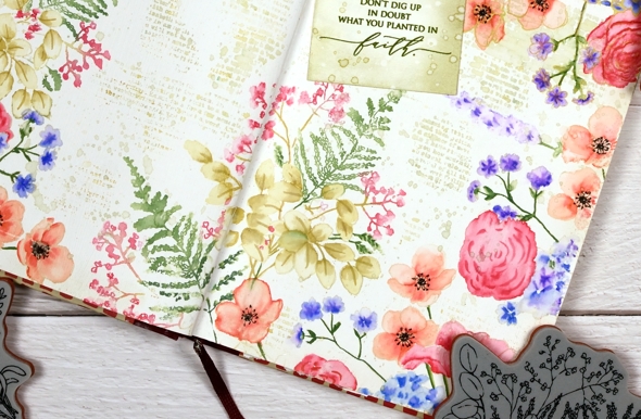
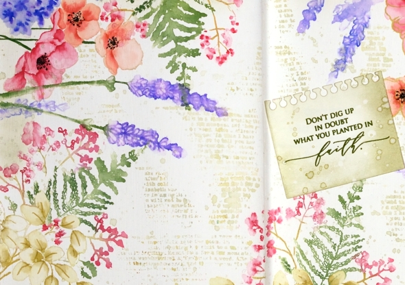
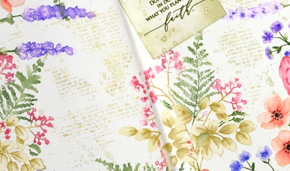
Next came the tricky stage when I had to decide what was happening with the empty area of the journal page. Writing, stamping, hand lettering or empty space were all options. I decided a bit of ‘filler’ in the shape of a text stamp would be nice and instead of the large script one I often use I chose the smaller typed text stamp from the PB ‘footnotes’ set. I stamped it here, there and everywhere in old paper ink, often spritzing with water before stamping so it just stamped a blurry pattern. I also added splatter then chose a phrase from the new PB ‘inspirational sentiments’ set.
Is that cute notebook die-cut covering a failed stamping attempt? Yes it is but I’m quite happy with that because the notebook page looks sweet. I cut it with a die from the PB ‘a pocket full’ set. I love how this page turned out even though I had no idea at the beginning it would progress this way. That’s the beauty of a journal page.
Supplies
(Compensated affiliate links used when possible)
Farewell to summer: Hummingbird
Posted: September 21, 2015 Filed under: Footnotes, Sweet Visit, Zigs & zags | Tags: Penny Black stamps, Penny Black stencils, Tsukineko Memento inks 6 Comments
This card just says ‘cottage life’ to me especially as the few hummingbirds I have seen were at friends’ cottages. I inked the stamp with memento markers, spritzed, stamped then blended with water before another spritz to spread the colour further. To create a border I ran a watercolour pencil inside the masking tape which was holding the panel down then softened the pencil line with a paintbrush. In a surprising departure from my usual habits I sponged the card base through a stencil around the edges as well as adding a little text.
I hope you are enjoying some late summer like I am.
Supplies:
Stamps: Sweet visit, Heartfelt, Footnotes (PB)
Inks: Nautical Blue, Bahama Blue, Danube Blue, Paris Dusk, Olive Grove, Bamboo Leaves, Desert Sand, Rose Bud, Tangelo, Potter’s Clay Memento markers (Imagine Craft/Tsukineko)
Cardstock: Fabriano hot press watercolour, Neenah natural White, Teal
Also: Zigs & zags stencil (PB), Gold and blue machine embroidery thread
Poinsettia panel
Posted: August 19, 2015 Filed under: Bursts of Red, Footnotes, Sparkler 10 Comments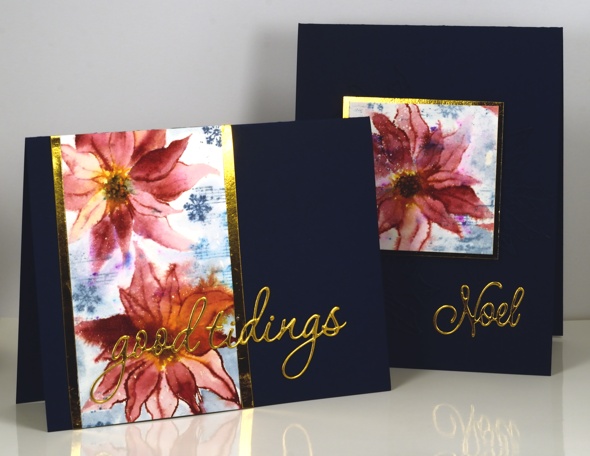
I played around with a poinsettia stamp from last year’s Christmas release to create these cards. My plan was not to create two cards. Well to be honest I didn’t really have a plan; I just taped down a piece of watercolour paper and started stamping. All the stamping was done with distress stains which enabled me to fill in all the petals by either pulling stain from the outline image or adding it where extra was needed. After the poinsettias were painted I drew the centre clusters with a marker as it had been blended over. I treated the panel more as patterned paper than a ‘picture’ by adding some music and snowflakes in blue then painting over them to spread colour into the surrounding area.
Because of my lack of planning the finished panel did not really work as a square or wide rectangle so I sliced it up and was able to make two cards. I had some gold foil cardstock scraps which worked for matting and sentiments but the little square piece needed more than the pop of gold. It is quite hard to see but if you click on the card below you might just make be able to make out the navy die cut poinsettias I arranged behind the patterned panel.
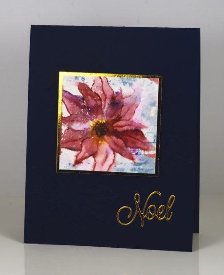
Pink, blue and gold is an unusual colour scheme for Christmas but I think it works. What colours are you reaching for when making this year’s Christmas cards?

Supplies:
Stamps: Sparkler, Footnotes, Hello Winter (PB)
Creative Dies: Good Tidings, Bursts of Red, Exultations(PB)
Inks: Aged Mahogany, Mustard Seed, Salty Ocean, Stormy Sky, Black Soot distress stains/markers(Ranger)
Cardstock: Fabriano 100% cotton hot pressed watercolour paper, Neenah Patriot blue, Gold foil cardstock
Also: Winsor & Newton masking fluid
Birthday Bister
Posted: August 3, 2015 Filed under: Bister, Footnotes, Soft Wings | Tags: Bister, Penny Black stamps, Ranger Distress stains 16 Comments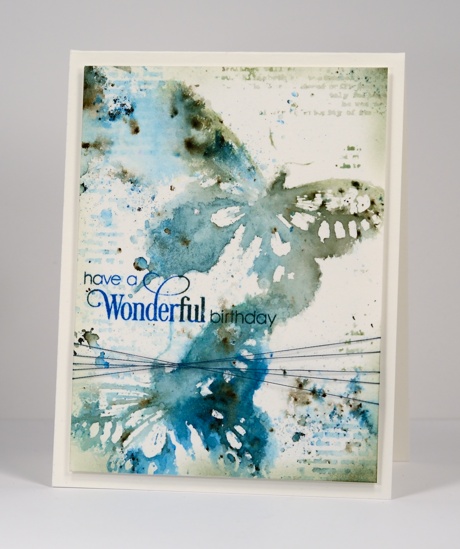
For my daughter’s 21st birthday card I chose blues, greens and the ‘soft wings’ butterfly stamp I always enjoy using. A reader commented a while back that bister and color burst work well with butterflies so it was time to try. I stamped the butterfly in a mix of distress stains which created a watery imprint I could add the blue and green bister powder to. I did multiple impressions then left them to dry while I added some texture around the rest of the panel. I used distress stain on the text stamp from ‘footnotes’ to add the patterns and did some splattering and spritzing with both stains and pearl-ex spray. Once the whole panel was dry I added the sentiment then trimmed and sponged some darker colour around the edges before adding some thread and popping up the panel on a watercolour paper card base.
Supplies:
Stamps: Sprinkles & Smiles, Soft Wings, Footnotes (PB)
Inks: Bundled Sage, Pine Needles, Evergreen Bough, Salty Ocean Distress Stains (Ranger) Deep Lagoon & Olympia Green Versafine inks (Tsukineko)
Paint Powder: Blue and Green Bister
Cardstock: Canson hot pressed 100%cotton watercolour paper
Also: home made interference blue pearl-ex spray, machine embroidery thread
Merry! Already?
Posted: August 5, 2014 Filed under: A Pocket Full, Flourish Holly, Footnotes, Shades, Tannenbaum, Textures | Tags: Fabriano Watercolour Paper, Penny Black creative dies, Penny Black stamps, Ranger Distress inks 5 Comments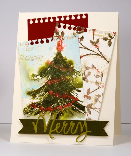
I know. It’s only August but I imagine many of you have been creating Christmas cards since… well, Christmas! I have only just started and believe me I find it hard to stamp snow in summer. There is however a very good reason for this little bit of merry. Penny Black is releasing their new Christmas Collection next week so the team are getting you in the mood for Christmas stamping by pulling out a few favourites from last year.
This tree was definitely a favourite of mine last year. (it’s here, here and here). For this little trio of notebook pages I inked it with distress inks, stamped it on watercolour paper, spritzed the image to make the colour bleed and added a little music in the background. I did the same with the holly stamp but added canvas in the background. The third notebook page and the sentiment banner repeated the colours in the two picture panels to tie it all together.
The sentiment banner is my first attempt at inlaid diecuts. (There is one in yesterday’s card but this was my first go) I cut the word merry from light green and a dark green piece of cardstock. I placed a piece of tape behind the dark green negative piece then ran it through the diecut machine again with the banner die. Because the tape was in place it held together. I then pressed the light green “Merry” onto the tape and snipped the exposed tape from above the ‘M’ and the loop of the ‘y’.
How is your Christmas card pile going? Have you started? Have you finished! Counting this one I think I might have thirteen completed.
Supplies:
Stamps: Tannenbaum, Flourish Holly, Textures, Footnotes (PB)
Inks: Antique Linen, Forest Moss, Salty Ocean, Barn Door Distress Inks (Ranger)
Cardstock: Fabriano 100% cotton hot pressed watercolour paper, Olive Grove mix & match papers, Neenah Natural White 110lb card stock
Creative Dies: A Pocket Full, Shades, Love & Joy
Stenciled with text
Posted: July 28, 2014 Filed under: CAS, Footnotes, Verdant | Tags: CAS, Faber-Castell Albrecht Durer Watercolour pencils, Fabriano Watercolour Paper, Penny Black stamps, Penny Black stencils 14 Comments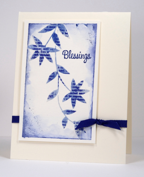
I have been experimenting with my stencils trying different techniques and one thing I wanted to do was stamp a pattern through the stencil onto the card underneath. I ended up using some modeling paste first to give me a slightly raised image. I taped the stencil to some watercolour paper first then spread modelling paste over it with a palette knife. I removed the stencil to let the paste dry thoroughly then replaced it before stamping. I used the text stamp from “Footnotes” and did not stick it to an acrylic block first, instead I kept it flexible and pressed it onto each leaf and flower space in the stencil. As I had stamped it with Versafine Majestic Blue I lightly sponged the same ink over the stencil to captures the stems and define the design a little more. The panel was taped to my work surface so I used the edge of the tape as a border adding blue with a watercolour pencil and blending the colour into the panel. I finished it off with just a few little splatters and a small sentiment. The panel is popped up over a grosgrain ribbon.
You can’t see the modeling paste in my photo but the effect on the card is a subtle raised image. I have more experimenting with stencils to share in the days to come. Thanks for dropping by.
Supplies:
Stamps: Footnotes, Treemendous (PB)
Stencil: Verdant (PB)
Inks: Versafine Majestic Blue (Tsukineko)
Pencils: Albrecht Durer Indianthrene Watercolour pencil 247 (Faber Castell)
Paper: Fabriano 100% cotton hot pressed watercolour paper, Neenah Classic Crest Natural White 110lb smooth
Texture: Modelling paste
Vintage Birthday
Posted: July 26, 2014 Filed under: Delicate Florals, Footnotes | Tags: Faber-Castell Albrecht Durer Watercolour pencils, Fabriano Watercolour Paper, Penny Black stamps, Tsukineko Memento inks 18 Comments
This is one of those designs that grew out of a vague idea not a definite plan. The popped up panel is watercolour paper which I taped down to my work surface. I spritzed water onto it before I stamped. I inked the stamp from “Delicate Florals” with Memento Dandelion, Tangelo and Olive Grove markers then spritzed generously before stamping. I restamped without re-inking a couple of times. Next I inked just the flower heads with the markers and stamped them a couple of times. Finally I stamped a little extra foliage. To highlight the flowers a little more I added more colour with the Potter’s Clay marker and the Venetian red watercolour pencil. The background colour is a combination of watercolour pencil splatter and Memento ink mixed with water. While the panel was still taped down I ran an olive watercolour pencil around the edge of the tape then blended it into the panel with a waterbrush. I added a little extra texture and pattern with the text stamp from the new “Footnotes” transparent set. Once I removed the tape the panel reminded me a little of old postcards so I chose the sentiment from “Sentimental set” because of the vintage style font.
Supplies:
Stamps: Delicate Florals, Sentimental, Footnotes (PB)
Inks: Memento Dandelion, Tangelo, Potter’s Clay, Olive Grove Markers, Olive Grove & Pistachio ink (Tsukineko)
Pencils: Albrecht Durer Watercolour pencils Olive Green 173, Venetian Red 190 (Faber Castell)
Cardstock: Fabriano 100% cotton hot pressed watercolour paper, Neenah Natural White 110lb cardstock


