
Bethlehem Skyline (alcohol ink)
Posted: September 29, 2026 Filed under: Alcohol Ink, Bethlehem skyline, cricut, Echidna Studios, grafix, Penny Black | Tags: Alcohol Ink, cricut, Echidna Studios, grafix, grafix craft plastic, Penny Black stamps 4 Comments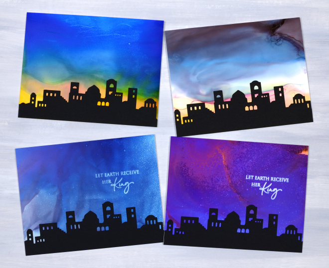
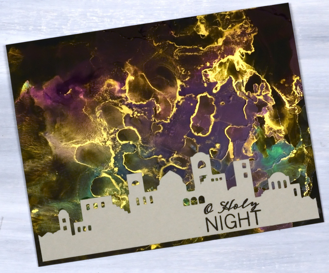
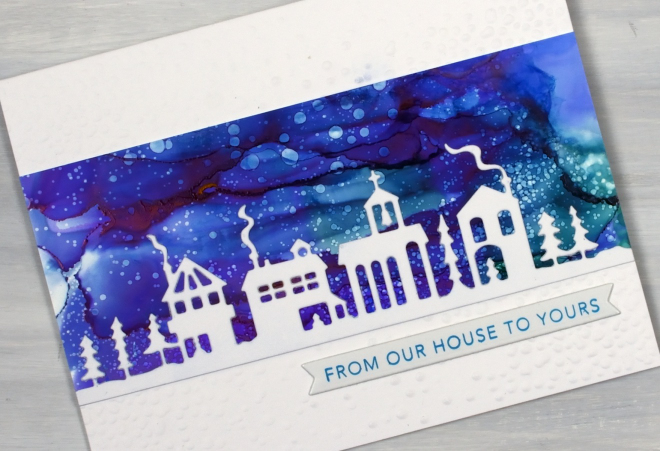
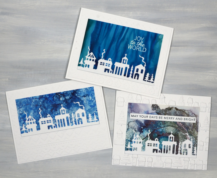
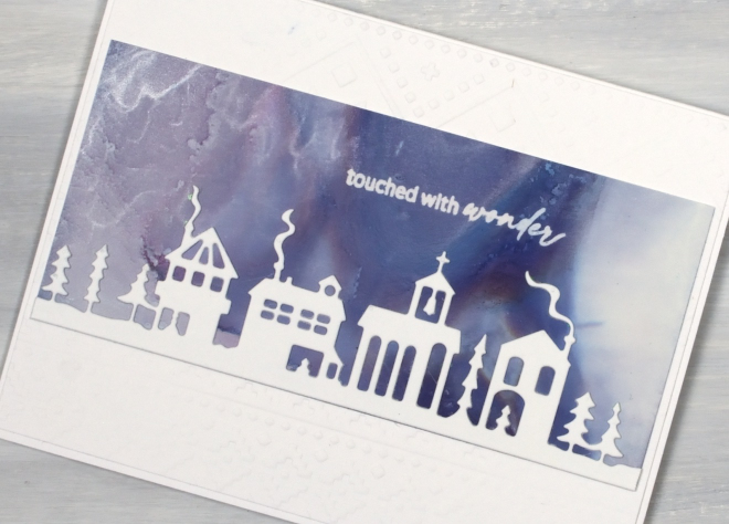
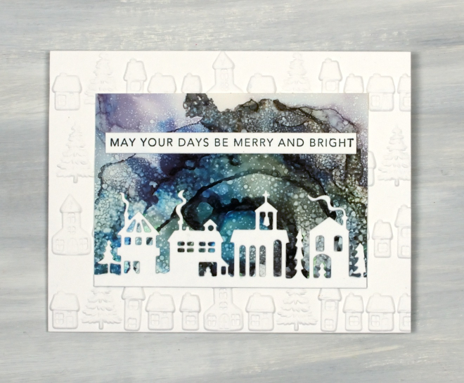
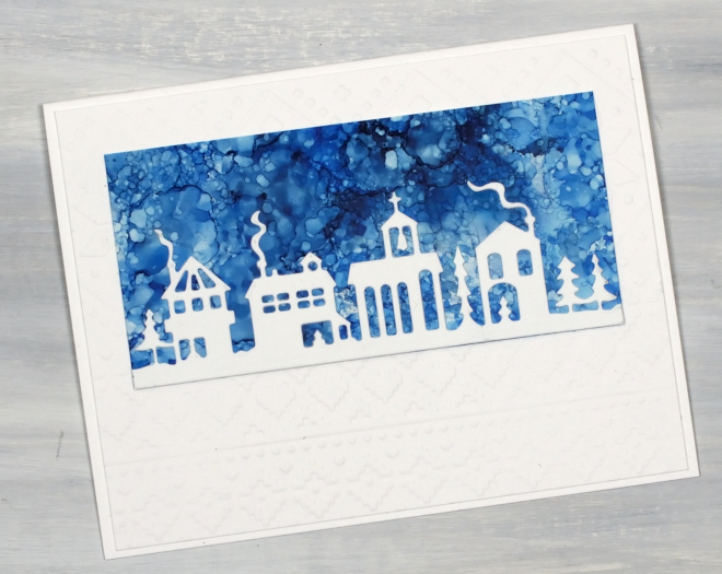
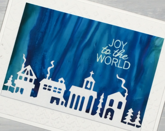
These Bethlehem scenes might be my favourite of all the alcohol ink Christmas cards I made in the summer. I really enjoyed making the wide skies which were large enough to cover a card front. For some I printed sentiments with alcohol lift ink and for others I left an open sky.
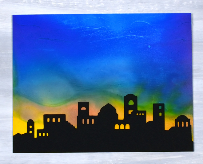
As I’ve mentioned in previous posts I worked outside while the weather was pleasant so I wouldn’t have to deal with the alcohol fumes. For the soft blended skies I covered the Grafix white craft plastic panel with a generous amount of isopropyl alcohol then added a few lines of different coloured alcohol inks. With so much liquid on the panel I was able to gently tilt the panels back and forth to move the inks. While they were moving they were also drying and leaving the occasional hard line but mostly soft blends.
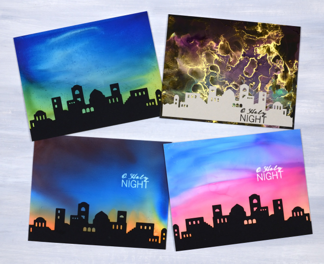
You can see in the group of four above that one panel was not done with the tilting method. The gold one was in my stash and was made on Grafix black craft plastic with alloys, pearls or mixatives which give a metallic effect.
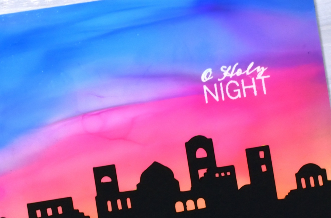
The Bethlehem Skyline silhouettes were cut on the cricut and the design was created for me by my daughter. It’s available as a cutting file in our Echidna Studios etsy store. Thanks for dropping by today, believe it or not I have just a few more tree cards to show you!
Bethlehem Skies (alcohol inks)
Posted: September 23, 2026 Filed under: Alcohol Ink, grafix, lighting the way, Penny Black, Silent Night | Tags: Alcohol Ink, grafix craft plastic, Penny Black stamps 1 Comment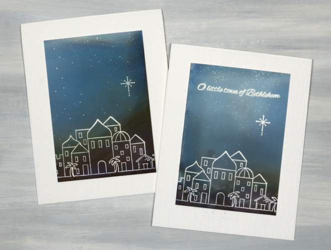
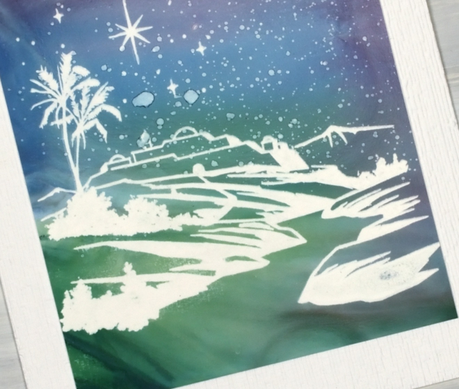
I know I have posted nothing but alcohol ink skies, trees and baubles for the last month or so. Trust me, we are nearing but not quite at the end. I mentioned having rediscovered the magic of the alcohol lift ink pad for sentiments, but it is also quite special for line art too. The little Bethlehem acrylic stamp featured above and below came out so crisply when I inked the stamp with alcohol lift ink, stamped on the alcohol ink panel, blotted both stamp and panel with paper towel and repeated the process numerous times. Of course I needed a stamp positioner to repeat the process but I was so happy with the white outlines, sentiment and star.
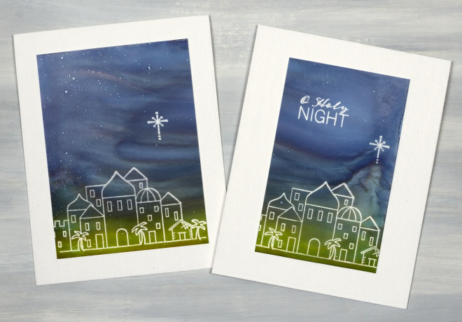
Some of the skies have a splatter of stars. I’m not sure what the collective noun for stars is but in this case I think ‘splatter’ is very appropriate! I just spritz some isopropyl alcohol into the air and swipe my panel through the same space, just like walking into a spritz of perfume. On the panel below I got a bit greedy for more stars and ended up with some blobs. I still liked the colours in the sky and land so turned it into a card regardless.
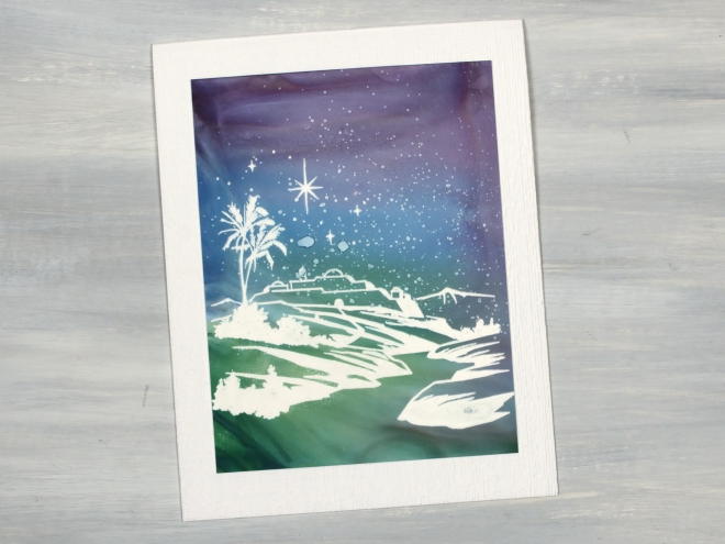
The Bethlehem scene above and below is from the Penny Black ‘Lighting the way’ acrylic stamp set and the scene in the first few photos is from the PB ‘Holy night’ acrylic set. They are oldies but in my opinion, goodies so I have held onto them.
Alcohol Ink Skies over the Neighbourhood
Posted: September 8, 2026 Filed under: Alcohol Ink, Dies, grafix, neighbourhood border, Penny Black, simple strips, Taylored Expressions, Uncategorized | Tags: Alcohol Ink, grafix craft plastic, Penny Black creative dies, Penny Black stamps, pinata alcohol ink, Ranger Alcohol Ink, Taylored Expressions 2 Comments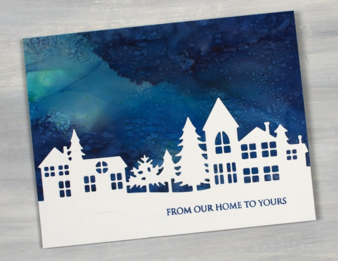
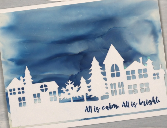
Today’s cards are similar to the recent tiny towns cards but feature the larger Neighbourhood Border die which only cuts along the top leaving the option of changing the amount of snowy foreground on cards.
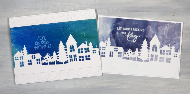
I used a range of techniques for the skies including tilting a few different alcohol ink colours on a panel to create soft blends as shown above left. I also added repeated spritzes of isopropyl alcohol over an inked panel to create the bubbly sky shown below left. A few of the panels have metallic alcohol inks included for some silver or gold shimmer.
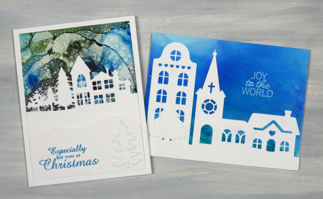
The card above right features elements from a Cricut cutting file I bought and cut apart to get the apartment building, church, cottage and tree. The alcohol panels were all done on yupo or Grafix white craft plastic and the card bases and die-cuts are from Neenah solar white cardstock.
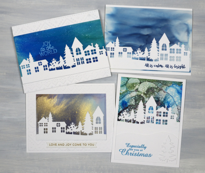
I used a mix of Penny Black and Taylored Expression sentiments and once more stamped a few of them with Alcohol lift ink to lift the words right out of the sky! As I share this post the alcohol inks are back on the shelf and the gel plate is on the work desk. I am keen to show the gel prints soon but have a couple more collections of alcohol ink Christmas cards to feature. I honestly can’t believe how many I did, but it was so enjoyable I just kept creating panels outside on the pleasant summer days.
Big Alcohol Ink Trees
Posted: September 1, 2026 Filed under: Alcohol Ink, Concord & 9th, grafix, Kristina Werner Joyful and Merry dies, Kristina Werner Joyful and Merry stamp set, simple strips, Stampin Up, Taylored Expressions, Tim Holtz | Tags: Alcohol Ink, Concord & 9th, grafix craft plastic, Stampin Up, Taylored Expressions, Tim Holtz 2 Comments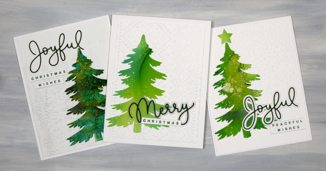
Time for another bunch of alcohol ink Christmas cards featuring one of the tree dies from the lovely Creative Expressions Festive Collection – Winter Pines set. The set has 6 different trees some tall, some short, some wide some skinny. The one featured here is a great size and shape so I used it over and over. The cards above feature Kristina Werner’s Joyful and Merry Stamps and Dies.
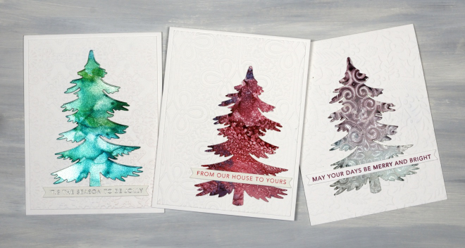
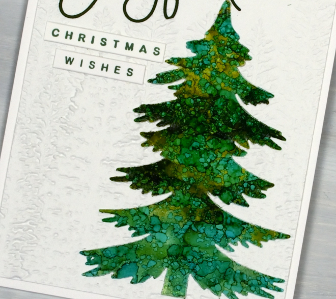
You can see the tree on the left was made with the Ranger alcohol ink silver sparkle cardstock. The tree on the right was made with a stencil on alcohol inks, hence the pattern. All the sentiments are from Taylored Expressions Simple Strips – Christmas stamp cut with the coordinating die.
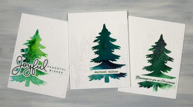
I used an embossed background behind every tree, often the retired evergreen folder from Stampin Up. I also used the snowflakes/speckles one from Tim Holtz.
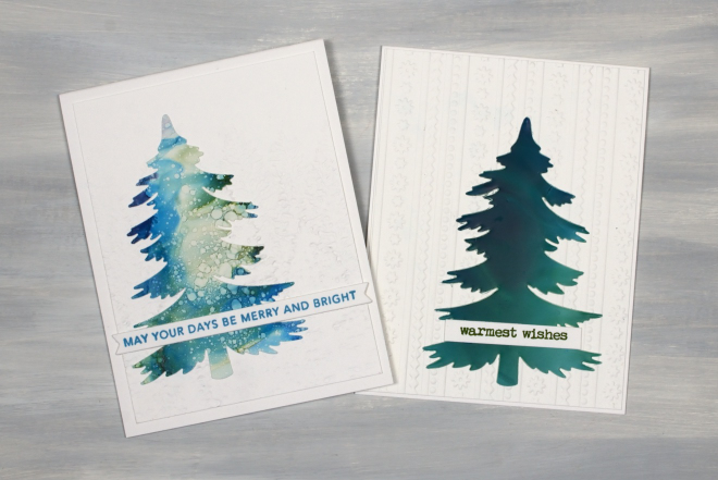
Of all the tree cards I made (and there were many) the one above on the left is my favourite. I like the mix of soft blues with a bit of dark blue and green and some splatter circles. I wish I remembered which alcohol inks I used but I don’t. It doesn’t matter too much. You can see I used dark blues and greens as well as light and some pinks, purples and silvers too.
Alcohol Ink Baubles
Posted: August 24, 2026 Filed under: Alcohol Ink, baubles, Christmas filigree, Concord & 9th, Echidna Studios, Kristina Werner Joyful and Merry dies, Kristina Werner Joyful and Merry stamp set, Penny Black, simple strips, Spellbinders, Taylored Expressions | Tags: Alcohol Ink, grafix craft plastic, Penny Black creative dies, Ranger Alcohol Ink, Spellbinders, Taylored Expressions, Yupo Paper 2 Comments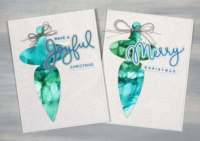
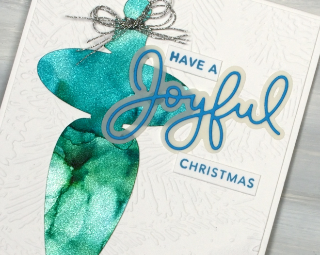
The alcohol ink cards continue but there is a new element featured in the shimmery baubles above. I created alcohol ink patterns on Ranger alcohol ink silver sparkle cardstock. Whatever colours you blend over the cardstock automatically shimmer and shine. On the cricut I cut the finials using the “Christmas Filigree Digital Stamp and Cutfiles” from Echidna Studios. Both decorations are on panels embossed with the Spellbinders “forevergreen” folder and feature Kristina Werner’s Joyful and Merry sentiment dies and stamps.
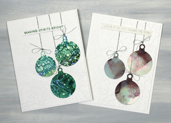
I also made simple round baubles using Penny Black dies and patterned panels. Basically any pretty alcohol ink panel is fair game for creating some baubles. As is my pattern they are also stuck on embossed panels, tied with silver cord and sentimented with Taylored Expressions “Simple Strips Christmas sentiments”.
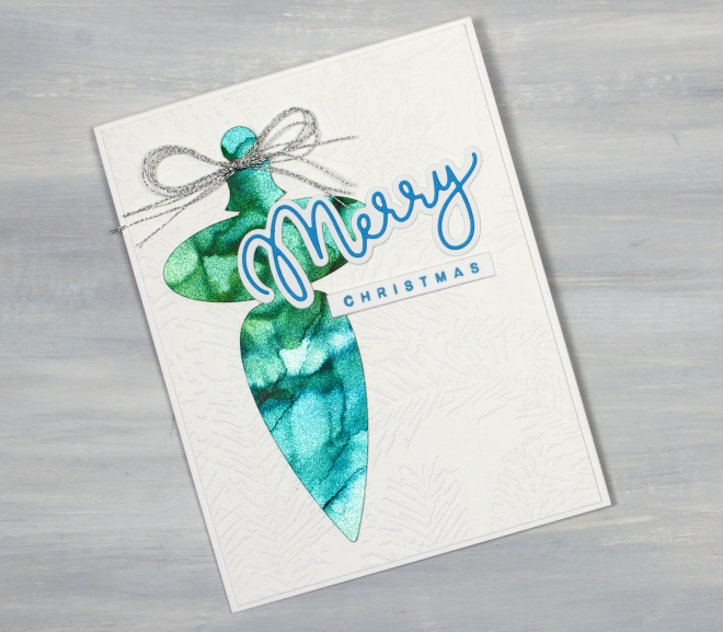
I don’t actually own any of this sparkly cardstock; a friend let me use some of hers, but I can highly recommend it if you want a very simple way to make your alcohol patterns look fabulous.
Tiny Towns under Alcohol Ink Skies
Posted: August 19, 2026 Filed under: Alcohol Ink, Dies, grafix, Penny Black, Sizzix, Spellbinders, Taylored Expressions, Tiny Tree | Tags: Alcohol Ink, grafix craft plastic, Penny Black creative dies, Penny Black stamps, sizzix embossing folder, Spellbinders, Taylored Expressions 4 Comments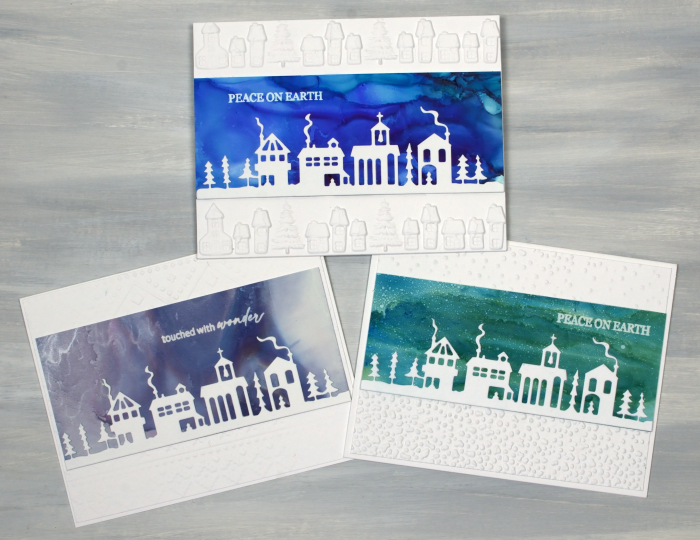
I do like the look of little houses and buildings against a bold or colourful sky. I’ve done the same thing numerous times with watercolour panels. The little town featured in these cards is the Penny Black ‘tiny town‘ die. Once again I have completed my cards with embossed panels and PB or Taylored Expressions sentiments.
One thing you might notice is that some of the sentiments are stamped on the alcohol ink sky not on a strip of cardstock. After several alcohol ink sessions resulting in a stack of useful panels I remembered my alcohol lift ink. Lift ink does exactly as the name suggests, it lifts alcohol ink off the surface (in this case yupo or grafix craft plastic). Once lifted the ink needs to be wiped off the stamp and a few more applications made in exactly the same spot. It is also necessary to blot the stamped area with a tissue or cloth to remove any ink which has been diluted by the stamp pad. I was very happy with the results and you will see just how happy in a bunch of future cards.
Once again I have created different alcohol ink patterns by tilting the panel to move the ink, blowing the ink with a hand pump or spritzing the ink with isopropyl alcohol to create the spotty or starry look.
I used several different embossing folders to add snow, more little houses or the spellbinders “ski lodge” folder to the background. The little houses embossing folder is from Vaessen Creative and was found at the new craft supply store in Ottawa.
Thank you for the encouraging comments left on the recent alcohol ink blog posts. I am glad to be providing some inspiration to get your own inks out. If you haven’t seen the previous alcohol ink posts look here and here.
And stay tuned there are more little houses, trees, baubles and Bethlehem skies to come. Have a great day!
Alcohol Ink Trees
Posted: August 17, 2026 Filed under: Alcohol Ink, Creative Expressions, grafix, Kristina Werner Joyful and Merry dies, Kristina Werner Joyful and Merry stamp set, Spellbinders, winter pines | Tags: Alcohol Ink, Concord & 9th, Creative Expressions, grafix craft plastic, Spellbinders 3 Comments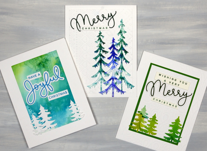
The alcohol ink cards continue, this time with a tree theme. If you didn’t see my first collection of alcohol ink cards please visit here. Once more I worked with only 2 or 3 alcohol inks to create patterned panels. I have been starting with 4.5″x 6″ yupo or craft plastic panels which I can turn into a large background panel, two smaller backgrounds or numerous trees.
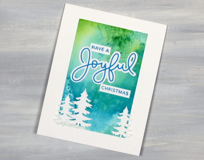
To add interest to alcohol ink panels I use several different techniques. I always add isopropyl alcohol to the panels to move and blend the inks and sometimes move the liquid around by tilting the panel or blowing the ink with an alcohol ink blower.
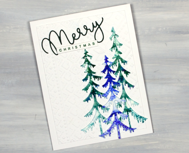
Another technique which gets quite intricate or softly blended results is to apply ink or isopropyl to a felt pad and ‘stamp’ it onto the yupo or craft plastic. Many of the cards I’ve been making feature an embossed panel behind the alcohol ink elements. I’ve used “a nordic themed”ski lodge” embossing folder from Spellbinders and an Anna Griffin ‘regal braid’ folder for today’s cards. The greeting stamps and dies are from Kristina Werner’s sets “Joyful and Merry stamp set” and “Joyful and Merry dies“. I don’t actually own them but you can be sure I made good use of them before my sister-in-law took them home to Australia. All the trees are cut using a fabulous Creative Expressions die set called Festive Collections – Winter Pines.
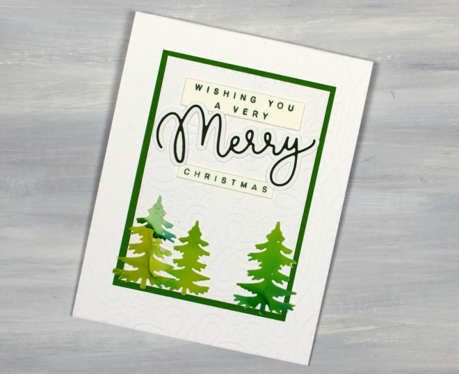
And, if you know me, you know there are more tree cards to come; this is just a smattering!
Alcohol Ink Skies
Posted: August 14, 2026 Filed under: Alcohol Ink, Dies, grafix, Penny Black, polar bears | Tags: Alcohol Ink, grafix, grafix craft plastic, Penny Black creative dies, pinata alcohol ink, Ranger Alcohol Ink, Yupo Paper 10 Comments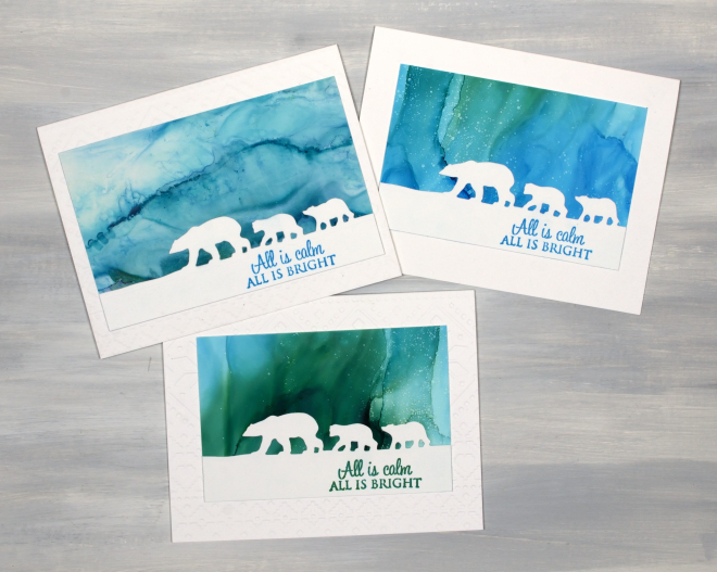
Well hello! Once again it has been weeks between blog posts, but here I am with a surprising selection of cards for you.
Surprising because they are alcohol ink panels. I don’t remember the last time I worked with alcohol inks. In the last month or so I have done little else in the art realm but work with alcohol inks. Why might that be? I have been working outside with said inks. My sister-in-law who was staying with me in June and July joined me at a friend’s house where we set up outside in the shade with a pleasant breeze and proceeded to experiment with the inks. As I mentioned I hadn’t use them for a long time and had forgotten many techniques. Since then I have refreshed my memory by watching a few videos and have worked outside with the inks numerous times where I don’t get headaches from the alcohol and everything dries quickly. Occasionally panels end up in the garden but that is a price I am willing to pay.
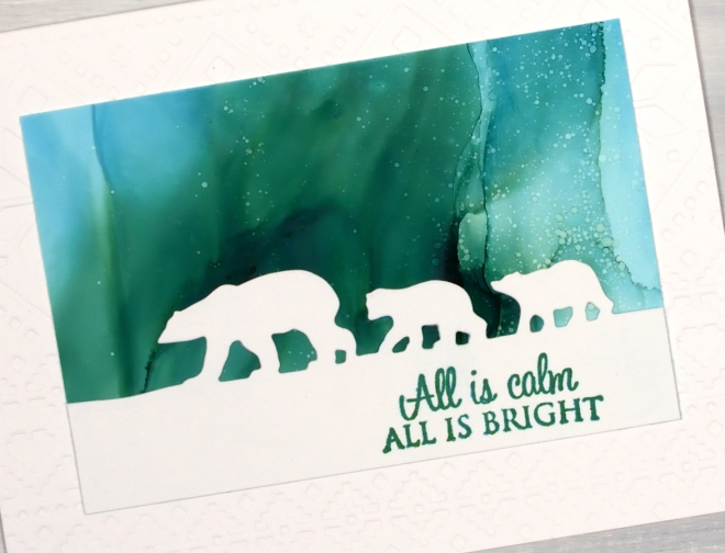
I made a few panels with 2 or 3 ink colours per panel and a generous amount of 99% isopropyl alcohol to move and blend the colours. I used an air blower (hand pump style, not electric) and sometimes a spritzer filled with isopropyl to add splatter which looks like snow or stars. I worked on yupo paper, grafix white craft plastic and Nara paper, all similar products and all from my existing supplies. I am still committed to ‘Using What I Have’ as much as possible.
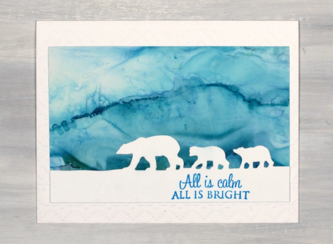
The second surprising thing about these cards is that they are Christmas cards. Never have I started my Christmas cards in the middle of summer. I have never wanted to because I am influenced so much by the seasons. For whatever reason that is not the case this year. Future me is going to be very thankful for this strange occurrence. These are three cards I made featuring the ‘polar bears’ die from Penny Black and a PB stamp set, “All is Bright”. I really enjoy creating northern skies with alcohol inks; they seem to mimic the beauty of the northern lights I am yet to see in person. I know that polar bears have nothing to do with Christmas but when I create alcohol ink or watercolour skies I am reminded of the verse from Psalm 19, ‘The heavens declare the glory of God; the skies proclaim the work of his hands.’ Thank you for visiting and reading to the end of this post; I will warn you now, the alcohol ink blog posts have just begun, so buckle up my friends!
Botanical Thank You cards
Posted: July 24, 2026 Filed under: gel press, Penny Black | Tags: gel printing, Penny Black stamps 7 Comments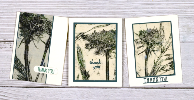
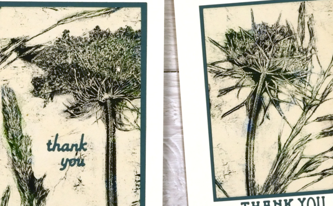
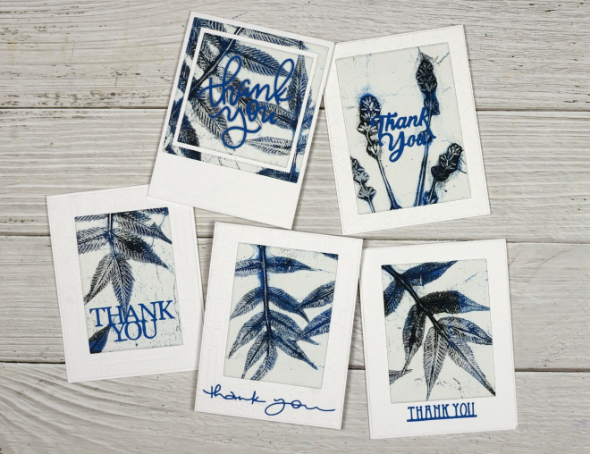
Recently a friend asked me to make her ten thank you cards. I decided to make them using a few botanical gel prints. Some prints were quite large, featuring several flowers or leaves on one large sheet of copy paper or rice paper. The cards above were from a print taken with dark green and cream paints so I added green mats and sentiments on cream card bases. I love printing plants; the detail possible always amazes me. So, as I use up these prints from another summer, I feel the need to pull out the gel plates and print some of the many flowers and leaves within reach this summer.
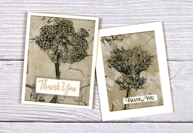
The cards below were prints of Queen Anne’s lace printed with black and picked up with gold paint. Again I used cream card bases and black or gold sentiments.
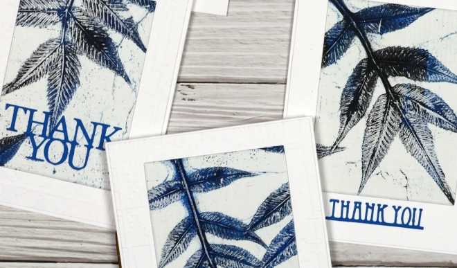
The last batch of co-ordinated cards were leaves and lavender in blue and black paint, lifted with white paint so I added blue sentiments and attached everything to white card bases.
You can find techniques for gel printing plants and many other things in my Gel Print Journey online class and use the coupon SUMMERSALE for a 25% discount. You can also find a playlist of gel printing videos I’ve made on my youtube channel.
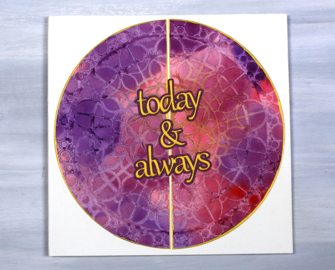
Today & Always
Posted: May 14, 2026 Filed under: beaded mandala, cricut, The Crafter's Workshop, Watercolour | Tags: Fabriano Watercolour Paper, Stencils, The Crafter's Workshop 2 Comments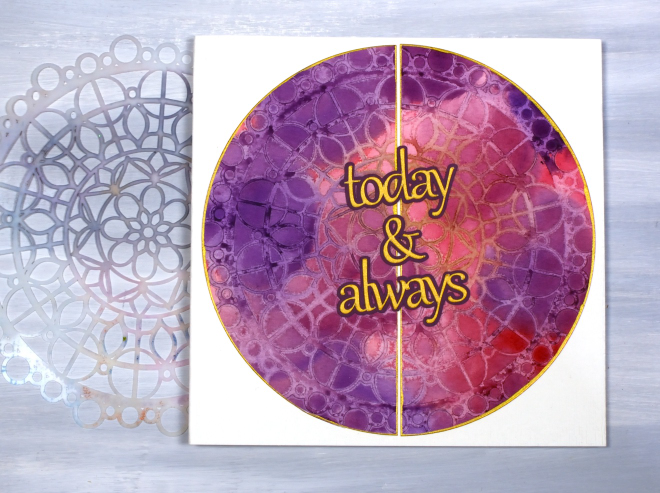
I have turned yet another stencil & watercolour print into a card, this time a wedding card featuring a large circle print made with the The Crafter’s Workshop ‘beaded mandala’ stencil.
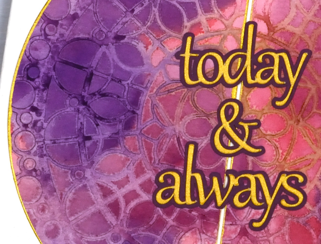
Most of the stencil print is paler than the surrounding blended watercolour painting because my technique involved spritzing the stencil to cover it with water before pressing it onto the painted panel. The water on the stencil dilutes the paint. I can’t remember for certain but I probably weighted the stencil down with a large acrylic block and let it dry for quite some time, maybe overnight. In the close up above you can see an area of the stencil print is a mustard colour, that was a happy accident due to the stencil not being clean! It prompted me to choose gold cardstock for the circle border and the sentiment cut on the cricut.
Thanks for dropping by. I think there will be several more stencil and watercolour projects to share but I do hear the gel plate calling me, so stay tuned!












