Some New Paint
Posted: May 19, 2025 Filed under: Effulgence, Penny Black, Rockwell art, Tim Holtz | Tags: Fabriano Watercolour Paper, Penny Black stamps, Rockwell art, Tim Holtz 4 Comments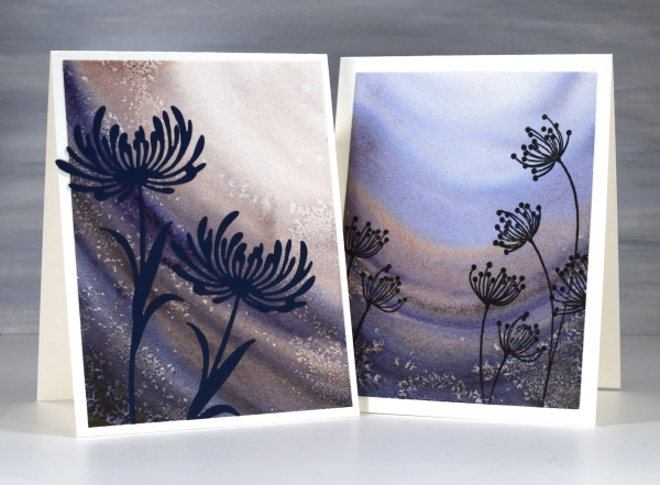
Recently a friend introduced me to some new watercolour paints. It was during a class and she introduced us all to the new paints both by using them in her projects and by saying how much she loved them. Now it just so happened that my birthday fell soon after that class and suprise, surprise I received some new paints for my birthday! (And by ‘received’ I mean I asked my husband if he would like me to order myself some new paints as a gift from him. Of course he did!)
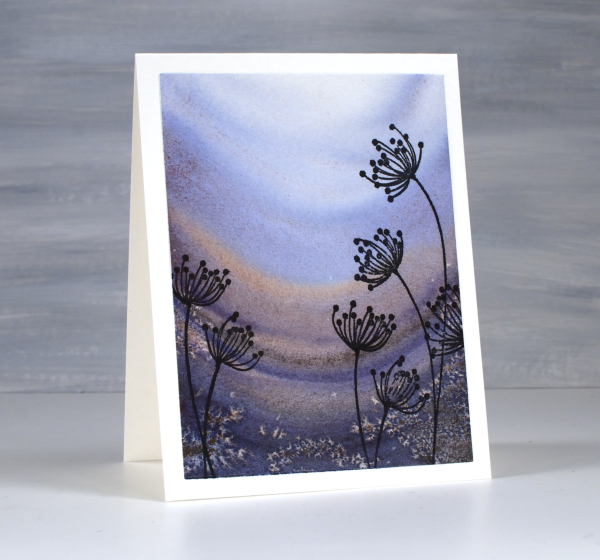
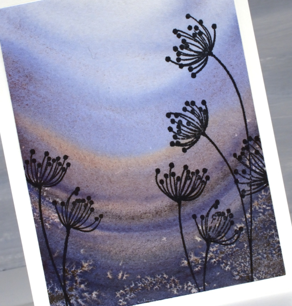
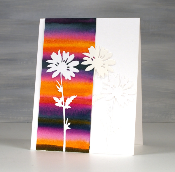
The new paints are from Rockwell Art, a Canadian company. They have a range of watercolour paints including a line they call ‘self evolving’ mineral pigments. The pigments granulate and break into different colours as you add water and the water moves the paint. Both cards featured today were painted with just one paint colour, ‘deep soul’. As I added water the paint separated into blues and burgandy-browns.
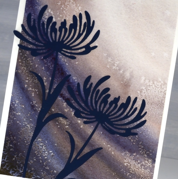
I applied the paint in curved stripes and sprinkled salt here and there while the paint was still wet to get the speckled effect.
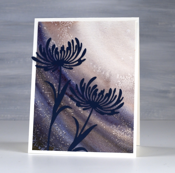
Because I had worked from dark to light it seemed appropriate to add flowers looking towards the light. The die-cut flowers are from Tim Holtz ‘wildflower’ set and the stamped flowers below are the Penny Black ‘effulgence‘ cling stamps.
Stripes & Daisies
Posted: May 16, 2025 Filed under: Hand painted, Tim Holtz, Watercolour, wild flowers #1 | Tags: Fabriano Watercolour Paper, Hand painted, Tim Holtz 2 Comments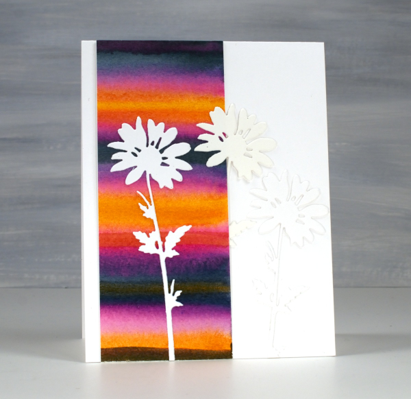
Back in February, I posted a pile of watercolour possibilities; you can see them here. The very bright strip on this card is one of the panels I painted during a watercolour technique class. I didn’t note down the exact paint colours but it would have been a limited palette of only 3 or 4. My guess is a yellow, a blue and a pink.
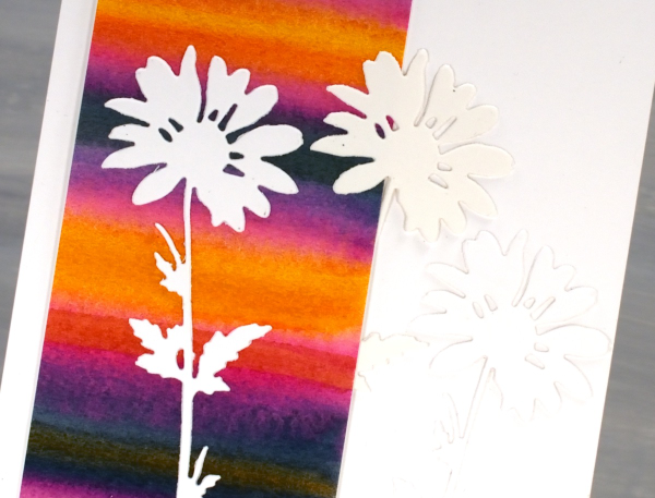
I used only half the painted panel on this card which means I can make another card or decorate the envelope. The background is so bright I liked crisp white daisies on top, it was a bit like putting together a summer outfit. The daisies were cut with Tim Holtz wildflowers dies and it looks like I cut 2 from white and one from cream cardstock. When I added the photos to this post I thought, ‘oh no! Did I add a cream daisy in?’ I pulled out the actual card and the daisies are indeed all white. Sadly the angle and lighting when I took the photo seems to be suggesting otherwise.
To just have one daisy was too stark so I added the other two to create a little more texture but no competing pattern or colour. I might put a sentiment on when I send it or I might not; we will see. Thank you for all your lovely messages about my Dad’s birthday and the card I made. The community of people who read my blog are so thoughtful; I always love hearing from you.
Pink & Blue Squares
Posted: May 18, 2024 Filed under: Collage cards, Dies, gel press, gift card pocket, Penny Black, Tim Holtz, wild flowers #1 | Tags: collage, gel printing, Penny Black creative dies, Tim Holtz 3 Comments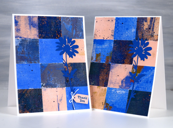
As mentioned in previous posts my stash of gel prints is considerable. I am always on the look out for ways to use them. Large prints are great for covers on handmade books; I use many smaller prints for card fronts and collage.
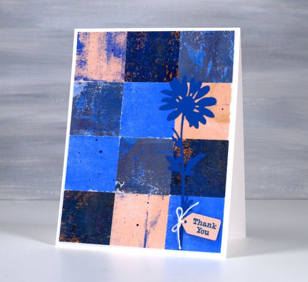
These two collage cards are made from four or five different gel prints. I punched the squares with a 1 3/8″ punch then fiddled around with the layout until I was happy with it. Because I love things to match all the prints had some blue in them and there is some repetition of pink as well.
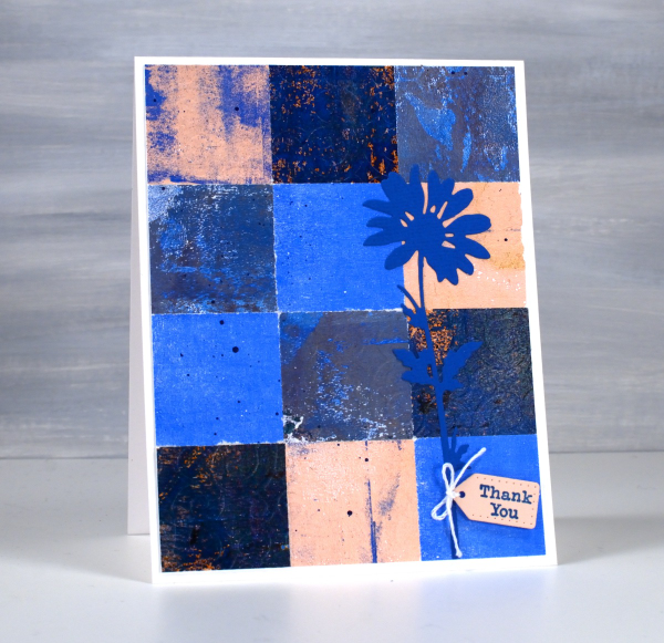
The prints were part of my stash and were not made specifically for these cards so some have patterns and others were probably second or third pulls to clean off a plate. Once I had them arranged to my satisfaction I die-cut Tim Holtz wildflowers and added a tiny Penny Black tag. You’ll see more of this style in the next few weeks as I made them in several different colour combinations. Those of you who know me might have noticed the dark blue splatter on the both cards; I always think a bit of splatter ties thing s together.
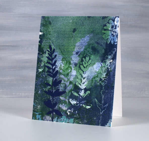
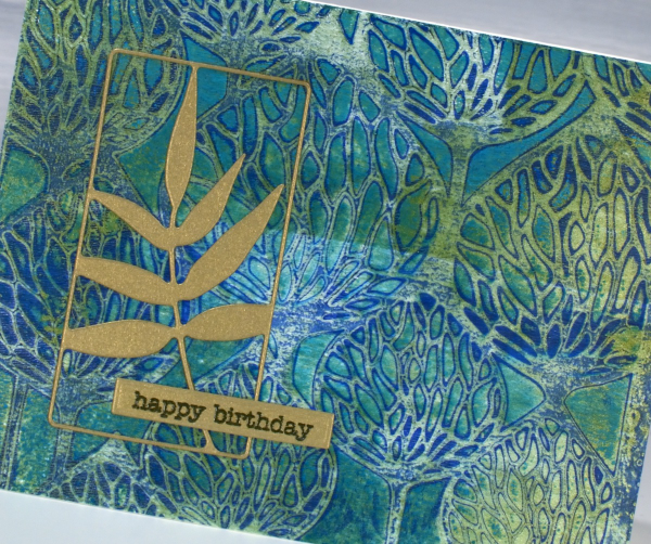
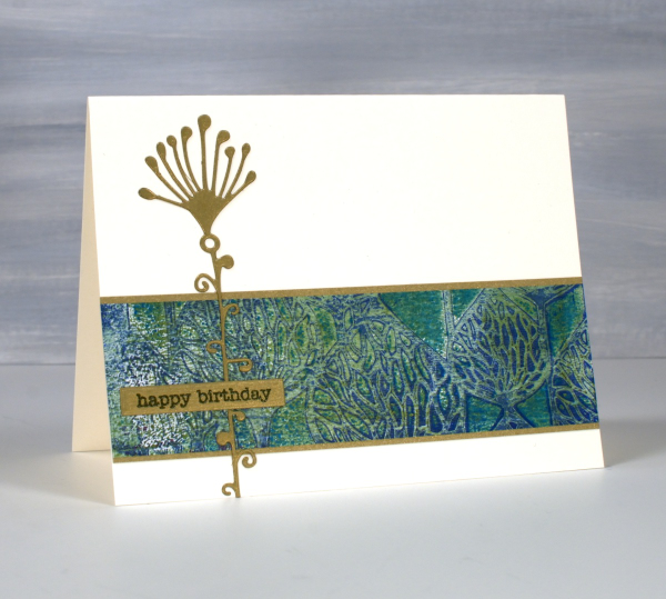
Leaves and Flowers-Cut & Printed
Posted: April 29, 2024 Filed under: gel press, Tim Holtz, vault wildflowers | Tags: gel press, gel printing, Tim Holtz 9 Comments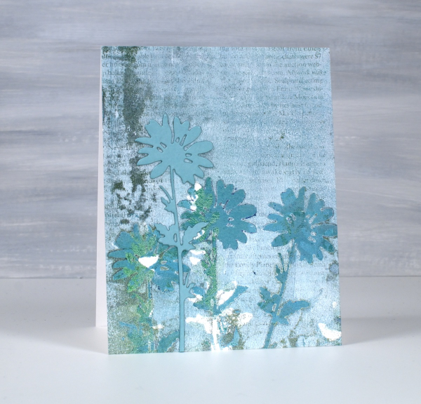
When fresh flowers for gel printing are not readily available, there are always the die-cut ones. In making today’s cards I gel printed patterns using die-cut flowers and leaves and a mix of blue, green and white paints.

Both the flowers on the card above and the stem of leaves on the card below are from Tim Holtz ‘vault wildflowers’ die set. The prints are grungy because I built up some layers of outlines on the plate before adding an image transfer text layer to the final print.
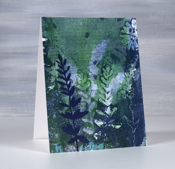
To finish the cards I added a cardstock flower or stem of leaves to match the partial prints in the background.
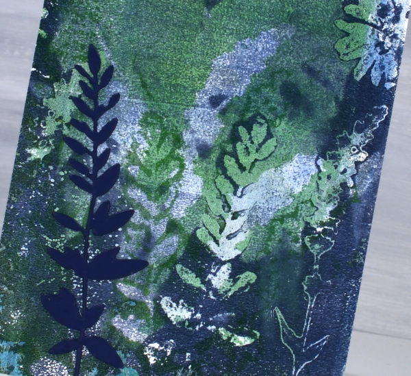
I did both prints on paper not cardstock then attached them to card bases with double sided adhesive. When I am spending a day or half day gel printing I will often do many prints on paper and a handful on cardstock or thicker paper. I never know which ones are going to be the favourites but I do know the session will be full of ‘just a couple more prints’ moments.

You can see when comparing these two cards the impact of adding some white paint to the mix. I used the same blue and green acrylic paints for both panels but the one above was toned down with white brayered onto the gel plate with the green and blue. So while you to print fresh flowers, die-cut yourself some from paper or duralar and see what you can come up with.
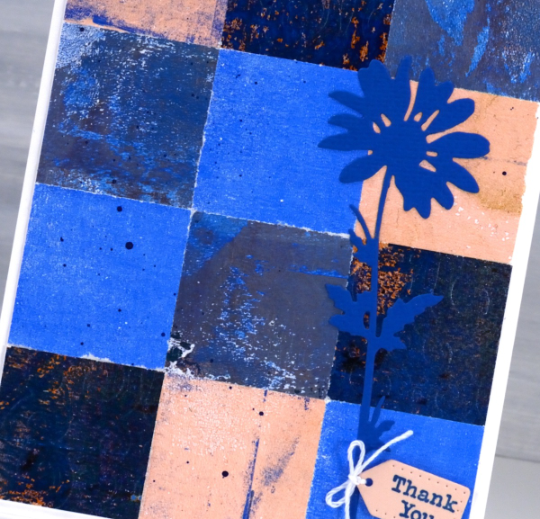
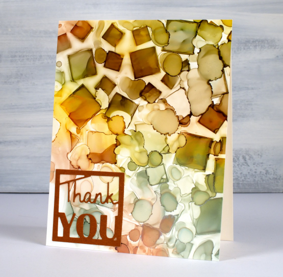
Tiles
Posted: April 26, 2024 Filed under: Collage cards, gel press, Tim Holtz, vault wildflowers | Tags: gel press, gel printing, Penny Black stamps, Tim Holtz 5 Comments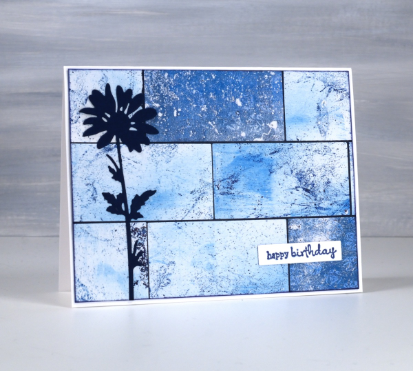
Do you have more gel prints than you know what to do with? Are some of them not very interesting or only partial prints? I definitely answer yes to both those questions. I keep finding though, that the grungy prints make really nice backgrounds for journal pages and cards.

I have many of my gel prints sorted by colour so I pulled several 6 x 6 prints from the blue folder and used them on a few different cards. I also had green, yellow and gold toned prints on hand to make some multicoloured cards; I’ll share them another day. To create this card I cut the blue gel prints with a rectangle die then arranged them like tiles over a navy background before trimming end to fit.
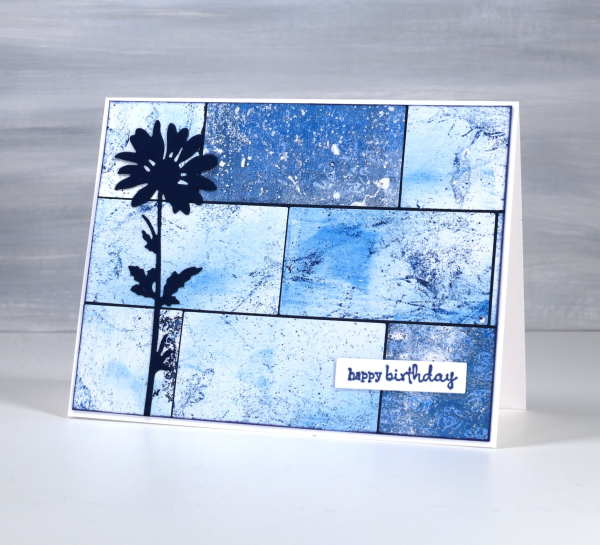
I added a die-cut flower from the Tim Holtz vault wildflowers set and a little Penny Black sentiment. If you like blue then maybe this multi-print collage will please you as much as it did me! This post includes affiliate links from Foiled Fox. If you buy through these links I receive a small commission at no extra cost to you.
Butterfly Journal Page
Posted: April 22, 2024 Filed under: gel press, grafix, Handmade book, perspective butterfly die, Tim Holtz | Tags: gel press, gel printing, grafix, Handmade book, Tim Holtz 6 Comments
It’s been ages since I posted a journal page here. I think some catching up is in order. This double spread is in my handmade 7″x 7″ journal. I did not sit down with an open journal and a plan for this page. After a productive gel printing session I had a butterfly print and a stripe and stencil print made with the same paint colours. To use them on cards I would have had to cut them up and I really didn’t want to.

When gel printing I will often print with the same handful of paint colours for a while before switching them. It makes it easier to keep printing as I have a few paint tubes on hand but more importantly I end up with a stack of prints which co-ordinate with each other because the colours and sometimes patterns are repeated.

I used the Tim Holtz ‘perspective butterfly‘ die to create a reusable duralar mask for gel printing. The circle patterns were made with the Carabelle Studio ‘accumulation de ronds’ stencil. The ‘corduroy’ looking pattern on both the butterfly and the circle page was made with a piece of textured wall paper. I completed this page quite a while ago but didn’t know if it was finished as I hadn’t added any words anywhere. Maybe that will change one day but I love it just the way it is. What you can’t see is the warm gold shimmer from the gold acrylic paint used to pull the prints.
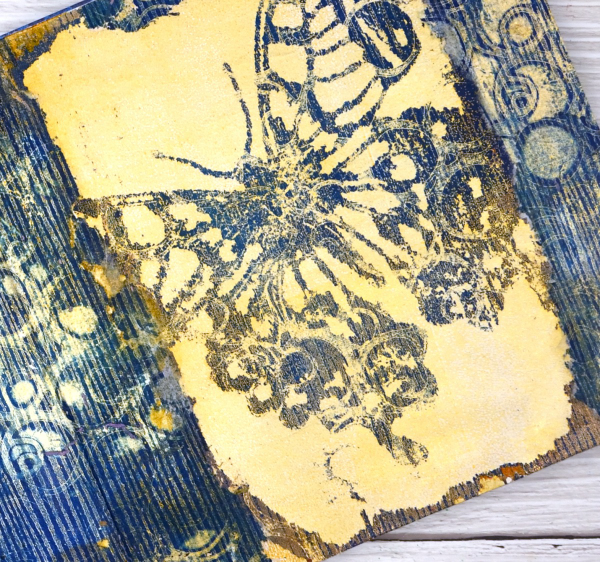
The butterfly print was on paper but the circle and stripe print was on tissue and was fairly fragile. I was able to glue most of it down successfully with gel medium but I don’t mind the ragged edges where it tore. This post includes affiliate links from Foiled Fox and Scrap’n’Stamp . If you buy through these links I receive a small commission at no extra cost to you.
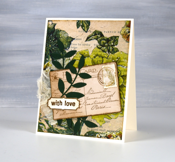
Greenery Collage Cards
Posted: April 3, 2024 Filed under: Collage cards, Darkroom Door, Dies, Finetec paints, gift card pocket, global postmarks, Leaves, measuring tape, Mixed Media, paris postcard, Penny Black, Tim Holtz, wild flowers #1 | Tags: collage, Darkroom Door stamps, Finetec artist mica watercolour paint, Mixed Media, Penny Black creative dies, Penny Black stamps, Tim Holtz 6 Comments
Continuing with the collage theme I have three cards featuring greenery from a paper napkin. I know people have been creating with paper napkins for years but I am new to the game. I have a small collection of pretty paper napkins to use on cards, book covers and journal pages. The green ones featured here are large dinner napkins found at Winners, probably in that tempting ‘just before the checkout’ area!

I glued the printed layer of the napkin over book pages to make my main panels and aged the edges with green and brown inks. I created a couple of little vintage postcards with the Paris postcard stamp, a background with the Measuring Tape stamp, sentiments and postmarks all from Darkroom Door.
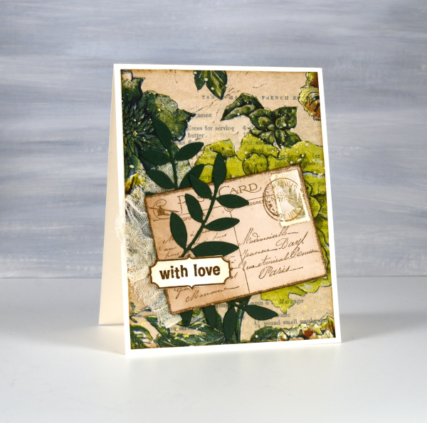
Once again I used some cute dies from Penny Black to cut tickets, file divider, tag and leaves adding blending around the edges for the vintage look.
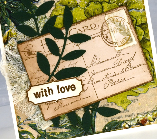
The scrap of cheesecloth, the lace and the grosgrain ribbon were all found around here, maybe the ribbon is actually vintage; it looks a bit discoloured from age which meant it co-ordinated well.

The lovely Queen Anne’s lace die is from the Tim Holtz ‘wildflowers #1 set.
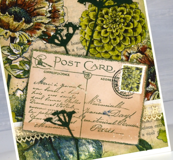
I did make my own little postage stamps for the postcards because I’m still in love with faux postage. These ones had to be quite small so I didn’t use a die I just punched tiny holes with a needle to perforate the edges. You can see a bit of splatter here and there with ivory paint and there are touches of gold watercolour paint on the petals of a few flowers too!
This post includes affiliate links from Foiled Fox and Scrap’n’Stamp . If you buy through these links I receive a small commission at no extra cost to you.
Gel Printed Pods
Posted: March 25, 2024 Filed under: artsy stems, framed fern, gel press, Lavinia, online class, Penny Black, Tim Holtz | Tags: gel press, gel printing, Lavinia, online class, Penny Black creative dies, Tim Holtz 3 Comments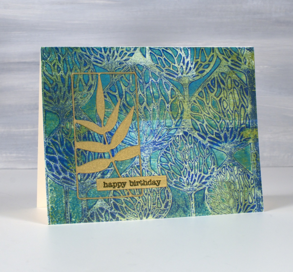
It’s been a while since I gel printed but that there is no lack of gel prints to show you. I currently have boxes of prints and and a stash of cards made from prints.

These two cards were made from the same stencil print, one of the examples from my Gel Print Journey online class (which is on sale along with all my online classes until March 29; just use the code LEAPYEAR40 at checkout)
If you are a fan of Lavinia stencils like I am you probably recognise the ‘Pods’ stencil used for this print. I printed on a 6″x 6″ gel plate giving me a print big enough for two cards. It’s hard to see in the photo but some of the paint was metallic so the print has some shimmer and shine on it.

I looked through my botanical dies and gold cardstock in order to fine co-ordinating elements for the cards. On the card above I used the ‘framed fern’ die from Penny Black and on the card below the die featured is from Tim Holtz artsy stems die set.
I hear my gel plate calling to me so hopefully I will soon dedicate a few days to happy printing. If you are looking for a beginner gel printing class or a refresher please check out Gel Print Journey. This post includes affiliate links from Ecstasy Crafts, Foiled Fox and Scrap’n’Stamp . If you buy through these links I receive a small commission at no extra cost to you.
Alcohol Ink Gel Print
Posted: June 19, 2023 Filed under: Alcohol Ink, artsy stems, gel press, little lowercase letters, My Favorite Things, Tim Holtz | Tags: gel press, gel printing, My Favorite Things, Ranger Alcohol Ink, Tim Holtz 3 Comments
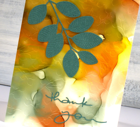
Last Monday I posted a faux batik look created on the gel plate. Today’s card is not faux alcohol ink; I did create a design on the gel plate with alcohol inks then picked it up with acrylic paint. Alcohol inks dry quite quickly so they are fun to fiddle with on a gel plate.

I can’t remember exactly which inks I used but I imagine there was a blue and yellow alcohol ink involved and perhaps ‘stream’ which is a deep teal colour. I sprinkled them on the gel plate, added some isopropyl alcohol to get the colours moving and then used a homemade stamp to add the flower shapes. In my online gel printing course I have a whole lesson about making and using homemade stamps with acrylic paints. Using them with alcohol inks is also an option as shown on this card. The speckled look over the panel is from adding a spritz of isopropyl alcohol to the plate before letting it dry.

I pulled the print with gold acrylic paint which has given the whole panel a goldish tint and in real life a bit of shine and shimmer. To finish the card I added a die-cut flower and letters in a co-ordinating colour. The letters were cut with MFT ‘little lowercase letters’ which might not be available anymore but I have linked to a similar set.
(Compensated affiliate links from Foiled Fox & Scrap n Stamp)
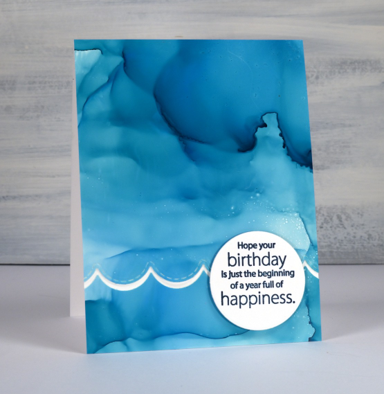
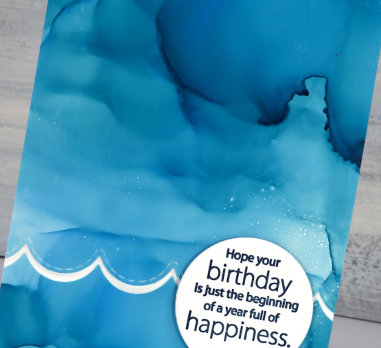
New YouTube channel – New Video
Posted: February 11, 2023 Filed under: Alcohol Ink, baby blue leaf embossing folder, Branch 9 die, cricut, Dies, grafix, Moda Scrap, my designs, ornate tile embossing folder, Paper Rose, Penny Black, Pink & Main, scripty, silhouette birds, so extra supporting sentiments, Stampin Up, thank you squares, Tim Holtz, Tutorial | Tags: cricut, grafix, grafix craft plastic, Penny Black creative dies, Penny Black stamps, Ranger Alcohol Ink, Stampin Up, Tim Holtz 6 Comments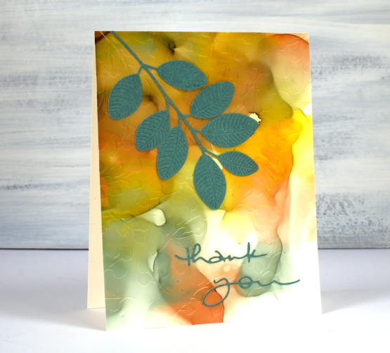
If you have been visiting this blog for a while you will know I had a youtube channel for many years. In 2022 after ten years of adding videos and gathering a community of 7000 subscribers my channel was deleted. In recent weeks I have started again with a new channel and some videos ‘from the archive’. My new channel is called Heather Telford Art and I would be very happy if you decided to like, subscribe and tell your friends! There is content on there that you may remember from the last few years and starting today there is new content also! The new ‘2 for 1 Alcohol Ink Panels’ is freshly filmed for my new channel and I hope it will be the first of many!
There are quite a few photos in this post because, well, this is a 2 for 1 technique and I created three panels which of course became six panels and one was cut in half so there are seven cards to show you in this blog post! Grab a cup of tea. I have added a linked supply list at the very bottom of this long post.
As well as a new youtube channel I am also a new Cricut owner. The stencil used on the card below was designed by me and cut on my Cricut. It is available as a cutting file from Echidna Studios etsy store.
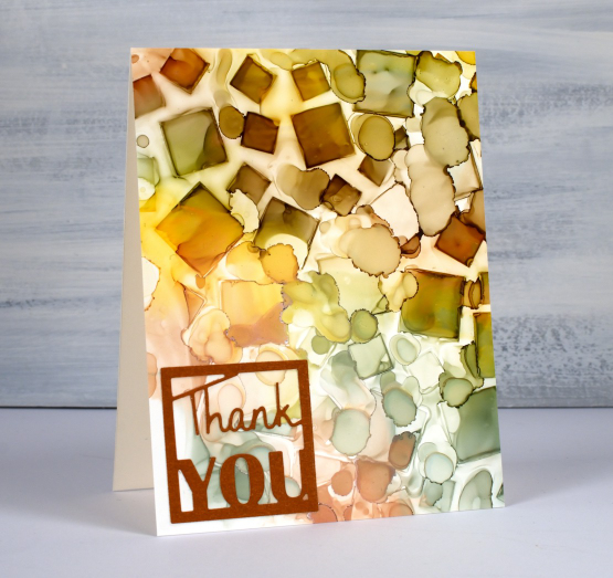
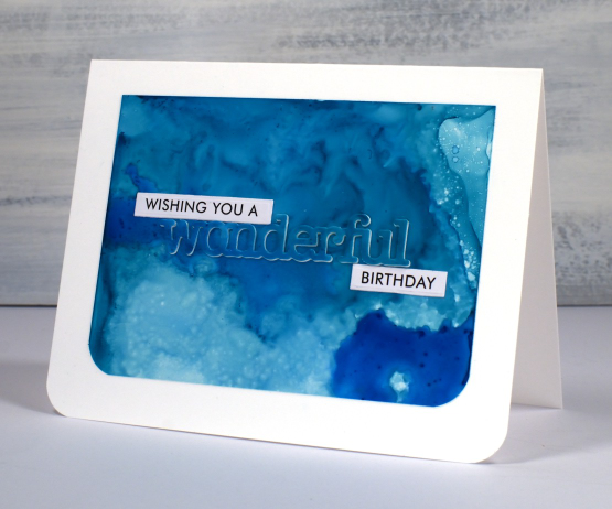
Most of the 2 for 1 smooshed panels I left as a full card fronts adding only a sentiment or some die-cutting. As the panel below reminded me of the ocean, the PB wavy scallop border seemed a nice touch.
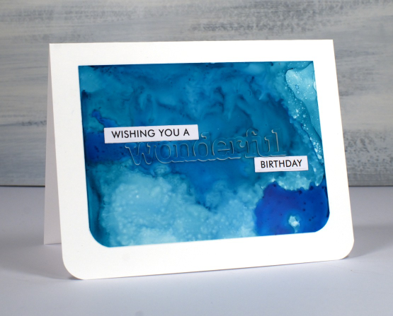
The panel below is a half panel from the first one I showed on the video. I love the patterns from the isopropyl alcohol ink spray even though they don’t stay distinct. Even when die-cutting the word from the panel I couldn’t leave it off so I popped it up. Not so funny story: I guess I haven’t popped up a die cut word in a while because I flicked those little shapes inside the letters into the garbage when I poked the word from the die. So yes, I had to hunt through my garbage to complete the card.
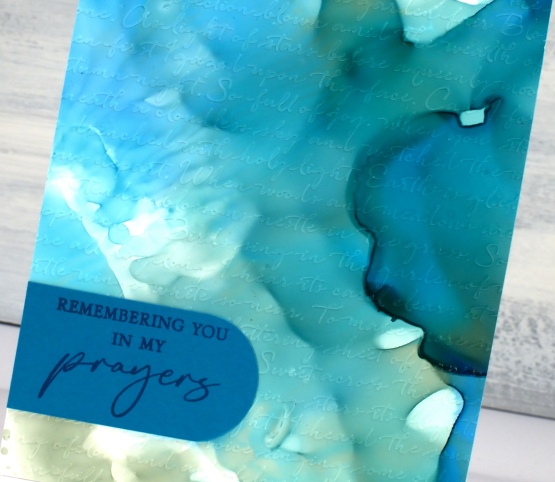
I don’t know why I hadn’t tried it before but seeing how well Grafix craft plastic responds when put in an embossing folder has been a revelation! I thought it might crack but it doesn’t so you can have the subtle impression of your embossing folder on a panel or the bold inked pattern as I’ve done on the card below. Sentiments in circles might be a little fad I go with for a while too; they look cute!
You can see the soft look of embossed script on the panel below, especially in the close up. This detailed embossing folder is from Stampin’ Up and is called ‘scripty’. I don’t think it is available anymore but you might something similar.
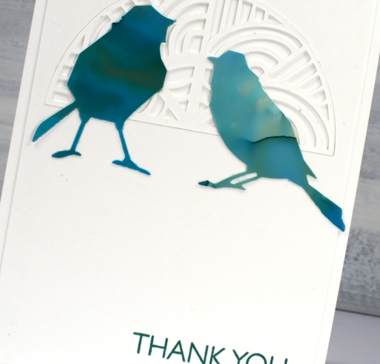
For this final card I cut six little birds from the panel and played with layouts for quite a while. I ended up just using two which means I have four birds in hand for another project. (pun definitely intended)
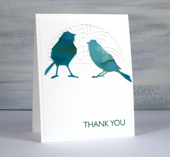
The intricate half circle cut out behind the birds is also one of my new cricut cutting files but more about that in another post. If you got this far, you’re a champion. Thank you for supporting me here on my blog and I would love to see you over on youtube as well.
(Compensated affiliate links from Foiled Fox, Scrap n Stamp)