Today & Always
Posted: May 14, 2026 Filed under: beaded mandala, cricut, The Crafter's Workshop, Watercolour | Tags: Fabriano Watercolour Paper, Stencils, The Crafter's Workshop 2 Comments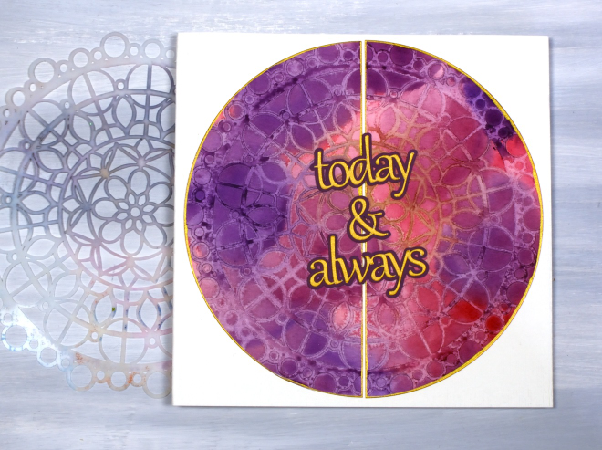
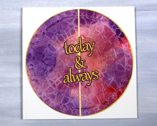
I have turned yet another stencil & watercolour print into a card, this time a wedding card featuring a large circle print made with the The Crafter’s Workshop ‘beaded mandala’ stencil.
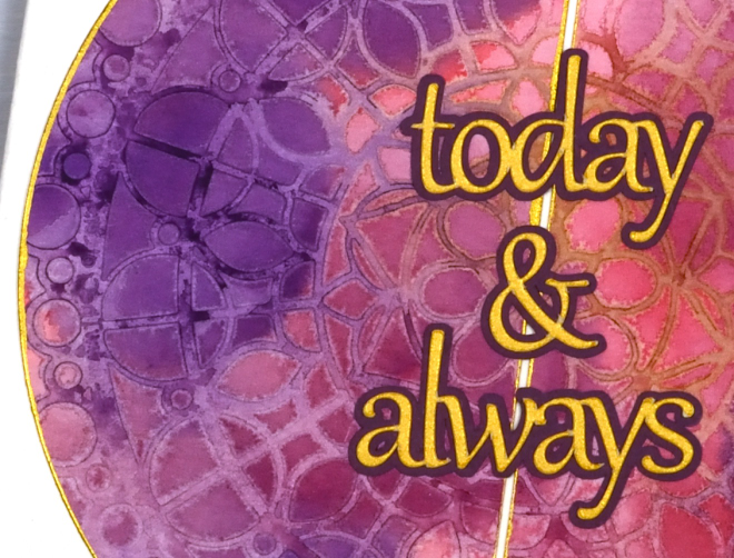
Most of the stencil print is paler than the surrounding blended watercolour painting because my technique involved spritzing the stencil to cover it with water before pressing it onto the painted panel. The water on the stencil dilutes the paint. I can’t remember for certain but I probably weighted the stencil down with a large acrylic block and let it dry for quite some time, maybe overnight. In the close up above you can see an area of the stencil print is a mustard colour, that was a happy accident due to the stencil not being clean! It prompted me to choose gold cardstock for the circle border and the sentiment cut on the cricut.
Thanks for dropping by. I think there will be several more stencil and watercolour projects to share but I do hear the gel plate calling me, so stay tuned!
Leafy Vines
Posted: May 11, 2026 Filed under: AALL & Create, The Crafter's Workshop, Watercolour | Tags: AALL & Create, Fabriano Watercolour Paper, The Crafter's Workshop 4 Comments
I have a stack of stencil+watercolour prints to turn into something and it appears that this ‘leafy vines’ stencil from The Crafters Workshop was a favourite during my preparations and workshops. I’ve turned one panel into a card and have six more panels to work with. I used a variety of techniques to create the panels including painting through the stencil as shown on this card.

Painting through the stencil didn’t give me a sharp complete representation of the stencil but it did give me a loose and impressionistic design with lovely soft blends from bluegreen to green to mustard. I matted with dark green cardstock and stamped an AALL & Create sentiment in green to complete the card.

Below are some more panels completed using the same stencil but different techniques. A few of them will become cards I imagine but I’m not sure with the blotchy one bottom right; not my favourite!

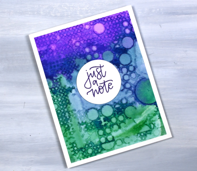
Totally Dotty
Posted: May 6, 2026 Filed under: AALL & Create, Classes, Concord & 9th, many mandalas, totally dotty stencil | Tags: AALL & Create, Classes, Concord & 9th, Fabriano Watercolour Paper, Stencils 4 Comments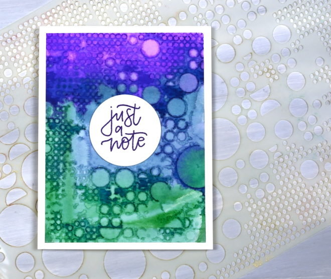
This stencil is appropriately called ‘totally dotty.’ It is a big stencil from AALL & Create and is cool for gel printing, alcohol inks and as it turns out, watercolour as well.
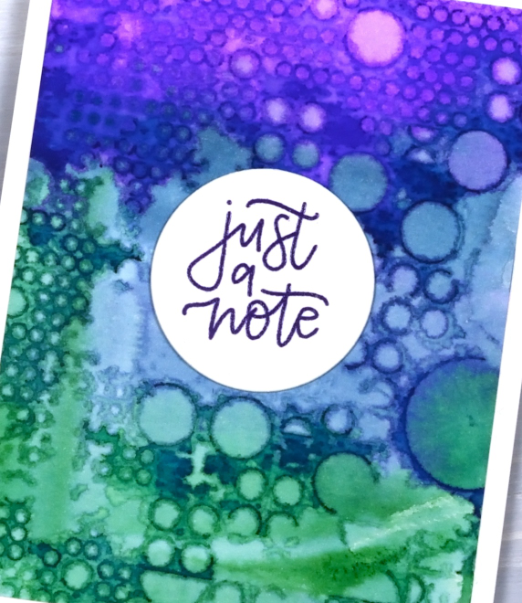
I have done quite a few stencil prints lately both in preparation for and during my recent workshops. I used different watercolour mediums including distress stains which provide quite saturated colour as you can see in the panel above. Pressing the painted panel on the stencil or vice versa can create very funky and distinct patterns as well as subtle dreamy ones. This panel ended up very distinct except for an area in middle. Not a problem as you can see; I stayed with the dotty theme and stamped my C&9 ‘many mandalas‘ sentiment on a circle for the centre.
This post includes an affiliate link from Scrap’n’Stamp . If you buy through this link I receive a small commission at no extra cost to you.
Flowers and Tiles
Posted: April 22, 2026 Filed under: Classes, cricut, Darkroom Door, Rockwell art, Watercolour, wildflowers | Tags: cricut, Darkroom Door stencils, Rockwell art 3 Comments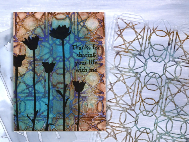
The experiments with watercolour and stencils keep on happening as I prepare for the in-person workshops next week. This one ended up being very satisfying. I designed the stencil to look like Moroccan tiles and chose the paint colours to look aged and stained. I was happy to see those effects in the final panel.
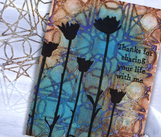
Because the panel looked a bit like a tiled floor or wall I wanted to add flower silhouettes like shadows. I inked through the Darkroom Door small ‘Wildflowers‘ stencil with Gina K obsidian ink and added an AAll & Create ‘everyday sentiment with the same ink.
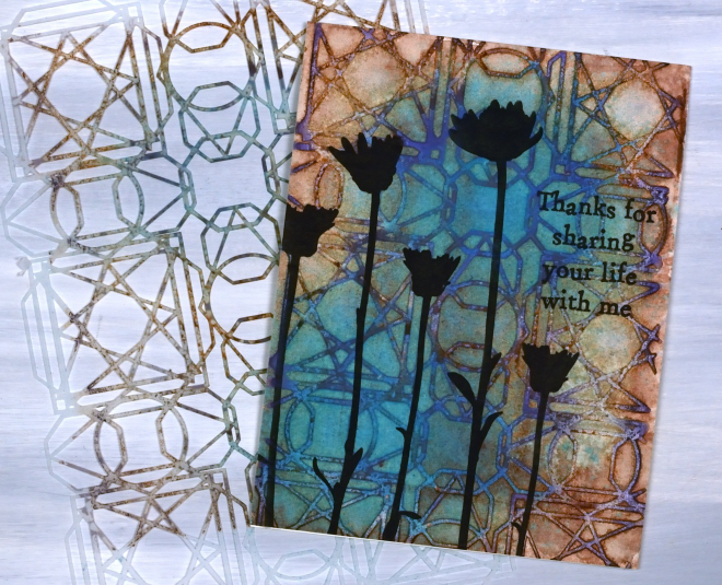
I used a combination of paints and distress oxide spray to get the unique mix of colours. Some of the paints were the Rockwell self evolving mineral watercolours which always give great multicolour effects.
Roses Stencil in Blue
Posted: April 7, 2026 Filed under: Brusho, Classes, cricut, Echidna Studios, grafix, Roses digital stamp set, Watercolour | Tags: Fabriano Watercolour Paper, Brusho, Classes, grafix, Echidna Studios, Stencils 3 Comments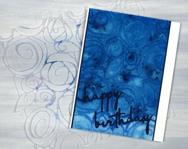
I’m continuing to enjoy my stencil and watercolour experimenting, this time featuring a stencil I designed myself and cut on the cricut. The stencil is made from two sections from a rose border digital design which is part of a trio of rose themed images available in the Echidna Studios etsy store. To create more of a square stencil I joined two parts of the border design together in cricut workspace before cutting them from Grafix matte dura-lar. I know many people don’t use cricuts or digital cutting machines but the technique would work with any fine line stencil.
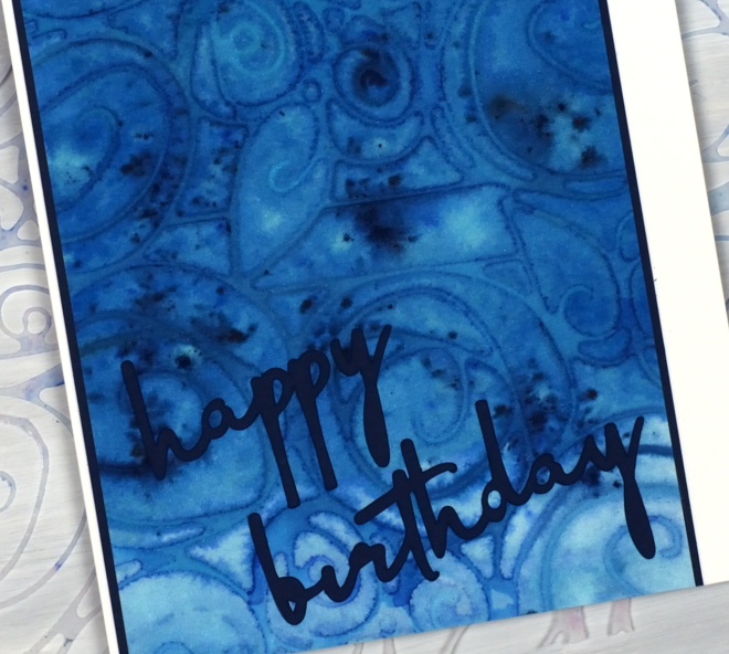
I painted the panel in blue paint before dropping the stencil on top, then added brusho powder and some spritzes of water. I am continuing to finalise techniques for my Stencils & Watercolour workshop here in Ottawa and this was one of the panels I created on watercolour paper. (there is one space left in the Monday workshop and several spaces in the Saturday workshop)
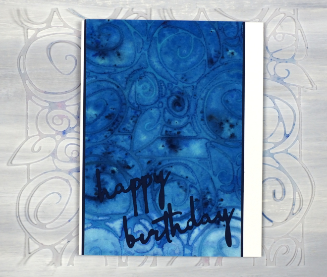
The sentiment was also cut on the cricut from the navy cardstock which also frames the stencil print. I know the cricut can be used for many things but my favourite use for it is definitely stencils! Looking at the photos as I write this I notice I did not glue the tittle over the ‘i’ in birthday. I had better try and find it!
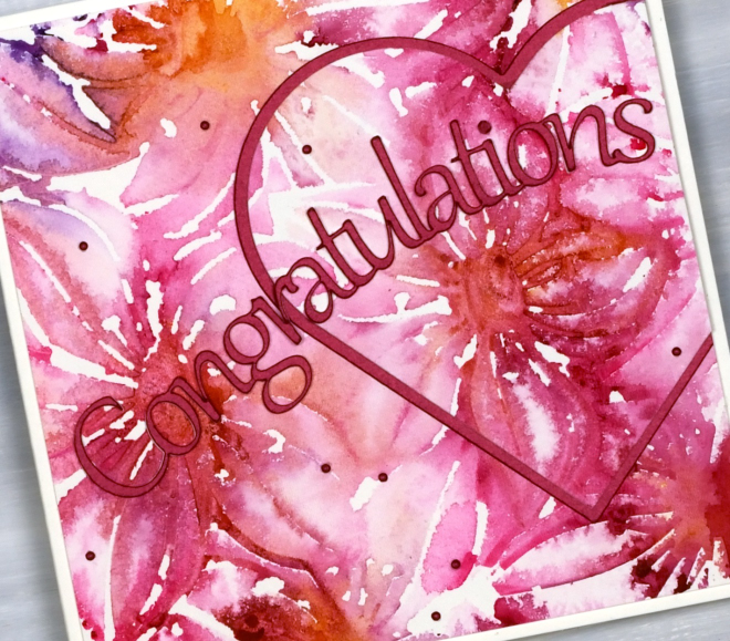
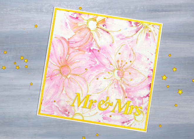
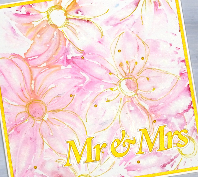
Stencil & Watercolour wedding cards
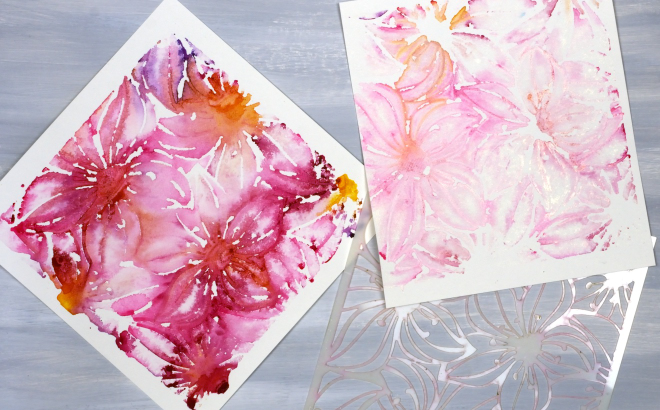
Posted: March 27, 2026 Filed under: Classes, clematis burst stencils, Creative Expressions, cricut, Watercolour | Tags: Classes, cricut, Fabriano Watercolour Paper, Stencils 2 Comments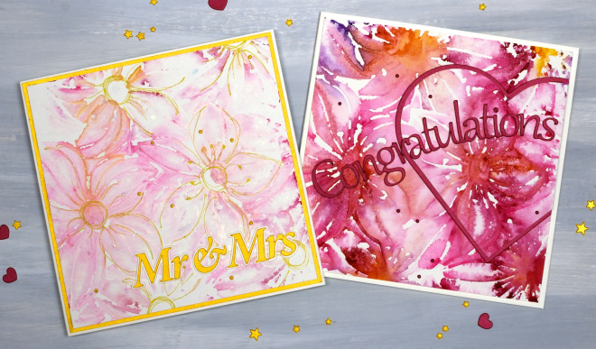
I’ve been creating quite a few patterned panels using stencils and watercolour while designing a workshop. There have been many experiments and most, but not all, have turned out quite well. You can see in the photo below the Creative Expressions square ‘Clematis Burst’ stencil beside two panels. The bright one on the left was the first impression and the one on the right the second impression using paint remaining on the stencil.
As I never seem to have any wedding cards on hand when someone asks for one I decided to make both panels into wedding cards, one bold and one subtle. I cut the sentiments on the cricut and also the large red heart
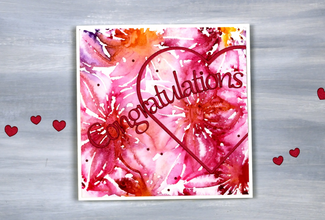
When you look closely you can see both ‘prints’ are loose and a bit messy but I don’t mind the impressionistic look!
I used a gold gel pen to add definition to the flowers on the lighter print, not every petal but enough to make sure they looked like flowers!
I am teaching a Stencils & Watercolour workshop here in Ottawa in late April and early May, you can find all the details on the CLASSES page.
January Calendar cards
Posted: March 10, 2026 Filed under: Calendar cards, cricut | Tags: cricut 5 Comments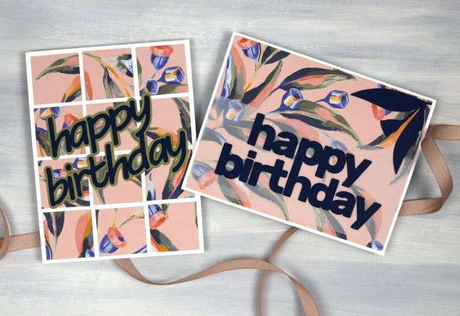
I’ve made a few more cards from the pages of the beautiful 2025 Earth Greetings calendar. I posted the cards made from the cover in a recent blog post. On the back of the cover was the January artwork by Jayne Branchflower featuring eucalyptus leaves and gum blossoms on a pink background.
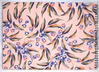
I made two cards below from the remainder of the cover/January page, one large panel with a navy sentiment cut on the cricut layered over vellum so it would be more distinct. I also cut a couple of gum leaves and one gum blossom from navy cardstock to add a bit more interest to the card. I cut them with scissors so they are very simple and mimic the design painted by Jayne Branchflower.

By this time in my cardmaking I had a strip of the pink panel and a medium size square left which I was able to cut into twelve 1¼” squares which I arranged randomly across one more card base. The sentiment was also cut on the cricut from navy cardstock and a shadow from green.

As I continue to use what I have (UWIH) I am quite happy to have made six cards from one (two sided) calendar page. Although I will continue to make cards from calendar pages I am keen to work with other favourite techniques that haven’t been featured on the blog lately. I have a non-card related project I’m working on which also uses what I have on hand. I will hopefully share more of that one if I successfully complete it.
Inspiration and Conversation
Posted: February 24, 2026 Filed under: Hand painted, sennelier watercolours | Tags: Fabriano Watercolour Paper, Hand painted, sennelier watercolours 18 Comments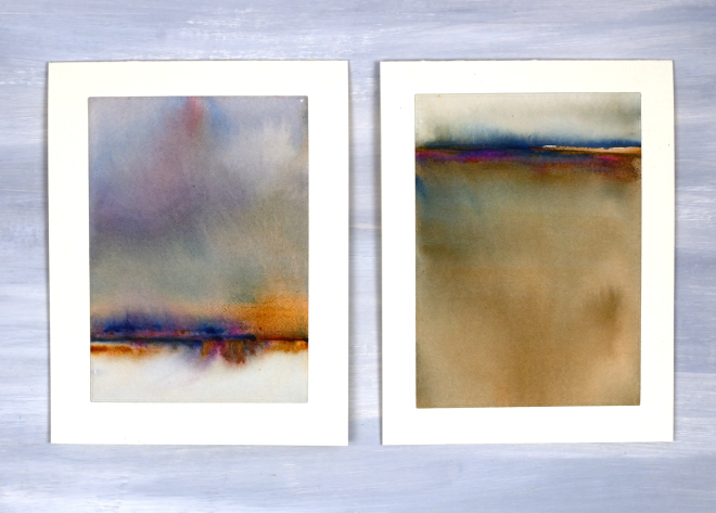
Today I wanted to have a bit of a chat with you, my readers, and especially take a few sentences to tell you how much I appreciate you. Some of you I have met but many of you I have not. Despite not having met in person I feel that we have formed a community and it is a very friendly and generous one. I took a break from the blog last year for several months and when I returned I was very encouraged by the comments and messages I received. Yes, it was nice to be missed, but more importantly it was lovely to see people engaging in discussion about techniques and materials. Many of you are kind enough to say you learn from my posts; I am so glad you do, but I also learn from you when you take the time to suggest products, methods and artists to check out.
Some of you have told me it is not as straight forward to comment these days. I’ve noticed this and I’m not sure why. I really enjoy hearing from you and read every comment and message I receive.
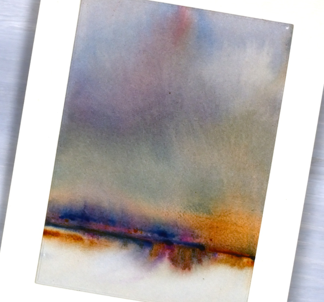
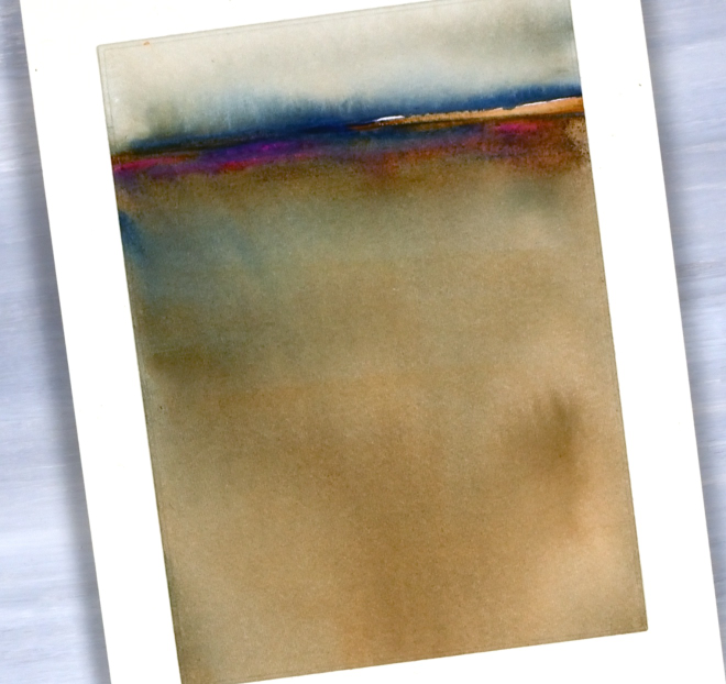
Today’s cards are inspired by the art of Claudia Drexhage. I encourage you to check out her website or instagram as her paintings are stunning and you will see where I got the idea for today’s abstract landscapes. I have only dipped my little toe into this technique but hopefully I’ll go in further in the future. One thing I find interesting about it is the way the abstract landscape can be seen one way and also turned upside down. I can’t remember which way I painted these panels originally but when I turned them into cards this week I decided I liked one with a big sky and the other with a big foreground. What do you think?
Thank you again for dropping in today and being part of this community. I look forward to seeing a few of you soon at some artsy get-togethers I am hosting but for those who don’t live close I look forward to seeing your inspiring creations if you share them on the interwebs or hearing from you in the comments or contact me button. Your encouragement and friendship mean a lot to me!
Calendar Cards
Posted: February 18, 2026 Filed under: border collection, Concord & 9th, cricut, Dies, online class, Patterned papers, Penny Black | Tags: Concord & 9th, cricut, Earth Greetings, online class, Penny Black creative dies 5 Comments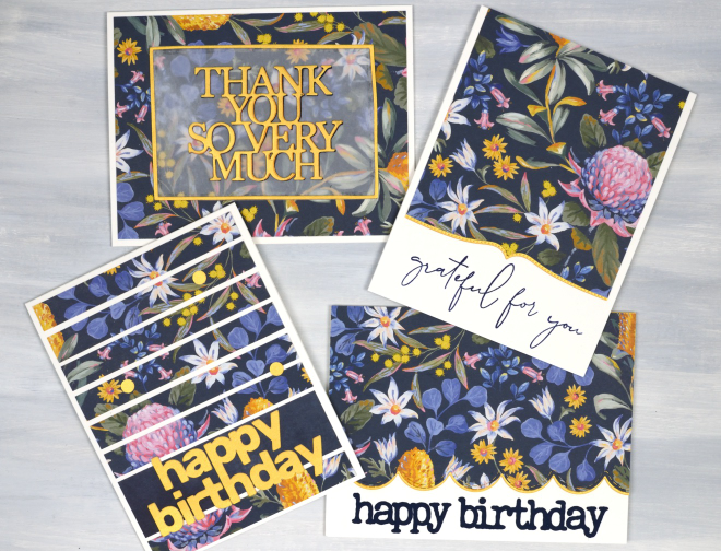
Here are some happy flowers to remind you of spring if you are still surrounded by snow like I am! Also to get you through winter there are details about a sale of my online classes at the bottom of this post.
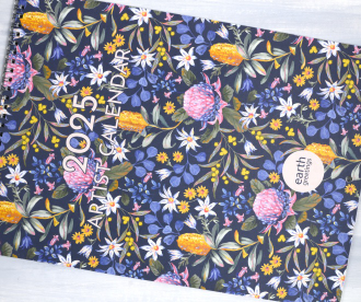
I received a beautiful Earth Greetings calendar last year from my brother and sister-in-law in Australia. I enjoyed the original artwork all year while also planning to turn the pages into cards once the year was over. I decided to start with the cover which features a beautiful floral design by Jayne Branchflower. The cover has the January artwork on the back so I used bits of each design, both painted by Jayne.
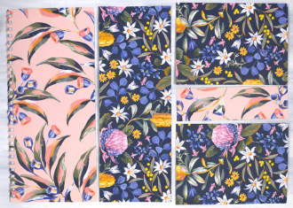
In this post I will feature the blue background panel covered in Australian native flowers such as waratah, bottlebrush and flannel flower. I created two portrait orientation cards shown below. The accents on all the cards are cut from gold cardstock to co-ordinate with the bottlebrush (callistemon) and wattle in the design. The greeting below left was cut on the cricut, below right features a Penny Black border die and a retired C&9 sentiment.
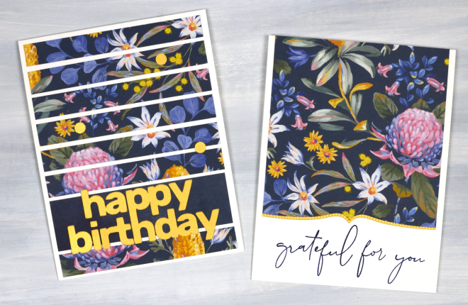
The two cards below I made in landscape orientation and used the PB Border Collection die to add a scalloped edge on the right along with a cricut cut sentiment. On the left I die-cut a PB sentiment, So Many Thanks, and lay it over duralar so it would be easier to see on the busy background. It is also stacked up on navy cardstock to give it a bit more prominence. I created the narrow gold border with WaffleFlower A2 rectangle dies. The cards in this post obviously do not have to be made with calendar pages; your own printed, drawn or painted papers would work, as would scrapbook papers or art papers. I am just having fun with calendar pages right now and hope I have inspired you to recycle and repurpose a few of yours!
All my online classes are on sale for 50% off. Just click over to https://heathertelford.podia.com/ to purchase.
This post includes affiliate links from Scrap’n’Stamp . If you buy through these links I receive a small commission at no extra cost to you.
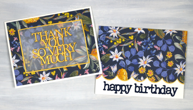
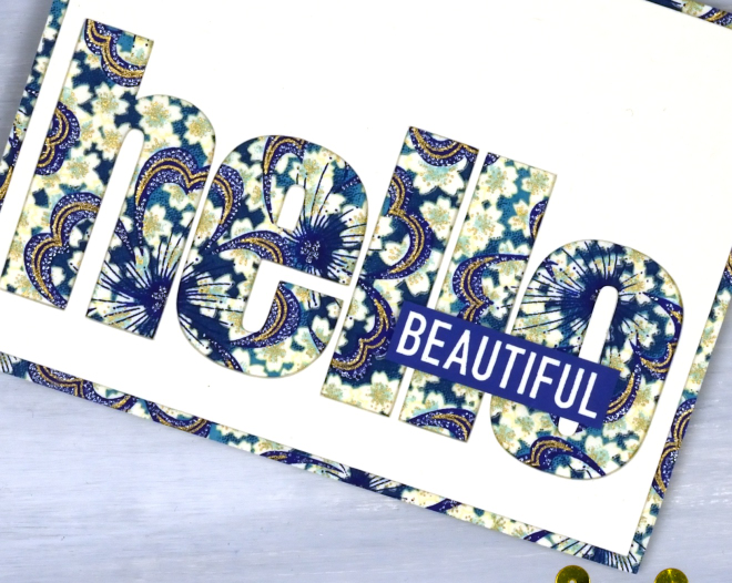
Pretty Papers
Posted: January 21, 2026 Filed under: cricut, My Favorite Things, Patterned papers, Penny Black | Tags: cricut, My Favorite Things, Penny Black creative dies 7 Comments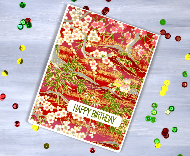
If you are anything like me you probably have a stash of pretty papers. Maybe they are scrapbooking papers or rice papers, perhaps they are pretty papers you made yourself by watercolouring or printing. I have quite the stash in all the above categories. So in the spirit of using what I have (UWIH), I pulled out some of the pretties and turned them into cards.
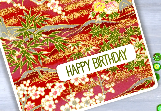
All the papers on today’s cards are rice papers featuring bold colours and gold details. They were a lovely gift from a lovely person. Because the papers are so beautiful I really didn’t do much to turn them into cards. (the red one, the bluey-green one, the blue floral one)
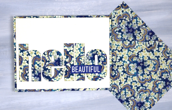
All the cards featured today use a panel that fills or almost fills a card front. I simply added sentiments and rounded corners to the red card and the bluey-green cards. For the hello card above I used the cricut to cut the word hello from a cream panel so the pretty paper would be revealed. I added the word ‘Beautiful’ from a Darkroom Door set, ‘You are Everything‘.
The word birthday below is die cut; the other letters are cricut-cut.
I like the finishing touch of rounded corners and have a corner rounder that I really like; it’s the Kadomaru PRO which gives me the choice or large, medium or small corners. What else do you do with pretty papers? I’d love to read your suggestions in the comments.