
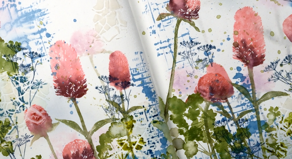
Wildflower Spring
Posted: May 8, 2024 Filed under: Darkroom Door, Nature Walk, online class, Taylored Expressions, Wildflowers Vol 1, Wildflowers Vol 2 | Tags: Darkroom Door stamps, online class 6 Comments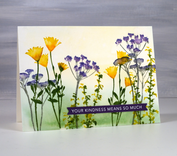
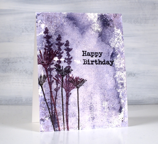
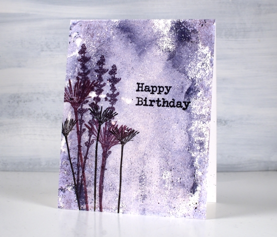
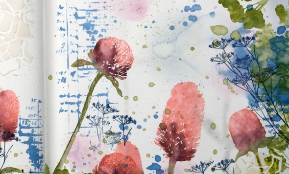
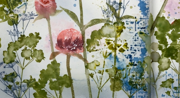
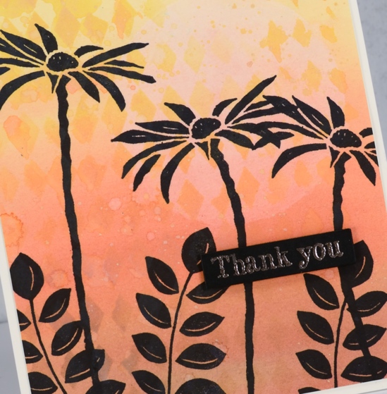
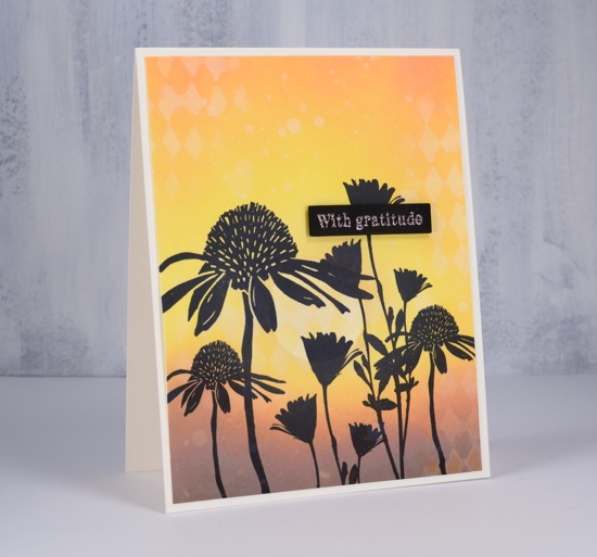
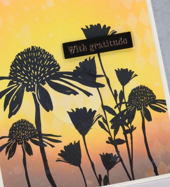
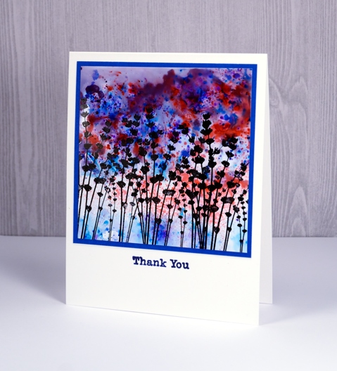
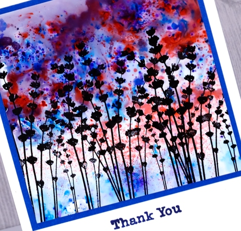
These spring flowers are all silhouette stamps from Darkroom Door, some from the Nature Walk set and a few from Wildflowers vol 1 & 2. Even though the stamps are solid with no detail it is possible to use ink pads and markers to give them more depth.

This card is a sample from my Floral Faves online class. In the class I feature no-line watercolour with outline stamps, techniques with brushstroke stamps and ways to use silhouette stamps as featured on this card. I often use my silhouette stamps with a black or dark ink over a sunset sky but I do like to give them colour sometimes with a pale watercolour wash in the background.
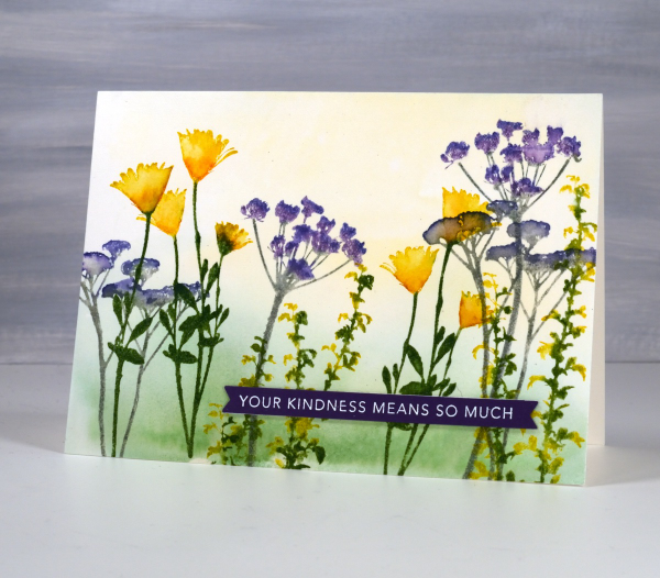
I hope you are seeing spring colour in your garden or perhaps fall colour if you are in the southern hemisphere.
Gardens on gel prints
Posted: August 2, 2022 Filed under: Darkroom Door, fine flowers vol 2, gel press, mesh, Nature Walk, Wildflowers Vol 2 | Tags: Darkroom Door stamps, gel press, gel printing 7 Comments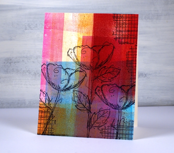
Another gel print post? Yes indeed, and no apologies. If you have tried gel printing you will know it is a little addictive. Today’s post features cards stamped with Darkroom Door flowers. Some are stamped on clean up sheets, others on gel prints. A clean up sheet is thick drawing paper I keep at the right of my gel plate for rolling excess ink off my brayer. As you can see in the panels above and below I can end up with some very colourful sheets.
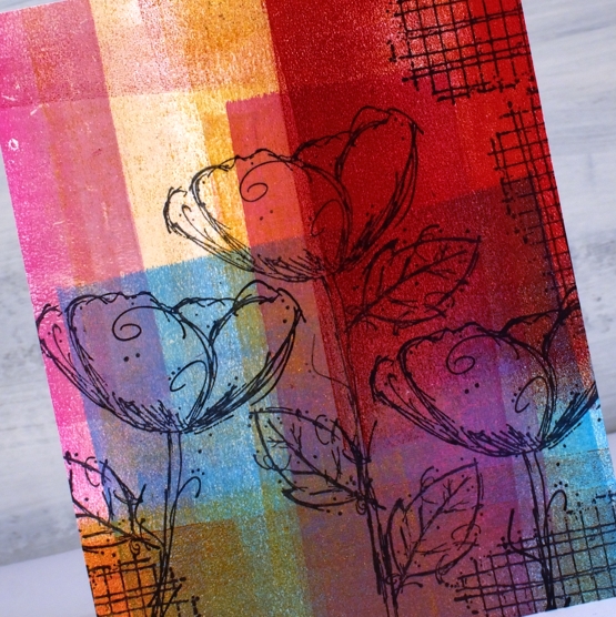
I stamped flowers from the DD set’ ‘fine flowers vol 2” and the ‘mesh’ texture stamp in Ciao Bella Oceania ink. The ink is a pigment ink which stamps beautifully on gel prints and dries quickly so I don’t end up smudging it.
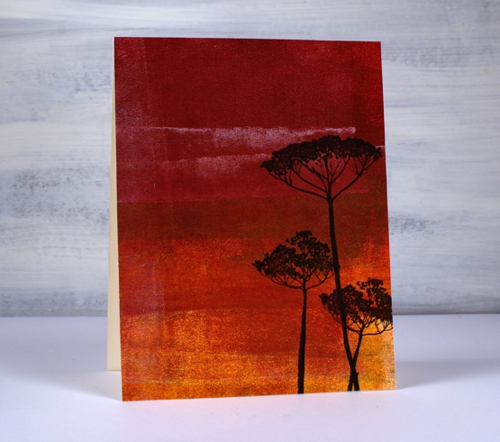
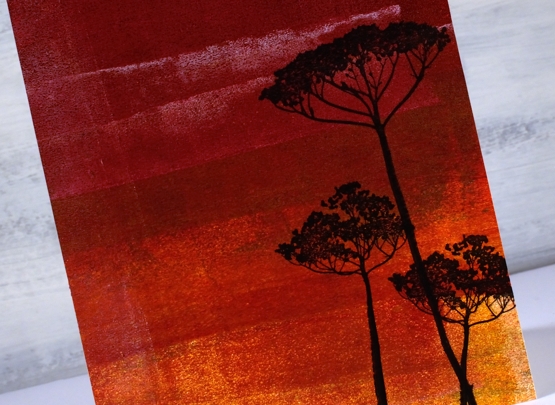
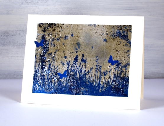
This deep red background is also a clean up panel. I am always excited to see landscapes or skies appear in an abstract print or clean up sheet. Those two strips of white added a hint of clouds to a very bold sunset! I stamped the silhouette flowers from the DD set, wildflowers vol 2.
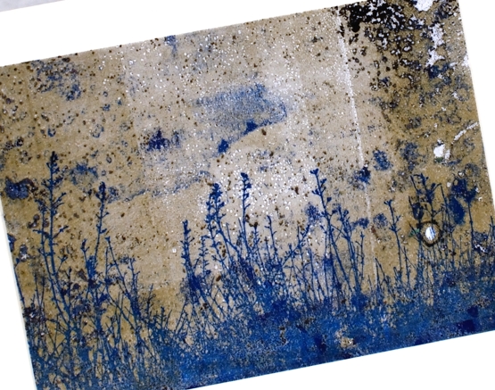
The last two cards are made from gel printed panels not clean up sheets but are very distressed. The print I pulled and cut up to make a couple of garden cards include plenty of distressed texture from a printing session including a little bit of text.
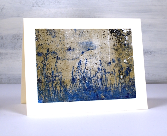
There was some blue in the print so I chose a co-ordinating ink to add the large grassy stamp from the DD ‘nature walk’ set. I’ve said it before it is a favourite set which I reach for again and again. I think I used versafine clair paradise ink.
I was crafting with a friend when I made these two cards and she had a tiny butterfly punch so the card below features a few co-ordinating butterflies. I haven’t seen many butterflies in my garden this year but there have been plenty of bees in the day and fireflies at night.
None of these cards have sentiments on them at this stage, I like to have blank cards on hand to use for any occasion. Thanks for dropping by today; I know it’s been quiet around here lately. I plan to be back soon with more projects and inspiration.
Supplies
(Compensated affiliate links used when possible)
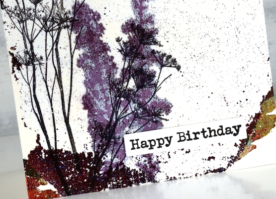
Distressed Gel Print backgrounds
Posted: May 20, 2022 Filed under: Art de Fleur vol 1, Darkroom Door, gel press, Nature Walk, tall flowers, Wildflowers Vol 2 | Tags: Darkroom Door stamps, gel press, gel printing, Ranger archival inks 7 Comments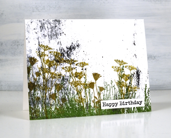
Last week I taught a couple of gel printing classes and had a blast seeing others fall in love with the process and results. As you might imagine I have many prints now, a big box waiting to be used. I thought I would use a few scrappy patchy prints as backgrounds. Some of these prints are ghost prints where I pick up a patchy layer of paint left on the gel print after a more distinct print has been taken. I also have some patchy distressed looking prints taken from a damaged gel plate. I don’t know how the surface got damaged but I still use it as a place to roll out paint before brayering on the main plate or to clean off excess paint after brayering on the main plate. The little dots you see on today’s prints are from imperfections in the damaged plate.
On the print above you can see not only the specks of black paint from the plate but also the leftover paint from the border of the plate. Most gel printers love being able to pick up some of those colourful leftovers on a future print.
Both the print above and the one below were made from excess paint so there is very little defined pattern but instead some lovely specks, blends and blobs.
I chose to make cards from these prints not just because I wanted distressed backgrounds but also because it shows how even the scrappy, incomplete, messy prints can be worth saving.
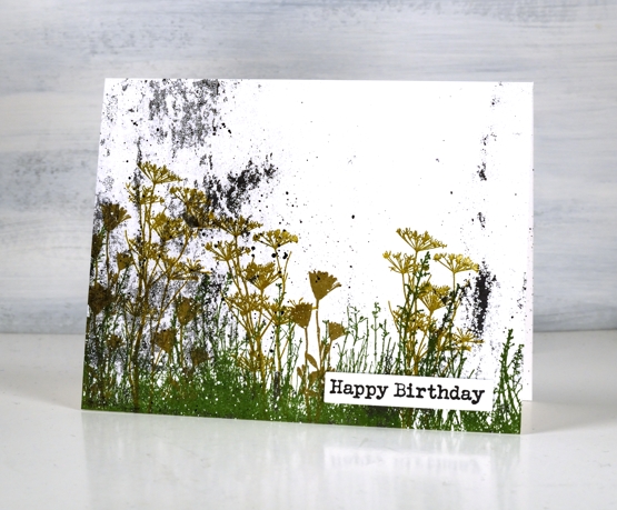
The only colour on the background print above was some black. I used rustic wilderness, wild honey and frayed burlap archival inks to stamp flowers and grasses from Darkroom Door sets, nature walk and wildflowers vol 2.
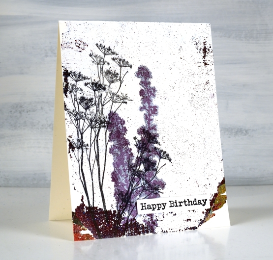
The ghost print above was pulled with rice paper. When I stamped the purple flowers in versafine clair they soaked through the paper and spread to give the image a halo surrounding it. Although it was an interesting effect I switched to archival inks for the rest of my stamping as they sit of the surface and dry quickly.
I used similar colours to stamp flowers from DD sets, tall flowers and art de fleur vol 1 over the purple ghost print.
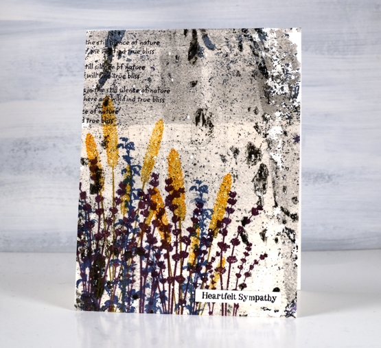
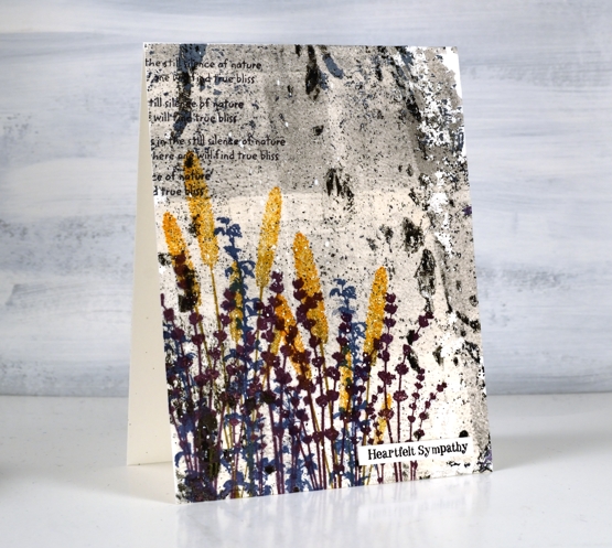
The print above was by far the busiest one I used so a bright contrasting colour seemed like a good idea. I used thistle, wild honey and faded jeans archival inks to stamp flowers from DD sets, nature walk and wildflowers vol 2. I also added some text with a stamp from the nature walk set
To attach the cards to the neenah card bases I used double sided adhesive sheets. I added some black and white paint splatter and Darkroom Door sentiments.
If you have read right to the end you are a champion. If you are a gel printer I hope you are inspired to use a few of those patchy prints you might otherwise discard. I have been using them in my art journals but it is nice to see them on cards too and it’s not as if I am going to run out anytime soon!
Supplies
(Compensated affiliate links used when possible)
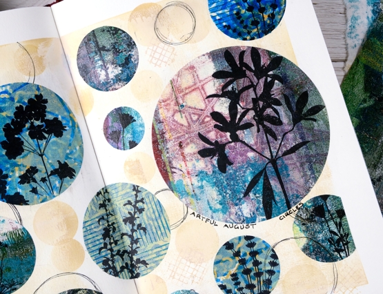
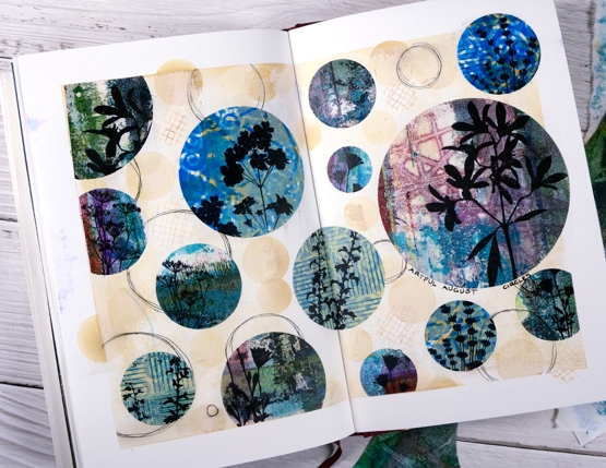
Artful August Circle Journal Page
Posted: August 5, 2021 Filed under: Art Journal, basket weave, Christmas bush, Darkroom Door, fragments, gel press, gelli plate, little swirls, mesh, Nature Walk, Paper Rose, Wildflowers Vol 2 | Tags: Art Journal, Darkroom Door stamps, gel press, gel printing, gelli plate 6 Comments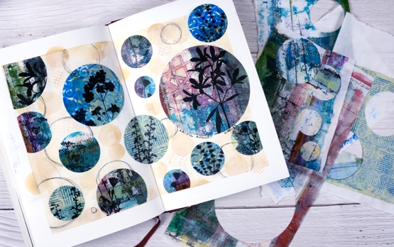
Rachel Greig from Darkroom Door is hosting ‘Artful August’, a challenge to make something arty each day in August. She has provided 31 prompts and I am going to play along as often as I can. Circles was the prompt yesterday so I cut circles from a just few of the many gel print panels I have piling up. I used only gelprints done on rice paper and they cut and adhered very easily.
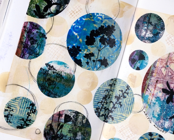
Once I had cut circles in different sizes from different gel printed panels I stamped flower silhouettes from several Darkroom Door sets. Before gluing the circles to the pages I painted the pages with a base of gesso + light brown paint and added some scribbly circles by tracing inside circle dies.

I glued the printed, stamped circles with matte medium both on the back of the paper and over the top to seal it. To add a bit more interest around the circles I blended antique linen ink through a homemade paper stencil.
The prompts in the challenge are very open and participants are encouraged to interpret them in any way and with any medium. If you are on instagram you can view the submissions by searching for #artfulaugust or #rachelgreigartfulaugustchallenge
As I participate in the challenge I will have simple experiments along with some completed projects like this one. The fun is simply playing with the prompts. In making today’s journal pages I was very happy to use some pretty scraps, experiments and clean up pages from gel printing sessions. There are always too many to turn into cards but each one has a unique texture and colour mix.
Supplies
(Compensated affiliate links used when possible)
If you have a garden…
Posted: May 31, 2021 Filed under: Art Journal, Darkroom Door, Hand lettered, Papertrey Inks, scratches, Wildflowers Vol 2, you are everything | Tags: Art Journal, Darkroom Door stamps, Fabriano art journal, Papertrey ink, Ranger Distress inks, Tsukineko Versafine inks 8 Comments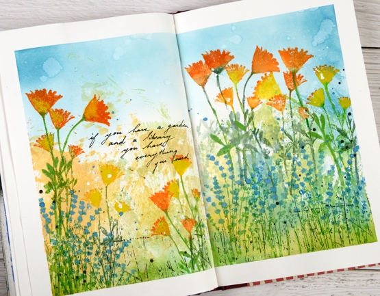
The rest of the quote says, ‘… and a library you have everything you need.’ My art journal is pretty much all book or flower related pages; I guess there is room for a new inspiration. Currently with a garden that is looking promising and an online course newly launched you could say flowers are on my mind.
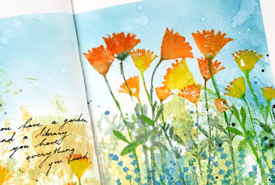
The background for this page was created months ago when I was making subtle backgrounds for a few cards. Instead of swiping a whole panel through waterbased inks I was inking a piece of acetate then spritzing it and swiping it on a stamped panel. I opened a spread in the art journal and swiped the acetate across the pages a few times to leave some ink there. I don’t remember the exact colours but the smooshed ink covered the lower half of the pages in blue, green, yellow and pale orange. Last week I pulled it out again and turned the page into a messy garden.
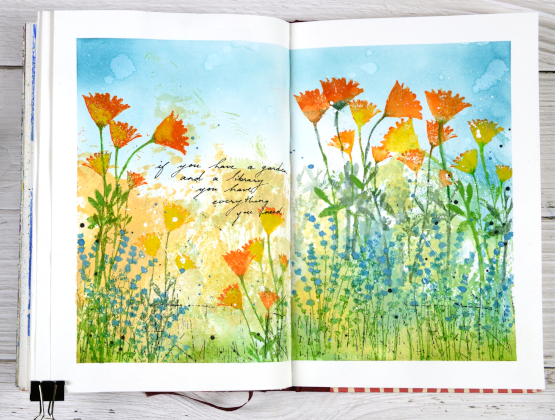
As I said the lower half of the pages is smooshed ink. The upper half is broken china distress inks applied with a blending brush. The flowers are a mix of silhouette stamps from Darkroom Door’s ‘you are everything’ and ‘wildflowers vol 2’ sets. I inked with papertrey ink cubes, spritzed the stamp and stamped on the pages. Sometimes I blended the stamped ink, other times not. To make the blue flowers stand out a bit more I painted blue gouache paint over the stamping. The gouache works well on the journal pages so you will probably see more.
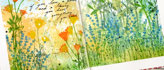
Once all the flowers were added I stamped the DD ‘scratches’ background stamp in black on the lower section of the page and added black and white splatter all over. I added the quote with a black gel pen. If you are in my Floral Faves online class you might this was inspired by one of the projects in lesson 3.
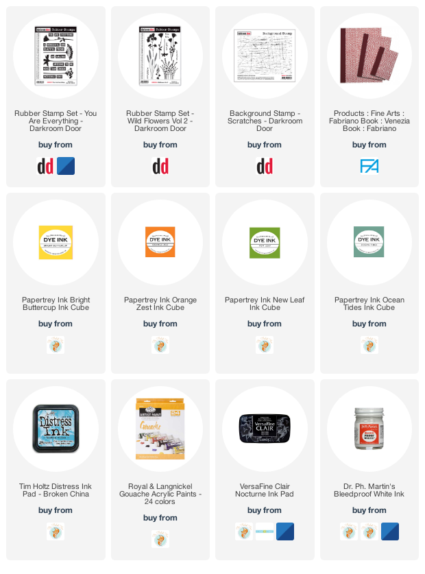
Supplies
(Compensated affiliate links used when possible)
Clover journal page
Posted: February 14, 2020 Filed under: Art Journal, crackle, Darkroom Door, Nature Walk, number medley, Stencils, warm wishes, Wildflowers Vol 2 | Tags: Art Journal, Darkroom Door stamps, Darkroom Door stencils, Ranger Distress inks, Ranger Distress stains, Wendy Vecchi 7 Comments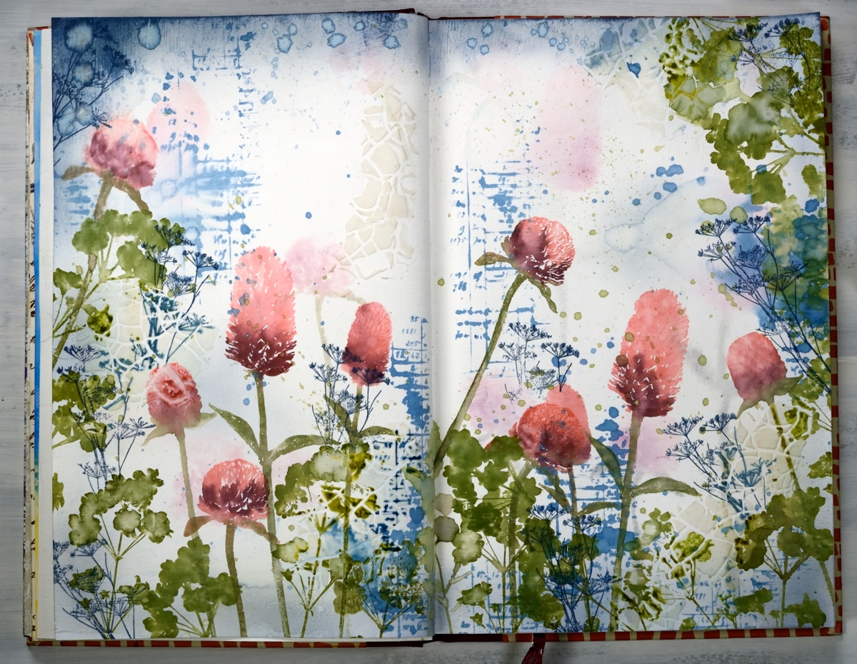
Are you wondering if I’m repeating myself? Didn’t I post this a few days ago? Indeed, I posted something similar on Monday, a card featuring the new ‘warm wishes’ set from Darkroom Door. At the end of the post I mentioned that I’d like to transform the design into a journal page…so I did!
I kept my colour scheme with the addition of more green and added a few extra stamp images and a bit of texture. I used a Fabriano ‘Venezia’ art journal, with drawing paper not watercolour paper. The weight of the paper is decent but if I’m going to be spritzing and adding water and ink I paint a layer of absorbant ground on both pages first.
I began by inking up the clover stamps with worn lipstick, aged mahogany and peeled paint markers, spritzed them so the ink started blending on the stamp then stamped randomly across the pages. I spritzed the images lightly so the ink moved and softened and also dabbed colour and water away with a paper towel. I inked the number/account book stamp from ‘number medley’ set with stormy sky distress stain and stamped it randomly around the pages. After stamping I spritzed the images so the ink spread, diluted and ran across the page. I dabbed some of it dry but left other bits to make watermarks. I also splattered the stain around with a paintbrush. Once the first layer of stamping was dry I switched to stormy sky distress ink and a blending brush to add colour to all the page edges. Also on the dry page I added a bit of texture by applying modeling paste through the DD stencil, ‘crackle’. The crackle was not very obvious but showed up a bit more after I added more stamping.
At this point I considered the background complete and started on the more distinct stamping. As I was working in the journal I couldn’t place it in the MISTI so I placed my ‘staytion’ magnetic board under the left hand page and added some acrylic blocks underneath the board to balance the left side of the journal with the right. I used an acrylic block to stamp all the clover and positioned a stampa-ma-jig against the block a couple of times just in case I didn’t have a complete image. I was able to do touch ups with a paintbrush and extra ink if the stamping was too pale.
I wanted some clover-ish leaves to stamp around the flowers so I grabbed a stamp from the DD ‘wildflowers vol 2’ and stamped foliage all around in peeled paint and forest moss inks. I added some green splatter too because journal pages always need splatter! At this point I was almost finished but I wanted a little more blue on the page. Rather than add more of the number stamp I used a very delicate floral stamp from ‘nature walk’ in faded jeans archival ink so I would have fine detailed lines that wouldn’t blend or blur. To balance mass of colour at the base of the pages I added more blue across the top edges. The blending brush was going to take too long so I swiped the ink pad over the edges and some water droplets also.
My journal is nowhere near full but it has become bulky with uneven pages because some have been glued to each other, others have been collaged. When I started the journal I glued pages together for sturdiness because that was what Vicky Papaioannou did and Vicky is an art journal wizard! She doesn’t always do that any more and neither do I because some of the pages just don’t want to be joined to each other, it makes it difficult to open them or flatten them. If you are an art journaller I would love to know if you prep your pages in some way so they can take a bit of water and liquid ink.
I hope you enjoyed seeing how a card inspired a double page spread; I definitely enjoyed working on the large scale with less pressure to keep things neat and contained!
Supplies
https://linkdeli.com/widget.js?1559654439292
Carved flower sunset
Posted: May 14, 2019 Filed under: carved flowers, carved leaves, circle stencil, diamonds, Wildflowers Vol 2 | Tags: Darkroom Door stamps, distress oxide inks 3 Comments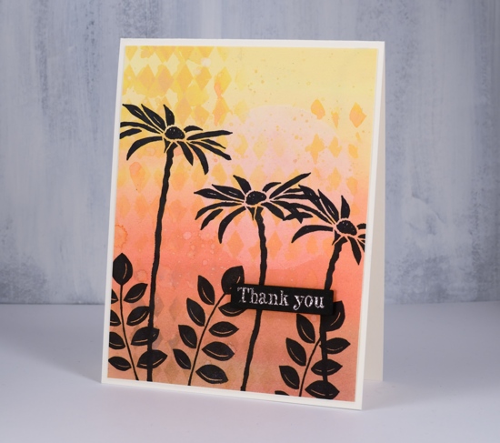
I tried out a few new products yesterday and ended up with these two cards featuring the Darkroom Door carved flower set. I coloured both cards with distress oxide inks. For this first one I smushed the oxide inks on my glass mat, added some water then painted a graduated wash going from yellow to brown. Oxide inks are designed to react with water so the diluted wash I painted on the card had a muted looked to it when it dried. I wanted to add a pale sun and some stenciled diamonds so I used my new ‘Wendy Vecchi Stay-tion’. It is a magnetic surface which is well suited to stenciling. There are four magnets to hold the stencil firmly over the paper while adding a medium through the stencil. I used it first to hold the DD circle stencil over the panel while I diluted the exposed circle with water and dabbed colour away with a paper towel. I then used the magnets and board to hold the diamond stencil while I sponged some oxide ink onto the background. I splattered some water over the panel then stamped the carved flowers and carved leaves in black archival ink.
Instead of painting a wash with diluted oxide ink for the second card I blended oxide inks over the whole panel which I had added a circle mask to before I started. Once again I used the magnets and board to keep the panel in place while I blended the inks and while I dabbed out some colour through the diamond stencil. Even though the two cards look similar the techniques were a bit different; you can see the oxide ink applied with a blending brush is smoother than the painted panel. Oxides really do blend well. I used the make up blending brushes my children gave me for mothers’ day. They are not life changing but they did do a very good job 😉
Once again I stamped carved flowers and wildflowers in jet black archival ink using the misti.
In keeping with the solid black flowers I chose to emboss sentiments on black cardstock in rose gold powder hoping it would look a bit coppery like the sunset. It did. The sentiments are from the DD ‘thank you’ sentiment strip stamped then cut out with the Avery Elle sentiment strip dies and popped up on black foam tape. The black tape is handy when the card base or element needing the tape is black or a dark colour.
It was my first time trying the Wendy Vecchi ‘stay-tion’ and I found it very useful. The magnets held the stencils and paper in place and it cleaned up easily. I am sure I will be using it often.
Don’t forget to check out the ‘Color Trio Challenge’ I am hosting with the Foiled Fox. I would love to see your three colour cards and give you the chance to win a shopping spree at the Foiled Fox store!
Supplies
Brusho sky with wildflowers
Posted: September 4, 2017 Filed under: Brusho, Wildflowers Vol 2 | Tags: Brusho, Darkroom Door stamps 6 Comments
Brusho skies and stazon flowers. I have had fun playing with brusho on photo paper and it is one of the techniques we’ll be using in my upcoming autumn leaves class.
I used warm colours for the panel above then stamped the flowers several times in a burgandy and a yellow ink before framing with co-ordinating cardstock.
My colour scheme for the second card is a bit more dramatic as I played with two primary colours and ended up with the secondary purple for a dramatic sky and black silhouetted flowers.
There are so many ways to colour backgrounds then turn them into cards with some simple foreground florals. If you are looking for a gorgeous way to create a background, check out Kathy Rac’s beautiful underwater background here and get inspired to join in her Daily Marker 30 day coloring challenge.
Supplies
Stamps: Wildflowers vol 2 Thank you (Darkroom Door)
Inks: claret, orange zest, jet blackStazon ink (Tsukineko)
Paper: Neenah solar white, Kirkland glossy photo, burgandy & blue cardstock
Paint: brusho (Colourcraft)
Wildflowers blue
Posted: August 7, 2017 Filed under: Bright Blossoms vol 1&2, Brusho, French Script, Wildflowers Vol 2 | Tags: Brusho, Darkroom Door stamps, Ranger Distress inks, Ranger Distress stains, WOW embossing powders 7 Comments
I have a couple more cards that came out of my session with the Darkroom Door Wildflowers vol 2 stamps recently. I began by making blue watercolour backgrounds with brusho paints on hot pressed watercolour paper. Rather than apply the paint directly to the paper, I sprinkled it on a craft sheet, spritzed, then pressed the paper into the paint. I was able to pick up paint that was almost in crystal form as well as soft blended sections.
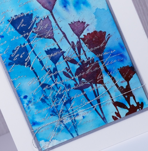
In the Wildflowers vol 2 set there is a large and a small version of the same flower so I used the small stamp on the panel above to create a base of flowers in chipped sapphire and stormy sky distress inks. I shook water droplets onto the panel to create pale watermarks here and there. Once the panel was dry I wiped an anti-static powder pillow across it and embossed the flowers and a sentiment from Bright Blossoms vol 1 in silver over the top of the blue. The silver catches the light depending on the angle but is tricky to capture with the camera.
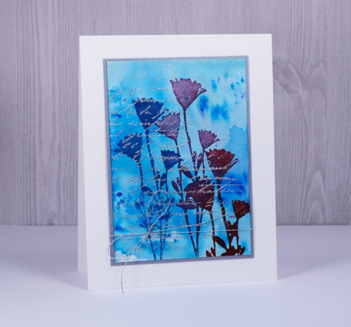
On my second card I created the painted background the same way then stamped the flower three times in different distress stains. Once again I embossed over the top with silver, this time using a partial stamping of the French Script background stamp. I framed both panels in silver cardstock and added silver thread around the second panel before attaching to white card bases.
Supplies
Stamps: Wildflowers vol 2 , French Script, Bright Blossoms vol 1 (Darkroom Door)
Inks: chipped sapphire, stormy sky distress inks & blueprint sketch, seedless preserves, aged mahogany distress stains (Ranger) versamark (Tsukineko)
Paper: Neenah solar white, hot pressed watercolour paper, brushed silver cardstock
Paint: prussian blue, cobalt brusho (Colourcraft)
Also: silver cord, silver embossing powder
Blue sky birthday
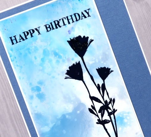
Posted: August 2, 2017 Filed under: Brusho, Wildflowers Vol 2 | Tags: Brusho, Darkroom Door stamps, Tsukineko Stazon inks 9 Comments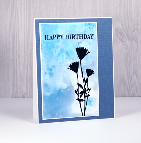
Here is another ‘wildflower’ card from the bunch I made last week. Sometimes it is fun to get out one set of stamps and play around with colours and techniques to create a range of looks. The flower is from the Darkroom Door ‘Wildflowers vol. 2″ set and the sentiment from the DD “Happy Birthday” set. I created this background with brusho paints on glossy photo paper using an impermeable mat. I sprinkled some turquoise and violet brusho on the mat, spritzed it, then swiped the photo paper through the paint to pick up the colour.
I chose a grey ink rather than black to stamp but after the final result after a few impressions looks almost black.
Supplies
Stamps: Wildflowers vol 2 Happy Birthday (Darkroom Door)
Inks: Cloudy Sky Stazon ink (Tsukineko)
Paper: Neenah solar white, Kirkland glossy photo, texture blue cardstock
Paint: violet, turquoise brusho (Colourcraft)


