Autumn lanterns
Posted: October 14, 2020 Filed under: Flower lanterns, fragile branches, Penny Black, Script | Tags: Fabriano Watercolour Paper, Penny Black stamps, Tsukineko Memento inks, Wendy Vecchi 5 Comments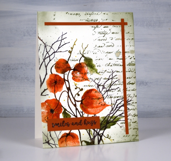
I have some dried Chinese lanterns in the corner of my workroom. They are lasting well, I’ve had them at least seven years, probably longer. A few have broken or fallen off the stems and the colour has faded so they are not the deep orange you see in the image on my card. I used Penny Black’s ‘flower lanterns’, ‘fragile beauty’ and ‘script background’ stamps to create this panel.
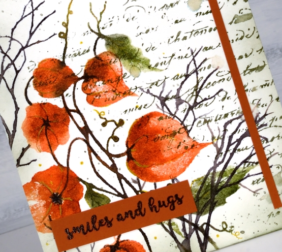
Just to mix things up a bit I pulled out memento inks for this project. There was a time when I used memento inks on every project and they are still within reach of my work table. The ‘Morocco’ browny orange is a beautiful colour so I started with that and used potter’s clay, olive grove, bamboo leaf and espresso truffle, some inkpads, some markers. I was very happy to see the ink pads are juicy as ever.
Memento inks don’t always blend once on the watercolour paper so I blend with a spritz of water to the stamp before stamping. I also smoosh some ink on my mat and pick it up with a brush if I want to add depth to a very specific area. I added some details with a gold gel pen after I had built up the lanterns and leaves with ink.
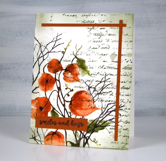
You can see some of my favourite ‘finishing touches’ on this panel: a script stamp, splatter and ink blended edges. I added two strips of co-ordinating cardstock as a half frame then balanced them with the sentiment from PB ‘banner sentiments’.
Supplies
Gel Print Leaves video
Posted: August 28, 2020 Filed under: Darkroom Door, gel press, gelli plate, Nature Walk | Tags: Darkroom Door stamps, gel printing, Wendy Vecchi 18 Comments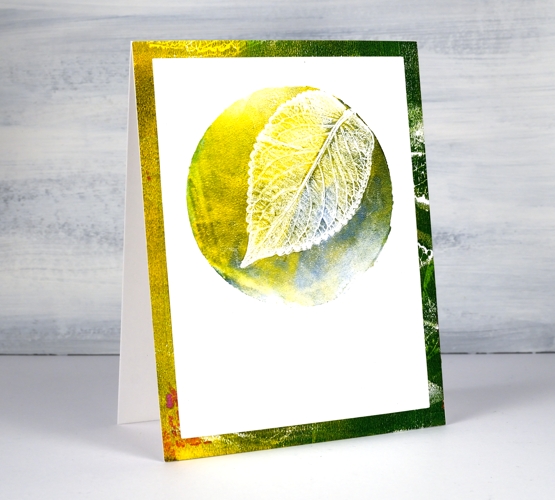
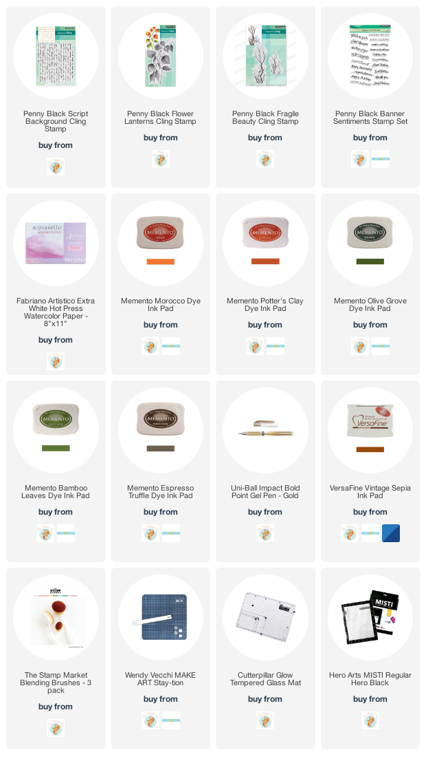
Last week I posted a card featuring gel printed leaves from herbs I grew. I tried to explain my process but a few of you wished for a video so I picked some more leaves and had some fun printing them.
I used two different methods in the video, the leaf printed in yellow at the top of the page uses a two step method. The blue + green leaf above uses three steps and has one technique layered over the other technique.
I think the part of gel printing that gives me most inconsistent results is the way I apply ink. I’m getting better but I still get unwanted lines from the edge of the brayer. That wasn’t so evident on these prints as I was working on little gel plates called ‘petites’ from Gel Press.
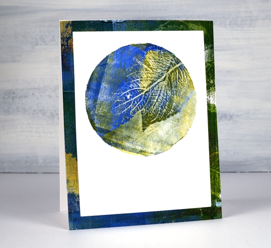
I did a bunch of prints for this video on the square and the circle ‘petite’ plates as shown on the top cards. For the ‘slimline’ card I used three of the square prints but die-cut them smaller so I could fit them side by side on a 8¾” x 3¾” card.
I hope you give this a try, it’s quite satisfying and addicting once you get going!

….And did I mention I now have an online class called COLOUR CLUES?…
Supplies
Clover journal page
Posted: February 14, 2020 Filed under: Art Journal, crackle, Darkroom Door, Nature Walk, number medley, Stencils, warm wishes, Wildflowers Vol 2 | Tags: Art Journal, Darkroom Door stamps, Darkroom Door stencils, Ranger Distress inks, Ranger Distress stains, Wendy Vecchi 7 Comments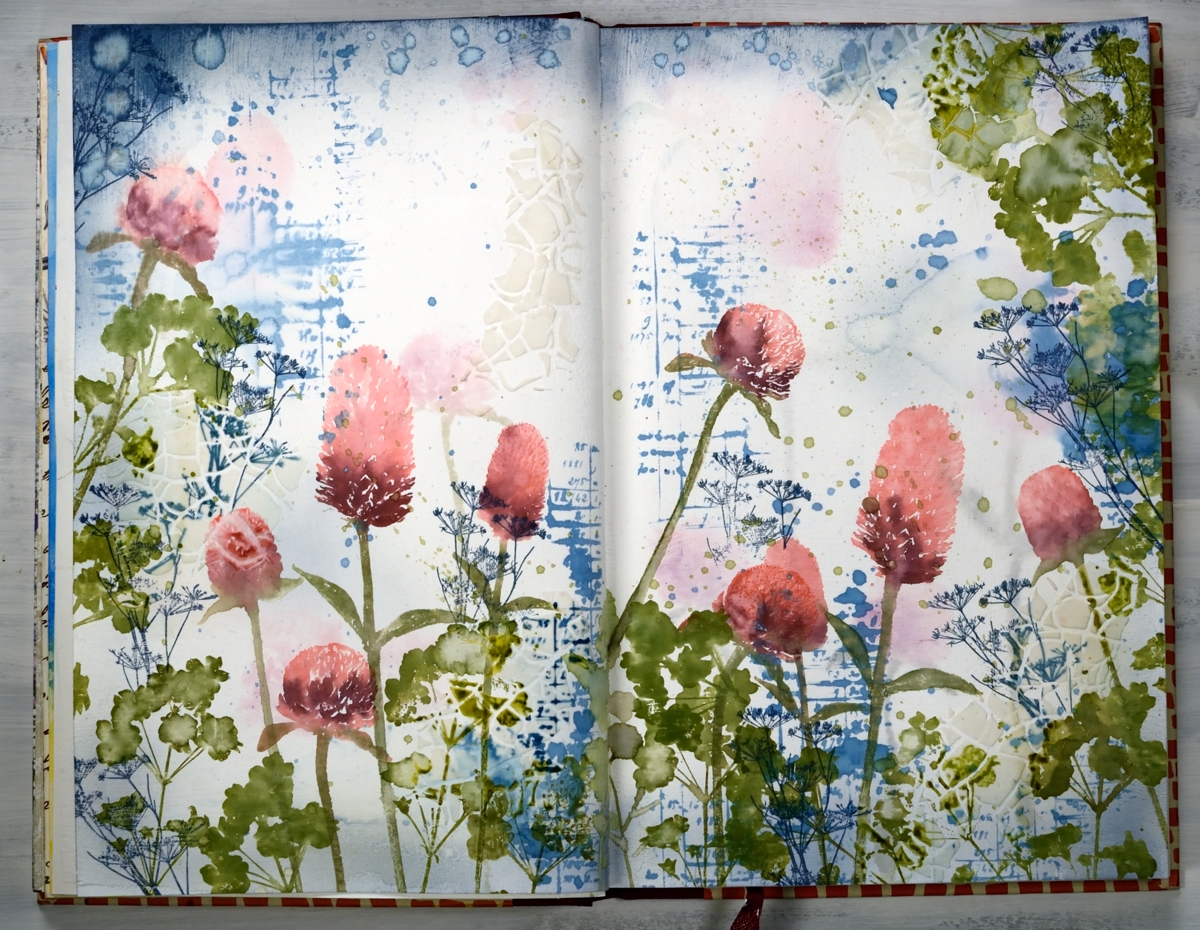
Are you wondering if I’m repeating myself? Didn’t I post this a few days ago? Indeed, I posted something similar on Monday, a card featuring the new ‘warm wishes’ set from Darkroom Door. At the end of the post I mentioned that I’d like to transform the design into a journal page…so I did!
I kept my colour scheme with the addition of more green and added a few extra stamp images and a bit of texture. I used a Fabriano ‘Venezia’ art journal, with drawing paper not watercolour paper. The weight of the paper is decent but if I’m going to be spritzing and adding water and ink I paint a layer of absorbant ground on both pages first.
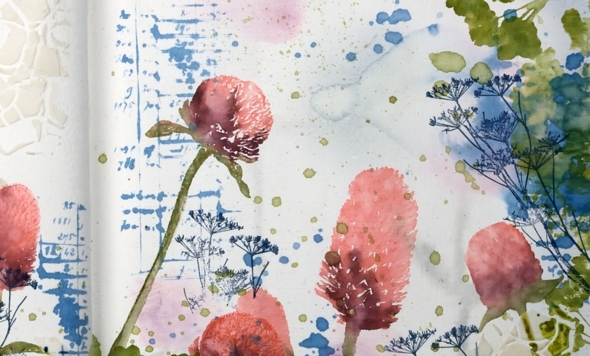
I began by inking up the clover stamps with worn lipstick, aged mahogany and peeled paint markers, spritzed them so the ink started blending on the stamp then stamped randomly across the pages. I spritzed the images lightly so the ink moved and softened and also dabbed colour and water away with a paper towel. I inked the number/account book stamp from ‘number medley’ set with stormy sky distress stain and stamped it randomly around the pages. After stamping I spritzed the images so the ink spread, diluted and ran across the page. I dabbed some of it dry but left other bits to make watermarks. I also splattered the stain around with a paintbrush. Once the first layer of stamping was dry I switched to stormy sky distress ink and a blending brush to add colour to all the page edges. Also on the dry page I added a bit of texture by applying modeling paste through the DD stencil, ‘crackle’. The crackle was not very obvious but showed up a bit more after I added more stamping.
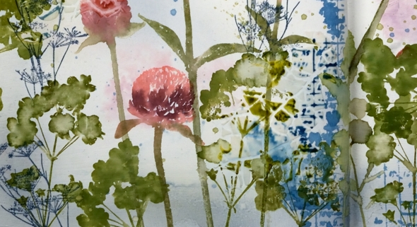
At this point I considered the background complete and started on the more distinct stamping. As I was working in the journal I couldn’t place it in the MISTI so I placed my ‘staytion’ magnetic board under the left hand page and added some acrylic blocks underneath the board to balance the left side of the journal with the right. I used an acrylic block to stamp all the clover and positioned a stampa-ma-jig against the block a couple of times just in case I didn’t have a complete image. I was able to do touch ups with a paintbrush and extra ink if the stamping was too pale.
I wanted some clover-ish leaves to stamp around the flowers so I grabbed a stamp from the DD ‘wildflowers vol 2’ and stamped foliage all around in peeled paint and forest moss inks. I added some green splatter too because journal pages always need splatter! At this point I was almost finished but I wanted a little more blue on the page. Rather than add more of the number stamp I used a very delicate floral stamp from ‘nature walk’ in faded jeans archival ink so I would have fine detailed lines that wouldn’t blend or blur. To balance mass of colour at the base of the pages I added more blue across the top edges. The blending brush was going to take too long so I swiped the ink pad over the edges and some water droplets also.
My journal is nowhere near full but it has become bulky with uneven pages because some have been glued to each other, others have been collaged. When I started the journal I glued pages together for sturdiness because that was what Vicky Papaioannou did and Vicky is an art journal wizard! She doesn’t always do that any more and neither do I because some of the pages just don’t want to be joined to each other, it makes it difficult to open them or flatten them. If you are an art journaller I would love to know if you prep your pages in some way so they can take a bit of water and liquid ink.
I hope you enjoyed seeing how a card inspired a double page spread; I definitely enjoyed working on the large scale with less pressure to keep things neat and contained!
Supplies
https://linkdeli.com/widget.js?1559654439292
Filled in Florals
Posted: July 8, 2019 Filed under: Concord & 9th, filled in florals, simple serif alphabet dies, Wendy Vecchi | Tags: Concord & 9th, Ranger Distress inks, Ranger Distress stains, Wendy Vecchi, WOW embossing powders 3 Comments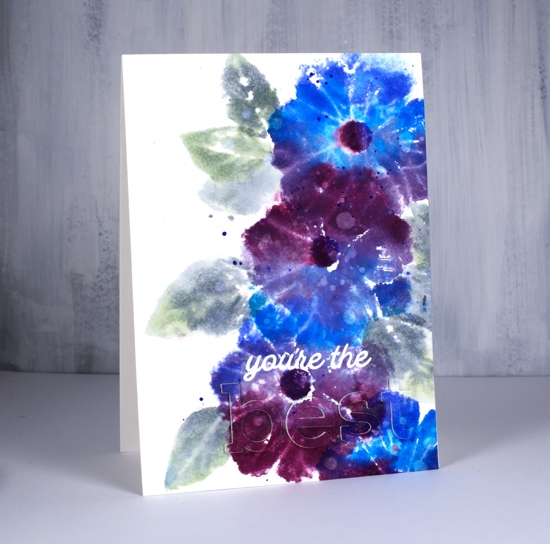
I’m on the Foiled Fox blog today showing off these lovely new stamps and dies from Concord & 9th. The stamps are from the ‘filled in florals‘ set and the dies from the simple serif alphabet set I love the size and shape of these letters and I am able to line them up neatly by using my new magnetic ‘staytion‘ so I won’t need to do the purposely wonky look every time!
I reached for some favourite distress stains to colour the big flower from the set. I used a stamp positioner but acrylic blocks would work fine too as precision is not key for this loose and watery look. As I’m still working with distress stain daubers I swiped the first colour across a third of the stamp, stamped on hot pressed watercolour paper then wiped off the stamp before inking with the next stain in the centre of the flower then repeating the process. I only spritzed the stamp lightly with water before I stamped the last colour on each flower as I didn’t want to flood the design but I did want to make sure the colours did a little blending with each other. I used a mix of blueprint sketch, salty ocean, seedless preserves and dusty concord stains on the flowers switching around the order and combo each time. I stamped the flower centres with blueprint sketch and seedless preserves ink. Is there a more beautiful colour combination than those two stains? I don’t think so!
For the leaves I switched to an acrylic block and inked with bundled sage and iced spruce stains and a little spritz of water to make them soft and dreamy. I dried the whole panel before dropping water here and there all over, letting it sit and soak in then absorbing it with a paper towel to leave all those watermarks on the leaves and petals. Last but not least I added a splat or two in blueprint sketch and bundled sage.
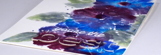
Once all those flowers were done I thought about the sentiment. I know I should consider the sentiment earlier in the process but I rarely do. I didn’t want to cover up too much of the design so I went for the subtle stacked letter die look. I cut the letters b e s t out of the panel and three more of each from blank watercolour paper then stacked them up and attached them on the card. I did some stamp surgery to separate ‘you’re the’ from one of the sentiment stamps in the ‘filled in florals’ set and stamped in versamark ink so I could emboss in white powder. The sentiment is fairly subtle when you look straight on but the recipient will be able to see and feel the texture of the raised letters.
Thank you for dropping in today, make sure you pop on over to the Foiled Fox for some extra details and to check out their lovely blog and store.
Supplies