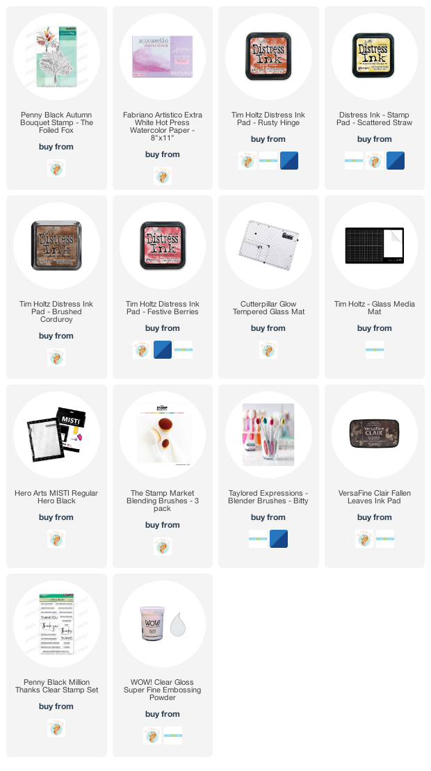
Ransom Alphabet cards
Posted: December 14, 2022 Filed under: Brushed Christmas vol 1&2, Brutus Monroe, Darkroom Door, ransom alphabet | Tags: brutus monroe embossing powder, Darkroom Door stamps, WOW embossing powders 6 Comments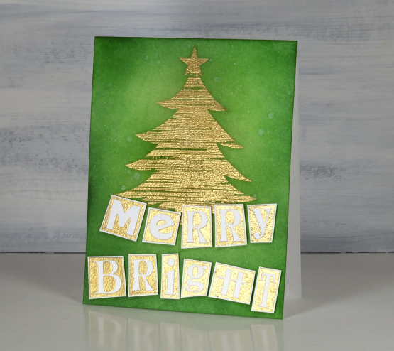
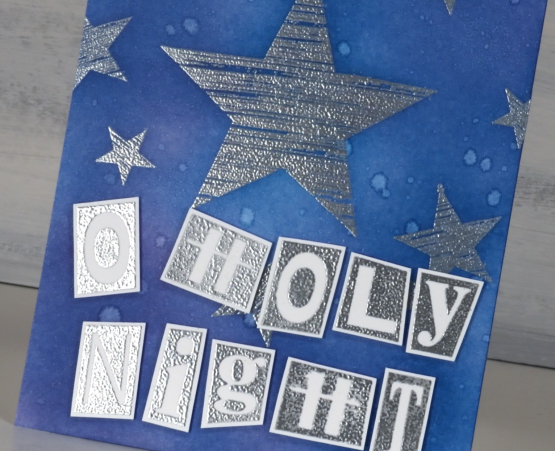
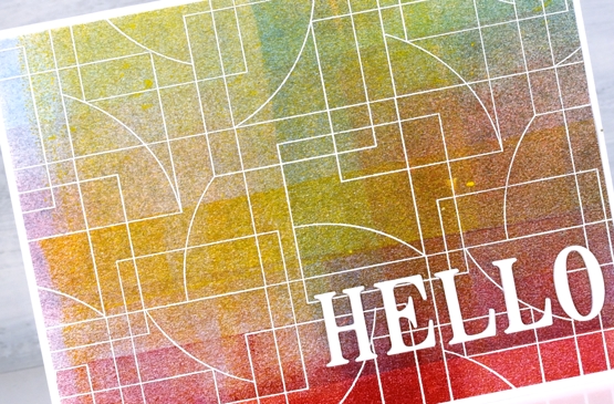
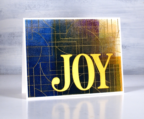
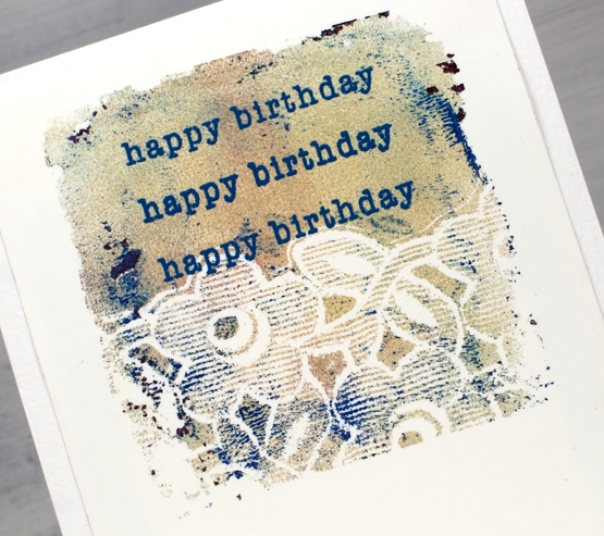
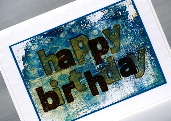
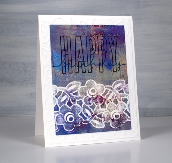
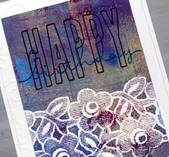
Darkroom Door recently released the ‘ransom alphabet’; it looks like letters cut from random newspapers or magazines. I decided not to cut my stamp into separate letters yet, so stamped it as one large stamp containing both alphabet, a few symbols and numbers 1-10. I embossed one sheet in gold powder and another in silver. I also stamped again on some small strips of cardstock to get the extra letters I needed to complete the greetings.
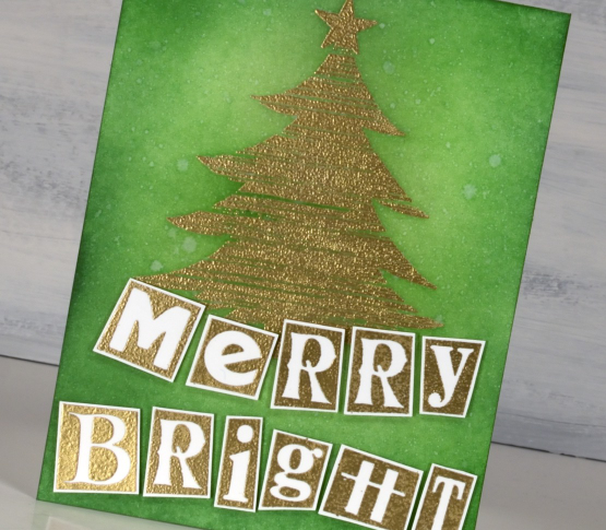
Both cards and alphabets are neenah solar white cardstock. I stamped a tree and star from the Darkroom Door ‘Brushed Christmas vol 1’ set then blended three greens over the card front using blending brushes. I spritzed water over the panel then blotted it with a paper towel to get a twinkly effect. A pearlized spray would have been even better but my workroom is upside down and inside out at present so locating the shimmer spray was asking too much!

I used the same process to create the ‘O Holy Night’ card but used a blue and a purple ink for the blended background. I wondered if the ransom alphabet was perhaps a bit too funsy for such a theme but then I remembered Mark 10:45, ‘the Son of Man came not to be served but to serve, and to give his life as a ransom for many.”
I’m looking forward to putting this set to use in my art journal. I think it might be necessary to cut the rubber stamp into separate letters eventually but for now it is still one large stamp.
Darkroom Door has so much inspiration on their blog. They are currently featuring all the products from their new release one product at a time. So many styles, colour schemes and projects.
(Compensated affiliate links from Foiled Fox, Scrap n Stamp & Ecstasy Crafts)
Blended Autumn Bouquet
Posted: September 30, 2021 Filed under: autumn bouquet, Penny Black, Uncategorized | Tags: Penny Black stamps, Ranger Distress inks, Tsukineko Versafine inks, WOW embossing powders 7 Comments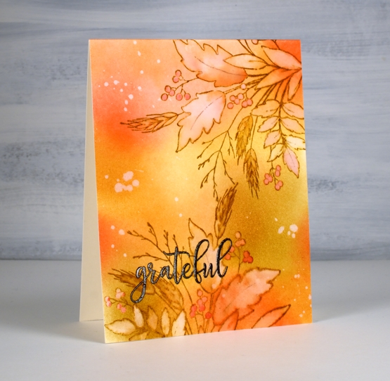
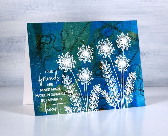
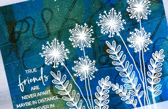
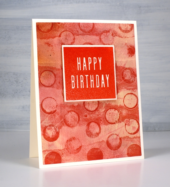
Today’s card is a second look with the Penny Black ‘autumn bouquet’ stamp. I blended distress inks over a panel of hot pressed watercolour paper before doing any stamping. The colours are listed below.
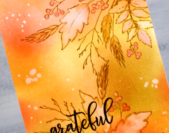
After blending I stamped the autumn bouquet stamp twice on the panel with brushed corduroy distress ink then painted inside all the leaves, berries and wheat stalks with water. As I painted I also dabbed away water leaving the insides of the images lighter than the outside. I picked up some smooshed ink and dropped it back into the round berries and the wheat berries.
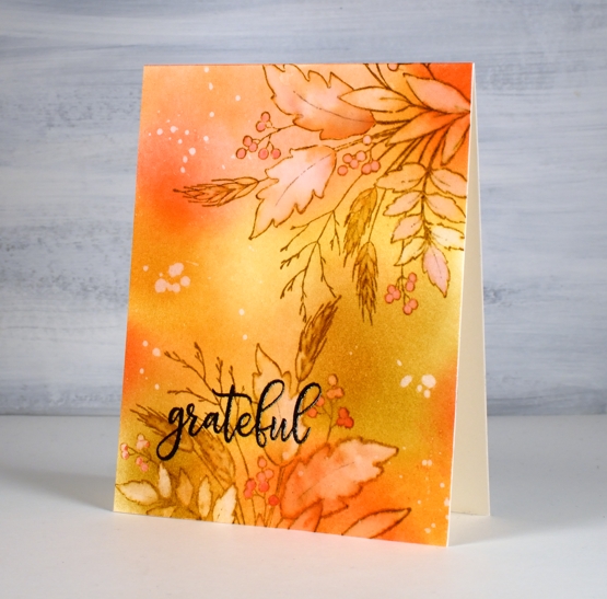
I splattered some water over the panel, let it sit then dabbed it away with paper towel leaving a random pattern of watermarks here and there. The embossed sentiment is from the PB ‘million thanks’ set stamped in fallen leaves versafine clair ink.
Thank you for dropping by. I am indeed grateful for all your support and kindness.
Supplies
(Compensated affiliate links used when possible)
Gel print backgrounds
Posted: June 14, 2021 Filed under: Brutus Monroe, contemporary, gel press, perfumed | Tags: brutus monroe embossing powder, gel press, gel printing, Penny Black creative dies, Penny Black stamps, WOW embossing powders 8 Comments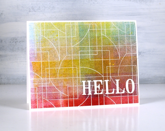
I have had my gel plate out recently and I am addicted. It is what happens when I get it out. Gel printing can be frustrating because some of the prints are a whole lot of nothing much while others are full of pattern, texture and colour. I never know whether the next print will be the former or the latter so I keep on printing. I have a stack of prints sitting around and I decided it was time to cut a few up to make cards. I added some stamping and die-cuts.
This first card is my favourite but I must be honest with you, it isn’t a gel print. It is the scrap paper I cleaned the brayer on! I love how pretty the colours and blends are but I’m a bit miffed that my clean up page was prettier than many of my prints!
To turn it into a card I stamped and embossed the PB ‘contemporary’ stamp in white and added the hello, cut with the PB ‘thanks & hello’
Same deal with this background but embossed with gold and adorned with the PB ‘jumbo joy’ die.

I’m glad to add another card to my very small Christmas card stack. My resolution to add to it every month seems to be a bit off and on.
This background is a recent print and includes a fun thread printing technique I saw on Birgit Koopsen’s instagram. She recently completed a challenge gel printing every day in May. She generously shared all the techniques she tried.
I added flowers from the PB ‘perfumed’ set and a sentiment in white embossing powder.
I guess the title of this post was a bit inaccurate as only one of these cards features a gel print background! Watching beauty emerge when gel printing is so much fun. To glance over at my brayer clean up sheet and realise I have to save it because it looks like a pastel check table cloth is a bonus. To see the pale ghosts of stencils turn up on third or fourth prints also amazes me.
I did not participate in Birgit’s recent challenge as I was busy busy launching the new online Floral Faves class but now the gel plate is out I am challenging myself to post something gel-print related every day this week. See you tomorrow.
Supplies
(Compensated affiliate links used when possible)
Floral notes slim
Posted: March 3, 2021 Filed under: floral notes, Heather lowercase die set, Karin brushmarkers, Pink Fresh studio | Tags: Fabriano Watercolour Paper, Karin brushmarkers, Pink Fresh studio, WOW embossing powders 5 Comments
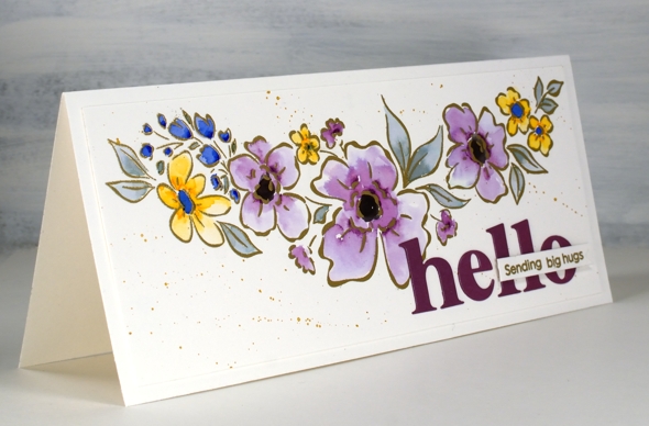
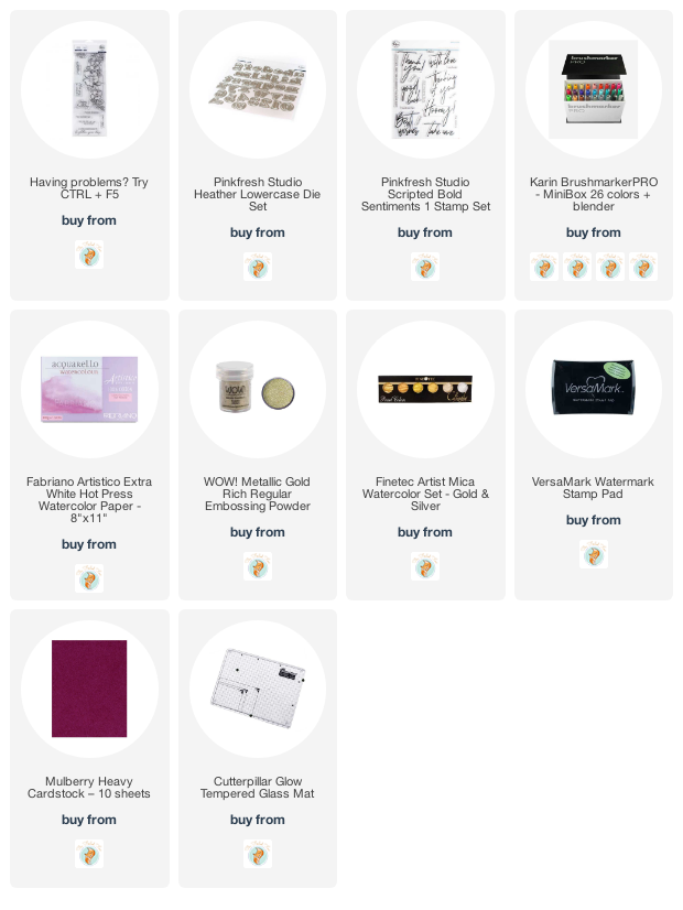
I’ve teamed up with the Foiled Fox again to share this lovely slimline Pinkfresh Studio stamp. The stamp is called ‘floral notes’ and it’s just over 8″ long! The set also includes some sentiments which I will feature another day.
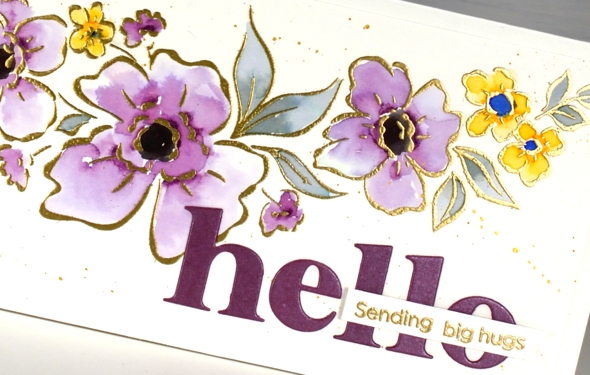
I embossed the floral stamp in gold powder then added colour with dabs of ink from the Karin brushmarkers (I only used royal blue, lilac, gold and black). I say dabs because that is really all it takes to watercolour with the Karin markers. I dab a few dots of ink where I want the colour to be strongest then blend from that point with water to fill the petals or leaves. I was wanting variation in the petals and was happy to achieve it particularly in the large flowers coloured in lilac.
After the colouring was complete I splattered ‘pearl gold’ pearlescent paint from Finetec; it was a close match to the WOW metallic gold embossing powder. For a sentiment I cut ‘hello’ with the Pinkfresh ‘Heather lowercase alphabet dies’ and left the border off so the letters would not be too big then added a blended sentiment using dies from the Pinkfresh ‘scripted bold sentiments’ set.
Previous to making this card I lost the letter ‘t’ die from the alphabet set. It was after cutting the word ‘star’ for another card. As you can imagine this caused me great dismay. Without the ‘t’ there would be only birhdays, bes wishes and merry Chrismasses! I searched high and low and went my workroom garbage and recycling multiple times. Yesterday, after eleven days without it, the ‘t’ was returned to the alphabet. It had fallen into the MFT box in the filing cabinet right between ‘YAY for you’ and ‘painted prints’!
I’ll be using this pretty floral stamp again and not necessarily just on slimline cards. The sentiments from the set are also lovely so keep an eye out for them. Don’t forget to visit the Foiled Fox blog today for more details including measurements.
Supplies
(Compensated affiliate links used when possible)
A Day at a Time journal page
Posted: January 20, 2021 Filed under: alphabet medley, Art Journal, book spines, Darkroom Door, diamonds, handwritten script, plaid, pocket watch, sheet music, teacups, Woodgrain | Tags: Darkroom Door stamps, Darkroom Door stencils, Ranger Distress inks, Ranger Distress stains, WOW embossing powders 7 Comments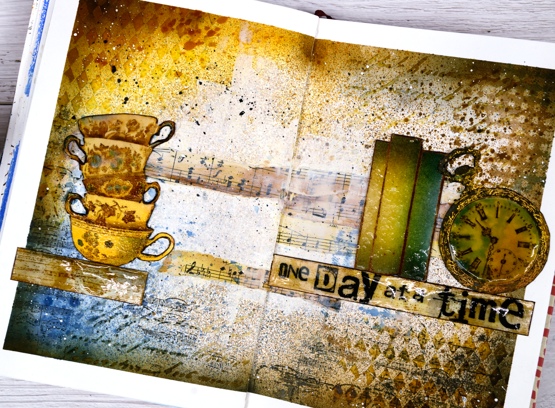
This page is in one of my Fabriano art journals. I’ve mentioned before that I have a love/hate relationship with these journals as the pages are not really meant for watercolour and I always want to do watercolour. I can’t bear to quit though because there are quite a few completed pages in the journals and I want to get to the end.
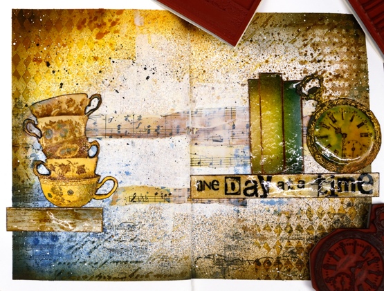
I began this spread with some inspiration pages open on my Pinterest ‘journal‘ board but no real plan; I was after a look but didn’t have a theme. I rarely use my distress stain sprays as sprays; I usually paint with them but this time I taped the edges of the pages then put the book in my recycle paper box and sprayed with vintage photo, faded jeans and wild honey spray stains. I then sprayed some water but as I mentioned, this paper doesn’t act like watercolour paper so the stains didn’t blend and move.
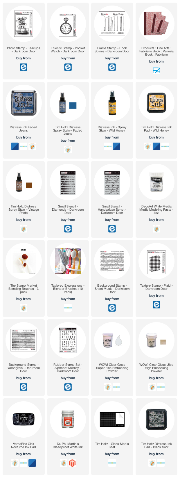
Next I added some texture with modelling paste through the Darkroom Door diamonds & handwritten script stencils. Once that dried I blended round the edges of the pages with faded jeans, vintage photo, wild honey and black soot distress inks which highlighted the added texture. I was happy with my chosen colours but still didn’t know what the focus should be. I coloured some strips of sheet music and added Darkroom Door ‘plaid’ and ‘sheet music’ stamping here and there.

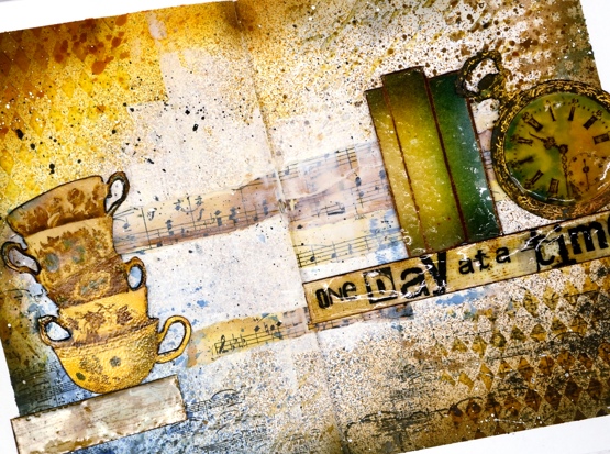
Initially I wanted to use the pocket watch and the teacups so I stamped them in vintage photo and swiped them through diluted inks to pick up colour as well as adding colour with a paint brush. Once they were painted and cut out I clear embossed the clock face three times with high gloss embossing powder to look like glass and used normal clear embossing powder for the cups.
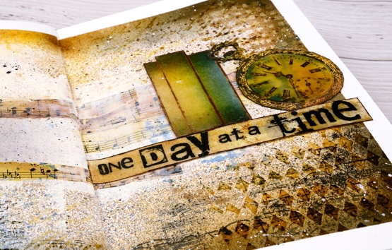
To brighten up the centre of the double page I ended up spreading white absorbent ground over the strips of sheet music and out towards the edges. Then began the longish process of turning the page into a composition. After much rearranging I realised that the tower of teacups and the pocket watch need a third element so I tried a floral piece then just a single shelf (stamped with DD woodgrain background stamp) and finally realised the ‘book spines’ stamp would probably work again. Honestly I’m not trying to put that stamp in every single journal page. Even with the books it still took a while to balance the layout and come up with some words. I finally decided on ‘one day at a time’ stamped on the shelf with the DD alphabet medley stamps. As Vicky Papaioannou often does on her amazing art journal pages, I finished with both black and white splatter then removed the masking tape before gluing down my elements.

It’s nothing like my initial inspiration photos on Pinterest but it did give me some good practice at adding texture and layers to my art journal, two things I don’t find easy. I only have one of my art journal pages on youtube as there is so much humming and ha-ing as I work out what I want. If I cut out the pondering parts is an art journal page process something you’d like to see in a video?
Supplies
(Compensated affiliate links used when possible)
Woolly Wishes
Posted: January 18, 2021 Filed under: A2 layers, Additional A2 layers, Darkroom Door, Karin brushmarkers, knitting, Penny Black, Waffle Flower | Tags: Darkroom Door stamps, Karin brushmarkers, Penny Black creative dies, Tsukineko Memento inks, WOW embossing powders 6 Comments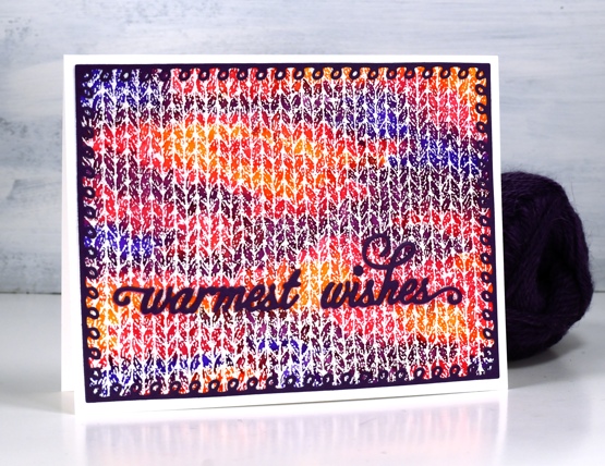
This is the first knitting project I have done in years! I keep meaning to pull out some needles and wool to see if it hurts my hands to knit. I have a little stash of wool and plenty of different sized needles and I used to knit while watching tv. My last project was never finished then my hands became quite sore so I haven’t tried again.
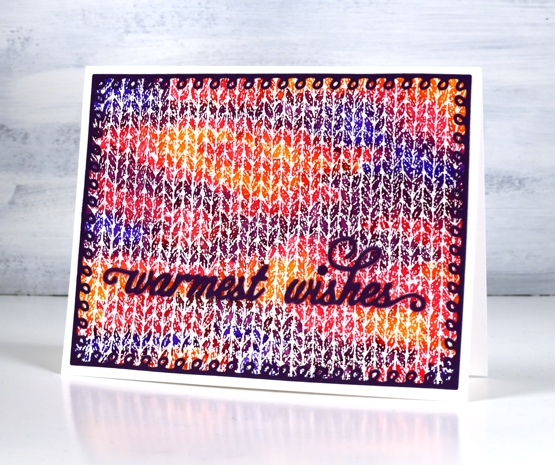
When I first saw this Darkroom Door knitting stamp I couldn’t believe how realistic it looked when stamped and coloured. I stamped with versamark and embossed in clear powder on hot pressed watercolour paper for both cards. On the panel above I used Karin brushmarkers (amber, lilac, violet blue, magenta) to colour random shapes over the panel just like you get when you knit multicoloured yarn. I spritzed lighlly over the panel with water to get the colours to blend just a little.
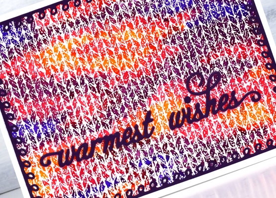
I knew just the dies to use to complete the card. Penny Black has a set of looped frame dies which look a little like knitting stitches and the PB warmest wishes die is made of small curly letters that look like loops of wool. I cut both from purple cardstock with double sided adhesive on the back.
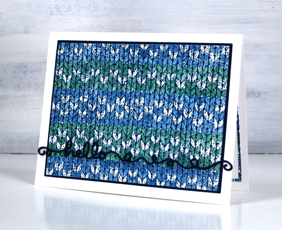
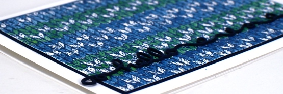
The second card features a simple pattern painted over the embossing with nautical blue and cottage ivy memento inks smooshed on my glass mat. I wanted to do a fancy snowflake pattern but decided I should start with something simple. Just as well as I missed a whole line of the pattern I was trying to do. This time I matted the panel with dark blue cardstock and stacked three layers of the ‘hello’ from the Penny Black ‘doodles’ die set which also looks a bit like yarn.
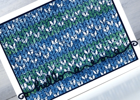
I had to make the knitting panel smaller to fit on the matching piece of blue cardstock so I re-cut it with the WaffleFlower A2 layer dies and saved the slim outline to glue inside the card. I will definitely be playing with the DD knitting stamp again because I want to colour a fancy fairisle type pattern. It will also show up in a small role on a card coming up later in the month.
I am happy to be back blogging again after my short break; I’ve missed chatting with you. I wish I could say I achieved all my planning and preparation goals but that is far from the truth. I think maybe my expectations were set a bit too high! Today’s cards feature the knitting stamp that had been sitting waiting patiently for some ink for months. I could have continued to stamp and play this image for days but I limited myself to one day so I could move onto other things. Is your year off to a good start, have you had some creative time already?
Supplies
(Compensated affiliate links used when possible)
Blue Dragon
Posted: October 13, 2020 Filed under: Dragon, Finetec paints, Pink Ink Designs | Tags: Ranger Distress inks, WOW embossing powders 6 Comments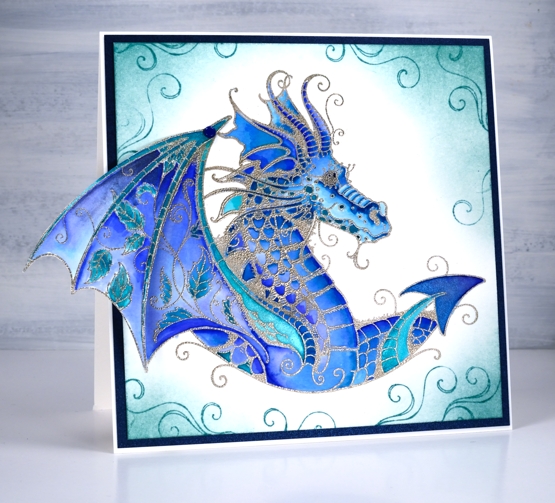
I’ve had this Pink Ink Designs dragon stamp for a quite a while and even started a couple of watercoloured panels with it but I was inspired to finally complete a card for an eight year old I know.
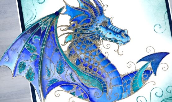
I did the stamping and embossing ages ago so I can’t remember if it is platinum or silver embossing powder. I used a mix of watercolour markers and finetec shimmer paint to colour the dragon then some distress ink to add shading and swirls to the edges. The wing is made from two stamps, the main body of the dragon plus an extra extension of wing. I have attached the extension with a little blue brad so it can fold in when the card fits goes in an envelope. I framed the design with a piece of dark blue metallic cardstock I bought from Crop A While along with matching envelopes.
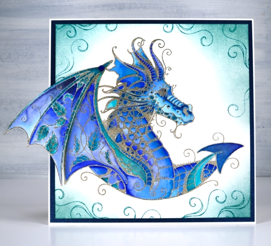
I first saw this stamp at Crop A While, my local scrapbooking store and fell in love with it straight away. I remember my friend and store owner, Carole being quite surprised that I would even take a second glance at a dragon stamp and then from the same brand, a sea turtle stamp. I admit it is a bit out of character for me. The initial appeal of this dragon stamp set was to make an art journal page with it. It hasn’t happened yet but the design has been simmering in my mind for a while now.
Crop A While has an online store, curbside pick up and in-store shopping available right now and the owners, Tom and Carole are happy to help you with orders, just phone or email them.
Supplies
All the Birthdays
Posted: October 7, 2020 Filed under: A2 layers, Additional A2 layers, all the birthdays, CAS, Concord & 9th, nesting squares, Waffle Flower | Tags: Concord & 9th, gel press, gel printing, Ranger archival inks, ranger embossing powders, Tsukineko Versafine inks, Waffle Flower dies, WOW embossing powders 4 Comments
I made a short stack of birthday cards yesterday with a new Concord & 9th set, ‘All the Birthdays’. I pulled out several prints from earlier gel printing sessions and chose some which would work as panels for birthday cards.
On the card above I used ranger blue embossing powder and the card below versafine tulip red was the perfect match for my printed background.
Some were printed using the petite set A gel presses so they were already shaped as squares. Others I cut from larger prints. I used stencils and lace to make the prints and a range of acrylic paints.
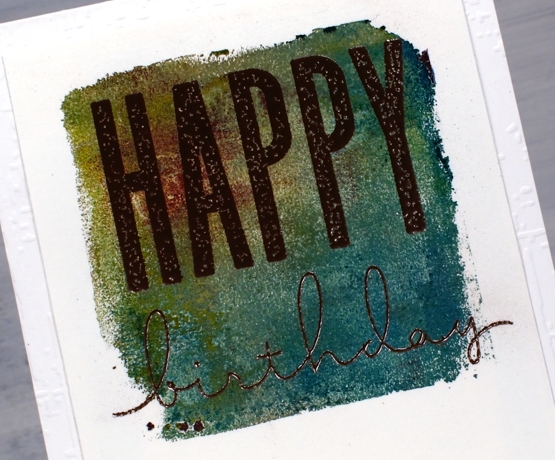
One of the stamp combinations from the C&9 ‘all the birthdays’ is a pair of stamps that overlap to spell ‘happy birthday’; there are outline stamps that frame the solid letters also. That is what I used on the card below with gold and brown inks then clear embossing powder.
I also added some texture to a few of the card bases or mats with embossing folders and stencils.
The printed panel below included such pretty blues and purples I wanted to match them in the sentiment so I stamped with archival dusty concord and faded jeans then, before the ink dried embossed in clear powder.
The card below features rose gold embossing powder; it looks a little darker than expected on this panel, maybe because of the depth of colour in the print.
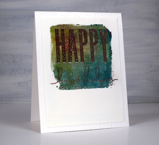
I really enjoyed pairing sentiments from the C&9 set with my leftover gel prints. I did have some embossing challenges though; I’m just not an embossing champion. Stray powder, over heating, underheating, even when I use a powder tool and preheat the heat tool I still make mistakes. This lot took me all afternoon but I am very happy with them and I’m pleased to have boosted my birthday card stash. Now if I can just remember to send them…
Supplies
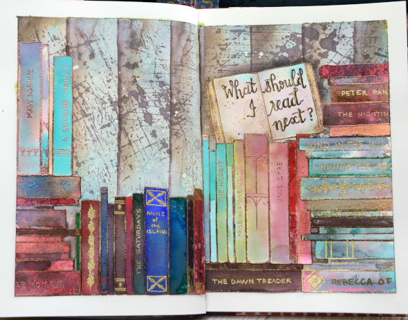
What should I read next?
Posted: October 1, 2020 Filed under: Art Journal, book spines, Darkroom Door, mini open book, scratches | Tags: Art Journal, brutus monroe embossing powder, Darkroom Door stamps, Fabriano art journal, Ranger Distress inks, Ranger Distress stains, WOW embossing powders 21 Comments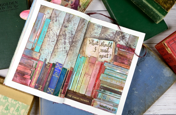
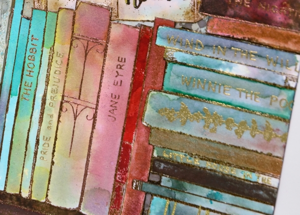
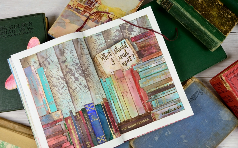
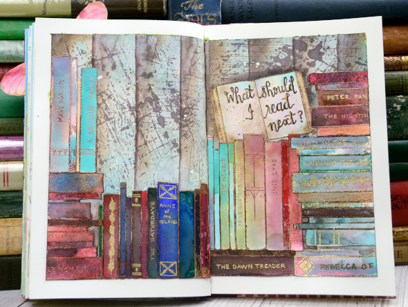
This book themed page has been in my mind for quite a while and that little open book stamp on the right side of the spread pushed me to make it happen. All the stamps are from Darkroom Door; I used ‘mini open book’ once, ‘book spines’ several times and the ‘scratches’ background stamp for the wall behind the books.
I have three art journals on the go and this one has a literary theme. I’ve done pages inspired by books and others inspired by quotes. I have a few started but not finished and several in my head.
I taped the edges of the double page spread before doing anything; it really helps keep the book open and stable while I work, it protects the other pages from paint and ink and I think it frames the finished design really nicely.
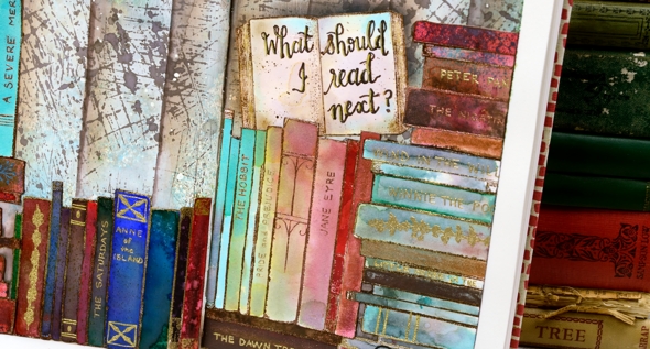
I embossed all the books on hot pressed watercolour paper in either gold or copper powder then coloured them with markers, distress stains and distress inks smooshed on my glass mat. I really just played with techniques until I had a good selection of colours and patterns. I stuck to jewel tones featuring dark green, bright blue, red and aqua. I’ve listed all the distress inks below. I also painted over the inking on a few books with Coliro pearlescent paints so they have a bit of shimmer.
I painted the background with ‘absorbant ground’ as I usually do when I want to work with liquid inks and water then I smooshed some ‘peacock feathers and ground espresso inks on a piece of acetate, spritzed it and dragged it across the page multiple times. That gave me some abstract colour but not enough so I used distress stain sprays in the same colours. After it dried I stamped the scratches background stamp a few times in ground espresso stain. When that dried I used a piece of tape to mask edges to sponge vertical lines across the pages.
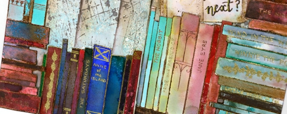
Arranging the books on the page took a little while. I cut them all out first then cut some of the groups into smaller groups to play with the layout. Once I had it settled I glued them down and started adding titles and decoration with gel pens, embossing pens and embossing powder. I wrote quite a few of my favourites on the spines, nothing particularly new even though I have read some great new books lately. I guess they just haven’t stood my test of time yet. I have some empty spines left that I will probably fill another day.
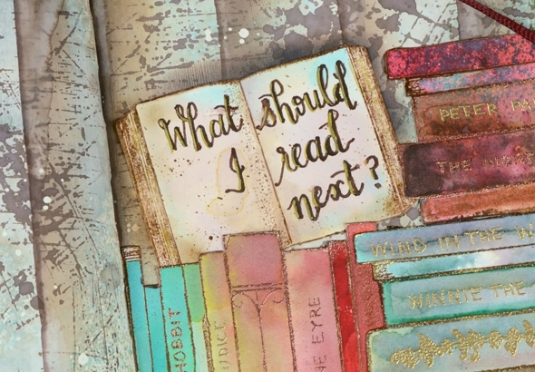
I finished by balancing that open book on one of the piles and added the name of my favourite podcast, ‘What Should I Read Next?’ I get a large chunk of my book recommendations from Anne Bogel, the host of WSIRN. I could talk about books for several more paragraphs but if you’ve made it this far you’re a champion so I’ll save the book chat for another book themed project. I think there will be a spin off card from this journal page.
Oh, and one more thing, please feel free to leave book recommendations in the comments; I’d love to hear your favourites.
Supplies
Poppy birthdays
Posted: February 25, 2020 Filed under: little lowercase letters, My Favorite Things, phrase builder you, Pink Fresh studio, poppy background, YAY for you | Tags: Fabriano Watercolour Paper, grafix, My Favorite Things, Pink Fresh studio, Ranger Distress inks, WOW embossing powders 5 Comments
When I pulled out the MFT ‘poppies background’ stamp my intention was to do some loose watercolour with splashes and dabs here and there. As you can see I didn’t manage that; I stayed inside the lines. It was not a fiddly job though, painting this panel. I was surprised at how quickly I was able to get it done. I put the stamp in the stamp positioner along with a piece of cold pressed watercolour paper. Using the papertrey ink cubes I was able to ink the flowers in ‘scarlet jewel’ and the buds, stems and pods in ‘ripe avocado’. If the inks ended up on the wrong section I either wiped it off or let it be because a little green in the flowers or red in the stems doesn’t matter.
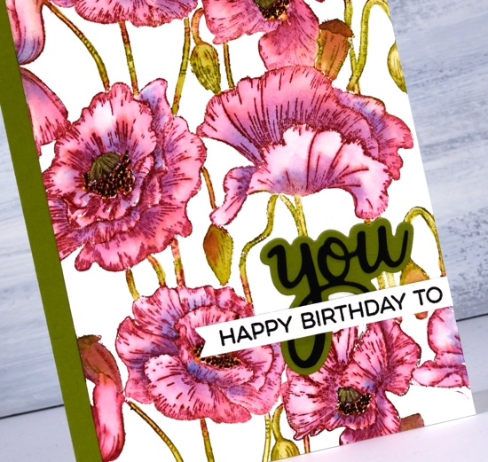
I blended one petal at a time which sounds time consuming but they are large petals so it wasn’t bad. As I finished blending the ink into one petal I picked up a little bit of ‘blueberry sky’ ink and dropped it into the wet petal at the inner edge. When I came to the poppy centres I got mixed up and did the centres black and the surrounding dots in yellow so to fix it I went over the yellow with little black dots then went over the black center with a gold gel pen to turn it yellowish! Adding a sentiment took me an age, not because it was too fiddly but because I couldn’t decide how to arrange it and my embossing game was definitely off. I ended up with ‘you’ from Pink Fresh ‘phrase builder: you’ set overlaid with a sentiment from MFT ‘YAY for you’ set.
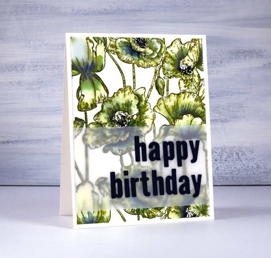
The second panel definitely involved more slap dash watercolouring but I still managed to stay inside the lines. I stamped the whole image in distress peeled paint which blends very easily with water. As I wanted some depth of colour in the centres of the flowers I smooshed faded jeans and chipped sapphire distress inks on my glass mat and picked up ink to paint shadows on the petals. I inked up the centres of the poppies with a chipped sapphire marker then chose a dark blue (not black) cardstock to die-cut the letters for the sentiment.
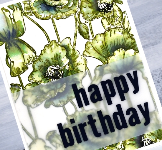
The die-cut letters got a little lost when placed straight on the busy background panel so I attached them to a piece of vellum first. To line them up I perfectly magnets held the vellum in place on my Wendy Vecchi magnetic board and, because it was vellum I was able to see a whole grid of lines to get them straight vertically and horizontally. I was pretty happy with this arrangement and might just have to do all my sentiments on vellum to experience the same satisfaction! I put ‘stick it’ adhesive on the back of the dark blue cardstock before I cut the letters so I would not have to deal with glue or tiny bits of tape for each letter. That would not have given me any satisfaction at all!
Even though green poppies are a bit of an oddity I think that one ended up being my favourite.
In other news make sure you pop over to the Penny Black blog to enter their giveaway; you have until March 1. I will be sharing plenty of new PB product in the weeks to come.
Supplies