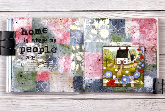
Home is… journal page
Posted: June 17, 2022 Filed under: alphabet medley, Art Journal, Darkroom Door, gel press, polka dot stencil, remington lowercase alphabet | Tags: Art Journal, Darkroom Door stamps, Darkroom Door stencils, gel press, gel printing 5 Comments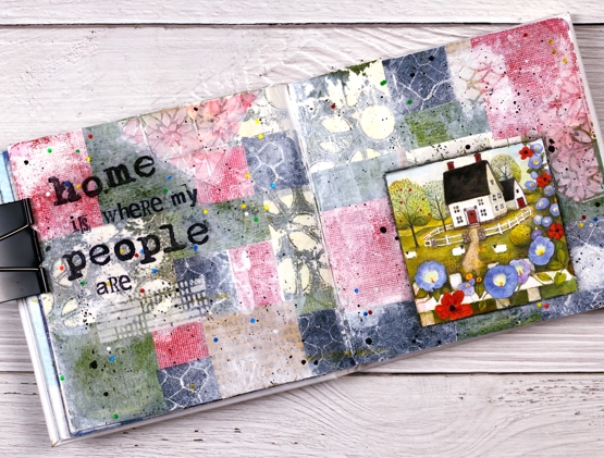
The shenanigans continue in my Art Journal Adventures workshops. Last month the theme was collage & texture and the range of pages was amazing. We all chose different papers, colours and focal images but followed a similar method to put them together.
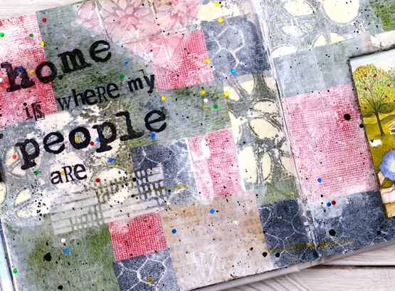
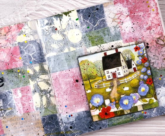
For this spread I relied heavily on my growing collection of gel prints. The little cottage picture is from a greeting card and I used it as a starting point when settling on colours. All the papers you can see are gel prints I made except for one kraft scrap down the bottom with text stamped on it. I added gesso as well as texture using modeling paste through the Ciao Bella patchwork stencil.
During each session of the class it was definitely a treat to walk around and be inspired by the ideas coming to life on all the pages. Some participants had their own stash of gel prints to draw from, others used some of mine. It was fun to see my prints pop up on other people’s pages. I loved it!
This week we are working on Tea and Coffee themed pages and next month it will be texture & movement. If you are close by and haven’t tried gel printing, I’m teaching another introductory class on July 9.
The sweet cottage with sheep at the gate looks nothing like my house! I do grow morning glory but that is about the only similarity. Home is definitely where my people are which means I have two homes very far apart. Although very much at home in Canada I claim Australia as home too, how could I not, some of my favourite people are there!
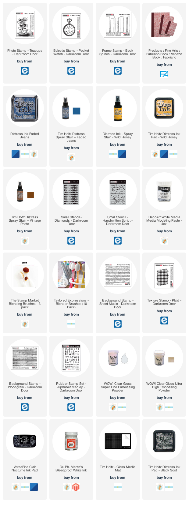
Supplies
(Compensated affiliate links used when possible)
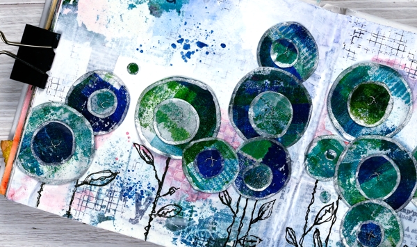
Circle Flowers journal page
Posted: March 25, 2022 Filed under: abstract flowers, alphabet medley, Art Journal, checkered, Classes, Darkroom Door, gel press, Hand drawn, mesh, Stencils | Tags: Art Journal, Classes, Darkroom Door stamps, Darkroom Door stencils, gel press, gel printing, Mixed Media, Penny Black creative dies 8 Comments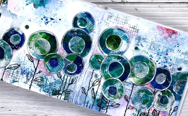
Last week I spent several happy hours gel printing. One of the prints I completed has ended all over this art journal spread. If you are a gel printer you know you can sometimes pull a couple of prints of the same design. The first one is full of colour and pattern and the second is often called a ghost print as it displays outlines and left over bits of paint.

For this journal page I used both the bold blue and green print and the ghost print. The ghost print can be seen on the top left and bottom right corners and is peeping out in a couple of other places. The first print which was very geometrical has been turned into circle flowers. It also had traces of a new stencil called ‘pods’. You will see more of it here on the blog because it is fabulous!
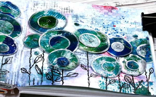
Also in the background you might see some black ink stamping (DD mesh and alphabet medley) and the texture of paste through the DD ‘checkered stencil. The text you see is a fabric tape with dictionary definitions of happiness; it is the first 49 & Market product I have bought and it is going to be handy!
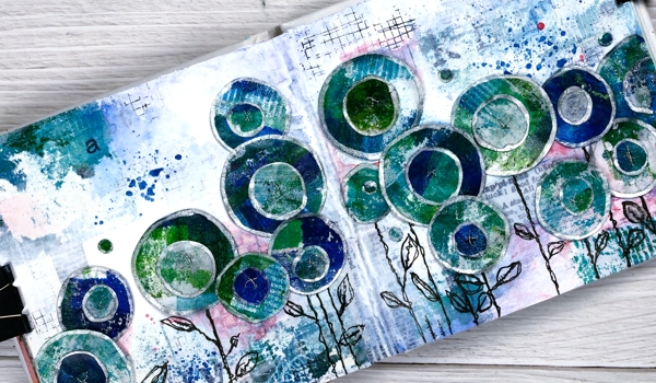
There is plenty of white gesso over the background to pull it together and mute some of the bold elements.
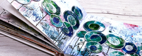
The flowers are all cut with Penny Black ‘abstract flowers’ dies which basically cut slightly wonky circles so I could have cut them myself but why bother when the machine will do it. The print was on rice paper so I could cut a few layers at once. After drawing an edge on each circle with a silver paint pen I stuck a small circle on a larger one, then sewed a cross in the centre with silver thread. There are stems in the set of dies but I doodled mine with a black marker. The blue splatters and pops of pink are from inktense pencils which are coming in handy for art journalling.
I know that was a lot of photos and chit chat but that is the way with some art journal pages especially the collage ones which involve different papers, paints, stencils, and mediums. I probably haven’t mentioned everything I used but if you are still here now I’m sure you’ve heard enough!
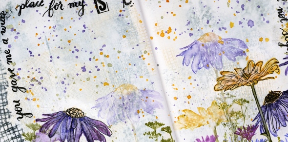
If you are in Ottawa and feel like doing a little art journalling of your own, there are still spaces left in my next Art Journal Adventure workshop where we will be creating a watercolour green and leafy spread similar to what you see below. All the details are on the Crop A While website.
Supplies
(Compensated affiliate links used when possible)
Crossword
Posted: April 20, 2021 Filed under: alphabet medley, crossword, Darkroom Door, Gazette, gel press, Nature Walk, torn text, you are everything | Tags: Darkroom Door stamps, gel printing, Ranger Distress inks, Tsukineko Versafine inks 4 Comments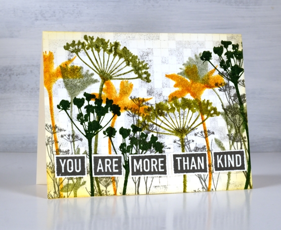
Darkroom Door added four new background stamps to their line up recently and I’ve shown you ‘handwoven‘ and ‘daisy delight‘ in previous posts. Today I have three very different cards featuring the ‘crossword’ background stamp.
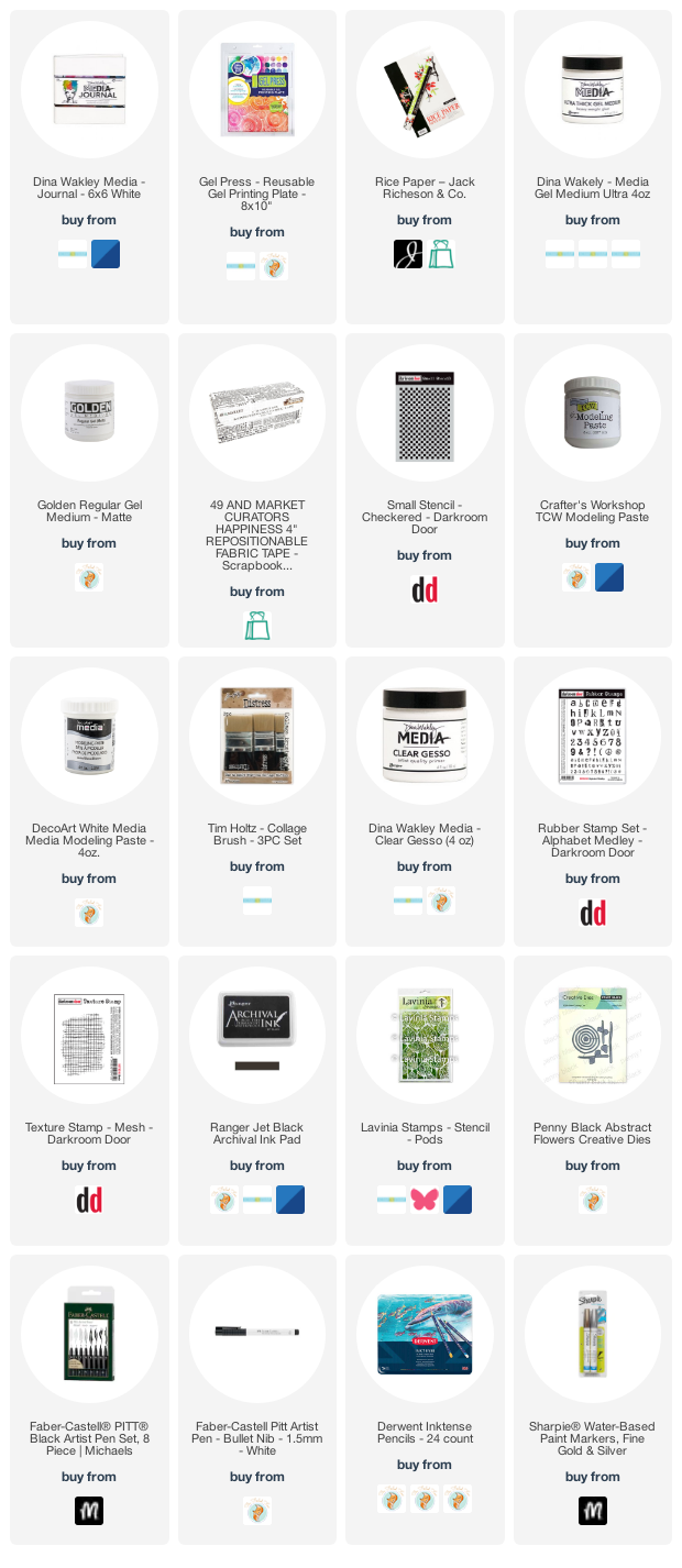
On this first floral card I have used the crossword stamp as a background. I stamped it on scrap first with versafine clair morning mist ink then on a panel of watercolour paper to get a pale grey image adding interest behind the silhouette flowers stamped in different distress inks. I used the same grey ink to stamp words from the ‘you are everything’ set to pop up along the bottom of the panel.
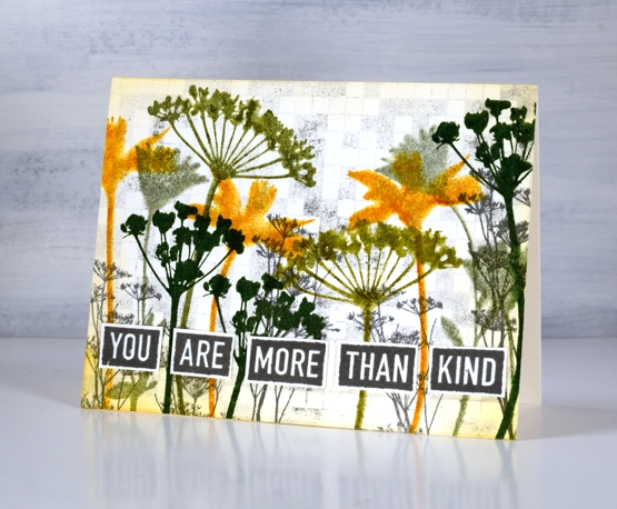
In this second card the stamp functions as both a background and a crossword (of sorts). Although the stamped image is a solvable crossword which comes with printed clues in the packet I have populated it with coffee themed words to work on my coffee themed card. I feel like coffee and the crossword is not an uncommon past time. I stamped the background with fallen leaves versafine clair ink and stamped the sentiment and coffee cup in the same ink on a gel printed panel. I added some blending and ink splatter in both brown and gold before popping up the coffee and sentiment over some gold cord.
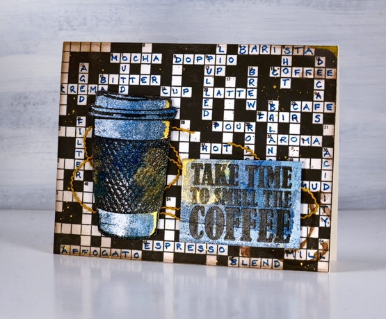
Although it took some time to stamp the background and foreground images the hardest part of the coffee card was definitely finding and arranging coffee themed words in the crossword!
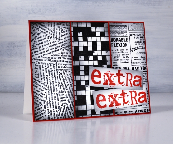
My last card reminds me of the riddle, “what is black and white and red all over?” A newspaper!
Get it?
“Read all over!”
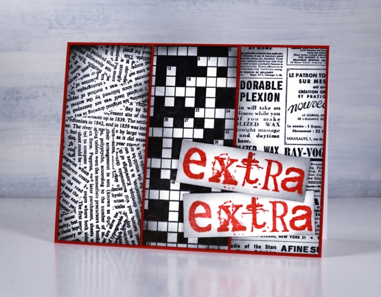
On both the second and third cards I used bristol cardstock for sharper stamped images as I wasn’t adding any water or waterbased inks. I stamped a strip of three different DD background stamps, blended the edges and attached them to a red panel then used the ‘alphabet medley’ set to stamp the words in versafine satin red ink. I’m thinking I can use this card for any exciting occasion and stamp another sentiment inside which is more specific.
Supplies
(Compensated affiliate links used when possible)
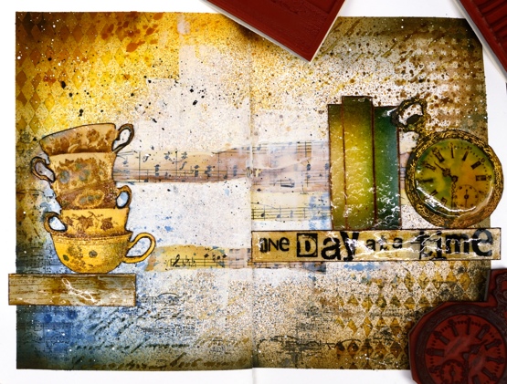
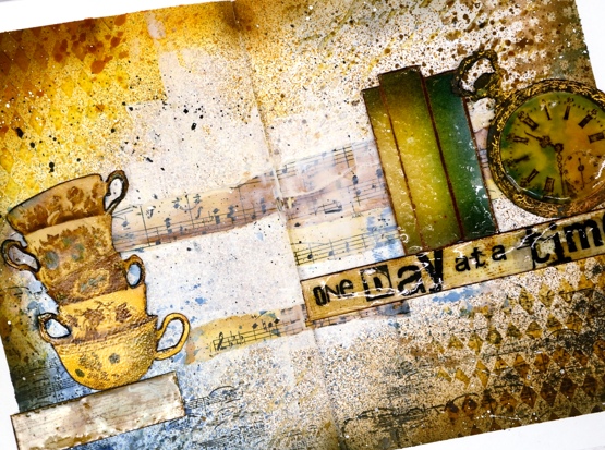
A Day at a Time journal page
Posted: January 20, 2021 Filed under: alphabet medley, Art Journal, book spines, Darkroom Door, diamonds, handwritten script, plaid, pocket watch, sheet music, teacups, Woodgrain | Tags: Darkroom Door stamps, Darkroom Door stencils, Ranger Distress inks, Ranger Distress stains, WOW embossing powders 7 Comments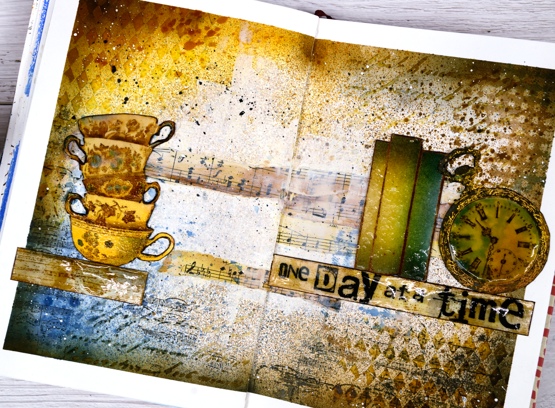
This page is in one of my Fabriano art journals. I’ve mentioned before that I have a love/hate relationship with these journals as the pages are not really meant for watercolour and I always want to do watercolour. I can’t bear to quit though because there are quite a few completed pages in the journals and I want to get to the end.
I began this spread with some inspiration pages open on my Pinterest ‘journal‘ board but no real plan; I was after a look but didn’t have a theme. I rarely use my distress stain sprays as sprays; I usually paint with them but this time I taped the edges of the pages then put the book in my recycle paper box and sprayed with vintage photo, faded jeans and wild honey spray stains. I then sprayed some water but as I mentioned, this paper doesn’t act like watercolour paper so the stains didn’t blend and move.
Next I added some texture with modelling paste through the Darkroom Door diamonds & handwritten script stencils. Once that dried I blended round the edges of the pages with faded jeans, vintage photo, wild honey and black soot distress inks which highlighted the added texture. I was happy with my chosen colours but still didn’t know what the focus should be. I coloured some strips of sheet music and added Darkroom Door ‘plaid’ and ‘sheet music’ stamping here and there.

Initially I wanted to use the pocket watch and the teacups so I stamped them in vintage photo and swiped them through diluted inks to pick up colour as well as adding colour with a paint brush. Once they were painted and cut out I clear embossed the clock face three times with high gloss embossing powder to look like glass and used normal clear embossing powder for the cups.
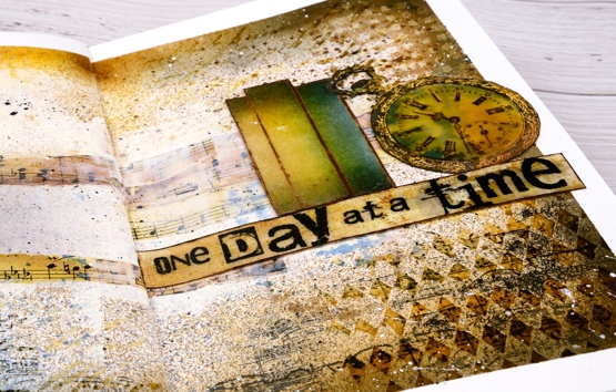
To brighten up the centre of the double page I ended up spreading white absorbent ground over the strips of sheet music and out towards the edges. Then began the longish process of turning the page into a composition. After much rearranging I realised that the tower of teacups and the pocket watch need a third element so I tried a floral piece then just a single shelf (stamped with DD woodgrain background stamp) and finally realised the ‘book spines’ stamp would probably work again. Honestly I’m not trying to put that stamp in every single journal page. Even with the books it still took a while to balance the layout and come up with some words. I finally decided on ‘one day at a time’ stamped on the shelf with the DD alphabet medley stamps. As Vicky Papaioannou often does on her amazing art journal pages, I finished with both black and white splatter then removed the masking tape before gluing down my elements.

It’s nothing like my initial inspiration photos on Pinterest but it did give me some good practice at adding texture and layers to my art journal, two things I don’t find easy. I only have one of my art journal pages on youtube as there is so much humming and ha-ing as I work out what I want. If I cut out the pondering parts is an art journal page process something you’d like to see in a video?
Supplies
(Compensated affiliate links used when possible)
Classic motorcycle
Posted: April 13, 2020 Filed under: alphabet medley, brick wall, classic cars vol 1, classic motorcycles, Darkroom Door, number medley | Tags: Darkroom Door stamps, distress oxide inks 13 Comments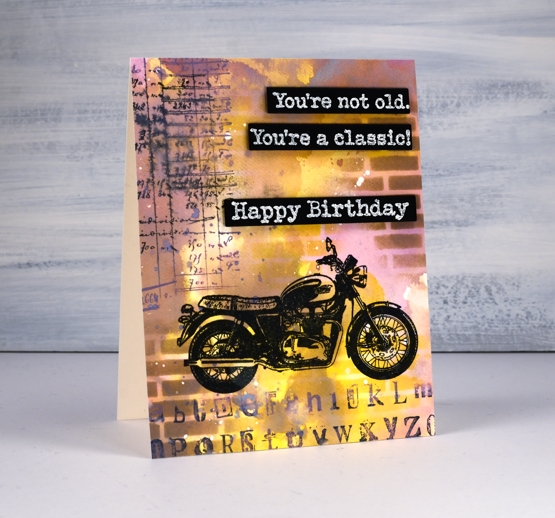
Recently I posted a classic car card and both my brother and father responded that it was time for a classic motorcycle card. It is my dad’s birthday tomorrow so here is a motorcycle themed birthday card. Unfortunately it won’t arrive in his mail box anytime soon but we will chat via the interwebs. Happy Birthday, Dad!
To create the card I pulled out the distress oxide inks; I haven’t used them lately and had forgotten the cool effects I can get when I layer them. I started by smooshing three colours on my glass mat then spritzing them with water. The three inks were dusty concord, frayed burlap and fossilized amber. The dusty concord looks more pink than purple when it’s wet, the amber gives a nice bright pop of colour and the burlap is a neutral that works with both. Before I swiped my watercolour panel through the spritzed ink I had splattered some masking fluid on it and let that dry. The little white spots here and there on the finished card are the results of using masking fluid before adding any ink. I know they are a subtle effect but I like the contrast of a few white spots.
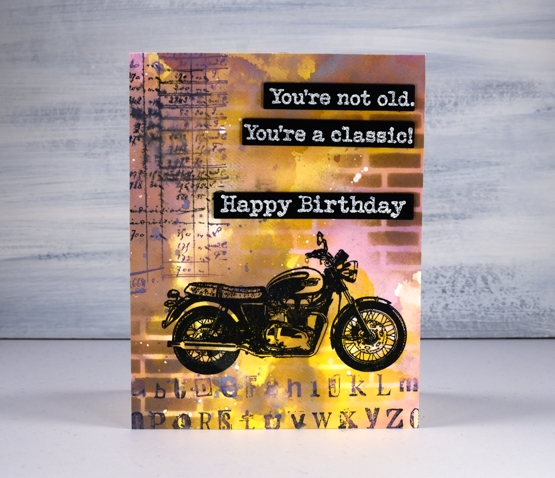
I ended up swiping the panel through the inks several times, letting it dry between swipes so the colours would layer rather than turn to mud. Once all the layering was finished I used the new Darkroom Door small brick wall stencil to blend some bricks over the panel with frayed burlap and fossilized amber inks. I stamped the motorcycle from DD ‘classic motorcycles’ set in versafine clair nocturne then added some collage numbers and letters using stamps from DD ‘alphabet medley’ and ‘number medley’ sets in black soot and dusty concord oxide ink.
I stamped and embossed sentiments from both ‘happy birthday’ and ‘classic cars vol 1’ and die cut them so I could pop them up down the side of the card. The embossing powder is Ranger ‘weathered wood’ to fit with the slightly grungy style of the card.
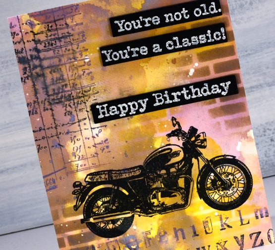
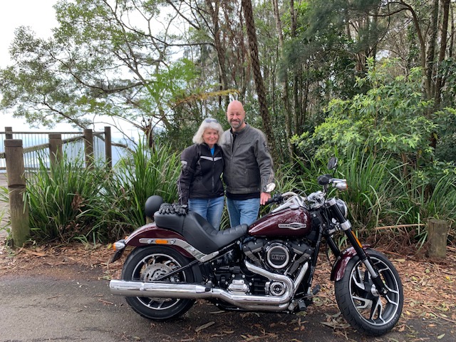
I have no idea what kind of motorcycle this is but maybe my brother can fill me in on that. About six months ago he became a Harley owner; that’s him and his lovely wife out for their first ride on the new bike. It is certainly not his first bike so maybe he will recognise some distinctive feature of the one on my card.
Thank you for getting in touch on my last post about online church and hope at this time of isolation. I am happy to hear it was an encouragement to so many of you.
Supplies
Steps journal page
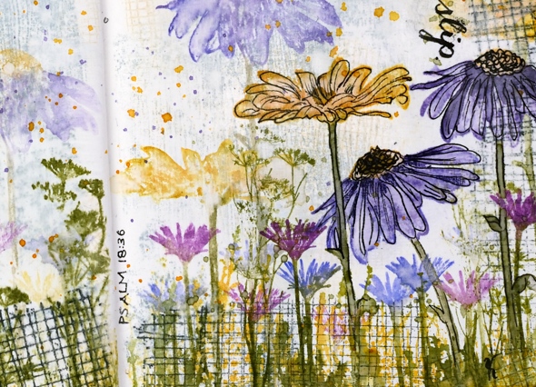
Posted: March 7, 2019 Filed under: alphabet medley, Art Journal, Darkroom Door, mesh, Nature Walk, stone, tall flowers, Woodgrain | Tags: Art Journal, Darkroom Door stamps, distress oxide inks, Ranger Distress inks 5 Comments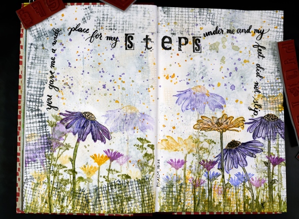
Are you a wee bit surprised to see a journal page here? I’m surprised myself, surprised but pleased. I really enjoyed dreaming it up and making it. It didn’t end up looking as I imagined but that is the way with journal pages is it not?
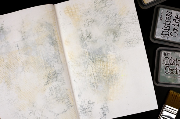
This art journal is a Fabriano journal; the paper is nice and thick but not watercolour paper so I painted over it with absorbent ground first. Then I grabbed a bunch of stamps from Darkroom Door along with three light coloured oxide inks and stamped mesh, stone and woodgrain texture stamps over the background. I spritzed it with water to soften the edges of the stamped images and dabbed some out too to make it subtler. Even after adding some water it was still bolder than I wanted so I painted another thin layer of absorbent ground over it.
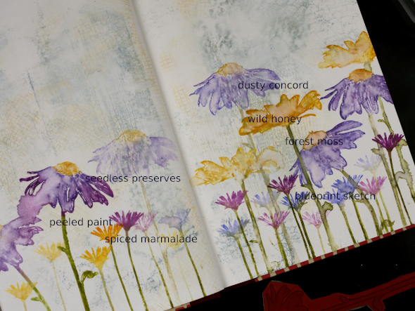
I filled the bottom of the page with repeat stampings of flowers from the Darkroom Door ‘tall flowers‘ set in distress inks then blended some of the big flowers with water. They don’t blend as well as they do on watercolour paper but the effect is still nice.
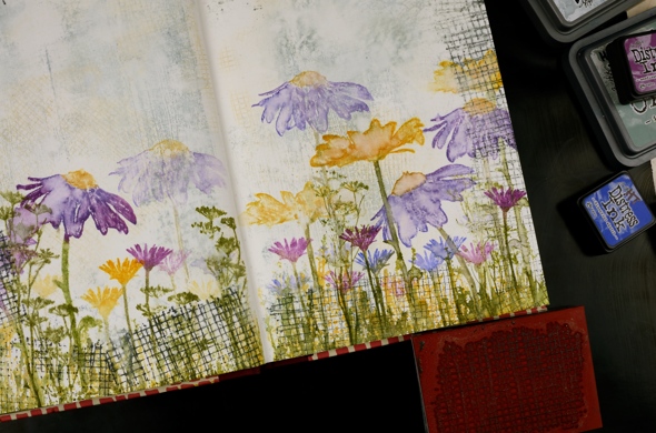
I added grass and flowers from the DD ‘ nature walk‘ set, also in distress ink then a border with the mesh texture stamp in black soot oxide ink. It was a bit bolder than I wanted so I spritzed then dabbed with a paper towel ( as you can see I’m a fan of the ‘spritz and dab’ ). I splattered wild honey, forest moss and dusty concord diluted ink over the whole spread and it ended up looking like confetti. To boost a few of the flowers I outlined them with fine tipped black markers.
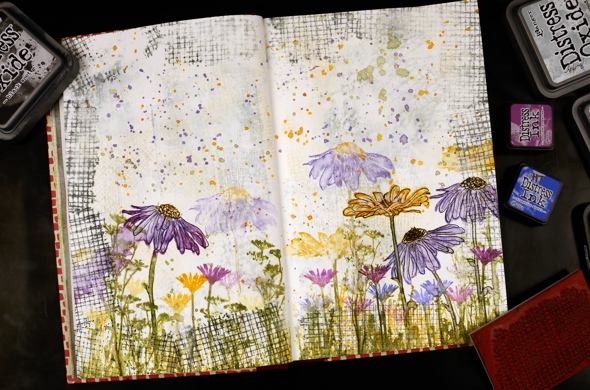
I wrote psalm 18:36 with a brush pen leaving a space to stamp the word ‘steps’ with the DD alphabet medley stamps. I find choosing words for a journal page tricky, which words and how to add them. But the beauty of a journal page is the experimental nature of it. If I don’t like something on this page, I’ll try something different on another. Once the ink had dried I sealed the large flowers and the lettering with distress micro glaze.
Do you have any art journallers you would recommend for inspiration? I already follow Rachel Greig from Darkroom Door, Julie Fei-Fan Balzer, Vicky Papaioannou and Maremi SmallArt who all have different styles and inspiring journal pages.
I’m hoping to create in my journals more often and will share pages here if possible. Even if you are not an art journal person the designs can usually be converted to a card and sometimes start out as cards anyway!
Art Supplies (all Darkroom Door stamps are linked in description)