Gardens on gel prints
Posted: August 2, 2022 Filed under: Darkroom Door, fine flowers vol 2, gel press, mesh, Nature Walk, Wildflowers Vol 2 | Tags: Darkroom Door stamps, gel press, gel printing 7 Comments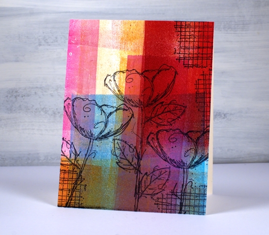
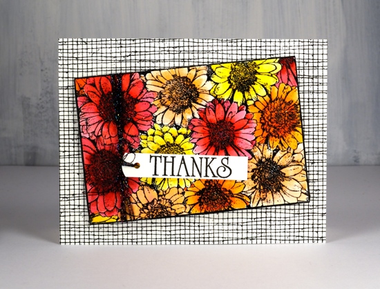
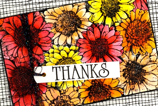
Another gel print post? Yes indeed, and no apologies. If you have tried gel printing you will know it is a little addictive. Today’s post features cards stamped with Darkroom Door flowers. Some are stamped on clean up sheets, others on gel prints. A clean up sheet is thick drawing paper I keep at the right of my gel plate for rolling excess ink off my brayer. As you can see in the panels above and below I can end up with some very colourful sheets.
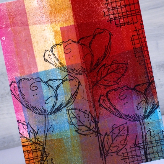
I stamped flowers from the DD set’ ‘fine flowers vol 2” and the ‘mesh’ texture stamp in Ciao Bella Oceania ink. The ink is a pigment ink which stamps beautifully on gel prints and dries quickly so I don’t end up smudging it.
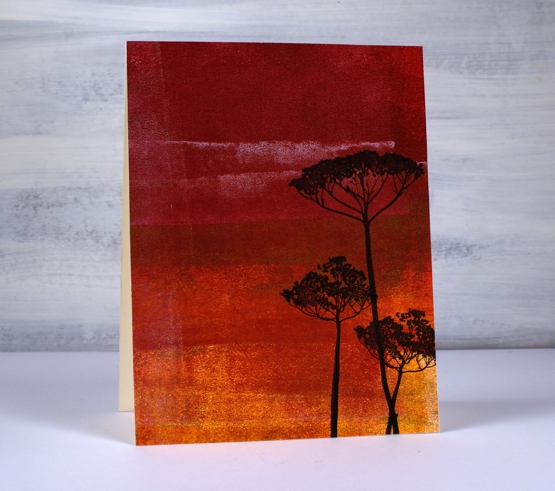
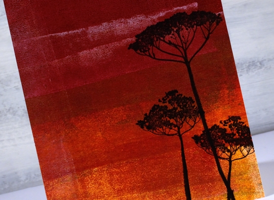
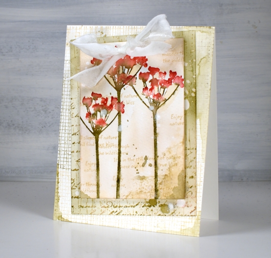
This deep red background is also a clean up panel. I am always excited to see landscapes or skies appear in an abstract print or clean up sheet. Those two strips of white added a hint of clouds to a very bold sunset! I stamped the silhouette flowers from the DD set, wildflowers vol 2.
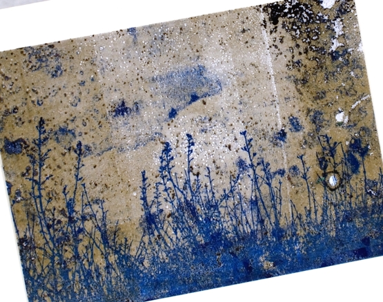
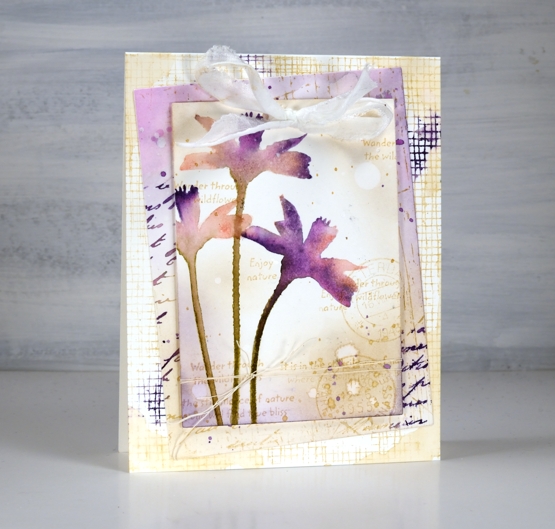
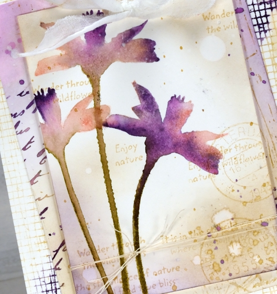
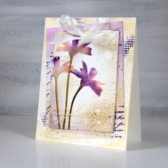
The last two cards are made from gel printed panels not clean up sheets but are very distressed. The print I pulled and cut up to make a couple of garden cards include plenty of distressed texture from a printing session including a little bit of text.
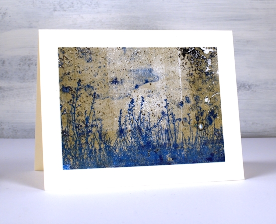
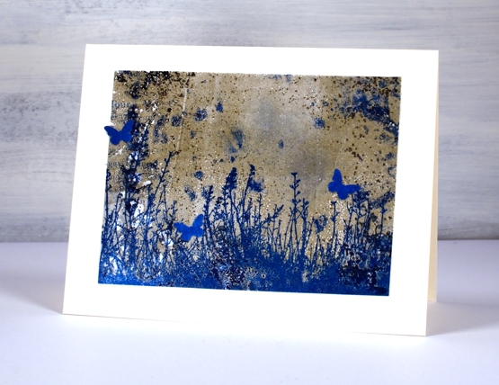
There was some blue in the print so I chose a co-ordinating ink to add the large grassy stamp from the DD ‘nature walk’ set. I’ve said it before it is a favourite set which I reach for again and again. I think I used versafine clair paradise ink.
I was crafting with a friend when I made these two cards and she had a tiny butterfly punch so the card below features a few co-ordinating butterflies. I haven’t seen many butterflies in my garden this year but there have been plenty of bees in the day and fireflies at night.
None of these cards have sentiments on them at this stage, I like to have blank cards on hand to use for any occasion. Thanks for dropping by today; I know it’s been quiet around here lately. I plan to be back soon with more projects and inspiration.
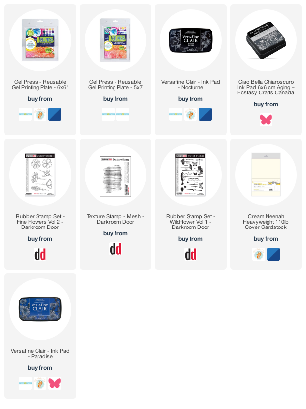
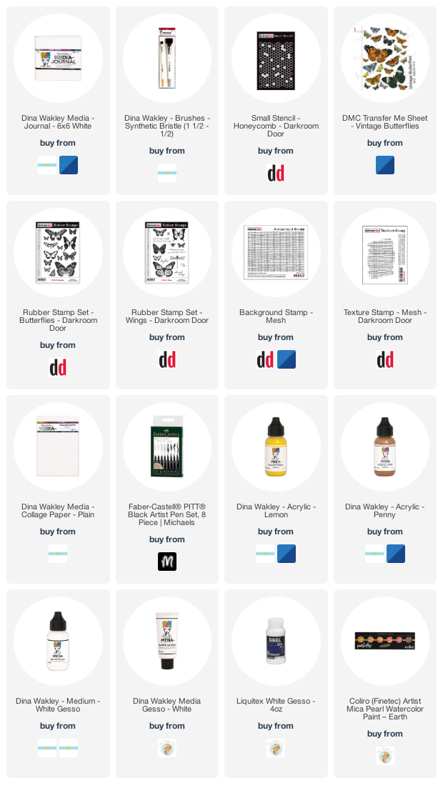
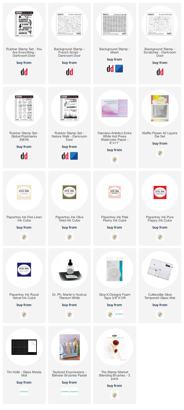
Supplies
(Compensated affiliate links used when possible)
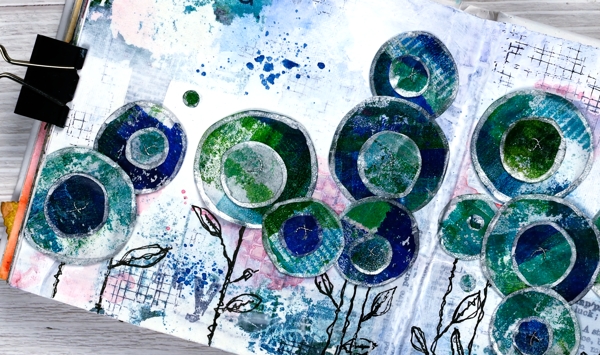
Circle Flowers journal page
Posted: March 25, 2022 Filed under: abstract flowers, alphabet medley, Art Journal, checkered, Classes, Darkroom Door, gel press, Hand drawn, mesh, Stencils | Tags: Art Journal, Classes, Darkroom Door stamps, Darkroom Door stencils, gel press, gel printing, Mixed Media, Penny Black creative dies 8 Comments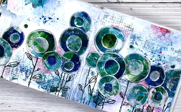
Last week I spent several happy hours gel printing. One of the prints I completed has ended all over this art journal spread. If you are a gel printer you know you can sometimes pull a couple of prints of the same design. The first one is full of colour and pattern and the second is often called a ghost print as it displays outlines and left over bits of paint.

For this journal page I used both the bold blue and green print and the ghost print. The ghost print can be seen on the top left and bottom right corners and is peeping out in a couple of other places. The first print which was very geometrical has been turned into circle flowers. It also had traces of a new stencil called ‘pods’. You will see more of it here on the blog because it is fabulous!
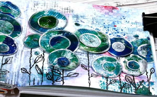
Also in the background you might see some black ink stamping (DD mesh and alphabet medley) and the texture of paste through the DD ‘checkered stencil. The text you see is a fabric tape with dictionary definitions of happiness; it is the first 49 & Market product I have bought and it is going to be handy!
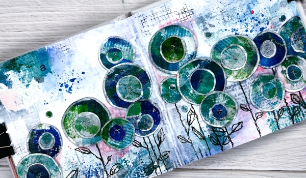
There is plenty of white gesso over the background to pull it together and mute some of the bold elements.
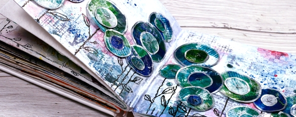
The flowers are all cut with Penny Black ‘abstract flowers’ dies which basically cut slightly wonky circles so I could have cut them myself but why bother when the machine will do it. The print was on rice paper so I could cut a few layers at once. After drawing an edge on each circle with a silver paint pen I stuck a small circle on a larger one, then sewed a cross in the centre with silver thread. There are stems in the set of dies but I doodled mine with a black marker. The blue splatters and pops of pink are from inktense pencils which are coming in handy for art journalling.
I know that was a lot of photos and chit chat but that is the way with some art journal pages especially the collage ones which involve different papers, paints, stencils, and mediums. I probably haven’t mentioned everything I used but if you are still here now I’m sure you’ve heard enough!
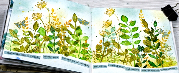
If you are in Ottawa and feel like doing a little art journalling of your own, there are still spaces left in my next Art Journal Adventure workshop where we will be creating a watercolour green and leafy spread similar to what you see below. All the details are on the Crop A While website.
Supplies
(Compensated affiliate links used when possible)
Butterfly Gold journal page
Posted: January 19, 2022 Filed under: Art Journal, Butterflies, Darkroom Door, honeycomb, mesh, Mixed Media, Stencils, transfer sheet, Wings | Tags: Art Journal, Darkroom Door stamps, Darkroom Door stencils, Mixed Media 6 Comments
I have a new spread in the 6 x 6 art journal today though not a seasonal one this time. These pages include a couple of photos from a magazine along with some layering of stamped tissue paper, book pages, stamping and some transfers.
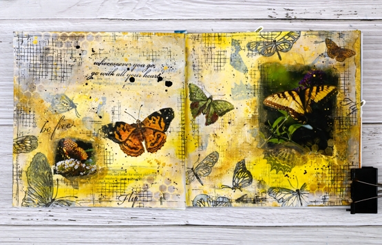
I began by stamping butterflies on white tissue paper in black archival ink then ripped up the paper before gluing it to the pages. I also ripped up some old book pages and accidentally ended up with a strip mentioning butterflies
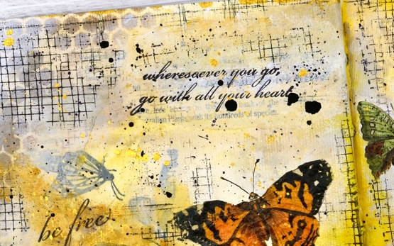
Over the paper layers I painted with white gesso and acrylic paint before stenciling gold paint through the Darkroom Door honeycomb stencil.

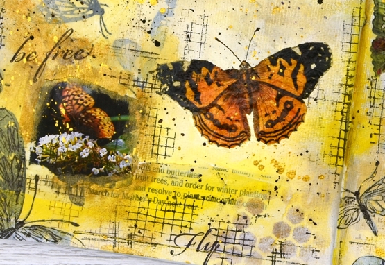
I glued the butterfly photos down and painted over the edges to soften the transition from journal page to photo. I used a black fineline pen to sketch over some of the stamped butterflies and added random texture using the DD mesh stamp.

The page was almost finished at this point but the two butterfly photos were at opposite sides of the spread with a lot of space in between. A visit to Crop A While ended up helping me out. I wasn’t there looking for anything butterfly related but after talking about transfer sheets Carole showed me the Vintage Butterflies sheet from ‘Dress my Craft’ and I had the final elements for this page.
I had not used transfer sheets in a very long time, they work just like the temporary flag tattoos my children applied to themselves on Canada Day years ago. Unlike the temporary tattoos these ones should stay stuck rather than gradually looking rattier and scrappier over a period of weeks!
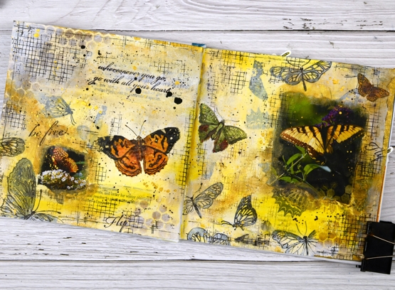
I used three of the transfer butterflies to create a visual path across the two pages then finished things up with quotes from the Darkroom Door ‘Wings’ set and of course some black, white and gold splatter!
Thank you for all the kind and generous messages about the cardinal card; it is always lovely to hear from you.
Supplies
(Compensated affiliate links used when possible)
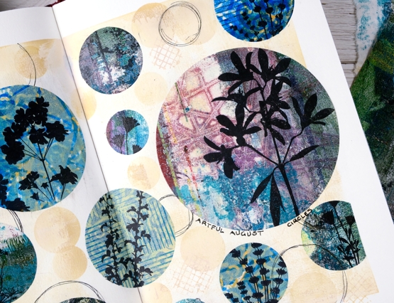
Artful August Circle Journal Page
Posted: August 5, 2021 Filed under: Art Journal, basket weave, Christmas bush, Darkroom Door, fragments, gel press, gelli plate, little swirls, mesh, Nature Walk, Paper Rose, Wildflowers Vol 2 | Tags: Art Journal, Darkroom Door stamps, gel press, gel printing, gelli plate 6 Comments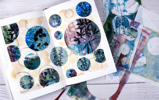
Rachel Greig from Darkroom Door is hosting ‘Artful August’, a challenge to make something arty each day in August. She has provided 31 prompts and I am going to play along as often as I can. Circles was the prompt yesterday so I cut circles from a just few of the many gel print panels I have piling up. I used only gelprints done on rice paper and they cut and adhered very easily.
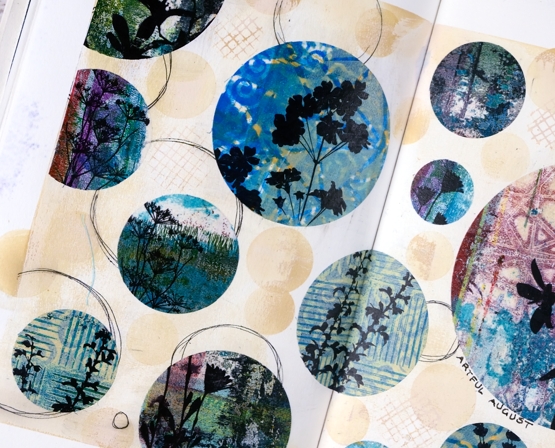
Once I had cut circles in different sizes from different gel printed panels I stamped flower silhouettes from several Darkroom Door sets. Before gluing the circles to the pages I painted the pages with a base of gesso + light brown paint and added some scribbly circles by tracing inside circle dies.

I glued the printed, stamped circles with matte medium both on the back of the paper and over the top to seal it. To add a bit more interest around the circles I blended antique linen ink through a homemade paper stencil.
The prompts in the challenge are very open and participants are encouraged to interpret them in any way and with any medium. If you are on instagram you can view the submissions by searching for #artfulaugust or #rachelgreigartfulaugustchallenge
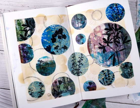
As I participate in the challenge I will have simple experiments along with some completed projects like this one. The fun is simply playing with the prompts. In making today’s journal pages I was very happy to use some pretty scraps, experiments and clean up pages from gel printing sessions. There are always too many to turn into cards but each one has a unique texture and colour mix.
Supplies
(Compensated affiliate links used when possible)
Vintage layers
Posted: April 5, 2021 Filed under: Darkroom Door, French Script, global postmarks, mesh, Nature Walk, Papertrey Inks, scratches, you are everything | Tags: Darkroom Door stamps, Dr Ph Martin Hydrus watercolor paints, Fabriano Watercolour Paper, Papertrey ink 12 Comments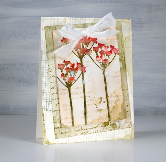
Today’s cards developed bit by bit over a week or so. I worked on flower panels one day, middle layers another day, let them sit a few days, searched for ribbon another day and finally a week later put them together still adding stamping, splattering and blending right up until I called them finished!
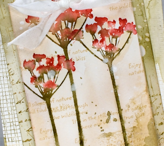
I featured the silhouette floral stamps from the new Darkroom Door ‘you are everything’ set. There are four floral stamps along with eighteen word stamps I mentioned in a previous post. The flowers above are stamped on cold press watercolour paper with papertrey inks. I used pale peony and pure poppy on the petals and olive twist on the stems. I spritzed lightly before stamping then blended further with a paintbrush on the paper. I used the same technique on the purple flowers in the second card but worked on hot pressed watercolour paper.
For the vintage and collage details on the card I above I used olive twist and fine linen inks to add painted areas, stamped text, splatter and blending with a brush.
The flowers above are stamped in pale peony, royal velvet and olive twist and I stuck with fine linen and royal velvet as the inks on the layered areas also.
I’ve listed all the stamps I used to add texture and interest to the floral panel and the layers underneath. You can see some of my favourite ‘filler’ stamps including French script and global postmarks. I also splattered water and white paint for some watermarks and subtle blots!
To finish both cards I punched a couple of holes in the top to thread some fabric through. I didn’t have a cream silk or sheer ribbon so I ripped some strips of what might be silk but I can’t remember. The ripped edge worked fine with my vintage layered look.
Supplies
(Compensated affiliate links used when possible)
Sunflower journal page
Posted: September 23, 2020 Filed under: Art Journal, brick wall, Darkroom Door, French Script, Leaves, mesh, plaid, Stencils, stone, sun, tickets, wildflowers | Tags: Art Journal, Darkroom Door stamps, Darkroom Door stencils, distress oxide inks, dylusions paint 6 Comments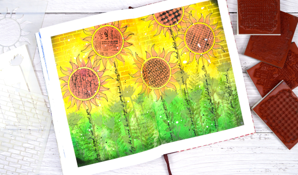
I’ve dones some more experimenting in my art journal with Darkroom Door stencils and stamps. As with some of my previous pages I finished and wished I done a few things differently but on the whole I was happy with the bright, happy look.
I began by taping the edges of the double page with painter’s tape which helps keep the pages flattish and creates a clean frame for the design. I painted the pages with absorbant ground in case I wanted to do some watercolour techniques then, when it was dry I painted the top of the page with dylusions pure sunshine paint and the bottom of the page with a mix of dylusions lemon zest & blue lagoon.
I blended oxide inks through the new small sun stencil to make sunflowers, the small wildflowers stencil to make stems and extra flowers and the brick stencil to fill in background. I also traced inside the flower stencil with a black gel pen to make the flowers stand out a little more.
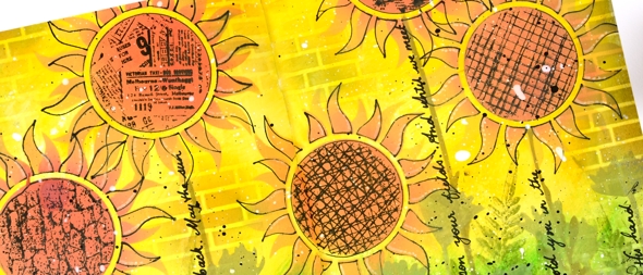
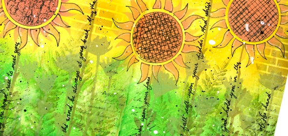
Although I worked mainly with stencils I filled the centre of the sunflowers with texture stamps, added extra leaves around the stems with a fern stamp from the ‘leaves’ set and stamped some script along the lower edge of the page. After adding all the different textures to the centre of the sunflowers, I wished I used the ticket one on all the flowers; it really does look the cutest.
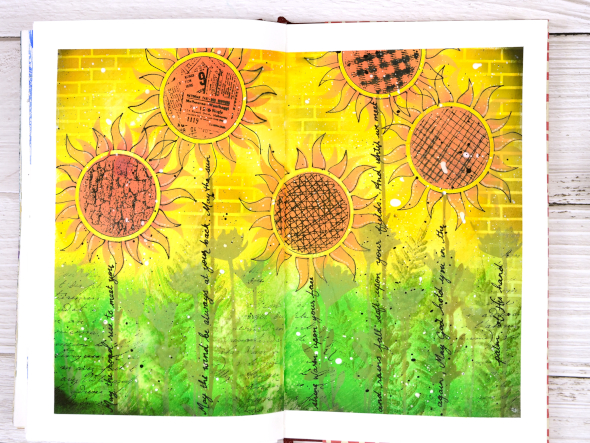
I added splatters of black and white gessos over the panel and wrote the words of the ‘Irish Blessing’ along the sunflower stems. It was the line ‘may the sun shine warm upon your face’ that I thought fitted with the page but decided to include the whole blessing.
There is a collection of fabulous new stamps and stencils in the latest Darkroom Door release so pop over and check them out. You will be seeing more of them around here over the next few weeks.
Supplies
Ferns & friendship
Posted: July 17, 2020 Filed under: Brusho, Butterflies, Darkroom Door, gelli plate, global postmarks, Leaves, mesh | Tags: Brusho, Darkroom Door stamps, gel printing 4 Comments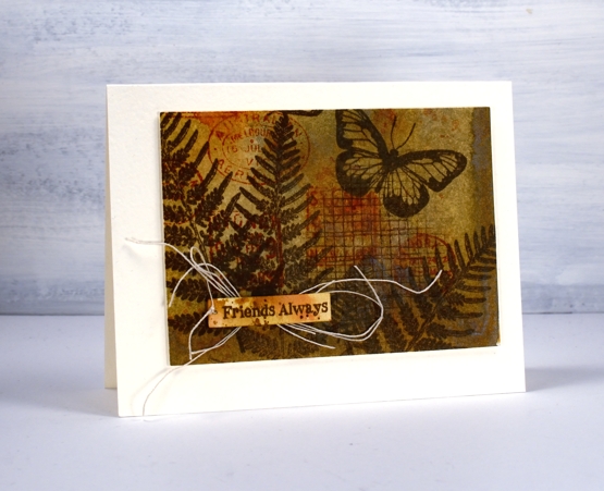
It is a long time since I had my gel plate out for monoprinting; I’m definitely keen, but for the last few months my time has been taken up by an exciting new project I’ll be sharing with you soon. I decided to go through prints from previous gel print adventures to make a few cards with Darkroom Door stamps.
Most often I use acrylic paints on my gel plate but to make this natural coloured background I used water colour powders. I can’t remember which paint colours I used, possibly only one like sandstone which can give a range of browny orange tones. To turn the monoprints into cards I used stamps from DD sets ‘leaves’, ‘butterflies’ and ‘global postmarks’. I also used the small ‘mesh’ texture stamp.
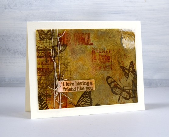
I stamped in ‘vintage sepia’ versafine ink, brushed corduroy and rusty hinge distress inks. Initially I stamped the sentiments from the ‘friendship’ sentiment strips on watercolour paper scraps but they looked too stark and clean so I splattered and swiped some ink on them so they blended into the background a bit more.
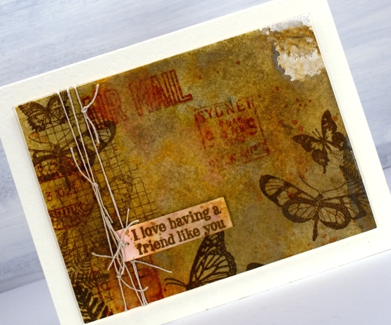
I also added some linen thread which worked with the natural tones and the postal images. I popped up the panels with a couple of cardstock layers on white luxe textured card bases.
Supplies
Gerberas
Posted: September 11, 2019 Filed under: Darkroom Door, gerberas, mesh | Tags: Darkroom Door stamps, Kuretake Zig clean color real brush markers, Ranger Distress inks 3 Comments
This pretty bunch of gerberas is one of the newest stamps from Darkroom Door. I would have shown it to you sooner but it arrived from Australia two days after I left to go to Australia! The inspiration for this colour scheme once again came from a simple web search. A photo popped up with pink, red, apricot and orange gerberas massed together. So that’s what I did.
I stamped in black ink and embossed in clear powder on hot pressed watercolour paper then used zig clean color real brush markers for colouring. I started each flower by colouring around the centre with the marker then blended out the colour with a brush and water. I was able to add more with the markers as needed. To give the flowers even more pizaazz I gave them all a layer of clear wink of stella. (the red and pink ones then got a coat of micro glaze because I kept touching them and getting pink and red stains on things that were not meant to be pink or red!) I wanted to mount the flowers on a background but didn’t want it to fight with the focal panel. The DD mesh stamp worked beautifully and reminds me of the decorative mesh that is sometimes wrapped around cut flowers.
I stamped a sentiment from the large DD ‘thank you’ set and threaded some sparkly black thread through the tag and round the panel. A friend gave me a stash of metallic threads recently and they are coming in handy for a little subtle sparkle.
For the second card I went with a more country style look. All the gerberas feature the same fossilized amber, vintage photo and rusty hinge colour scheme with the two brown inks used also to create a background. I stamped the whole gerbera stamp in fossilized amber distress ink first then inked the centres in rusty hinge. I blended each petal with water and did the same with the centres then inked one side of the flower centres in vintage photo to add some dimension.
I tried a woodgrain background but it was too dark. By choosing to stamp the ‘thank you’ sentiment strip several times more of the cream background showed through. I inked the sentiment strip in vintage photo and rusty hinge distress inks and spritzed it lightly before each print. The result was blended and sometimes smudgy words. I gave both the flower panel and the background the splatter treatment then popped the gerberas up on a foam rectangle.
Gerberas are pretty classy flowers I think, they always seem to stand out in a bouquet.
Supplies
Steps journal page
Posted: March 7, 2019 Filed under: alphabet medley, Art Journal, Darkroom Door, mesh, Nature Walk, stone, tall flowers, Woodgrain | Tags: Art Journal, Darkroom Door stamps, distress oxide inks, Ranger Distress inks 5 Comments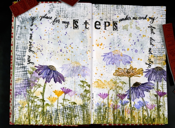
Are you a wee bit surprised to see a journal page here? I’m surprised myself, surprised but pleased. I really enjoyed dreaming it up and making it. It didn’t end up looking as I imagined but that is the way with journal pages is it not?
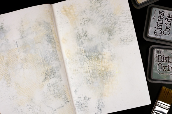
This art journal is a Fabriano journal; the paper is nice and thick but not watercolour paper so I painted over it with absorbent ground first. Then I grabbed a bunch of stamps from Darkroom Door along with three light coloured oxide inks and stamped mesh, stone and woodgrain texture stamps over the background. I spritzed it with water to soften the edges of the stamped images and dabbed some out too to make it subtler. Even after adding some water it was still bolder than I wanted so I painted another thin layer of absorbent ground over it.
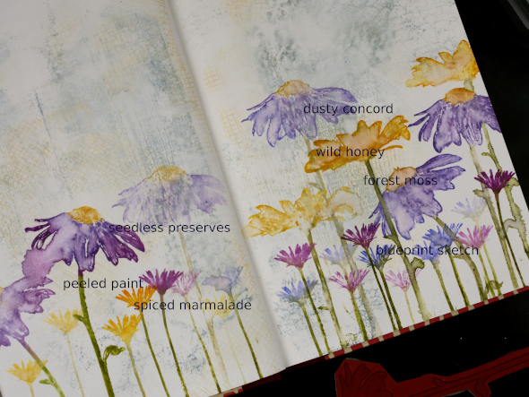
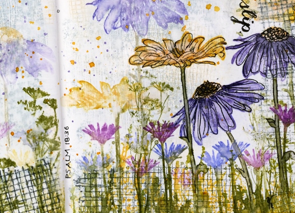
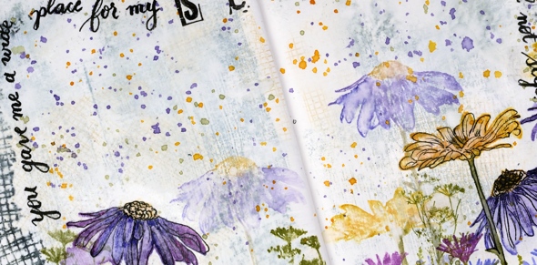
I filled the bottom of the page with repeat stampings of flowers from the Darkroom Door ‘tall flowers‘ set in distress inks then blended some of the big flowers with water. They don’t blend as well as they do on watercolour paper but the effect is still nice.
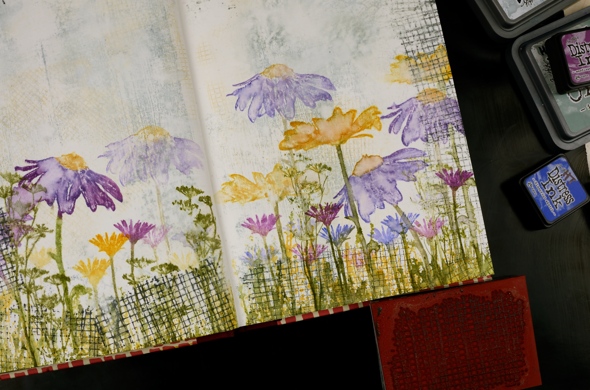
I added grass and flowers from the DD ‘ nature walk‘ set, also in distress ink then a border with the mesh texture stamp in black soot oxide ink. It was a bit bolder than I wanted so I spritzed then dabbed with a paper towel ( as you can see I’m a fan of the ‘spritz and dab’ ). I splattered wild honey, forest moss and dusty concord diluted ink over the whole spread and it ended up looking like confetti. To boost a few of the flowers I outlined them with fine tipped black markers.
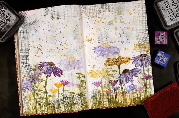
I wrote psalm 18:36 with a brush pen leaving a space to stamp the word ‘steps’ with the DD alphabet medley stamps. I find choosing words for a journal page tricky, which words and how to add them. But the beauty of a journal page is the experimental nature of it. If I don’t like something on this page, I’ll try something different on another. Once the ink had dried I sealed the large flowers and the lettering with distress micro glaze.
Do you have any art journallers you would recommend for inspiration? I already follow Rachel Greig from Darkroom Door, Julie Fei-Fan Balzer, Vicky Papaioannou and Maremi SmallArt who all have different styles and inspiring journal pages.
I’m hoping to create in my journals more often and will share pages here if possible. Even if you are not an art journal person the designs can usually be converted to a card and sometimes start out as cards anyway!
Art Supplies (all Darkroom Door stamps are linked in description)