Off to School journal page
Posted: July 15, 2022 Filed under: Alcohol Ink, Darkroom Door, Mixed Media, scratches, tickets | Tags: Art Journal, Darkroom Door stamps, Mixed Media 15 Comments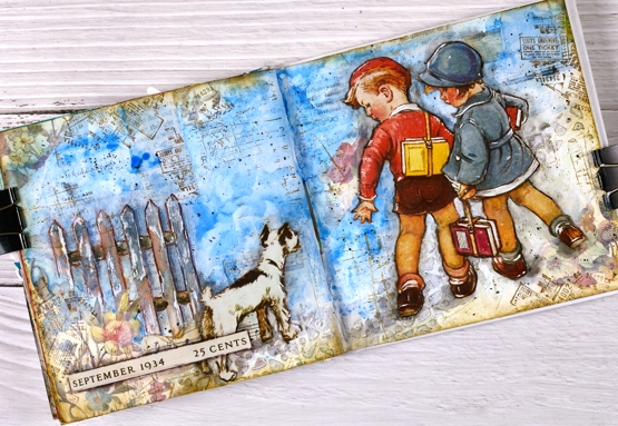
Some of you might recognise the artwork on this journal page. I have saved calendars, magazines, greeting cards and diaries over the years and now that I am creating collages and journal page spreads they are coming into their own. Quite a few years back I saw a calendar featuring covers from Good Housekeeping magazines of the 1920’s and 30’s. I thought the covers were delightful and bought two of the calendars. I enjoyed it during the year then tucked it away for future inspiration.
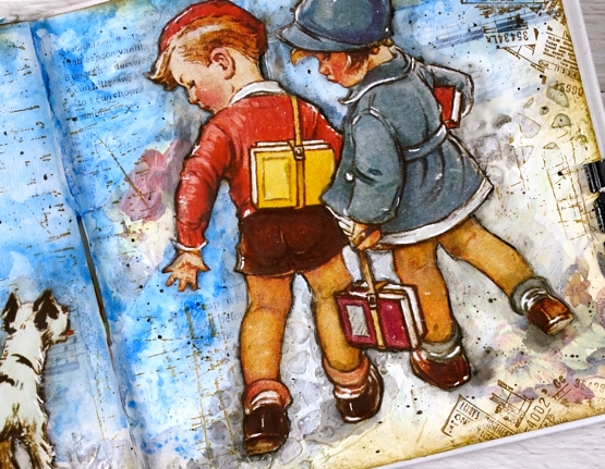
The calendar images are larger than the 6″x 6″ pages in the journals I am currently using so I chose a painting where I could cut out components and create a smaller scene. I cut the two children and the dog and glued them onto a collaged and painted background. I used floral paper mainly around the edges, blue paint for the background. The fence and cobble stone path were created with texture paste through a stencil. I used a few different Darkroom Door stamps to add vintage details across the page.
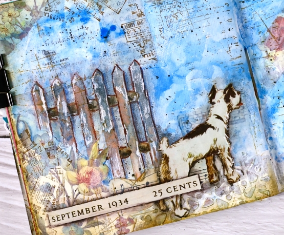
I did have to do more fussy cutting than I usually care to but these sweet images were worth it. Once they were glued down I used a black marker to go round the edges of the cut outs and immediately smudged the ink with my fingers or a damp brush. It’s a technique I have seen Vicky Papaioannou do many times on her journal pages. I used a white gel pen to add highlights, another trick from Vicky.
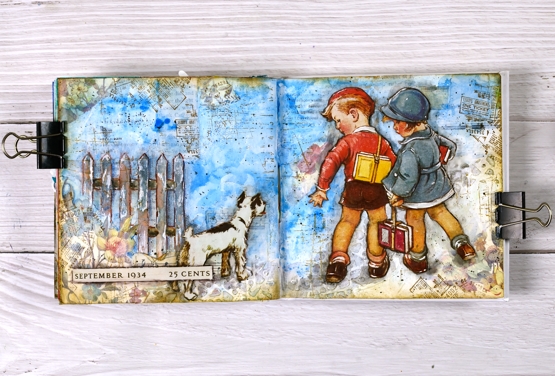
If you want to see what the original artwork by Vernon Thomas, just search good housekeeping magazine with the date I have added to the bottom left corner of my page.
Supplies
(Compensated affiliate links used when possible)
Big Leafy Hugs
Posted: September 27, 2021 Filed under: Darkroom Door, French Script, Leaves, scratches, warm wishes | Tags: Darkroom Door stamps, Ranger Distress inks 10 Comments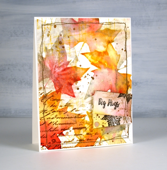
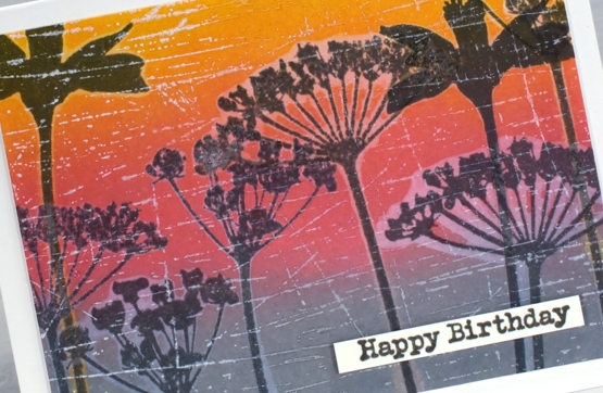
No need to guess where my current inspiration is coming from. I went for three walks last week through the same woods and could see the colours spread over just five days. These leaves are all stamped by one stamp in the Darkroom Door ‘leaves’ set on Fabriano hot pressed watercolour paper. For each impression I inked with a combination of wild honey, old paper and barn door distress inks. After stamping I blended over the image with a pearlescent water mix.
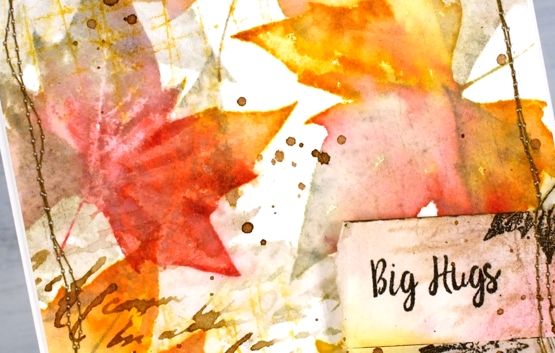
Once I had filled the panel with coloured leaves I stamped over them with the same stamp but just old paper ink which filled the remaining white area with pale leaves. I added more texture with some script, some scratches (both DD background stamps listed below) and some gathered twigs splatter.
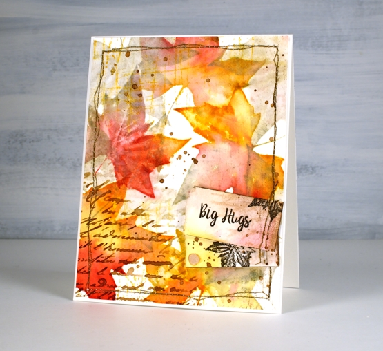
Once the panel was dry I sewed around the edges then made a couple of tags featuring a sentiment from the DD ‘warm wishes’ set and a small leaf from the DD ‘leaves’ set. I hope you see some delightful colours outside this week whether they are autumnal or springy!
Supplies
(Compensated affiliate links used when possible)
Enjoy the Journey Journal page
Posted: July 23, 2021 Filed under: Art Journal, Darkroom Door, gel press, nomad, scratches, vintage car, World Map | Tags: Art Journal, Darkroom Door stamps, distress oxide inks, gel press, gel printing, Ranger archival inks, Ranger Distress inks 3 Comments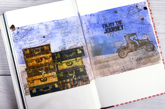
This week I have shared a gel plate video and a series of cards made with prints and leftovers from that gel printing session. If you look closely at this journal page you will see a couple more prints put to use.
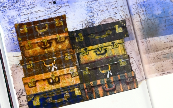
The Darkroom Door set, Nomad, recently arrived in my mailbox and the main reason I chose it was the pile of suitcases. I own one old suitcase which belonged to my grandmother; it houses the ‘dress up’ collection. It is not unlike the third one in the left hand stack. The stamp set also has a single suitcase, some passport stamps and two sentiments, one included on this page.
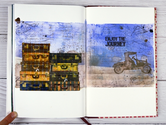
To add even more vintage-ness to the vintage suitcases I stamped them on a grid and striped prints from the gel printing session. I used corrugated cardboard to make the patterns on the gel plate originally. I stamped the suitcases in archival inks then added extra colour with distress inks and gel pens. To create the background I smooshed blueprint sketch distress inks on a piece of acetate, spritzed water over the ink then transferred it to the masked journal pages. With the blue protected I blended a brown base, also with distress inks. Over the top of the inking I added some impressions with the DD world map and scratches background stamps. To balance the suitcases I added the vintage car and sentiment on the right hand side.
Maybe these pages came from my longing to be out and about seeing new and old places, or a longing to be poking around antique and thrift stores. The latter will probably happen before the former.
Are you longing for a trip somewhere? Are you thinking near or far?
Supplies
(Compensated affiliate links used when possible)
If you have a garden…
Posted: May 31, 2021 Filed under: Art Journal, Darkroom Door, Hand lettered, Papertrey Inks, scratches, Wildflowers Vol 2, you are everything | Tags: Art Journal, Darkroom Door stamps, Fabriano art journal, Papertrey ink, Ranger Distress inks, Tsukineko Versafine inks 8 Comments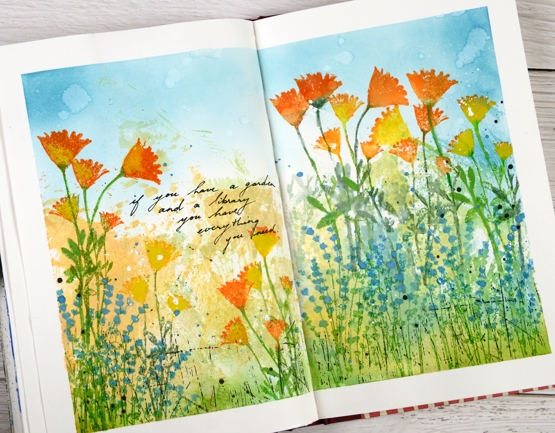
The rest of the quote says, ‘… and a library you have everything you need.’ My art journal is pretty much all book or flower related pages; I guess there is room for a new inspiration. Currently with a garden that is looking promising and an online course newly launched you could say flowers are on my mind.
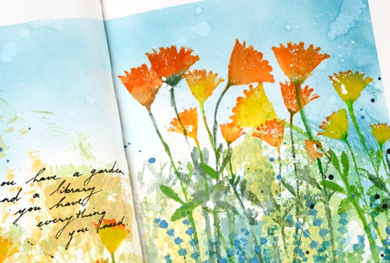
The background for this page was created months ago when I was making subtle backgrounds for a few cards. Instead of swiping a whole panel through waterbased inks I was inking a piece of acetate then spritzing it and swiping it on a stamped panel. I opened a spread in the art journal and swiped the acetate across the pages a few times to leave some ink there. I don’t remember the exact colours but the smooshed ink covered the lower half of the pages in blue, green, yellow and pale orange. Last week I pulled it out again and turned the page into a messy garden.
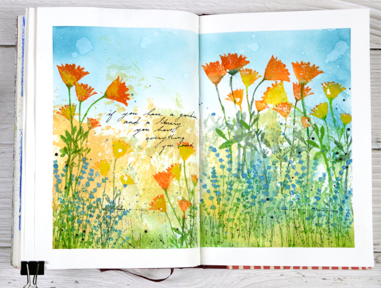
As I said the lower half of the pages is smooshed ink. The upper half is broken china distress inks applied with a blending brush. The flowers are a mix of silhouette stamps from Darkroom Door’s ‘you are everything’ and ‘wildflowers vol 2’ sets. I inked with papertrey ink cubes, spritzed the stamp and stamped on the pages. Sometimes I blended the stamped ink, other times not. To make the blue flowers stand out a bit more I painted blue gouache paint over the stamping. The gouache works well on the journal pages so you will probably see more.
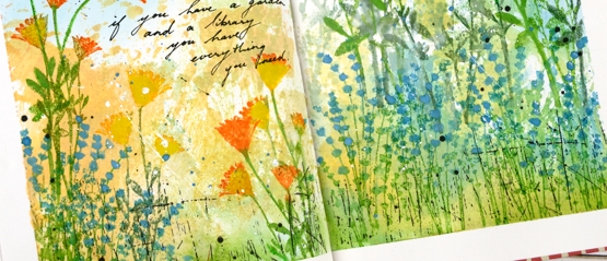
Once all the flowers were added I stamped the DD ‘scratches’ background stamp in black on the lower section of the page and added black and white splatter all over. I added the quote with a black gel pen. If you are in my Floral Faves online class you might this was inspired by one of the projects in lesson 3.
Supplies
(Compensated affiliate links used when possible)
Mixed Media-ish
Posted: May 17, 2021 Filed under: daisy delight, Darkroom Door, French Script, scratches, scripty, Stampin Up, you are everything | Tags: Brutus Monroe, Darkroom Door stamps, distress oxide inks, Stampin Up, Tsukineko Versafine inks 5 Comments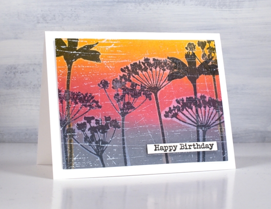
I have in my workroom a few new items to try but with one thing and another I haven’t had a chance. I recently bought two new pads of paper, one is rice paper and the other is mixed media paper from Fabriano, that’s the one I used for today’s cards. I’m very taken with Fabriano 100% cotton watercolour paper so I wanted to see what I thought of the mixed media.
It is quite a while since I’ve done anything with my oxide inks so I pulled them out to make a blended background. After blending I did some water-stamping with both the DD ‘daisy delight’ background stamp and the floral silhouettes from the DD ‘you are everything’ set. The paper worked brilliantly for both steps. After drying the panels I stamped again with versafine clair inks and, as I hadn’t moved the stamps, the inked images landed inside the watermark images.
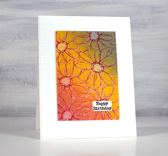
I dried all the stamping with a heat tool before adding background stamps over the top for added texture. I used white ink for both the DD ‘French script’ stamp and the DD ‘scratches’ stamp. The daisy stamp ended up with a double dose of script when I embossed a white base layer with the SU ‘scripty embossing folder.
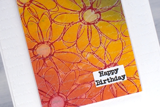
I gave both cards a little birthday label and pronounced the mixed media paper a success. Of course I will put it through it’s paces with gel printing and a few other processes but so far so good.
Supplies
(Compensated affiliate links used when possible)
Vintage layers
Posted: April 5, 2021 Filed under: Darkroom Door, French Script, global postmarks, mesh, Nature Walk, Papertrey Inks, scratches, you are everything | Tags: Darkroom Door stamps, Dr Ph Martin Hydrus watercolor paints, Fabriano Watercolour Paper, Papertrey ink 12 Comments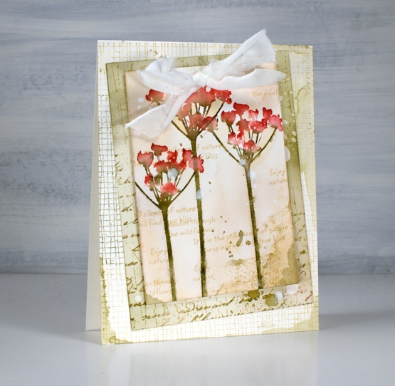
Today’s cards developed bit by bit over a week or so. I worked on flower panels one day, middle layers another day, let them sit a few days, searched for ribbon another day and finally a week later put them together still adding stamping, splattering and blending right up until I called them finished!
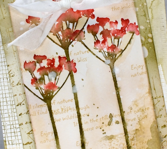
I featured the silhouette floral stamps from the new Darkroom Door ‘you are everything’ set. There are four floral stamps along with eighteen word stamps I mentioned in a previous post. The flowers above are stamped on cold press watercolour paper with papertrey inks. I used pale peony and pure poppy on the petals and olive twist on the stems. I spritzed lightly before stamping then blended further with a paintbrush on the paper. I used the same technique on the purple flowers in the second card but worked on hot pressed watercolour paper.
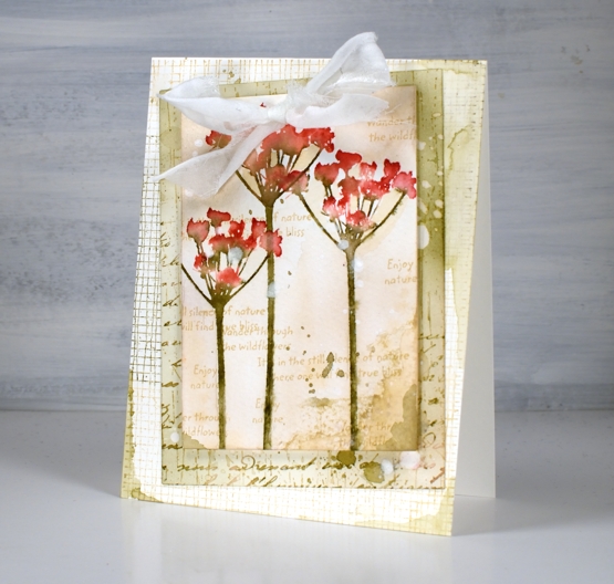
For the vintage and collage details on the card I above I used olive twist and fine linen inks to add painted areas, stamped text, splatter and blending with a brush.
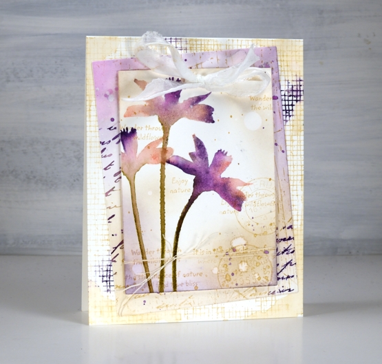
The flowers above are stamped in pale peony, royal velvet and olive twist and I stuck with fine linen and royal velvet as the inks on the layered areas also.
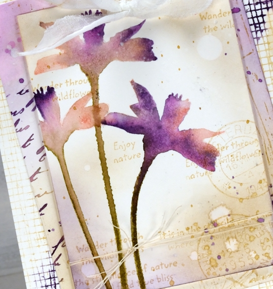
I’ve listed all the stamps I used to add texture and interest to the floral panel and the layers underneath. You can see some of my favourite ‘filler’ stamps including French script and global postmarks. I also splattered water and white paint for some watermarks and subtle blots!
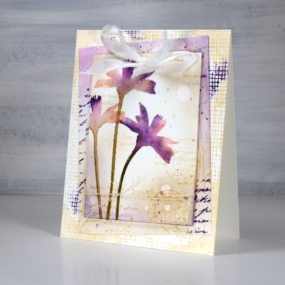
To finish both cards I punched a couple of holes in the top to thread some fabric through. I didn’t have a cream silk or sheer ribbon so I ripped some strips of what might be silk but I can’t remember. The ripped edge worked fine with my vintage layered look.
Supplies
(Compensated affiliate links used when possible)
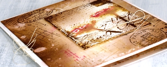
Art de Fleur
Posted: October 23, 2020 Filed under: Art de Fleur vol 1, Botanical Script, Darkroom Door, global postmarks, majestic mountains, scratches, sheet music, tall flowers | Tags: Darkroom Door stamps, Fabriano Watercolour Paper, Papertrey ink 5 Comments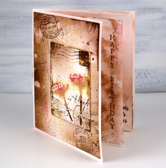
This card is the cardmaking version of going down a rabbit hole. I know how easy that is on the interwebs, but apparently it is possible with a card as well. What started out as a vintage style two layer card became a little more than that. I just kept thinking of stamps and papers and techniques I wanted to add.
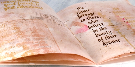
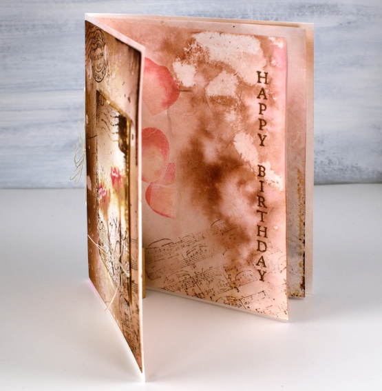
I decided an insert would be nice; I don’t usually put anything on the inside of my cards so an insert is quite the departure. An insert turned into two inserts which is more like a little book when you count both sides of the pages!
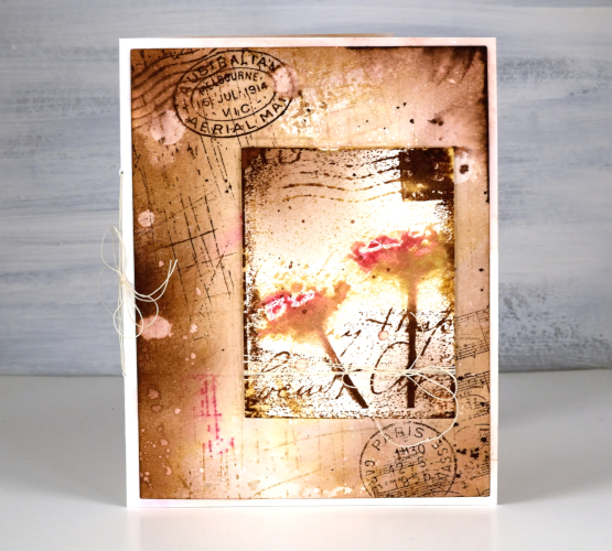
The front panel, which was initially going to be the whole deal features several Darkroom Door stamps: scratches background stamp, sheet music background stamp, global postmarks, art de fleur vol 1.
For the whole card I stuck with four Papertrey ink cubes (listed below); I used them for stamping, watercolouring, splattering and blending with a blending brush.
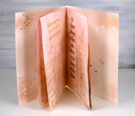
The inside pages are not watercolour paper but handmade paper from a Hanji gifts in Toronto. It is handmade paper with rose petals embedded in it. It was very white straight out of the packet so I smooshed some brown and pink inks on my glass mat, diluted with water then swiped the paper through the ink. This resulted in the colour I wanted but removed the sizing and wrinkled the paper. I ironed it, which did the trick then added little bits of stamping on every page. I used a couple of sentiments and some quote stamps, all from Darkroom Door and reused the same background stamps plus the floral stamps from the Art de Fleur set.
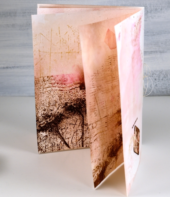
To join it all together I poked holes and used some fine twine for a little ‘book binding’. With all the ‘vintaging’ I did on the front panel and pages the card base itself looked very stark so I swiped that through some smooshed ink too so everything would co-ordinate.
I was so deep down the rabbit hole by this point I realised an ordinary envelope was just not an option so I pulled out another sheet of the handmade rose petal paper, inked it, ironed it and used my envelope punch board to create an custom envelope, which I failed to photograph. All in all a very satisfying but surprising creative project. Now, back to work!
Supplies
What should I read next?
Posted: October 1, 2020 Filed under: Art Journal, book spines, Darkroom Door, mini open book, scratches | Tags: Art Journal, brutus monroe embossing powder, Darkroom Door stamps, Fabriano art journal, Ranger Distress inks, Ranger Distress stains, WOW embossing powders 21 Comments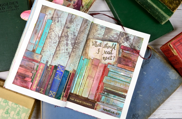
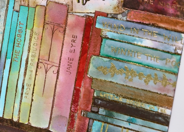
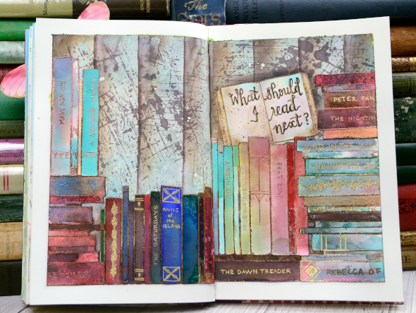
This book themed page has been in my mind for quite a while and that little open book stamp on the right side of the spread pushed me to make it happen. All the stamps are from Darkroom Door; I used ‘mini open book’ once, ‘book spines’ several times and the ‘scratches’ background stamp for the wall behind the books.
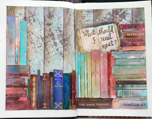
I have three art journals on the go and this one has a literary theme. I’ve done pages inspired by books and others inspired by quotes. I have a few started but not finished and several in my head.
I taped the edges of the double page spread before doing anything; it really helps keep the book open and stable while I work, it protects the other pages from paint and ink and I think it frames the finished design really nicely.
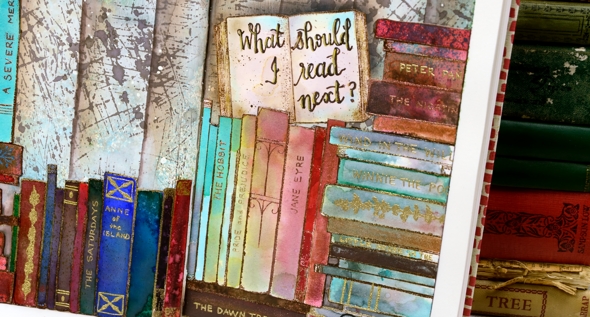
I embossed all the books on hot pressed watercolour paper in either gold or copper powder then coloured them with markers, distress stains and distress inks smooshed on my glass mat. I really just played with techniques until I had a good selection of colours and patterns. I stuck to jewel tones featuring dark green, bright blue, red and aqua. I’ve listed all the distress inks below. I also painted over the inking on a few books with Coliro pearlescent paints so they have a bit of shimmer.
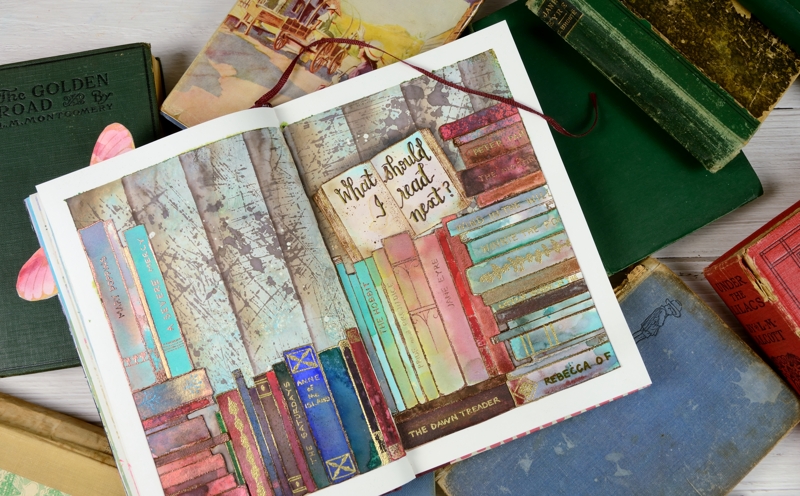
I painted the background with ‘absorbant ground’ as I usually do when I want to work with liquid inks and water then I smooshed some ‘peacock feathers and ground espresso inks on a piece of acetate, spritzed it and dragged it across the page multiple times. That gave me some abstract colour but not enough so I used distress stain sprays in the same colours. After it dried I stamped the scratches background stamp a few times in ground espresso stain. When that dried I used a piece of tape to mask edges to sponge vertical lines across the pages.
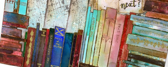
Arranging the books on the page took a little while. I cut them all out first then cut some of the groups into smaller groups to play with the layout. Once I had it settled I glued them down and started adding titles and decoration with gel pens, embossing pens and embossing powder. I wrote quite a few of my favourites on the spines, nothing particularly new even though I have read some great new books lately. I guess they just haven’t stood my test of time yet. I have some empty spines left that I will probably fill another day.
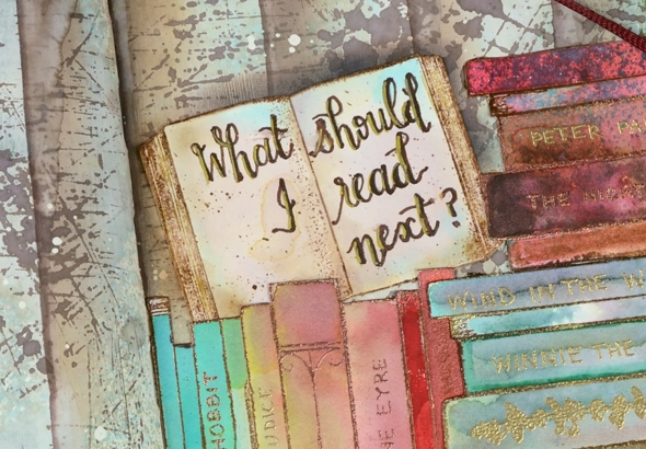
I finished by balancing that open book on one of the piles and added the name of my favourite podcast, ‘What Should I Read Next?’ I get a large chunk of my book recommendations from Anne Bogel, the host of WSIRN. I could talk about books for several more paragraphs but if you’ve made it this far you’re a champion so I’ll save the book chat for another book themed project. I think there will be a spin off card from this journal page.
Oh, and one more thing, please feel free to leave book recommendations in the comments; I’d love to hear your favourites.
Supplies