
A New Handmade Book
Posted: February 7, 2025 Filed under: Finetec paints, Hand painted, Handmade book, sennelier watercolours | Tags: Fabriano art journal, Fabriano Watercolour Paper, Handmade book, sennelier watercolours 6 Comments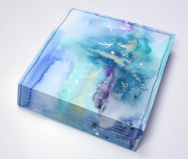
I’ve completed another challenge with Ali Manning in her Handmade Book Club. I have written before about Ali’s wonderful teaching. The most recent class was no exception. It was called ‘Valentine Palooza’ as a nod to the February timing and the cute heart binding on the spine of the book. The Handmade Book Club offers some free classes, some short challenges open to non-members (I have now done four of these) and a monthly or yearly membership ( something I would like to join at some point).
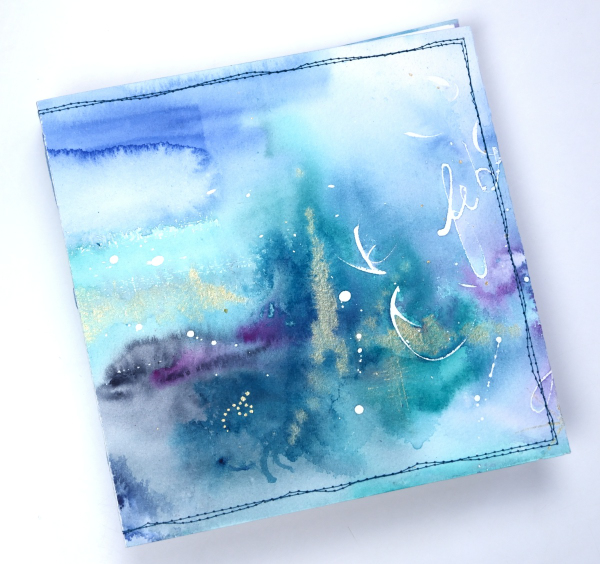
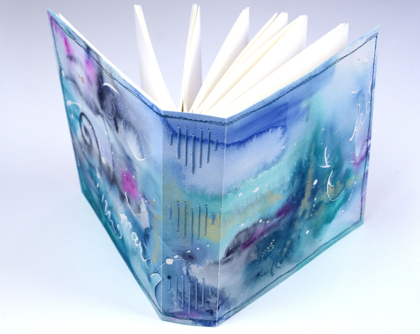
For this most recent challenge I chose to use cold pressed watercolour paper for the cover and hot pressed watercolour paper for the signatures. I watercoloured the cover in a loose abstract style over the top of some masking fluid words and squiggles. As I write this I realise I didn’t take any photos of the inside cover. Both the back and front covers fold over to make the cover more sturdy so my watercolour patterns continue inside.
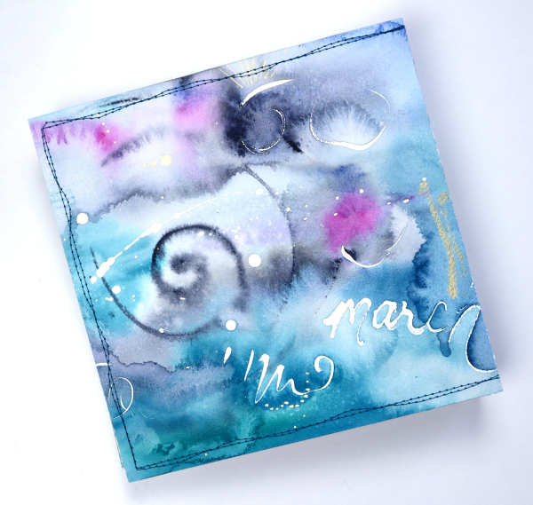
This cover was inspired by Tiffany Sharpe’s lovely stitched and watercoloured cover. I made my book 7″x7″ which was different to the rectangular examples in the workshop but all the steps are the same once you work out your dimensions. I have now made three 7×7 watercolour journals and like the page size for art journalling.
I’m playing with watercolour techniques a lot at present in preparation for my upcoming in person class on Watercolour Techniques. You will see some of the technique samples turned into cards eventually and some will be the base for future journal pages. You can see the other books I have made here: Mixed Media Journal, Coptic Journal, a second Coptic Journal, and Scrappy Journal.
Winter Garden art journal page
Posted: July 14, 2021 Filed under: Art Journal, bookworm, Correspondence, Darkroom Door, gel press, little swirls, nomad, Paper Rose, snowflakes, Trees, Wildflowers Vol 1 | Tags: Art Journal, Darkroom Door stamps, Fabriano art journal, gel press, Paper Rose 12 Comments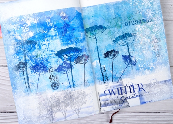
It’s been a while since I worked in my book themed art journal. As I looked over a table covered in gel prints I settled on two blue ones filled with pattern and paint. Both were on rice paper and sized 6″x6″ which is not big enough to cover the whole journal page. I decided to tear a rough edge on the bottom and glue the panels with space above and below.
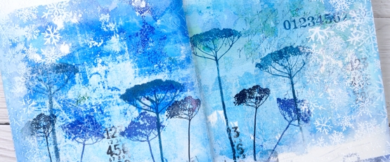
The inspiration for the page is Kristin Hannah’s novel ‘Winter Garden’. I used Darkroom Door floral stamps to decorated the gel prints with blue flowers then added more stamping to the blue area and the white space at the bottom of the page.
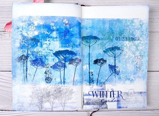
Picking from a few themes in the book I stamped trees to represent the orchard, a suitcase to represent the escape from Leningrad, books from the library where the main character worked. I also used number, correspondence and snowflake stamps to complete the collage.
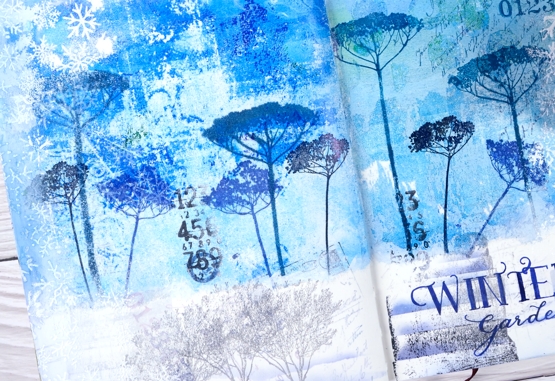
I am always in two minds about adding words to my pages and this time was no exception. Rather than a quote I just added the name of the novel and author. I used pigment and archival inks for all the stamping, white gesso around the edges and white ink and embossing powder to add the snowflake borders.
Have you read any Kristin Hannah? My book club considers ‘The Nightingale’ our best choice so far! We are always searching for good book club reads; if you have any suggestions please leave them in the comments.
Supplies
(Compensated affiliate links used when possible)
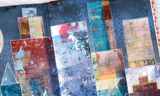
Gel print city journal page
Posted: June 17, 2021 Filed under: Art Journal, gel press, Waffle Flower | Tags: Fabriano art journal, gel press, gel printing, gelli plate, Waffle Flower dies 5 Comments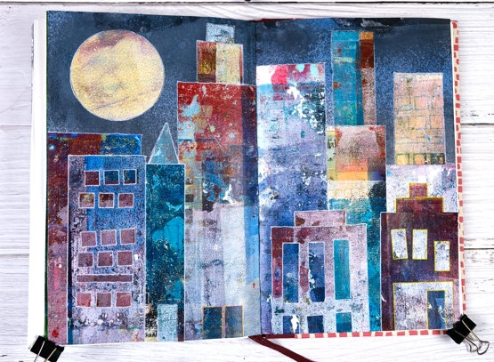
Continuing my week of gel prints you might see a resemblance between yesterday’s projects and todays. I posted large cityscape projects yesterday made by masking areas of the gel plate with paper rectangles cut from stiff magazine paper. Some of the masks had little shapes cut from them with dies. I used the magazine masks over and over on several prints and experiments so by the end they were covered in paint and way more interesting than they started out.
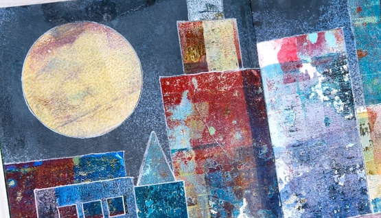
Rather than save the masks or throw them away I turned them into a city scape art journal page. Once again my scraps are prettier than some of my prints! Every time I brayered a new colour onto the gel plate I lay the rectangle masks paint side down so they ended up picking up paint, pattern and texture while occasionally letting a bit of text or photo show through.
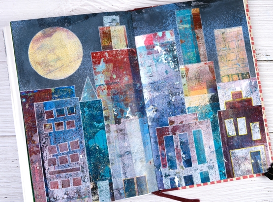
The background sky was done with distress sprays, a few blues and a black (listed below) spritzed over the open spread to cover the top half of both pages.
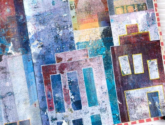
Once the sky was dry I arranged and rearranged the ‘buildings’ so I would have contrasting heights and colours across the scene. Some of the tiny shapes die cut from the masks also had paint on them so I used a few as doors on this scene. The windows are all cut outs revealing some of the prints underneath. I used matte medium and a Tim Holtz collage brush to glue everything down then decided to outline the shapes with gel pens to separate them a little more.
This art journal design was one of those rare ones that turned out as I imagined it might. Doesn’t always go that way!
I mentioned a couple of days ago I am appearing on Craft Roulette Live Improv show on Friday night. I’d love to see you there if you are free. You can hop on the chat and say hello. The details are here and here
Supplies
(Compensated affiliate links used when possible)
If you have a garden…
Posted: May 31, 2021 Filed under: Art Journal, Darkroom Door, Hand lettered, Papertrey Inks, scratches, Wildflowers Vol 2, you are everything | Tags: Art Journal, Darkroom Door stamps, Fabriano art journal, Papertrey ink, Ranger Distress inks, Tsukineko Versafine inks 8 Comments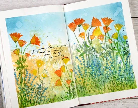
The rest of the quote says, ‘… and a library you have everything you need.’ My art journal is pretty much all book or flower related pages; I guess there is room for a new inspiration. Currently with a garden that is looking promising and an online course newly launched you could say flowers are on my mind.
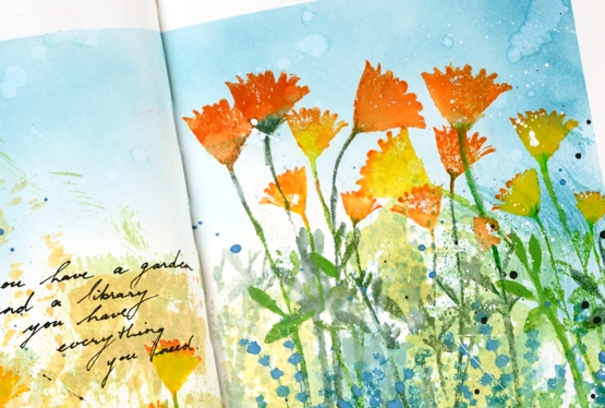
The background for this page was created months ago when I was making subtle backgrounds for a few cards. Instead of swiping a whole panel through waterbased inks I was inking a piece of acetate then spritzing it and swiping it on a stamped panel. I opened a spread in the art journal and swiped the acetate across the pages a few times to leave some ink there. I don’t remember the exact colours but the smooshed ink covered the lower half of the pages in blue, green, yellow and pale orange. Last week I pulled it out again and turned the page into a messy garden.
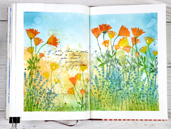
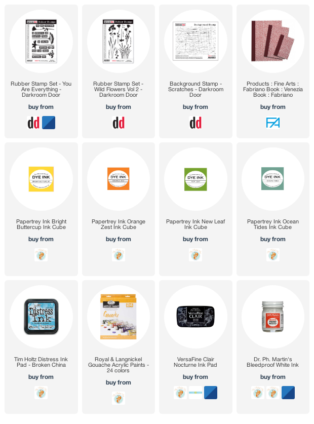
As I said the lower half of the pages is smooshed ink. The upper half is broken china distress inks applied with a blending brush. The flowers are a mix of silhouette stamps from Darkroom Door’s ‘you are everything’ and ‘wildflowers vol 2’ sets. I inked with papertrey ink cubes, spritzed the stamp and stamped on the pages. Sometimes I blended the stamped ink, other times not. To make the blue flowers stand out a bit more I painted blue gouache paint over the stamping. The gouache works well on the journal pages so you will probably see more.
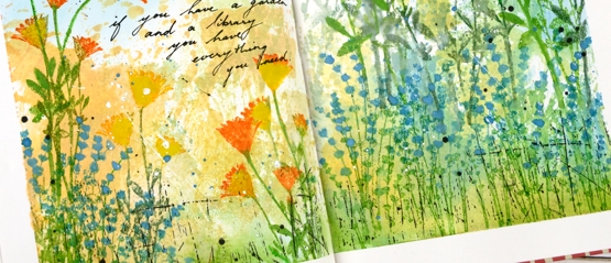
Once all the flowers were added I stamped the DD ‘scratches’ background stamp in black on the lower section of the page and added black and white splatter all over. I added the quote with a black gel pen. If you are in my Floral Faves online class you might this was inspired by one of the projects in lesson 3.
Supplies
(Compensated affiliate links used when possible)
Fern and floral art journal page
Posted: March 5, 2021 Filed under: Art Journal, fresh ferns, garden variety, Penny Black | Tags: Art Journal, Fabriano art journal, Penny Black creative dies, Penny Black stamps, Tsukineko Memento inks, Tsukineko Versafine inks 8 Comments
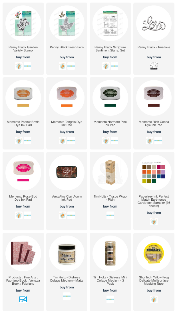
Recently when I was making a card with the new Penny Black stamps, ‘garden variety’ and ‘fresh fern’ I also began an art journal page. I really need to be braver with my art journal, I tend to reach for the same mediums that I use all the time in my cards. Today’s journal page was not particularly adventurous but I did pull out my box of pastes, gels and mixed mediums only to find several of them had dried up completely in their containers while others that used to be thick had turned to liquid. Those ones got tossed but a jar of distress collage medium came in handy along with some modelling paste. I think they might have both done the same job in the end.
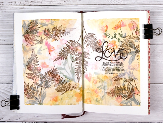
I’m still working in my Fabriano art journals made up of drawing paper so I’m trying not to rely on my watercolour habits and techniques. I began as usual by taping the edges of the pages both to keep the book open and to create an attractive frame.
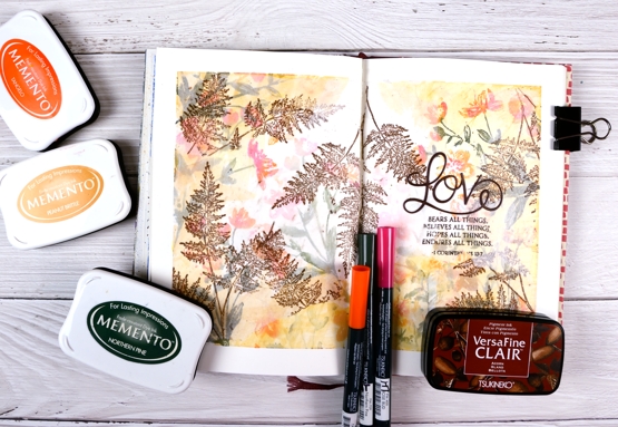
I inked the garden variety stamp with tangelo, northern pine and rosebud memento inks, spritzed it and stamped on the pages multiple times. I did first and second generation stamping to get both bold and pale prints. Then, feeling all brave and mixed media-ish I coloured some modelling paste with peanut brittle memento ink and applied it around the edges with a little plastic applicator (an old bank/library card would do). This step didn’t really yield the results I wanted but it was all in the spirit of experimentation so on I went.

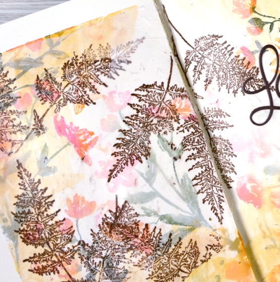
I hadn’t used tissue paper in a while so I scrounged through our wrapping paper box and found some white, stamped the fresh fern in rich cocoa memento ink then tore it into sections before gluing it on the journal pages with collage medium. The tissue became almost transparent which gave the flowers behind a soft pearly look. I stamped the verse from 1 Corinthians on tissue too and glued it down in the same way replacing the first word, ‘love’ with a die cut.

I would love to know if you have an art journaller you admire. I am a big fan of Vicky Papaioannou and have watched many if not all her art journaling videos. I am interested to know what gels, pastes and mediums people use for what purposes. Which are best for resist effects, which are great for gluing, etc. Please share any recommendations you have.
Supplies
(Compensated affiliate links used when possible)
Bloom Art Journal page
Posted: October 26, 2020 Filed under: Art Journal, Christmas bush, Darkroom Door, sketched alphabet, torn text | Tags: Art Journal, Darkroom Door stamps, Fabriano art journal 2 Comments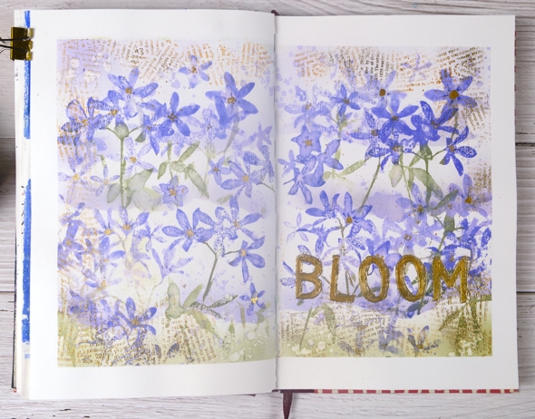
After making a Christmas card with the new Darkroom Door Christmas Bush stamp set I was keen to use the silhouette stamps for a different project. I decided to fill a journal page spread with them and chose a different colour scheme to do so. I think they look a bit like violets.
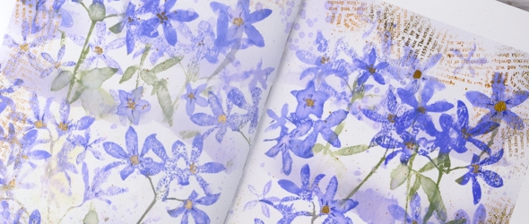
I taped the edges of the pages which frames the layout, keeps the pages flat and protects any pages underneath which are poking out. I painted absorbant ground over the whole area as a base before stamping and painting.
I wanted to have layers of flowers and so I tore a ripped edge on some masking paper and attached it across both pages. I used blending brushes to apply colour over the torn edge then did generational stamping in blueprint sketch, shaded lilac and peeled paint distress inks. Once the top section was completed I masked again, further down the page this time and repeated the process twice.
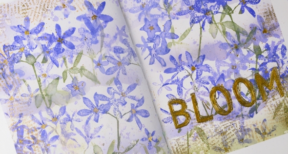
For highlights and details I used markers and gold paint to add details to the petals and centres to the flowers. I also used gold embossing to make a print border and title with the Darkroom Door ‘torn text’ and ‘sketched alphabet’ stamps. The Christmas Bush stamps proved to be very versatile as I thought they would when I first saw them.
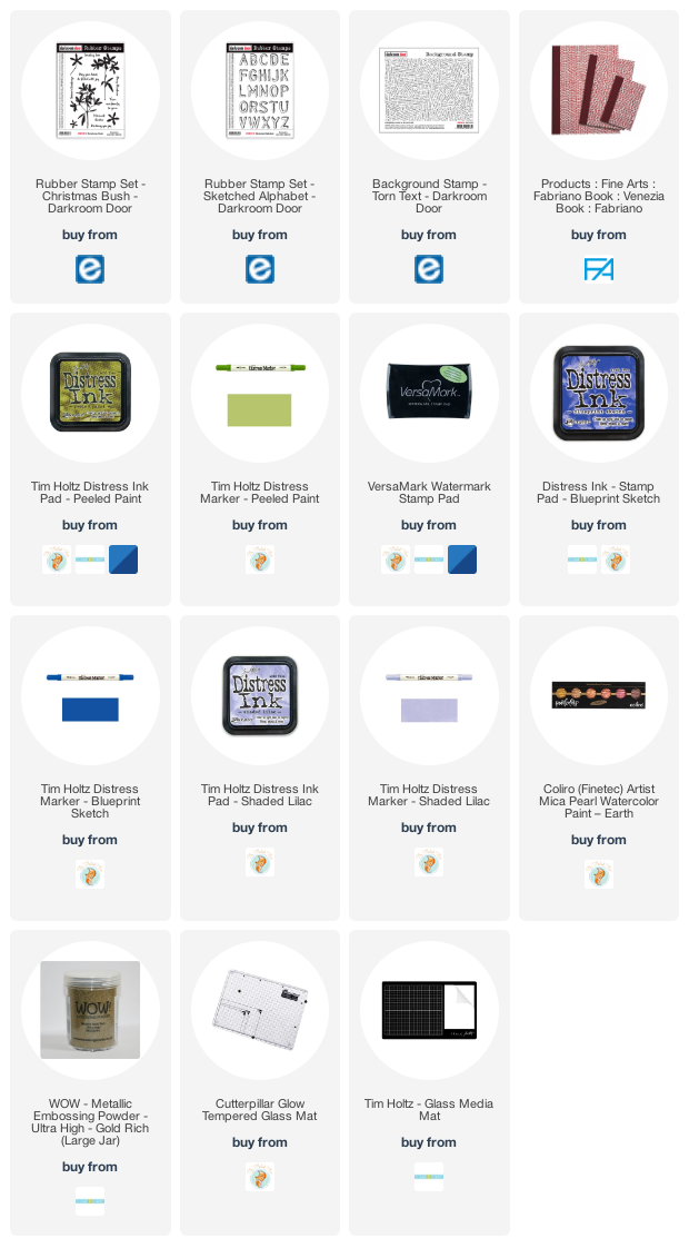
Supplies
What should I read next?
Posted: October 1, 2020 Filed under: Art Journal, book spines, Darkroom Door, mini open book, scratches | Tags: Art Journal, brutus monroe embossing powder, Darkroom Door stamps, Fabriano art journal, Ranger Distress inks, Ranger Distress stains, WOW embossing powders 21 Comments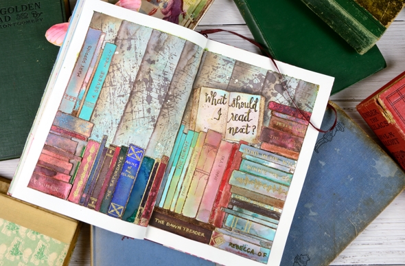
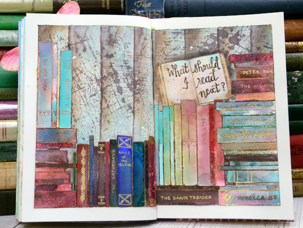
This book themed page has been in my mind for quite a while and that little open book stamp on the right side of the spread pushed me to make it happen. All the stamps are from Darkroom Door; I used ‘mini open book’ once, ‘book spines’ several times and the ‘scratches’ background stamp for the wall behind the books.
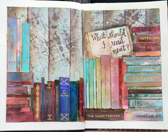
I have three art journals on the go and this one has a literary theme. I’ve done pages inspired by books and others inspired by quotes. I have a few started but not finished and several in my head.
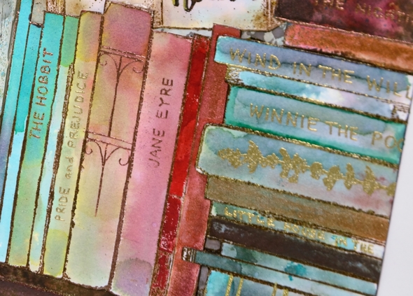
I taped the edges of the double page spread before doing anything; it really helps keep the book open and stable while I work, it protects the other pages from paint and ink and I think it frames the finished design really nicely.
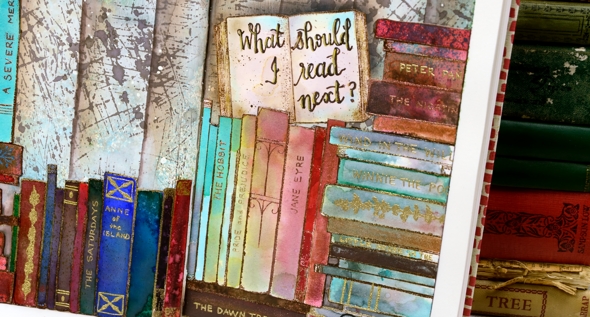
I embossed all the books on hot pressed watercolour paper in either gold or copper powder then coloured them with markers, distress stains and distress inks smooshed on my glass mat. I really just played with techniques until I had a good selection of colours and patterns. I stuck to jewel tones featuring dark green, bright blue, red and aqua. I’ve listed all the distress inks below. I also painted over the inking on a few books with Coliro pearlescent paints so they have a bit of shimmer.
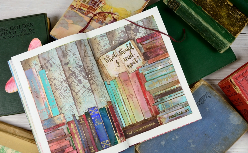
I painted the background with ‘absorbant ground’ as I usually do when I want to work with liquid inks and water then I smooshed some ‘peacock feathers and ground espresso inks on a piece of acetate, spritzed it and dragged it across the page multiple times. That gave me some abstract colour but not enough so I used distress stain sprays in the same colours. After it dried I stamped the scratches background stamp a few times in ground espresso stain. When that dried I used a piece of tape to mask edges to sponge vertical lines across the pages.
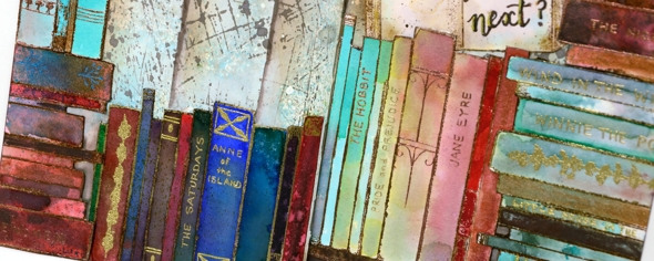
Arranging the books on the page took a little while. I cut them all out first then cut some of the groups into smaller groups to play with the layout. Once I had it settled I glued them down and started adding titles and decoration with gel pens, embossing pens and embossing powder. I wrote quite a few of my favourites on the spines, nothing particularly new even though I have read some great new books lately. I guess they just haven’t stood my test of time yet. I have some empty spines left that I will probably fill another day.
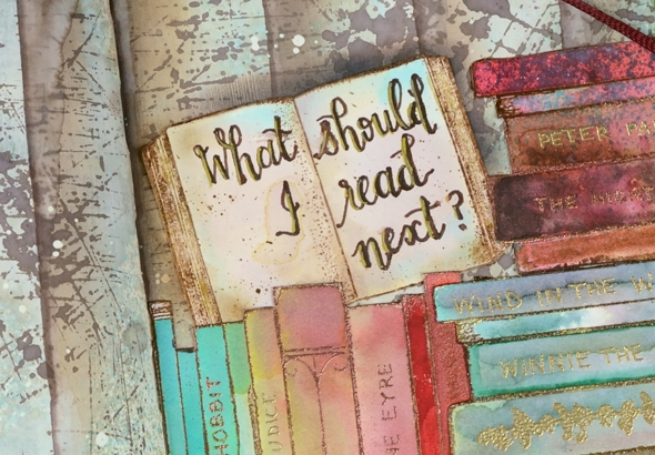
I finished by balancing that open book on one of the piles and added the name of my favourite podcast, ‘What Should I Read Next?’ I get a large chunk of my book recommendations from Anne Bogel, the host of WSIRN. I could talk about books for several more paragraphs but if you’ve made it this far you’re a champion so I’ll save the book chat for another book themed project. I think there will be a spin off card from this journal page.
Oh, and one more thing, please feel free to leave book recommendations in the comments; I’d love to hear your favourites.
Supplies
Fine floral journal page
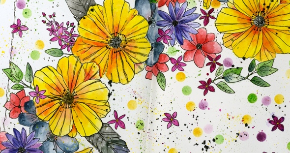
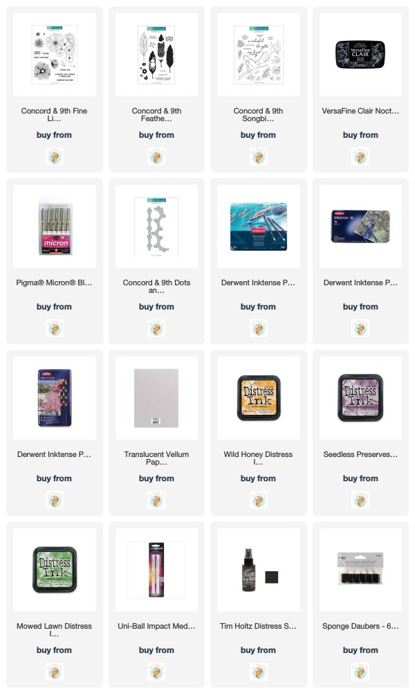
Posted: April 17, 2019 Filed under: Art Journal, Concord & 9th, dots and hearts, Feathered stamp set, fine line florals, Inktense pencils, songbird | Tags: Art Journal, Concord & 9th, Fabriano art journal, Inktense 5 Comments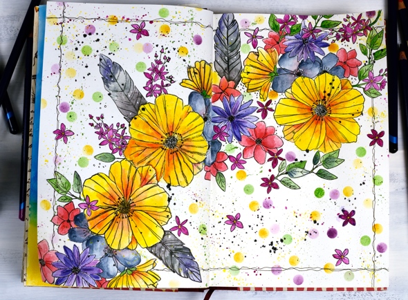
I’ve been experimenting in my journal again featuring some new and old stamps from Concord & 9th. Once again I had an idea in my head and although this does not look like my original idea, I’m very happy with the vibrant look of the massed flowers. I haven’t put any words on this page yet and possibly wont. Now if you are not an art journal type of person, hang in there, I have cards made with the new ‘fine line florals’ set coming over the next few weeks.
As I mentioned last time a couple of my journals do not have watercolour pages, this one is drawing paper. Sometimes I paint my pages with gesso or absorbant ground before I start or glue other papers to the page. I’ve also glued two pages together a few times to make sure liquids don’t soak through the page. The glued pages are very bulky and bumpy though so I don’t think I’ll keep that up. With this page I wanted to see if I could add watercolouring to an untreated page without it soaking through, breaking down the page or seeping outside the stamped images. Even though I love watercolouring with distress inks or stains I thought they might be too wet. I decided instead to used inktense pencils as I hoped to get vibrant colour with limited water. I tried picking up colour from the pencil lead with a wet brush and painting it into my stamped images as well as colouring the image with the pencil then adding the water over the top. I preferred the look of the former method. When I coloured directly on the page it was more likely that I would end up with shading lines or the colour would seep outside the stamping once I added water. I did get some paint soaking through the next page of the journal so I’ll cover that up with my next spread.
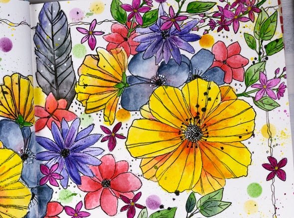
The big flowers are part of a large multiflower stamp from the new C&9 set, fine line florals. I stamped it three times on my journal double page but the page doesn’t sit flat so I was not able to get perfect prints. I was using the fiskars stamp press on the flatter right hand page but used my hand to press the stamp on the bumpy left hand page and tried to do the stamping across the centre of the two pages in two steps while masking the left then right. I kept going even with my patchy stamping and used micron pens to add in missing lines and trace over the pale stamping. I wondered whether the lines I added would be obvious but once all the colour was added it was hard to tell the difference between the stamped and the hand drawn outlines.
The other stamps in my floral explosion are a feather from the C&9 ‘feathered’ set and leaves, flowers and little sprays from the C&9 ‘songbird’ set. I did several layers of colour on the large flowers, letting it dry after each one but just one layer on the leaves, little flowers and feathers. The dots were distress inks sponged through a homemade die cut vellum stencil made with C&9 ‘dots and hearts’ die.

I also did quite a bit of splattering by flicking a wet brush across the lead of the inktense pencils. I added black outlines as I did the watercolouring but when all the painting was finished I went over the centre of the flowers drawing little circle centres with the micron pens and adding little white dots here and there with a white gel pen. To frame the spread I drew a squiggly frame with in black then added some black soot distress stain splatter here and there.
I had fun with this spread and learnt a few things along the way. Hope you are having a great day; thanks for spending some of it here on my blog.
Supplies
https://linkdeli.com/widget.js?1552642647875
Narnia Journal page
Posted: April 15, 2015 Filed under: Art Journal, On the Town, Prancers | Tags: Fabriano art journal, Penny Black stamps, Ranger Distress stains 19 Comments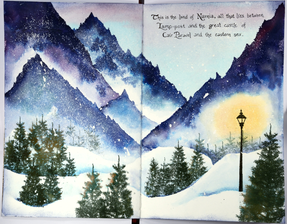
Not what you were expecting to find here on Bits & Pieces? This is my first art journal page; well to be totally honest my second journal page but the first one completed. I have had a few art journals sitting around for over a year waiting for time and inspiration. I started a page last year but it is still in process. The inspiration for this page came from the new Dirty Dozen gallery which opens on Splitcoaststampers today. I am now in my fourth month as a member of the Dirty Dozen and each month we have created projects around a theme. Each theme has been quite a challenge for me including this one. The new gallery theme is “Imagine That” and I was without inspiration until I thought about story books, fantasy and magical story books in particular. I ended up designing five out of my six projects based on some of my favourite books. To view the Dirty Dozen gallery you have to be a fan club member which is a great idea anyway because you will have access to all sorts of extra inspiration while supporting the wonderful creative world of Splitcoaststampers.
After creating a Narnia card for the gallery I decided to expand my design into an art journal spread. I don’t have a video or even a how to for this one although that is my plan for future pages. I followed the advice of the Vicky Papaioannou, who is a very talented art journaller and I glued two pages together to make them sturdier. It has made the pages somewhat bent but I think it prevented the watercolour from seeping through to the other side.
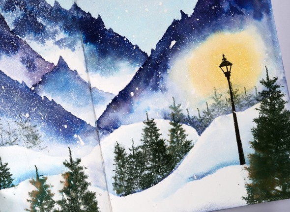
If you know the Chronicles of Narnia by C.S. Lewis you will recognise that this scene is from the early part of ‘The Lion, the Witch and the Wardrobe’. Lucy enters a magical world where it is ‘always winter but never Christmas’.
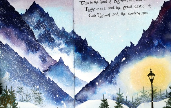
She meets Mr Tumnus who explains that she is in ‘the land of Narnia, all that lies between Lamp-post and the great castle of Cair Paravel on the eastern sea,’ the quote I chose for my page.
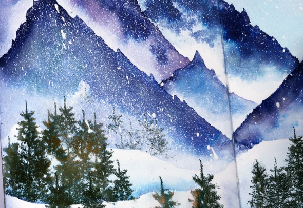
I enjoyed creating this page and may use books as inspiration for future pages. If you do check out the Dirty Dozen gallery this month you will see scenes from some other favourites of mine along with the products of the rest of the team’s creative imaginations.
I used distress stains and memento inks to create my scene over pages heavily splattered with masking fluid. You should recognise the tree stamps from the Prancers set and the lamp-post from On the Town but the mountains and handwriting are all mine.


