Feathers, CAS & calm
Posted: June 5, 2019 Filed under: Brusho, CAS, Catherine Pooler inks, Challenges, Concord & 9th, Feathered die set, Feathered stamp set, Leaf Canopy | Tags: Altenew, Brusho, Catherine Pooler inks, Concord & 9th 9 Comments
I finally got my act together enough to enter a challenge and not even in the last few minutes it was open! I just hosted a challenge with the Foiled Fox and we will be announcing winners in the next few days. I enjoyed visiting all the entries and was inspired by each card. Today’s card was inspired by the ‘Ombre’ challenge at CAS Mix Up and I will be entering it in the ‘Calm’ challenge at Casology as well.
Before I talk about this calm and clean and simple and ombre card I just want to thank those who joined the conversation on Monday about ‘bunchies’. I posted a photo on Monday of myself, aged 6, with my hair in ‘bunchies’ and asked what others called the two ponytail style. I was surprised to read they were known as ‘dog ears’ and ‘dust mops’ as well as the more common ‘pigtails’. One reader called them ‘bunches’ which is practically the same as me so I was not alone with that tag.
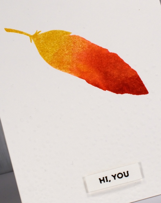
Back to the feather, I used the solid feather stamp from the C&9 Feathered set and Catherine Pooler inks to create the watercolour ombre look. The coverage and blending is just what I was after. Like some dye inks the colours continue to soak in and smooth out after stamping with the CP inks which is exactly what I needed for this look. I inked the whole stamp in ‘shea butter’ ink, stamped then inked two thirds in ‘bellini’ ink, spritzed and stamped, then finished by inking the tip in ‘rockin red’ ink, spritzed and stamped. The little spritz over the ink spread the ink on the stamp so there were no hard lines where one ink stopped or started.
I dry embossed the whole panel with the snowfall/speckles texture fade folder for a bit more visual interest and popped up the sentiment from the same stamp set. Did you know embossing folders are enjoying a rise in popularity these days? I don’t know if that is true or not, I just know they are around here! The CAS mix up challenge required ombre + stamping + my choice (embossing), so all boxes checked! There are a few metallic ombre looks featured on the challenge blog; I’ve never thought of metallic ombre but it is pretty fancy so I might have to give it a try.
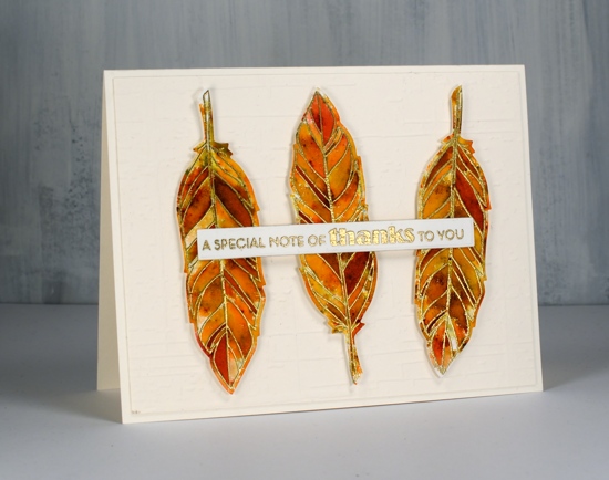
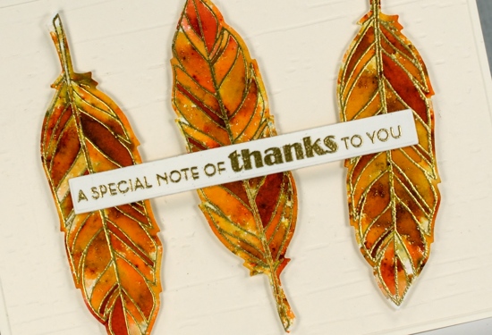
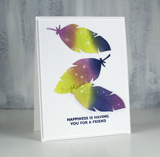
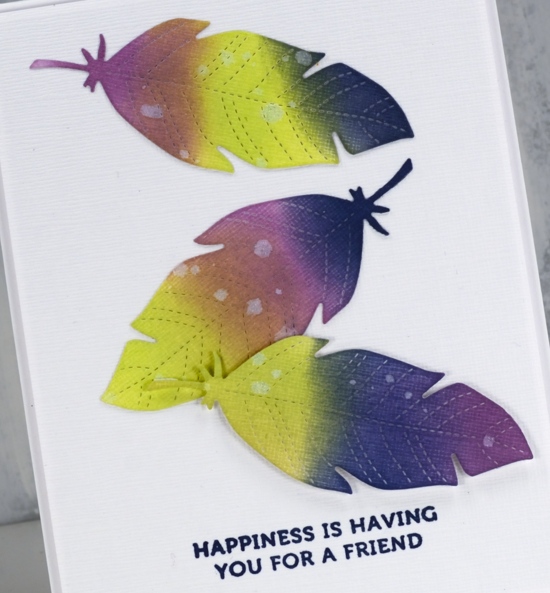
My second card is not entering any challenges; it was made because I love pairing sectioned stamps with sprinkled brusho. I embossed the sectioned feather from the same C&9 set in gold three times on hot pressed watercolour paper, sprinkled sandstone and terracotta brusho powder over the top then spritzed water gently to activate the brusho. I added more brusho and spritzing several times and then moved some paint around with a paintbrush, not much just a few places so there would be a few more solid sections. I die cut the feathers then popped them up on a different dry embossed background, ‘weathered’ by Taylored Expressions. The sentiment is from the Altenew set, ‘leaf canopy’.
Click on the badges below to see what’s happening in the challenges I’m entering.


Supplies
Colour Trio Challenge
Posted: May 6, 2019 Filed under: Feathered die set, Feathered stamp set | Tags: challenge, Concord & 9th, distress oxide inks 4 Comments
I love playing with colour and over the years I have come to the conclusion that often less is more when adding colours to a project. It is not a hard and fast rule but I like to use three colours and mix more from the original three. With that idea in mind I have collaborated with the Foiled Fox to host a card challenge. We invite you to join us in creating cards of only three colours (along with white or black if needed), post them in the link up below and be in the running for a shopping spree at the Foiled Fox store

To create today’s cards I used distress oxides: twisted citron, dusty concord and chipped sapphire. I would call this a complementary colour scheme because although purple and dark blue are right next to each other on the colour wheel, opposite them is yellow.

Two of the feathers above are stamped using the solid feather from the Concord & 9th ‘feathered’ stamp set. I inked the centre feather with dusty concord then stamped the outline over the top in twisted citron. The feather on the right was inked in all three colours with a spritz of water to get them blending. Once the ink dried I added spots and lines using the decorative stamps from the same set. After the stamping dried I cut them out using a co-ordinating die. I also smushed some oxide ink on my glass mat, added a spritz of water then swiped some watercolour paper through it. I used another feather die to cut the feather on the left. For some added texture the feathers are layered on canvas textured cardstock, the middle and right hand ones popped up on foam tape.
For this second card I die cut three feathers from the textured cardstock and used blending tools to apply the three colours of oxide ink. I splattered a little water over them, waited then dabbed it away with a paper towel which gave me the little light dots on each feather. Once again the feathers are layered on the same canvas textured cardstock with a sentiment from the same ‘feathered’ set.
We would love to see the colour trios you come up with. Please use the link up below to link directly to your card on whatever social media platform you use. You have until May 30 to play along. I can’t wait to see all the colour combos; I am ready for new inspiration!
Supplies
Fine floral journal page
Posted: April 17, 2019 Filed under: Art Journal, Concord & 9th, dots and hearts, Feathered stamp set, fine line florals, Inktense pencils, songbird | Tags: Art Journal, Concord & 9th, Fabriano art journal, Inktense 5 Comments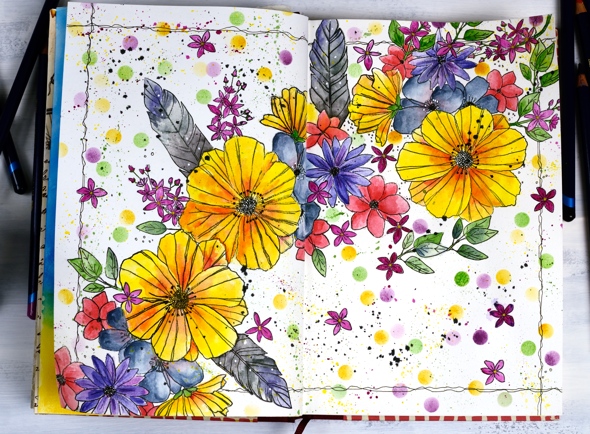
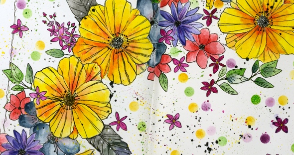
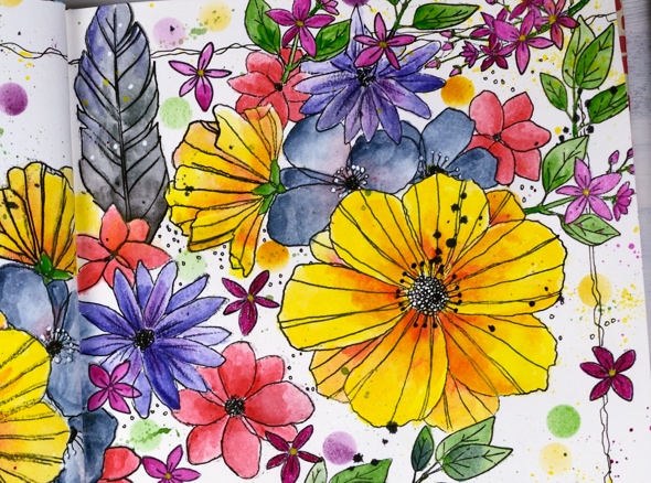
I’ve been experimenting in my journal again featuring some new and old stamps from Concord & 9th. Once again I had an idea in my head and although this does not look like my original idea, I’m very happy with the vibrant look of the massed flowers. I haven’t put any words on this page yet and possibly wont. Now if you are not an art journal type of person, hang in there, I have cards made with the new ‘fine line florals’ set coming over the next few weeks.
As I mentioned last time a couple of my journals do not have watercolour pages, this one is drawing paper. Sometimes I paint my pages with gesso or absorbant ground before I start or glue other papers to the page. I’ve also glued two pages together a few times to make sure liquids don’t soak through the page. The glued pages are very bulky and bumpy though so I don’t think I’ll keep that up. With this page I wanted to see if I could add watercolouring to an untreated page without it soaking through, breaking down the page or seeping outside the stamped images. Even though I love watercolouring with distress inks or stains I thought they might be too wet. I decided instead to used inktense pencils as I hoped to get vibrant colour with limited water. I tried picking up colour from the pencil lead with a wet brush and painting it into my stamped images as well as colouring the image with the pencil then adding the water over the top. I preferred the look of the former method. When I coloured directly on the page it was more likely that I would end up with shading lines or the colour would seep outside the stamping once I added water. I did get some paint soaking through the next page of the journal so I’ll cover that up with my next spread.
The big flowers are part of a large multiflower stamp from the new C&9 set, fine line florals. I stamped it three times on my journal double page but the page doesn’t sit flat so I was not able to get perfect prints. I was using the fiskars stamp press on the flatter right hand page but used my hand to press the stamp on the bumpy left hand page and tried to do the stamping across the centre of the two pages in two steps while masking the left then right. I kept going even with my patchy stamping and used micron pens to add in missing lines and trace over the pale stamping. I wondered whether the lines I added would be obvious but once all the colour was added it was hard to tell the difference between the stamped and the hand drawn outlines.
The other stamps in my floral explosion are a feather from the C&9 ‘feathered’ set and leaves, flowers and little sprays from the C&9 ‘songbird’ set. I did several layers of colour on the large flowers, letting it dry after each one but just one layer on the leaves, little flowers and feathers. The dots were distress inks sponged through a homemade die cut vellum stencil made with C&9 ‘dots and hearts’ die.

I also did quite a bit of splattering by flicking a wet brush across the lead of the inktense pencils. I added black outlines as I did the watercolouring but when all the painting was finished I went over the centre of the flowers drawing little circle centres with the micron pens and adding little white dots here and there with a white gel pen. To frame the spread I drew a squiggly frame with in black then added some black soot distress stain splatter here and there.
I had fun with this spread and learnt a few things along the way. Hope you are having a great day; thanks for spending some of it here on my blog.