Merriest
Posted: November 4, 2021 Filed under: Catherine Pooler inks, Karin brushmarkers, merriest, Penny Black, Tutorial, winter branches | Tags: Catherine Pooler inks, Fabriano Watercolour Paper, Karin brushmarkers, Penny Black stamps, Tsukineko Versafine inks 7 Comments
The new ‘Making Spirits Bright’ release from Penny Black is full of beautiful festive foliage. As you know I love working with florals and foliage especially on rubber cling stamps so these new stamps are definitely my thing!
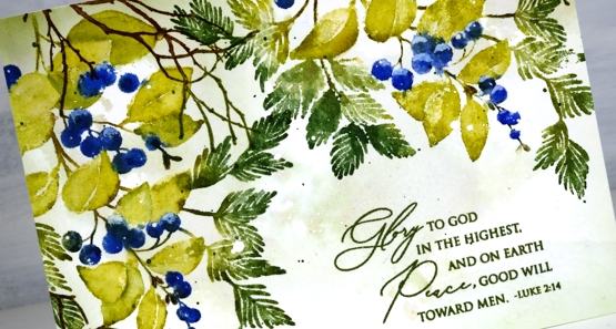
I used Catherine Pooler inks for this design and the colours worked beautifully. I sometimes forget my CP inks, then when I put them to use I remember now juicy and vibrant they are. Take a look at my process below; I have used some of my favourite techniques on this one. (by the way I think I call the release ‘keeping spirits bright’ and the branch stamp fragile beauty instead of ‘winter branches’. Oops)
I know I have been hinting and promising the new class release for the last week. So thanks for your patience; it’s coming, it’s really coming!
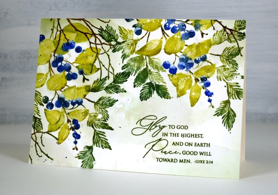
I know it’s subtle but one of my favourite things about this card is the muted background, just some pale greens and brown tones with tiny white dots from the masking fluid.
Thanks for dropping by today. I’ll see you again tomorrow.
Supplies
(Compensated affiliate links used when possible)
Seashells
Posted: August 4, 2021 Filed under: Catherine Pooler inks, seashells | Tags: Catherine Pooler inks, distress markers, Penny Black stamps 8 Comments
Penny Black recently came out with new stamps that had me daydreaming of the beach. I was a shell collector as a child and still love wandering the shore looking for seashell beauty when I get the chance.
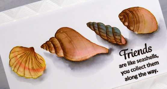
To bring these clear stamps to life I stamped initially in various colours of Catherine Pooler ink then blended out the colours to fill the shells. I smooshed the inks on my glass mat so I could use it as a palette and featured brown inks in all four shells but added different colours to make each one stand out a little. After blending colours for a while some of the initial detail was lost so I used a few distress markers to add some lines back in.
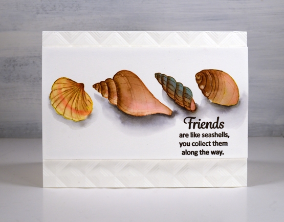
Once the shells dried I used a warm grey Karin brush marker to add shadows below the shells. I drew around the base of each shell in grey then blended it out with water before adding extra grey right beside the shell for depth.
I popped the panel up up an embossed background made with the ‘mod squares’ folder from Altenew.
Oh I would like to be beside the seaside!
Supplies
(Compensated affiliate links used when possible)
Captivating Blue
Posted: June 30, 2021 Filed under: captivating, Catherine Pooler inks, Penny Black | Tags: Catherine Pooler inks, Penny Black stamps, Ranger Distress inks 8 Comments
I’ve been creating backgrounds for landscape stamping lately often by smooshing a few inks on my glass mat, diluting the ink then swiping the watercolour paper through it. The background for this floral card was done the same way and features faded jeans and kitsch flamingo distress inks plus some scattered salt for subtle patterns.
I stamped the Penny Black ‘captivating’ stamp in Catherine Pooler ‘juniper mist’ ink then blended the stamped ink to fill all the lower petals of the fuchsias. I painted the upper petals with kitsch flamingo and the leaves with CP eucalyptus ink. For the tips of the little stamen I used a white gel pen.
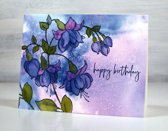
With all the pattern in the background I kept the sentiment simple with part of a stamp from the PB ‘carefree wishes’ set in CP juniper mist.
This stamp features in one of the lessons included in my Floral Faves online class where I teach a range of techniques for use with floral stamps. It’s a self paced class where you can access the video content at your own convenience.
Supplies
(Compensated affiliate links used when possible)
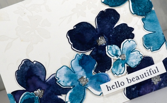
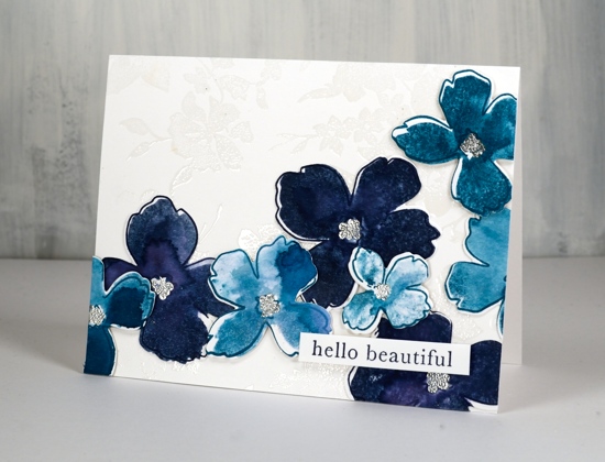
One colour floral
Posted: May 26, 2021 Filed under: Catherine Pooler inks, Penny Black, thriving | Tags: Catherine Pooler inks, Penny Black stamps 5 Comments
I know I’ve been talking a lot about FLORAL FAVES, my new online class, but today’s post is not all about a favourite stamp or a favourite technique. Today the star is my favourite colour. I am team blue all the way! Some might consider this particular blue a bit sneaky because it dilutes to pink and purple tones but I just consider it clever. The way this design turned out with overlapping flowers in shades of blue reminds me of a piece of clothing my mother had when I was very young, perhaps a skirt. My mother was definitely team blue as well!
Juniper Mist ink from Catherine Pooler is one of those magical inks that separates into several different colours. It might not be quite as magical as Memento northern pine, but it’s definitely up there.
Using a stamp from the transparent PB set ‘thriving’, I stamped what might be a lilac several times on hot pressed watercolour paper with juniper mist and painted each flower and leaf with water. I didn’t spend long on the painting so it’s a little messy but that’s the style for this one. As I painted I varied the amount of water I blended with, added extra ink for some flowers and dabbed other ones. Dabbing away wet ink when using juniper mist leaves a pink print.
I’m keeping it floral here on the blog for a while longer to celebrate the launch of my new online class FLORAL FAVES. Thank you to everyone who has joined already. The lesson content is all available now so dive in!
Supplies
(Compensated affiliate links used when possible)
Foiling without heat
Posted: August 10, 2020 Filed under: balloons!, Brutus Monroe, Catherine Pooler inks, Penny Black, silver sketch deco foil | Tags: Brutus Monroe, Catherine Pooler inks, Foiling, Penny Black creative dies, sizzix embossing folder 4 Comments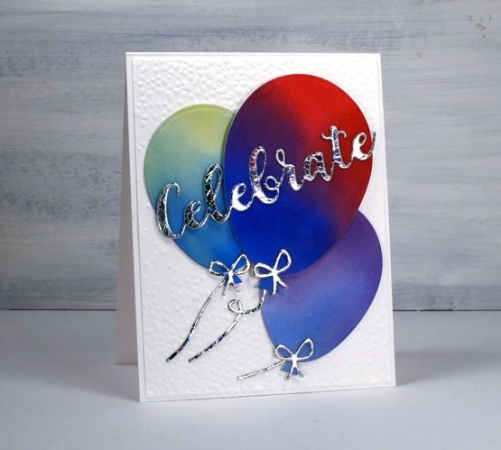
I’m celebrating the opening of my online class today. All the lessons and projects are now available so if you haven’t heard click here to see what it’s all about.
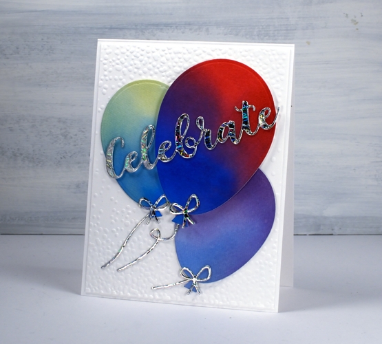
What’s a celebration without balloons and shiny things? I know you don’t see too much sparkle and shine around here but I was intrigued to see how this Brutus Monroe deco foil would look with some watercoloured balloons.
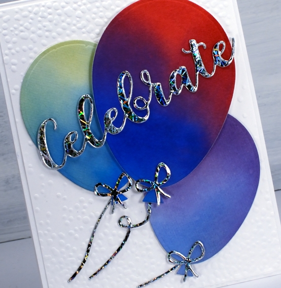
Once I had created a foiled sentiment and some bows I flipped the arrangement and paired foiled balloons with a blended sentiment. As you can see in the photos below I allowed some of the foil to be over exposed in the photo so you could see how it pretty the pattern is as it picks up the light.
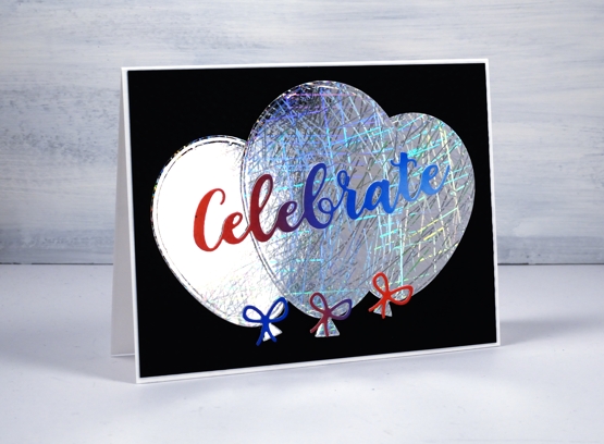
I did my foiling without heat by attaching double sided adhesive (stick-it) to cardstock then removing the backing so I could lay the ‘silver sketch’ transfer foil’ directly on the adhesive. I pressed it down with my fingers carefully to avoid air bubbles then die cut the balloons, strings and sentiment from the foiled cardstock. Once cut I removed the foil top layer to reveal beautifully foiled die cuts. Rather than attaching the balloons to plain black or white card stock I ran the panels through my die cutter inside the ‘snowfall/speckles embossing folder, then flipped the panel around to emboss speckles on both ends.

You can see all that pretty reflective pattern on the foil even better in this close up. Thank you Foiled Fox for sending pretty shiny things my way!
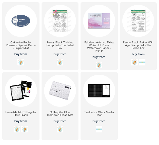
Supplies
Refreshing winners
Posted: July 24, 2020 Filed under: Catherine Pooler inks, Penny Black, Script, soulful silhouettes | Tags: Catherine Pooler inks, Penny Black stamps 6 Comments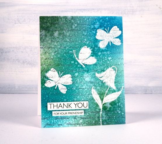
I want to thank everyone who participated in the ‘Refreshing’ giveaway I hosted with the Foiled Fox. I enjoyed reading your preferred ways to find refreshment and noticed many of you head to your garden during the cooler parts of the day, sit by the water if you have some nearby, or on your porch or patio. Some find doing something creative refreshing and there were quite a few mentions of drinks and good books. I would love to be sitting by the water these days but as that is not possible right now I am doing many of the things you are. Thanks so much for sharing those snapshots of your life. Without further ado, I would like to congratulate Martha and Kathy.
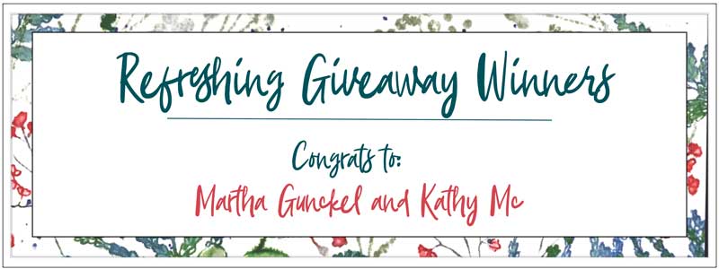
You have won a gift certificate to go shopping at the Foiled Fox online store. I am sure you can find some refreshment there! Shauna from the Foiled Fox will be in touch with more details.
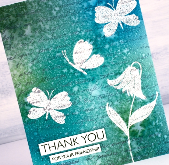
Today’s card features a technique I’m going to call emboss resist masking. It involves embossing in order to resist the application of ink over the top but I wanted the finished project to look as though I masked the butterflies and flowers rather than have shiny raised images at the end. The trick is to iron off the embossing powder once the project is completed.
I know this isn’t a new technique but I was looking at some inspiration pics on pinterest and decided it was a good way to get the effect I wanted.
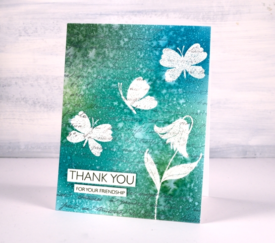
I stamped the PB ‘script’ background stamp in hickory smoke archival ink so the print would not attract embossing powder or be blurred when I added others inks or water. The archival ink is fast drying and permanent.
I used a stamp positioner to stamp a flower and some butterflies from the PB ‘soulful silhouettes’ set in versamark then I embossed in clear powder. To cover the panel with colour I chose four Catherine Pooler inks (listed below) and applied them with blending brushes. I gave the whole panel a couple of spritzes with water which resulted in the lovely pattern you see on the finished card. I didn’t dab it with paper towel or dry it with a heat tool. I was actually patient and let it air dry on the desk because the spritz looked like rain on a window.
Once it was dry I got some scrap paper and lay the panel face down on the scrap paper and ironed it without steam. I changed the scrap paper several times because the embossing powder transfers to the scrap. Eventually there is none left on the original panel. I chose a couple of sentiments from the million thanks set and stamped them in CP spruce ink.
Supplies
Ready to bloom
Posted: October 4, 2019 Filed under: Catherine Pooler inks, floral background, ready to bloom | Tags: Catherine Pooler inks, Ink to Paper, The Stamp Market 3 Comments
These lovely blooms are new from the Stamp Market and I’ve paired them with the Stamp Market floral background stamp. I experimented with some new to me cardstock and my Catherine Pooler inks to create this design. The cardstock is bristol smooth from Koh-I-Noor and even though this is only my first card with it I am impressed. As you can probably see I subjected it to a decent amount of water. I didn’t flood it but I did spritz each solid stamp before stamping all the petals so the paper had to be able to take a little water. It didn’t respond in the same way as watercolour paper does but it did let the water sit on top and blend as it dried rather than soaking through the instant it got wet. This made it possible for me to get some blurs, blends and watermarks on each flower.
I stamped all the outline stamps first, the larger ones in juniper mist and the smaller ones in daydream CP inks. I then stamped the matching solid stamps in the same colours but spritzed each stamp before pressing it down to fill the outline shape. I love the watermarks and variation of shades I achieved by doing this. I’m not sure if there is a recommended order for stamping outline and fill stamps but I think I have more success when I try to put the filler inside the outline rather than the other way round. As you can see they aren’t exactly lined up but that was intentional.
I stamped little centres on the flowers and embossed in silver powder then cut them all out with the co-ordinating dies. I arranged them to flow across a white panel but decided I wanted a little bit of non-distracting interest in the background panel. Clear embossing the ‘flower background’ stamp was enough, it looks a bit like a white damask table cloth. I glued the dark flowers directly to the background panel and popped the lighter flowers up on dimensional tape. The little sentiment is from the Ink to Paper set ‘tagged’.
Have a beautiful weekend.
Supplies
Inky floral background
Posted: June 7, 2019 Filed under: Catherine Pooler inks, floral background, My Favorite Things, The Stamp Market | Tags: Catherine Pooler inks, My Favorite Things, The Stamp Market 8 Comments
I’m still in yellow-orange-red mode, quite unusual for me. I can assure you the blues and pinks will return! I’ve been wanting to ink up the lovely floral background from The Stamp Market again ever since I gave it the rainbow treatment. With the stamp in the MISTI I stamped first with Catherine Pooler shea butter ink on hot pressed watercolour paper. Next I did partial inking with CP samba ink. As you can see I wasn’t particularly accurate with the second colour but I did try to apply it to flowers not leaves. I spritzed the stamp and stamped again. I switched over to leaves and inked them with CP eucalyptus ink, spritzed and stamped again.
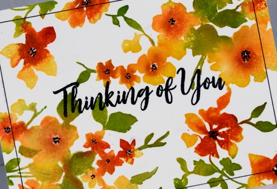
I had managed to catch a lot of the leaves with the ink pad but not all so I switched techniques and pressed the eucalyptus ink onto an acrylic block and picked ink up with a brush to apply to the smaller leaves and stems on the stamp. This worked really well so I pressed the ‘rockin red’ ink on the acrylic block also and used a paintbrush to apply it to the centres of the flowers. There is quite of bit of bleed from one flower or leaf to the next but the overall effect is semi realistic.
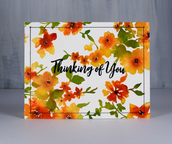
I added black centres to the flowers with a black fine tip marker and they popped nicely so I decided on a black embossed sentiment too, it’s from MFT brushstroke expressions. When I embossed the black sentiment in clear powder it also stuck to the flower centres which I wasn’t expecting, giving them a little shine. At this point I was almost happy but not convinced the design was finished. It needed…a frame! I pulled out my new ‘stay-tion’ magnetic board and the black fine tip marker. Lining up frames and borders like this is one of the reasons I really like the new magnetic board. I lined up my panel with the grid on the board, held the panel in place with magnets then positioned the magnetic ruler across the panel ¼” from the edge. I was able to line up the ends of the ruler with the ¼” grid on the board and ruled a thin black line on each side. So satisfying to not mess that up!
Supplies
Feathers, CAS & calm
Posted: June 5, 2019 Filed under: Brusho, CAS, Catherine Pooler inks, Challenges, Concord & 9th, Feathered die set, Feathered stamp set, Leaf Canopy | Tags: Altenew, Brusho, Catherine Pooler inks, Concord & 9th 9 Comments
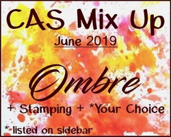
I finally got my act together enough to enter a challenge and not even in the last few minutes it was open! I just hosted a challenge with the Foiled Fox and we will be announcing winners in the next few days. I enjoyed visiting all the entries and was inspired by each card. Today’s card was inspired by the ‘Ombre’ challenge at CAS Mix Up and I will be entering it in the ‘Calm’ challenge at Casology as well.
Before I talk about this calm and clean and simple and ombre card I just want to thank those who joined the conversation on Monday about ‘bunchies’. I posted a photo on Monday of myself, aged 6, with my hair in ‘bunchies’ and asked what others called the two ponytail style. I was surprised to read they were known as ‘dog ears’ and ‘dust mops’ as well as the more common ‘pigtails’. One reader called them ‘bunches’ which is practically the same as me so I was not alone with that tag.
Back to the feather, I used the solid feather stamp from the C&9 Feathered set and Catherine Pooler inks to create the watercolour ombre look. The coverage and blending is just what I was after. Like some dye inks the colours continue to soak in and smooth out after stamping with the CP inks which is exactly what I needed for this look. I inked the whole stamp in ‘shea butter’ ink, stamped then inked two thirds in ‘bellini’ ink, spritzed and stamped, then finished by inking the tip in ‘rockin red’ ink, spritzed and stamped. The little spritz over the ink spread the ink on the stamp so there were no hard lines where one ink stopped or started.
I dry embossed the whole panel with the snowfall/speckles texture fade folder for a bit more visual interest and popped up the sentiment from the same stamp set. Did you know embossing folders are enjoying a rise in popularity these days? I don’t know if that is true or not, I just know they are around here! The CAS mix up challenge required ombre + stamping + my choice (embossing), so all boxes checked! There are a few metallic ombre looks featured on the challenge blog; I’ve never thought of metallic ombre but it is pretty fancy so I might have to give it a try.
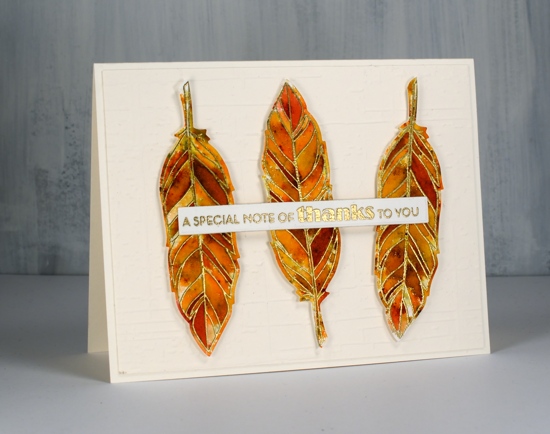
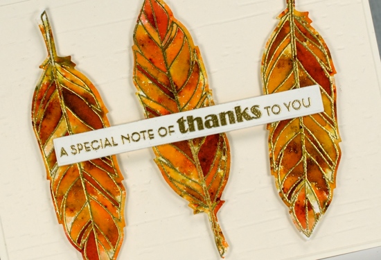
My second card is not entering any challenges; it was made because I love pairing sectioned stamps with sprinkled brusho. I embossed the sectioned feather from the same C&9 set in gold three times on hot pressed watercolour paper, sprinkled sandstone and terracotta brusho powder over the top then spritzed water gently to activate the brusho. I added more brusho and spritzing several times and then moved some paint around with a paintbrush, not much just a few places so there would be a few more solid sections. I die cut the feathers then popped them up on a different dry embossed background, ‘weathered’ by Taylored Expressions. The sentiment is from the Altenew set, ‘leaf canopy’.
Click on the badges below to see what’s happening in the challenges I’m entering.

Supplies