
Inky floral background
Posted: June 7, 2019 Filed under: Catherine Pooler inks, floral background, My Favorite Things, The Stamp Market | Tags: Catherine Pooler inks, My Favorite Things, The Stamp Market 8 Comments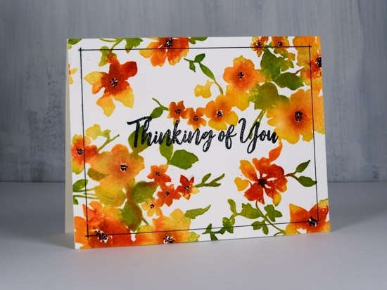
I’m still in yellow-orange-red mode, quite unusual for me. I can assure you the blues and pinks will return! I’ve been wanting to ink up the lovely floral background from The Stamp Market again ever since I gave it the rainbow treatment. With the stamp in the MISTI I stamped first with Catherine Pooler shea butter ink on hot pressed watercolour paper. Next I did partial inking with CP samba ink. As you can see I wasn’t particularly accurate with the second colour but I did try to apply it to flowers not leaves. I spritzed the stamp and stamped again. I switched over to leaves and inked them with CP eucalyptus ink, spritzed and stamped again.
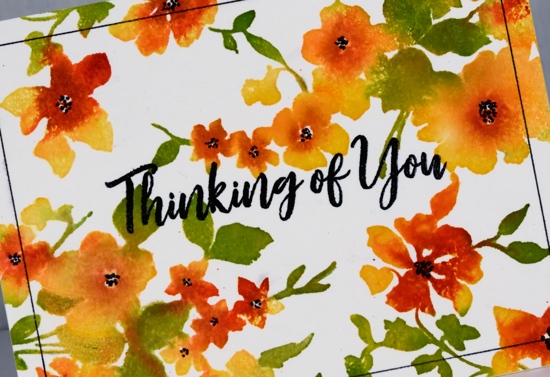
I had managed to catch a lot of the leaves with the ink pad but not all so I switched techniques and pressed the eucalyptus ink onto an acrylic block and picked ink up with a brush to apply to the smaller leaves and stems on the stamp. This worked really well so I pressed the ‘rockin red’ ink on the acrylic block also and used a paintbrush to apply it to the centres of the flowers. There is quite of bit of bleed from one flower or leaf to the next but the overall effect is semi realistic.
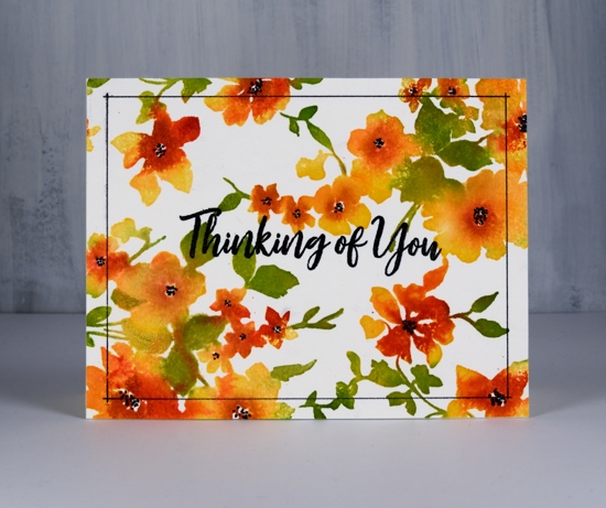
I added black centres to the flowers with a black fine tip marker and they popped nicely so I decided on a black embossed sentiment too, it’s from MFT brushstroke expressions. When I embossed the black sentiment in clear powder it also stuck to the flower centres which I wasn’t expecting, giving them a little shine. At this point I was almost happy but not convinced the design was finished. It needed…a frame! I pulled out my new ‘stay-tion’ magnetic board and the black fine tip marker. Lining up frames and borders like this is one of the reasons I really like the new magnetic board. I lined up my panel with the grid on the board, held the panel in place with magnets then positioned the magnetic ruler across the panel ¼” from the edge. I was able to line up the ends of the ruler with the ¼” grid on the board and ruled a thin black line on each side. So satisfying to not mess that up!
Supplies


Lovely card. Those colours are fabulous. The watercolour look is very beautiful.
This is so pretty, I love the orange!
This card looks perfect and beautiful to me but I know what it is like to be critical of ones own work. Love the warm and bright colors!
Sent from my iPad
>
Gorgeous, I just love these colors!
The Catherine Pooler inks are so bright and pretty Heather and the overall effect is stunning using this beautiful SM floral image, and the magnetic board offers great assistance in putting the frame in position accurately, and this really does give it the perfect finished look. x
So, so beautiful!!! Love the colors and loose watercolor technique with this stamp!
This card just GLOWS! Love your new ‘play-time’ colour palette. 😀
Gorgeous 1 I love your colors an the black frame!