Pink Majesty
Posted: November 4, 2024 Filed under: Finetec paints, Penny Black, Scarlet Majesty, Stampin Up, subtle | Tags: distress markers, Fabriano Watercolour Paper, Finetec artist mica watercolour paint, Papertrey ink, Penny Black stamps, Ranger Distress inks 10 Comments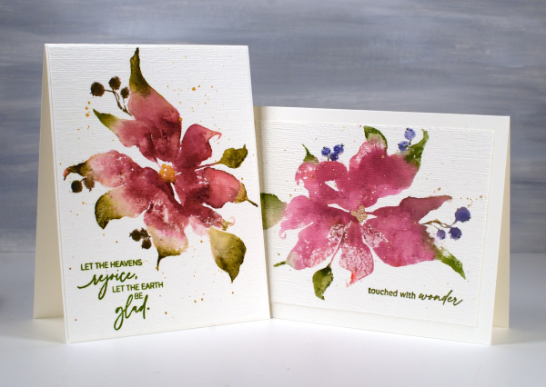
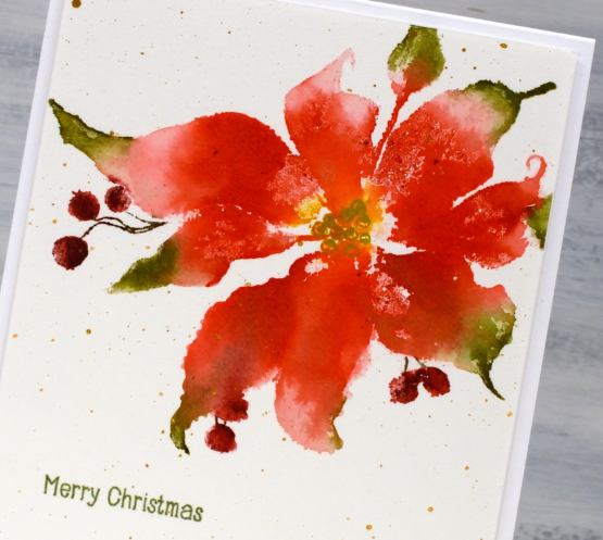
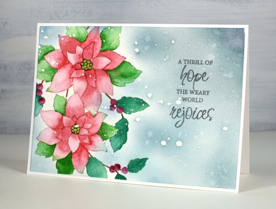
Today’s cards feature the beautiful Penny Black stamp, ‘scarlet majesty‘ but as the title suggests, I have chosen pinks over scarlet for the ink colours. I worked on Fabriano hot pressed watercolour paper in my stamp positioner.
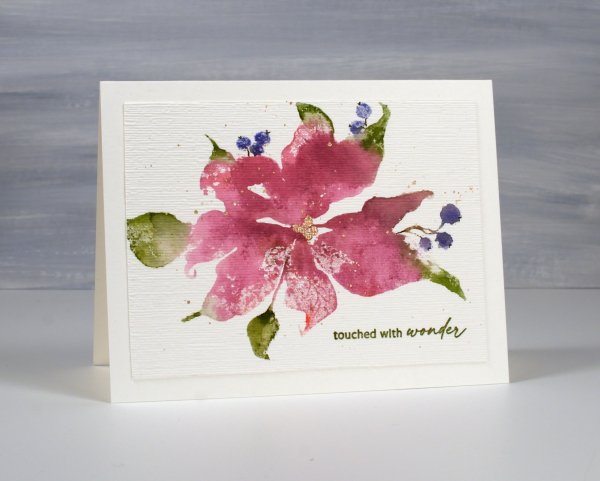
I inked most of the petals with a pink ink then added darker ink with more of a burgandy such as aged mahogany. I use a mix of small cube ink pads and markers to ink the stamp. The leaves were inked with peeled paint and the berries a purply blue such as chipped sapphire. Before stamping I spritz the stamp so the inks can move a little. I stamp the first impression then decide whether more ink is needed, more water or often some blending with a paintbrush and water.
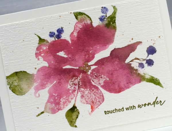
I don’t remember fiddling much with this panel as I liked the watery blends and the paler veins showing through here and there. I painted the centre of the poinsettia with gold finetec paint and of course added some splatter.
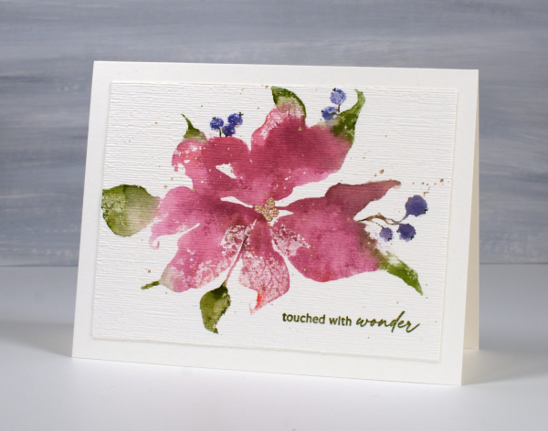
The sentiment is from PB ‘jolly snippets‘ and the texture from the retired SU ‘subtle’ embossing folder.
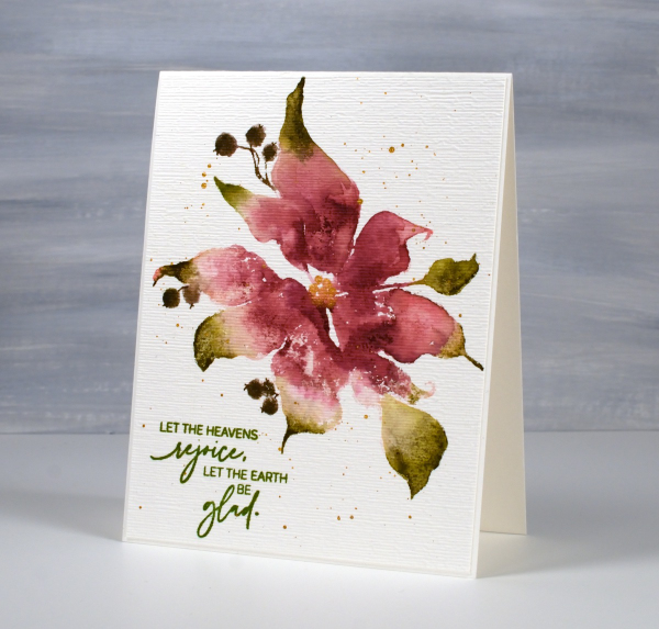
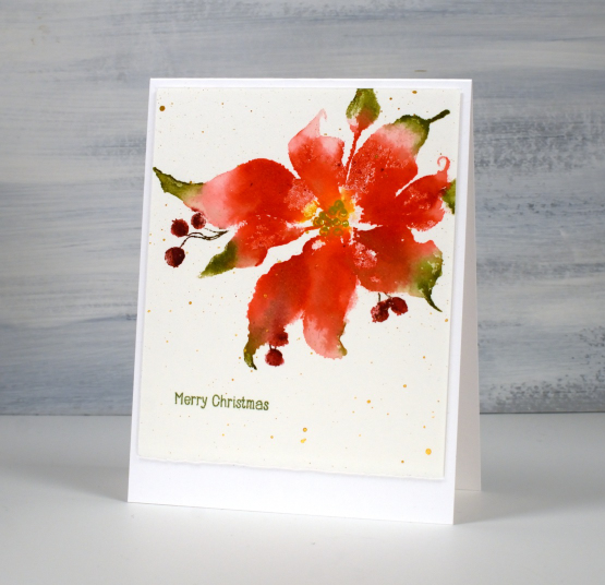
I used the same technique on this second card but used darker inks for leaves, petals and berries. My guess is aged mahogany, forest moss and a dark brown which was possibly made by mixing the first two. (I don’t always take note of my ink colours)
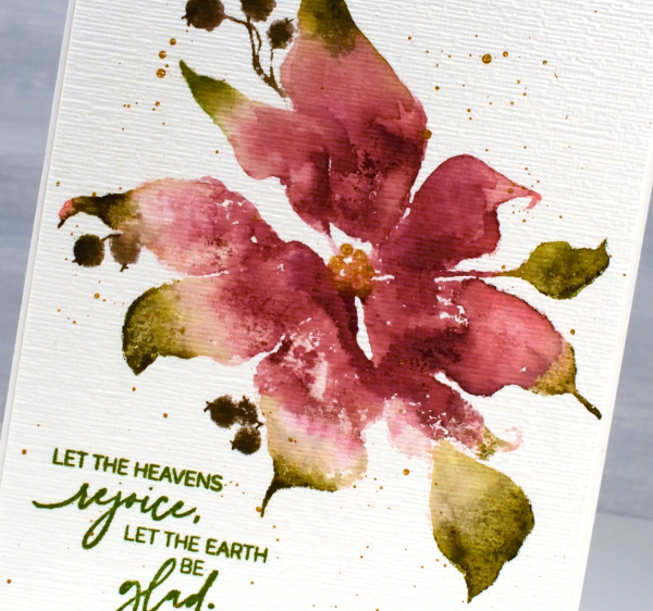
I think ‘scarlet majesty’ is a stunning stamp; I like the curl at the ends of the petals. Here are a few more cards made with it. I will admit that it is tricky to ink because you can’t always see where to try and define edges. I have another post coming up where I handle this issue by adding lines after stamping. I’ll share that soon. The sentiment this time came from the PB set, ‘promise of hope’.

Today’s post features affiliate links to The Foiled Fox. If you buy through these links I receive a small commission at no extra cost to you.
Cones and Berries
Posted: November 21, 2023 Filed under: Cones & berries, Penny Black, Uncategorized | Tags: distress markers, Penny Black stamps, Ranger Distress inks, Stampin Up 5 Comments
More variations on a theme in today’s post. As mailing deadlines get closer I am creating some ‘same but different’ cards to swell my stack. I have never been one to create more than about five of the same card and even when I do there are usually variations. I used the Penny Black cones and berries stamp facing downwards and upwards. I also did first and second generation stamping for a dark and a light version.

Some of the images I cropped closely as shown above and others I gave more space as in the splattered example below. The texture of the SU embossing folder ‘timber’ gave some subtle texture to the woodsy image. You can also see I did extra blending on the card above and deeper colours on the one below.

Even with the variations this was not a time consuming card to make. I worked in a stamp positioner and inked the pinecone and sticks with distress inks, the berries and leaves with distress markers or other waterbased brush markers before stamping on hot pressed watercolour paper. With the stamp in the positioner I was able to spritz it again to create my second generation image and at one stage I was stamping either end of a larger piece of watercolour paper so I could just flip the orientation between impressions. The joy to the world sentiment is from PB Christmas sentiments set and the other sentiment is also PB, it’s red rubber and I cannot find a name for the set. Speaking of mailing deadlines, my cards to Australia were posted yesterday! Having a sprained ankle is keeping me at home right now so this year I might just be a little ahead of my usual ‘just made it’ schedule.
Today’s post features affiliate links to The Foiled Fox. If you buy through these links I receive a small commission at no extra cost to you.
Scarlet Majesty
Posted: October 26, 2023 Filed under: Finetec paints, Penny Black, Scarlet Majesty | Tags: distress markers, Fabriano Watercolour Paper, Finetec artist mica watercolour paint, Penny Black stamps, Ranger Distress inks 7 Comments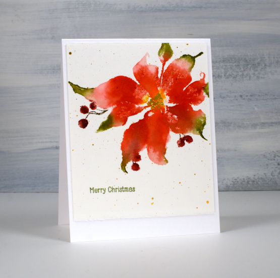
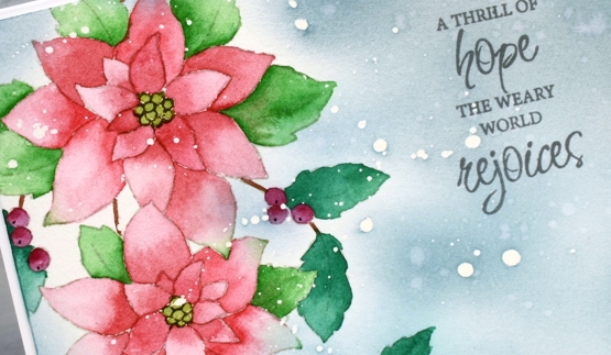
Penny Black has released a lovely selection of poinsettia stamps over the years but this one might just be my favourite (don’t tell the others). The endearing feature on this image is those curly ends on the petals. I just love how whimsical they look. This pretty poinsettia is called ‘scarlet majesty‘ and I have featured it in years gone by.
You might have noticed that I don’t have pictures of the products used in my projects at the end of my blog posts anymore. I decided to return to just linking to products in the written text of the post. Many of the links will still be affiliate links and when clicked will take you straight to one of the three stores where I earn affiliate income. Some of the links won’t be affiliate links, they will just be for your convenience.
To create this panel I worked in a stamp positioner so I could work on one or two parts of the stamp at a time rather than try and get it right in one go. I used a couple of red distress inks to stamp the petals but wiped ink off the tips so I could ink them with green ink. I gave the stamp a spritz to get the inks moving and after stamping, blended from red to green with a paint brush. I also used some yellow ink in the centre of the poinsettia and later drew the seeds over the top with a gold gel pen.
To ink those sweet little berries I switched to water-based markers. Once dry I splattered gold paint over the panel and added a little sentiment from the PB ‘holiday snippets’. As is my preference I worked on Fabriano hot pressed watercolour paper.
Thanks for dropping by today. I appreciate your support and love to read the kind messages you leave in the comments.
Today’s post features affiliate links to The Foiled Fox. If you buy through these links I receive a small commission at no extra cost to you.
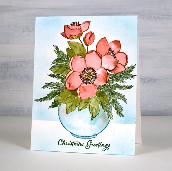
Winter Blooms
Posted: November 26, 2021 Filed under: Penny Black, winter blooms | Tags: Catherine Pooler inks, distress markers, Penny Black stamps 5 Comments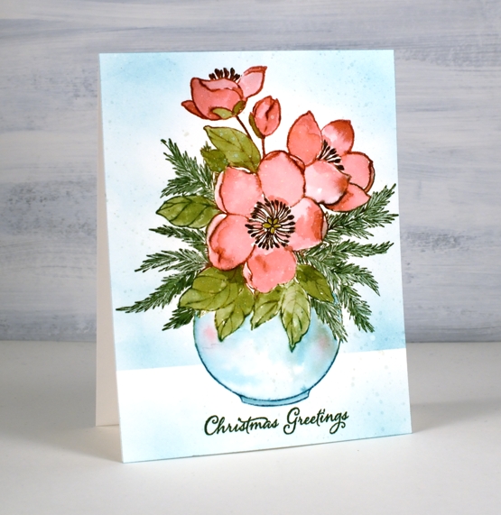
I am happy to be a guest on the Foiled Fox blog today so I hope you will pop over there and check out all the inspiration they share. I am also happy to tell you they are having a Friday – Monday sale, all the more reason to visit!
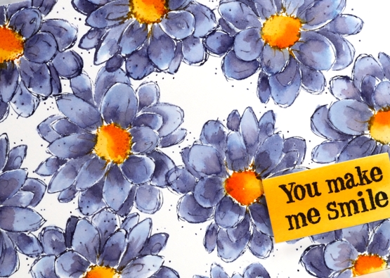
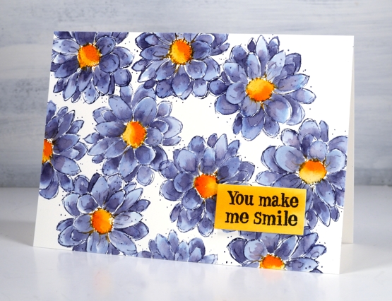
This lovely new floral arrangement from Penny Black is called ‘winter blooms’. I think the blooms are Helleborus; when I looked them up I discovered they come in many colours including pinks, reds and purples. I chose to stamp with juicy Catherine Pooler inks then blend the ink to fill the petals and leaves.
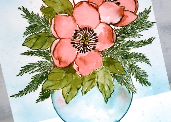
I inked all the elements except the dark centres before doing any stamping. To ink the petals and the leaves without getting ink in the wrong places I press the ink pad on the stamp then wipe the areas that don’t need that colour then do the next colour. Occasionally I end up with colours mixing or spaces with no ink. Neither of those issues cause a problem because when I spritz the stamp the inks move and dilute a little.
Once I had stamped I used water and sometimes extra ink to fill all the elements. I dried the panel before stamping the centres with dark brown ink (applied with a distress marker). I dried the panel again before blending ink over a post-it note mask to create a background and ground the vase. I added a sentiment from PB ‘festive snippets’ set stamped in both shady lane and rainforest versafine clair inks; sometimes I stamp one ink over another to match a colour in my design. As I look at these photos I notice I did not paint a shadow underneath the vase. I think I meant to…
Make sure you visit The Foiled Fox blog and store and use the code JOY2021 for a 15% discount at check out.

Three of my online classes are also on sale until the end of November. Use the code HTNOV to get a 25% discount on the Floral Faves class, Winter Wonder class and the Colour Clues class. Have a delightful weekend.
Supplies
(Compensated affiliate links used when possible)
Carmine – No Line Watercolour Video
Posted: November 16, 2021 Filed under: carmine, Penny Black, sennelier watercolours, Tutorial | Tags: distress markers, Fabriano Watercolour Paper, Papertrey ink, Penny Black stamps, sennelier watercolours, Tsukineko Versafine inks, Tutorial, video 9 Comments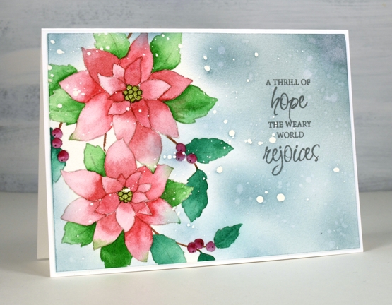
I hope you enjoy today’s no-line watercolour video. When I first saw this stamp I knew it would be perfect for the technique. There are a few little petals but most of the image is made up of open leaves and petals which are easy to see while painting. I used soft stone ink for the initial image on cold press watercolour paper and Sennelier watercolour paints for all the painting.
If you don’t always have a plan for the background you will see how I added one after all the painting was done. Take a look at the video below to see my process.
This is such a pretty stamp and might get inked up again soon to keep my stock of Christmas cards growing. I think it would look good embossed in white on a coloured background. Stay tuned!
Supplies
(Compensated affiliate links used when possible)
Combining scenic stamps
Posted: August 16, 2021 Filed under: farmland, homeward, Penny Black, Stamped Landscapes | Tags: distress markers, Fabriano Watercolour Paper, Penny Black stamps, Ranger Distress inks 7 Comments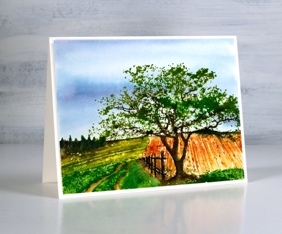
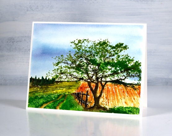
I’ve been playing with scenic stamps again, this time combining sections of two stamps to create a new scene. The Penny Black ‘farmland’ stamp forms the background scenery and the PB ‘homeward’ stamp makes up the foreground.
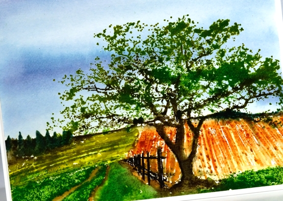
Out of habit (a successful one!) I used distress inks and markers to ink the stamps and add detail to the design. I kept the palette limited using two blues for the sky and several greens and browns for the rest of the scene. To see the process take a look at the video below.
I know some people find scenic stamps a bit daunting but the detail in the stamps themselves makes it possible to add a little or a lot of your own artistry. I hope you find the techniques shown in the video helpful.
You can see cards featuring the farmland stamp on its own here and to see the homeward stamp here.
I mentioned in the video that although I think the fields look authentic I have no idea what the crops might be. If you know of crops that would appear to be rust or olive coloured mention it below!
Supplies
(Compensated affiliate links used when possible)
Seashells
Posted: August 4, 2021 Filed under: Catherine Pooler inks, seashells | Tags: Catherine Pooler inks, distress markers, Penny Black stamps 8 Comments
Penny Black recently came out with new stamps that had me daydreaming of the beach. I was a shell collector as a child and still love wandering the shore looking for seashell beauty when I get the chance.
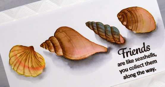
To bring these clear stamps to life I stamped initially in various colours of Catherine Pooler ink then blended out the colours to fill the shells. I smooshed the inks on my glass mat so I could use it as a palette and featured brown inks in all four shells but added different colours to make each one stand out a little. After blending colours for a while some of the initial detail was lost so I used a few distress markers to add some lines back in.
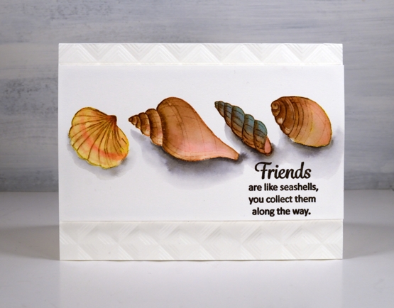
Once the shells dried I used a warm grey Karin brush marker to add shadows below the shells. I drew around the base of each shell in grey then blended it out with water before adding extra grey right beside the shell for depth.
I popped the panel up up an embossed background made with the ‘mod squares’ folder from Altenew.
Oh I would like to be beside the seaside!
Supplies
(Compensated affiliate links used when possible)
Fine Flowers watercolour video
Posted: August 3, 2021 Filed under: Darkroom Door, fine flowers vol 2, Tutorial | Tags: Darkroom Door stamps, distress markers, Ranger Distress inks, Tutorial, video 6 Comments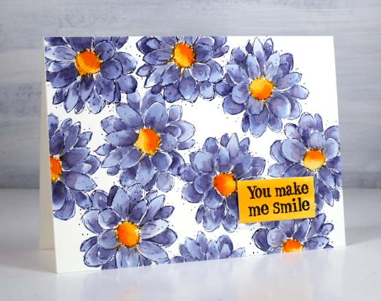
This pretty outline flower is from the Darkroom Door set ‘fine flowers vol 2’. There are six flowers in the set and I am working my way through trying out each stamp. I began inking and stamping this zinnia/dahlia style flower and was so happy with the colour combination I stopped stamping and set myself up to film. You can see the process in the video below.
I’ve exclaimed about inks that colour separate before( and go into more detail in my online class Colour Clues ) but one of my favourites in this regard is chipped sapphire distress ink. You can see in the close up below grey blue, navy blue, pale blue and purply blue. Hardly any effort required!
All the stamps in the set have the same sketchy style and tiny dots so I did not add any further fanciness. It really was a minimal supplies card in the end even though I did not start with that plan in mind.
By the way Rachel Greig from Darkroom Door is running a challenge throughout August called #artfulaugust. If you check her instagram you can see a list of prompts. I am going to join in as often as possible as it is an open ended no pressure challenge. I have already missed one day but I am not going to dwell on that I will just dive in when I can. Kathy Racoosin is also running the Daily Marker colouring challenge during August, another low pressure, designed for fun and relaxation challenge. I hope to participate in that when I can too. Let me know if you are joining in.
Supplies
(Compensated affiliate links used when possible)
Work & Relax
Posted: July 30, 2021 Filed under: paws and relax, Peerless watercolours, zooming by | Tags: distress markers, Papertrey ink, Peerless Transparent Watercolors, Penny Black stamps 2 Comments
Are you surprised to see another critter post? Regular programming will resume I promise but first let’s enjoy Scooter and her friends working from home and pampering themselves!

Once again I stamped the images with Papertrey ink’s soft stone. It is great for no-line watercolour. I used Peerless watercolours to paint the little scenes concentrating on a few main colours for each card. For the hedgehog I switched to brown distress markers, easier for getting all those spikes!

If you didn’t read it in my earlier post, Penny Black is donating some of the proceeds from the Scooter release to Muttville a rescue program for senior dogs.

Hope you get to ‘paws & relax’ this weekend. It’s a long weekend here in Ontario!
Supplies
(Compensated affiliate links used when possible)
Hot Diggity
Posted: July 29, 2021 Filed under: doggone great, hot diggity dog, Peerless watercolours, Penny Black | Tags: distress markers, Peerless Transparent Watercolors, Penny Black stamps, Ranger Distress inks 4 Comments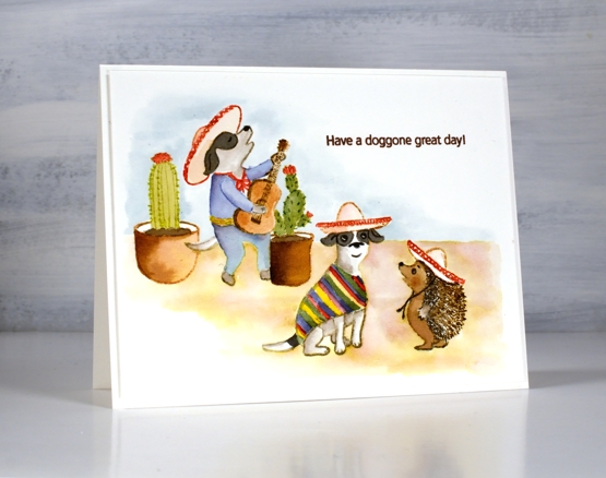
I have another cute Scooter card for you today. Once again I watercoloured, this time with distress inks. I think this is my favourite set from the release; what’s not to like about a canine mariachi band?
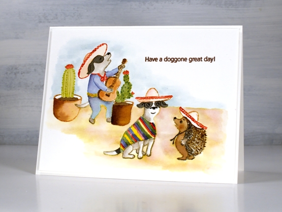
I stamped some images with soft stone ink then painted with distress inks. Other images, including the hedgehog I stamped in brown distress inks and blended them to fill the image. I painted the background with distress inks smooshed and diluted on my glass mat.
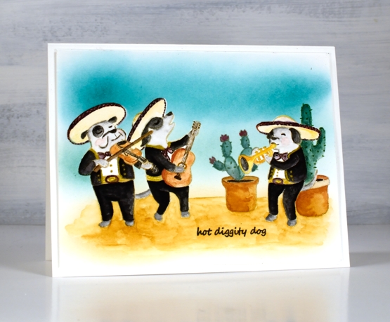
The second card I stamped in antique linen distress inks and stamped on masking paper also so I could create the scene with cacti in the background and one musician behind another.

I painted with peerless watercolour paints and added gold details with a gel pen. I used the masks a second time so I could blend ink over the background.
These Scooter scenes were definitely a departure from my nature (and book) themed projects but as a friend said to my yesterday, ‘always good to step out of your comfort zone!’
Supplies
(Compensated affiliate links used when possible)