
Pink Majesty
Posted: November 4, 2024 Filed under: Finetec paints, Penny Black, Scarlet Majesty, Stampin Up, subtle | Tags: distress markers, Fabriano Watercolour Paper, Finetec artist mica watercolour paint, Papertrey ink, Penny Black stamps, Ranger Distress inks 10 Comments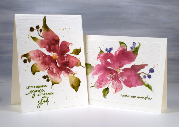
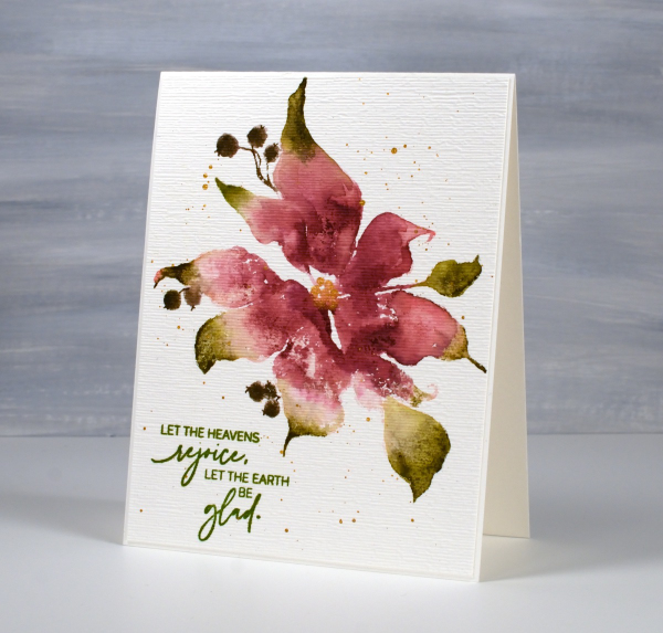
Today’s cards feature the beautiful Penny Black stamp, ‘scarlet majesty‘ but as the title suggests, I have chosen pinks over scarlet for the ink colours. I worked on Fabriano hot pressed watercolour paper in my stamp positioner.
I inked most of the petals with a pink ink then added darker ink with more of a burgandy such as aged mahogany. I use a mix of small cube ink pads and markers to ink the stamp. The leaves were inked with peeled paint and the berries a purply blue such as chipped sapphire. Before stamping I spritz the stamp so the inks can move a little. I stamp the first impression then decide whether more ink is needed, more water or often some blending with a paintbrush and water.
I don’t remember fiddling much with this panel as I liked the watery blends and the paler veins showing through here and there. I painted the centre of the poinsettia with gold finetec paint and of course added some splatter.
The sentiment is from PB ‘jolly snippets‘ and the texture from the retired SU ‘subtle’ embossing folder.
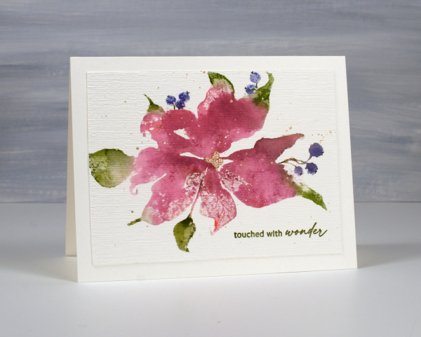
I used the same technique on this second card but used darker inks for leaves, petals and berries. My guess is aged mahogany, forest moss and a dark brown which was possibly made by mixing the first two. (I don’t always take note of my ink colours)
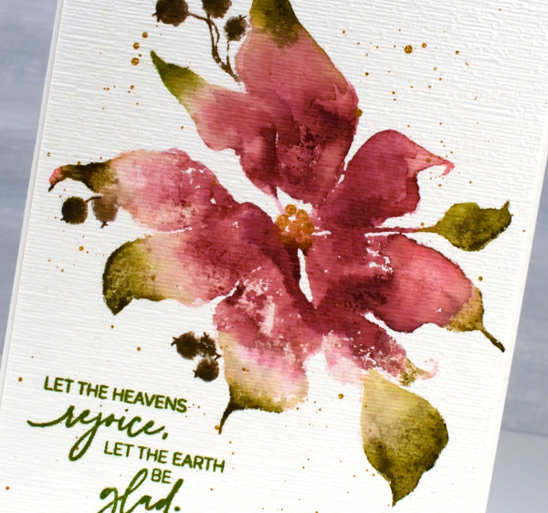
I think ‘scarlet majesty’ is a stunning stamp; I like the curl at the ends of the petals. Here are a few more cards made with it. I will admit that it is tricky to ink because you can’t always see where to try and define edges. I have another post coming up where I handle this issue by adding lines after stamping. I’ll share that soon. The sentiment this time came from the PB set, ‘promise of hope’.

Today’s post features affiliate links to The Foiled Fox. If you buy through these links I receive a small commission at no extra cost to you.
Trilling Trio
Posted: January 17, 2022 Filed under: Penny Black, Stampin Up, subtle, trilling trio | Tags: Penny Black stamps, Stampin Up 15 Comments
Trilling Trio from Penny Black arrived on the scene late last year and features three different birds. My card today uses just the cardinal stamp but I have coloured it two ways so as to have the male and the female on my panel.
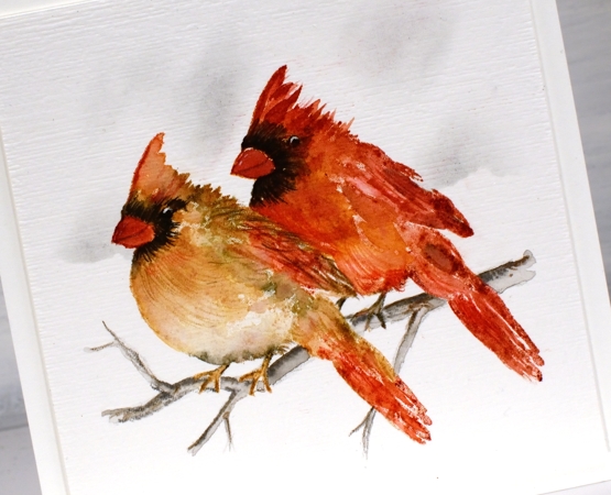
I worked with distress inks and watercolour pencils on hot pressed watercolour paper and I kept the panel in the stamp positioner so I could build the colours gradually. I stamped the female cardinal first in antique linen ink so it gave me a pale outline then I used tea dye, vintage photo and barn door inks to add colour. I spritzed the stamp lightly before stamping so the colours would blend but then did more blending with a paintbrush. I added black around the eye and beak both by stamping and by colouring directly on the panel. To add texture to the feathers I used sharpened watercolour pencils. I added the male cardinal behind using more barn door ink along with the tea dye and black soot inks.
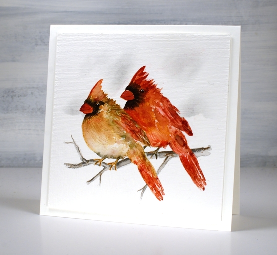
Once the birds were completed I drew a small branch with watercolour pencils, blended it and then used a blending brush and a torn piece of post-it note to add shadow in the background. I ran the panel through with the ‘subtle’ embossing folder from SU; it adds such nice canvas texture! There are two more delightful bird stamps in the set which I hope to feature soon!
We are getting much snow today so I will be hunkered down in the work room or maybe taking a turn clearing the path and driveway!
Supplies
(Compensated affiliate links used when possible)
Gilded Wheat
Posted: September 20, 2021 Filed under: gilded wheat, Penny Black, Stampin Up, subtle | Tags: Faber-Castell Albrecht Durer Watercolour pencils, Penny Black stamps, Ranger Distress inks, Stampin Up 14 Comments
This beautiful wheat stalk, ‘gilded wheat’ is new from Penny Black. You know that feeling when you think maybe a project is complete but you’re not sure so you keep going? I had that feeling after I had finished stamping, painting and highlighting the wheat stalks. I just wasn’t sure whether to add a background or not.
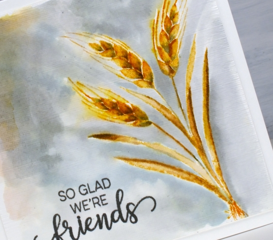
I stamped the wheat in scattered straw and wild honey distress inks then blended with a paint brush. To add shadow to the sides of the leaves and the base of the wheat berries I used iced spruce ink. After painting I switched to watercolour pencils and added more shadow with a similar grey-green spruce colour.
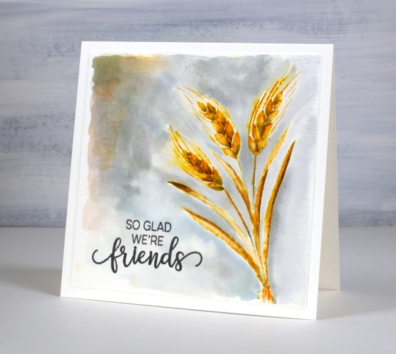
I could have stopped there and not added the background painting which is kind of patchy but I liked the contrast of the gold colours and the grey so I kept going. Before putting the card together I stamped a sentiment from the PB ‘choose happy’ set and ran the panel through the die cutting machine in the SU ‘subtle’ embossing folder. Sometimes people ask me how I settle on my colour combos; this one was inspired by the small leaves at the top of the previous card. Who knew grey and gold would be so happy together?
Supplies
(Compensated affiliate links used when possible)

Cow’s it going?
Posted: May 14, 2021 Filed under: Cow's it going?, Pink Ink Designs, Stampin Up, subtle | Tags: Fabriano Watercolour Paper, Pink Ink Designs, Stampin Up 18 Comments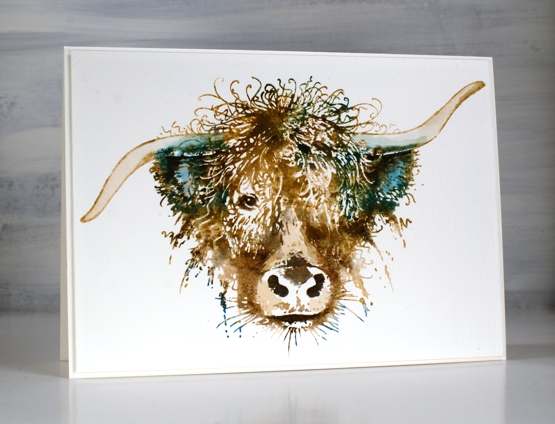
How much do you love this big highland cow? I hope you don’t mind this departure from my usual subject matter but there is something about this cow (and some other beauties from Pink Ink Designs) that amuses and inspires me! When I saw this stamp I knew it would make the perfect birthday card for someone I know who finds highland cows adorable. Although confused by my behaviour, Crop A While here in Ottawa ordered it for me and I’m so glad.
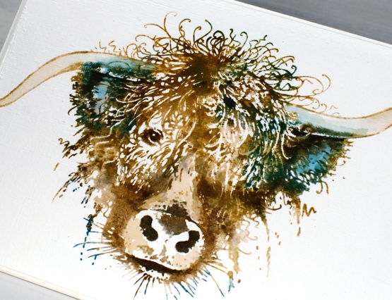
This card is stamped and painted with dye inks, classic kraft papertrey ink as a base colour then four distress colours to highlight, shade and add personality to the beautiful face and hair-do. I worked in a stamp positioner so I could add the colours bit by bit to build up the image. I did some painting and blending with a paint brush but kept white areas also as they add so much to the design.
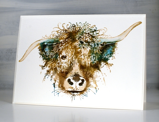
After I had completed the painting part I decided not to add anything more but instead ran the panel through the die cut machine inside the SU subtle embossing folder. If you look at the close up image you might just see the linen texture achieved. The ‘cow’s it going’ stamp set includes eleven smaller stamps along side this one including some distinctly Scottish ones so I’m looking forward to following that theme another time. My name is Heather after all, Heather McDonald originally!
Hope you are having a good hair day, like this cow obviously is!
Supplies
(Compensated affiliate links used when possible)

Secret Garden
Posted: May 13, 2020 Filed under: Papertrey Inks, Penny Black, secret garden, subtle | Tags: Papertrey ink, Penny Black stamps 10 Comments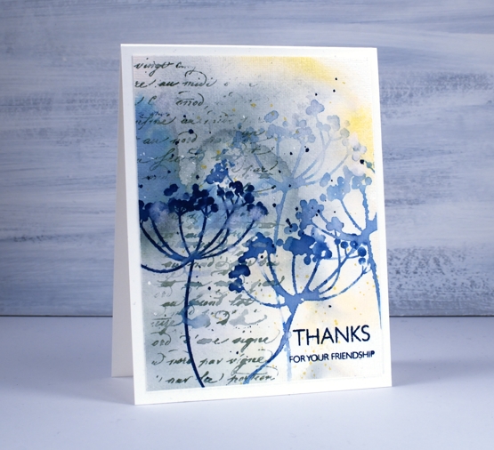
Before I chit chat about today’s cards I just want to thank you for your feedback on my wreath card. I loved reading your kind words and thoughts on the sentiment question. In the end I left the front of the card sentiment free (I really didn’t want to mess it up!) and made a envelope out of watercolour paper onto which I will add roses and hand-lettering. When I do another wreath I will hand letter the sentiment first then proceed with the flowers, that way I won’t be afraid of messing up a finished wreath with a wonky letter. Now, back to our scheduled programming.
Last week I created a couple of abstract watercolour background panels to create coffee themed cards; I used the same approach for today’s floral cards. My method for creating the background was the same, I smooshed three colours of dye ink on my glass mat then spritzed them generously with water to make them move and blend a little. I had a large panel of hot pressed watercolour paper ready with some masking fluid already dotted over it. The colours I used were papertrey ink cubes lemon tart, enchanted evening and stormy sea (yellow, blue and grey).
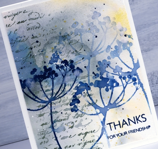
I cut the panel into four and chose to work with stamps from the PB ‘secret garden’ clear set. My plan was to stamp the flowers in the same colours I used for the background, maybe use all three colours or just one or two. After fiddling around with some stamping I decided I liked just the flowers in the blue, stamped and restamped for paler impressions. I guess you’re not surprised I settled on blue, the lemon is very pretty but too pale to stand out and the grey was, well, not quite pretty enough.
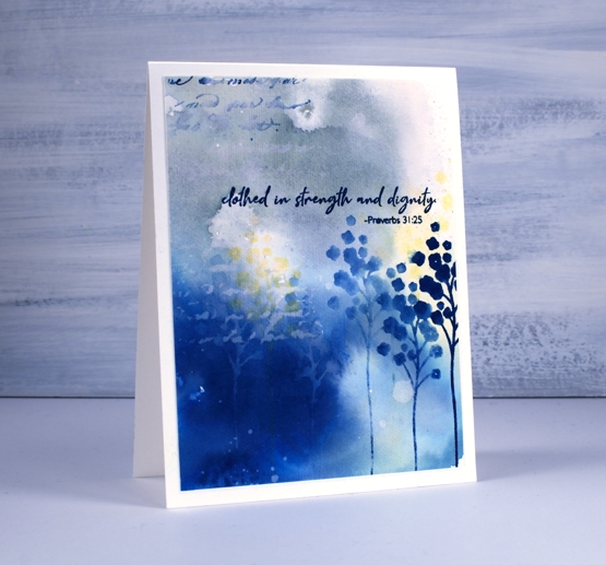
Both floral stamps I chose had long skinny stems that I was able to rearrange on the lid of the MISTI to go in the directions I wanted. I did some water stamping too which just means misting the stamp with water and pressing it down on an inked area (the darker the better) and holding it there for a little longer than normal to let the water soak in then dabbing away the water to reveal a stamped ‘watermark’.
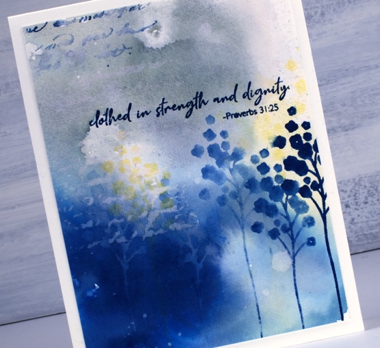
Once I had the flowers all stamped the panels still didn’t look quite finished so I turned to two elements I like to add when a card needs a little something. I used the PB ‘script’ stamp down the side of both panels in blue, grey and watermark then ran the panels through my diecutting machine with a rather cool embossing folder from Sizzix (sold by SU) called ‘subtle’. It gave the panels a canvas look. To add sentiments I used the ever useful ‘million thanks’ set and the lovely ‘SHE builder’ set both from Penny Black.
Supplies


