Winter Barn
Posted: October 28, 2022 Filed under: Papertrey Inks, winter barn | Tags: Fabriano Watercolour Paper, Penny Black stamps, Ranger archival inks, Ranger Distress inks 11 Comments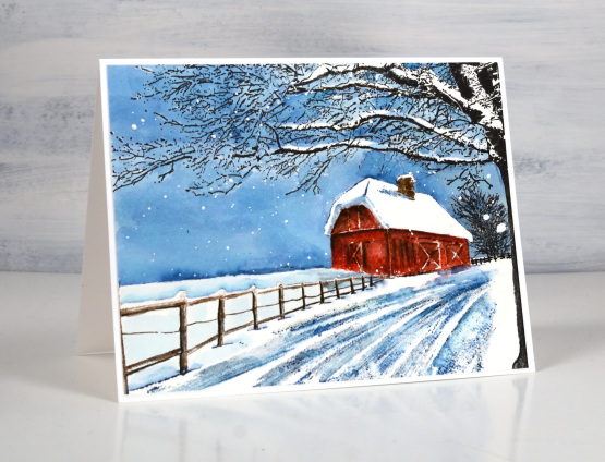
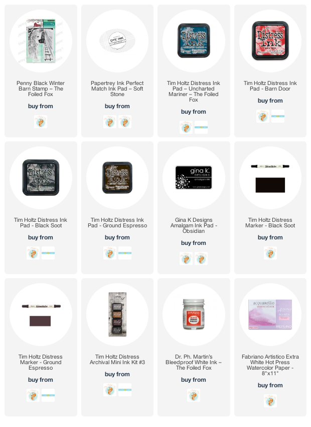
We’ve been having such warm pleasant weather lately this scene seems like a very distant prospect. The tide is turning though; it was rather chilly out today, not snow-covered-barn chilly but, could-have-worn-a-jacket chilly. This stamp is called winter barn and it’s new from Penny Black. I worked on hot pressed watercolour paper in a stamp positioner and started by stamping the whole scene in soft stone ink, a pale grey which gives me the whole scene in a pale tone which won’t interfere with the colours I add over the top. I used barn door distress ink (of course) for the barn, black soot archival and distress ink for the trees, ground espresso distress for the fence and uncharted mariner for all the sky and shadows in the driveway.
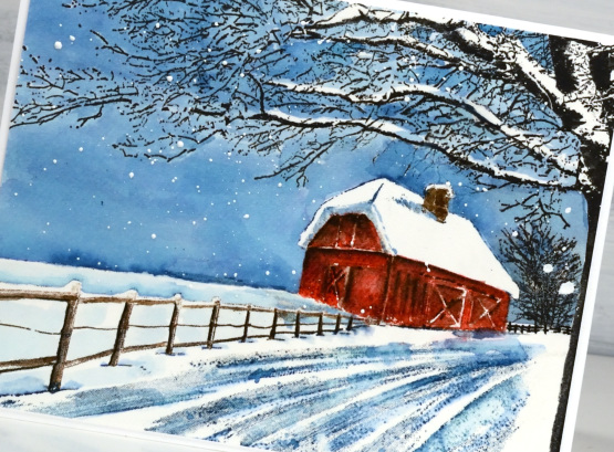
I stamped the barn with just the red ink first then as I blended added brown shadows both by re-stamping and with a paint brush. I stamped the tree in archival ink and amalgam ink (both waterproof) so I could paint the sky over the stamping. I did paint carefully around the snow laden branches to leave some areas white. I stamped the fence in ground espresso but used black soot when blending the ink to give shadows to the fence posts. I blended some areas of the driveway but left some sections unblended which seemed to work well to suggest the ruts in the snow after it’s been driven on.
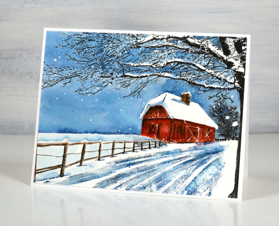
When I was happy with the scene I splattered on some white paint to look like snow.
Just a quick question for those of you with barns or experience with barns, do they often have chimneys? I would have thought the hay might be a fire risk…
(Compensated affiliate links from Foiled Fox & Scrap n Stamp)
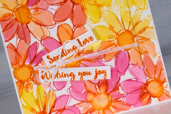
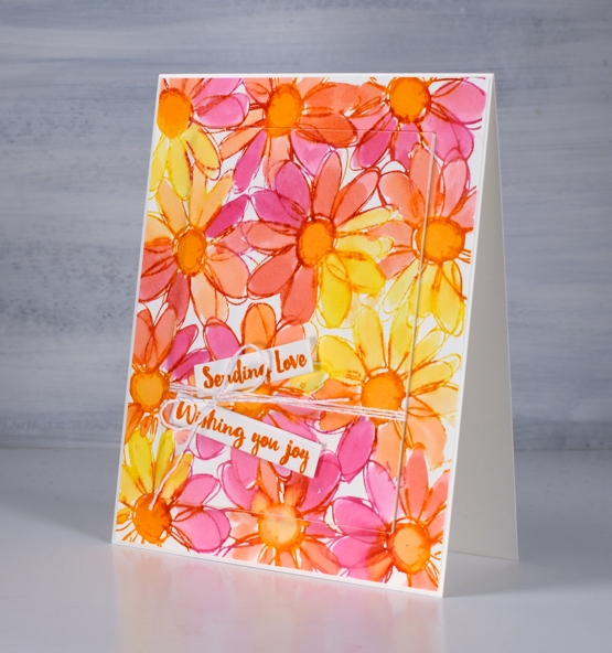
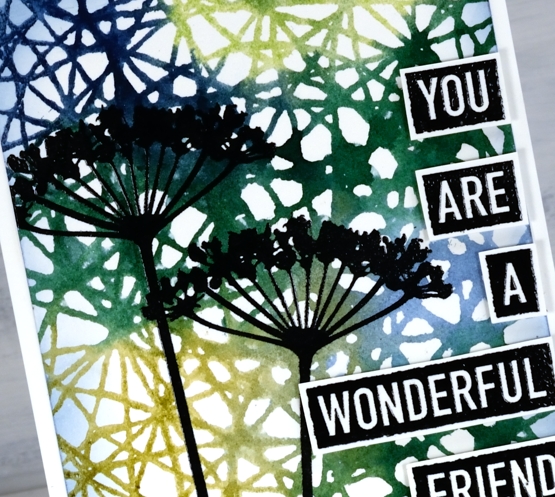
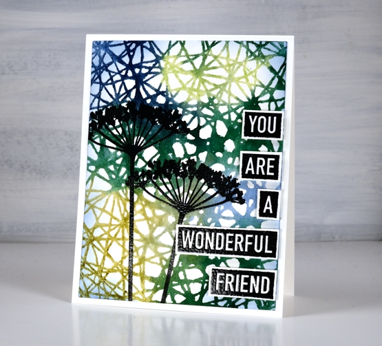
If you have a garden…
Posted: May 31, 2021 Filed under: Art Journal, Darkroom Door, Hand lettered, Papertrey Inks, scratches, Wildflowers Vol 2, you are everything | Tags: Art Journal, Darkroom Door stamps, Fabriano art journal, Papertrey ink, Ranger Distress inks, Tsukineko Versafine inks 8 Comments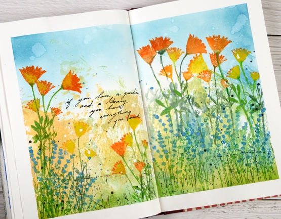
The rest of the quote says, ‘… and a library you have everything you need.’ My art journal is pretty much all book or flower related pages; I guess there is room for a new inspiration. Currently with a garden that is looking promising and an online course newly launched you could say flowers are on my mind.
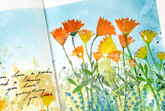
The background for this page was created months ago when I was making subtle backgrounds for a few cards. Instead of swiping a whole panel through waterbased inks I was inking a piece of acetate then spritzing it and swiping it on a stamped panel. I opened a spread in the art journal and swiped the acetate across the pages a few times to leave some ink there. I don’t remember the exact colours but the smooshed ink covered the lower half of the pages in blue, green, yellow and pale orange. Last week I pulled it out again and turned the page into a messy garden.
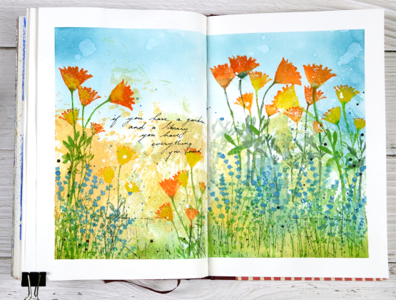
As I said the lower half of the pages is smooshed ink. The upper half is broken china distress inks applied with a blending brush. The flowers are a mix of silhouette stamps from Darkroom Door’s ‘you are everything’ and ‘wildflowers vol 2’ sets. I inked with papertrey ink cubes, spritzed the stamp and stamped on the pages. Sometimes I blended the stamped ink, other times not. To make the blue flowers stand out a bit more I painted blue gouache paint over the stamping. The gouache works well on the journal pages so you will probably see more.
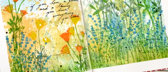
Once all the flowers were added I stamped the DD ‘scratches’ background stamp in black on the lower section of the page and added black and white splatter all over. I added the quote with a black gel pen. If you are in my Floral Faves online class you might this was inspired by one of the projects in lesson 3.
Supplies
(Compensated affiliate links used when possible)
Rose Dance & a Giveaway
Posted: May 19, 2021 Filed under: A2 layers, Additional A2 layers, Papertrey Inks, Penny Black, rose dance, Waffle Flower | Tags: Papertrey ink, Penny Black stamps, Waffle Flower dies 48 Comments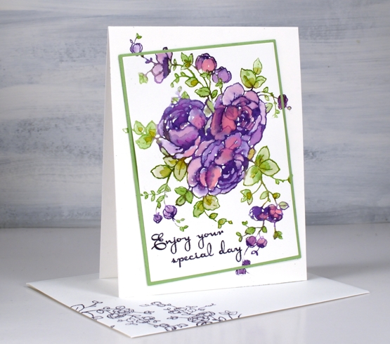
When I first posted a card with the PB ‘rose dance‘ stamp I mentioned I’d been putting it to work with several techniques. To create this card I worked on hot pressed watercolour paper with papertrey ink cubes.
With the stamp and paper in the stamp positioner I inked the roses in ‘royal velvet’ and a few dabs of ‘pure poppy’ inks, spritzed then stamped. I used three different greens (listed below) for the leaves and stems. The papertrey ink cubes are fairly juicy to start with but with a spritz of water before stamping the ink is wet enough to blend into the petals and leaves.
When it came to putting the card together I decided to mix things up a little by cutting out the main image on an angle before adding some dimension with a few extra layers of cardstock. The Waffle Flower A2 layer dies and additional layer dies made it possible to cut the image from the panel, cut a scrap the same size to fit in the space and cut a slightly larger green mat before putting it back together. I pulled out an older PB sentiment set ‘kind words’ and stamped the message in dusty concord archival ink.
This technique is covered in lessons 2 of my new online class FLORAL FAVES. The lessons cover a range of my favourite techniques, some simple and elegant, others requiring more time and fine detail but all outlined clearly on video so they can become your favourites too! Registration opens tomorrow and I will have all the information in tomorrow’s blog post.
If you would like to win a place in the FLORAL FAVES class please comment below telling me one of your favourite flower stamps. I will randomly pick a winner and announce it here on the blog on Monday.
Supplies
(Compensated affiliate links used when possible)
Dancing Peacock
Posted: April 26, 2021 Filed under: Altenew, dancing peacock embossing folder, Heather lowercase die set, Papertrey Inks, Pink Fresh studio | Tags: Altenew, Papertrey ink, Pink Fresh studio 6 Comments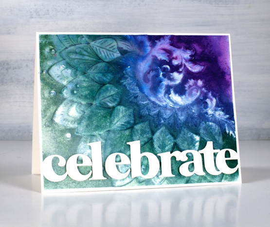
Today is another fun day on my blog because the Foiled Fox and I have teamed up to share this amazing embossing folder with you and to announce the winner of our recent giveaway. In a shared post earlier in April we asked you to tell us what is on your wish list. I really enjoyed reading your answers and share some of your wishes. Today’s card is a result of a wish list longing I’ve satisfied recently. I kept seeing cards with beautiful backgrounds achieved by using an embossing folder. I ordered a few and the Foiled Fox sent me a couple of lovely ones from Altenew including the ‘dancing peacock’ one you see here.
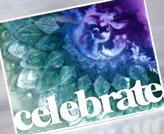
To create this dramatic panel I used hot pressed watercolour paper knowing that I would be spritzing the panel with water to make the inks blend. A spritz of water on the cardstock can also keep the panel from tearing when it is inside the folder going through the die-cutting machine. As I wanted the pattern to be raised on my card front I inked the non-raised side of the embossing folder with four peacock tones from Papertrey ink. I gave the folder a light spritz of water to get the inks blending.
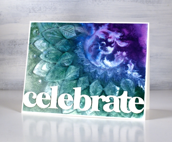
The inks and the very detailed embossing folder did exactly what I’d hoped and created a blended textured panel. The inks didn’t cover the whole area so I used a paintbrush and some water to spread the inks to the edges and let the panel dry. I waited for it to air dry but I think it would have been fine to use the heat tool. Once dry I placed it back into the embossing folder and ran it through the machine again to sharpen the edges of the design.
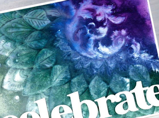
To complete the card I trimmed the embossed panel to 4⅛” x 5⅜” so it would be framed with a narrow white frame. I cut the letters of the word ‘celebrate’ with Pinkfresh Studio’s ‘Heather lowercase’ die set and snuggled them together to fit along the lower edge of the card front. To overlap the letters neatly I attached some directly to the panel and popped others up on foam tape.
And now what you’ve all been waiting for, the winner of gift certificate to spend in the Foiled Fox store. Congratulations, Jo Anna! The Foiled Fox will be in touch.

Thank you to everyone who entered the giveaway. Among the list of crafty items people are wishing for there were several mentions of new PB floral and sentiment stamps – no surprises there! A few people are wishing for markers, both Karin and distress – again I totally understand. Some of you are after inks, including the new distress colours; did you see the newest one released over the weekend, ‘salvaged patina’? Well, I now know I need some salvaged patina in my life! At the risk of sounding like I want ‘all the things’ I will stop here and once again thank the Foiled Fox for collaborating with me and supporting my blog and creativity, something I love sharing with you.
Supplies
(Compensated affiliate links used when possible)

2021 BuJo – April theme
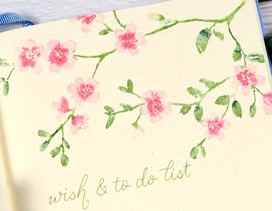
Posted: April 10, 2021 Filed under: blissful blossoms, Bullet Journal, Dingbat notebooks, Papertrey Inks, Penny Black | Tags: Bullet Journal, Dingbats notebook, distress markers, Papertrey ink, Penny Black stamps 10 Comments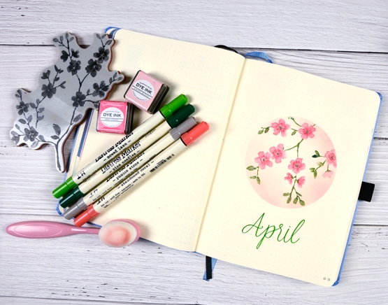
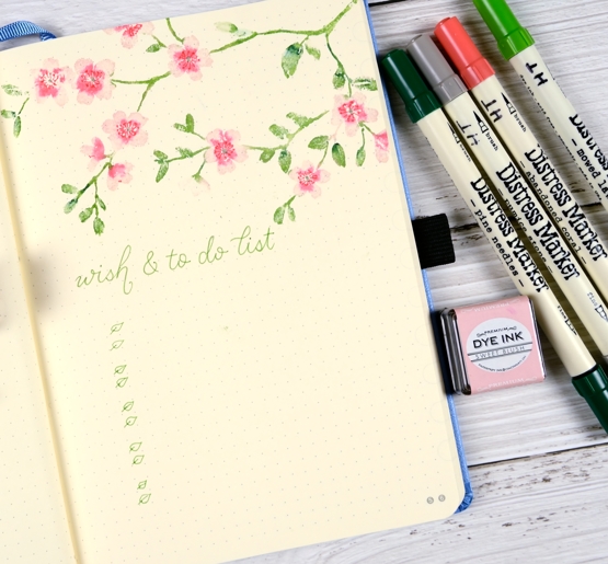
April’s bullet journal pages do not feature snow! I haven’t seen any blossoms yet but I’m sure I will before April is over so I chose blossoms for this month’s theme. As I’ve done for January, February and March, I masked a shape in the middle of the page with a large piece of post-it paper and did all my stamping and blending inside the masked area.
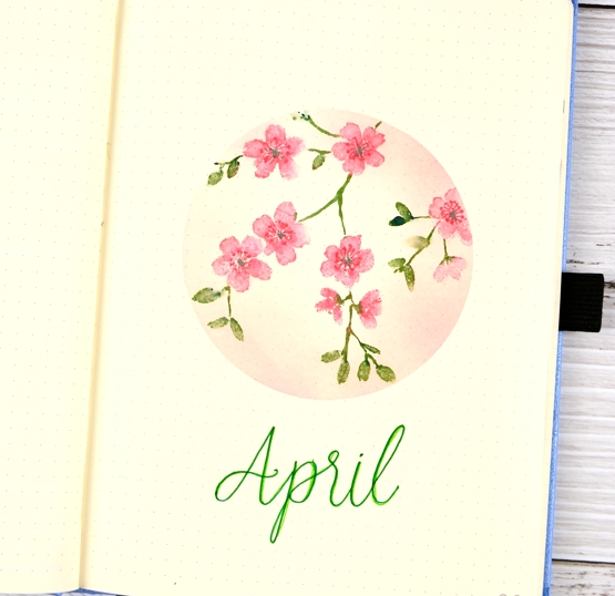
This is the first page I’ve used stamps for in my bullet journal so there was some experimenting involved. The stamp I chose is a ‘brushstroke’ stamp designed to look painted and I never use these stamps without adding some water and blending. Stamping ‘blissful blossoms’ on the non-watercolour paper meant minimal water so as to not get too much bleed through to the back of the page.
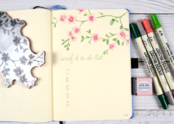
For both the title page and the to-do list page I inked the blossoms with pink ink cubes then added the rest of the colour with distress markers. I spritzed the stamp ever so lightly with water before stamping and blended the flowers and leaves ever so lightly on the page with a blender pen.
There was some bleed through but it wasn’t bad and I stamped over the top of it with the same blossoms when creating my April month spread that I’ll share another day.
Hope April is off to a good start for you. We have had gorgeous sunshine all week but I have seen there is rain coming. But you know what they say, “April showers bring May flowers”!
Supplies
(Compensated affiliate links used when possible)
Vintage layers
Posted: April 5, 2021 Filed under: Darkroom Door, French Script, global postmarks, mesh, Nature Walk, Papertrey Inks, scratches, you are everything | Tags: Darkroom Door stamps, Dr Ph Martin Hydrus watercolor paints, Fabriano Watercolour Paper, Papertrey ink 12 Comments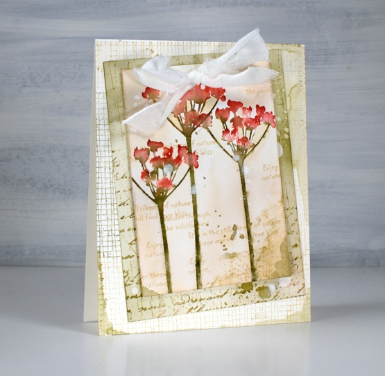
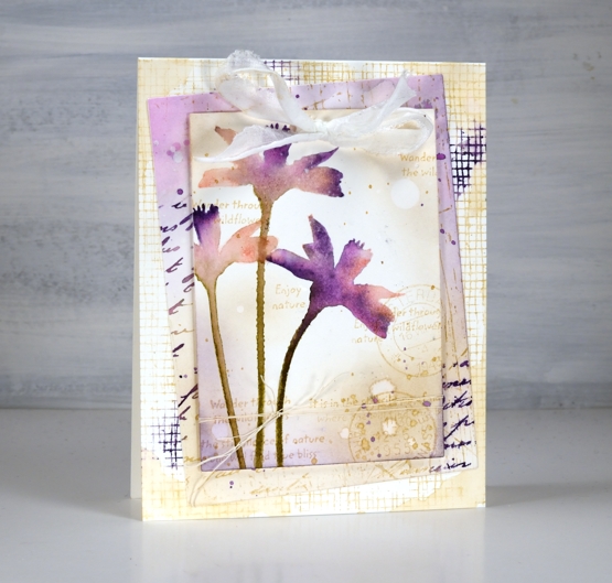
Today’s cards developed bit by bit over a week or so. I worked on flower panels one day, middle layers another day, let them sit a few days, searched for ribbon another day and finally a week later put them together still adding stamping, splattering and blending right up until I called them finished!
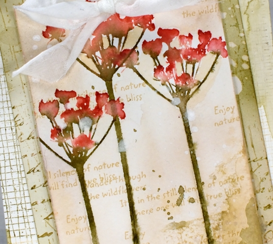
I featured the silhouette floral stamps from the new Darkroom Door ‘you are everything’ set. There are four floral stamps along with eighteen word stamps I mentioned in a previous post. The flowers above are stamped on cold press watercolour paper with papertrey inks. I used pale peony and pure poppy on the petals and olive twist on the stems. I spritzed lightly before stamping then blended further with a paintbrush on the paper. I used the same technique on the purple flowers in the second card but worked on hot pressed watercolour paper.
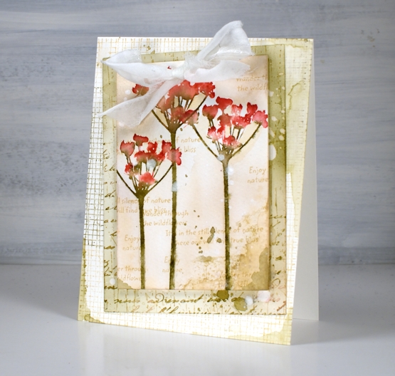
For the vintage and collage details on the card I above I used olive twist and fine linen inks to add painted areas, stamped text, splatter and blending with a brush.
The flowers above are stamped in pale peony, royal velvet and olive twist and I stuck with fine linen and royal velvet as the inks on the layered areas also.
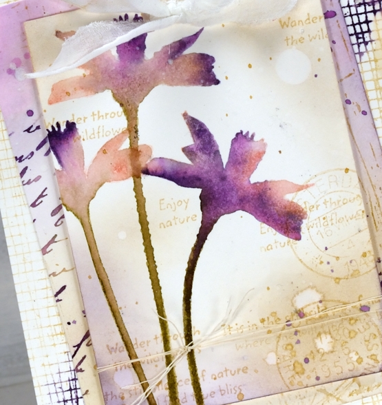
I’ve listed all the stamps I used to add texture and interest to the floral panel and the layers underneath. You can see some of my favourite ‘filler’ stamps including French script and global postmarks. I also splattered water and white paint for some watermarks and subtle blots!
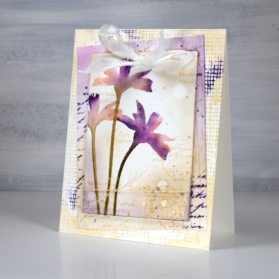
To finish both cards I punched a couple of holes in the top to thread some fabric through. I didn’t have a cream silk or sheer ribbon so I ripped some strips of what might be silk but I can’t remember. The ripped edge worked fine with my vintage layered look.
Supplies
(Compensated affiliate links used when possible)
Delighted with Daisies
Posted: March 30, 2021 Filed under: Christmas bush, daisy delight, Darkroom Door, Papertrey Inks | Tags: Darkroom Door stamps, Fabriano Watercolour Paper, Papertrey ink 5 Comments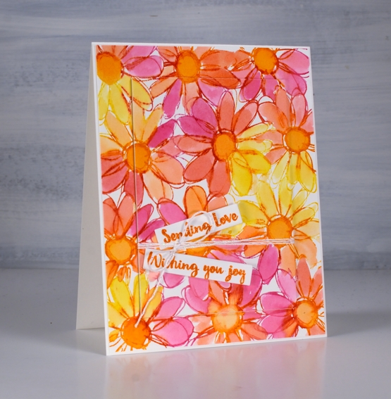
This is the second card I’ve created with the new Darkroom Door background stamp ‘daisy delight‘. Once again I ended up using the whole stamp because it is just so happy and bright. At some stage I must try cutting a strip or some squares because I’m sure that would look pretty too.
Using the stamp in a positioner with hot pressed watercolour paper I first inked the centres of the daisies with an orange ink cube. I wasn’t careful to ink only the circles; I just gave each daisy a twist of orange ink then stamped. I cleaned the stamp and inked sections with raspberry fizz ink then stamped and finally inked remaining sections with bright buttercup ink. I gave it a spritz of water to help the inks blend before stamping the last time.
To fill the petals I smooshed the same three inks on my glass mat then used a paintbrush and water to paint loosely inside the petals and centres. I also mixed new blends with the pink, orange and yellow inks.
To put the card together I die cut a rectangle from the centre of the panel, popped in up on three layers of cardstock and wrapped some white and silver twine around it before attaching it to the card base. The sentiments are from the DD ‘Christmas bush’ set and they are perfect for many occasions; possibly a birthday this time.
Did you know Darkroom Door has a blog where they post oodles of inspiration for using their huge range of stamps and stencils? They also have a newsletter so you can receive emails full of inspiration.
Thanks for joining me today, see you again soon.
Supplies
(Compensated affiliate links used when possible)
Handwoven
Posted: March 29, 2021 Filed under: Christmas bush, Coliro paints, Darkroom Door, Finetec paints, handwoven, Papertrey Inks, you are everything | Tags: Coliro paints, Darkroom Door stamps, Fabriano Watercolour Paper, Papertrey ink, Stonehenge black watercolour paper 8 Comments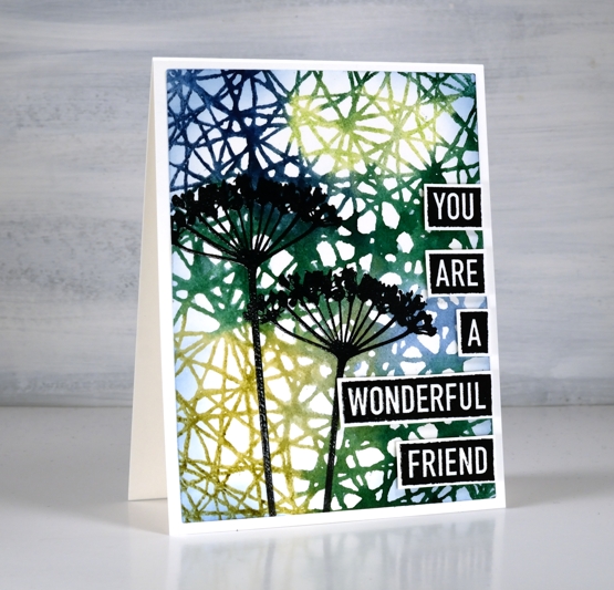
Today’s cards feature the new ‘handwoven’ background stamp from Darkroom Door it two quite different ways.
To create this first card I inked the handwoven stamp with blue and green papertrey ink cubes, spritzed the stamp then pressed it on hot pressed watercolour paper. The result was some green areas, some blue areas and some pretty blended areas where the inks overlap. The blue-green background created a pretty pattern as it was and I could have just added a sentiment and called it complete but I decided to take the risk of adding some flowers. I would understand if you wish I had left it flower free because it is a busy panel but I like the look of a patterned geometric roof or canopy over the flowers.
The flowers are from the new DD set ‘you are everything’ as are the words. The words in this set are great; there are eighteen negative space words that can be stamped and cut out to make countless sentiments. I embossed both the flowers and the words to give them more prominence over the busy background.
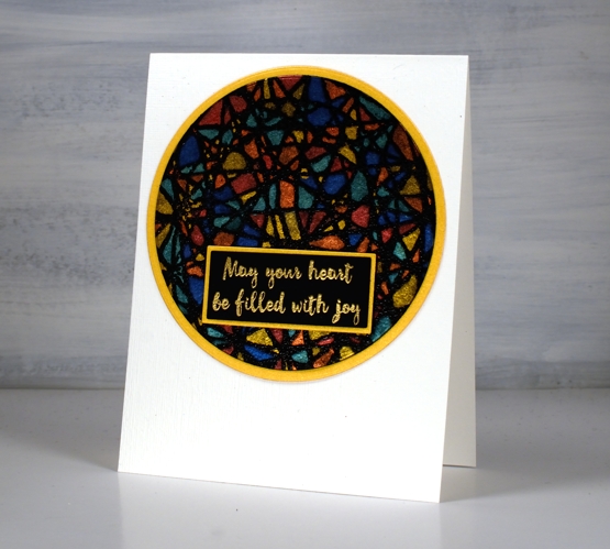
The second card I am planning to use as an Easter card. Filling the spaces of the handwoven pattern with pearlescent paint reminded me of a stain glass window so I looked through my sentiments and found this one in the DD ‘Christmas bush’ set and decided it works for many occasions, including Easter. I stamped the handwoven stamp on black watercolour paper in versamark then embossed in clear powder before painting all the little spaces with Coliro paints and a fine point brush. It did take a while and I didn’t do it in one sitting as the fiddliness factor was high!
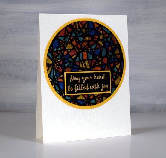
I matted both the patterned circle and the sentiment in gold shimmer cardstock and embossed the front of the card base using the ‘subtle’ embossing folder from SU.
Supplies
(Compensated affiliate links used when possible)
Christmas Stars
Posted: February 22, 2021 Filed under: Cuttlebug, lighting the way, Papertrey Inks, Penny Black | Tags: Penny Black stamps 3 Comments
Last month I made a shaker card with five star cuts outs and sparkly sequins and beads inside to shake around. As the stars were cut out of a watercoloured panel I saved them for another project. My friend Stamping Matilda does this every weekend, her Sunday posts are called ‘Sunday Scraps’ and she features leftovers from that week in a new card or project. I don’t do that anywhere near as often but occasionally I have some scraps, like these stars, which inspire me to turn them into something new. I’m also committed to making a few Christmas cards every month so I don’t leave it all to the last few months of the year.

I used two of the cut out stars as backgrounds for some Christmas themed silhouette stamping, backed them with blue foam then mounted them on embossed backgrounds. On the card above I stamped the Bethlehem scene from the PB ‘lighting the way’ set along with a sentiment from PB ‘Christmas sentiments’. The embossed background was made with neenah solar white cardstock in the Tim Holtz ‘snowflakes – speckles’ embossing folder.
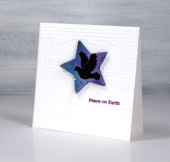
This smaller star was big enough to feature the dove from the PB ‘joy filled’ set and I added sentiment from the PB ‘holiday snippets’ set underneath in versafine clair purple delight ink. The embossed background was made with the ‘allegro’ embossing folder which has been sitting around since my cuttlebug days.

The star dies from We R Memory Keepers seem to be retired but I linked to some similar dies in the supply list below. The original shaker card these stars were cut from contained five stars but I deemed two too small to use. I did stamp the remaining star and it auditioned for a spot on a card but didn’t make the cut. You know it happens sometimes!
Supplies
(Compensated affiliate links used when possible)
Freshly cut flowers
Posted: February 15, 2021 Filed under: Foiled Fox store, fresh cut, love you Mom, Papertrey Inks, Penny Black | Tags: Fabriano Watercolour Paper, Papertrey ink, Penny Black creative dies, Penny Black stamps 2 Comments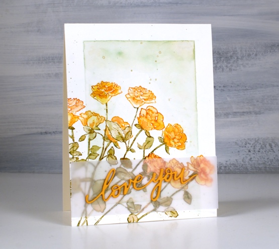
I’ve teamed up with the Foiled Fox again to share a post on their blog. If you pop over there you can read all the process details for this floral card featuring a stamp and a die from Penny Black.
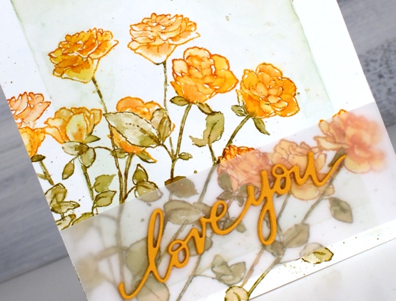
This stamp is called Fresh Cut and it is a rubber cling stamp of five long stem roses. I did some masking and partial stamping to fill the corner of my panel with eleven orange roses. I guess I should have added one more to have a dozen!
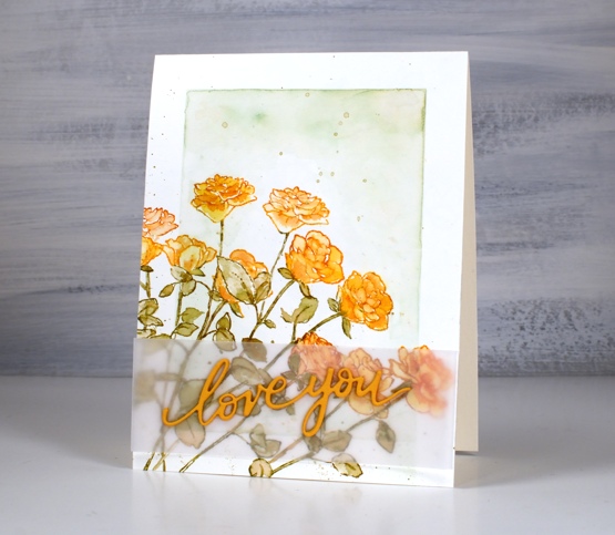
You might recognise the background style on this card; it is inspired by some of Jill Foster’s amazing cards for Penny Black. Because all those roses make the panel a little busy I separated the stacked die-cut words from the roses with a piece of vellum, just to make it easier to read. Don’t forget to visit the Foiled Fox blog today for all the details and while you are there browse awhile for more inspiration.
Supplies
(Compensated affiliate links used when possible)