The 90th birthday card
Posted: May 14, 2025 Filed under: Hand painted, Heather lowercase die set, Pink Fresh studio, Watercolour | Tags: Fabriano Watercolour Paper, Hand painted, Pink Fresh studio 8 Comments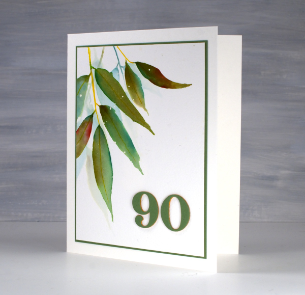
As some of my readers guessed when I was away recently I was visiting my family in Australia. One of the reasons to be there in April was my dad’s 90th birthday. Late March/early April ended up being a lovely time to be in NSW where the sun shone and the temperature hovered around the mid 20s! It was also a good time to be out of Ottawa where there were several ice storms and 15cm of snow more than once!
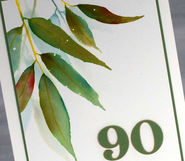
We celebrated Dad’s birthday with a lovely afternoon tea gathering attended by friends from recent years and years gone by, along with many family members including a brand new great grand daughter! We had an afternoon of food, fun and fellowship with songs, speeches, photos, a quiz and a slideshow. It really was a special occasion.
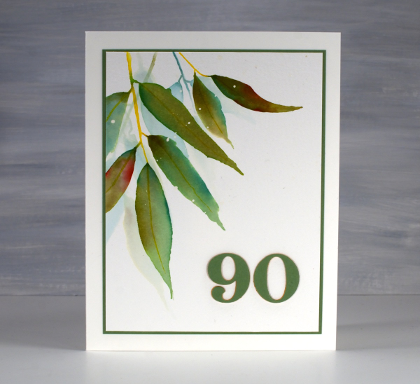
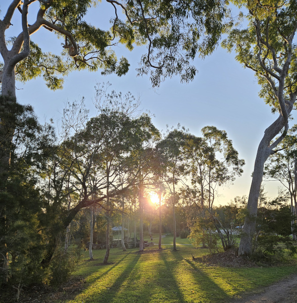
For his birthday card I painted some eucalyptus leaves (as I also did for the invitation) and added a die-cut 90 in co-ordinating colours. By the time I left to go home the sideboard in his living room was covered in cards and not a duplicate among them. How lovely to see so many of his friends and family celebrating with him or sending kind greetings for the occasion. And here’s another sunset photo taken close to Dad’s home.
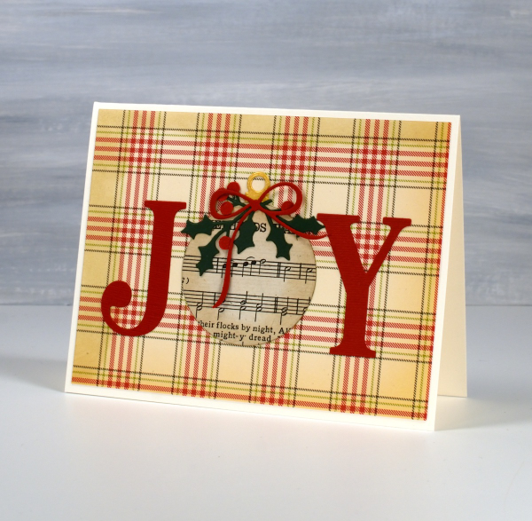
Joy, joy, joy!
Posted: November 7, 2024 Filed under: Darkroom Door, Dies, Heather lowercase die set, immense joy, jumbo bauble, jumbo joy, Penny Black, Pink Fresh studio, World Map 8 Comments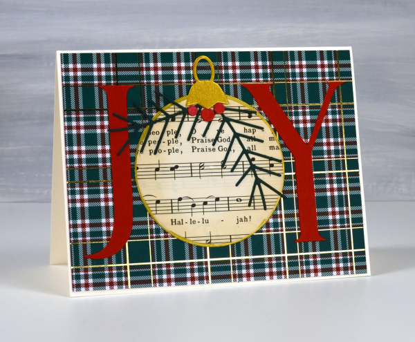
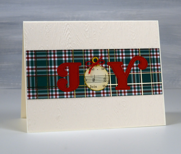
I’m using old book pages in some of my Christmas cards this year, partly because ‘Bookish Christmas’ was the theme of my recent Christmas card workshop but also because I am still enjoying creating with vintage papers.

All of the cards featured today are variations on a theme; I left the ‘O’ out of Joy and replaced it with a bauble. All the baubles except one I cut from Christmas carol music. One is cut from a map because joy to the ‘world’… get it? I used different Penny Black ‘JOY’ dies for the large letters. I used circle dies or bauble dies for the baubles.

I used embossing folders and patterned papers for the background and some die-cut foliage and bows to decorate the baubles.
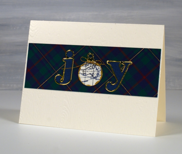
For these last two cards I cut the j and the y with Pinkfresh Studio alphabet dies and added very cute little baubles to replace the o.
This post includes affiliate links from Scrap N Stamp. If you buy through these links I receive a small commission at no extra cost to you.
Zig Zag Print cards
Posted: May 28, 2024 Filed under: gel press, Heather lowercase die set, Penny Black, Pink Fresh studio, Stencils, Tim Holtz, wild flowers #1, Zigs & zags 3 Comments
Recently I posted several ’tiled’ collage cards on the blog and mentioned there would be more to come. Today’s cards once again feature gel printed panels arranged and decorated in two ways.

I used three different gel prints to ’tile’ the card above, a plain blue print, a print created with a zig-zag stencil and a print made with the an impression from an embossing folder. To tie together the dark blue, light blue and yellow + blue prints I added a navy wildflower (Tim Holtz) and navy ink splatter.

To create the square birthday card below I used ’tiles’ from the same print but rearranged them on the card front so they didn’t fit together like a jigsaw.

The brassy-gold paint used on the gel print prompted me to die-cut letters, stars and the word birthday from a similar colour cardstock to create a sentiment. This post includes affiliate links from Foiled Fox. If you buy through these links I receive a small commission at no extra cost to you.

Floral Focus in pencil
Posted: July 5, 2021 Filed under: Brutus Monroe, floral focus, Heather lowercase die set, Inktense pencils, Pink Fresh studio | Tags: brutus monroe embossing powder, Inktense, Pink Fresh studio 7 Comments
Last week I shared a card featuring the Pinkfresh Studio background stamp, ‘floral focus‘ watercoloured with Karin Markers. Today I have another card with the same stamp but pencil coloured this time using Derwent inktense pencils. At some point I should do pencil colouring on white or cream cardstock again but I am still in love with the look of pencil on kraft. Inktense pencils are watersoluble but you can also use them as traditional pencils with no water added, that’s what I did here.
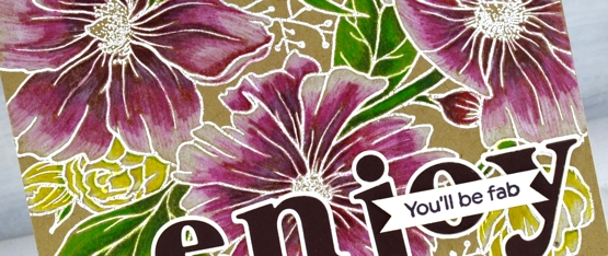
I embossed the background stamp in white powder, another technique that looks great on kraft cardstock then used the inktense pencils to fill the flowers and leaves. The flowers are coloured with red violet, fuchsia and antique white. The leaves and stems I did with felt green and apple green and the small flowers are coloured with sun yellow and antique white.
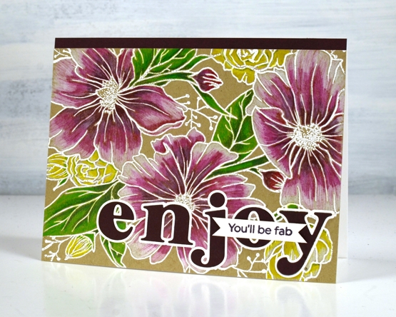
To finish the card I added a strip of violet cardstock and cut letters from the same cardstock with the Pinkfresh ‘Heather lowercase letter’ dies. The little sentiment is from PF set ‘scripted bold sentiments. You might think this is an odd pairing of sentiments; I was thinking it would suit someone starting something new, some encouragement along with a reminder to enjoy the experience.
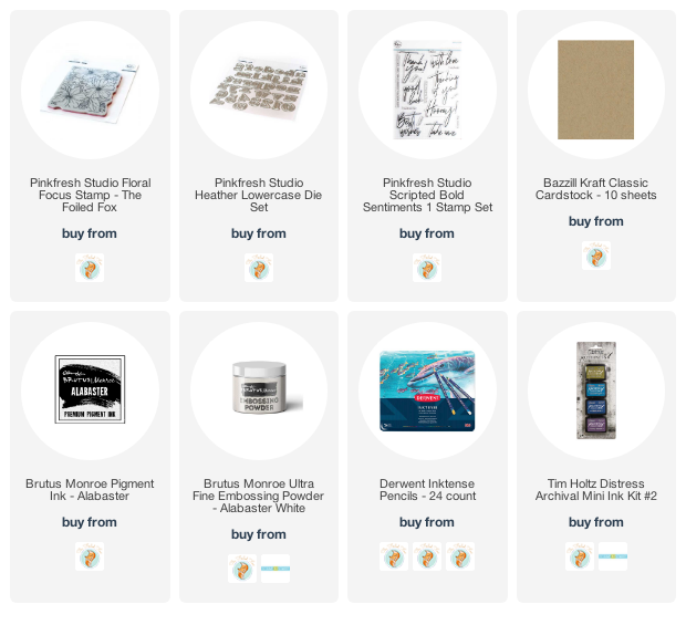
Supplies
(Compensated affiliate links used when possible)
Dancing Peacock
Posted: April 26, 2021 Filed under: Altenew, dancing peacock embossing folder, Heather lowercase die set, Papertrey Inks, Pink Fresh studio | Tags: Altenew, Papertrey ink, Pink Fresh studio 6 Comments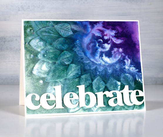
Today is another fun day on my blog because the Foiled Fox and I have teamed up to share this amazing embossing folder with you and to announce the winner of our recent giveaway. In a shared post earlier in April we asked you to tell us what is on your wish list. I really enjoyed reading your answers and share some of your wishes. Today’s card is a result of a wish list longing I’ve satisfied recently. I kept seeing cards with beautiful backgrounds achieved by using an embossing folder. I ordered a few and the Foiled Fox sent me a couple of lovely ones from Altenew including the ‘dancing peacock’ one you see here.
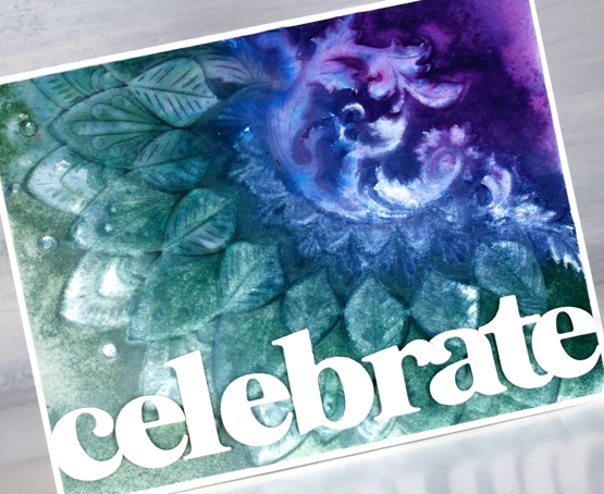
To create this dramatic panel I used hot pressed watercolour paper knowing that I would be spritzing the panel with water to make the inks blend. A spritz of water on the cardstock can also keep the panel from tearing when it is inside the folder going through the die-cutting machine. As I wanted the pattern to be raised on my card front I inked the non-raised side of the embossing folder with four peacock tones from Papertrey ink. I gave the folder a light spritz of water to get the inks blending.
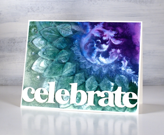
The inks and the very detailed embossing folder did exactly what I’d hoped and created a blended textured panel. The inks didn’t cover the whole area so I used a paintbrush and some water to spread the inks to the edges and let the panel dry. I waited for it to air dry but I think it would have been fine to use the heat tool. Once dry I placed it back into the embossing folder and ran it through the machine again to sharpen the edges of the design.
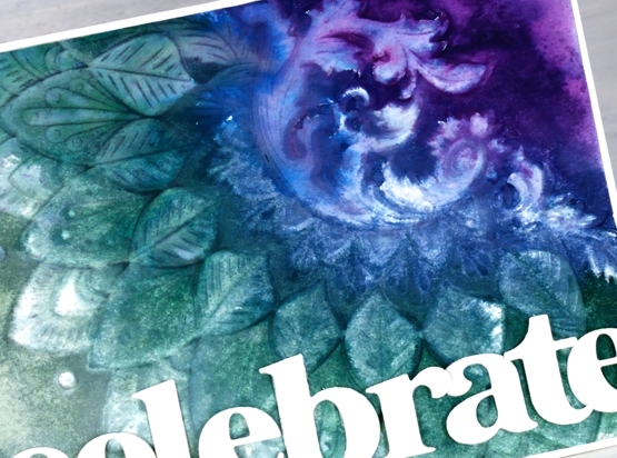
To complete the card I trimmed the embossed panel to 4⅛” x 5⅜” so it would be framed with a narrow white frame. I cut the letters of the word ‘celebrate’ with Pinkfresh Studio’s ‘Heather lowercase’ die set and snuggled them together to fit along the lower edge of the card front. To overlap the letters neatly I attached some directly to the panel and popped others up on foam tape.
And now what you’ve all been waiting for, the winner of gift certificate to spend in the Foiled Fox store. Congratulations, Jo Anna! The Foiled Fox will be in touch.

Thank you to everyone who entered the giveaway. Among the list of crafty items people are wishing for there were several mentions of new PB floral and sentiment stamps – no surprises there! A few people are wishing for markers, both Karin and distress – again I totally understand. Some of you are after inks, including the new distress colours; did you see the newest one released over the weekend, ‘salvaged patina’? Well, I now know I need some salvaged patina in my life! At the risk of sounding like I want ‘all the things’ I will stop here and once again thank the Foiled Fox for collaborating with me and supporting my blog and creativity, something I love sharing with you.
Supplies
(Compensated affiliate links used when possible)
Floral notes slim
Posted: March 3, 2021 Filed under: floral notes, Heather lowercase die set, Karin brushmarkers, Pink Fresh studio | Tags: Fabriano Watercolour Paper, Karin brushmarkers, Pink Fresh studio, WOW embossing powders 5 Comments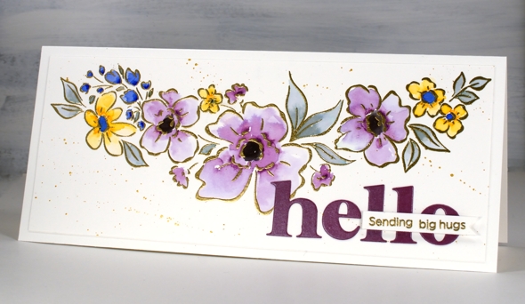
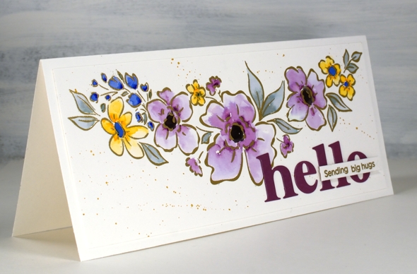
I’ve teamed up with the Foiled Fox again to share this lovely slimline Pinkfresh Studio stamp. The stamp is called ‘floral notes’ and it’s just over 8″ long! The set also includes some sentiments which I will feature another day.
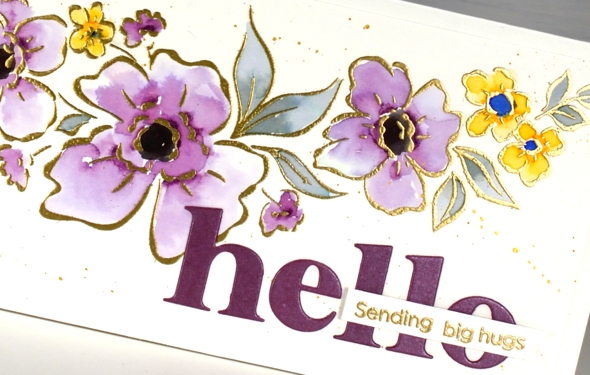
I embossed the floral stamp in gold powder then added colour with dabs of ink from the Karin brushmarkers (I only used royal blue, lilac, gold and black). I say dabs because that is really all it takes to watercolour with the Karin markers. I dab a few dots of ink where I want the colour to be strongest then blend from that point with water to fill the petals or leaves. I was wanting variation in the petals and was happy to achieve it particularly in the large flowers coloured in lilac.
After the colouring was complete I splattered ‘pearl gold’ pearlescent paint from Finetec; it was a close match to the WOW metallic gold embossing powder. For a sentiment I cut ‘hello’ with the Pinkfresh ‘Heather lowercase alphabet dies’ and left the border off so the letters would not be too big then added a blended sentiment using dies from the Pinkfresh ‘scripted bold sentiments’ set.
Previous to making this card I lost the letter ‘t’ die from the alphabet set. It was after cutting the word ‘star’ for another card. As you can imagine this caused me great dismay. Without the ‘t’ there would be only birhdays, bes wishes and merry Chrismasses! I searched high and low and went my workroom garbage and recycling multiple times. Yesterday, after eleven days without it, the ‘t’ was returned to the alphabet. It had fallen into the MFT box in the filing cabinet right between ‘YAY for you’ and ‘painted prints’!
I’ll be using this pretty floral stamp again and not necessarily just on slimline cards. The sentiments from the set are also lovely so keep an eye out for them. Don’t forget to visit the Foiled Fox blog today for more details including measurements.
Supplies
(Compensated affiliate links used when possible)
You’re a star
Posted: February 19, 2021 Filed under: Alexandra Renke, Heather lowercase die set, My Favorite Things, ornamental star stencil, Pink Fresh studio, YAY for you | Tags: Alexandra Renke, My Favorite Things, Pink Fresh studio, Ranger Distress stains 7 Comments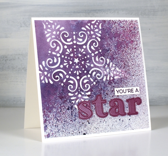
I’ve been wanting to work with some of my new stencils and the CAS Mix Up challenge is currently a embossed stencil challenge so I got to work. I taped the Alexandra Renke ornament star stencil to a piece of hot pressed watercolour paper and started sponging some versamark ink through the stencil. I soon switched to just squishing the versamark ink pad directly on the stencil as that was faster. I embossed the star in clear powder then put the panel in a box so I could spray some stain over it without decorating myself or my desk.
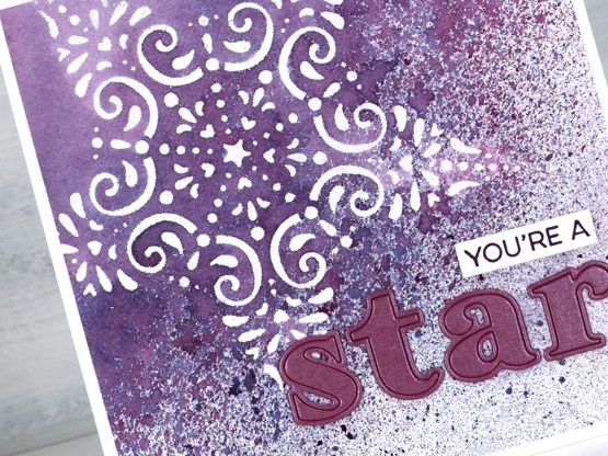
I sprayed seedless preserves, faded jeans and speckled eggs distress stains over the panel from 20-30cm away and ended up with a pretty speckled panel. I wanted to make the spotted sprayed area transition from speckled to solid so I painted water over one edge then spritzed water next to the painted area which achieved my goal leaving some of the panel barely touched by water. It took quite a while to dry and impatient me did smudge some of the speckles but they are underneath the die cut letters now so no harm done.
I applied tape to the back of a piece of co-ordiating cardstock then cut the letters s,t,a,r out using the ‘Heather lowercase alphabet’ die set from Pink Fresh studio. I searched through my stamps and dies to find a sentiment I could alter to say ‘you’re a’ and ended up using part of a stamp from the MFT ‘Yay for You’ set stamped in versafine monarch ink.
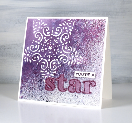
When I was doing the spray over embossing step I realised this stencil is probably going to pair up with spray stains again in an art journal page, the speckled effect over the lacy star is just so pretty.
I’m excited to participate in a challenge again, it has been a while! There is still time to get involved if, like me you have stencils that are waiting patiently to be the star or even the background of a card.
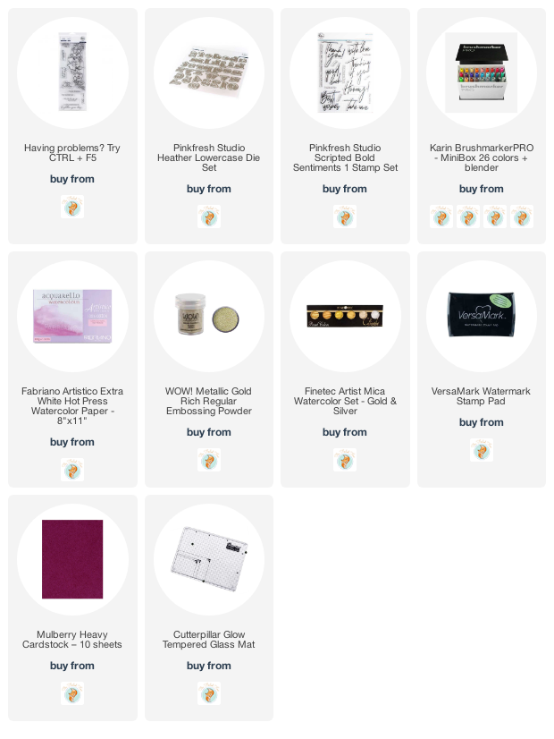
Supplies
(Compensated affiliate links used when possible)
Winter Wonder art journal page
Posted: February 1, 2021 Filed under: A blizzard, Art Journal, Brusho, Classes, Dies, fir tree, Heather lowercase die set, online class, Penny Black, Pink Fresh studio, Skis 'n' sled, Snow time, winter trees, winter wardrobe | Tags: Brusho, online class, Penny Black creative dies, Pink Fresh studio 6 Comments
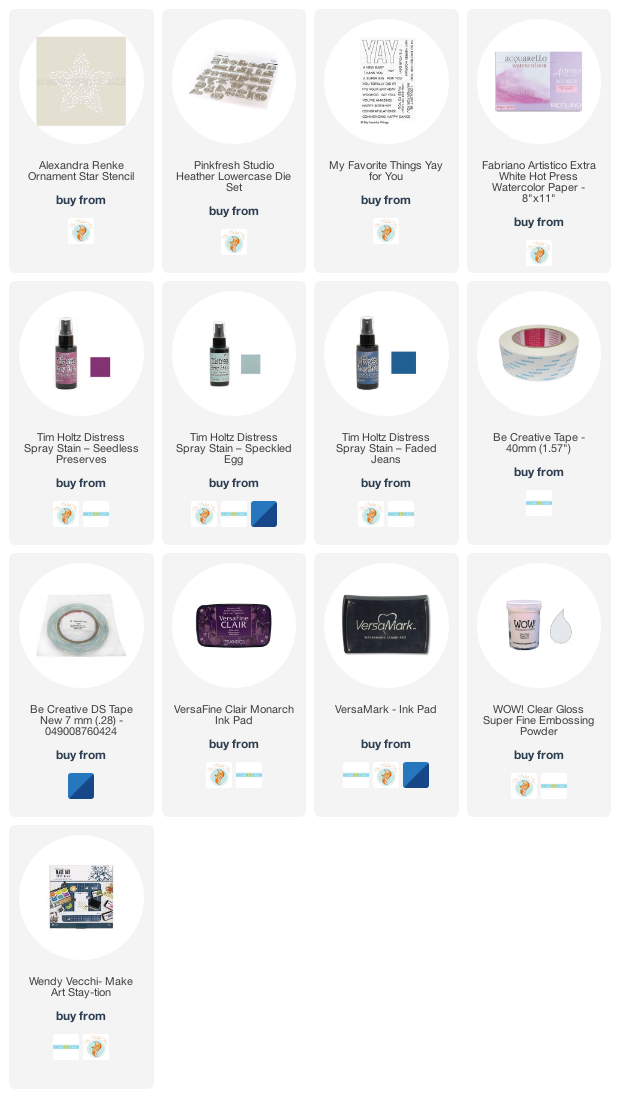
After my son and I finished filming the stop animation intro for my Winter Wonder online class I didn’t know what to do with the painted background and all the die cuts we’d used. They lay on a tray still in their snowy formation for a few months gathering dust until I realised I could keep the scene if I transferred it to my art journal.
The initial spread was bigger than art journal page so I cut down the watercoloured background panel, cut new snowdrifts out of lighter weight cardstock and added ink blending to help them stand out. I saved the trees, sled, skis, mitts, snowflakes and bird all cut using the Penny Black dies listed below and glued them on. Yes the gluing almost finished me but I persevered and even glued the outline letters from Pink Fresh studio. I found that I do have a glue pen that works if you are patient and take note that enough glue if coming out.
If you haven’t scene the stop motion animation it is part of the promo for my WINTER WONDER class which teaches my methods for making cards with a northern winter theme. I’ll include the promo below just for fun and in case you’re new around here.
The scene shown in the journal page is mirrored outside right now; we have plenty of snow, we’ve been skiing and enjoying winter wonder all around us. Back in October-November when we filmed the class there was little to no snow!
Supplies
(Compensated affiliate links used when possible)
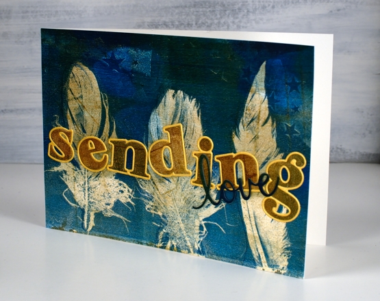
Gel printed feathers again
Posted: October 21, 2020 Filed under: gel press, Heather lowercase die set, phrase builder you, Pink Fresh studio | Tags: gel press, gel printing, Pink Fresh studio 10 Comments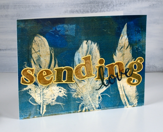
Last year I did my first gel prints with feathers and I was thrilled with the detail in the prints. When I was gel printing with leaves a few months ago I did a few feather prints at the same time. It’s the same process.
The letters and word added to this feather print were cut from the same panel. I was working on my large gel plate and lifting the prints on A4 pieces of cardstock. The mustard/gold paint was over the whole print before I added dark turquoise paint to one end as I printed feathers.
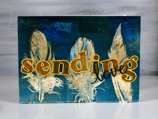
I cut the letters for the word ‘sending’ with the ‘Heather lowercase’ dies from Pinkfresh studio. There are capital letter dies in the same style and co-ordinating stamps for both lower and upper case but I just bought the lowercase dies. Buying alphabet dies or stamps is quite the investment so I worked out what I would get the most use from and it was these pretty letter dies. I am way more likely to make words with all lowercase than with all caps. After I had ordered the dies I realised they were all double dies in that they cut a very narrow border around every letter which gives you a bonus delicate die cut letter which can be used as a border for the solid letter. Maybe you know all this but I was pretty happy to get double the letter fun.
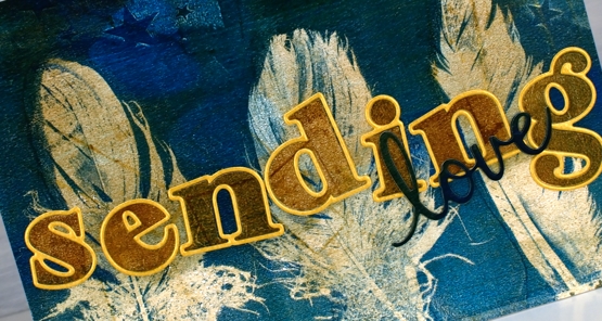
I cut all the letters for the word ‘sending’ and arranged them on top of the feather panel but they did not stand out enough until I cut the same letters from shimmer gold cardstock so I could give each one the narrow border. I added double sided adhesive to the back before cutting the letters so it would be easy to attach them to the panel. I cut the word love from a teal section of the printed panel twice and layered them to make them stand out a bit more, the die is from the Pinkfresh phrase builder ‘sending’ set.
I’m very keen to get out my gel plates again but my to do list has other things on it right now. It’s fun to have a stack of prints to put to use in the interim.
Supplies