
Joy, joy, joy!
Posted: November 7, 2024 Filed under: Darkroom Door, Dies, Heather lowercase die set, immense joy, jumbo bauble, jumbo joy, Penny Black, Pink Fresh studio, World Map 8 Comments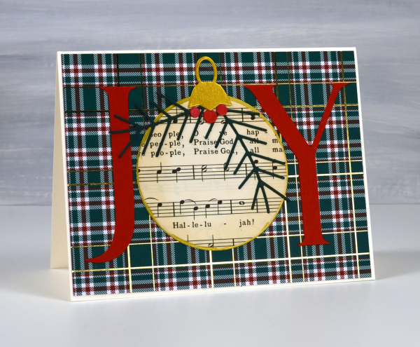
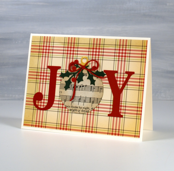
I’m using old book pages in some of my Christmas cards this year, partly because ‘Bookish Christmas’ was the theme of my recent Christmas card workshop but also because I am still enjoying creating with vintage papers.

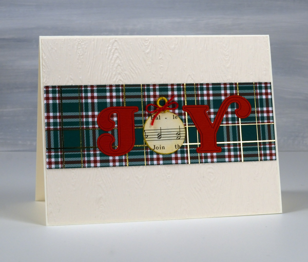
All of the cards featured today are variations on a theme; I left the ‘O’ out of Joy and replaced it with a bauble. All the baubles except one I cut from Christmas carol music. One is cut from a map because joy to the ‘world’… get it? I used different Penny Black ‘JOY’ dies for the large letters. I used circle dies or bauble dies for the baubles.

I used embossing folders and patterned papers for the background and some die-cut foliage and bows to decorate the baubles.
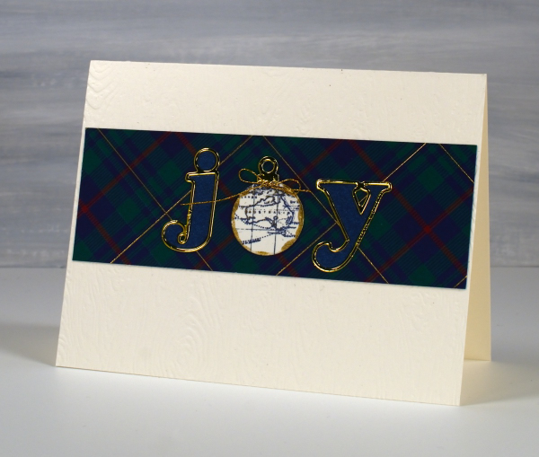
For these last two cards I cut the j and the y with Pinkfresh Studio alphabet dies and added very cute little baubles to replace the o.
This post includes affiliate links from Scrap N Stamp. If you buy through these links I receive a small commission at no extra cost to you.
Cars, Bikes and birthdays
Posted: April 11, 2023 Filed under: brushed stars, classic motorcycles, Darkroom Door, postage stamps, this way, vintage car, word labels, World Map | Tags: Darkroom Door stamps, One-Layer cards, Ranger archival inks, Ranger Distress inks, Tsukineko Versafine inks 5 Comments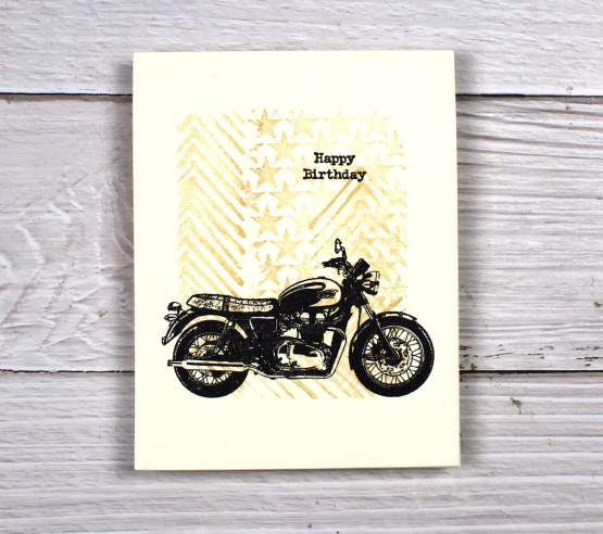
You’ve seen me use the ‘this way’ stamp behind a trio of butterflies and a classic car as well as featured on a journal page. It reminds me a little of tire tread so I have paired it again with some vehicles. For this motorbike card I masked the edges of a cream panel and stamped ‘this way’ and ‘brushed stars’ in antique linen distress ink.

After removing the masking tape I added one of the motorcycles from the classic motorcyles set in black along with a little happy birthday. I haven’t masked edges like this in a while but it makes it easy to make a simple but eye catching one layer card. You could fill the masked area with any stamping you wanted then add a bold black image over the top.

I also used ‘this way’ in the vintage style watercolour background of this card. I combined, the arrow pattern of ‘this way’ with postage stamps and world map. There is also splatter and a torn edge to keep the background looking aged. I stamped the DD vintage card on teabags and added stitching and word labels to complete the card.

(Compensated affiliate links from Foiled Fox, Scrap n Stamp)
Lighthouse Journal Page
Posted: April 6, 2023 Filed under: Art Journal, Darkroom Door, global postmarks, Handmade book, this way, word labels, World Map | Tags: Art Journal, Coliro paints, Darkroom Door stamps, Fabriano Watercolour Paper, Handmade book, Ranger Distress inks 5 Comments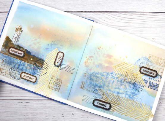
This journal spread was a joy to make. It combines so many of my favourite things. A few weeks back I posted about a new handmade art journal. This is it and these are the first pages I’ve completed. I didn’t work on the very first page; I leave that for later, so this is a few pages in. The pages are cold pressed watercolour paper so I taped the edges and created a watery blended background with distress inks smooshed on a piece of acetate then pressed onto my pages. I added more ink with a paintbrush and stamped the Darkroom Door world map stamp into the wet ink. I wasn’t trying to create sky or land or anything in particular I was just working randomly with blues and browns.
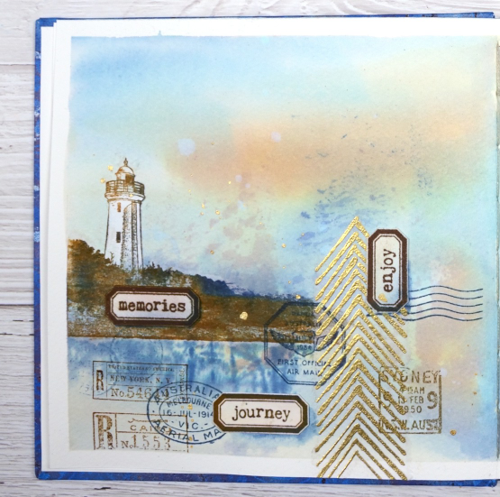
Once the background dried I used stamps from another favourite, the DD ‘global postmarks’ set, again stamped in blue and brown but archival ink, not distress, so it wouldn’t dilute and blur.
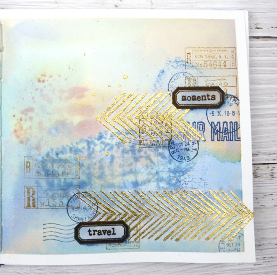
On an extra scrap of watercolour paper I picked up some smooshed and diluted ink then dried it before stamping the new ‘word labels’ stamps so I could cut them out and arrange them over the page.
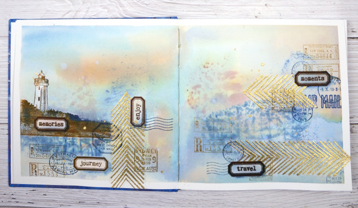
If you have been visiting my blog for a while you will have seen the lighthouse stamp before. The lighthouse is in Norah Head, on the central coast of NSW, not far from where my father lives and the Darkroom Door premises. I have visited there several times and climbed the lighthouse with my dad. You can probably see now why I chose the word labels I did. The lighthouse and the ‘this way’ arrows are stamped on tissue paper. This allowed me to move them around to work out exactly where I wanted them. The blurry world map stamping worked as a ‘reflection for the lighthouse image so that’s where it ended up.
When I am adding stamped tissue to a page I gently tear around the edges with the help of a damp paintbrush. For the lighthouse I cut carefully around the walls and light then painted white paint on the back of the tissue so it would not be transparent. Of course I splattered some water and some gold paint to complete the page.
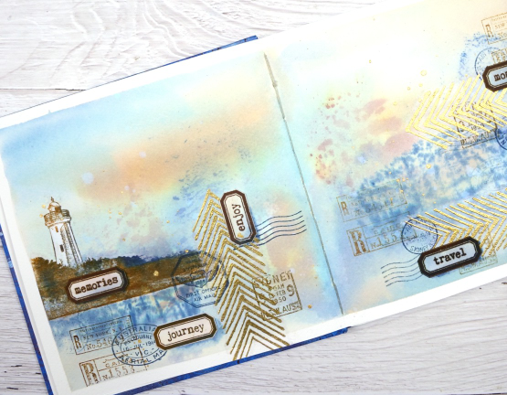
As this was the first time I had used my new journal I was interested to see how the cold pressed watercolour paper worked. Nothing soaked through the paper to the other side and I took care to dab up liquid from the centre seam so there was not much bleed through there either. The 7″ x 7″ size gave me a little more room than the 6 x 6 journals I have been working in but wasn’t so large as to be overwhelming.
(Compensated affiliate links from Foiled Fox, Scrap n Stamp & Ecstasy Crafts)
Tea, Coffee, Art Journalling?
Posted: February 28, 2023 Filed under: 6"x 6" journal, Art Journal, Background Stamps, coffee time, Cup of tea, Darkroom Door, Dies, Gazette, Penny Black, Script, Time, What's in your cup, World Map | Tags: Art Journal, Darkroom Door stamps, Penny Black creative dies, Penny Black stamps, Ranger Distress inks 2 Comments
Today I am posting a few pages from last year’s Art Journal Adventure workshops. I taught seven different ‘episodes’ last year and one month the theme was coffee and tea. I did a few pages before the sessions and then created a different page during each class. I don’t like replicating the same spread in my art journal so each one had a different colour scheme and style.

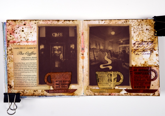
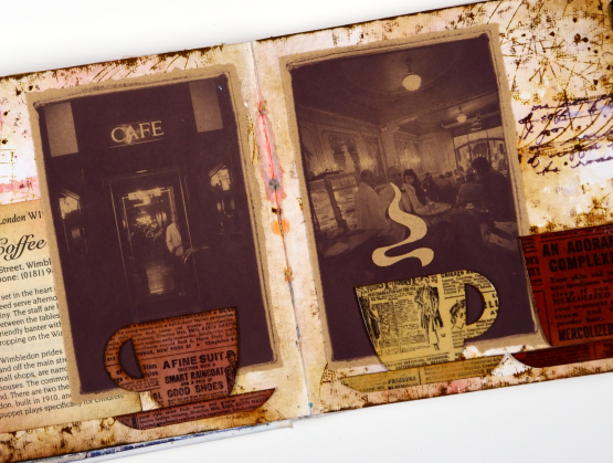
Even though I am more of a herbal tea drinker than a coffee drinker I ended up creating three coffee themed pages and two tea themed. You can see the first coffee themed page here. As you can see from the three spreads featured here I use a variety of techniques, papers and elements in my pages. The common technique on these pages is a watercolour background and the common element is the chipboard cups. Both the coffee themed pages feature photos from an old coffee themed diary. In both cases I took my colour scheme from the photo and added browns.
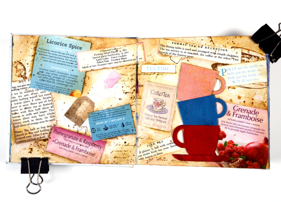
This tea themed page could also be called ‘these are a few of my favourite teas!’ I used packaging from boxes and sachets, embossed the teacups to match and add snippets from old books and magazines.
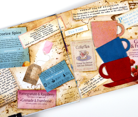
These pages show how I gather elements and papers from here, there and everywhere when creating a page. I used inks, embossing powders and glazes, stamps and stencils for these pages but I also used an old diary, packaging, pages from a vintage recipe book, and old teabags!
I almost didn’t finish this last spread but once I had stamped then glazed the cute chipboard cups I knew I had to finish. Now I want a mug with vintage newsprint on it!
Art Journal Adventure for 2023 kicks off this week. There is still space in the Friday class and the Monday class. We will be creating with semi- transparent papers.
(Compensated affiliate links from Foiled Fox, Scrap n Stamp)
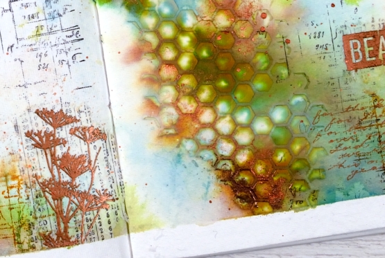
Beauty of the Earth journal page
Posted: January 26, 2022 Filed under: Art Journal, Brutus Monroe, Darkroom Door, honeycomb, Nature Walk, number medley, Stencils, World Map, you are everything | Tags: Art Journal, Darkroom Door stamps, Darkroom Door stencils, Ranger archival inks, Ranger Distress inks, Ranger Distress stains 5 Comments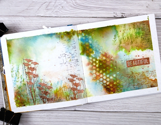
I have another double page spread in the 6″x 6″ journal today. Don’t tell the others but this one seems to be getting all the attention at present!
The pages in this journal are thick watercolour paper so I wanted to take advantage of that and use watercolour techniques. Most of the pages I have completed up until now have had a base layer of gesso or acrylic paint.
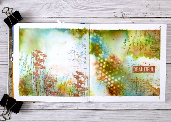
As you can see I taped the edges of the pages with tape before starting. I added some stamping in black here and there using a stamp from the Darkroom Door ‘number medley’ set. Next I used the DD ‘honeycomb’ stencil and modeling paste to add a texture strip from left to right down the centre of the spread. I added a small section bottom left also. Once the paste was dry I began painting colour around the honeycomb and across both pages. I spent a while doing this so as to see the blends and build up some depth of colour.
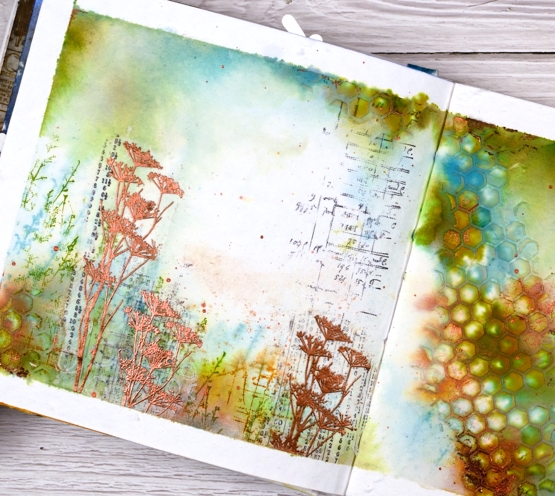
Other than some black stamping I used only three colours of distress ink, both spray stain and from the ink pads. I took care to keep some white space; sometimes I realise too late that I have colour all over the pages. I stamped some grasses in peeled paint archival ink so they would not dilute and broken china distress ink so they would dilute. I also stamped sections of the world map in rusty hinge. Although I loved the combo of peeled paint, rusty hinge and broken china I thought a bit of metallic shine would be nice so I added some wildflowers embossed in Brutus Monroe ‘penny’ powder.
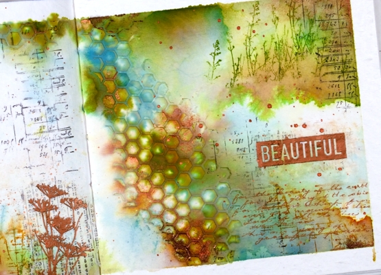
With a copper coloured gel pen I wrote the first verse of ‘For the Beauty of the Earth’ in the lower right hand corner then added the embossed word ‘beautiful’. And of course there is some copper splatter to finish it off. This is a style and look I have been hoping to create so you’ll probably see a few more like this one.
Supplies
(Compensated affiliate links used when possible
Enjoy the Journey Journal page
Posted: July 23, 2021 Filed under: Art Journal, Darkroom Door, gel press, nomad, scratches, vintage car, World Map | Tags: Art Journal, Darkroom Door stamps, distress oxide inks, gel press, gel printing, Ranger archival inks, Ranger Distress inks 3 Comments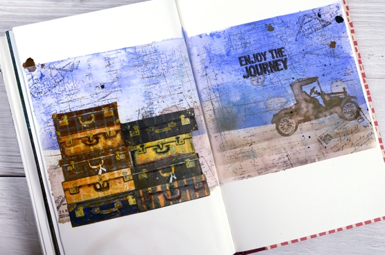
This week I have shared a gel plate video and a series of cards made with prints and leftovers from that gel printing session. If you look closely at this journal page you will see a couple more prints put to use.
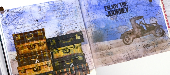
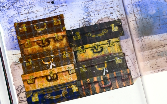
The Darkroom Door set, Nomad, recently arrived in my mailbox and the main reason I chose it was the pile of suitcases. I own one old suitcase which belonged to my grandmother; it houses the ‘dress up’ collection. It is not unlike the third one in the left hand stack. The stamp set also has a single suitcase, some passport stamps and two sentiments, one included on this page.
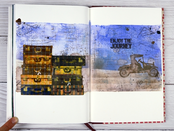
To add even more vintage-ness to the vintage suitcases I stamped them on a grid and striped prints from the gel printing session. I used corrugated cardboard to make the patterns on the gel plate originally. I stamped the suitcases in archival inks then added extra colour with distress inks and gel pens. To create the background I smooshed blueprint sketch distress inks on a piece of acetate, spritzed water over the ink then transferred it to the masked journal pages. With the blue protected I blended a brown base, also with distress inks. Over the top of the inking I added some impressions with the DD world map and scratches background stamps. To balance the suitcases I added the vintage car and sentiment on the right hand side.
Maybe these pages came from my longing to be out and about seeing new and old places, or a longing to be poking around antique and thrift stores. The latter will probably happen before the former.
Are you longing for a trip somewhere? Are you thinking near or far?
Supplies
(Compensated affiliate links used when possible)
Long Distance
Posted: March 19, 2021 Filed under: Darkroom Door, global postmarks, long distance, World Map | Tags: Darkroom Door stamps, Fabriano Watercolour Paper, Ranger Distress inks, Tsukineko Versafine inks 7 Comments
Many of us are separated from family and friends these days so when I saw this new set of sentiments from Darkroom Door I knew immediately that I could put them to good use. The set is called ‘long distance’ and is a long strip of sentiments one under the other, eleven in total. I have several sentiment strips from Darkroom Door and have not cut any of them into individual strips. Instead I tend to stamp the whole strip or a section of the strip and then snip off or die-cut the ones I want to use.
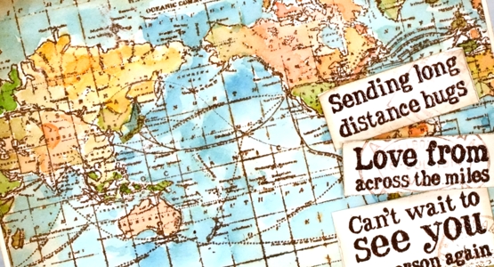
As many of you know I am originally from Australia and all my family still lives there while my husband, children and I live in Canada and have done for twenty years. When I designed this card featuring the DD ‘world map’ stamp I did so with my Australian family and friends in mind so I had to make sure both countries were still on display after I added the sentiments. I stamped the map on hot pressed watercolour paper in tea dye distress ink and acorn versafine clair, dried the inks then started painting colours over the map. I smooshed tea dye, carved pumpkin, abandoned coral, broken china and mowed lawn distress inks on my glass mat and painted loosely with no major concern for borders or accuracy. I searched ‘antique map’ for an inspiration photo to guide me.
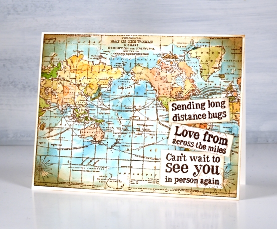
I cie-cut the map panel with a Waffle Flower A2 additional layer die then applied vintage photo ink around the edge of the map and the sentiments with a blending brush. It’s a subtle addition but I also stamped pale postmarks on the sentiments using the DD ‘global postmarks’ stamps. I will be showing you more of the new stamps from Darkroom Door over the next few weeks but there are already several blog posts on the Darkroom Door blog featuring the new beauties so make sure you pop over there to take a look.
Supplies
(Compensated affiliate links used when possible)
Virtual Coffee
Posted: May 4, 2020 Filed under: brick wall, coffee time, Darkroom Door, handwritten script, Stencils, World Map | Tags: Darkroom Door stamps, Darkroom Door stencils, Ranger Distress inks 4 Comments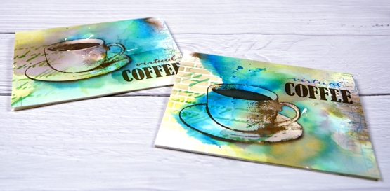
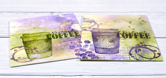
I posted a coffee themed card using the Darkroom Door ‘coffee time’ set recently which prompted a request for a pack of coffee themed cards. These ones are on their way to Australia, and were made with the addition of the word ‘virtual’ because, well, you know why. I rarely do multiples and when I do they are never exactly the same. This time I did four of one colour scheme with the cup and saucer stamp from Darkroom Door’s ‘coffee time’ set and then four more in a different colour scheme a little more like my original coffee card featuring the take out cup from the same set.
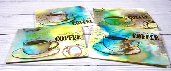
The nice thing about making multiples is starting with a large panel to create the background. I used hot pressed watercolour paper for both sets and splattered masking fluid over the panel first. I like the addition of some random white spots and shapes from a masking fluid splatter but often I wish I’d done more when I remove it from the finished project. To create the cards above I smooshed ground espresso, salty ocean and crushed olive distress inks on my glass mat. I spritzed water over the inks until they were spread over a large area then placed the watercolour panel over the top and moved it around to soak up random coloured patterns. When I turned the panel over there were blotches of each colour along with blends and blank areas. I did some further spritzing and picking up of colour until I was satisfied with the coverage. Once the panel was dry I cut it into four pieces and used both the DD handwritten script and brick wall stencils to add pattern in the same three distress inks. I used blending brushes to apply the ink which gave me soft blends that faded away into nothing at the edges.
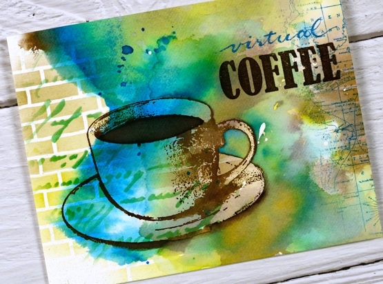
Next I add coffee cups and coffee stains in ground espresso ink. I blended ink inside the cup on some panels but on others I added more ink outside the cup to darken the negative space. It is hard to describe my process with the cups as I did each one differently and kept playing with the three inks until I was happy with the results. On a couple of the panels I added a partial print of the world map stamp. With all the artsy stuff done I just needed to add the ‘virtual coffee’ label. The word ‘coffee’ is part of one of the word stamps from the set so I masked, stamped and embossed then wrote the word ‘virtual’ above and embossed that. I was interested to see I could write the words with a papermate flair pen and then if I covered it with clear embossing powder straight away I could get the shiny embossed effect. I do have clear embossing pens but it is impossible to see what I’ve written with a clear pen!
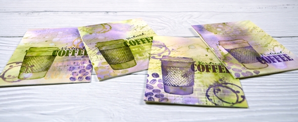
I also did four more cards with the takeaway cup stamp using much the same technique and a peeled paint/scattered straw/dusty concord colour scheme. I added a few stamped coffee beans to these ones; the ‘coffee time’ set is a very cool collection of stamps.
Thanks for joining me for ‘virtual coffee’ today. I hope your week is off to a good start.
Supplies
Coffee with a friend
Posted: April 22, 2020 Filed under: coffee time, Darkroom Door, global postmarks, handwritten script, World Map | Tags: Brusho, Darkroom Door stamps, Darkroom Door stencils, distress oxide inks, Ranger Distress inks 6 Comments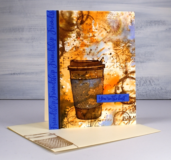
Are you missing the coffee shops? I’m sure you are missing your friends and perhaps you are missing coffee with friends. This one is for a friend of mine who loves her coffee!
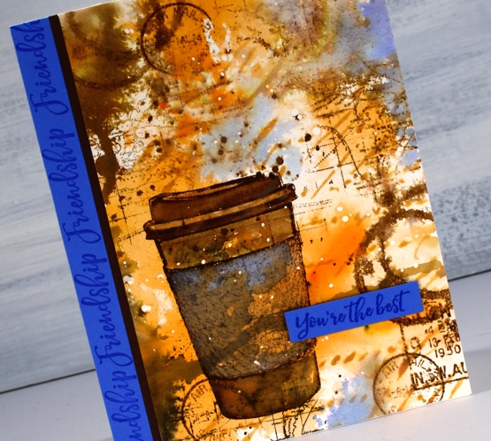
I began with a piece of hot pressed watercolour paper and splattered a few drops of masking fluid over the whole thing. Once the masking fluid was dry I sprinkled sandstone brusho on my glass mat, spritzed the brusho with water and swiped this panel through it. It took a few swipes before I had an orange and brown abstract background. I added some dark brown brusho on one side and spritzed that to make it blend and spread a bit. Once I’d dried that I blended through the new Darkroom Door ‘handwritten script’ stencil with rusty hinge oxide ink.
At this point the panel was very much just an abstract background so I stamped the cup from DD ‘coffee time’ in gathered twigs distress ink and blended the stamping with some water and extra ink. The set also has a coffee cup stain stamp so I added that here and there, spritzing it to make it blurry. I stamped some postmarks from the ‘global postmarks’ set because I can’t help myself.
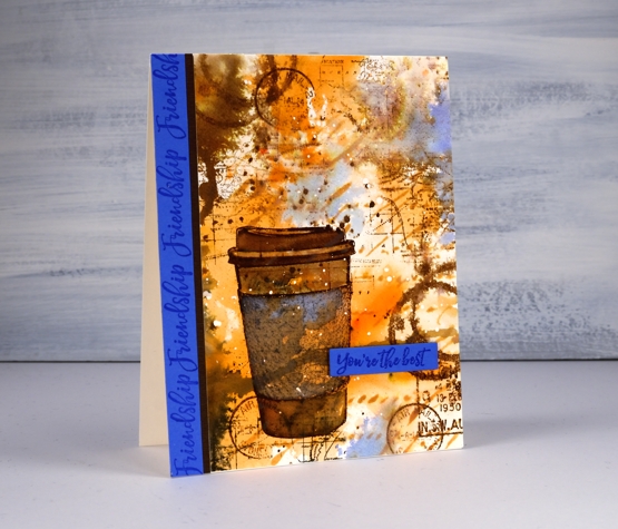
Unfortunately the coffee cup did not stand out enough from the background and the background itself looked incomplete. DD world map stamp and blueprint sketch distress ink came to the rescue. I stamped the world map several times on the panel in gathered twigs ink and then, to break up the orange and brown monopoly, I added some blueprint sketch ink in just a few places. I found some blue cardstock that matched the blue and stamped ‘friendship’ and ‘you’re the best’ from the DD ‘friendship’ strip of sentiments to finish the card. Oh, and I added a thin strip of brown cardstock separating the blue from the patterned panel.
I’m glad I didn’t give up on this panel; it is just the thing for my friend who I will enjoy a coffee with again one day.
Supplies
Correspondence
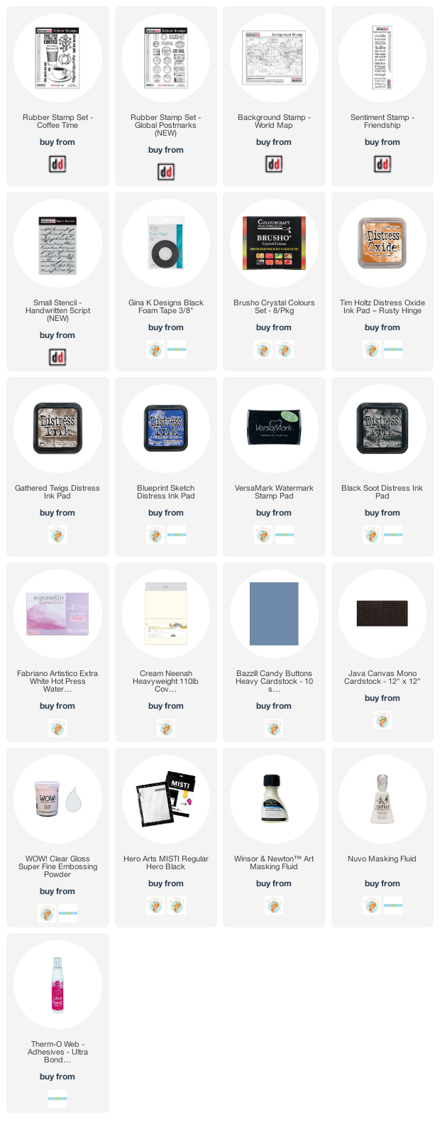
Posted: November 30, 2017 Filed under: Correspondence, World Map | Tags: Darkroom Door stamps, distress oxide inks, Finetec artist mica watercolour paint 7 Comments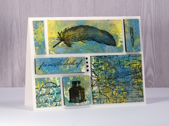
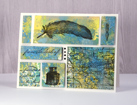
Supplies used:
Stamps: Darkroom Door Correspondence set, Darkroom Door World Map
Ink: Versafine Ink Onyx Black
Distress Oxide inks: Fossilized Amber, Broken China, Cracked Pistachio
Also: gold paint, Nuvo Black ebony crystal drops, black foam sheet, craft mat
Paper: Neenah solar white, Hot pressed watercolour paper


