The Magic of Brusho
Posted: November 4, 2025 Filed under: Background Stamps, Brusho, contemporary, cricut, Penny Black | Tags: Brusho, brutus monroe embossing powder, cricut, Fabriano Watercolour Paper, Penny Black stamps 5 Comments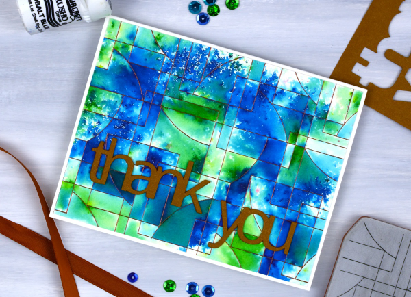
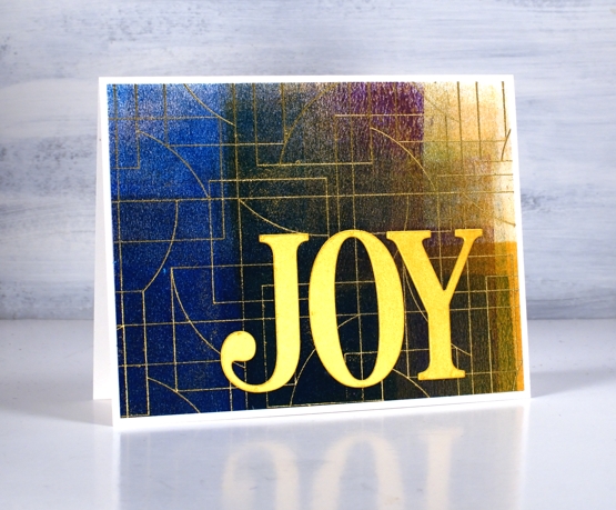
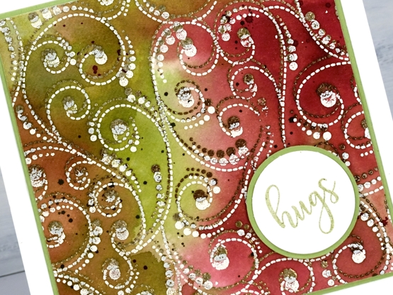
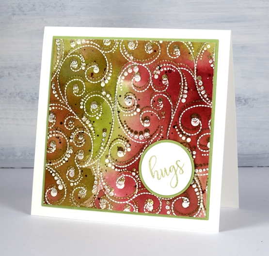
I’ve said it before but here is more evidence, Brusho watercolour paint powders make magic! I embossed the ‘contemporary‘ background stamp from Penny Black in a copper colour (I think it was ‘Penny‘ from Brutus Monroe) on hot pressed watercolour paper.
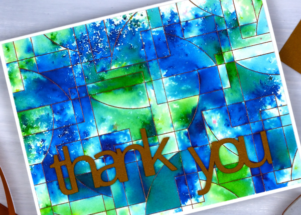
You can see the pattern in the background stamp is made up of curved and straight edged shapes. The embossing creates enclosed spaces on the panel and the the brusho powders get trapped in the spaces.
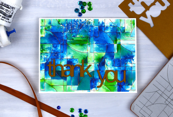
There are a couple of ways to trap brusho in an embossed design, you can spritz the embossed panel with water then sprinkle some brusho over the top, or you can sprinkle the brusho first then spritz. I often end up doing a bit of both. For this panel I think I spritzed some water first then sprinkled both blue and green brusho over the wet areas. My aim was to keep some sections blue, some green and others a mix of the two colours. I also wanted some areas to look speckled and other sections to look softly blended. Less water keeps things speckled; more water gives the paint more time to dissolve and blend.
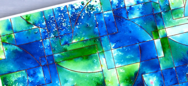
I had some bronze shimmery cardstock which matched the embossing powder so I cut the ‘thank’ and ‘you’ on the cricut. I stacked two layers so the words would stand out from the busy background.
Tea, Coffee, Art Journalling?
Posted: February 28, 2023 Filed under: 6"x 6" journal, Art Journal, Background Stamps, coffee time, Cup of tea, Darkroom Door, Dies, Gazette, Penny Black, Script, Time, What's in your cup, World Map | Tags: Art Journal, Darkroom Door stamps, Penny Black creative dies, Penny Black stamps, Ranger Distress inks 2 Comments
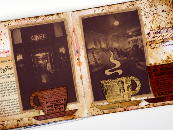
Today I am posting a few pages from last year’s Art Journal Adventure workshops. I taught seven different ‘episodes’ last year and one month the theme was coffee and tea. I did a few pages before the sessions and then created a different page during each class. I don’t like replicating the same spread in my art journal so each one had a different colour scheme and style.

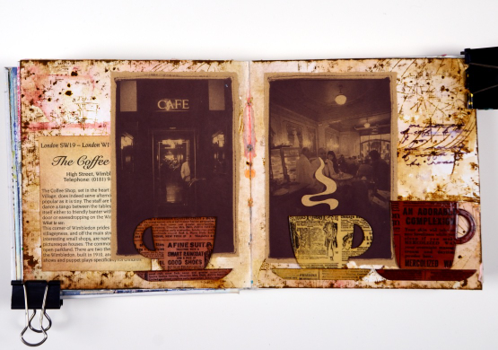
Even though I am more of a herbal tea drinker than a coffee drinker I ended up creating three coffee themed pages and two tea themed. You can see the first coffee themed page here. As you can see from the three spreads featured here I use a variety of techniques, papers and elements in my pages. The common technique on these pages is a watercolour background and the common element is the chipboard cups. Both the coffee themed pages feature photos from an old coffee themed diary. In both cases I took my colour scheme from the photo and added browns.
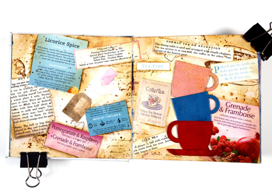
This tea themed page could also be called ‘these are a few of my favourite teas!’ I used packaging from boxes and sachets, embossed the teacups to match and add snippets from old books and magazines.
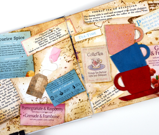
These pages show how I gather elements and papers from here, there and everywhere when creating a page. I used inks, embossing powders and glazes, stamps and stencils for these pages but I also used an old diary, packaging, pages from a vintage recipe book, and old teabags!
I almost didn’t finish this last spread but once I had stamped then glazed the cute chipboard cups I knew I had to finish. Now I want a mug with vintage newsprint on it!
Art Journal Adventure for 2023 kicks off this week. There is still space in the Friday class and the Monday class. We will be creating with semi- transparent papers.
(Compensated affiliate links from Foiled Fox, Scrap n Stamp)
Farm Fresh Lavender
Posted: March 15, 2022 Filed under: Background Stamps, Brick wall, Brusho, farm fresh, Penny Black | Tags: Brusho, Fabriano Watercolour Paper, Penny Black stamps, Ranger Distress inks 7 Comments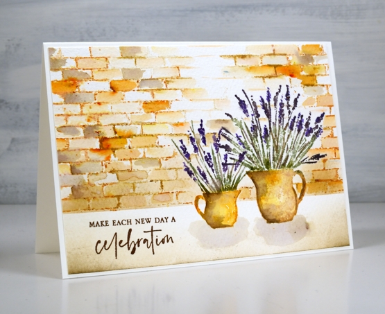
I am hoping I can fill a couple of jugs with lavender this summer. A couple of years back a friend split her lavender and gave me two plants which were coming along well last year and I hope will be even stronger and more full this year. When I have flowers in the garden I am always torn when deciding whether to cut them and bring some inside or just enjoy them outside where they will probably last longer.
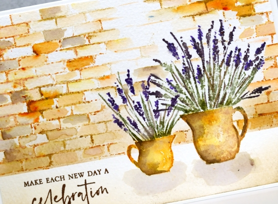
To create this little scene I used two stamps from the new Penny Black ‘farm fresh’ set and the ‘brick wall’ background stamp. I worked in a stamp positioner to create this panel. I stamped the jugs first with wild honey and tea dye distress inks. After blending the ink with water I added shadow with walnut stain ink. I used both bundled sage and rustic wilderness for the stems and a mix of milled lavender (of course) and dusty concord for the flowers.
Because I had done the jugs first I stamped and cut little masks from post-it notes to make it easier to stamp a brick wall behind them. I used tea dye to stamp the brick wall then started blending the tea dye ink to fill the bricks. I sprinkled a very small amount of sandstone brusho over the wall and started blending it in random bricks. This resulted in the warm orange bricks you see. I also added walnut stain ink to a few bricks for a darker look.
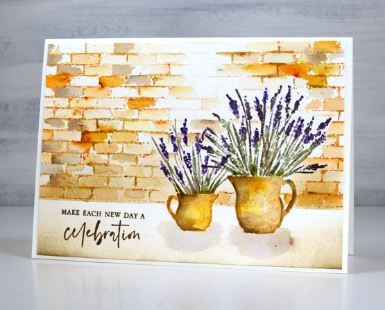
I blended antique linen and walnut ink in the foreground and painted pale shadows below the jugs. The card is finished with a sentiment from the new PB ‘love big’ stamp set.
Just in case you wondered at me thinking about cutting flowers from my garden, I’m just dreaming; it is definitely still covered in snow!
Supplies
(Compensated affiliate links used when possible)
Grid & Floral mix
Posted: August 30, 2021 Filed under: Background Stamps, contemporary, Dies, Penny Black, rosa | Tags: Papertrey ink, Penny Black creative dies, Penny Black stamps, Ranger Distress inks 3 Comments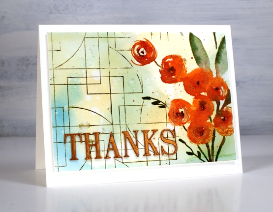
It was fun to pull out a floral and a background stamp for a new card design. I was planning to stamp the PB ‘rosa’ stamp a few times across the panel but ended up putting it snugly on the right hand side leaving room for the grid patterned ‘contemporary’ stamp on the other side.
Before any stamping I smooshed some salty ocean, scattered straw and mowed lawn inks on my glass mat, spritzed water then swiped watercolour paper through the mix of colour. I let the colours dry for a while then dropped water on top and then absorbed it with a paper towel leaving pale water marks all over the panel.
I stamped the flowers in a mix of canyon clay and raspberry fizz inks (Papertrey ink) and the leaves and stems in rustic wilderness and bundled sage. I added copper pearlescent paint to the centres of the flowers as well as splattering some on the panel. I also added some black to the centres to define the flowers a wee bit more.
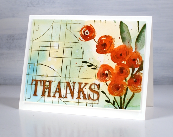
I added the PB ‘contemporary’ stamp to complete the panel along with the ‘THANKS’ die-cut from copper cardstock. You can see the fall colours are easing their way in but the summer colours are not leaving just yet!
Supplies
(Compensated affiliate links used when possible)
Gel print backgrounds
Posted: June 14, 2021 Filed under: Brutus Monroe, contemporary, gel press, perfumed | Tags: brutus monroe embossing powder, gel press, gel printing, Penny Black creative dies, Penny Black stamps, WOW embossing powders 8 Comments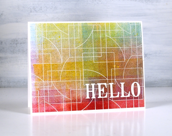
I have had my gel plate out recently and I am addicted. It is what happens when I get it out. Gel printing can be frustrating because some of the prints are a whole lot of nothing much while others are full of pattern, texture and colour. I never know whether the next print will be the former or the latter so I keep on printing. I have a stack of prints sitting around and I decided it was time to cut a few up to make cards. I added some stamping and die-cuts.
This first card is my favourite but I must be honest with you, it isn’t a gel print. It is the scrap paper I cleaned the brayer on! I love how pretty the colours and blends are but I’m a bit miffed that my clean up page was prettier than many of my prints!
To turn it into a card I stamped and embossed the PB ‘contemporary’ stamp in white and added the hello, cut with the PB ‘thanks & hello’
Same deal with this background but embossed with gold and adorned with the PB ‘jumbo joy’ die.
I’m glad to add another card to my very small Christmas card stack. My resolution to add to it every month seems to be a bit off and on.
This background is a recent print and includes a fun thread printing technique I saw on Birgit Koopsen’s instagram. She recently completed a challenge gel printing every day in May. She generously shared all the techniques she tried.
I added flowers from the PB ‘perfumed’ set and a sentiment in white embossing powder.
I guess the title of this post was a bit inaccurate as only one of these cards features a gel print background! Watching beauty emerge when gel printing is so much fun. To glance over at my brayer clean up sheet and realise I have to save it because it looks like a pastel check table cloth is a bonus. To see the pale ghosts of stencils turn up on third or fourth prints also amazes me.
I did not participate in Birgit’s recent challenge as I was busy busy launching the new online Floral Faves class but now the gel plate is out I am challenging myself to post something gel-print related every day this week. See you tomorrow.
Supplies
(Compensated affiliate links used when possible)
Bird’s eye view
Posted: April 23, 2021 Filed under: bird's eye view, Dies, Flower Frolic, gift card pocket, Karin brushmarkers, Penny Black, Script | Tags: distress markers, Karin brushmarkers, Penny Black creative dies, Penny Black stamps, Ranger Distress inks 7 Comments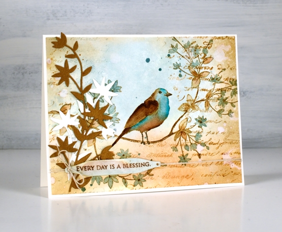
This cute bird on a branch stamp is new from Penny Black and is called ‘bird’s eye view’. We recently installed a new bird feeder in our backyard. It is on a shepherd’s hook metal pole to discourage the squirrels. The feeder itself has the anti-squirrel spring mechanism which closes access to the seed when something as heavy as a squirrel lands on it. You can probably guess what I’m going to say next; squirrels are wily creatures as are chipmunks! I can say that no adult squirrels have successfully fed directly from the feeder, they hang around underneath and eat what falls to the ground. We have seen a smaller squirrel climb the pole and lean over to take seed from the feeder without putting weight on it and a chipmunk that is light enough to sit on the feeder and stuff it’s face happily!
I know from experience you win some and lose some with feeders and I am enjoying the cardinal couple, the chickadees and the sparrows that are popping in. I think we’ve seen a finch or two but not certain.
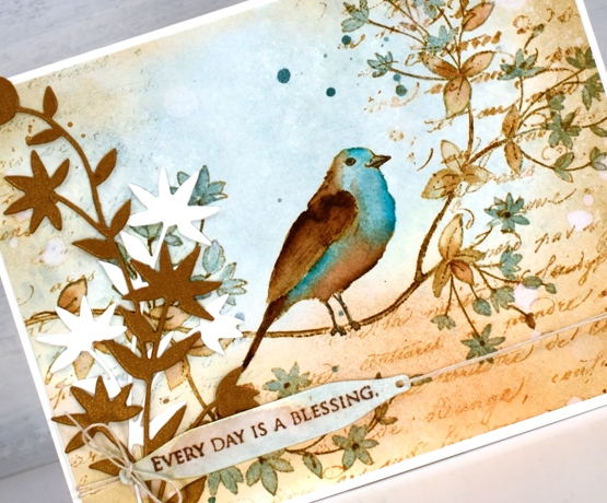
To create this vintage themed card I limited myself to a brown and blue colour scheme. The browns are tea dye, antique linen and vintage photo distress inks; the blues are speckled egg distress ink plus the arctic blue and cyan Karin brushmarkers. First I smooshed tea dye and speckled egg inks on a glass mat, diluted them with water then swiped a piece of hot pressed watercolour paper through the inks. Once the background was dry I stamped the ‘bird’s eye view’ image on the panel with antique linen and kept the panel in the stamp positioner while I added darker ink by applying distress marker to the stamp where I needed darker browns and black.
I painted the leaves in both tea dye and speckled egg inks and did the same with the bird before adding vintage photo ink to the wing, tail and legs. Once the bird was finished I felt the speckled egg blue was not deep enough so I used the blue Karin markers to add ink directly to the paper then blended with a paintbrush.
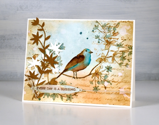
To add to the vintage look I blended around the edge of the panel with vintage photo ink then dropped splats of water here and there to create watermarks. I also stamped the PB script stamp which never fails to add some vintage charm. I hunted through my dies to find a pretty foliage die that mimics the shape of leaves and cut both bronze and cream pieces to attach to the left of the panel. Continuing the vintage theme I stamped a partial sentiment on a little tag and tied it to the panel with twine. Yes, of course there is also some ink splatter.
Let me know if you have successfully deterred squirrels from you backyard bird feeders; I’d love to hear your techniques.
Supplies
(Compensated affiliate links used when possible)
Autumn lanterns
Posted: October 14, 2020 Filed under: Flower lanterns, fragile branches, Penny Black, Script | Tags: Fabriano Watercolour Paper, Penny Black stamps, Tsukineko Memento inks, Wendy Vecchi 5 Comments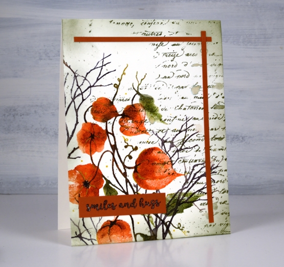
I have some dried Chinese lanterns in the corner of my workroom. They are lasting well, I’ve had them at least seven years, probably longer. A few have broken or fallen off the stems and the colour has faded so they are not the deep orange you see in the image on my card. I used Penny Black’s ‘flower lanterns’, ‘fragile beauty’ and ‘script background’ stamps to create this panel.
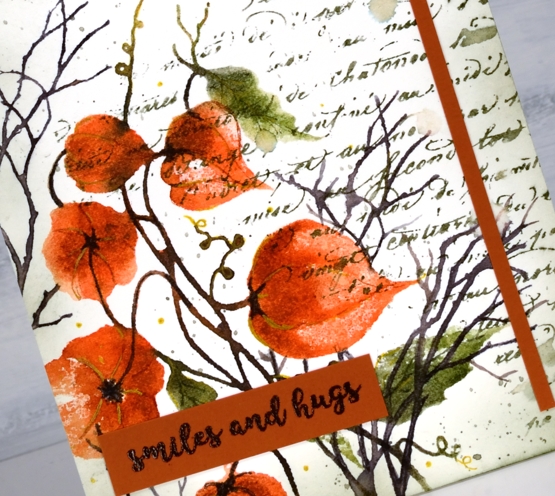
Just to mix things up a bit I pulled out memento inks for this project. There was a time when I used memento inks on every project and they are still within reach of my work table. The ‘Morocco’ browny orange is a beautiful colour so I started with that and used potter’s clay, olive grove, bamboo leaf and espresso truffle, some inkpads, some markers. I was very happy to see the ink pads are juicy as ever.
Memento inks don’t always blend once on the watercolour paper so I blend with a spritz of water to the stamp before stamping. I also smoosh some ink on my mat and pick it up with a brush if I want to add depth to a very specific area. I added some details with a gold gel pen after I had built up the lanterns and leaves with ink.
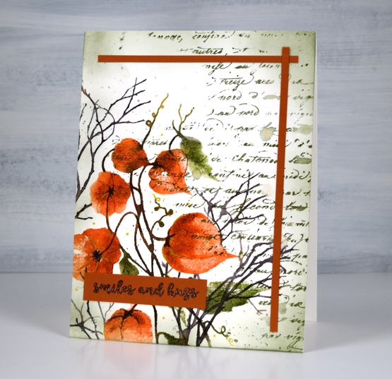
You can see some of my favourite ‘finishing touches’ on this panel: a script stamp, splatter and ink blended edges. I added two strips of co-ordinating cardstock as a half frame then balanced them with the sentiment from PB ‘banner sentiments’.
Supplies
Double Embossed
Posted: August 31, 2020 Filed under: Background Stamps, Brutus Monroe, dotted fusion, Penny Black | Tags: brutus monroe embossing powder, Penny Black stamps 8 Comments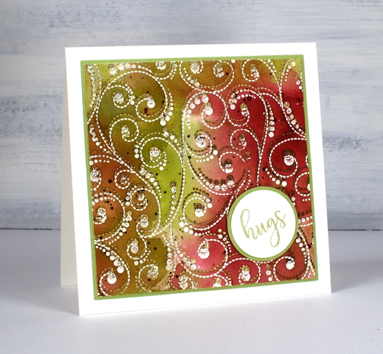
At the risk of losing you I have to begin this post by directing you to the beautiful inspiration for this card. Just pop over to the wonderful blog of Anna-Karin Evalddson to see her double embossing. There is so much texture in her card. When I first saw it I was sure it was heat embossed and then dry embossed because the surface looked so 3D. Anna-Karin did a video of her process, which I watched then immediately went and made the card above. I often see cards which inspire me and I save or tag or pin them for another time; rarely do I immediately act on the inspiration.
I didn’t achieve the 3D effect that Anna-Karin did but I like the play of double embossing and the unusual combination of colours and embossing powders. I worked on hot pressed watercolour paper, embossing the ‘dotted fusion’ stamp from PB first in a mix of ‘sandcastle’ & ‘potting soil’. (supplies linked below). I moved the panel a little to one side then embossed again in a cream embossing powder.
To colour the panel I pulled out my distress stains, not the sprays, (but they would work) the daubers. I hardly ever reach for them now as they are no longer available so I don’t want to taunt you with something you can’t have. I still really like the daubers for applying a strong liquid ink in a confined space. In this case I dabbed them on the glass mat, spritzed some water and swiped the embossed panel through the colours (aged mahogany, peeled paint and old paper). Anna-Karin just used distress inkpads and her results were amazing.
To keep with the circle/dotty theme I stamped a word from PB ‘huggable’ set on a circle, matted on a circle and put the card together. Oh and there is splatter too, no surprises there.
that’s a booster colour scheme btw, if you do my online class you will hear about that! 😉
Supplies
Refreshing winners
Posted: July 24, 2020 Filed under: Catherine Pooler inks, Penny Black, Script, soulful silhouettes | Tags: Catherine Pooler inks, Penny Black stamps 6 Comments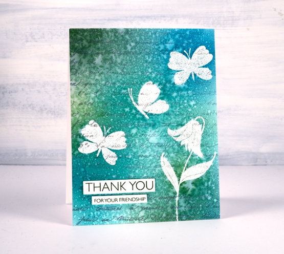
I want to thank everyone who participated in the ‘Refreshing’ giveaway I hosted with the Foiled Fox. I enjoyed reading your preferred ways to find refreshment and noticed many of you head to your garden during the cooler parts of the day, sit by the water if you have some nearby, or on your porch or patio. Some find doing something creative refreshing and there were quite a few mentions of drinks and good books. I would love to be sitting by the water these days but as that is not possible right now I am doing many of the things you are. Thanks so much for sharing those snapshots of your life. Without further ado, I would like to congratulate Martha and Kathy.
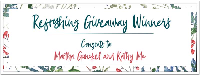
You have won a gift certificate to go shopping at the Foiled Fox online store. I am sure you can find some refreshment there! Shauna from the Foiled Fox will be in touch with more details.
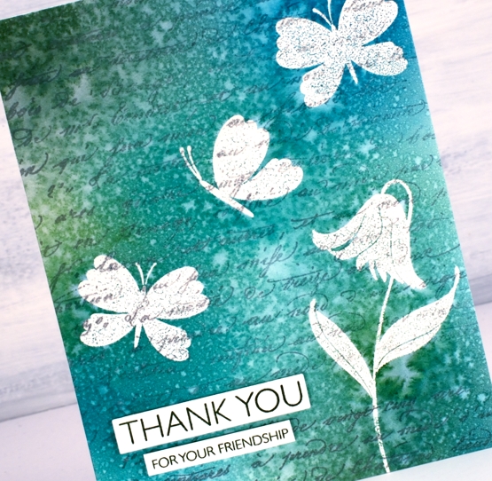
Today’s card features a technique I’m going to call emboss resist masking. It involves embossing in order to resist the application of ink over the top but I wanted the finished project to look as though I masked the butterflies and flowers rather than have shiny raised images at the end. The trick is to iron off the embossing powder once the project is completed.
I know this isn’t a new technique but I was looking at some inspiration pics on pinterest and decided it was a good way to get the effect I wanted.
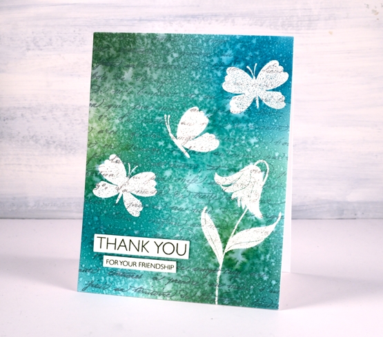
I stamped the PB ‘script’ background stamp in hickory smoke archival ink so the print would not attract embossing powder or be blurred when I added others inks or water. The archival ink is fast drying and permanent.
I used a stamp positioner to stamp a flower and some butterflies from the PB ‘soulful silhouettes’ set in versamark then I embossed in clear powder. To cover the panel with colour I chose four Catherine Pooler inks (listed below) and applied them with blending brushes. I gave the whole panel a couple of spritzes with water which resulted in the lovely pattern you see on the finished card. I didn’t dab it with paper towel or dry it with a heat tool. I was actually patient and let it air dry on the desk because the spritz looked like rain on a window.
Once it was dry I got some scrap paper and lay the panel face down on the scrap paper and ironed it without steam. I changed the scrap paper several times because the embossing powder transfers to the scrap. Eventually there is none left on the original panel. I chose a couple of sentiments from the million thanks set and stamped them in CP spruce ink.
Supplies
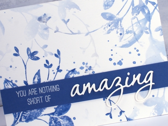
You are nothing short of amazing
Posted: April 8, 2020 Filed under: exhilaration, Penny Black, Script | Tags: brutus monroe embossing powder, Fabriano Watercolour Paper, Papertrey ink, Penny Black creative dies, Penny Black stamps, Ranger Distress inks 12 Comments
I got together with some friends a while back for a crafting afternoon, seems like an age ago now! While there I stamped the two panels you see here. For a while they were forgotten as I was working on other projects then I fiddled around to create two quite different cards. The basic technique is the same for both panels and involves stamping and restamping without reinking in between impressions. The card above began as a vintage looking panel stamped in antique linen ink. I smooshed some antique linen distress ink on my glass mat, spritzed with water then swiped my panel through it to pick up inky stains. I dabbed some areas with paper towel which makes them dry a more yellowy colour. I partially inked the Penny Black script background stamp in antique linen and stamped on one side.
Once the background was dry I used the PB stamp, ‘exhilaration’ to stamp some coloured flowers. I inked the flowers with a Papertrey Americana ink cube and chipped sapphire distress ink then the stems with a gathered twigs distress marker. I wiped ink off the stamp in some areas so the image would be patchy on purpose, spritzed then stamped on the panel. I did both the left hand side and right top corner then, without cleaning the stamp spritzed it again and stamped paler images which immediately appear to be in the background. I stamped a sentiment on an ‘antiqued’ scrap in versafine vintage sepia ink, added a twine bow and popped it up on some foam tape.
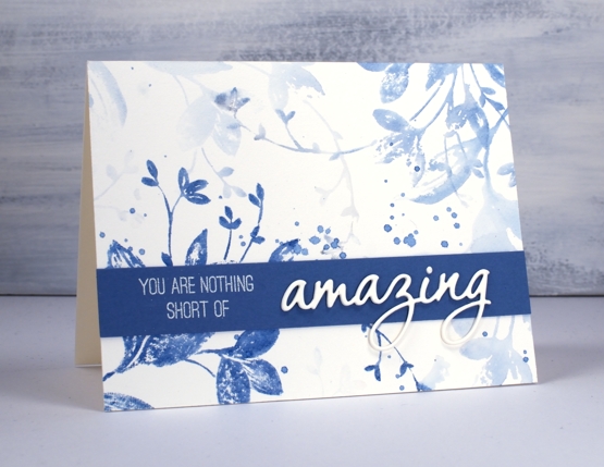
Now that I have described my process for the first card you can probably see that I used the same technique for the blue card but only used one colour, Papertrey ink ‘blueberry sky’. I didn’t start by making a vintage style background, I just jumped right on in with the first stamping. I spritzed the stamp and did another print, then another and one more very pale one and that was it! I added some splatters but nothing more to this pretty blue panel. It was very quick and probably took longer to find a matching cardstock. Once I found a co-ordinating blue I stamped part of a sentiment from the PB ‘sentiment’ set and embossed in alabaster powder. I finished the sentiment by stacking three die cut ‘amazings’ from the PB OMG die set.
I love this technique for adding depth and dimension to flat stamped panels. I have a video coming next week demonstrating a similar process so stay tuned!
Thanks for visiting here today, I hope you are safe and well where you are and thanks again if you are on the front lines taking care of health, food and safety needs. You are nothing short of amazing!