You are nothing short of amazing
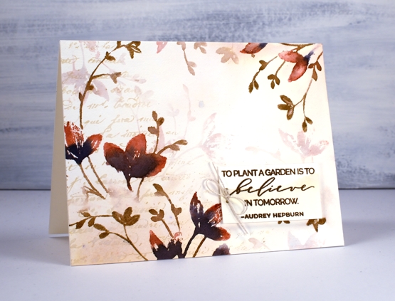
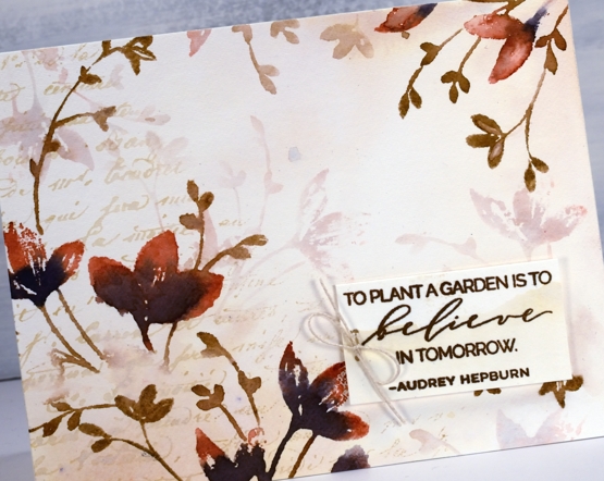
Posted: April 8, 2020 Filed under: exhilaration, Penny Black, Script | Tags: brutus monroe embossing powder, Fabriano Watercolour Paper, Papertrey ink, Penny Black creative dies, Penny Black stamps, Ranger Distress inks 12 CommentsI got together with some friends a while back for a crafting afternoon, seems like an age ago now! While there I stamped the two panels you see here. For a while they were forgotten as I was working on other projects then I fiddled around to create two quite different cards. The basic technique is the same for both panels and involves stamping and restamping without reinking in between impressions. The card above began as a vintage looking panel stamped in antique linen ink. I smooshed some antique linen distress ink on my glass mat, spritzed with water then swiped my panel through it to pick up inky stains. I dabbed some areas with paper towel which makes them dry a more yellowy colour. I partially inked the Penny Black script background stamp in antique linen and stamped on one side.
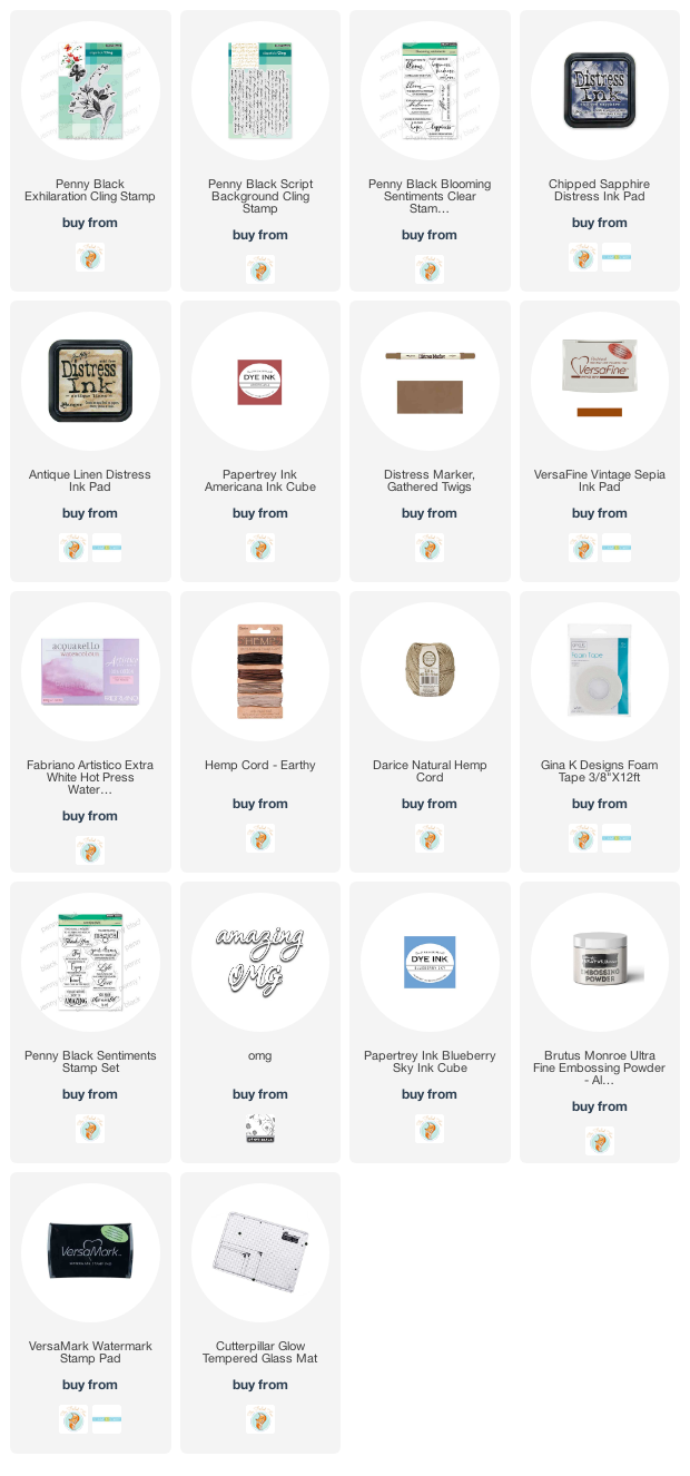
Once the background was dry I used the PB stamp, ‘exhilaration’ to stamp some coloured flowers. I inked the flowers with a Papertrey Americana ink cube and chipped sapphire distress ink then the stems with a gathered twigs distress marker. I wiped ink off the stamp in some areas so the image would be patchy on purpose, spritzed then stamped on the panel. I did both the left hand side and right top corner then, without cleaning the stamp spritzed it again and stamped paler images which immediately appear to be in the background. I stamped a sentiment on an ‘antiqued’ scrap in versafine vintage sepia ink, added a twine bow and popped it up on some foam tape.
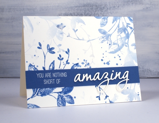
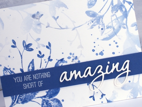
Now that I have described my process for the first card you can probably see that I used the same technique for the blue card but only used one colour, Papertrey ink ‘blueberry sky’. I didn’t start by making a vintage style background, I just jumped right on in with the first stamping. I spritzed the stamp and did another print, then another and one more very pale one and that was it! I added some splatters but nothing more to this pretty blue panel. It was very quick and probably took longer to find a matching cardstock. Once I found a co-ordinating blue I stamped part of a sentiment from the PB ‘sentiment’ set and embossed in alabaster powder. I finished the sentiment by stacking three die cut ‘amazings’ from the PB OMG die set.
I love this technique for adding depth and dimension to flat stamped panels. I have a video coming next week demonstrating a similar process so stay tuned!
Thanks for visiting here today, I hope you are safe and well where you are and thanks again if you are on the front lines taking care of health, food and safety needs. You are nothing short of amazing!



Those brown and blue tones are gorgeous Heather and love the way you have finished both, and the first with the added smooshed Antique Linen on the base just gives a slightly more vintage look with the brown. That’s a beautiful stamp too. I look forward to your video next week. Your cards are always so inspirational! x
Thank you, Pat, you are such an encouragement to me!
Wow..
Love these.
Can’t wait to try my own
Thanks.
Tish
It’s one of those ‘looks tricky but really isn’t techniques’!
Beautiful cards!
These were panels I did that day we had a crafty get together in Feb. Remember those days when we got together in the same room…
These are so beautiful, i love seeing how the same technique looks so different with the different colour way, the blue makes me think of dutch china! 🙂
Thank you, I thought of Dutch china too when I stamped the blue one!
💙
Wow that is just gorgeous!! great technique
Beautiful creations! I especially love the first card colors!
Wonderful examples of generational stamping, Heather! I love the vintage collage look of the first and the crispness of the blue on the second!