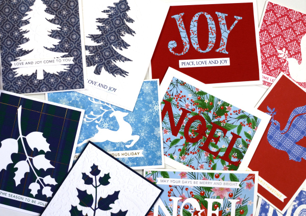
Calendar Cards
Posted: February 18, 2026 Filed under: border collection, Concord & 9th, cricut, Dies, online class, Patterned papers, Penny Black | Tags: Concord & 9th, cricut, Earth Greetings, online class, Penny Black creative dies 5 Comments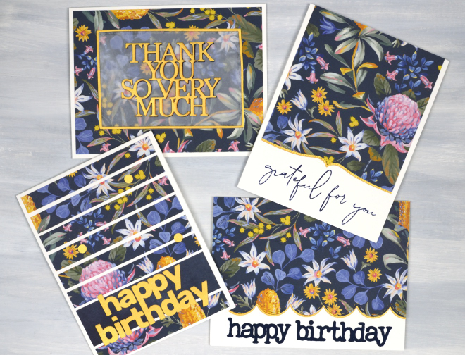
Here are some happy flowers to remind you of spring if you are still surrounded by snow like I am! Also to get you through winter there are details about a sale of my online classes at the bottom of this post.
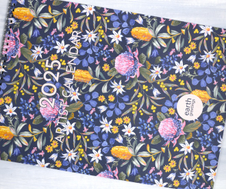
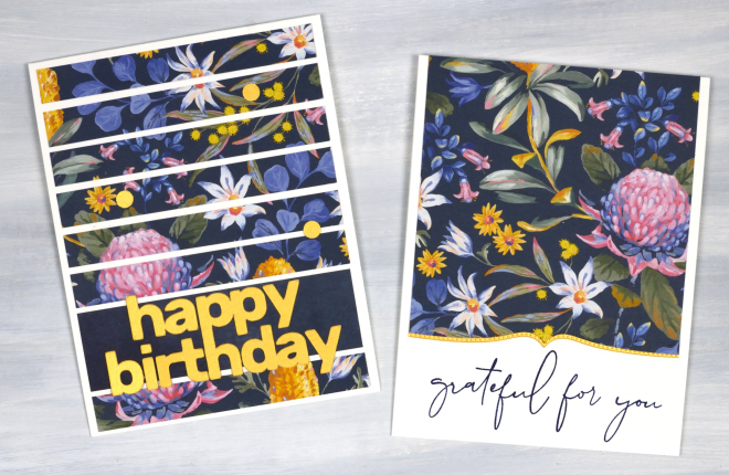
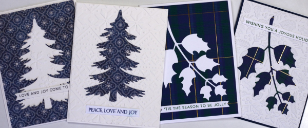
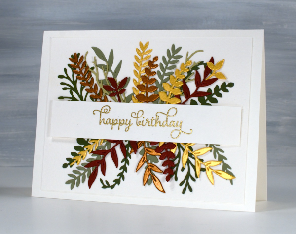
I received a beautiful Earth Greetings calendar last year from my brother and sister-in-law in Australia. I enjoyed the original artwork all year while also planning to turn the pages into cards once the year was over. I decided to start with the cover which features a beautiful floral design by Jayne Branchflower. The cover has the January artwork on the back so I used bits of each design, both painted by Jayne.
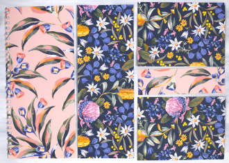
In this post I will feature the blue background panel covered in Australian native flowers such as waratah, bottlebrush and flannel flower. I created two portrait orientation cards shown below. The accents on all the cards are cut from gold cardstock to co-ordinate with the bottlebrush (callistemon) and wattle in the design. The greeting below left was cut on the cricut, below right features a Penny Black border die and a retired C&9 sentiment.
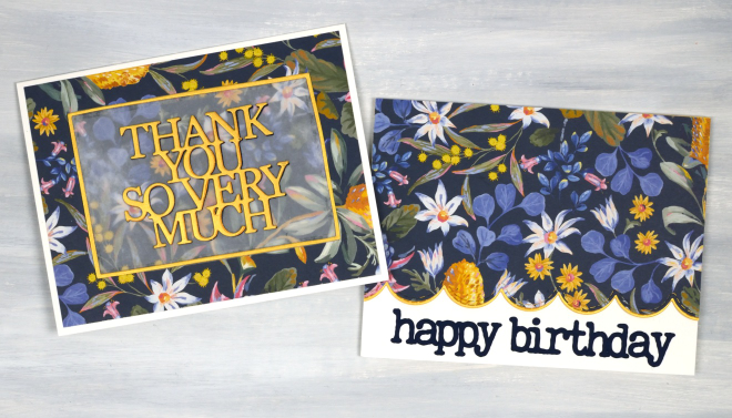
The two cards below I made in landscape orientation and used the PB Border Collection die to add a scalloped edge on the right along with a cricut cut sentiment. On the left I die-cut a PB sentiment, So Many Thanks, and lay it over duralar so it would be easier to see on the busy background. It is also stacked up on navy cardstock to give it a bit more prominence. I created the narrow gold border with WaffleFlower A2 rectangle dies. The cards in this post obviously do not have to be made with calendar pages; your own printed, drawn or painted papers would work, as would scrapbook papers or art papers. I am just having fun with calendar pages right now and hope I have inspired you to recycle and repurpose a few of yours!
All my online classes are on sale for 50% off. Just click over to https://heathertelford.podia.com/ to purchase.
This post includes affiliate links from Scrap’n’Stamp . If you buy through these links I receive a small commission at no extra cost to you.
Pretty Papers
Posted: January 21, 2026 Filed under: cricut, My Favorite Things, Patterned papers, Penny Black | Tags: cricut, My Favorite Things, Penny Black creative dies 7 Comments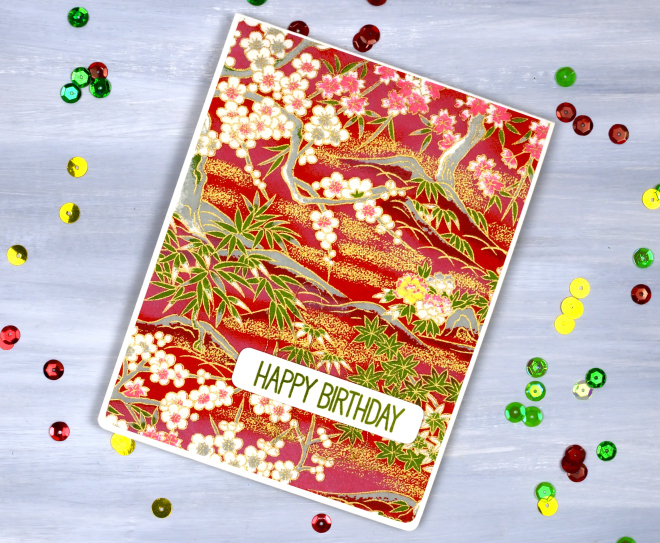
If you are anything like me you probably have a stash of pretty papers. Maybe they are scrapbooking papers or rice papers, perhaps they are pretty papers you made yourself by watercolouring or printing. I have quite the stash in all the above categories. So in the spirit of using what I have (UWIH), I pulled out some of the pretties and turned them into cards.
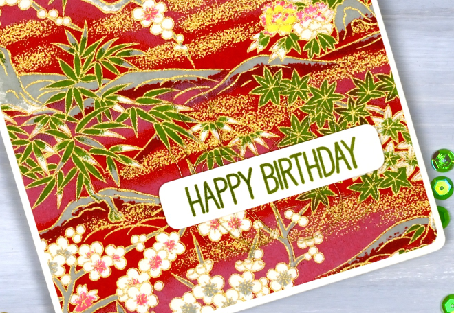
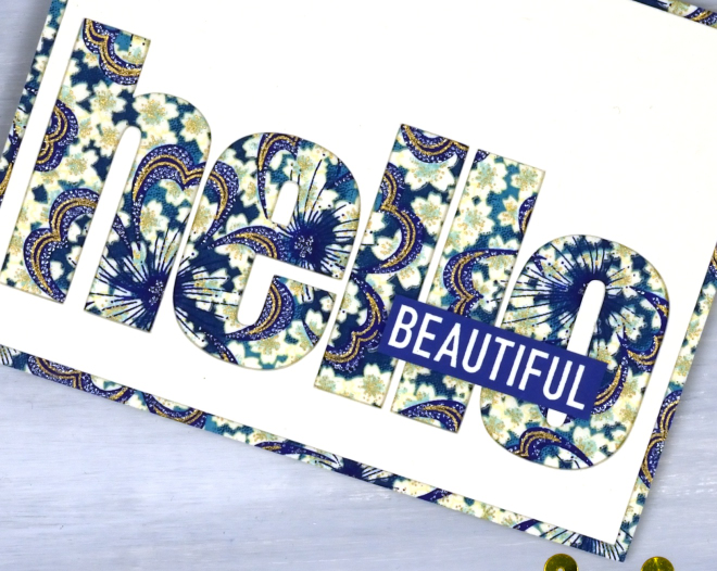
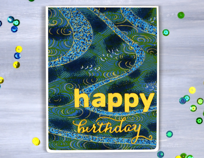
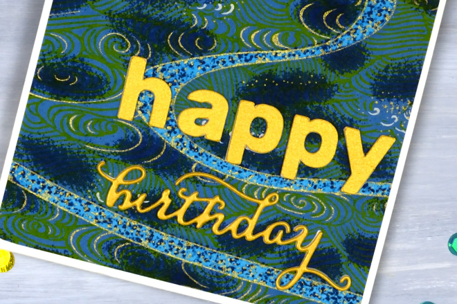
All the papers on today’s cards are rice papers featuring bold colours and gold details. They were a lovely gift from a lovely person. Because the papers are so beautiful I really didn’t do much to turn them into cards. (the red one, the bluey-green one, the blue floral one)
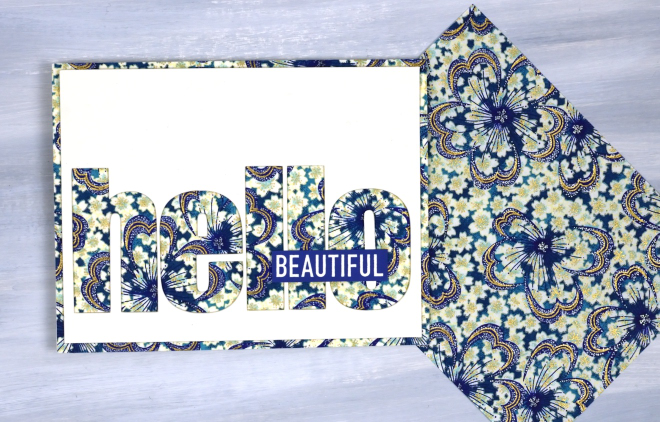
All the cards featured today use a panel that fills or almost fills a card front. I simply added sentiments and rounded corners to the red card and the bluey-green cards. For the hello card above I used the cricut to cut the word hello from a cream panel so the pretty paper would be revealed. I added the word ‘Beautiful’ from a Darkroom Door set, ‘You are Everything‘.
The word birthday below is die cut; the other letters are cricut-cut.
I like the finishing touch of rounded corners and have a corner rounder that I really like; it’s the Kadomaru PRO which gives me the choice or large, medium or small corners. What else do you do with pretty papers? I’d love to read your suggestions in the comments.
Birds on Birches
Posted: December 9, 2025 Filed under: beneath the birches, Dies, Penny Black, sennelier watercolours, winter trees | Tags: Fabriano Watercolour Paper, Penny Black creative dies, Penny Black stamps, sennelier watercolours 3 Comments
In case you were wondering I have done some watercolouring for Christmas cards this year; it’s not all napkin art. I created a batch of cards for a friend which included either watercolour skies or watercolour trees.
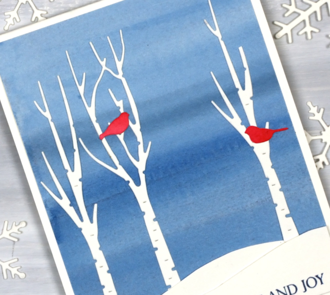
I painted a blended sky with a couple of different blues then added hand-cut snowbanks and die-cut trees and birds from the Penny Black sets, ‘beneath the birches‘ and ‘winter trees‘.

This would be a simple card to make in multiples by painting a large sheet of watercolour paper to divide into sky panels then add the white and red elements. The greeting is from the PB ‘Christmas sentiments‘ set. How is your Christmas card sending going? I sat in a waiting room yesterday and wrote about eight cards instead of reading a book or scrolling so that advanced me through my list a little.
Eucalyptus & gold
Posted: December 3, 2025 Filed under: Airy, Dies, Penny Black, stocking stuffers | Tags: Penny Black creative dies, Penny Black stamps 5 Comments
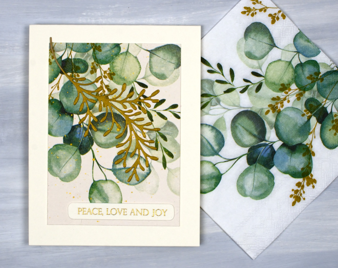
I thought this would be my last napkin/serviette related post for now but I forgot about a pack of dinner napkins I bought in the summer. So maybe one more!?
But onto today’s cards; you can see in the photo above that the eucalyptus themed napkins are printed on a white base but my cards are all cream tones. When I adhered the single layer of the napkin to cream cardstock, the background transformed into cream not white.
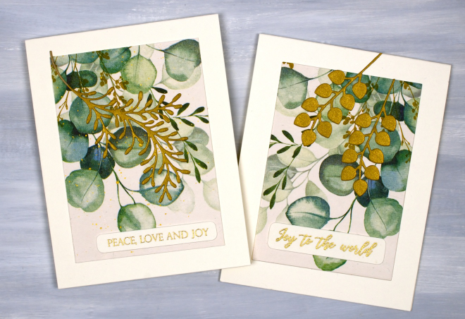
The napkins are not Christmas themed themselves but I chose to add gold foliage die-cuts, gold embossed greetings and even some gold splatter on the one below to turn them into Christmassy cards. I used the Penny Black dies, ‘stocking stuffers‘ and ‘airy’.
2 for 1 cards
Posted: November 24, 2025 Filed under: Penny Black, Taylored Expressions | Tags: Penny Black creative dies, Penny Black stamps, Taylored Expressions 6 Comments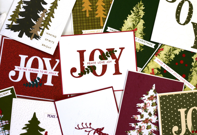
Here are some of the ‘2 for 1’ cards a group from our church made on Saturday. I had a couple of friends help with prep and running the event and it was a fun creative time. Of course there were snacks, laughter and plenty of conversation.
The ‘2 for 1 technique’ in this case required the maker to cut an image or word out of patterned paper and turn the positive and the negative piece into two separate cards. To add some texture and pattern we had coloured and embossed backgrounds to choose from.
I have run this event before and there is always some creative free styling when participants see the supplies available. I get inspired watching everyone create. I wanted one photo of all the cards but my kitchen table was crowded with just half so I divided them into landscape and portrait orientation.
Thank you to the twenty three people who participated before and during the event. I hope the residents at the nursing home will enjoy the pretty cards and message.
Christmas Greenery
Posted: November 21, 2025 Filed under: Christmas inchies, Darkroom Door, Elizabeth Craft Designs, Gina K, global postmarks, Penny Black, postage stamps | Tags: Darkroom Door stamps, Elizabeth Craft Designs, Penny Black creative dies, Penny Black stamps 7 Comments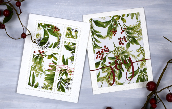
Yes, finally a Christmas card post. I have been playing around with paper napkins for some of my Christmas cards. All the designs in today’s post use panels from a greenery + berries design. I peel off the printed layer from the three layer napkins or serviettes (depending where you’re from) and glue it to cardstock. I’ve used both double sided adhesive (pricey) and glue sticks (slightly curls the cardstock). Either option works I just need to take some time to flatten the glued panels.
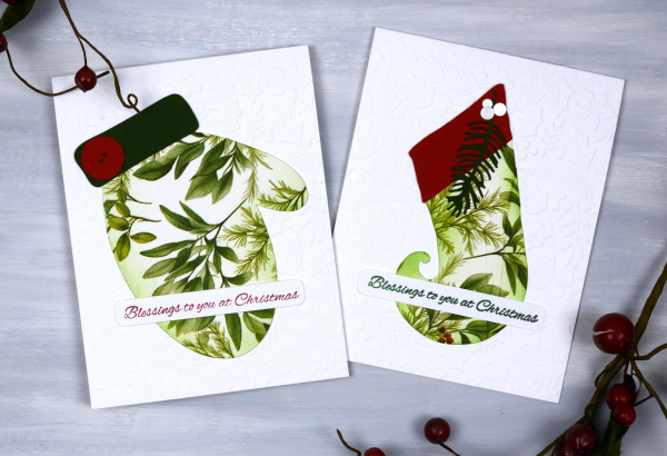
Sometimes when attaching the fragile napkin layer to the cardstock you get some creases; I think they add interest and texture so I don’t let them worry me. I used my cricut and the Echidna Studio stocking design and mitten designs to cut out large features to add to an embossied background.
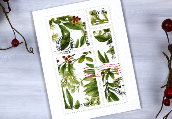
I also used the lovely postage dies from Elizabeth Craft and the Darkroom Door Global Postage and Christmas Inchies stamps to add postmarks along with small sentiment stamps from Penny Black to add words. For the card below I simply cut the word joy using a PB die and added it to a large panel. You could definitely make all these cards with patterned papers or your own painted or printed papers. I just get tempted by the beautiful paper serviettes out there and end up buying them for craft and dinner!

I am packed up ready to do Christmas card making with some friends from church tomorrow. We are making 2-for-1 cards to give to the residents in a local nursing home. I’ll try and share a few of the designs next week. Have a lovely weekend.
The happy cut-out
Posted: October 22, 2025 Filed under: cricut, Dies, Penny Black | Tags: cricut, Penny Black creative dies Leave a comment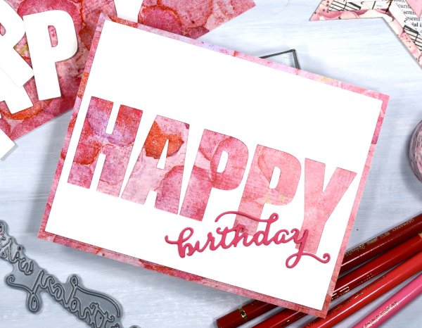
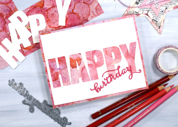
Today’s card is very similar to yesterday’s. I used the cricut to cut the letters H, A, P, P &Y from a cream panel which reveals the patterned paper layered below it. Because the patterned paper is the same size as the card front there is a border revealed by the smaller blank panel.
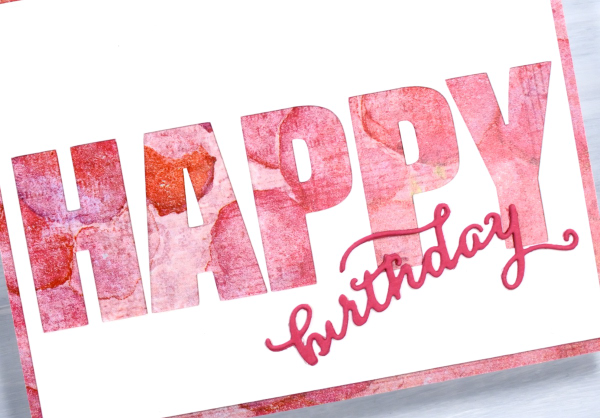
I’m know there are various ways to get the same effect but in some way it is easier to let the cricut cut the large letters in a straight line rather than expect myself to glue the cut-out letters in a perfect row! I used a Penny Black die to cut the little birthday word from pink cardstock. The patterned paper is one of the bonus pages you sometimes get in paper-crafting magazines. I think it’s the first time I’ve used one but I have a little stash which I will continue to put to use.
Shimmery Foliage
Posted: October 14, 2025 Filed under: Airy, Dies, Finetec paints, Leaflets, Leaves, Penny Black, Taylored Expressions | Tags: Fabriano Watercolour Paper, Finetec artist mica watercolour paint, Penny Black creative dies, Taylored Expressions 2 Comments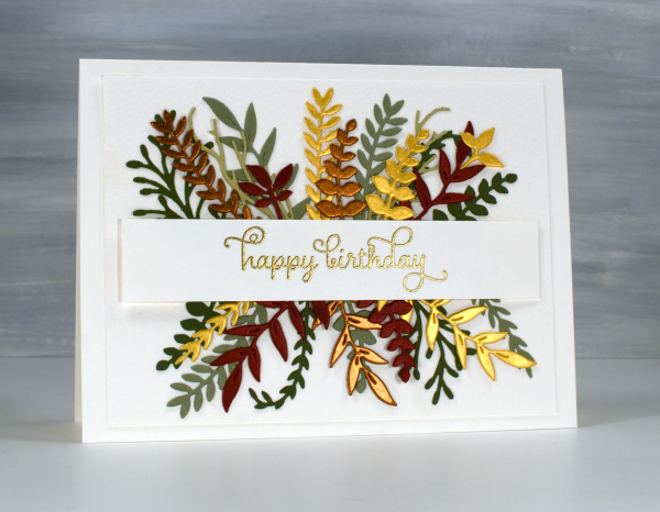
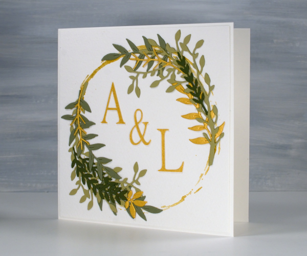
Recently a friend and I got together and worked on wreath style wedding cards. Mine is featured further down in this post. After my friend left I used some of the die-cut foliage leftovers to make her a birthday card. You can see a few matte green leafy branches plus more cut from gold, bronze and reddish shimmer cardstock. I arranged it all either side of a stamped and embossed banner. This sort of a card takes a while to arrange in a balanced way so once I had it looking good I took a photo so I would be able to glue it all down again in the same way.
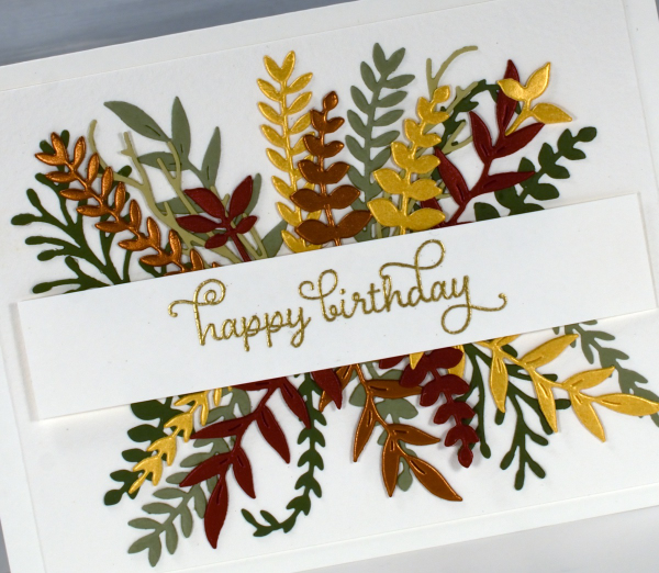
All the die-cutting was done with Penny Black foliage dies from a variety of sets. The curly twirly birthday sentiment is from the Taylored Expressions set, ‘In & Out Birthday’ embossed in gold powder
To make the wreath card I began by stamping a rough circle using gold watercolour paint on a jar lid. It was the lid of the lentil jar so yes, I had to wash it carefully before it was returned to the jar.
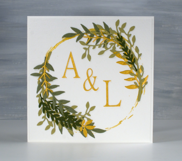
I arranged die-cut foliage around the gold circle not with perfect symmetry but I aimed for balance.
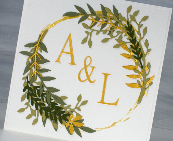
I cut the A, & and L on the cricut using the Linux Libertine Display G font. Both cards were made on cold pressed watercolour paper which has a nice creamy colour and soft texture.
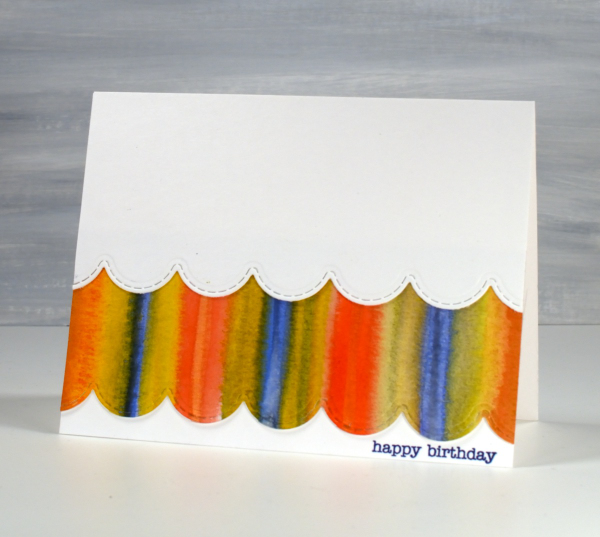
Strips & Stripes
Posted: March 5, 2025 Filed under: border collection, Hand painted | Tags: Hand painted, Penny Black creative dies, Penny Black stamps 1 Comment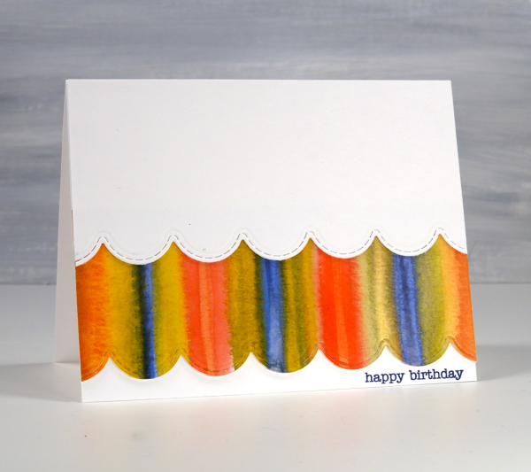
Amongst my recent watercolour panels there are quite a few with stripes. I was colour mixing and playing with wet into wet technique as I painted stripe over stripe to fill the panels.
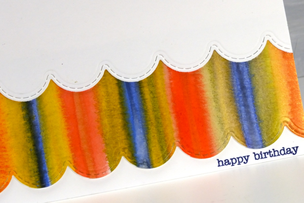
I could have die cut a scalloped strip to add on top of the card front but I liked the layered look which reminds be a bit of carnival tents so I added first the painted strip, then over the top a scalloped piece of white. The scallop die is from the Penny Black set, ‘border collection’ and the sentiment from the ever faithful PB ‘snippets’ set.
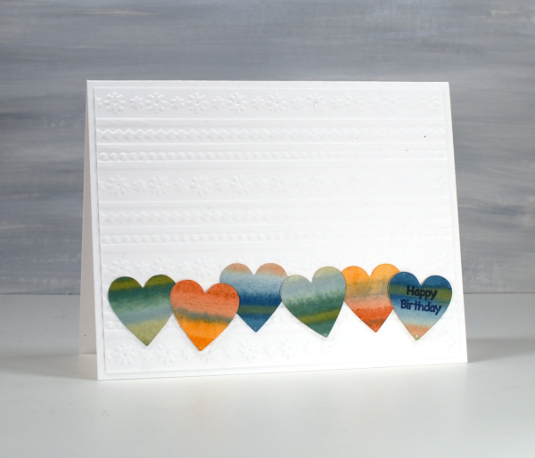
The heart themed card below is the same layout with a couple of variations. As you can see I still used a striped panel but die cut some hearts from it and lined them up to span the card front.
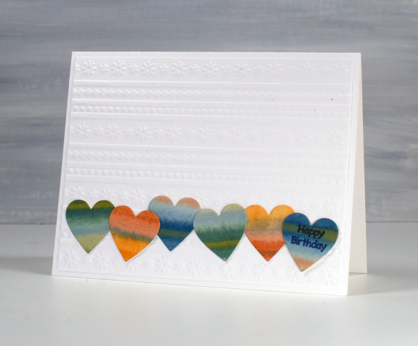
Although the hearts looked cute in a row, the white card front looked too plain so I added an embossed panel as the background to add texture and interest without adding more colour.
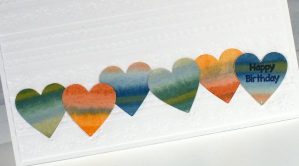
The little happy birthday is from Darkroom Door, once again I used a small sentiment; I do have a soft spot for tiny text.
These two are examples made for my upcoming in-person card design class which still has a few available spots in it.
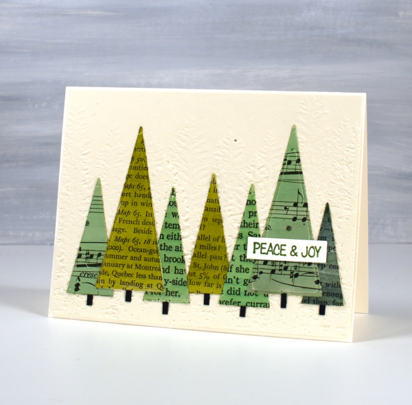
Book Trees
Posted: December 20, 2024 Filed under: Dies, modern xmas tree, Penny Black | Tags: Penny Black creative dies 6 Comments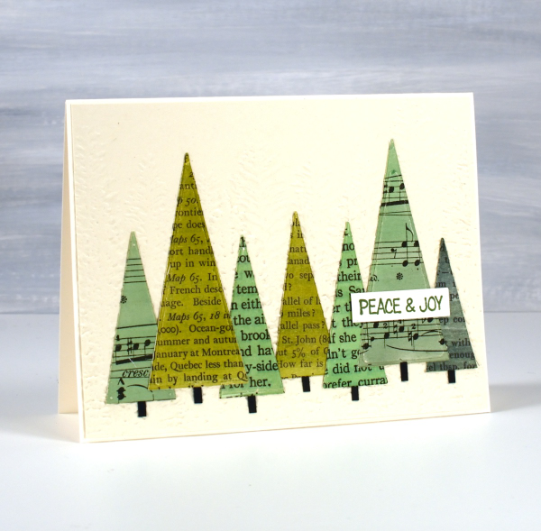
I gave this Christmas card to a friend who is a journalist. As she studied it she exclaimed, ‘What? You cut up books!’ I explained that yes, I did, but they were not my precious books, most were picked up at second hand book sales or thrift stores.
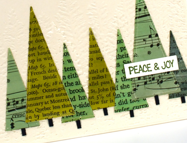
I painted a selection of pages with distress inks and when the pages dried I glued them to cardstock before using triangle dies to cut them out. After I arranged them on an embossed background I cut a strip of black cardstock into small pieces to tuck under the trees as trunks. Just another simple idea with vintage papers.