The happy cut-out
Posted: October 22, 2025 Filed under: cricut, Dies, Penny Black | Tags: cricut, Penny Black creative dies Leave a comment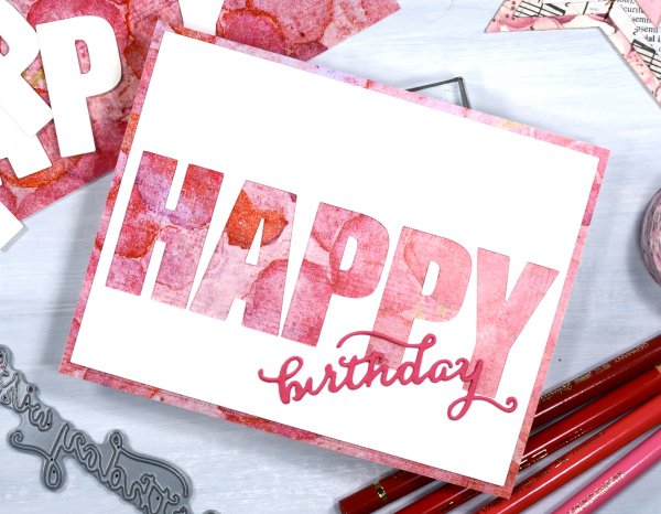
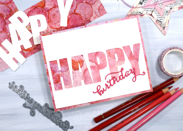
Today’s card is very similar to yesterday’s. I used the cricut to cut the letters H, A, P, P &Y from a cream panel which reveals the patterned paper layered below it. Because the patterned paper is the same size as the card front there is a border revealed by the smaller blank panel.
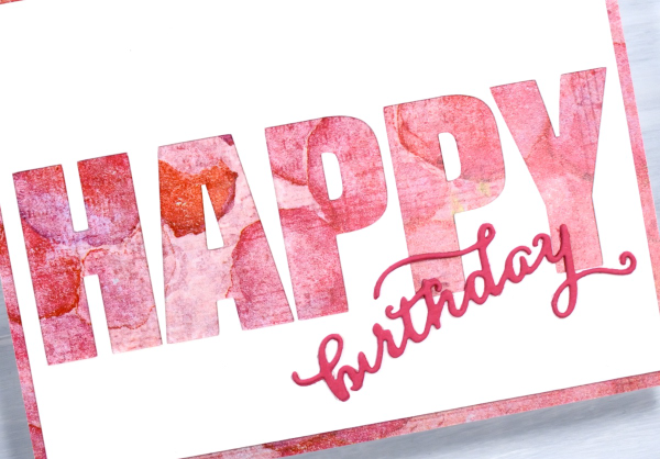
I’m know there are various ways to get the same effect but in some way it is easier to let the cricut cut the large letters in a straight line rather than expect myself to glue the cut-out letters in a perfect row! I used a Penny Black die to cut the little birthday word from pink cardstock. The patterned paper is one of the bonus pages you sometimes get in paper-crafting magazines. I think it’s the first time I’ve used one but I have a little stash which I will continue to put to use.
Shimmery Foliage
Posted: October 14, 2025 Filed under: Airy, Dies, Finetec paints, Leaflets, Leaves, Penny Black, Taylored Expressions | Tags: Fabriano Watercolour Paper, Finetec artist mica watercolour paint, Penny Black creative dies, Taylored Expressions 2 Comments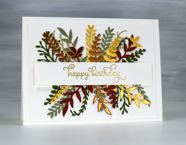
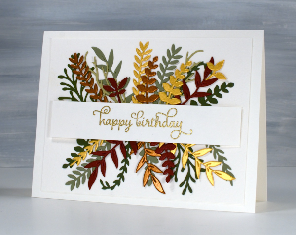
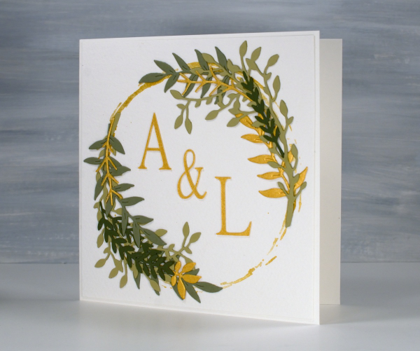
Recently a friend and I got together and worked on wreath style wedding cards. Mine is featured further down in this post. After my friend left I used some of the die-cut foliage leftovers to make her a birthday card. You can see a few matte green leafy branches plus more cut from gold, bronze and reddish shimmer cardstock. I arranged it all either side of a stamped and embossed banner. This sort of a card takes a while to arrange in a balanced way so once I had it looking good I took a photo so I would be able to glue it all down again in the same way.
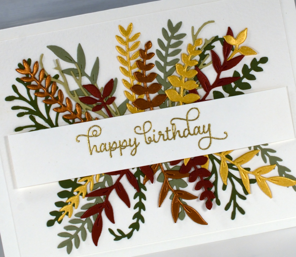
All the die-cutting was done with Penny Black foliage dies from a variety of sets. The curly twirly birthday sentiment is from the Taylored Expressions set, ‘In & Out Birthday’ embossed in gold powder
To make the wreath card I began by stamping a rough circle using gold watercolour paint on a jar lid. It was the lid of the lentil jar so yes, I had to wash it carefully before it was returned to the jar.
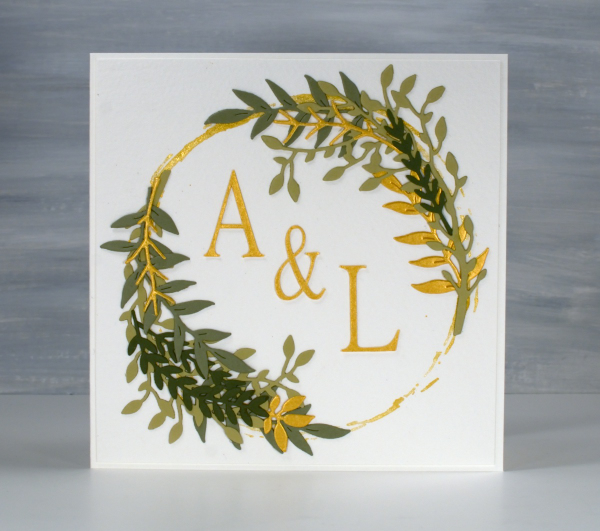
I arranged die-cut foliage around the gold circle not with perfect symmetry but I aimed for balance.
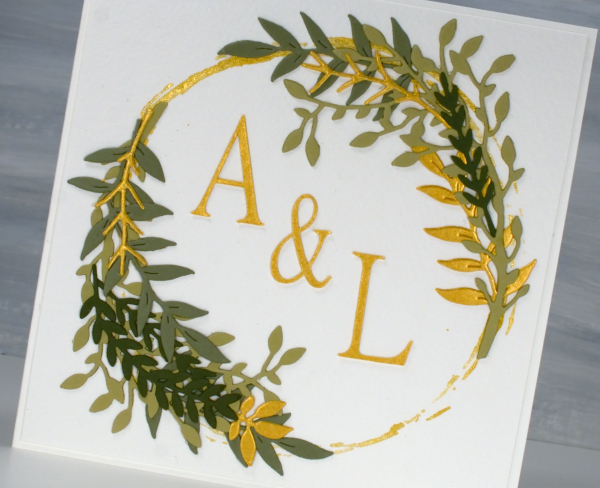
I cut the A, & and L on the cricut using the Linux Libertine Display G font. Both cards were made on cold pressed watercolour paper which has a nice creamy colour and soft texture.
Strips & Stripes
Posted: March 5, 2025 Filed under: border collection, Hand painted | Tags: Hand painted, Penny Black creative dies, Penny Black stamps 1 Comment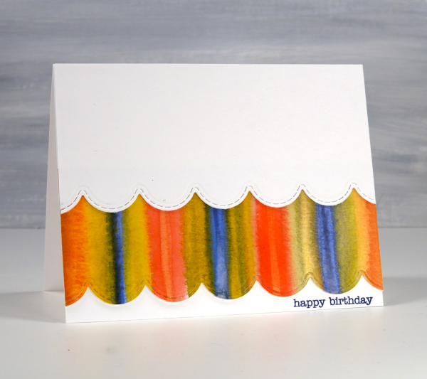
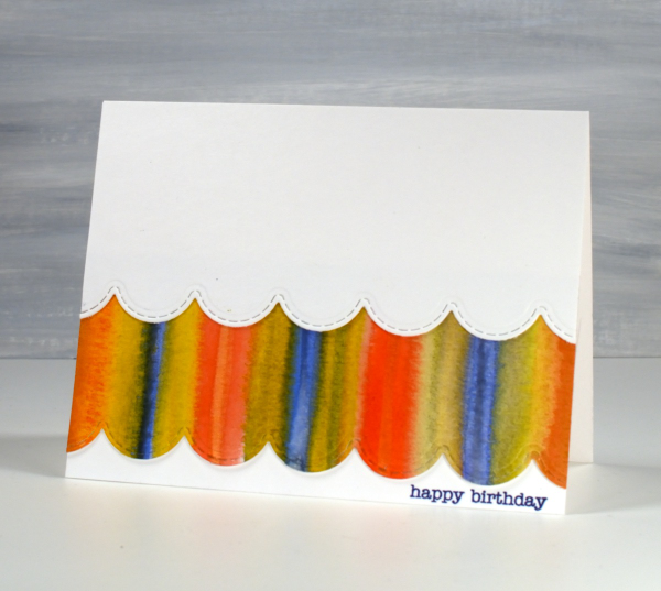
Amongst my recent watercolour panels there are quite a few with stripes. I was colour mixing and playing with wet into wet technique as I painted stripe over stripe to fill the panels.
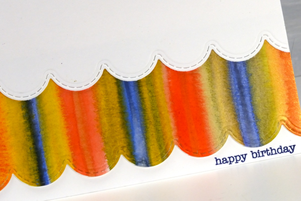
I could have die cut a scalloped strip to add on top of the card front but I liked the layered look which reminds be a bit of carnival tents so I added first the painted strip, then over the top a scalloped piece of white. The scallop die is from the Penny Black set, ‘border collection’ and the sentiment from the ever faithful PB ‘snippets’ set.
The heart themed card below is the same layout with a couple of variations. As you can see I still used a striped panel but die cut some hearts from it and lined them up to span the card front.
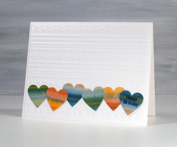
Although the hearts looked cute in a row, the white card front looked too plain so I added an embossed panel as the background to add texture and interest without adding more colour.
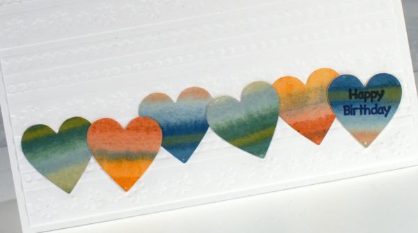
The little happy birthday is from Darkroom Door, once again I used a small sentiment; I do have a soft spot for tiny text.
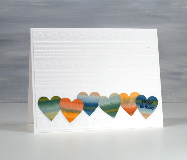
These two are examples made for my upcoming in-person card design class which still has a few available spots in it.
Book Trees
Posted: December 20, 2024 Filed under: Dies, modern xmas tree, Penny Black | Tags: Penny Black creative dies 6 Comments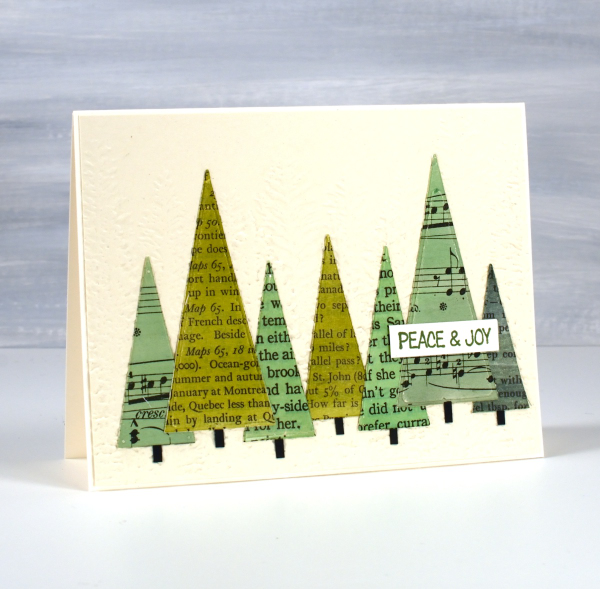
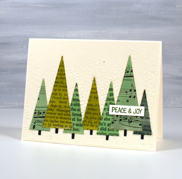
I gave this Christmas card to a friend who is a journalist. As she studied it she exclaimed, ‘What? You cut up books!’ I explained that yes, I did, but they were not my precious books, most were picked up at second hand book sales or thrift stores.
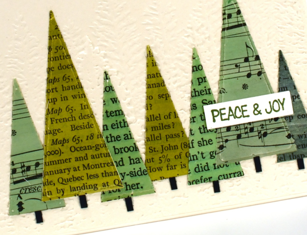
I painted a selection of pages with distress inks and when the pages dried I glued them to cardstock before using triangle dies to cut them out. After I arranged them on an embossed background I cut a strip of black cardstock into small pieces to tuck under the trees as trunks. Just another simple idea with vintage papers.
Layered Poinsettias
Posted: December 3, 2024 Filed under: Dies, Gina K, holiday flora embossing folder, joy of giving, juniper, layered poinsettia, layered Xmas wreath die set, Penny Black, stocking stuffers | Tags: Penny Black creative dies 1 Comment
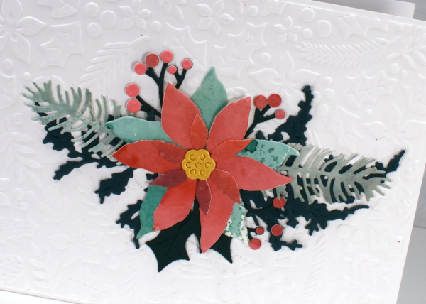
I have a box of berries, leaves, pine boughs and other festive foliage along with some watercoloured panels waiting to be put to use. I cut poinsettias from the watercoloured panels and had fun arranging them on an embossed panel with other foliage die cuts. (PB ‘joy of giving‘, ‘juniper‘, ‘layered Xmas wreath‘ and stocking stuffers)
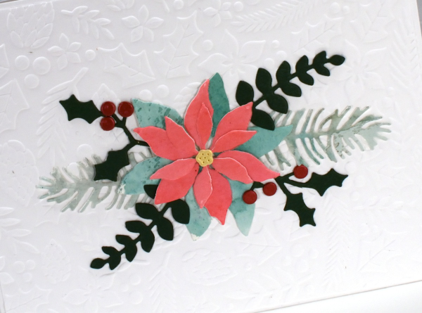
The pretty background panel is Neenah solar white embossed with the Gina K ‘holiday flora’.
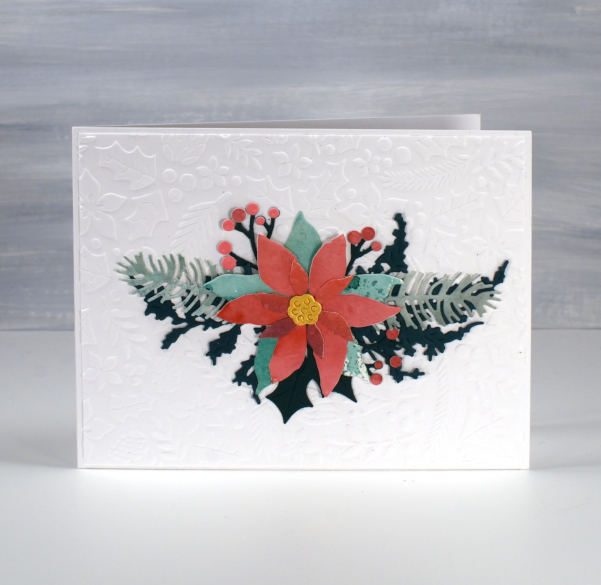
I like the variety of patterns and colours in the petals and leaves when they are cut from a watercolour panel. I held a couple of Christmas card making nights for my church and we made watercolour panels using my smoosh, spritz and swipe method. We ‘smooshed’ distress inks on a teflon mat, ‘spritzed’ the ink with water to dilute and move it, then ‘swiped’ the watercolour paper through the ink as many times as needed to make a well coloured panel.
This post includes affiliate links from Foiled Fox and Scrap n Stamp. If you buy through these links I receive a small commission at no extra cost to you.
Vintage Stockings
Posted: November 26, 2024 Filed under: Christmas stockings digital stamp set, cricut, Echidna Studios, Gina K, holiday flora embossing folder, mittens | Tags: christmas, crafting, crafts, cricut, diy, Echidna Studios, Penny Black creative dies 4 Comments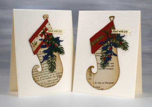
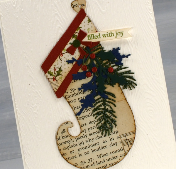
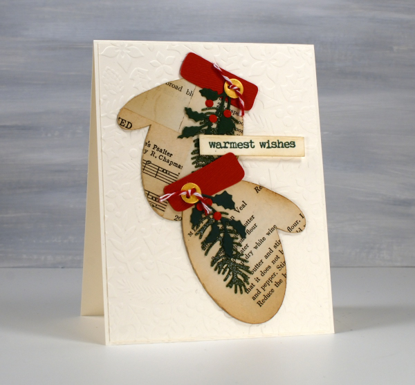
I have more vintage papers on display in today’s cards. These stockings are examples from my recent Bookish Christmas card class where we used book pages from carol books, dictionaries, recipe books and more to add a vintage charm to our cards.
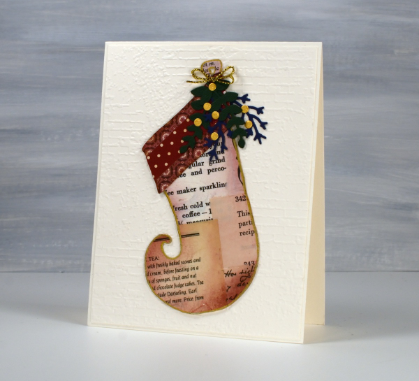
I collaged the vintage papers together then cut stockings from the collaged panels using my Cricut and the Christmas Stocking digital cutting file from Echidna Studios. I love the shape of this stocking my daughter designed; I think I mentioned last year, it makes me think of Narnia with that curly toe!
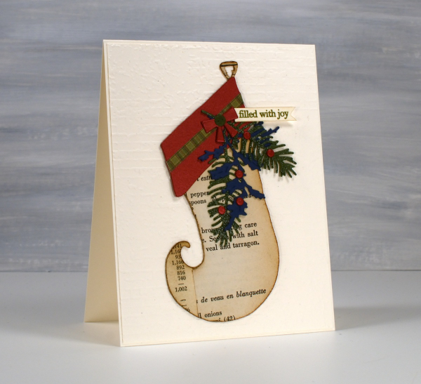
The cutting file includes a cuff for the stocking so I cut them from shimmer cardstock then added all sorts of foliage cut with Penny Black dies.
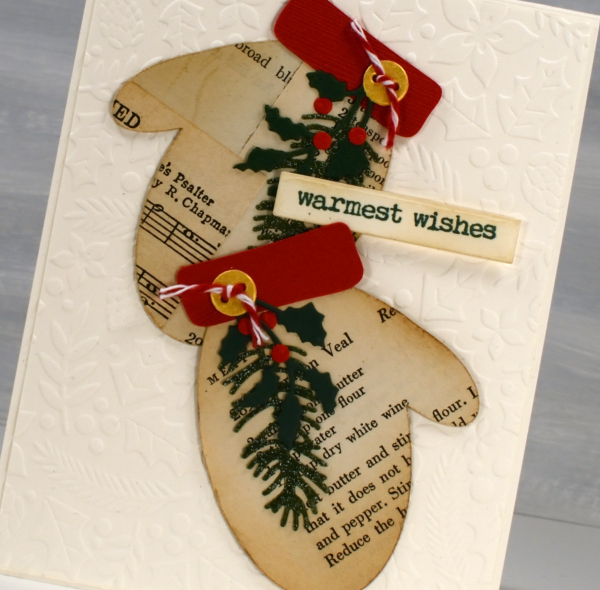
I hope you’re not tired of the mittens that I bombarded you with last week but as you see I also cut some from the collaged vintage papers and added some foliage, gold buttons and bakers twine.
I’ve been using a lot of embossed backgrounds in my Christmas cards this year. There are so many pretty ones including the Gina K ‘holiday flora’ one shown below and the Stampin up ‘exposed brick’ and ‘timber’ shown behind the stockings at the beginning of this post.
Today’s post features affiliate links to The Foiled Fox. If you buy through these links I receive a small commission at no extra cost to you.
Noel, Noel, Noel, Noel
Posted: November 15, 2024 Filed under: Penny Black, star noel, wreath noel | Tags: Penny Black creative dies 4 Comments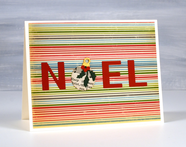
Last week I posted some of my JOY cards where I replaced the ‘O’ with a vintage paper bauble. Not just any vintage paper but Christmas Carol music pages. Well of course I did the same with the ‘O’ in NOEL, how could I not?
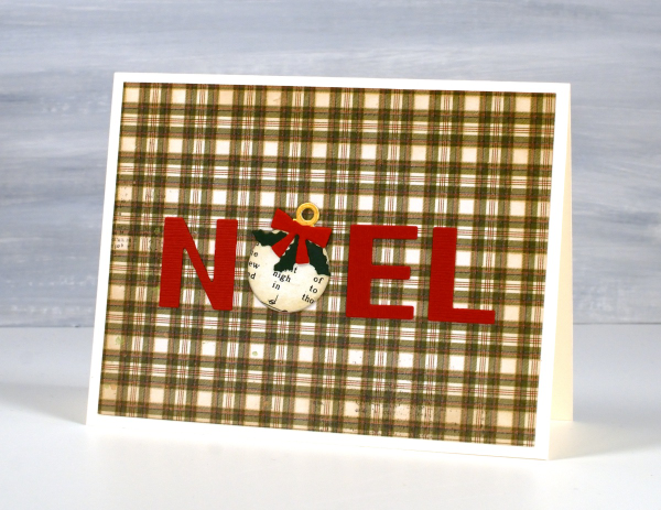
Once again I used pretty printed papers for the backgrounds and both the Penny Black ‘wreath noel die‘ and the PB ‘star noel die‘ for the letters.
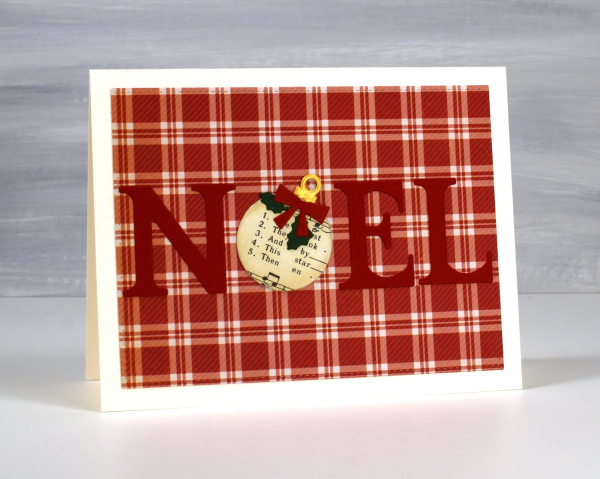
I didn’t start out glueing the baubles on their sides but as I organized all the pieces ready for assembly I saw one bauble sitting there askew and it definitely looked cuter that way.
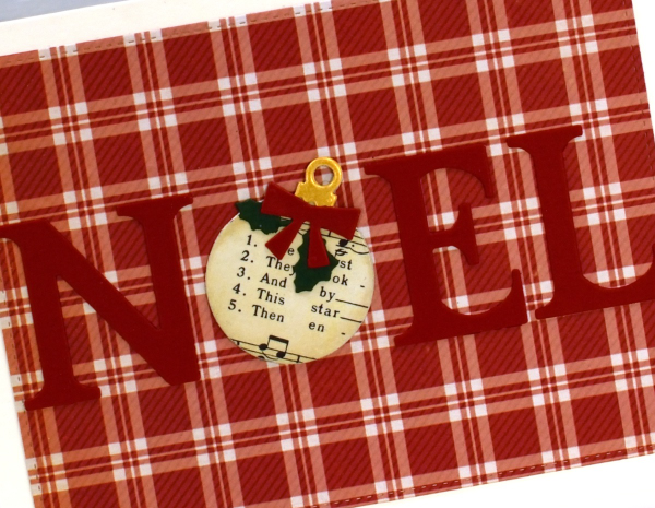
The letters in one NOEL die are bigger than in the other so I used two different bauble dies but it would work with basic circle dies.
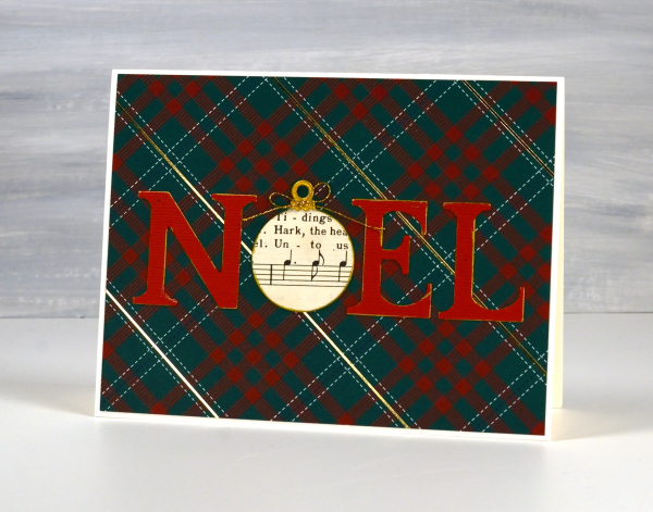
There isn’t much more to these cards other than a few bows and die-cut foliage. Since making both the JOY and NOEL cards I have been trying to think of other words I could make where a substitute shape could be added. Feel free to leave me ideas in the comments.
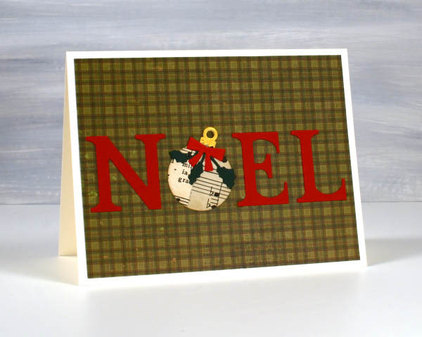
Today’s post features an affiliate link to The Foiled Fox. If you buy through these links I receive a small commission at no extra cost to you.
What I like about Gel Printing
Posted: October 31, 2024 Filed under: Branch 9 die, gel press, Moda Scrap, online class | Tags: gel press, gel printing, online class, Penny Black creative dies 3 Comments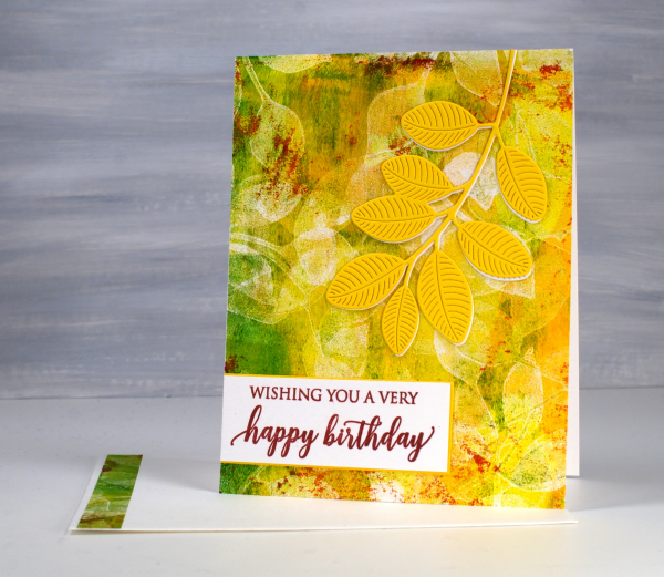
I think you already know I like gel printing: I’ve made that very clear! This card includes many of the reasons I enjoy it. There is a lot of layering, colour and imperfections in the print on this card and that often happens when gel printing. I didn’t strategically add grazes of red paint to the gel plate; they were left there from a previous print. They add so much that I chose to match the sentiment to those ‘leftovers’.
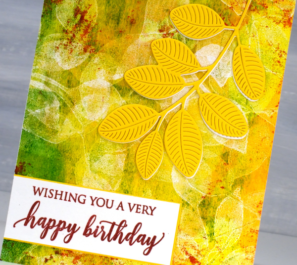
The leaves on the top of the panel are definitely die cut but the leaves on the print were added using my homemade stamp. I have quite a few homemade gel printing stamps; I don’t worry about cleaning the paint out of the stamp and I use scraps of cardstock and fun foam to make them very cheaply.
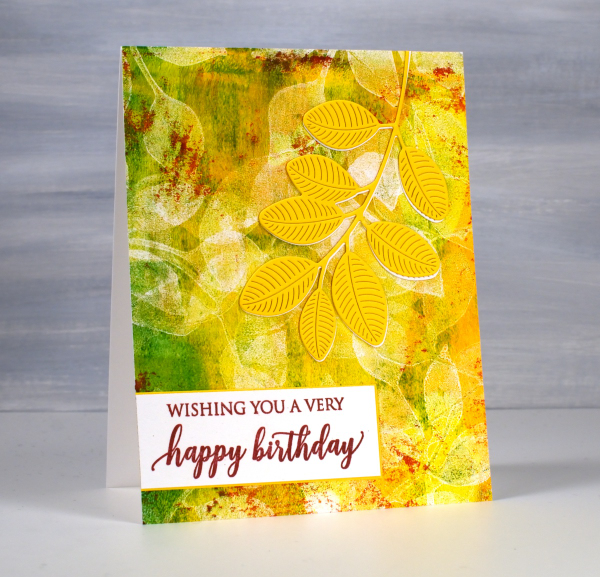
Gel printing is full of surprises; some of my favourite prints are not ones I carefully planned, they are ghost prints or partial prints, what some would call ‘fails’. There is often beauty in the texture, leftover paint and pale patterns of these prints. This card was made from a print demonstrated in my online class ‘Gel Print Journey‘ an introductory gel printing class. I created a 40% off discount coupon for the class if you are interested. Just use the coupon code SURPRISE at checkout anytime before the end of November. This post includes affiliate links from Foiled Fox. If you buy through these links I receive a small commission at no extra cost to you.
Birds & Feathers
Posted: June 5, 2024 Filed under: Collage cards, Darkroom Door, Feathers, gel press, on a wire, Penny Black | Tags: Darkroom Door stamps, gel printing, Penny Black creative dies 2 Comments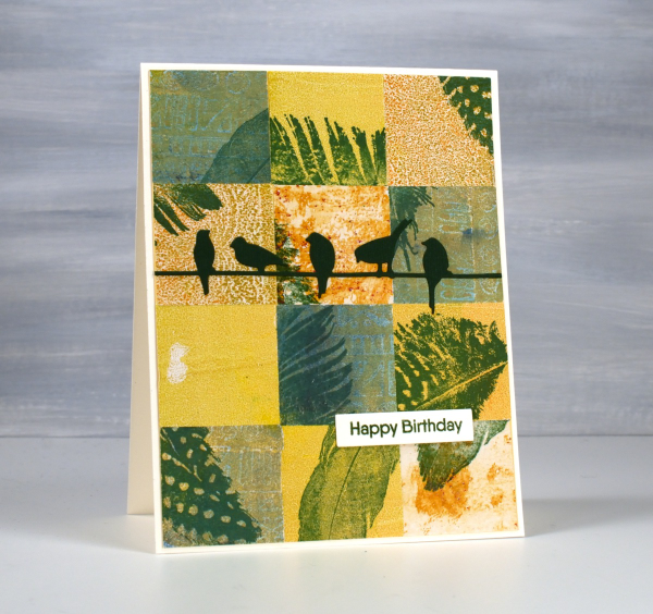
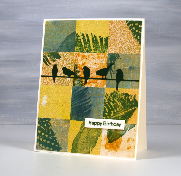
Same concept, different colour palette. I’ve been sharing my collaged gel print cards over recent weeks featuring a lot of blue prints. You know I love blue but it isn’t the only colour I print with. Although I have gel-printed with feathers, the ones featured here were all stamped. You can add interest to your prints with stamping or stenciling or other techniques; you don’t have to leave them just the way they pulled off the plate.
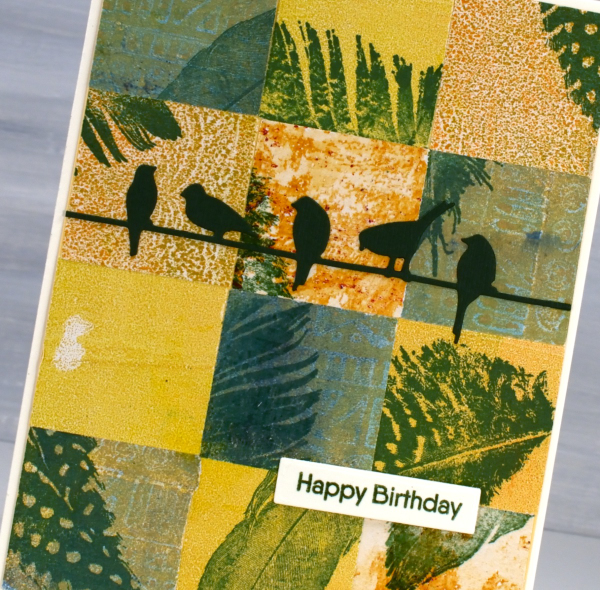
For this bird themed card I chose yellow, orange and greenish prints then stamped feathers on them before cutting them into squares. To make the squares I sometimes use a square punch, but often tear the panels with a metal edge ruler so I get some white of the paper on the edge. The feather stamps are from Darkroom Door ‘Feathers’ set. The birds die is called ‘on a wire’ and it’s from Penny Black.
Pink & Blue Squares
Posted: May 18, 2024 Filed under: Collage cards, Dies, gel press, gift card pocket, Penny Black, Tim Holtz, wild flowers #1 | Tags: collage, gel printing, Penny Black creative dies, Tim Holtz 3 Comments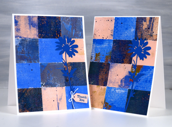
As mentioned in previous posts my stash of gel prints is considerable. I am always on the look out for ways to use them. Large prints are great for covers on handmade books; I use many smaller prints for card fronts and collage.
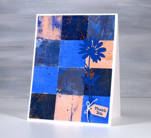
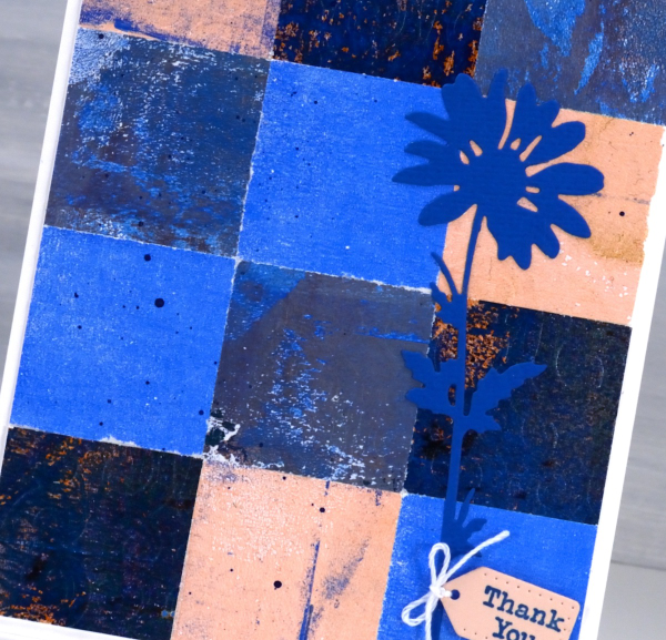
These two collage cards are made from four or five different gel prints. I punched the squares with a 1 3/8″ punch then fiddled around with the layout until I was happy with it. Because I love things to match all the prints had some blue in them and there is some repetition of pink as well.
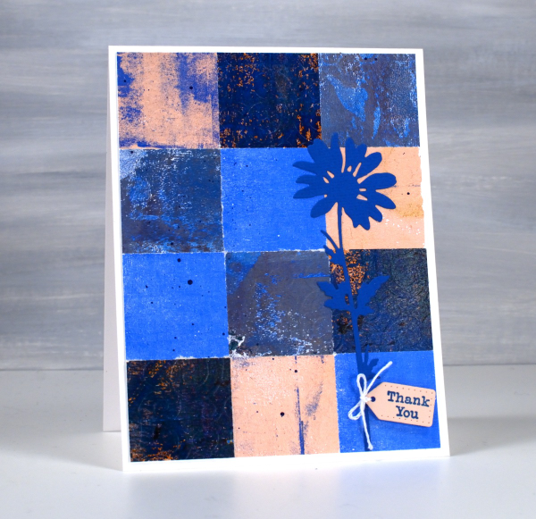
The prints were part of my stash and were not made specifically for these cards so some have patterns and others were probably second or third pulls to clean off a plate. Once I had them arranged to my satisfaction I die-cut Tim Holtz wildflowers and added a tiny Penny Black tag. You’ll see more of this style in the next few weeks as I made them in several different colour combinations. Those of you who know me might have noticed the dark blue splatter on the both cards; I always think a bit of splatter ties thing s together.