
It’s been snowing
Posted: January 8, 2026 Filed under: Brusho, cricut, Darkroom Door, Echidna Studios, snow flakes, snowflake digital stamp set | Tags: cricut, Darkroom Door stamps, digital stamps, Echidna Studios, Fabriano Watercolour Paper 4 Comments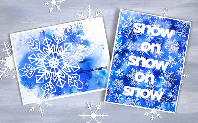
It’s been snowing quite a bit around here and we’ve had some very cold nights. A few of those nights happened to be while our furnace was not working but it’s fixed now and all is warm and cosy again! I am sending these out to a couple of friends who will totally get the snowy themed greetings, people who know about the beauty and length of a Canadian winter.
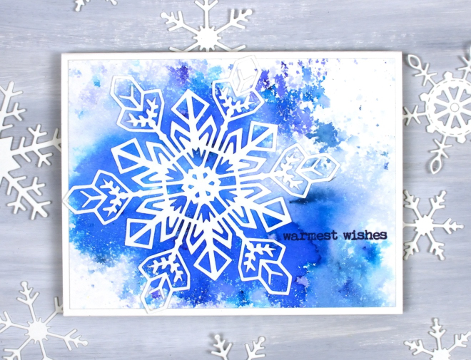
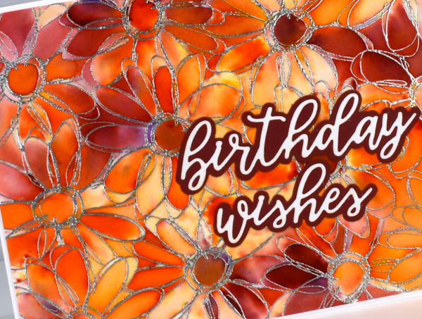
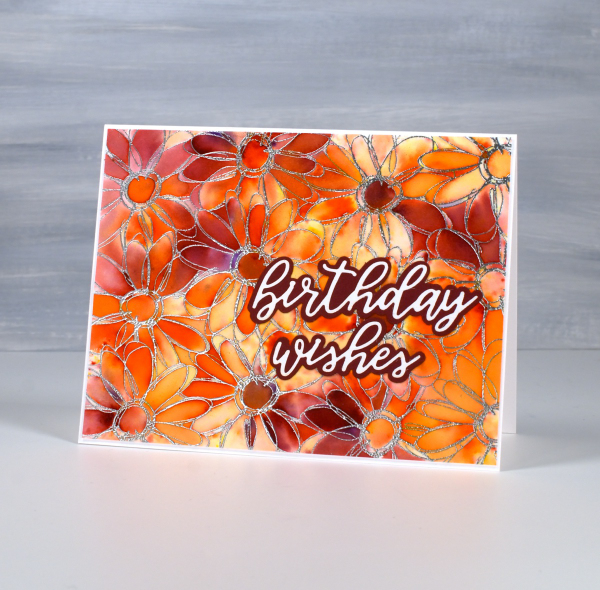
Believe it or not I did not create these cards at the same time but I’m pretty sure I ended up using the same supplies. The single snowflake card above was made with a watercolour panel I made years ago when experimenting with brusho. I probably sprinkled the brusho on watercolour paper then spritzed it with water until I was happy with the result. Even after you are happy with the result it can change as the paper and paint dry. I liked the panel so much I hoarded it, waiting for the right design. I am trying not to do that so much any more as I am very keen to Use What I Have (UWIH does not make a catchy acryonym so I am still playing with the category title). I paired the panel with one of my daughter’s snowflake designs available in the Echidna Studios etsy store as a print or cutting file. There are 6 snowflake designs in the set and I think they are beautiful.
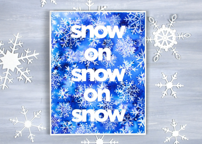
The second card was also made with brusho but I sprinkled it over an embossed panel. I embossed the Darkroom Door snow flakes background stamp with clear powder then covered it with brusho watercolour. I cut the words with my cricut to get a size that would show up on the busy background. Happy New Year and thank you for dropping in here.
Christmas Greenery
Posted: November 21, 2025 Filed under: Christmas inchies, Darkroom Door, Elizabeth Craft Designs, Gina K, global postmarks, Penny Black, postage stamps | Tags: Darkroom Door stamps, Elizabeth Craft Designs, Penny Black creative dies, Penny Black stamps 7 Comments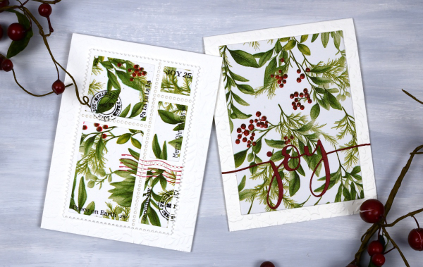
Yes, finally a Christmas card post. I have been playing around with paper napkins for some of my Christmas cards. All the designs in today’s post use panels from a greenery + berries design. I peel off the printed layer from the three layer napkins or serviettes (depending where you’re from) and glue it to cardstock. I’ve used both double sided adhesive (pricey) and glue sticks (slightly curls the cardstock). Either option works I just need to take some time to flatten the glued panels.
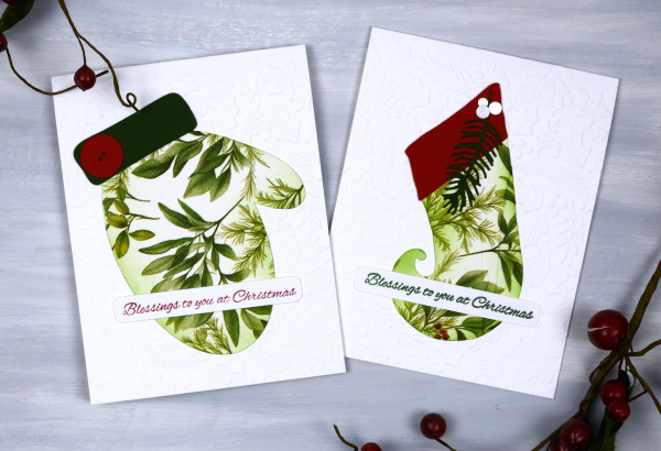
Sometimes when attaching the fragile napkin layer to the cardstock you get some creases; I think they add interest and texture so I don’t let them worry me. I used my cricut and the Echidna Studio stocking design and mitten designs to cut out large features to add to an embossied background.
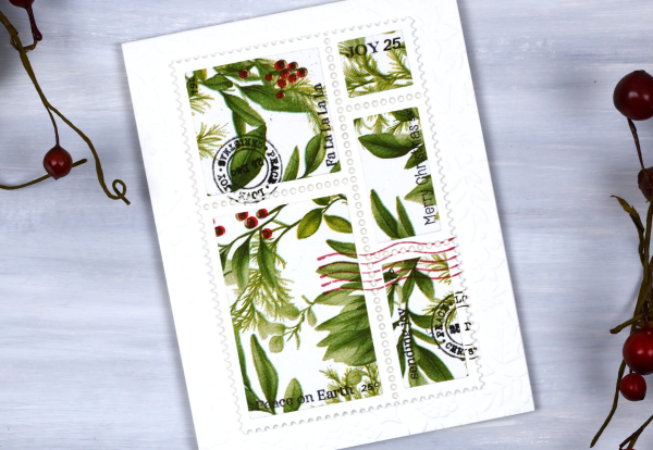
I also used the lovely postage dies from Elizabeth Craft and the Darkroom Door Global Postage and Christmas Inchies stamps to add postmarks along with small sentiment stamps from Penny Black to add words. For the card below I simply cut the word joy using a PB die and added it to a large panel. You could definitely make all these cards with patterned papers or your own painted or printed papers. I just get tempted by the beautiful paper serviettes out there and end up buying them for craft and dinner!

I am packed up ready to do Christmas card making with some friends from church tomorrow. We are making 2-for-1 cards to give to the residents in a local nursing home. I’ll try and share a few of the designs next week. Have a lovely weekend.
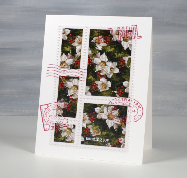
Faux Postage Christmas cards
Posted: November 1, 2024 Filed under: Christmas inchies, Darkroom Door, Elizabeth Craft Designs, global postmarks, postage stamps | Tags: Darkroom Door stamps, Elizabeth Craft Designs 6 Comments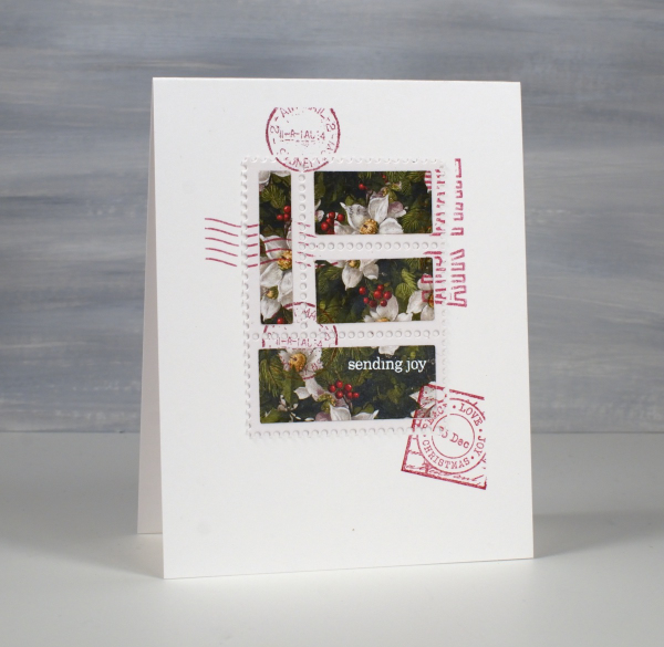
Around this time last year I bought a faux postage die set from Elizabeth Craft Designs. I’ve used it a couple of times with watercolour panels but a friend recently inspired me to try with Christmas papers. I cut a white perforated panel and used the co-ordinating rectangle dies to cut the poinsettia paper.
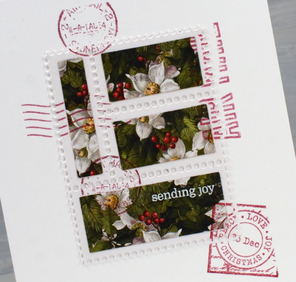
The Elizabeth Craft die is a large one so I was able to get the four stamp section above and the five stamp section below out of one die-cut panel. I used a paper from the Simple Stories ‘Simple Vintage Yuletide’ paper pad.
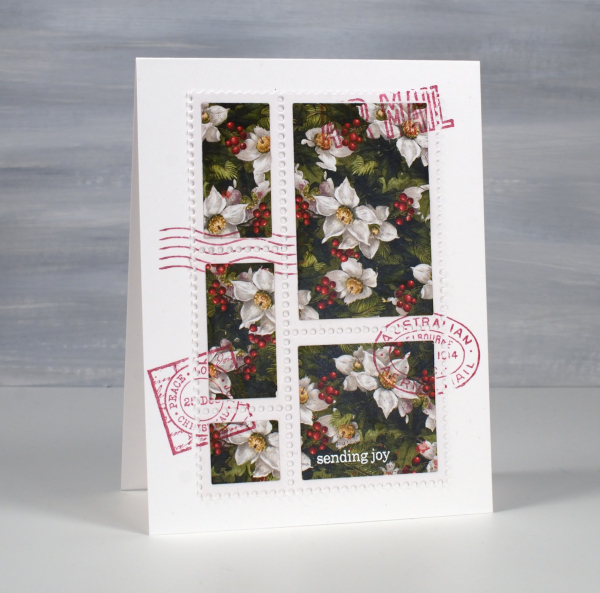
Of course I had to add some postmarks to my faux postage and Darkroom Door stamps are perfect for that. I used red ink and stamps from both Global Postmarks and Christmas Inchies sets.
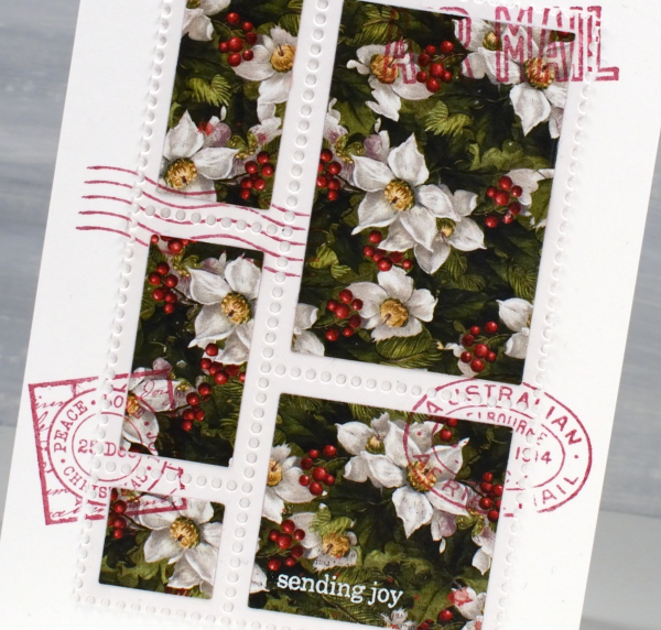
I only added one bit of text to the ‘postage stamp’ and using white embossing powder to make it show up. The ‘sending joy’ is from Penny Black’s very useful ‘holiday snippets’ set – it’s an oldie but a goodie!
I know it’s been a bit quiet on the blog over the last few months and when I have posted it has usually involved leaves! I’m sure there will be more leaves but during November I will be posting Christmas card designs and will hopefully be popping up here a few times a week. Thanks for visiting.
Green leaf print
Posted: October 10, 2024 Filed under: Darkroom Door, gel press, gelli plate | Tags: Darkroom Door stamps, gel press, gel printing 3 Comments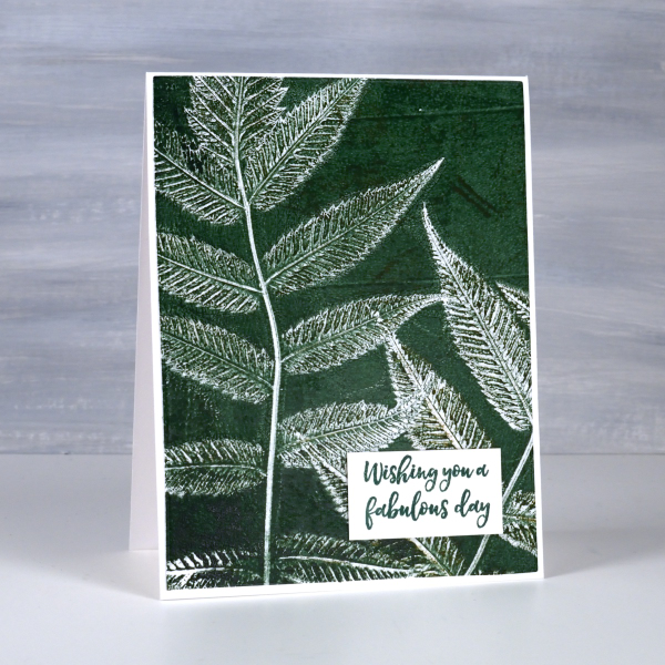
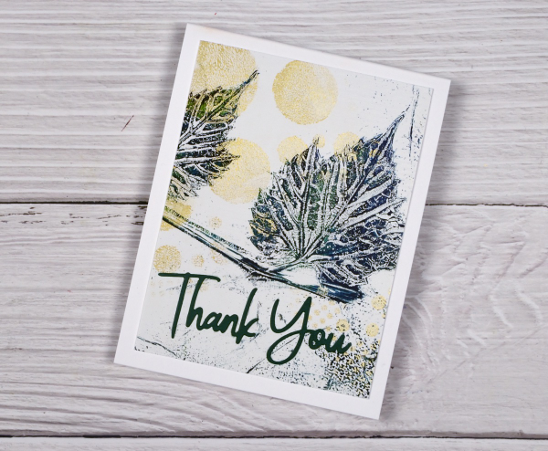
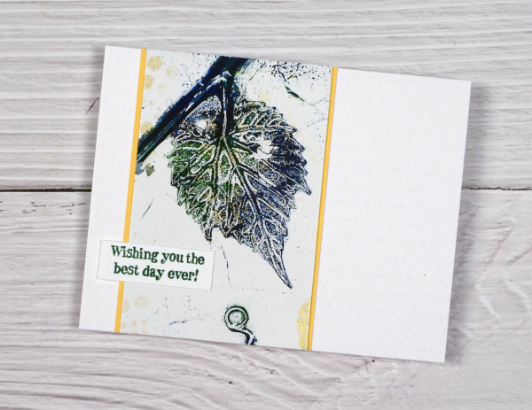
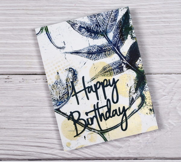
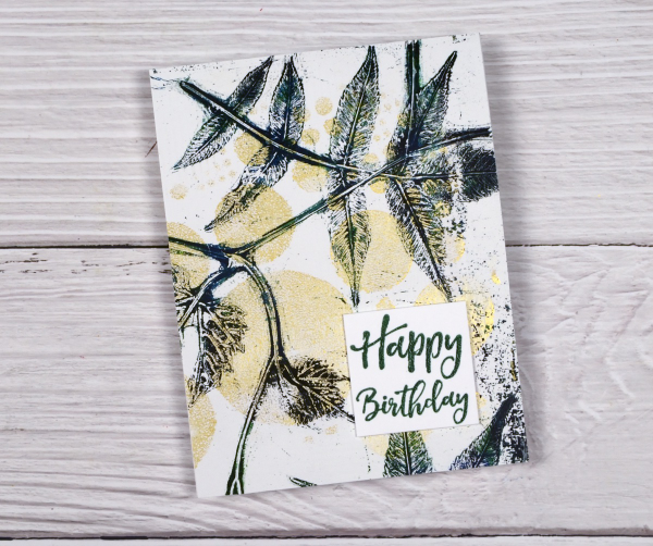
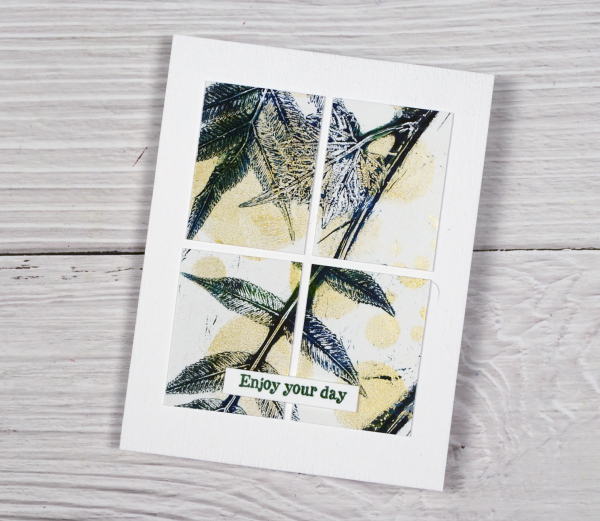
More leaf prints on the blog! Yes, I have a few more leaf print projects to share before I move into Christmas cards. To see the technique for this type of print pop over to my youtube channel and take a look at my last two videos. This plant is called false spirea and it prints very clearly showing all those lovely veins on the back of the leaves.
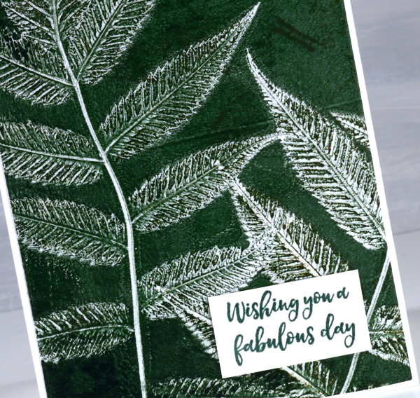
I’ve been playing with colour mixing when using acrylics and watercolours and it is definitely worth experimenting. Adding a little black to a bright green paint gave me a deeper and darker green as shown on this card.
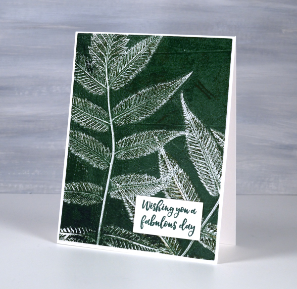
I used this card as a birthday card yesterday as the sentiment from Darkroom Door is useful for any special day. I’ve been thinking that the leaves are late in changing this year. What is it like where you are? We are now seeing some nice reds, yellows and oranges around. Of course after the leaves change they fall so that’s another task coming up in the next few weeks.
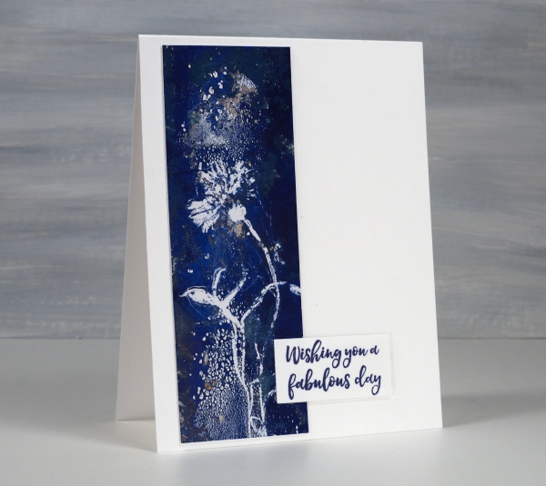
Gel Printed Cornflower & Grasses
Posted: August 21, 2024 Filed under: Darkroom Door, gel press, Waffle Flower | Tags: Darkroom Door stamps, gel press, gel printing, Waffle Flower dies 10 Comments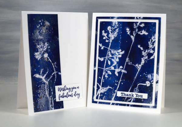
Arting and crafting has looked a bit different for me recently. This week I am ‘Professor Paint’ doing crafts each day with the children at our church day camp. There has been quite a bit of prep and experimenting going on over the past weeks. I made the sign for my ‘Art Lab’ at camp using gel prints but the crafts we’ve been doing haven’t involved gel printing at all. We have done some watercolouring with paint and water soluble markers though.
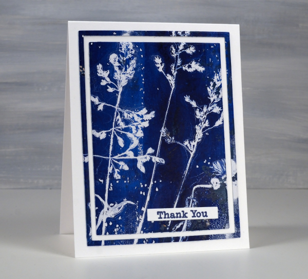
The two cards shown today were both made from one print. I don’t always take time to plan the layout of a botanical print so some prints look balanced and others don’t. I ended up cutting the cornflower image off the side of the full print to make the card below and left the grasses together to make the card above.
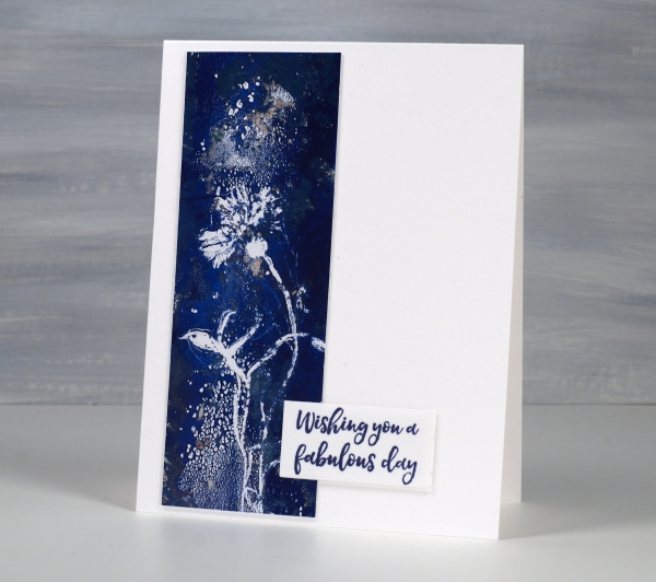
The print was definitely not perfect. You can see on the card above some odd texture from the paint. I thought it looked a bit like a spray of water above and below the cornflower.
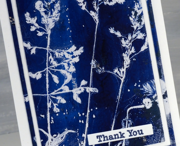
I don’t remember which paints I used but it looks like either two blues or a blue and a black.
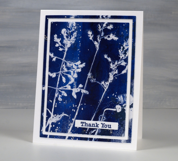
I’ve made a few cards lately using the framing technique above. I use three nesting dies to cut a large rectangle panel, then another inside and another inside that. I leave the middle frame out of the layout but could save it for another card or a strip on an envelope perhaps. The sentiments are from Darkroom Door. The printing technique used was the one shown in my last short video.
Collage the Blues
Posted: July 31, 2024 Filed under: Darkroom Door, gel press, Nature Walk | Tags: collage, Darkroom Door stamps, gel press, gel printing, gelli plate 11 Comments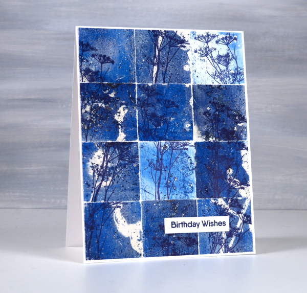
You might wonder what I do with all my gel prints, and believe me I have many, many gel prints! If I got rid of the partial prints that didn’t really work I would have less to deal with but sometimes the partial prints can become favourite cards or journal pages.
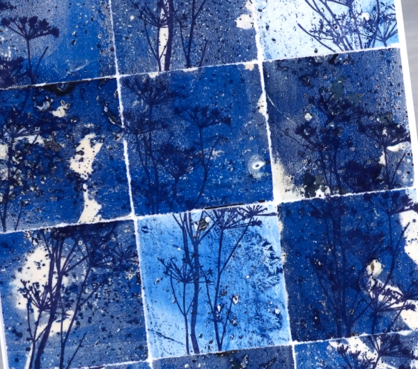
To create this collage of blues I tore a couple of partial prints into squares and stamped the delicate stamp from Darkroom Door’s nature walk set at different angles on the the squares. I put these ‘scraps’ back together and the partial prints brought shades of blue, pops of white and bits of pattern and texture.
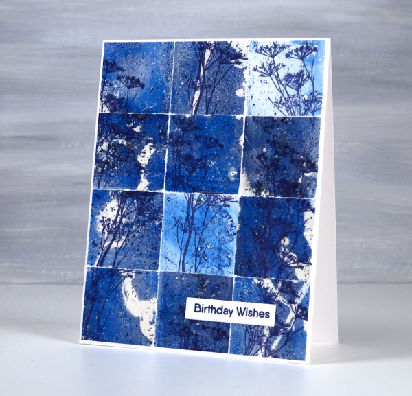
So, how many gel prints is too many? You can’t have too many!
Brusho Daisies
Posted: July 19, 2024 Filed under: Brusho, daisy delight, Darkroom Door, Spellbinders | Tags: Brusho, brutus monroe embossing powder, Darkroom Door stamps, Spellbinders 7 Comments
Yesterday I did some embossing with a friend and, as I was introducing her to brusho paints, I remembered how much I like the emboss resist technique with brushos. I don’t do too much heat embossing these days because of the gritty mess of embossing powder that ends up on my desk even when I am careful. But the results with brusho…
I embossed the Darkroom Door ‘daisy delight’ stamp on hot pressed watercolour paper with sterling embossing powder. I spritzed the panel with water then sprinkled orange and crimson brusho powders over the top. The trapped colour is just what I hoped for.
I added a Spellbinders sentiment from the die set, ‘Serenade Sentiments‘ to complete the card. So maybe it is worth getting gritty occasionally. This post includes affiliate links from Foiled Fox. If you buy through these links I receive a small commission at no extra cost to you.
Leaf & Stencil print – Video
Posted: July 16, 2024 Filed under: Darkroom Door, gel press, gelli plate, simply perfect mix & match sentiments, Tutorial | Tags: Darkroom Door stamps, gel press, gel printing, Spellbinders, video 6 Comments
Last week I shared a leaf and lavender gel print video; in today’s video I have added some gold dots through the totally dotty stencil for some shimmer and extra interest. In the video you will see the gel printing process. I turned the printed panel into five cards and I have listed the added stamps or dies below each card photo. I have an in-person botanical gel printing class coming up on Saturday July 27th and there are a couple of spaces left if you’re interested.
I added a die-cut sentiment in dark green to the panel above using the Spellbinders ‘simply perfect mix & match’ sentiment dies.
Even though I brayered blue, green and black paint very randomly on the plate, I like the way patches of one colour or another appear on the leaves.
To create the card above I embossed a white panel using the Stampin’ Up embossing folder scripty, added a gold mat behind the gel printed panel and added a Darkroom Door sentiment from the ‘happy birthday’ sentiment strip.
The panel above covers the whole card front and has a stacked green die-cut sentiment from the same Spellbinders set mentioned earlier. I stacked two layers for the sentiment to help it stand out from the stems on the gel print.
Another full card front panel above with a Darkroom Door sentiment. The gold looks shinier in real life but I think you can see some shimmer on both the card above and below.
You can cut your gel print panels to any size, sometimes cutting a large shape into smaller shapes is a good way to add interest to a layout. I’ve added another DD sentiment to the card above. I had fun printing the panel and working out how to get the most out of it for cards. I can give these away individually but I think I might keep them together as a gift set.
Girl in the Garden Journal Page
Posted: June 18, 2024 Filed under: Alexandra Renke, Art Journal, Darkroom Door, gel press, global postmarks, mandala | Tags: Alexandra Renke, Art Journal, collage, Darkroom Door stamps, gel press, gel printing 4 Comments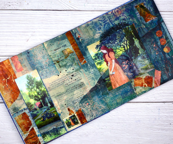
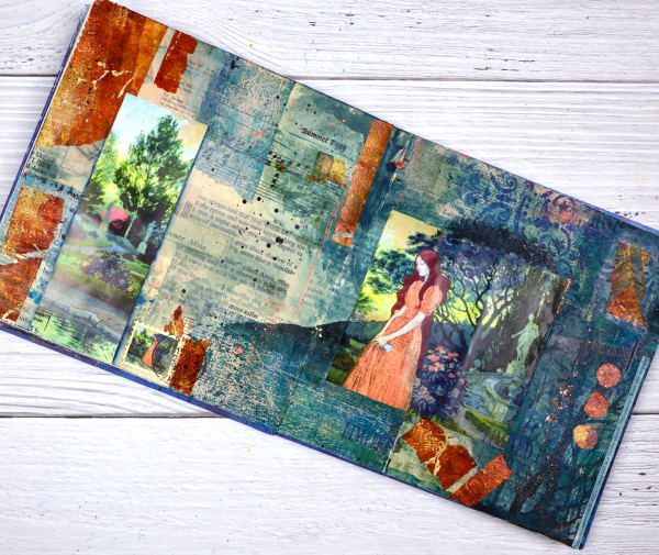
Although I made this page a month or so back; it is an appropriate theme for right now. We are in the ‘garden days’. My back garden is looking colourful and I love wandering out there each day to see what is growing, blooming or falling over!

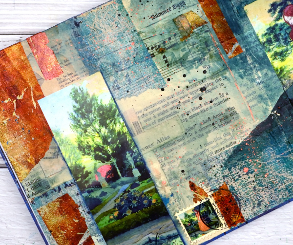
This page began as a collage of book page pieces. I didn’t have a plan but wanted a base. I used pages from an old novel, an old atlas, sewing instructions, sheet music and other scraps to cover the double page spread in my 7″x7″ handmade journal. Months passed before I came back to do more.
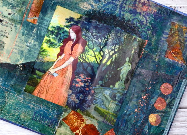
Before adding colour I painted some off white paint over the collaged pages. You might think the calendar image was the inspiration for the pages but bronze and the teal gel prints came first. Both prints were on tissue paper and were most likely made as I picked up extra paint around a primary design. As they were on tissue paper they revealed some of the print underneath when glued to the journal pages. I added ink through an Alexandra Renke mandala stencil.
At this point I went looking for pictures to add to the colourful abstract pages and this one from a calendar co-ordinated well. It is from an old art calendar and is a detail from Eugene Grasset’s painting ‘Young Girl in a Garden’. I used some liquid watercolours to extend the painting onto my journal pages, made a faux stamp, added some splatter and stamping then let it all dry. Sometimes I’m not sure when a journal page is finished but I think this one is.
Rose Print Card
Posted: June 7, 2024 Filed under: Correspondence, Darkroom Door, Echidna Studios, gel press, Roses digital stamp set | Tags: Darkroom Door stamps, Echidna Studios, gel printing 1 Comment
I’ve shared quite a few gel print collage cards now made from squares or rectangles. Today’s card also combines a couple of gel prints but in a different style. Both the blue background print and the gold strip are gel prints.

The background print and the little banner tag both feature rose stencils from my ‘roses digital stamp set‘ available as a digital file in the Echidna Studios etsy store. The set has three rose designs and I have cut stencils of different sizes from each of the designs which I have used mainly for gel printing but also with alcohol inks and basic stenciling.

To complete this card I added some stamping using a Darkroom Door text stamp and a little sentiment. This post includes an affiliate link from Foiled Fox. If you buy through these links I receive a small commission at no extra cost to you. If you buy from Echidna Studios etsy store my daughter and I get all kinds of excited.


