Collage the Blues
Posted: July 31, 2024 Filed under: Darkroom Door, gel press, Nature Walk | Tags: collage, Darkroom Door stamps, gel press, gel printing, gelli plate 11 Comments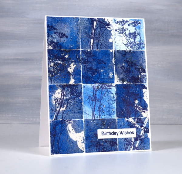
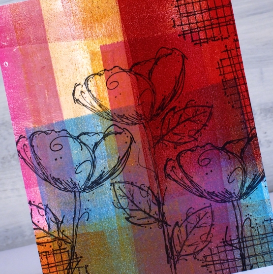
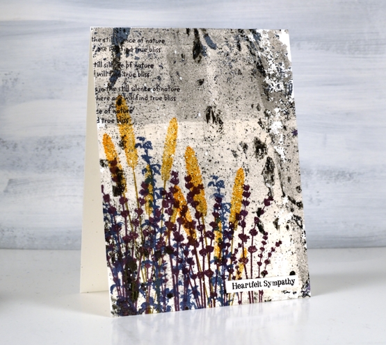
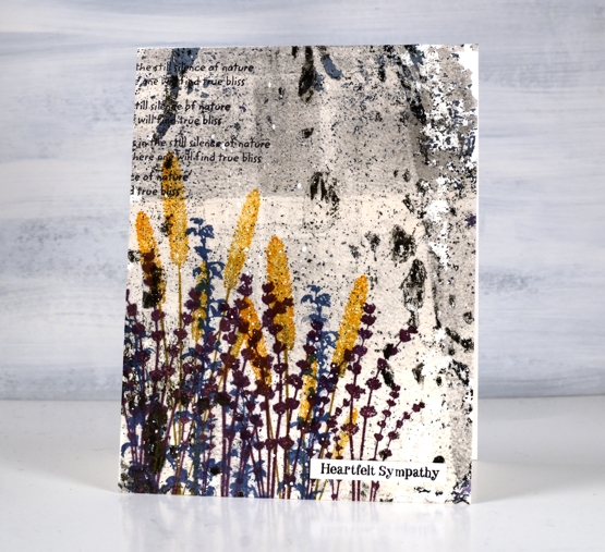
You might wonder what I do with all my gel prints, and believe me I have many, many gel prints! If I got rid of the partial prints that didn’t really work I would have less to deal with but sometimes the partial prints can become favourite cards or journal pages.
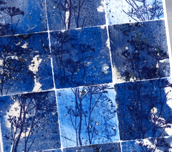
To create this collage of blues I tore a couple of partial prints into squares and stamped the delicate stamp from Darkroom Door’s nature walk set at different angles on the the squares. I put these ‘scraps’ back together and the partial prints brought shades of blue, pops of white and bits of pattern and texture.
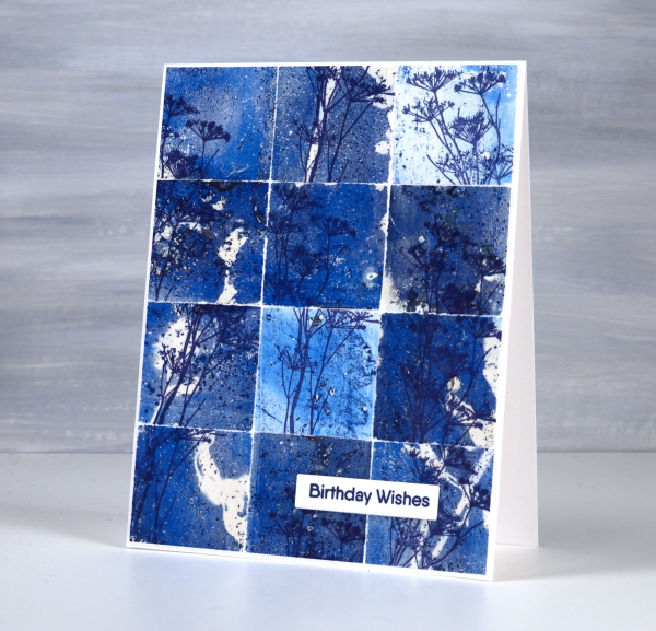
So, how many gel prints is too many? You can’t have too many!
Wildflower Spring
Posted: May 8, 2024 Filed under: Darkroom Door, Nature Walk, online class, Taylored Expressions, Wildflowers Vol 1, Wildflowers Vol 2 | Tags: Darkroom Door stamps, online class 6 Comments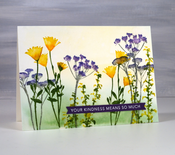
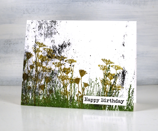
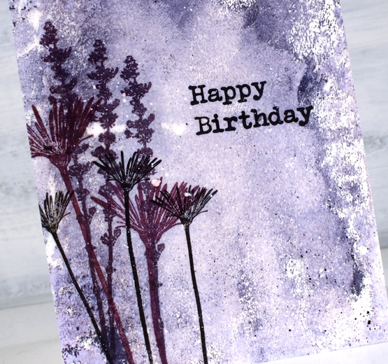
These spring flowers are all silhouette stamps from Darkroom Door, some from the Nature Walk set and a few from Wildflowers vol 1 & 2. Even though the stamps are solid with no detail it is possible to use ink pads and markers to give them more depth.

This card is a sample from my Floral Faves online class. In the class I feature no-line watercolour with outline stamps, techniques with brushstroke stamps and ways to use silhouette stamps as featured on this card. I often use my silhouette stamps with a black or dark ink over a sunset sky but I do like to give them colour sometimes with a pale watercolour wash in the background.
I hope you are seeing spring colour in your garden or perhaps fall colour if you are in the southern hemisphere.
Faux Postage Stamps – Video
Posted: March 7, 2024 Filed under: Darkroom Door, Elizabeth Craft Designs, fine flowers vol 2, global postmarks, Nature Walk, postage stamps, Tutorial | Tags: Darkroom Door stamps, Elizabeth Craft Designs, Ranger Distress inks, video 7 Comments
Recently I created some faux postage stamps from a stamped and watercoloured panel. I pulled out another floral panel from my ‘pile of possibilities’ and filmed myself making some more faux postage stamps to feature on cards. The watercoloured panel features a repeated flower from the Darkroom Door set, ‘fine flowers vol 2’ and there is a video of my watercolouring process for that too.
The large postage die set I used is from Elizabeth Craft Designs and includes a die to cut perforated stamps of different sizes which remain joined until you cut or tear them apart. There are also dies which cut rectangles to fit in each of the ‘postage stamp’ spaces. There are also bonus number and symbol dies, so the set offers quite a lot.
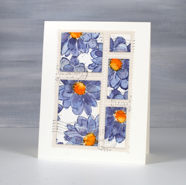
I chose this set because I liked the way the postage stamps were all joined and I have the option of creating combinations or individual stamps. There are dies available from other companies which just cut the perforated lines and I demonstrate how to do the same thing with that kind of die towards the end of the video. Adding stamped postmarks and even small words makes the faux postage look real and I’m really enjoying using stamped panels, patterned papers and gel prints to make my own postage. I think any hand delivered card I make from now on should have a handmade postage stamp on it!

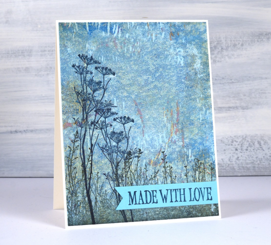
Made for You
Posted: April 12, 2023 Filed under: Darkroom Door, gel press, made for you, Nature Walk, Wildflowers Vol 1 | Tags: Darkroom Door stamps, gel press, gel printing 8 Comments
Some stamps old, some stamps new and some cardstock blue is the approach I took with these sweet new label stamps. I pulled out a textured gel print on rice paper and stamped flowers from a couple of favourite floral sets from Darkroom Door.
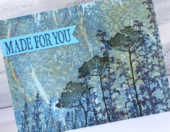
I used Ciao Bella chiascuro ink pads, the colours are deep but muted and worked beautifully with the paint colours in the gel print. Because rice paper is somewhat transparent I adhered the panel to a piece of aqua cardstock which made the print look bluer. I used the same cardstock to stamp the two phrases from the new DD ‘made for you’ set of label stamps.
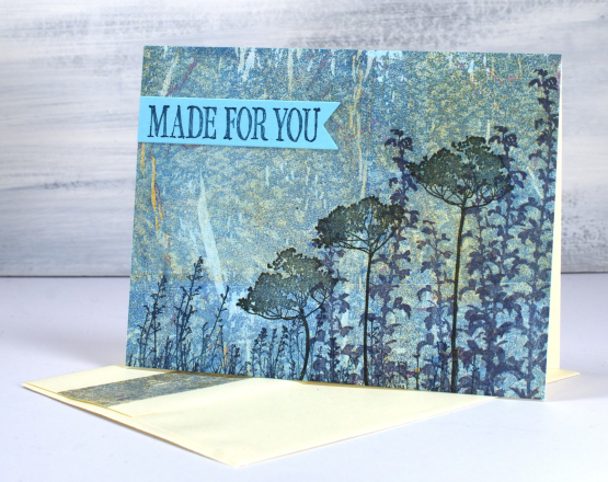
The original gel print was done on a 9″x11″ gel plate so there was enough print for two cards and some extra strips on the envelope flaps
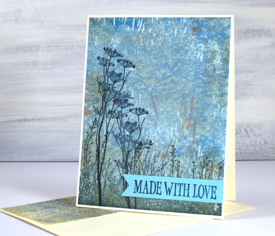
I think I have made cards a bit like this before. I love pairing DD silhouette flowers with gel prints. When I think about it, this gel print didn’t ‘work’ as far as the technique was concerned. I was using a wallpaper sample which textured swirls on it and they did not appear at all, I just got the scaly texture you can almost see. That’s the beauty of gel printing. Just because they don’t do what you expect doesn’t mean they are not usable.
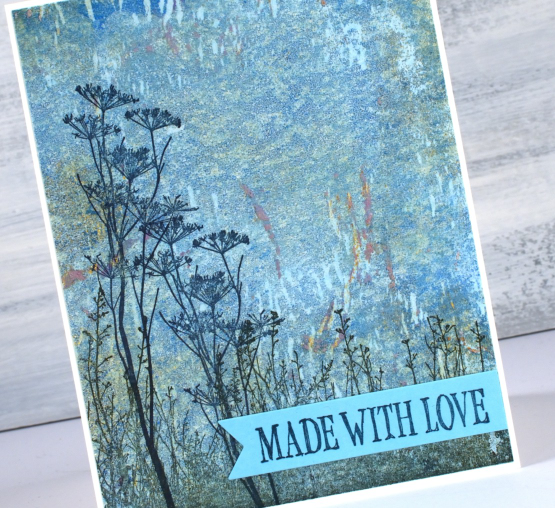
The label stamps I’ve used as sentiments were probably designed to go on handmade items such as sewing or perhaps the back of a card. I decided they worked just as well as a message on the front of a card ready to send to someone dear to me.
(Compensated affiliate links from Foiled Fox, Scrap n Stamp & Ecstasy Crafts)
Gardens on gel prints
Posted: August 2, 2022 Filed under: Darkroom Door, fine flowers vol 2, gel press, mesh, Nature Walk, Wildflowers Vol 2 | Tags: Darkroom Door stamps, gel press, gel printing 7 Comments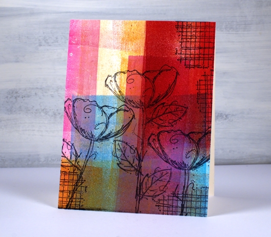
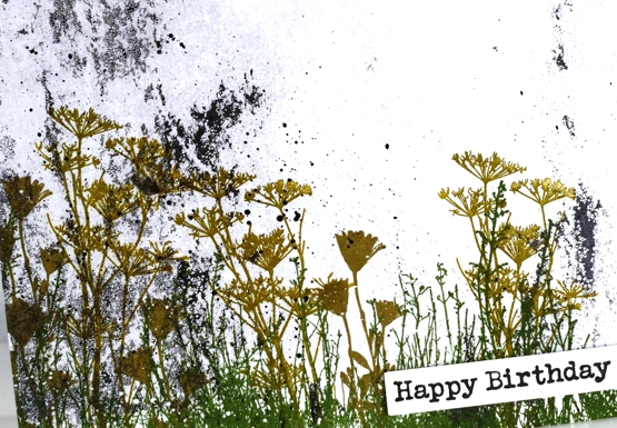
Another gel print post? Yes indeed, and no apologies. If you have tried gel printing you will know it is a little addictive. Today’s post features cards stamped with Darkroom Door flowers. Some are stamped on clean up sheets, others on gel prints. A clean up sheet is thick drawing paper I keep at the right of my gel plate for rolling excess ink off my brayer. As you can see in the panels above and below I can end up with some very colourful sheets.
I stamped flowers from the DD set’ ‘fine flowers vol 2” and the ‘mesh’ texture stamp in Ciao Bella Oceania ink. The ink is a pigment ink which stamps beautifully on gel prints and dries quickly so I don’t end up smudging it.
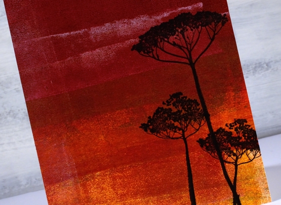
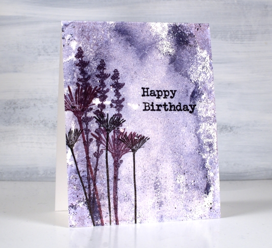
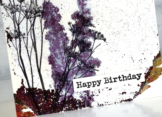
This deep red background is also a clean up panel. I am always excited to see landscapes or skies appear in an abstract print or clean up sheet. Those two strips of white added a hint of clouds to a very bold sunset! I stamped the silhouette flowers from the DD set, wildflowers vol 2.
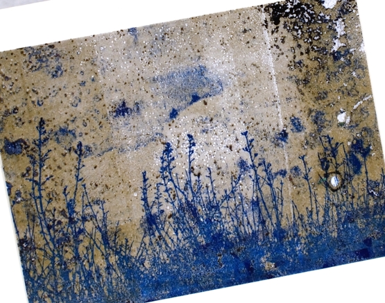
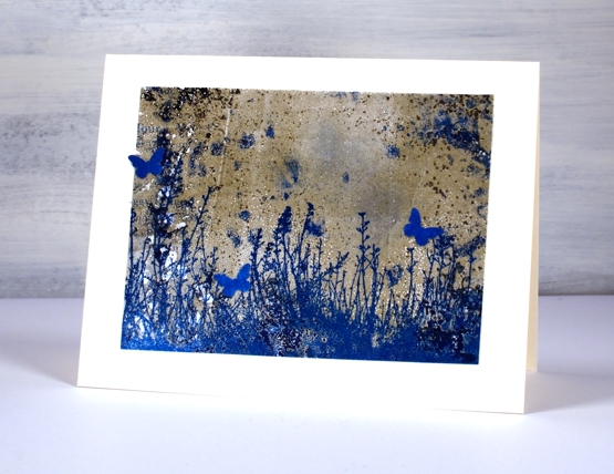
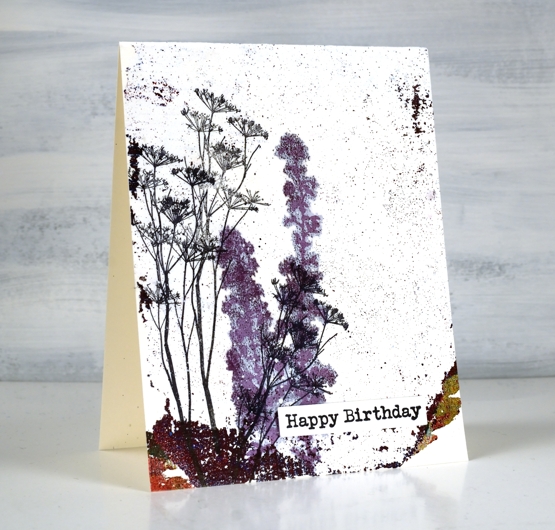
The last two cards are made from gel printed panels not clean up sheets but are very distressed. The print I pulled and cut up to make a couple of garden cards include plenty of distressed texture from a printing session including a little bit of text.
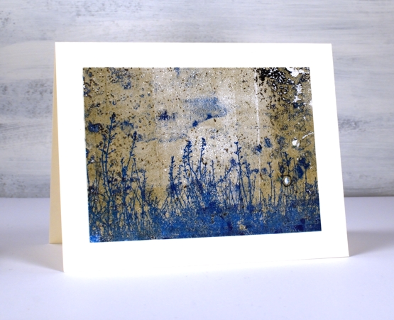
There was some blue in the print so I chose a co-ordinating ink to add the large grassy stamp from the DD ‘nature walk’ set. I’ve said it before it is a favourite set which I reach for again and again. I think I used versafine clair paradise ink.
I was crafting with a friend when I made these two cards and she had a tiny butterfly punch so the card below features a few co-ordinating butterflies. I haven’t seen many butterflies in my garden this year but there have been plenty of bees in the day and fireflies at night.
None of these cards have sentiments on them at this stage, I like to have blank cards on hand to use for any occasion. Thanks for dropping by today; I know it’s been quiet around here lately. I plan to be back soon with more projects and inspiration.
Supplies
(Compensated affiliate links used when possible)
Distressed Gel Print backgrounds
Posted: May 20, 2022 Filed under: Art de Fleur vol 1, Darkroom Door, gel press, Nature Walk, tall flowers, Wildflowers Vol 2 | Tags: Darkroom Door stamps, gel press, gel printing, Ranger archival inks 7 Comments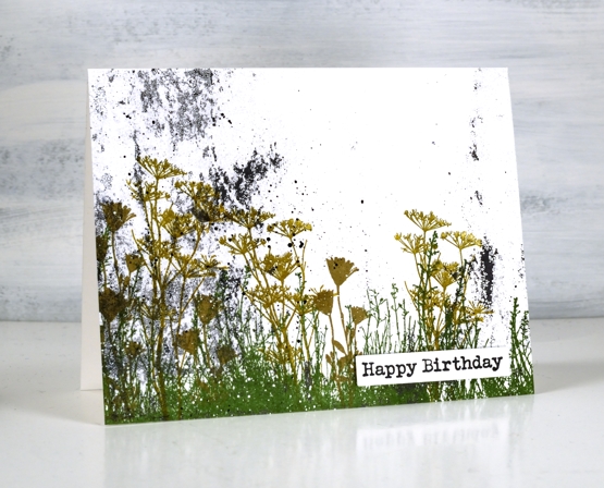
Last week I taught a couple of gel printing classes and had a blast seeing others fall in love with the process and results. As you might imagine I have many prints now, a big box waiting to be used. I thought I would use a few scrappy patchy prints as backgrounds. Some of these prints are ghost prints where I pick up a patchy layer of paint left on the gel print after a more distinct print has been taken. I also have some patchy distressed looking prints taken from a damaged gel plate. I don’t know how the surface got damaged but I still use it as a place to roll out paint before brayering on the main plate or to clean off excess paint after brayering on the main plate. The little dots you see on today’s prints are from imperfections in the damaged plate.
On the print above you can see not only the specks of black paint from the plate but also the leftover paint from the border of the plate. Most gel printers love being able to pick up some of those colourful leftovers on a future print.
Both the print above and the one below were made from excess paint so there is very little defined pattern but instead some lovely specks, blends and blobs.
I chose to make cards from these prints not just because I wanted distressed backgrounds but also because it shows how even the scrappy, incomplete, messy prints can be worth saving.
The only colour on the background print above was some black. I used rustic wilderness, wild honey and frayed burlap archival inks to stamp flowers and grasses from Darkroom Door sets, nature walk and wildflowers vol 2.
The ghost print above was pulled with rice paper. When I stamped the purple flowers in versafine clair they soaked through the paper and spread to give the image a halo surrounding it. Although it was an interesting effect I switched to archival inks for the rest of my stamping as they sit of the surface and dry quickly.
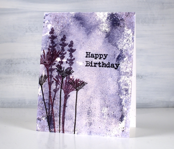
I used similar colours to stamp flowers from DD sets, tall flowers and art de fleur vol 1 over the purple ghost print.
The print above was by far the busiest one I used so a bright contrasting colour seemed like a good idea. I used thistle, wild honey and faded jeans archival inks to stamp flowers from DD sets, nature walk and wildflowers vol 2. I also added some text with a stamp from the nature walk set
To attach the cards to the neenah card bases I used double sided adhesive sheets. I added some black and white paint splatter and Darkroom Door sentiments.
If you have read right to the end you are a champion. If you are a gel printer I hope you are inspired to use a few of those patchy prints you might otherwise discard. I have been using them in my art journals but it is nice to see them on cards too and it’s not as if I am going to run out anytime soon!
Supplies
(Compensated affiliate links used when possible)
Beauty of the Earth journal page
Posted: January 26, 2022 Filed under: Art Journal, Brutus Monroe, Darkroom Door, honeycomb, Nature Walk, number medley, Stencils, World Map, you are everything | Tags: Art Journal, Darkroom Door stamps, Darkroom Door stencils, Ranger archival inks, Ranger Distress inks, Ranger Distress stains 5 Comments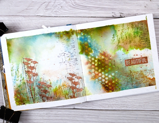
I have another double page spread in the 6″x 6″ journal today. Don’t tell the others but this one seems to be getting all the attention at present!
The pages in this journal are thick watercolour paper so I wanted to take advantage of that and use watercolour techniques. Most of the pages I have completed up until now have had a base layer of gesso or acrylic paint.
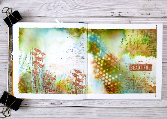
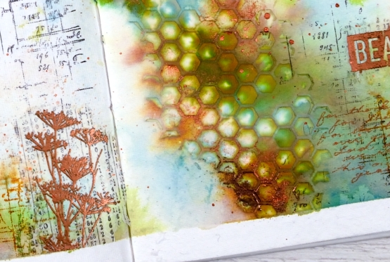
As you can see I taped the edges of the pages with tape before starting. I added some stamping in black here and there using a stamp from the Darkroom Door ‘number medley’ set. Next I used the DD ‘honeycomb’ stencil and modeling paste to add a texture strip from left to right down the centre of the spread. I added a small section bottom left also. Once the paste was dry I began painting colour around the honeycomb and across both pages. I spent a while doing this so as to see the blends and build up some depth of colour.
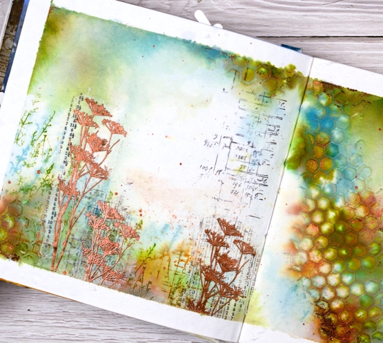
Other than some black stamping I used only three colours of distress ink, both spray stain and from the ink pads. I took care to keep some white space; sometimes I realise too late that I have colour all over the pages. I stamped some grasses in peeled paint archival ink so they would not dilute and broken china distress ink so they would dilute. I also stamped sections of the world map in rusty hinge. Although I loved the combo of peeled paint, rusty hinge and broken china I thought a bit of metallic shine would be nice so I added some wildflowers embossed in Brutus Monroe ‘penny’ powder.
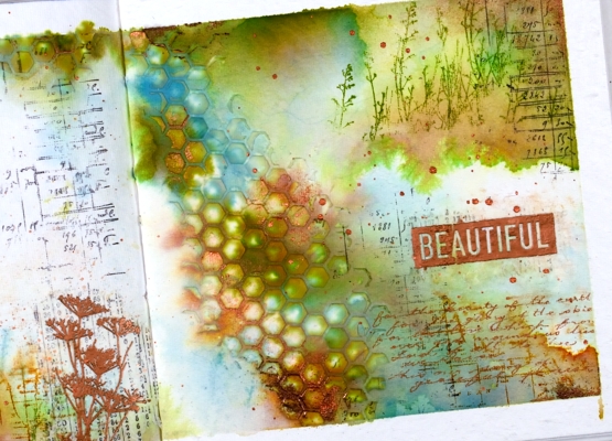
With a copper coloured gel pen I wrote the first verse of ‘For the Beauty of the Earth’ in the lower right hand corner then added the embossed word ‘beautiful’. And of course there is some copper splatter to finish it off. This is a style and look I have been hoping to create so you’ll probably see a few more like this one.
Supplies
(Compensated affiliate links used when possible
Winter Wildflowers
Posted: January 10, 2022 Filed under: Darkroom Door, Nature Walk, Woodgrain | Tags: Darkroom Door stamps, Ranger archival inks, Ranger Distress inks 4 Comments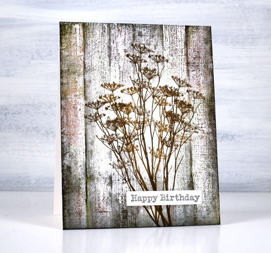
The bright and beautiful flowers of spring and summer delight me as you know but so do those left standing through autumn and winter. On a snowy walk recently I was happy to see the brown tones that show up bold and contrasting against the snow. Queen Anne’s Lace closes up and dries out after summer but that makes it all the better to balance some snow like icing.
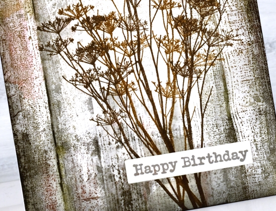
For this wintery image of dried stems against aged wood paneling I stamped the flower stems from Darkroom Door’s ‘nature walk’ first in brown archival inks so they wouldn’t blend when I worked on the background. I stamped the DD ‘woodgrain’ stamp over the top first in hickory smoke distress ink then a few more times adding black soot, forest moss and barn door distress inks. I blended as sparingly as I could to retain the texture of the stamp.
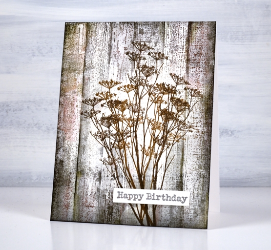
I added a sentiment from the DD ‘happy birthday’ set and now I am wondering if I can recreate the same aged wood effect on a journal page. This seems to be the way I roll at present; a journal page inspires a card then a card inspires a journal page.
By the way my Art Journal Adventure class has been postponed for now due to current restrictions here in Ontario but we will reschedule when possible. In the interim I will continue scheming and dreaming up themes and techniques!
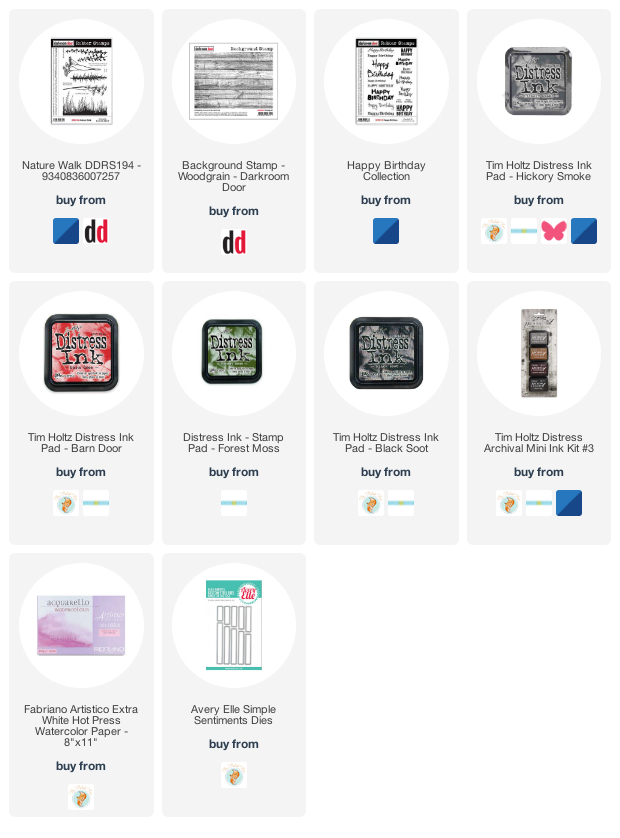
Supplies
(Compensated affiliate links used when possible)
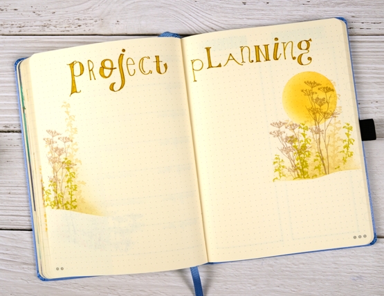
2021 BuJo – September theme
Posted: September 6, 2021 Filed under: Bullet Journal, Darkroom Door, Dingbat notebooks, Hand lettered, Nature Walk | Tags: Bullet Journal, Darkroom Door stamps, Dingbats notebook, Staedtler watercolour brush pens 6 Comments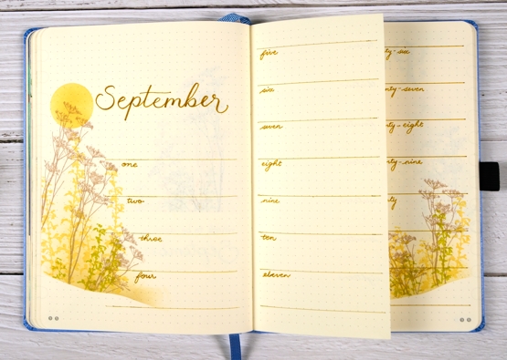
This was not the original plan I had for the September theme; I’d thought instead of doing apples. I sketched a few apples in preparation then realised I would want to have them on all my pages and that would take me half of September. I would then want to colour them in and that would take the other half of the month. I was already late on getting this done so….
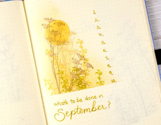
…when short on time and want something pretty what do you do? You pull out one of your faves! ‘Nature Walk’ from Darkroom Door is definitely a fave and for a late summer theme it works beautifully.
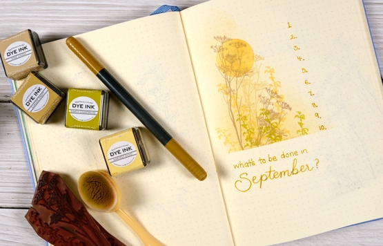
I began each page design with a masked sun, blended in harvest gold ink. Next I masked either a straight or hilly base and blended fine linen for the background then stamped flowers and grasses in gold, kraft and chartreuse.
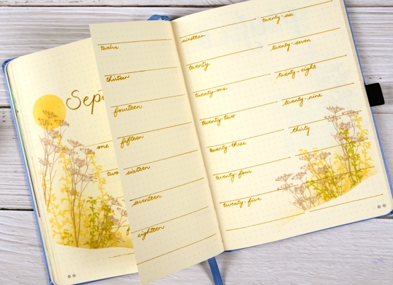
Life now includes a few more commitments so I decided to spread the month of September over a few pages with the middle one cut down narrower.
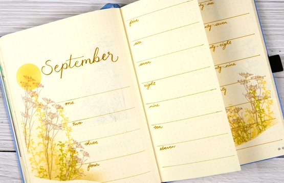
I also have a page for my work commitments, current projects, future projects, etc. The title is my attempt at a mixed up font. There are plenty of examples on the interwebs but I decided to make up this one out of my head. Not too bad for a first try. You would think it would be easy to do every letter a different way but even a mixed up font needs balance!
Hope you are feeling more balanced than mixed up! Have a great week.
Supplies
(Compensated affiliate links used when possible)
Honeycomb & Checkered
Posted: August 10, 2021 Filed under: checkered, Darkroom Door, Feathers, gel press, honeycomb, Nature Walk, Stencils | Tags: Darkroom Door stamps, Darkroom Door stencils, gel press, gel printing, Tsukineko Versafine inks 3 Comments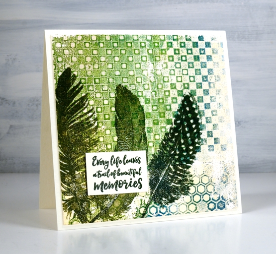
New stencils from Darkroom Door means new gel prints in my stack! I used greens, teal, beige and gold paints to print with the new honeycomb and checkerboard stencils. For the second card I used a mix of blue, beige, gold and coral paint for a rich print.
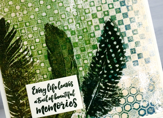
I used the stencil printing method demonstrated in this video and worked on printer paper with a 6″x6″ gel press.
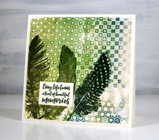
After completing a fresh stack of gel prints I chose these two because of the beautiful mix of colours and textures. I pulled out Darkroom Door feather and wildflower stamps and stamped them over the top of the prints. I decided to emboss using co-ordinating versafine inks to make the images stand up a little over the print.
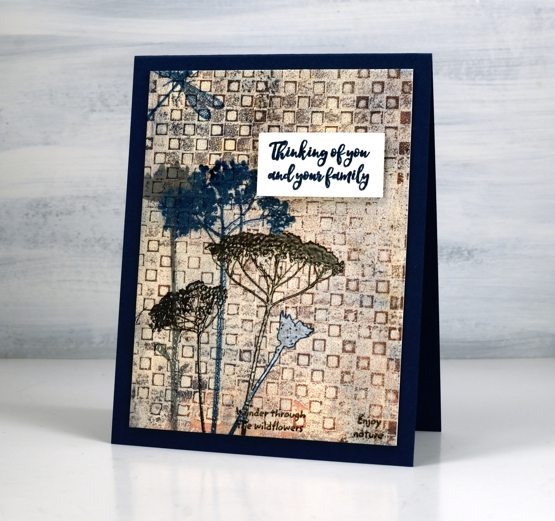
I chose sentiments from the DD sentiment strip stamp and embossed them to pop up over the stamped and printed panels.
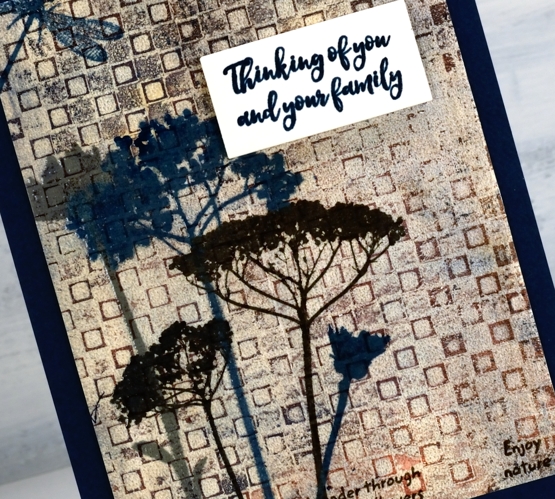
Ever since I started gel printing with stencils I can’t get enough of the intricate detailed ones. These two new ones from Darkroom Door are very cool and create such great backgrounds!
Supplies
(Compensated affiliate links used when possible)