Delicate florals on Watercolour
Posted: May 9, 2025 Filed under: Delicate Florals, Penny Black, Watercolour | Tags: Fabriano Watercolour Paper, Penny Black stamps, sennelier watercolours, Tsukineko Versafine inks 3 Comments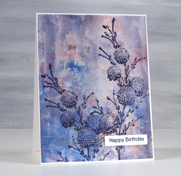
I have another floral stamp over a watercolour background; I don’t think I will ever tire of the combination. This background was created using a very different method to the previous card posted. Whereas the last one required careful blending of paint colours this one was definitely abstract and unpredictable. I randomly painted watercolours on a piece of clear acetate then smooshed it onto a piece of watercolour paper.

It took a few smooshings to start to build up pattern and depth of colour but eventually I had something I liked. Along the way I spritzed water to help the paint move and tilted the panel this way and that to spread it from one area to another. I didn’t like it when I first began but after several repetitions with the smooshing I could see it working as a pretty background.

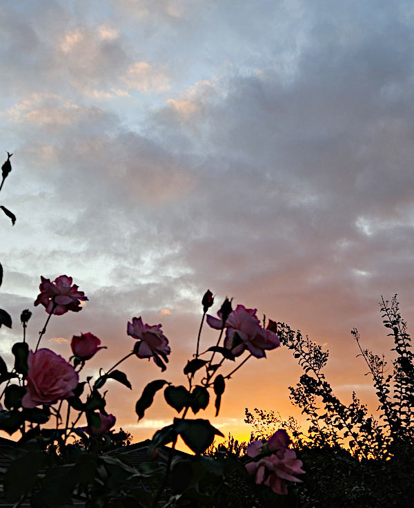
Once again I chose a Penny Black stamp, ‘delicate florals’ as the focal point over the background, this time choosing dark blue ink because I love the matchy-matchy! If you compare with the previous card you can see I added visual interested once again with a horizontal line down low on the card. It doesn’t get in the way but it leads the eye from left to right. While I was away I enjoyed the roses still blooming in my Dad’s garden. The tallest bush gave some foreground interest to yet another sunset photo.
Cars, Bikes and birthdays
Posted: April 11, 2023 Filed under: brushed stars, classic motorcycles, Darkroom Door, postage stamps, this way, vintage car, word labels, World Map | Tags: Darkroom Door stamps, One-Layer cards, Ranger archival inks, Ranger Distress inks, Tsukineko Versafine inks 5 Comments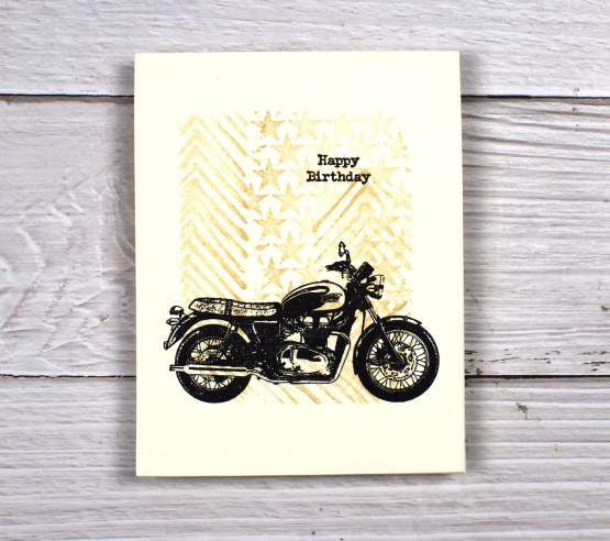
You’ve seen me use the ‘this way’ stamp behind a trio of butterflies and a classic car as well as featured on a journal page. It reminds me a little of tire tread so I have paired it again with some vehicles. For this motorbike card I masked the edges of a cream panel and stamped ‘this way’ and ‘brushed stars’ in antique linen distress ink.

After removing the masking tape I added one of the motorcycles from the classic motorcyles set in black along with a little happy birthday. I haven’t masked edges like this in a while but it makes it easy to make a simple but eye catching one layer card. You could fill the masked area with any stamping you wanted then add a bold black image over the top.

I also used ‘this way’ in the vintage style watercolour background of this card. I combined, the arrow pattern of ‘this way’ with postage stamps and world map. There is also splatter and a torn edge to keep the background looking aged. I stamped the DD vintage card on teabags and added stitching and word labels to complete the card.

(Compensated affiliate links from Foiled Fox, Scrap n Stamp)
Do red cars go faster?
Posted: April 3, 2023 Filed under: brushed stars, classic cars vol 1, Darkroom Door, this way, word labels | Tags: Darkroom Door stamps, Ranger Distress inks, Tsukineko Versafine inks 4 Comments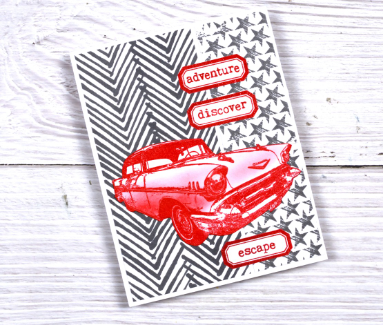
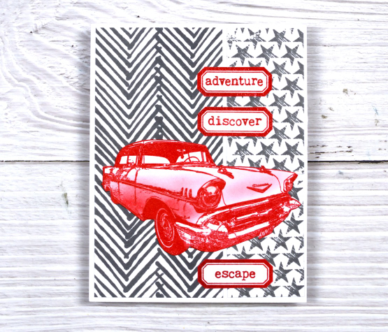
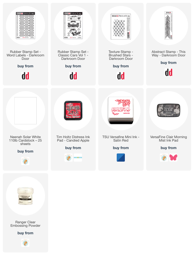
I mentioned on Friday that Darkroom Door has a new release available now and shared a butterfly card. For this bold two toned card I used the same narrow ‘this way’ stamp but in hickory smoke ink. I completed the background with the brushed stars texture stamp then added bright red elements on top.
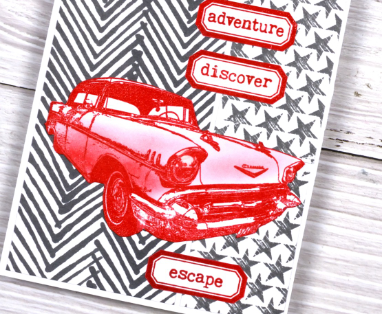
The labels are from a new DD stamp set ‘word labels’. The set includes 27 different words which will be brilliant for cards and journalling. The cool car is from the ‘classic cars vol 1’ set. I embossed it with versafine satin red ink then added shading with candied apple distress ink.
We had a red car once which I rather liked but not long after buying it we up and left for Canada so had to sell it again!
Make sure you check out the new release from Darkroom Door it is full of style and originality. You’ll be seeing more of it in the weeks to come.
(Compensated affiliate links from Foiled Fox, Scrap n Stamp & Ecstasy Crafts)
Watercolour decorations
Posted: September 26, 2022 Filed under: Dies, jumbo bauble, Penny Black, stocking stuffers | Tags: Fabriano Watercolour Paper, Penny Black creative dies, Penny Black stamps, Ranger Distress inks, Tsukineko Versafine inks 5 Comments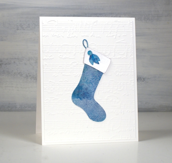
There are some delightful new Christmas themed dies from Penny Black and sneak peaks have started of more to come. I love the ‘stocking stuffers‘ die set which features the stocking, trim and various bits of foliage. I used one watercolour panel to create this stocking card and the decorated bauble below uses jumbo bauble and foliage from stocking stuffers.
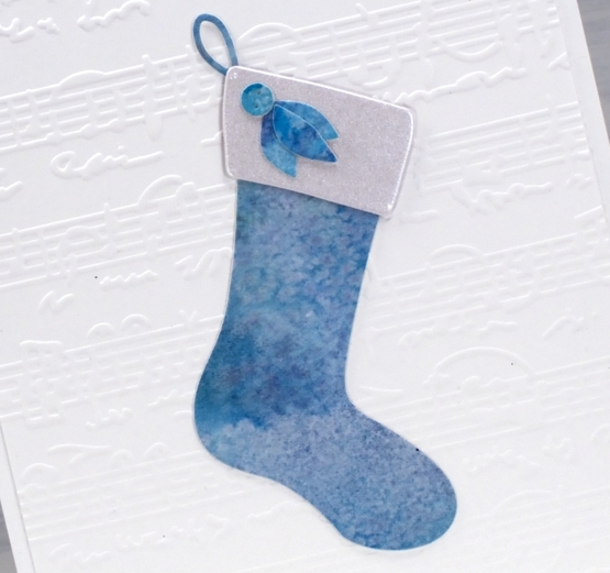
As you can probably tell from the mottled look of the watercolour panel I sprinkled salt over a wet panel coloured with distress inks. When you sprinkle salt over a wet panel you can achieve different results depending on how coarse the salt is.
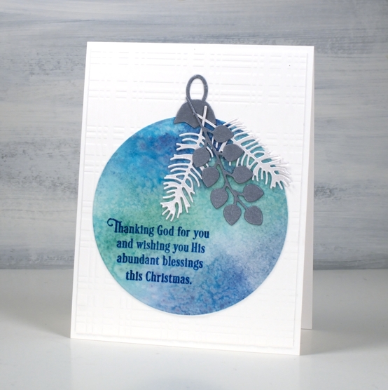
The trimmings for both the bauble and the stocking were cut from shimmer cardstock in silver and quartz. The stamped message on the bauble is from the PB shine God’s glory set using versafine clair paradise ink.
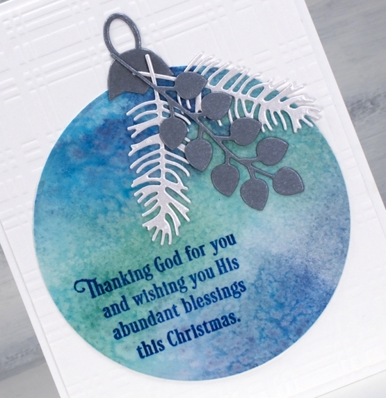
The card bases and embossed panels are Neenah solar white cardstock embossed with TE sheet music and Spellbinders plaid company. All the links are below.
Today’s cards are similar to the cards we will be making in my October Collage Christmas card workshops in Ottawa. Click over to the Classes page to learn more and register.
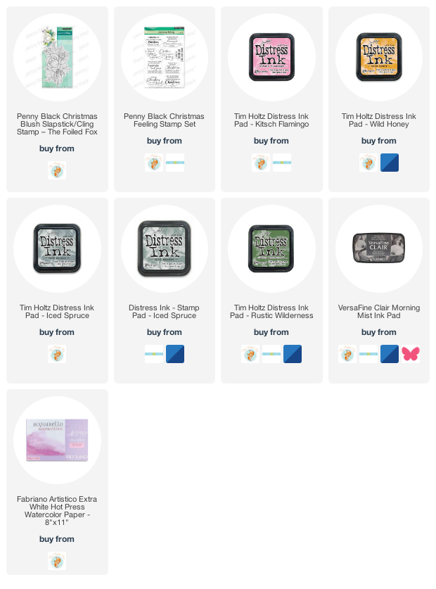
Supplies
(Compensated affiliate links from Foiled Fox, Scrap n Stamp)

Fresh Spring
Posted: May 10, 2022 Filed under: fresh spring | Tags: Fabriano Watercolour Paper, Penny Black stamps, Ranger Distress inks, Tsukineko Versafine inks 4 Comments

Now that May has arrived I feel it is the right time to post tulip cards. My one tulip is blooming and the tulip festival is a week away. I have used the Penny Black ‘fresh spring’ stamp on hot press watercolour paper with distress inks.
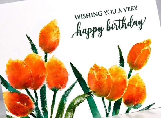
Sometimes I stamp then blend with a paintbrush after stamping. This time the blends from a spritz of water on the inked stamp were almost enough without adding anything. I did a little blending on a few tulips and a few leaves but some of the blends just happened so I let them be.

I inked the tulips with wild honey distress ink and added festive berries over the base of the petals with a marker. Same with the leaves but using rustic wilderness with added forest moss for depth and variation. I know the distress markers are discontinued but they are so useful for adding ink selectively I will keep using them ’til they give up! The sentiment is from the PB set ‘special sentiments’.
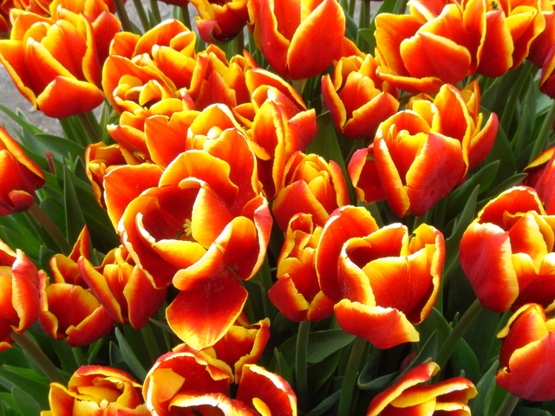
My friend Jan recently sent me some more floral inspiration pics so I have added the inspiration for today’s card below. Thank you Jan.
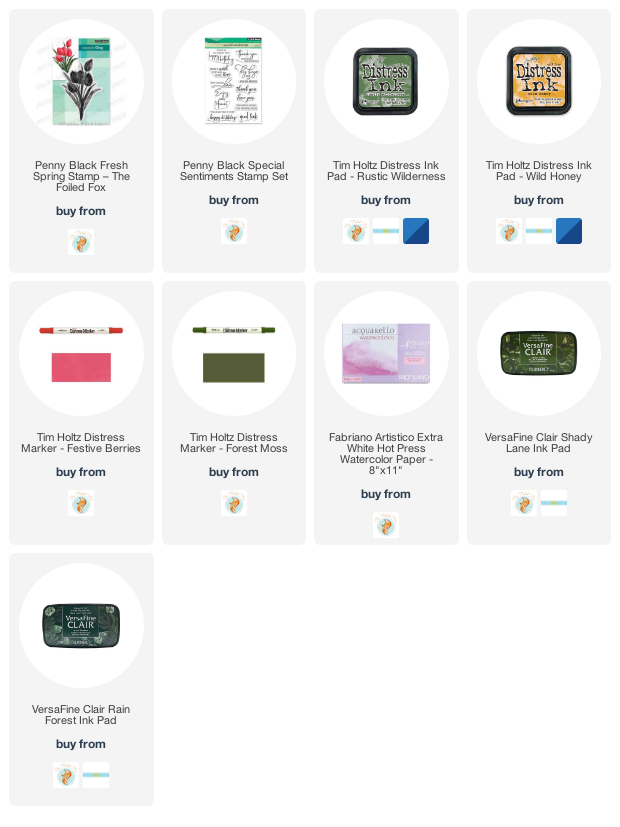
Supplies
(Compensated affiliate links used when possible)
Delicate Pines – 9 Ways!
Posted: November 29, 2021 Filed under: delicate pines, Dies, gift card pocket, joyful ornaments, jubilation, juniper, onramental branch, Penny Black, tall trees, Taylored Expressions, trees and hills | Tags: Catherine Pooler inks, Penny Black creative dies, Penny Black stamps, Taylored Expressions, Tsukineko Versafine inks 8 Comments
Welcome to a long post with quite a few photos!
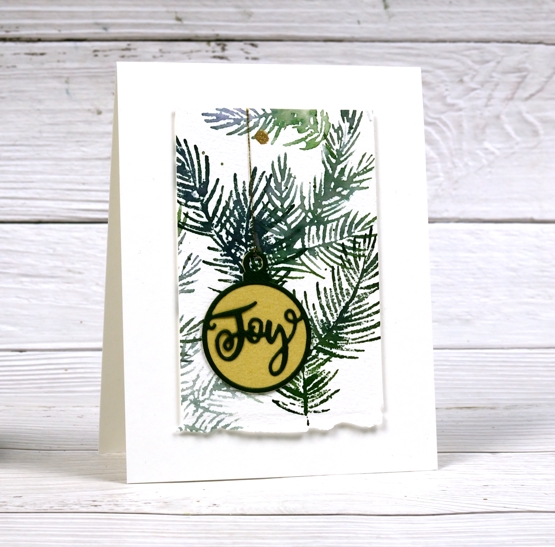
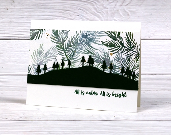
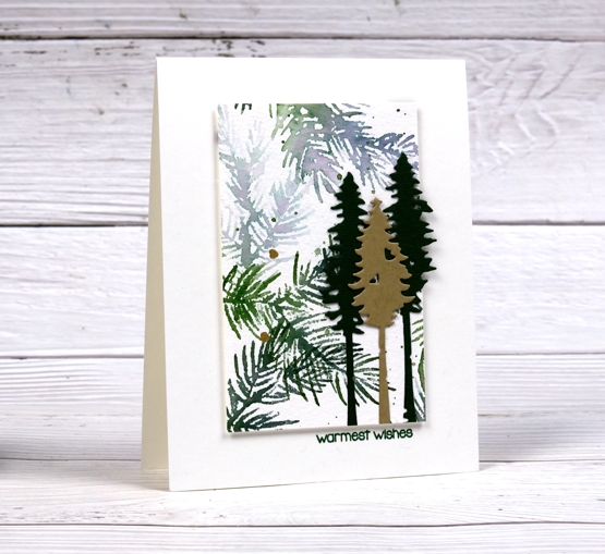
When I last counted up the names on my Christmas card list and the number of cards I have completed the two numbers were not close to matching. I decided a quick way to grow the stack of cards would be to stamp a big panel then slice it up to make several cards.
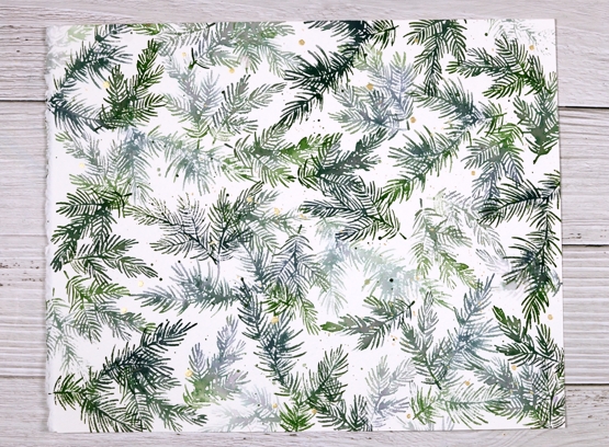
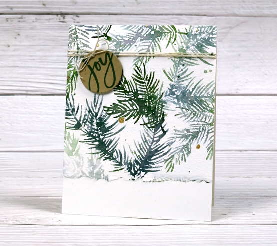
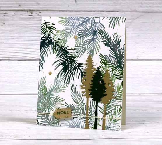
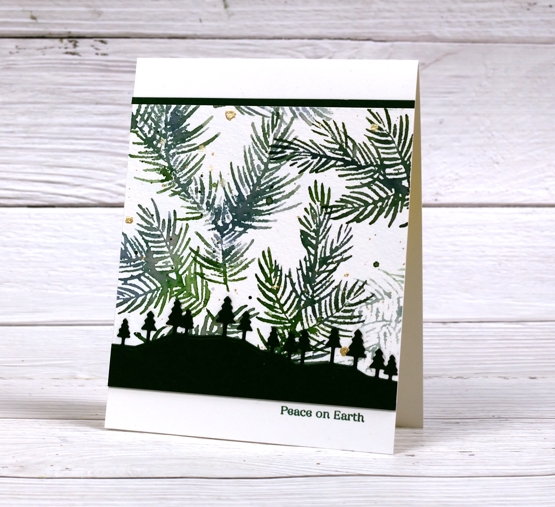
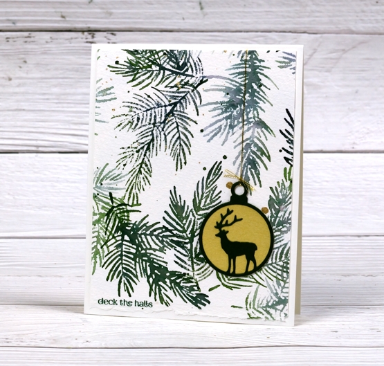
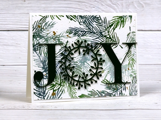
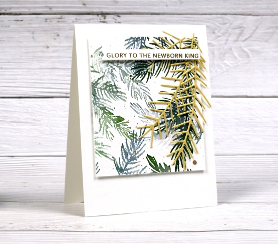
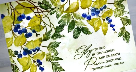
Turns out this idea was not all that quick. It took a while to make these cards because although they are from the same stamped panel, they are still all different. The photo above shows the original panel stamped with Penny Black’s new ‘delicate pines’ set of 3 stamps and two Catherine Pooler inks. After the stamping I added ink splatter then gold paint splatter.
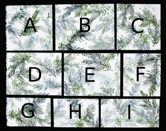
I kept the deckle edge on the 11″x14″ cold pressed watercolour panel and sliced up the panel lengthwise first. A,B & C are all 4¼” wide, D,E & F are all 4″ wide which left G,H & I all 2¾” wide. Below are all the finished cards. I used some pale gold, Bazzill avocado green and kraft cardstocks for the die cuts and framing. I used versafine clair rainforest ink to add sentiments and some linen twine here and there. All the cards are shown below with the size of the stamped panel portion included underneath (all the finished cards are 4¼”x 5½”)
A. 4¼ x 4½
B. 4¼ x 5½
C. 4¼ x 4⅛
D. 4 x 5¼
E. 4 x 5¼
F. 4 x 3½
G. 2¾ x 4¼
H. 2¾ x 4¼
I. 2¾ x 5½
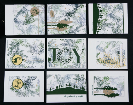
The finished cards above are in the places that correspond to the labelled photo up at the beginning of the post. I had them laid out on a cutting mat on the floor beside me as I put them all together so I didn’t get them mixed up. I wanted you to see how I used each size in a different way.
I hope you find some inspiration from these cards. Remember that three of my online classes are on sale until the end of November. Use the code HTNOV to get a 25% discount on the Floral Faves class, Winter Wonder class and the Colour Clues class.
The stores I have affiliate links with are also having sales right now (isn’t everyone?) I have put the links in the right hand side bar of the blog for easy access. Just click on the store name and start shopping!
Supplies
(Compensated affiliate links used when possible)
Carmine – No Line Watercolour Video
Posted: November 16, 2021 Filed under: carmine, Penny Black, sennelier watercolours, Tutorial | Tags: distress markers, Fabriano Watercolour Paper, Papertrey ink, Penny Black stamps, sennelier watercolours, Tsukineko Versafine inks, Tutorial, video 9 Comments
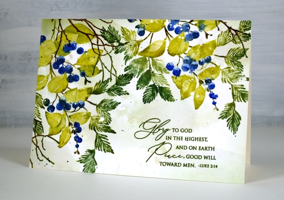
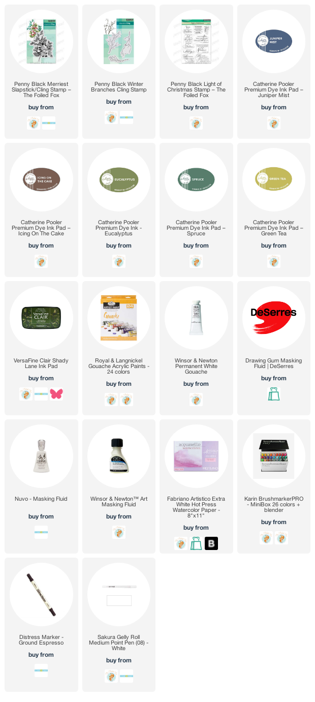
I hope you enjoy today’s no-line watercolour video. When I first saw this stamp I knew it would be perfect for the technique. There are a few little petals but most of the image is made up of open leaves and petals which are easy to see while painting. I used soft stone ink for the initial image on cold press watercolour paper and Sennelier watercolour paints for all the painting.
If you don’t always have a plan for the background you will see how I added one after all the painting was done. Take a look at the video below to see my process.
This is such a pretty stamp and might get inked up again soon to keep my stock of Christmas cards growing. I think it would look good embossed in white on a coloured background. Stay tuned!
Supplies
(Compensated affiliate links used when possible)
Merriest
Posted: November 4, 2021 Filed under: Catherine Pooler inks, Karin brushmarkers, merriest, Penny Black, Tutorial, winter branches | Tags: Catherine Pooler inks, Fabriano Watercolour Paper, Karin brushmarkers, Penny Black stamps, Tsukineko Versafine inks 7 Comments
The new ‘Making Spirits Bright’ release from Penny Black is full of beautiful festive foliage. As you know I love working with florals and foliage especially on rubber cling stamps so these new stamps are definitely my thing!
I used Catherine Pooler inks for this design and the colours worked beautifully. I sometimes forget my CP inks, then when I put them to use I remember now juicy and vibrant they are. Take a look at my process below; I have used some of my favourite techniques on this one. (by the way I think I call the release ‘keeping spirits bright’ and the branch stamp fragile beauty instead of ‘winter branches’. Oops)
I know I have been hinting and promising the new class release for the last week. So thanks for your patience; it’s coming, it’s really coming!
I know it’s subtle but one of my favourite things about this card is the muted background, just some pale greens and brown tones with tiny white dots from the masking fluid.
Thanks for dropping by today. I’ll see you again tomorrow.
Supplies
(Compensated affiliate links used when possible)
Christmas Blush
Posted: October 27, 2021 Filed under: Christmas blush, Penny Black | Tags: Penny Black stamps, Ranger Distress inks, Tsukineko Versafine inks 7 Comments
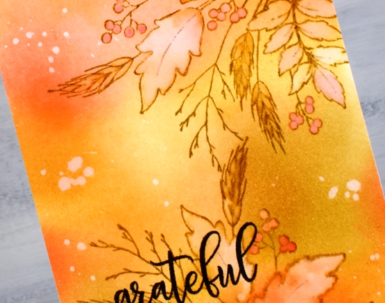
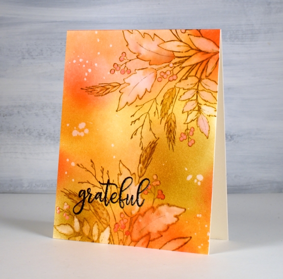
This pretty rose surrounded by leaves and needles is called ‘Christmas Blush’ and is another beauty from the Penny Black ‘Keeping Spirits Bright’ release. Even though it is part of a Christmas release I think I will use it year round. It’s quite a large stamp so I have made a 6¼” x 4½” card.
I used a technique similar to a favourite from a few years ago when I would ink my rubber stamps with distress stains. The distress stains first came in daubers which made it possible to ink a stamp with a very juicy amount of ink. To replicate that I inked with a stamp pad then spritzed generously before stamping.
I inked the rose first in wild honey and kitsch flamingo, cleaned off the surrounding area then inked the foliage with rustic wilderness and iced spruce. Next I spritzed the stamp with water and stamped in the stamp positioner. There was enough ink still on the stamp to spritz it again and stamp it on the other end of the watercolour paper panel. While the ink was still wet on the paper I blended with a wet paintbrush, adding extra ink where necessary. I often watercolour outline stamps this way, the difference this time being how wet the ink was hitting the paper. I was looking for excess ink so the painting would be loose rather than precise.
After blending ink inside all the leaves and petals I dried the image and used blending brushes to add both green inks around the edges of the card and a little wild honey in the centre. I splattered water over the panel several times before dabbing it off with a paper towel to leave watermarks in both the blended and stamped areas. I added some green splatter and a sentiment from the PB ‘Christmas feeling’ set stamped in morning mist versafine clair ink.
I like this loose watercolour look and also the fact that it didn’t take anywhere near the time a more precise no-line watercolouring approach would take. I’m sure I will take more time over this stamp another day with another colour scheme; it’s too pretty not to.
Supplies
(Compensated affiliate links used when possible)
Blended Autumn Bouquet
Posted: September 30, 2021 Filed under: autumn bouquet, Penny Black, Uncategorized | Tags: Penny Black stamps, Ranger Distress inks, Tsukineko Versafine inks, WOW embossing powders 7 Comments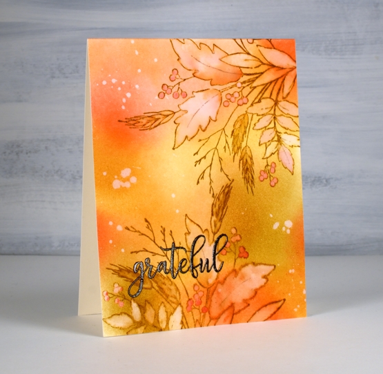
Today’s card is a second look with the Penny Black ‘autumn bouquet’ stamp. I blended distress inks over a panel of hot pressed watercolour paper before doing any stamping. The colours are listed below.
After blending I stamped the autumn bouquet stamp twice on the panel with brushed corduroy distress ink then painted inside all the leaves, berries and wheat stalks with water. As I painted I also dabbed away water leaving the insides of the images lighter than the outside. I picked up some smooshed ink and dropped it back into the round berries and the wheat berries.
I splattered some water over the panel, let it sit then dabbed it away with paper towel leaving a random pattern of watermarks here and there. The embossed sentiment is from the PB ‘million thanks’ set stamped in fallen leaves versafine clair ink.
Thank you for dropping by. I am indeed grateful for all your support and kindness.
Supplies
(Compensated affiliate links used when possible)