Cones and Berries
Posted: November 21, 2023 Filed under: Cones & berries, Penny Black, Uncategorized | Tags: distress markers, Penny Black stamps, Ranger Distress inks, Stampin Up 5 Comments
More variations on a theme in today’s post. As mailing deadlines get closer I am creating some ‘same but different’ cards to swell my stack. I have never been one to create more than about five of the same card and even when I do there are usually variations. I used the Penny Black cones and berries stamp facing downwards and upwards. I also did first and second generation stamping for a dark and a light version.

Some of the images I cropped closely as shown above and others I gave more space as in the splattered example below. The texture of the SU embossing folder ‘timber’ gave some subtle texture to the woodsy image. You can also see I did extra blending on the card above and deeper colours on the one below.

Even with the variations this was not a time consuming card to make. I worked in a stamp positioner and inked the pinecone and sticks with distress inks, the berries and leaves with distress markers or other waterbased brush markers before stamping on hot pressed watercolour paper. With the stamp in the positioner I was able to spritz it again to create my second generation image and at one stage I was stamping either end of a larger piece of watercolour paper so I could just flip the orientation between impressions. The joy to the world sentiment is from PB Christmas sentiments set and the other sentiment is also PB, it’s red rubber and I cannot find a name for the set. Speaking of mailing deadlines, my cards to Australia were posted yesterday! Having a sprained ankle is keeping me at home right now so this year I might just be a little ahead of my usual ‘just made it’ schedule.
Today’s post features affiliate links to The Foiled Fox. If you buy through these links I receive a small commission at no extra cost to you.
Old favourites
Posted: November 10, 2023 Filed under: Berry kissed, Penny Black, Uncategorized | Tags: Fabriano Watercolour Paper, Penny Black stamps, Tsukineko Memento inks 6 Comments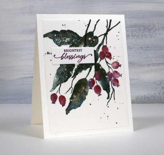
When I say old favourites I am talking in crafting years not harking back to my grandmother’s time. The PB stamp featured on today’s card is definitely a favourite, it’s called ‘berry kissed‘ and it’s been around a few years.
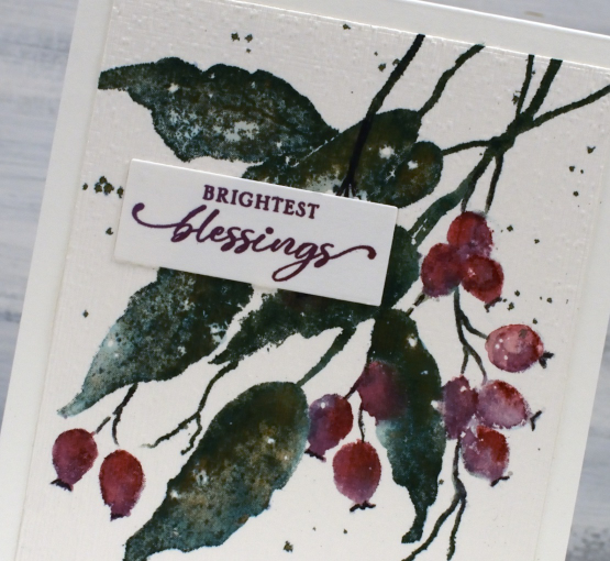
Another old favourite on this card is my often used technique of splattering masking fluid on my hot pressed watercolour paper before stamping or painting. After all the ink is added and dried I remove the masking fluid to reveal little white dots here and there which look like snow.
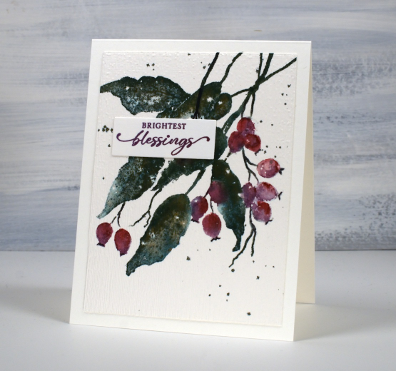
The final old favourite worth mentioning on this card is the ‘magic’ ink, memento northern pine. It is a dark green dye ink and when it is wet it bleeds into greens, blues and browns. I stamped the leaves with this ink then blended over them with a paintbrush and you can see all the different tones, especially in the close up photo. And yes, the placement of the sentiment does cover a few blotchy berries!
Today’s post features affiliate links to the following companies. If you buy through these links I receive a small commission at no extra cost to you. The Foiled Fox & Scrap’n’Stamp
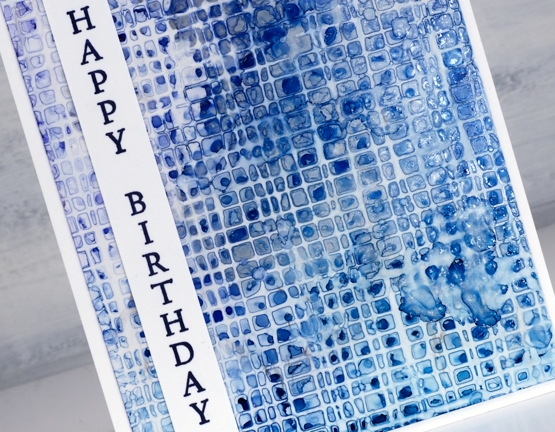
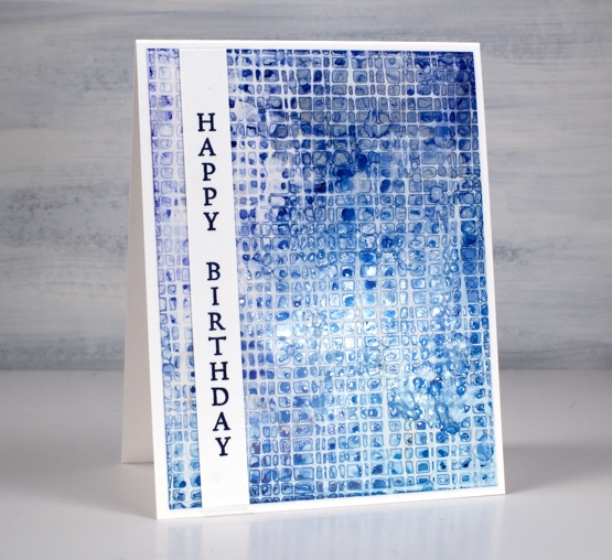
AI + Stencils Blue Edition
Posted: January 31, 2022 Filed under: Alcohol Ink, crackle, Darkroom Door, geometric stars, grafix, mesh, MFT stencils, My Favorite Things, Pink Fresh studio, Stencils, tall flowers, Uncategorized, you are everything | Tags: Darkroom Door stamps, Darkroom Door stencils, grafix, grafix craft plastic, My Favorite Things, pinata alcohol ink, Pink Fresh studio, Ranger Alcohol Ink 11 Comments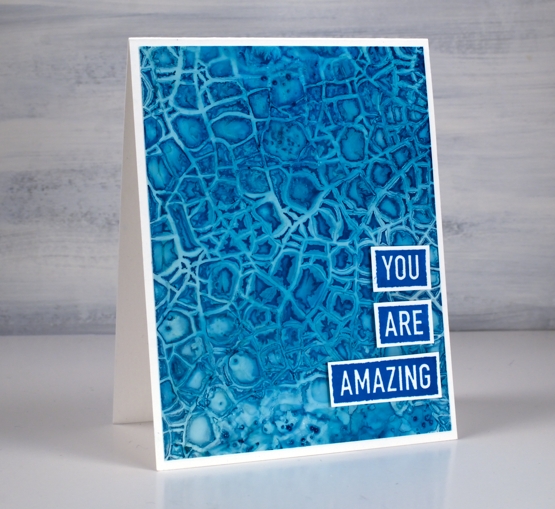
After success with one of my detailed stencils over an alcohol ink panel I tried a few more all with a mix of blue inks. The one above features the Darkroom Door crackle stencil over a mix of cloudy blue and stream inks.
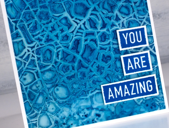
There is also a little bit of salt sprinkled on the panel where the stencil did not make consistent contact. This technique is definitely not for the impatient among us!
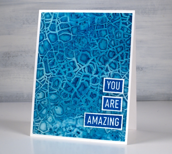
I am still working on Grafix white craft plastic and often starting over the top of a panel that already had ink on it. All the card bases are Neenah solar white.
The stencil above is MFT geometric stars and I positioned it over a panel of denim and stream inks with some leftover copper as well. The ‘print’ is not very consistent but I like the way a distinct line is right next to a blurry pattern.
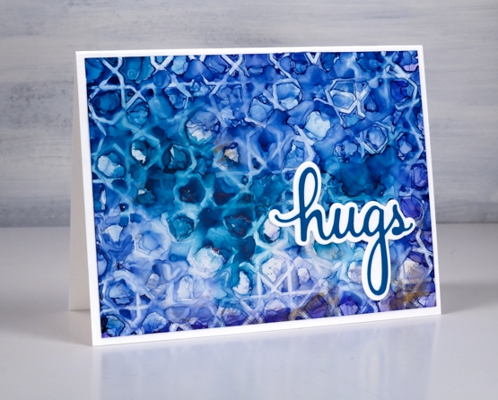
I finished this one off with a die from the Pinkfresh Studio ‘sending’ die set.
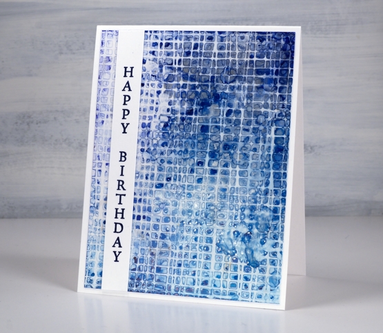
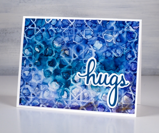
I worked with the DD mesh stencil a couple of times because it didn’t make consistent contact on my first attempts. I found if I taped it over the alcohol ink panel onto a piece of scrap cardboard I could bend the cardboard slightly to make sure stencil stayed pressed onto the wet alcohol inks. I just popped the piece in the right sized container to keep it bent while it dried.
This one is a mix of denim, cloudy blue, silver and a tiny bit of stream down in the right hand corner. I added a sentiment from the DD ‘tall flowers’ set.
As you can see my fascination with this technique continues. I did pick up a couple more detail stencils the other day for this very purpose. I will also give it a try with some watercolour paints and paper. I’m sure the result will be different as the watercolour paints soak in but I think there could be a pretty and subtle pattern. Stay tuned!
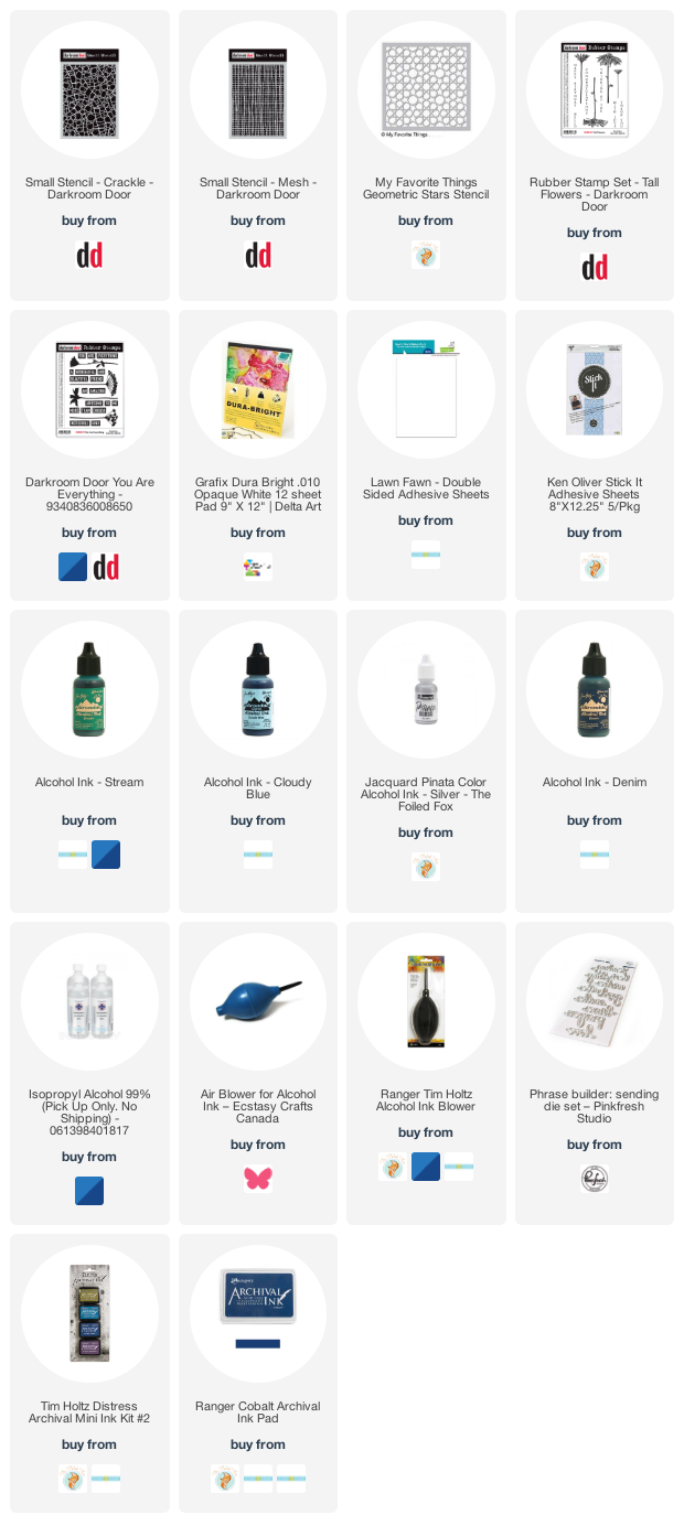
Supplies
(Compensated affiliate links used when possible)
2021 BuJo – October theme
Posted: October 2, 2021 Filed under: Autumn Jewels, Bullet Journal, Dies, Dingbat notebooks, Penny Black, Uncategorized | Tags: Bullet Journal, Dingbats notebook, Penny Black creative dies, Ranger Distress inks 9 Comments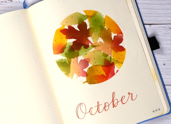
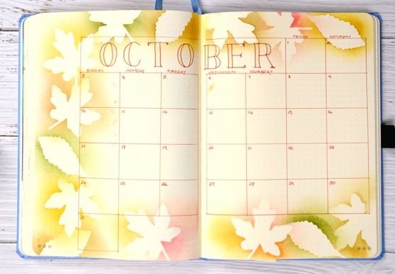
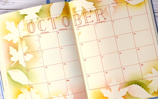
I had no trouble choosing a theme for October in my bullet journal, would it be leaves, leaves or leaves? I die-cut a surround circle mask to protect most of the page, a technique I used in August, April and January. I cut leaf masks from post-it notes using the ‘autumn jewels’ dies from Penny Black.
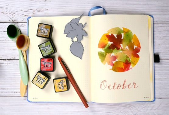
The same mix of inks carries through on all the pages blending yellows, brown, green and red over the masks with blending brushes.
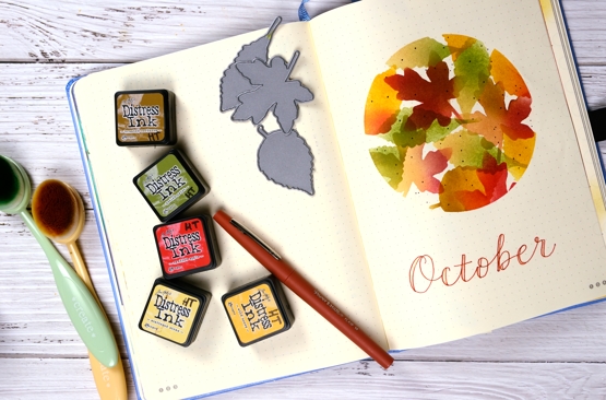
I added hand lettered titles with a brown papermate flair pen and some shimmer with a nuvo gold shimmer pen.
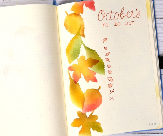
When I cut the leaf masks I had both the negative space mask used on the pages above and the leaf itself which I used on the calendar page below.
There is a bit of shimmer on the title letters of October but it doesn’t really show up in the photos. It will make me happy each time I turn to the page. Have a lovely October.
Supplies
(Compensated affiliate links used when possible)
Blended Autumn Bouquet
Posted: September 30, 2021 Filed under: autumn bouquet, Penny Black, Uncategorized | Tags: Penny Black stamps, Ranger Distress inks, Tsukineko Versafine inks, WOW embossing powders 7 Comments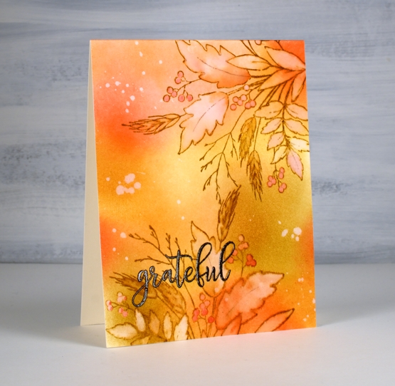
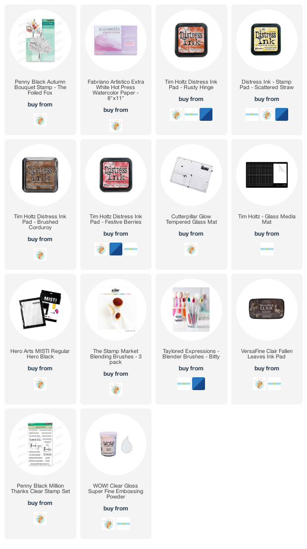
Today’s card is a second look with the Penny Black ‘autumn bouquet’ stamp. I blended distress inks over a panel of hot pressed watercolour paper before doing any stamping. The colours are listed below.
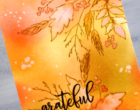
After blending I stamped the autumn bouquet stamp twice on the panel with brushed corduroy distress ink then painted inside all the leaves, berries and wheat stalks with water. As I painted I also dabbed away water leaving the insides of the images lighter than the outside. I picked up some smooshed ink and dropped it back into the round berries and the wheat berries.
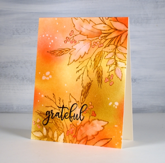
I splattered some water over the panel, let it sit then dabbed it away with paper towel leaving a random pattern of watermarks here and there. The embossed sentiment is from the PB ‘million thanks’ set stamped in fallen leaves versafine clair ink.
Thank you for dropping by. I am indeed grateful for all your support and kindness.
Supplies
(Compensated affiliate links used when possible)
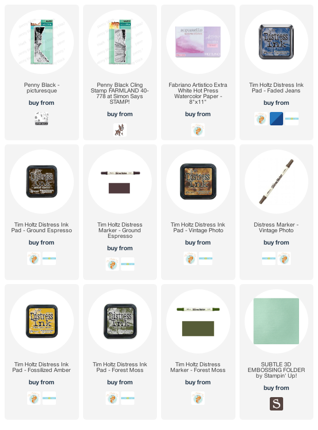
Mountain Farm
Posted: August 20, 2021 Filed under: farmland, Penny Black, picturesque, Stamped Landscapes, Uncategorized | Tags: Penny Black stamps, Ranger Distress inks 3 Comments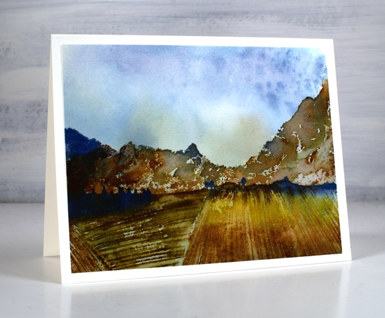
More mountains, this time the ‘picturesque’ stamp is paired with the ‘farmland’ stamp, once again in a blue and brown colour scheme. I began by making a smooshed ink background with faded jeans and fossilized amber inks.
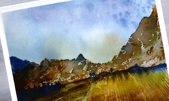
Once the background was dry I inked the mountains in vintage photo, faded jeans and ground espresso inks taking care not to ink to the bottom of the stamp but instead leaving the lower edge unevenly inked. I did some blending with a paintbrush after stamping to make the mountains less defined.
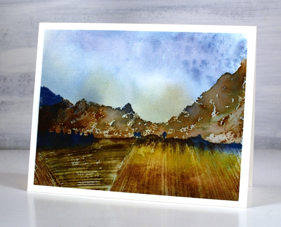
I inked the farmland stamp in faded jeans along the top then fossilized amber, forest moss and vintage photo in the fields. Again I did a little blending with a paintbrush. Once finished I ran the panel through my die cutting machine with the ‘subtle’ embossing folder from SU to give it a canvas look; you can see the texture in the close up photo.
I hope you have enjoyed all the scenery on the blog lately. What are you hoping to see next? I won’t promise to deliver straight away but I’d love to know what interests you.
Supplies
(Compensated affiliate links used when possible)
Out the back door
Posted: July 27, 2021 Filed under: Uncategorized 13 Comments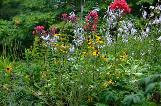
Floral inspiration today but not the stamped and painted kind. I thought I would give you a glimpse of my backyard garden. I am not a knowledgeable or careful gardener but after years of working and learning the half circle garden is thriving and blooming.
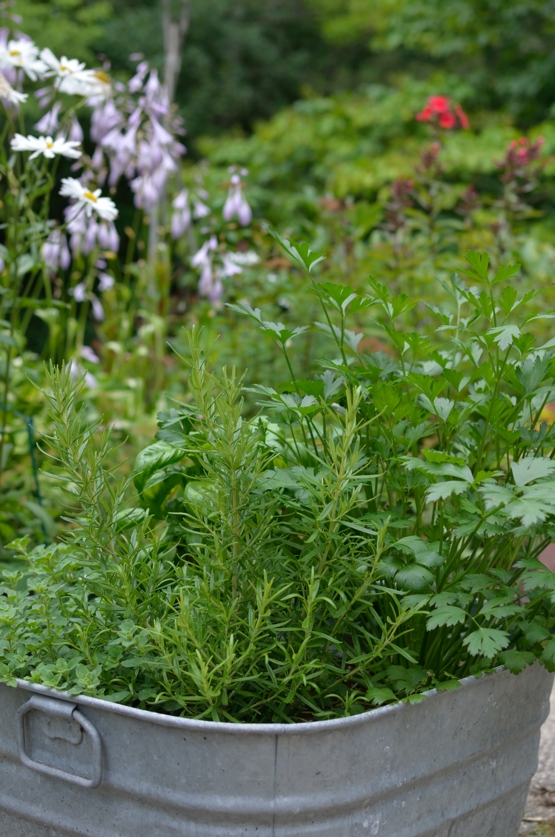
I am not the only one who has put time into this garden. For the last couple of years my daughter has spurred me on by spending hours weeding and mulching. During past visits my dad has done plenty of digging and weeding also.
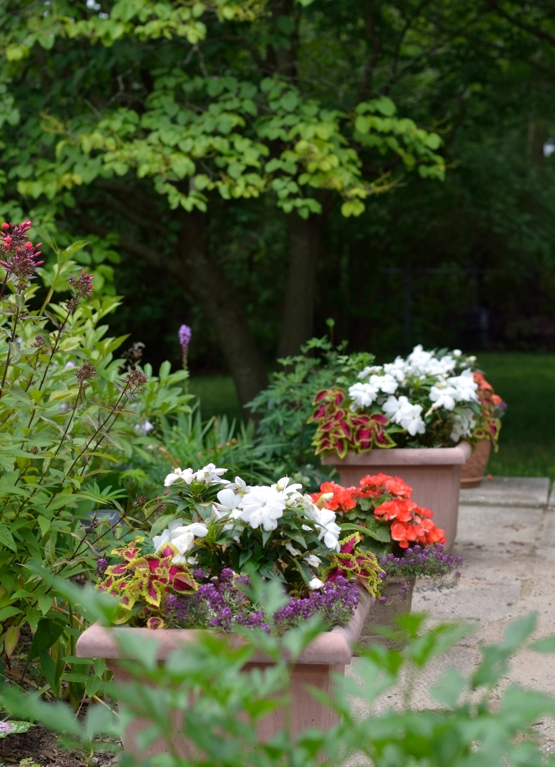
Several friends with expertise have guided me along the way.
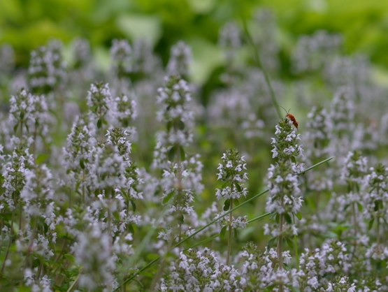
It’s not fancy but it is pretty. My mother, an avid gardener would be surprised but pleased so see how much time I spend on this pastime.
2021 BuJo – April daily record
Posted: April 17, 2021 Filed under: blissful blossoms, Bullet Journal, Dingbat notebooks, Penny Black, Uncategorized | Tags: Bullet Journal, Dingbats notebook, distress markers, Papertrey ink, Penny Black stamps 4 Comments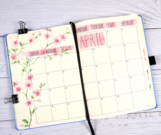
Here is my month at a glance record with the April blossom theme. If you look closely you will see I left no space for April 1st so I tacked it on at the end of the March page and moved on!
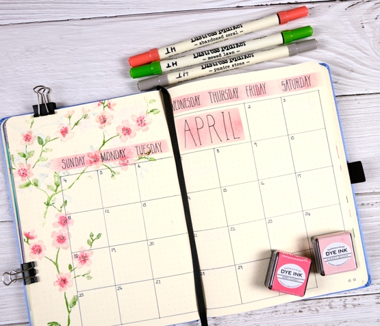
I used the same blissful blossom stamp from Penny Black that I used on the title page and to-do list. This time I masked some strips for blending pink before writing the days and the month title. You can see some evidence of bleed through in the top left corner but it’s just blossom so I like the shadowy effect.
Supplies
(Compensated affiliate links used when possible)
Rain or Shine
Posted: April 9, 2021 Filed under: Coloured pencil, Penny Black, rain or shine, Uncategorized | Tags: Faber-Castell Polychromos Colour Pencil, patterned paper, Penny Black stamps, Ranger archival inks 10 Comments
Paper piecing? Fussy cutting? Cute teddy bears? What is going on? I can’t honestly say other than I was inspired by the April CAS mix up challenge and my current enjoyment of pencil colouring on kraft.

I stamped the PB ‘rain or shine’ stamp on kraft cardstock and Madison patterned paper in jet black archival ink. I started cutting the umbrella out of the patterned paper and realised my (lack of) fussy cutting skills would not do a good job of cutting around the bear’s heads. Instead I cut just the front of the umbrella out and coloured the stamped inside part of the umbrella with a white, a blue and a pale blue pencil. I used two browns for the bear on the left and the lighter brown plus a mustard for the bear on the right. A little pink and white on the faces and I completed my first pencil coloured PB bears!! Do you think cute might be a new direction for me 😉
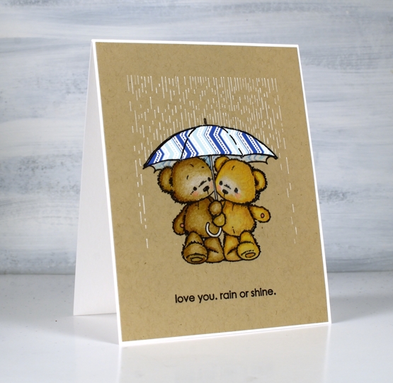
The sentiment is from the same set, stamped in the same ink. To add rain I taped the panel onto my glass mat and positioned a piece of post it tape along the top edge to mask as I ruled lines with a fine white gelly roll pen. Taping the panel to my glass mat and using a t-tuler made the rain pretty straightforward. As I mentioned at the top of the post I’m entering the CAS mix up challenge with this one.
Supplies
(Compensated affiliate links used when possible)
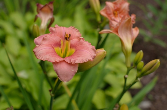
Garden Variety
Posted: February 24, 2021 Filed under: fresh ferns, garden variety, Penny Black, Uncategorized | Tags: distress markers, Penny Black stamps, Ranger Distress inks 7 Comments
I’m enjoying having new flowers to arrange, stamp-wise, that is. Penny Black’s new ‘Daydream collection has some lovely floral stamps including the ‘garden variety’ I’ve used for today’s card alongside ‘fresh fern’, another new one. I used distress inks and markers to ink the stamps; I generally pick at least two colours for the flowers and two colours for the foliage then give the stamp a spritz so the inks begin to blend.
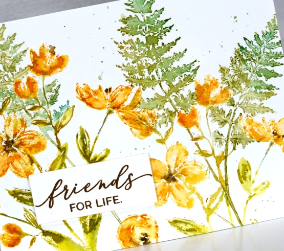
Once I’ve stamped the images I decide whether to blend further with a paint brush and water, for this card I kept it minimal but sometimes I do more blending for a looser watery look. I stamped the ferns after the flowers which required some partial stamping and as well as a little masking to make the ferns appear to be behind.
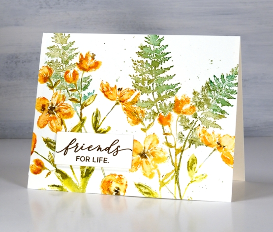
I finished the panel off with splatter then stamped a sentiment and stacked it up on three layers. I have an art journal page in process with the ‘garden variety’ stamp which I will hopefully finish and share with you next week.
Have a great day; thanks for spending some of it here on the blog with me.
Supplies
(Compensated affiliate links used when possible)