The Red Vintage Truck
Posted: November 29, 2024 Filed under: Coloured pencil, Vintage Truck | Tags: Echidna Studios, Faber-Castell Polychromos Colour Pencil 7 Comments
I’m just a wee bit excited about this lovely truck. As you might have guessed, it is one of my daughter’s digital designs and is available as a digital stamp from Echidna Studios to print any size you like. She took a photo of a vintage truck one day and this design is inspired by that truck. It wasn’t in winter and it didn’t have a tree in the back but she added the tree as an optional addition! The digital stamp is called Vintage Truck + Bonus Christmas Tree!

I haven’t done any pencil colouring but I thought it would pop on kraft paper so I printed it on my laser printer. I used Polychromos pencils to colour it and added the snow at the end with a white gel pen

The kraft paper is a thick paper which I bought on Amazon; I like the warmth of the colour. Some kraft papers are a bit more grey. The card is 7″x5″ which is unusual for me but I found an envelope that works. I think I might do more of a burgandy coloured truck next. My daughter did blue on her samples so check them out on the Echidna Studios instagram account. (We’d love you to follow us there and on Pinterest if you’d like to.)
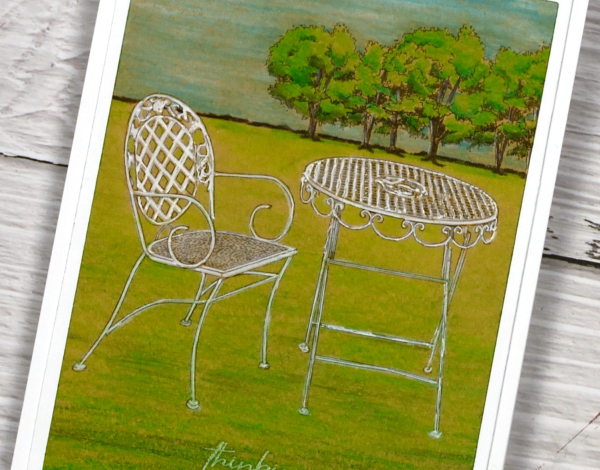
Vintage Patio set
Posted: June 26, 2024 Filed under: Coloured pencil, Echidna Studios, Tori's Trees, vintage patio set | Tags: Echidna Studios, Faber-Castell Polychromos Colour Pencil 4 Comments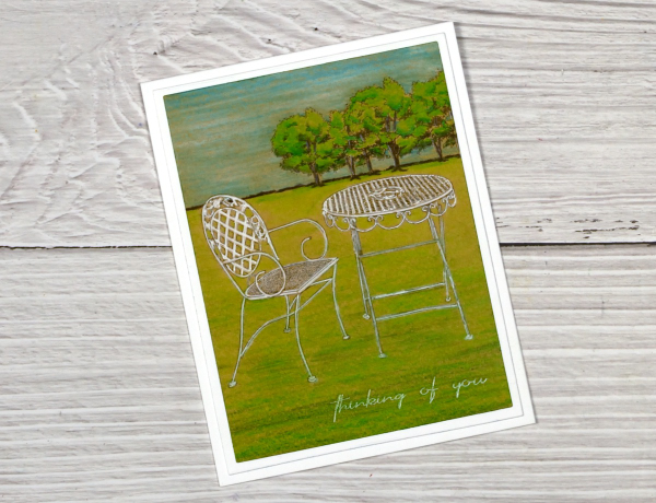
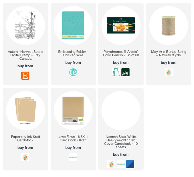
There are some lovely new summer digital images in the Echidna Studios etsy store. My daughter has been busy turning her own photos into line art for printing and colouring. I chose coloured pencils for the Vintage Patio set and added Tori’s Trees to the background. I have fun creating scenes with digital images. Even though the Vintage Patio set includes a table and two chairs I used only one chair on my card and added trees from a different digital set. Adding the ‘thinking of you‘ sentiment gave the card the card a bit of a ‘miss you’ vibe. I always like the look of coloured pencils on kraft paper so I used my Faber Castell polychromos for this card.
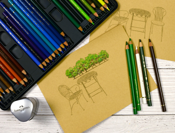
My initial plan was to colour the grass gradually wider from the edges of the trees to the chair and table, creating a wedge shape. I coloured the trees first with three greens then used the same greens plus a couple more to add the grass.

When I had coloured all the grass I used white and grey pencils to colour the table and chair but the green underneath muted the white so I used white gel pens to make the furniture pop. Keeping the wedge shape looked odd so I used my rectangle dies to help me ‘frame’ the image and choose a suitable cropped size.
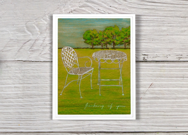
I matted the little scene with a white frame and added it to a white card base. Make sure you pop over to the Echidna Studios store to see the other summery images along with some new ‘ready to print’ coloured cards. We would love you to follow Echidna Studios on Pinterest if you use it; it will help us reach a few more card making enthusiasts!
This post includes an affiliate link from Foiled Fox. If you buy through these links I receive a small commission at no extra cost to you.
Standing Ducks
Posted: March 12, 2024 Filed under: Echidna Studios, sennelier watercolours, standing ducks | Tags: Echidna Studios, Faber-Castell Polychromos Colour Pencil, Fabriano Watercolour Paper, sennelier watercolours 5 Comments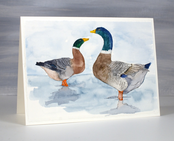
Introducing ‘standing ducks‘, a lovely digital stamp set from Echidna Studios. The weather has turned much warmer round here so there are puddles instead of snow to be seen; the type of weather where you might see ducks standing or swimming around. It is too early for ducklings but in the past we have had to slow down and stop for duck families on the busy road behind our house.

I printed both ducks from the set on hot pressed watercolour paper then painted them with Sennelier watercolour paints. I added some finishing touches with coloured pencils. I also printed the left facing duck on some pastel paper as I received a set of pastel pencils for my birthday and have started learning how to use them. As you can imagine pastel is very soft so it is fun to blend but easy to smudge. When I have done a little more learning and practicing I hope to share some pastel pencil colouring.
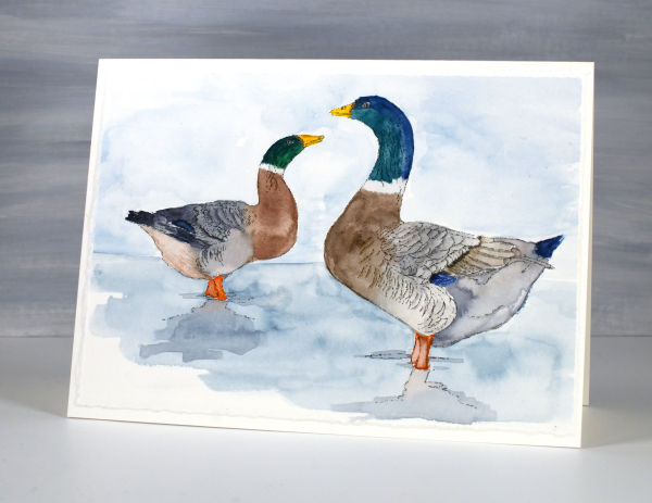
This card is another ‘larger than usual card’ measuring just over 5″ x 7″. The piece of watercolour paper I printed on had one deckled edge so I tore the other three edges to keep a deckled look round the whole panel.
Tulips & more tulips
Posted: February 21, 2024 Filed under: Echidna Studios, sennelier watercolours, tulip background, tulip set, Watercolour | Tags: digital stamps, Echidna Studios, Faber-Castell Albrecht Durer Watercolour pencils, Faber-Castell Polychromos Colour Pencil, Fabriano Watercolour Paper, sennelier watercolours 11 Comments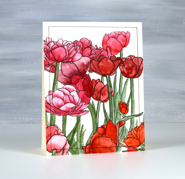
If there are tulips already blooming where you live you must let me know in the comments! It will be another two or three months before they bloom around here. All the more reason to have some blooming here on the blog. The group you see on the card above are part of a new digital stamp called ‘tulip background‘ from Echidna Studios. The whole image is a landscape oriented design and I printed it on hot pressed watercolour paper to be 8½” wide which gave me plenty of choice when deciding which part to use on a portrait oriented card.

I used Sennelier watercolours to paint the design using various mixes of four different reds and pinky red paints. I also used one of the reds to give the green paint a more muted realistic tone. Once I had painted all the tulips and stems I used polychromos pencils to add extra shading and shadow. This is a technique I learnt from Kathy Racoosin and it always adds to the finished panel. I ruled a narrow black line around the panel to frame it.

The flowers below are from a co-ordinating digital set simply called ‘tulip set‘ also from Echidna Studios. The set includes three individual tulips. I didn’t paint this one, my daughter did, using watercolour pencils. She also fussy cut each of the three tulips to create a pretty layered arrangement. This post includes an affiliate link to The Foiled Fox, if you use it I receive a small commission at no extra cost to you.

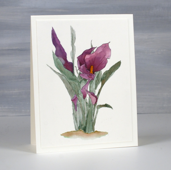
Calla Lilies
Posted: February 12, 2024 Filed under: calla lilies, Coloured pencil, Echidna Studios | Tags: Echidna Studios, Faber-Castell Polychromos Colour Pencil, Fabriano Watercolour Paper, sakura Koi watercolor brush pens 11 Comments
Time for new digital stamps from Echidna Studios and these two, Calla Lilies, are stunners. Once again my daughter drew the designs from one of her own photos. I printed this first one on kraft paper and coloured it with Faber Castell polychromos pencils.

My palette was quite limited as I completed most of the colouring with a pink, a green and a white. When most of the colouring was complete I used a darker pink, a darker green and a black to add final shadows and shading.

I used watercolour techniques to paint the second lily design after printing it on hot pressed watercolour paper.
I found a photo on line to give me some colour inspiration and worked with watercolour brush pens. to get the wine colour I mixed purple and red on a glass mat then picked up the ink with a paintbrush. When using two colours in this way it is easy to get different tones for the shadows and variations just by adding more of either the purple or the red to the mix. I used one green mixed with a small amount of the same red brush pen ink to give me a more muted tone.
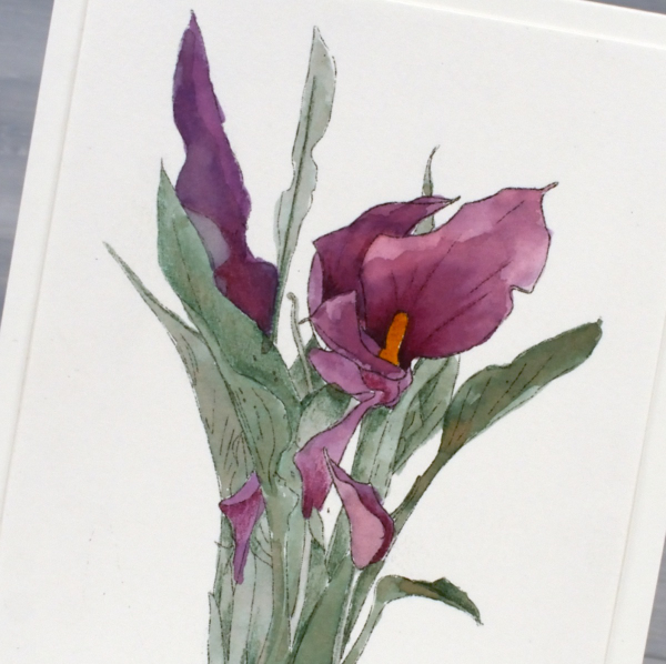
To see another colour scheme and orientation pop over to Echidna Studios instagram and take a look. I chose not to add sentiments even though they would make nice Easter cards. I think they would also be suitable sympathy cards so for now I’m leaving them blank. This post includes affiliate links to The Foiled Fox, if you use them I receive a small commission at no extra cost to you.

Like a box of chocolates
Posted: January 17, 2024 Filed under: Echidna Studios, valentines chocolates | Tags: Echidna Studios, Faber-Castell Polychromos Colour Pencil, Fabriano Watercolour Paper, sennelier watercolours 6 Comments
We have been enjoying a rather nice selection of chocolates at our place; the Christmas stash is lasting well! Not long after Christmas my husband and I celebrated our anniversary and it is only a month before our February birthdays so we’ve never really been big on celebrating valentines day. That being said, I loved painting this box of chocolates. It wasn’t better than eating chocolate but it was very satisfying all the same. The digital image is from the Valentines Chocolate stamp set which includes two images; the other one has chocolate coated strawberries. And yes they are from Echidna Studios, more of my daughter’s art work.

I printed the image on hot pressed watercolour paper and painted with a limited palette of browns, paynes grey, pink and yellow. I used a white gel pen to add some details and did extra shading with coloured pencils after all the painting was completed.

It’s not very obvious but you might just be able to see the texture of an embossing folder on the card base. I used a large cuttlebug folder with curly patterns, subtle but cute. Thanks for dropping by. May your chocolate stash be ever enough! Today’s post features affiliate links to The Foiled Fox. If you buy through these links I receive a small commission at no extra cost to you.
Gazebo
Posted: September 8, 2023 Filed under: Coloured pencil, Echidna Studios, gazebo | Tags: digital stamps, Echidna Studios, Faber-Castell Polychromos Colour Pencil 5 Comments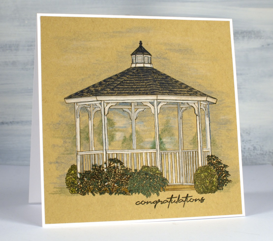
This dreamy gazebo image is the latest digital stamp from Echidna Studios. As I coloured it I had summer gatherings in mind but it would be pretty in autumn colours too.
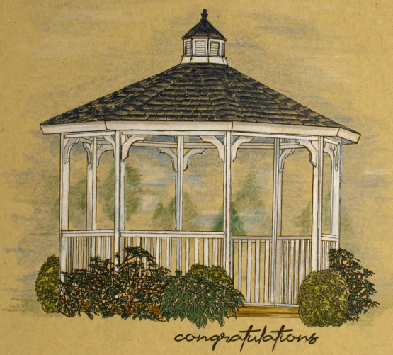
As I’ve mentioned before with a digital stamp it is possible to print it any size so I printed this one to fit a 5.5″ square and the gazebo itself is 4.25″ across. It is printed on a heavy weight kraft paper because I enjoy using coloured pencils on kraft. I really did want a white gazebo so it seemed the obvious choice. This particular kraft paper has a warmer look than the desert storm kraft cardstock I sometimes use. As you can see I coloured the gazebo and plants with enough pressure to fill the outlines and used the side of the sharpened pencil tip to add shading to the background and sky area.
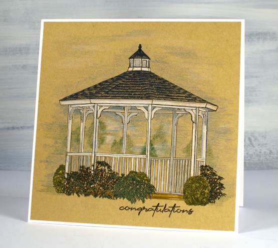
I added a sentiment from the Simply Graphic set ‘English sentiments‘ then attached the panel to a white card base. We went to a wedding many years ago where the bride and groom stood in a gazebo and the guests gathered round to watch which made me think a ‘congratulations’ sentiment fitted nicely.
There are fifty items in the Echidna Studios store now; please pop over and have a look around.
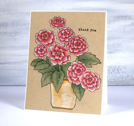
Potted Pretties in Pencil
Posted: May 24, 2023 Filed under: Coloured pencil, how sweet, Penny Black, potted pretties | Tags: Faber-Castell Polychromos Colour Pencil, Penny Black stamps 5 Comments
This is the new ‘potted pretties’ stamp from Penny Black; it is pretty isn’t it? Although I love the soft blends of loose watercolour I also find pencil colouring very satisfying too, especially on kraft cardstock.

I use Faber Castell Polychromos pencils and chose a dark and a light pink along with white for the petals, two greens for the leaves and a tan with white for the pot. Once I had almost finished I added some more shadow to the centre of some flowers and the shadows of the leaves with a dark burgandy pencil – a trick I learned from Kathy Racoosin, colouring wizard.
If no-line watercolour is more your thing then I am colouring the same image in that style too. I’ll post it on the blog soon.
Don’t forget to check out my new online course if you haven’t already. The discount TEAMBLOG10 is still valid for a 10% discount at checkout. Thank you to those of you who have joined already. I am excited to hear from or see some prints once you’ve had a chance to dive in!
And another event you might be interested in if you are local is the Community Paper Crafting Garage Sale on June 10.

(Compensated affiliate links from Foiled Fox)
Spring Emerges
Posted: March 28, 2023 Filed under: Coloured pencil, Penny Black, spring emerges | Tags: Faber-Castell Polychromos Colour Pencil, Penny Black stamps, Waffle Flower dies 3 Comments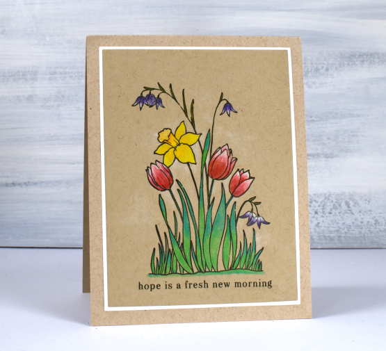
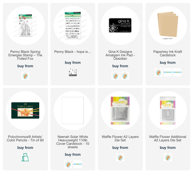
Spring is emerging around my place but not to the extent suggested in this stamp. I do have a daffodil plant that has broken through the soil and I can see a bud on it even though it is a couple of feet from the snow drifts! The stamp featured today is called ‘spring emerges’ and it is a small transparent stamp from Penny Black’s latest release.
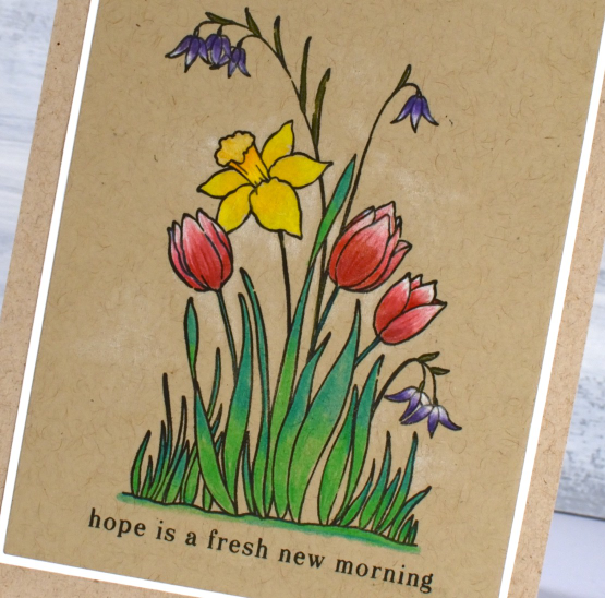
It’s been a while since my coloured pencils were the stars of the show but after finishing this little panel I might keep them on my desk a little longer. I particularly like pencils on kraft cardstock. I often add either a base of white pencil or just highlights so the brown of the kraft doesn’t make everything too muted. On this card I blended white and reds for the tulips and added white highlights purple flowers. I layered a mix of yellows and oranges for the daffodil and two greens for the leaves and grass. I kept the panel and stamp in the stamp positioner in case I wanted to restamp over the top after colouring (which I did). With a stamp this small sometimes my colouring goes outside or over the lines, restamping just sharpened the outline. I used Gina K’s osidian amalgam ink.
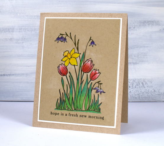
I used A2 layer dies to cut the panel and the mat and added a sentiment from the PB ‘hope is…’ set. You can see some very pale white shading around the flowers too which was done with the white pencil.
Wishing you a hope filled day.
(Compensated affiliate links from Foiled Fox, Scrap n Stamp)
Autumn Harvest Scene
Posted: October 26, 2022 Filed under: autumn harvest scene, chicken wire, Echidna Studios | Tags: Echidna Studios, Faber-Castell Polychromos Colour Pencil, Taylored Expressions 1 Comment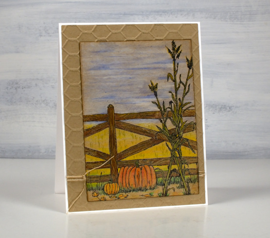
This delightful scene was designed by my daughter and is available as a digital download for cardmaking or other harvest themed crafting or decorating. Her etsy shop is called Digitalis Designs and is launching with a selection of harvest and halloween designs. I have been giving her suggestions for future releases!
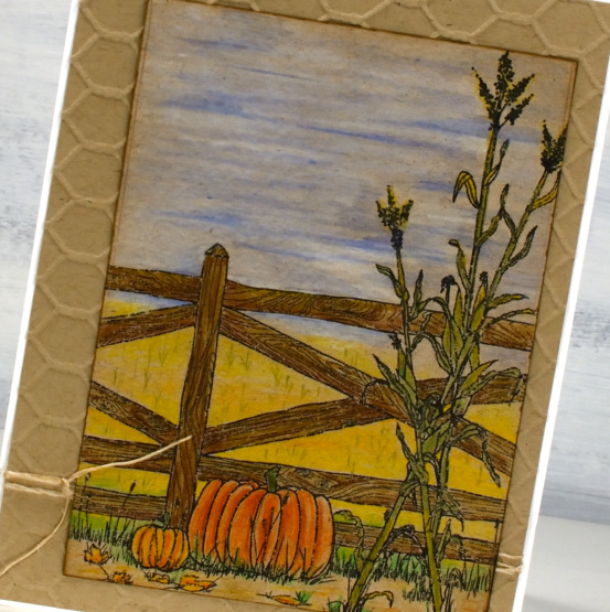
This is the first time I have created with a digital stamp so it’s just the beginning. I printed the ‘autumn harvest scene’ on kraft cardstock then coloured with polychromos pencils. I printed the scene to fit on an A2 card but the beauty of digital stamps is you can print them any size on many things!
I have had the cool chicken wire embossing folder from Taylored Expressions for a while waiting for a suitable time to use it. What could be better than a farm scene?
(Compensated affiliate links from Foiled Fox & Scrap n Stamp)