Frames in frames
Posted: March 24, 2025 Filed under: A2 layers, AALL & Create, Additional A2 layers, Echidna Studios, gel press, grafix, snowflake digital stamp set, Waffle Flower | Tags: digital stamps, Echidna Studios, gel press, Waffle Flower dies 3 Comments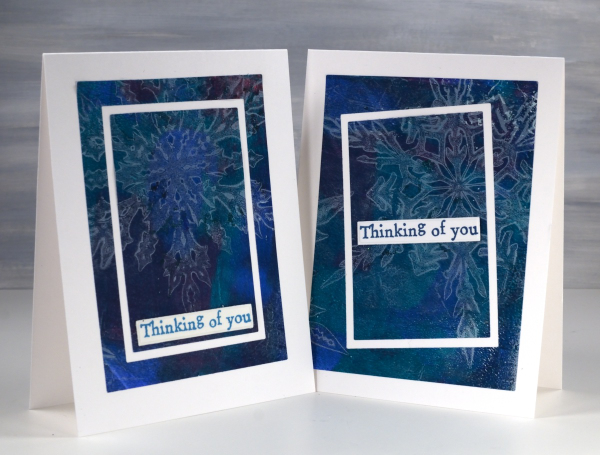
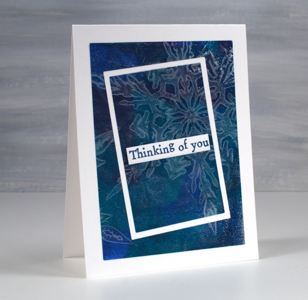
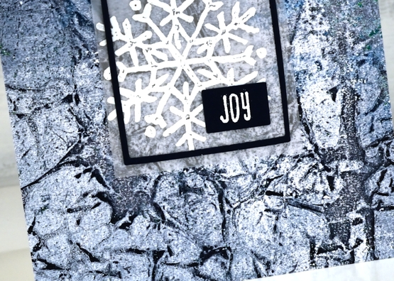
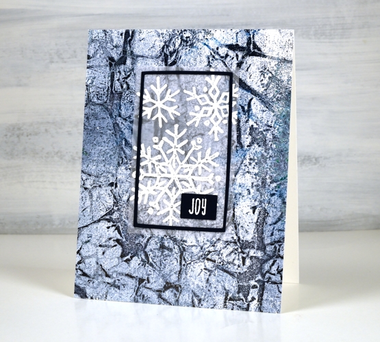
As I write this post I realise that these cards feature snowflakes when probably all you want to see is flowers! Nevertheless I see snow falling outside this morning; it’s not over yet where I live. I used snowflake masks cut from Grafix matte duralar using my cricut and the digital snowflake set from Echidna Studios.
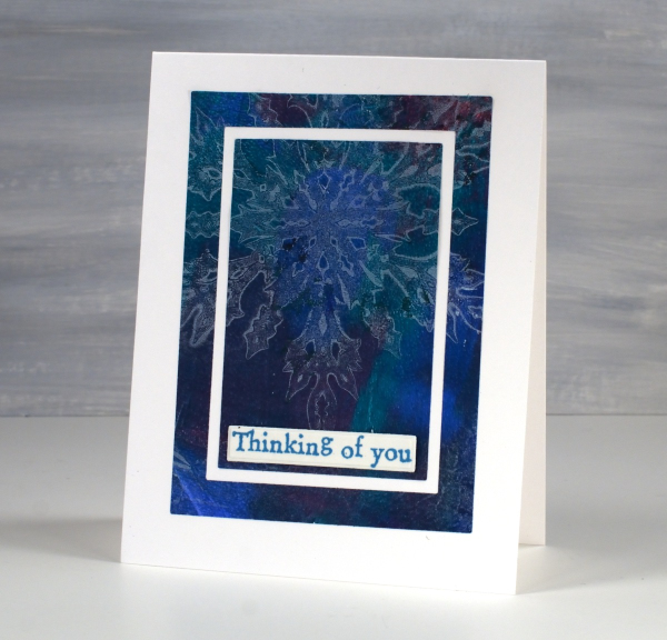
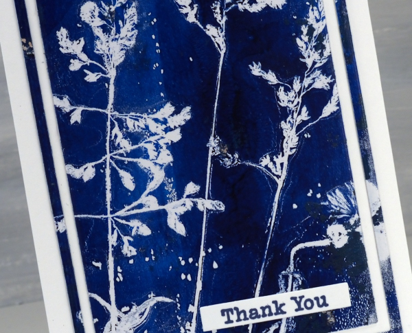
In my mind this post is more about the layouts than the images. I have featured the frame in frames idea before as a way to feature a large patterned panel but add some extra interest as you do so. I used the Waffle Flower A2 layer dies to cut my frames and cut all three rectangles at one time taping dies to panel to plate to keep everything in place.
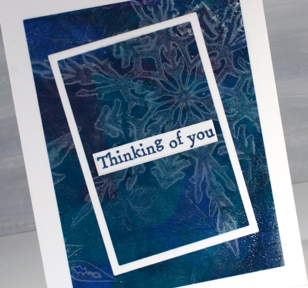
On one card I kept the frames parallel to each other but on the one above I offset the two centre dies for a wonky look. The print is a gel print created with a white snowflake layer then lifted with a mixed layer of blue, turquoise and red paint. I expected the mixed layer to be much bolder but I’m happy the paints blended into a muted mix. The sentiments are from the AALL & Create ‘everyday sentiments’ set.
Gel Printed Cornflower & Grasses
Posted: August 21, 2024 Filed under: Darkroom Door, gel press, Waffle Flower | Tags: Darkroom Door stamps, gel press, gel printing, Waffle Flower dies 10 Comments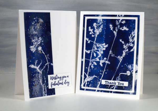
Arting and crafting has looked a bit different for me recently. This week I am ‘Professor Paint’ doing crafts each day with the children at our church day camp. There has been quite a bit of prep and experimenting going on over the past weeks. I made the sign for my ‘Art Lab’ at camp using gel prints but the crafts we’ve been doing haven’t involved gel printing at all. We have done some watercolouring with paint and water soluble markers though.
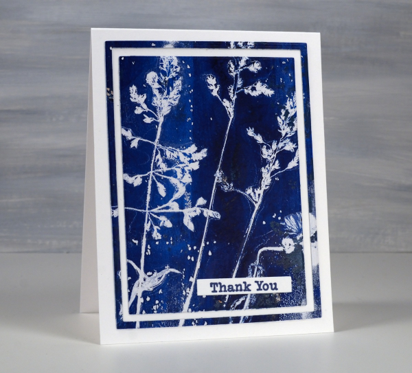
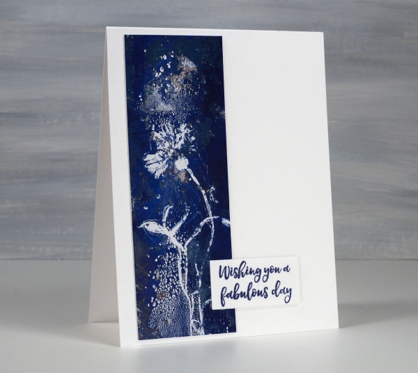
The two cards shown today were both made from one print. I don’t always take time to plan the layout of a botanical print so some prints look balanced and others don’t. I ended up cutting the cornflower image off the side of the full print to make the card below and left the grasses together to make the card above.
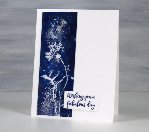
The print was definitely not perfect. You can see on the card above some odd texture from the paint. I thought it looked a bit like a spray of water above and below the cornflower.
I don’t remember which paints I used but it looks like either two blues or a blue and a black.
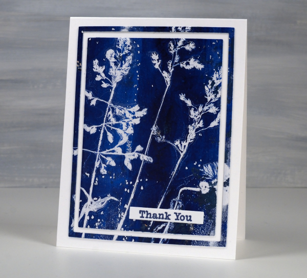
I’ve made a few cards lately using the framing technique above. I use three nesting dies to cut a large rectangle panel, then another inside and another inside that. I leave the middle frame out of the layout but could save it for another card or a strip on an envelope perhaps. The sentiments are from Darkroom Door. The printing technique used was the one shown in my last short video.
Totally Dotty
Posted: July 15, 2024 Filed under: AALL & Create, Foiled Fox store, nesting squares, Penny Black, The Foiled Fox, totally dotty stencil, Waffle Flower | Tags: AALL & Create, Penny Black stamps, Ranger Distress inks, Waffle Flower dies Leave a comment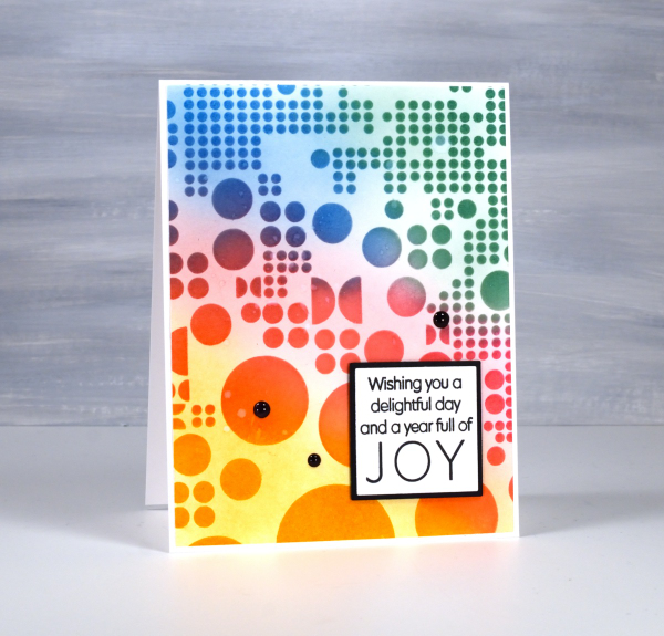
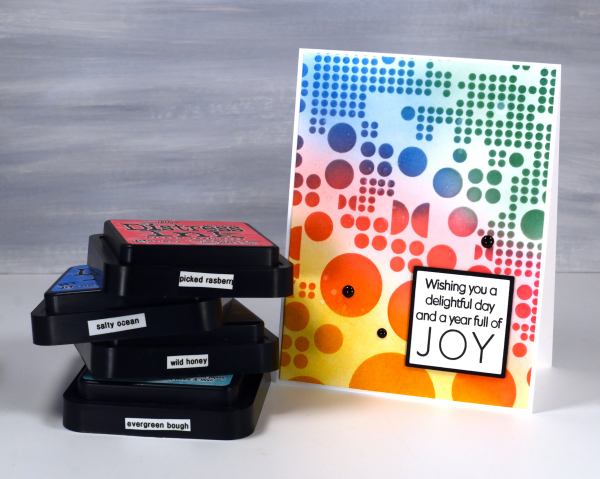
Yes, the stencil used for this card is called ‘Totally Dotty’! I mean what else would you call it? It is a large stencil from AALL & Create sent to me by the Foiled Fox so I could do totally dotty things with it. I blended inks through it for this card but I have also blended paint through it on gel prints and will no doubt use it with alcohol inks and art journals as well.
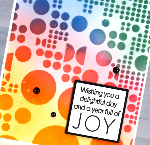
I blended wild honey, picked raspberry, salty ocean and evergreen bough distress inks through the stencil with blending brushes then, when I lifted it, blended more ink to soften the stark white background. This is a technique I’ve seen the blending wizards use.

Such a colourful background called for a contrasting sentiment so I stamped in black on white then matted in black using Waffle Flower square nesting dies. Nesting dies definitely cut down on the mistakes I make in creating very slim mats for panels. Did you see I added enamel dots; not a common embellishment for me but the water splatter just didn’t make enough impact so shiny black dots to the rescue. Make sure you pop over to the Foiled Fox blog and online store to be inspired and delighted. (Yes, there are affiliate links used in this post, no extra cost for you but a bonus to me!)
Spring Emerges
Posted: March 28, 2023 Filed under: Coloured pencil, Penny Black, spring emerges | Tags: Faber-Castell Polychromos Colour Pencil, Penny Black stamps, Waffle Flower dies 3 Comments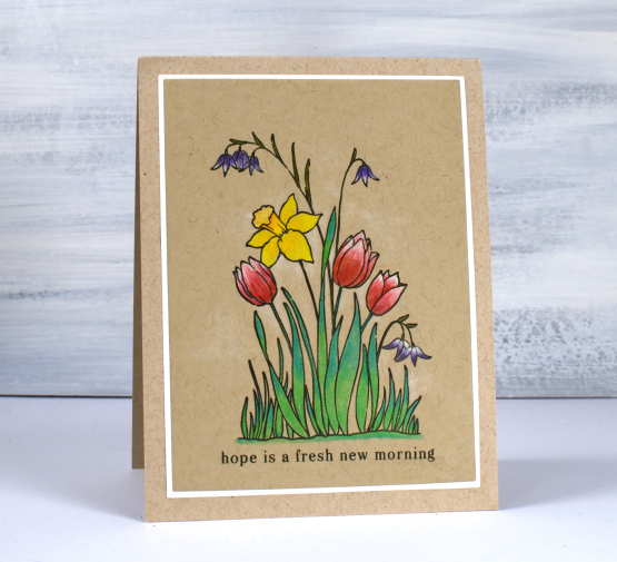
Spring is emerging around my place but not to the extent suggested in this stamp. I do have a daffodil plant that has broken through the soil and I can see a bud on it even though it is a couple of feet from the snow drifts! The stamp featured today is called ‘spring emerges’ and it is a small transparent stamp from Penny Black’s latest release.
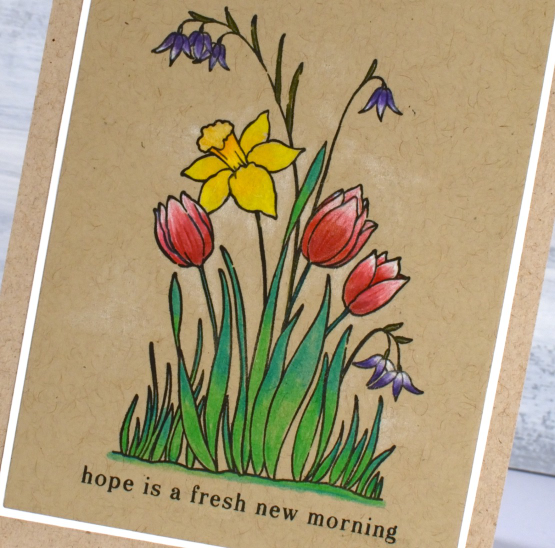
It’s been a while since my coloured pencils were the stars of the show but after finishing this little panel I might keep them on my desk a little longer. I particularly like pencils on kraft cardstock. I often add either a base of white pencil or just highlights so the brown of the kraft doesn’t make everything too muted. On this card I blended white and reds for the tulips and added white highlights purple flowers. I layered a mix of yellows and oranges for the daffodil and two greens for the leaves and grass. I kept the panel and stamp in the stamp positioner in case I wanted to restamp over the top after colouring (which I did). With a stamp this small sometimes my colouring goes outside or over the lines, restamping just sharpened the outline. I used Gina K’s osidian amalgam ink.
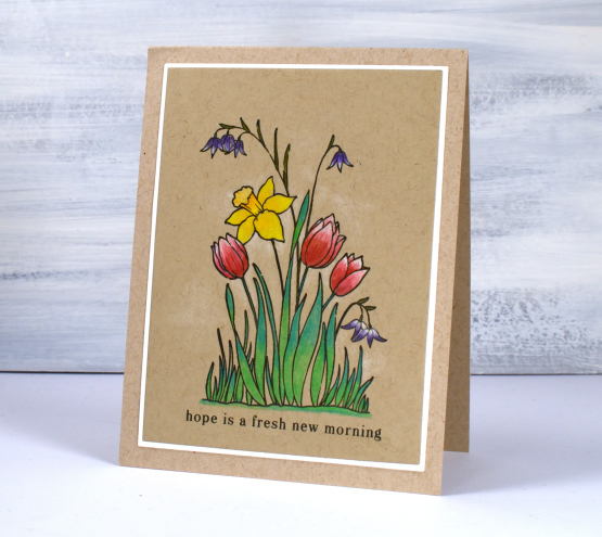
I used A2 layer dies to cut the panel and the mat and added a sentiment from the PB ‘hope is…’ set. You can see some very pale white shading around the flowers too which was done with the white pencil.
Wishing you a hope filled day.
(Compensated affiliate links from Foiled Fox, Scrap n Stamp)
Snow & Ice
Posted: April 13, 2022 Filed under: Darkroom Door, gel press, pine cones, snow flakes | Tags: Darkroom Door stamps, gel press, gel printing, Waffle Flower dies 4 Comments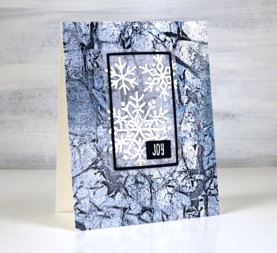
Although most of the ice is now gone, over the last few weeks I have seen it breaking up on the river near our home. The ice that once covered most of the bay cracks and ends up in layers as it breaks, moves and eventually disappears. When I lifted the print above from my gel plate I immediately thought of the cracking ice. It also reminded me of the colours in glaciers, not usually navy blue but I have seen blues and aquas.
Around the time the ice was breaking and melting this snowflake stamp arrived from Darkroom Door so I stamped it on vellum to overlay the background. I really didn’t want to lose much of the background hence the vellum and then a very narrow navy frame and sentiment.
This gel print delighted me, both the colours and the pattern. That’s the fun of gel printing; you never know quite what you will get. I will be sharing a few more gel prints turned into cards and backgrounds over the next few days. In May I will be teaching a couple of gel printing workshops at Crop A While. I’d love to have you join me in making surprising and intriguing prints.
Supplies
(Compensated affiliate links used when possible)
Gel print city journal page
Posted: June 17, 2021 Filed under: Art Journal, gel press, Waffle Flower | Tags: Fabriano art journal, gel press, gel printing, gelli plate, Waffle Flower dies 5 Comments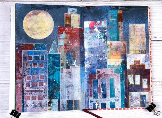
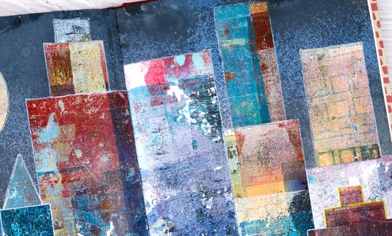
Continuing my week of gel prints you might see a resemblance between yesterday’s projects and todays. I posted large cityscape projects yesterday made by masking areas of the gel plate with paper rectangles cut from stiff magazine paper. Some of the masks had little shapes cut from them with dies. I used the magazine masks over and over on several prints and experiments so by the end they were covered in paint and way more interesting than they started out.
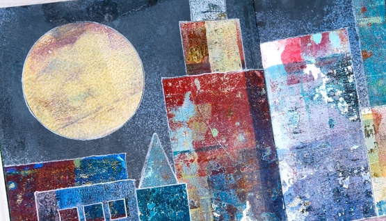
Rather than save the masks or throw them away I turned them into a city scape art journal page. Once again my scraps are prettier than some of my prints! Every time I brayered a new colour onto the gel plate I lay the rectangle masks paint side down so they ended up picking up paint, pattern and texture while occasionally letting a bit of text or photo show through.
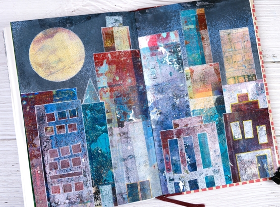
The background sky was done with distress sprays, a few blues and a black (listed below) spritzed over the open spread to cover the top half of both pages.
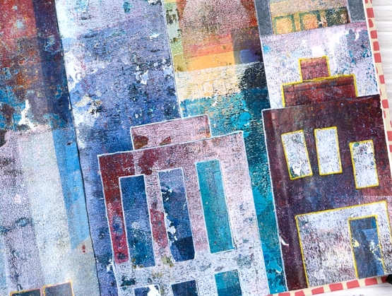
Once the sky was dry I arranged and rearranged the ‘buildings’ so I would have contrasting heights and colours across the scene. Some of the tiny shapes die cut from the masks also had paint on them so I used a few as doors on this scene. The windows are all cut outs revealing some of the prints underneath. I used matte medium and a Tim Holtz collage brush to glue everything down then decided to outline the shapes with gel pens to separate them a little more.
This art journal design was one of those rare ones that turned out as I imagined it might. Doesn’t always go that way!
I mentioned a couple of days ago I am appearing on Craft Roulette Live Improv show on Friday night. I’d love to see you there if you are free. You can hop on the chat and say hello. The details are here and here
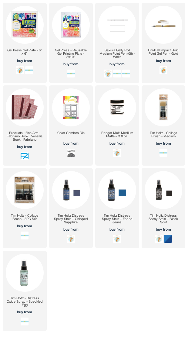
Supplies
(Compensated affiliate links used when possible)
Rose Dance & a Giveaway
Posted: May 19, 2021 Filed under: A2 layers, Additional A2 layers, Papertrey Inks, Penny Black, rose dance, Waffle Flower | Tags: Papertrey ink, Penny Black stamps, Waffle Flower dies 48 Comments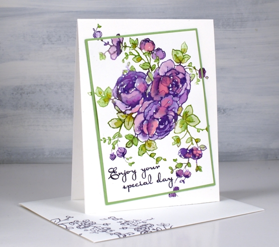
When I first posted a card with the PB ‘rose dance‘ stamp I mentioned I’d been putting it to work with several techniques. To create this card I worked on hot pressed watercolour paper with papertrey ink cubes.
With the stamp and paper in the stamp positioner I inked the roses in ‘royal velvet’ and a few dabs of ‘pure poppy’ inks, spritzed then stamped. I used three different greens (listed below) for the leaves and stems. The papertrey ink cubes are fairly juicy to start with but with a spritz of water before stamping the ink is wet enough to blend into the petals and leaves.
When it came to putting the card together I decided to mix things up a little by cutting out the main image on an angle before adding some dimension with a few extra layers of cardstock. The Waffle Flower A2 layer dies and additional layer dies made it possible to cut the image from the panel, cut a scrap the same size to fit in the space and cut a slightly larger green mat before putting it back together. I pulled out an older PB sentiment set ‘kind words’ and stamped the message in dusty concord archival ink.
This technique is covered in lessons 2 of my new online class FLORAL FAVES. The lessons cover a range of my favourite techniques, some simple and elegant, others requiring more time and fine detail but all outlined clearly on video so they can become your favourites too! Registration opens tomorrow and I will have all the information in tomorrow’s blog post.
If you would like to win a place in the FLORAL FAVES class please comment below telling me one of your favourite flower stamps. I will randomly pick a winner and announce it here on the blog on Monday.
Supplies
(Compensated affiliate links used when possible)
Lemon Lush – pencil on kraft
Posted: March 26, 2021 Filed under: A2 layers, Additional A2 layers, Coloured pencil, floral notes, lemon lush, Pink Fresh studio, Waffle Flower | Tags: brutus monroe embossing powder, Faber-Castell Polychromos Colour Pencil, Pink Fresh studio, Waffle Flower dies 5 Comments
I have a second card featuring the pretty ‘lemon lush’ stamp from Pinkfresh Studio. Last time I used peerless watercolours for a bold, bright look. Today’s white on kraft combo is softer and subtler.

I stamped the large 6″ x 6″ stamp on kraft cardstock in Brutus Monroe alabaster ink then embossed in alabaster powder. I used polychromos pencils to colour all the elements. The whole lemons needed a few shades of yellow and orange but the rest of the design was completed with pairs of inks, two greens, two pinks or two yellows with sometimes the addition of white to soften or brighten.
The sentiment is from the Pinkfresh set ‘floral notes’ embossed in white then cut and framed with the help of my ever-useful Waffle Flower A2 layer dies.
Wishing you a bright and happy day!
Supplies
(Compensated affiliate links used when possible)
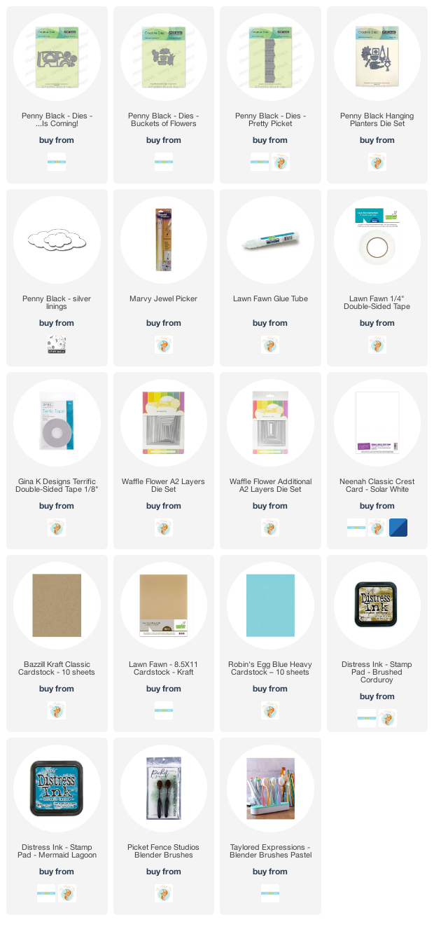
Flower truck…is coming
Posted: February 8, 2021 Filed under: ...is coming, A2 layers, Additional A2 layers, buckets of flowers, hanging planters, Penny Black, pretty picket, silver linings, Waffle Flower | Tags: Penny Black creative dies, Waffle Flower dies 3 Comments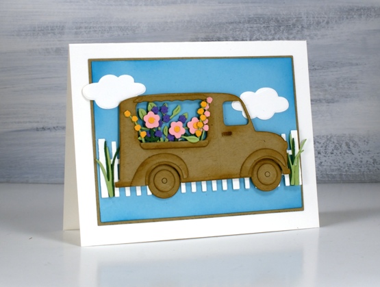
Not my usual style, you know I don’t often take the cute route (pun intended) but this little truck really appealed to me. As I worked on this card and looked through my dies for flowers I realised I could also turn it into an icecream truck or a pumpkin truck and maybe a postal delivery truck.
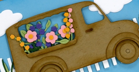
My initial plan was to die cut everything from kraft cardstock except for the flowers but once I’d done the truck and flowers I decided to add more colour with a picket fence and some clouds on a bright blue background. I used a blending brush to add ‘brushed corduroy’ distress ink around all the pieces of the truck and ‘mermaid lagoon’ around the blue panel. I’ve listed all the dies below; as you can imagine the fiddliness factor on this card was high but I persevered and the satisfaction factor is also high.
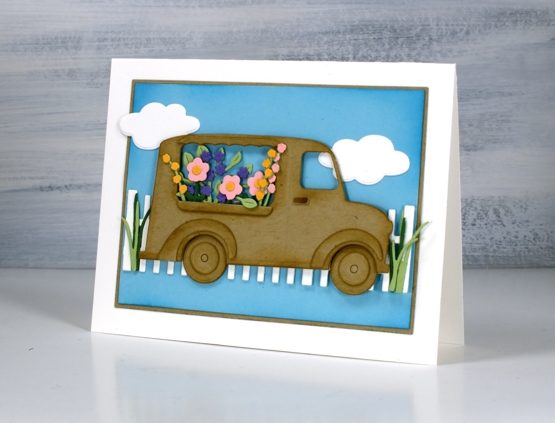
I haven’t added a sentiment but feel that it could be good for many occasions so I will wait and see. I’d be happy to see a truck bursting with flowers in my driveway right about now when everything is covered in snow.
Supplies
(Compensated affiliate links used when possible)
Christmas Colours
Posted: November 24, 2020 Filed under: Coliro paints, Coloured pencil, Finetec paints, {heart} Christmas | Tags: brutus monroe embossing powder, Faber-Castell Polychromos Colour Pencil, Finetec artist mica watercolour paint, Penny Black stamps, Waffle Flower dies 5 Comments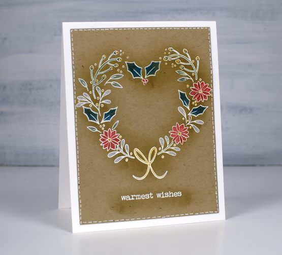
I’ve started thinking about colours I’ll use to decorate this year. I pick a different colour scheme every year. Not wildly different, usually there will be gold or silver along with a colour or white. I don’t buy new decorations every year; I have a selection of wide ribbons plus a few boxes of coloured balls and a range of unique decorations we’ve collected, made or been given over the years.
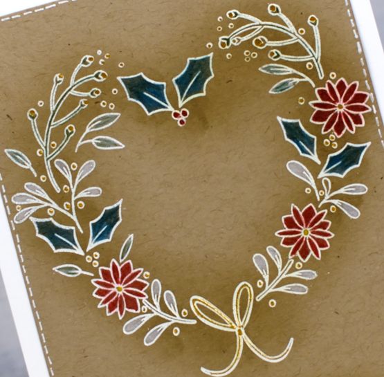
One year I did a rustic, natural sort of theme with burlap ribbon and wood ornaments with some white and gold similar to the colours in this card. This year I am thinking of black and gold. I’m not thinking of black in a sad and dark way more of a rich velvet with tartan ribbon kind of way. Just before and after Christmas last year I bought quite a few of the same decoration, heavily discounted, in preparation for a class I planned to teach this month. Well that’s not happening but I am hoping to use some of my stash and share them here. And there will be black and tartan in the mix.
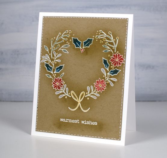
I stamped the heart from PB {heart} Christmas set in versamark and embossed in white powder on kraft cardstock then used a blending brush to blend frayed burlap distress ink over the stamping to give it a shadow. I know the effect I was after with the blending but not sure that I’ve achieved it here.
I used polychromos pencils and Coliro pearlescent paints to colour in the outline stamping. I embossed in white a sentiment from the PB merry up set and used a white gel pen to add a stitching line around the edge of the panel.
Supplies
(Compensated affiliate links used when possible)