Frames in frames
Posted: March 24, 2025 Filed under: A2 layers, AALL & Create, Additional A2 layers, Echidna Studios, gel press, grafix, snowflake digital stamp set, Waffle Flower | Tags: digital stamps, Echidna Studios, gel press, Waffle Flower dies 3 Comments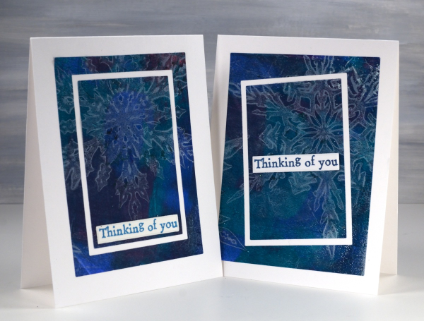
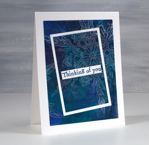
As I write this post I realise that these cards feature snowflakes when probably all you want to see is flowers! Nevertheless I see snow falling outside this morning; it’s not over yet where I live. I used snowflake masks cut from Grafix matte duralar using my cricut and the digital snowflake set from Echidna Studios.
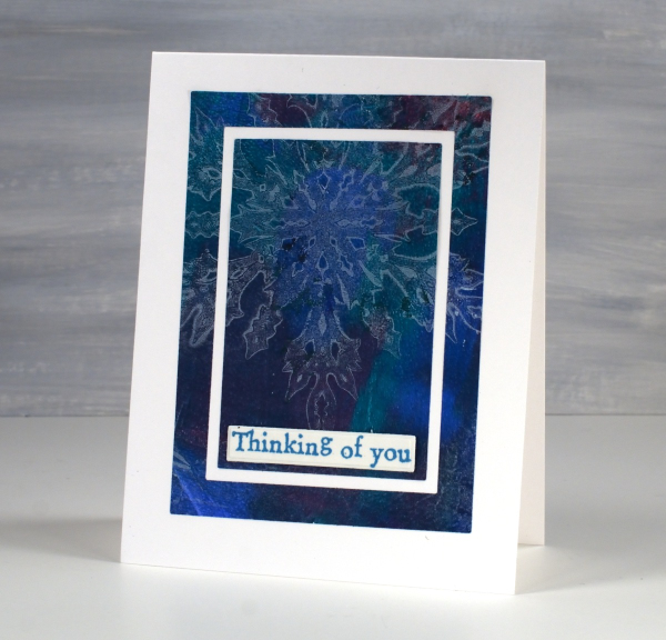
In my mind this post is more about the layouts than the images. I have featured the frame in frames idea before as a way to feature a large patterned panel but add some extra interest as you do so. I used the Waffle Flower A2 layer dies to cut my frames and cut all three rectangles at one time taping dies to panel to plate to keep everything in place.
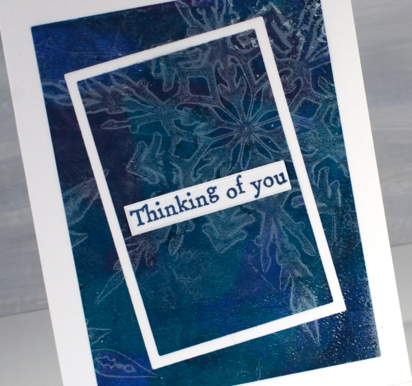
On one card I kept the frames parallel to each other but on the one above I offset the two centre dies for a wonky look. The print is a gel print created with a white snowflake layer then lifted with a mixed layer of blue, turquoise and red paint. I expected the mixed layer to be much bolder but I’m happy the paints blended into a muted mix. The sentiments are from the AALL & Create ‘everyday sentiments’ set.
Rose Dance & a Giveaway
Posted: May 19, 2021 Filed under: A2 layers, Additional A2 layers, Papertrey Inks, Penny Black, rose dance, Waffle Flower | Tags: Papertrey ink, Penny Black stamps, Waffle Flower dies 48 Comments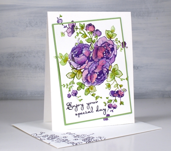
When I first posted a card with the PB ‘rose dance‘ stamp I mentioned I’d been putting it to work with several techniques. To create this card I worked on hot pressed watercolour paper with papertrey ink cubes.
With the stamp and paper in the stamp positioner I inked the roses in ‘royal velvet’ and a few dabs of ‘pure poppy’ inks, spritzed then stamped. I used three different greens (listed below) for the leaves and stems. The papertrey ink cubes are fairly juicy to start with but with a spritz of water before stamping the ink is wet enough to blend into the petals and leaves.
When it came to putting the card together I decided to mix things up a little by cutting out the main image on an angle before adding some dimension with a few extra layers of cardstock. The Waffle Flower A2 layer dies and additional layer dies made it possible to cut the image from the panel, cut a scrap the same size to fit in the space and cut a slightly larger green mat before putting it back together. I pulled out an older PB sentiment set ‘kind words’ and stamped the message in dusty concord archival ink.
This technique is covered in lessons 2 of my new online class FLORAL FAVES. The lessons cover a range of my favourite techniques, some simple and elegant, others requiring more time and fine detail but all outlined clearly on video so they can become your favourites too! Registration opens tomorrow and I will have all the information in tomorrow’s blog post.
If you would like to win a place in the FLORAL FAVES class please comment below telling me one of your favourite flower stamps. I will randomly pick a winner and announce it here on the blog on Monday.
Supplies
(Compensated affiliate links used when possible)
Lemon Lush – pencil on kraft
Posted: March 26, 2021 Filed under: A2 layers, Additional A2 layers, Coloured pencil, floral notes, lemon lush, Pink Fresh studio, Waffle Flower | Tags: brutus monroe embossing powder, Faber-Castell Polychromos Colour Pencil, Pink Fresh studio, Waffle Flower dies 5 Comments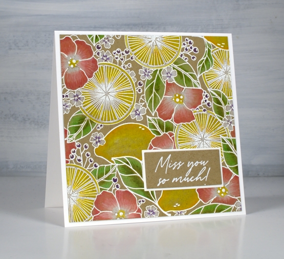
I have a second card featuring the pretty ‘lemon lush’ stamp from Pinkfresh Studio. Last time I used peerless watercolours for a bold, bright look. Today’s white on kraft combo is softer and subtler.

I stamped the large 6″ x 6″ stamp on kraft cardstock in Brutus Monroe alabaster ink then embossed in alabaster powder. I used polychromos pencils to colour all the elements. The whole lemons needed a few shades of yellow and orange but the rest of the design was completed with pairs of inks, two greens, two pinks or two yellows with sometimes the addition of white to soften or brighten.
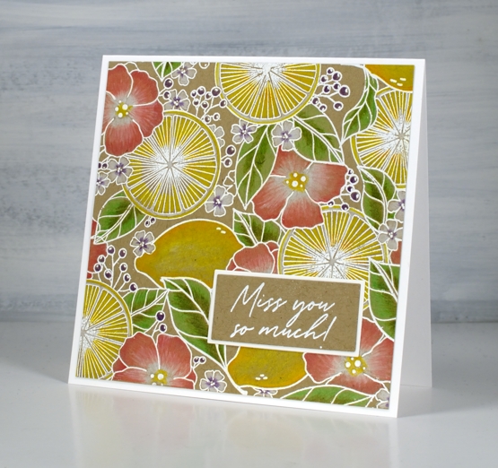
The sentiment is from the Pinkfresh set ‘floral notes’ embossed in white then cut and framed with the help of my ever-useful Waffle Flower A2 layer dies.
Wishing you a bright and happy day!
Supplies
(Compensated affiliate links used when possible)
Flower truck…is coming
Posted: February 8, 2021 Filed under: ...is coming, A2 layers, Additional A2 layers, buckets of flowers, hanging planters, Penny Black, pretty picket, silver linings, Waffle Flower | Tags: Penny Black creative dies, Waffle Flower dies 3 Comments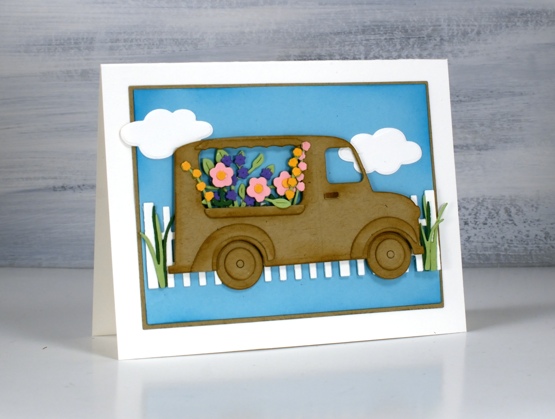
Not my usual style, you know I don’t often take the cute route (pun intended) but this little truck really appealed to me. As I worked on this card and looked through my dies for flowers I realised I could also turn it into an icecream truck or a pumpkin truck and maybe a postal delivery truck.
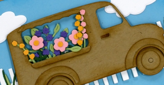
My initial plan was to die cut everything from kraft cardstock except for the flowers but once I’d done the truck and flowers I decided to add more colour with a picket fence and some clouds on a bright blue background. I used a blending brush to add ‘brushed corduroy’ distress ink around all the pieces of the truck and ‘mermaid lagoon’ around the blue panel. I’ve listed all the dies below; as you can imagine the fiddliness factor on this card was high but I persevered and the satisfaction factor is also high.
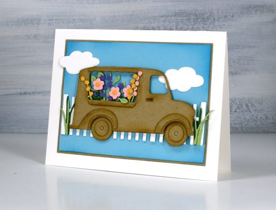
I haven’t added a sentiment but feel that it could be good for many occasions so I will wait and see. I’d be happy to see a truck bursting with flowers in my driveway right about now when everything is covered in snow.
Supplies
(Compensated affiliate links used when possible)
Woolly Wishes
Posted: January 18, 2021 Filed under: A2 layers, Additional A2 layers, Darkroom Door, Karin brushmarkers, knitting, Penny Black, Waffle Flower | Tags: Darkroom Door stamps, Karin brushmarkers, Penny Black creative dies, Tsukineko Memento inks, WOW embossing powders 6 Comments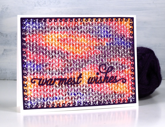
This is the first knitting project I have done in years! I keep meaning to pull out some needles and wool to see if it hurts my hands to knit. I have a little stash of wool and plenty of different sized needles and I used to knit while watching tv. My last project was never finished then my hands became quite sore so I haven’t tried again.
When I first saw this Darkroom Door knitting stamp I couldn’t believe how realistic it looked when stamped and coloured. I stamped with versamark and embossed in clear powder on hot pressed watercolour paper for both cards. On the panel above I used Karin brushmarkers (amber, lilac, violet blue, magenta) to colour random shapes over the panel just like you get when you knit multicoloured yarn. I spritzed lighlly over the panel with water to get the colours to blend just a little.
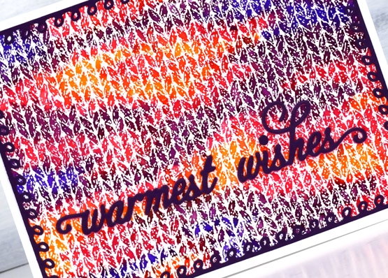
I knew just the dies to use to complete the card. Penny Black has a set of looped frame dies which look a little like knitting stitches and the PB warmest wishes die is made of small curly letters that look like loops of wool. I cut both from purple cardstock with double sided adhesive on the back.
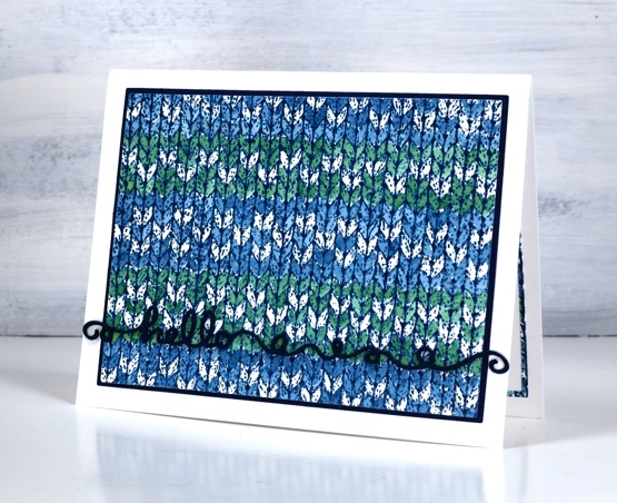
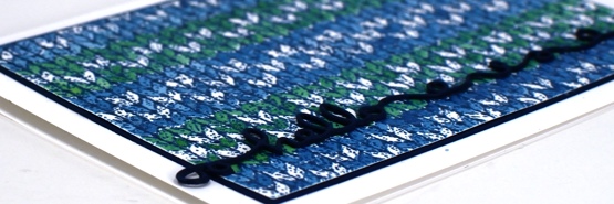
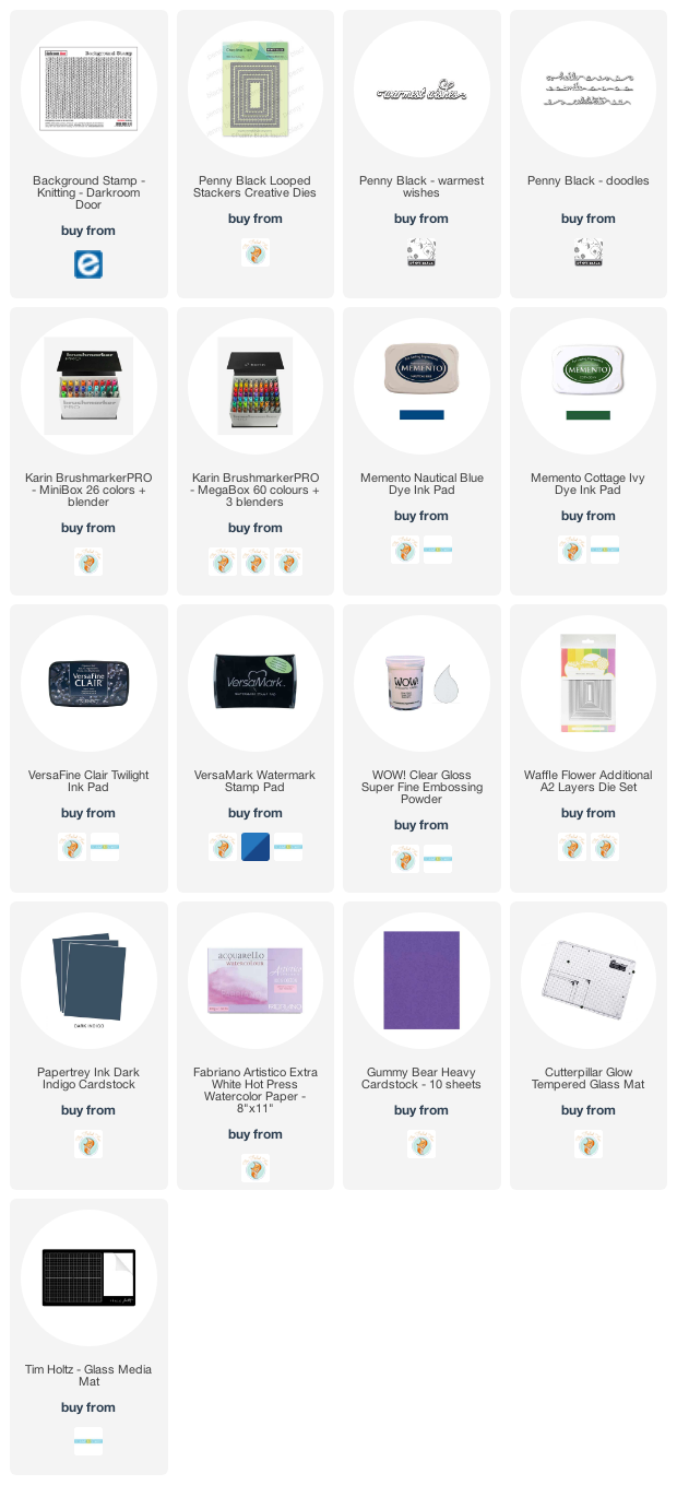
The second card features a simple pattern painted over the embossing with nautical blue and cottage ivy memento inks smooshed on my glass mat. I wanted to do a fancy snowflake pattern but decided I should start with something simple. Just as well as I missed a whole line of the pattern I was trying to do. This time I matted the panel with dark blue cardstock and stacked three layers of the ‘hello’ from the Penny Black ‘doodles’ die set which also looks a bit like yarn.
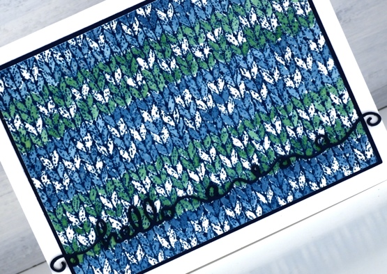
I had to make the knitting panel smaller to fit on the matching piece of blue cardstock so I re-cut it with the WaffleFlower A2 layer dies and saved the slim outline to glue inside the card. I will definitely be playing with the DD knitting stamp again because I want to colour a fancy fairisle type pattern. It will also show up in a small role on a card coming up later in the month.
I am happy to be back blogging again after my short break; I’ve missed chatting with you. I wish I could say I achieved all my planning and preparation goals but that is far from the truth. I think maybe my expectations were set a bit too high! Today’s cards feature the knitting stamp that had been sitting waiting patiently for some ink for months. I could have continued to stamp and play this image for days but I limited myself to one day so I could move onto other things. Is your year off to a good start, have you had some creative time already?
Supplies
(Compensated affiliate links used when possible)
All the Birthdays
Posted: October 7, 2020 Filed under: A2 layers, Additional A2 layers, all the birthdays, CAS, Concord & 9th, nesting squares, Waffle Flower | Tags: Concord & 9th, gel press, gel printing, Ranger archival inks, ranger embossing powders, Tsukineko Versafine inks, Waffle Flower dies, WOW embossing powders 4 Comments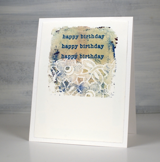
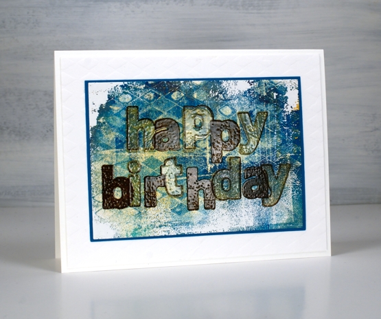
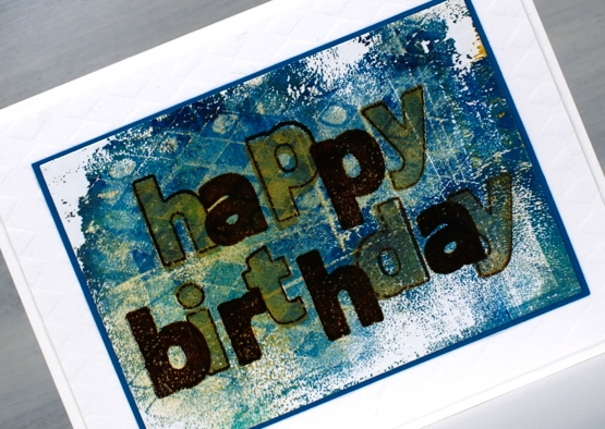
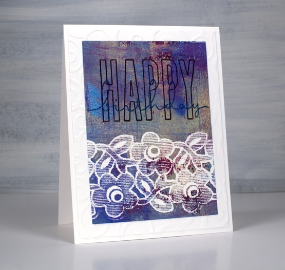
I made a short stack of birthday cards yesterday with a new Concord & 9th set, ‘All the Birthdays’. I pulled out several prints from earlier gel printing sessions and chose some which would work as panels for birthday cards.
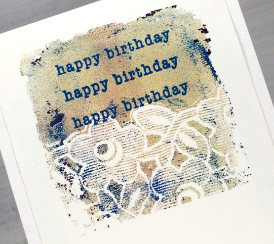
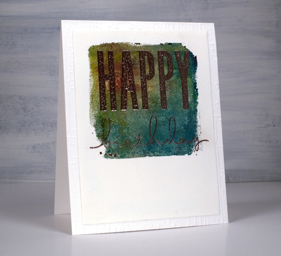
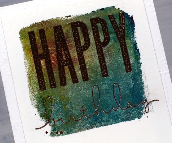
On the card above I used ranger blue embossing powder and the card below versafine tulip red was the perfect match for my printed background.
Some were printed using the petite set A gel presses so they were already shaped as squares. Others I cut from larger prints. I used stencils and lace to make the prints and a range of acrylic paints.
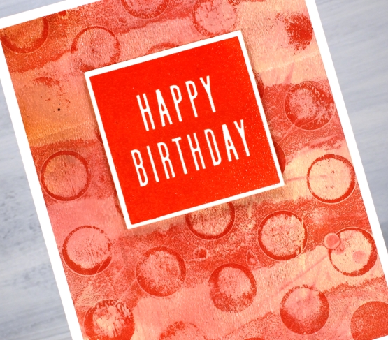
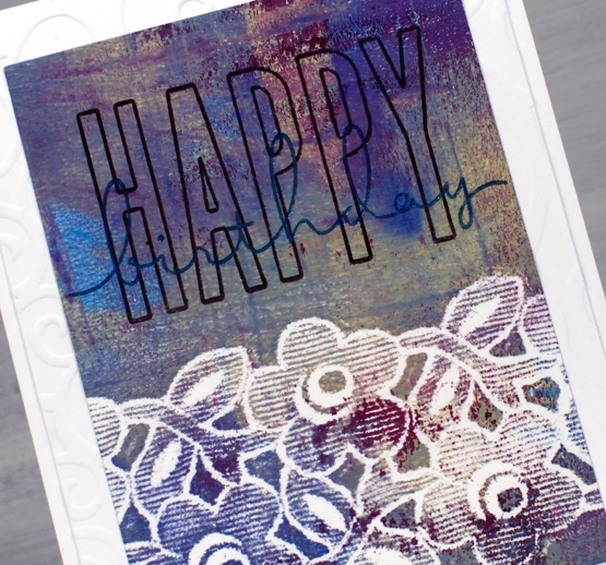
One of the stamp combinations from the C&9 ‘all the birthdays’ is a pair of stamps that overlap to spell ‘happy birthday’; there are outline stamps that frame the solid letters also. That is what I used on the card below with gold and brown inks then clear embossing powder.
I also added some texture to a few of the card bases or mats with embossing folders and stencils.
The printed panel below included such pretty blues and purples I wanted to match them in the sentiment so I stamped with archival dusty concord and faded jeans then, before the ink dried embossed in clear powder.
The card below features rose gold embossing powder; it looks a little darker than expected on this panel, maybe because of the depth of colour in the print.
I really enjoyed pairing sentiments from the C&9 set with my leftover gel prints. I did have some embossing challenges though; I’m just not an embossing champion. Stray powder, over heating, underheating, even when I use a powder tool and preheat the heat tool I still make mistakes. This lot took me all afternoon but I am very happy with them and I’m pleased to have boosted my birthday card stash. Now if I can just remember to send them…
Supplies
Birthday birdhouses
Posted: June 8, 2020 Filed under: A2 layers, Additional A2 layers, Good neighbours, Penny Black, Triple Banner, Waffle Flower | Tags: Fabriano Watercolour Paper, Penny Black creative dies, Penny Black stamps, Ranger Distress inks, Waffle Flower dies 7 Comments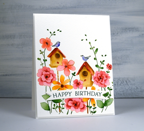
I hope your garden is full of birds and blooms right now, mine is getting there slowly. If you are having a birthday during this season, it’s possibly a little different to past celebrations. My birthday is in the dead of winter but I do remember fondly when it was in the height of summer when birds, blooms and strawberries were in abundance!
To create this bright happy card I did some no line watercolour with distress inks. I stamped the PB ‘good neighbors’ outline stamp in antique linen then did all the painting with distress inks smooshed on my glass mat. For fine lines and tiny spaces I used distress markers.
I used cold pressed watercolour paper for this one; I switch back and forth between hot pressed and cold pressed, often choosing hot pressed for the ease of stamping detailed stamps. Once I was finished I decided to pop up the panel on a piece of foam but first I cut the panel with the new love of my card making life, Waffle Flowers ‘additional A2 layers’ dies. I love both their A2 layers dies and additional layers dies the same, no favouritism, in fact the reason I love them is because there are two sets making it possible to mat panels with a ⅛” border. I’m not demonstrating that feature on this card but I will be on future projects. I also love the fact that my rectangle is even and perfect first go. My cutter still does a great job just not sure if my steady hand and eye do the stellar job they once did.

I finished off the card by cutting two banners with one of Penny Black’s triple banner dies, two so it was raised up just a bit, not as much as foam tape would raise it. I stamped a sentiment from banner sentiments on the banner but if you know this set you might realise the stamp doesn’t actually curve that way; let me tell you it does when you snip it in two and arrange it on the door of your misti.
Supplies