Floral Birthday
Posted: October 29, 2021 Filed under: all the birthdays, companions, Concord & 9th, Penny Black | Tags: Fabriano Watercolour Paper, Penny Black stamps, Ranger Distress stains 10 Comments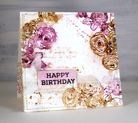
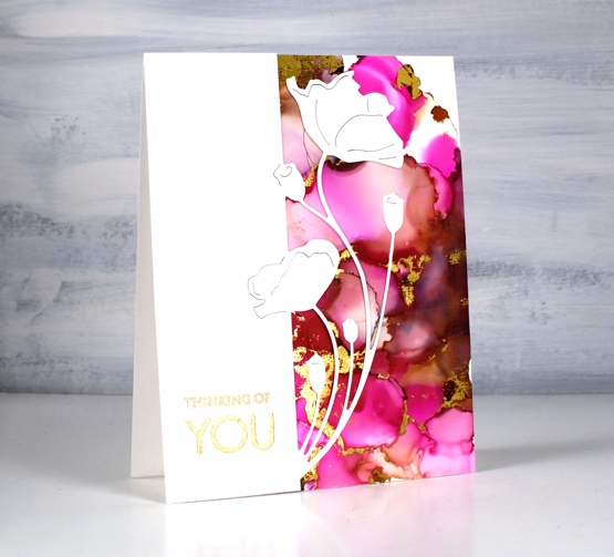
In my last post I shared a Christmas card featuring loose watercolour; the style of this card is even looser and was done with a few of the distress stain daubers I still have in my stash. Although I used techniques I’d devised years ago, this card was inspired by a card I saw on Pinterest recently. I followed the link and read through the whole post on the Tattered Nest Designs blog and combined some of her techniques with mine to create this very vintage floral birthday card.
I worked on hot pressed watercolour paper with gathered twigs and seedless preserves distress stains. I still have those two colours in the daubers but you could use ink pads or spray stains on a glass mat or craft mat to get similar results. Check out the Tattered Nest post to read how she did it with spray stains. I inked the PB ‘companions’ stamp with both distress stains and stamped on the corners of my watercolour paper panel. I dried the stain with a heat tool then started blending loosely with water and a paintbrush. If the ink was too intense I would use more water or dab it with a paper towel, if too pale I would add more stain with the paintbrush.
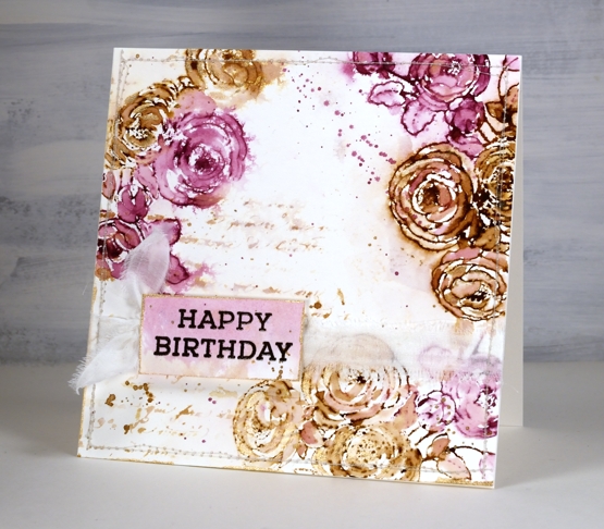
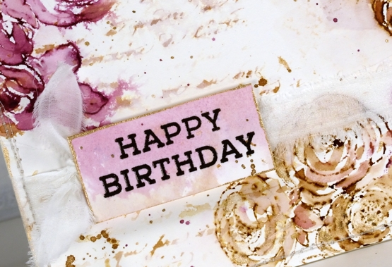
Once the flowers were loosely blended I inked the PB script background stamp with the same inks, spritzed it and stamped off on scrap paper. I spritzed it again with water before stamping a diluted print on the panel. You can see I also added splatter and created a sentiment on a small piece coloured with the same inks.
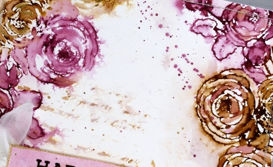
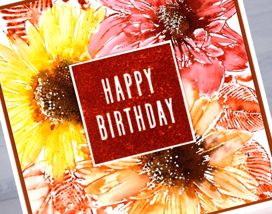
To finish the card I added splatter and some extra painting with rose gold pearlescent paint. You can see the gold border around the little tag in the close up above. Inspired by the Tattered Nest projects I sewed around the edge of the panel and then tore a strip of fabric to make a frayed ribbon sash.
Progress continues on my new online class; I’ve been gazing at the computer screen for days. I’m excited to share it with you very soon!
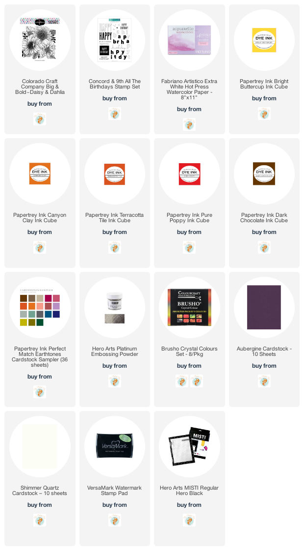
Supplies
(Compensated affiliate links used when possible)
Alcohol ink + foil
Posted: January 28, 2021 Filed under: Alcohol Ink, all the birthdays, Concord & 9th, Metropolitan, Penny Black, poppy edger | Tags: Concord & 9th, Penny Black creative dies, Penny Black stamps, pinata alcohol ink, Ranger Alcohol Ink 11 Comments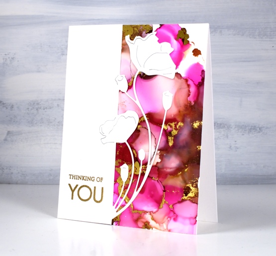
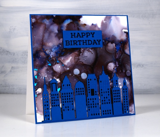
When I get the alcohol inks out I always have a stack of panels at the end of the session. Some sit around and never amount to much but others wait for inspiration to hit. This one was created on white craft plastic (Grafix dura-bright white) with ginger and burgandy Ranger alcohol inks and Pinata magenta. I added gold foil using the minc well after the inks had dried.
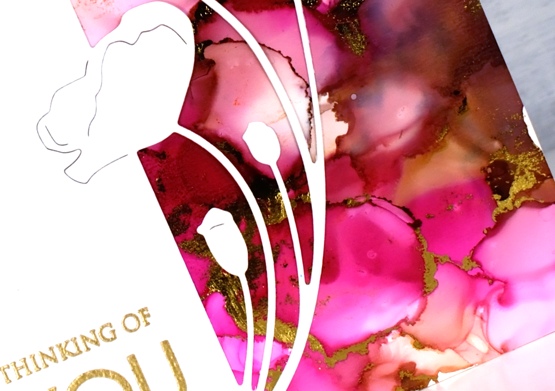
Sometimes it is possible to make the foil stick soon after finishing the inking. There is a sweet spot as far as letting the ink dry enough that it is not gooey but not so much that it is dry to touch. The sections that will hold the foil are the ‘seams’ between colours where the ink is thicker. If you press foil on these areas when they are a bit tacky you can get it to stick with just a bit of burnishing. If the panel has dried it sometimes possible to get foil to stick by running the panel through a minc or laminator using some heat. This can be risky as sometimes the foil sticks to more of the panel than you expected.
When I ran this panel through the minc I was happy with most of the foiling but there were a few sections that didn’t look great so I just used the part that looked good and covered the rest with this pretty poppy edger from Penny Black. I finished the card with a gold embossed sentiment from the PB ‘only you’ set.
This second panel amazes me because it was created with only black alcohol ink plus rubbing alcohol. The blue and burgandy tones appeared when the black ink was diluted. Cool huh? I pressed the blue foil onto this panel at just the right time to get it to stick when the seams were tacky. It is hard to get it to show in the photo but there are small sections of blue foil here and there across the sky.
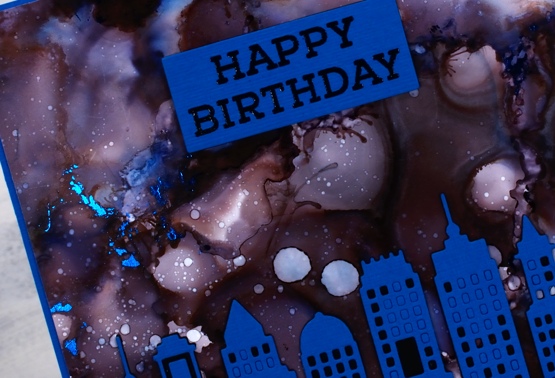
The inking on both panels was pretty experimental, a drop here and there some rubbing alcohol and tilting and blowing the ink to make a random pattern. I cut the Penny Black metropolitan die from both black and blue cardstock then stacked blue on black without removing all the window cut outs. I ended up using spray adhesive on the back of the blue die cut because gluing is not my gifting.
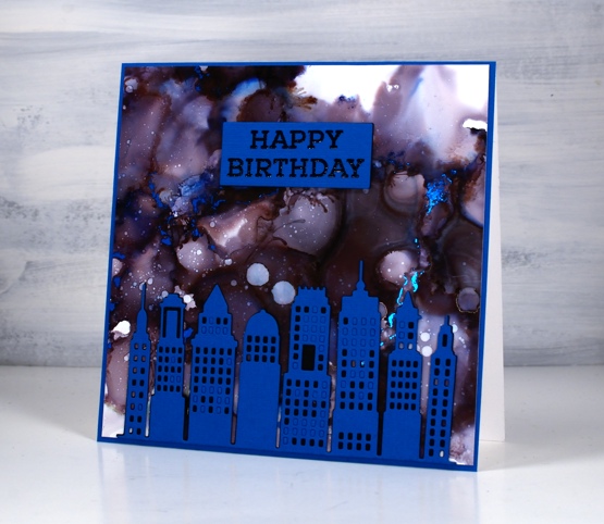
The sentiment is from the Concord & 9 ‘all the birthdays set stamped in black and embossed in clear then stacked up on two layers of black cardstock. More alcohol inks next week; I’m having fun.
Supplies
(Compensated affiliate links used when possible)
For some reason the images did not want to display on this list but if you click the word Supplies, above, you will get to the complete list.
Daisy & Dahlia
Posted: November 2, 2020 Filed under: all the birthdays, Brusho, Colorado Craft Company, Concord & 9th, Daisy & Dahlia, Papertrey Inks | Tags: Colorado Craft Company, Concord & 9th 8 Comments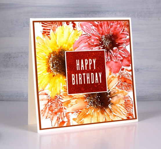
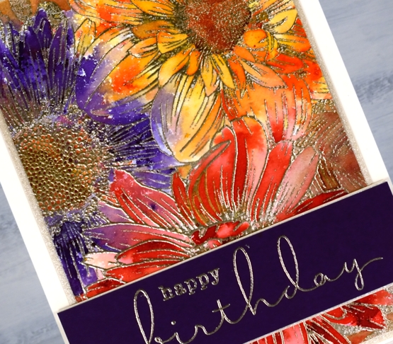
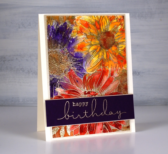
This bunch of flowers is a single large stamp from the Colorado Craft Company and I’m over on the Foiled Fox blog today describing how it inspired me. It’s called ‘daisy & dahlia’ and it is from the ‘big and bold’ collection.
For this square card I chose autumn tones, because despite that sprinkle of snow we had last week it is definitely still autumn. I used Papertrey ink cubes which are very juicy and blend well with water after they’re stamped on watercolour paper.
I used one of the inks from the floral panel to stamp a bold birthday square with one of the stamps from Concord & 9th’s ‘all the birthdays’ set.
On my second card I used a similar colour scheme but threw in the contrast of purple paint. I embossed the stamp on a rectangular panel with platinum embossing powder then sprinkled four different colours of brusho powder strategically on the panel.
If you have used brusho powders at all you will know you can’t really be very strategic; it goes where ere it will! I still ended up with a red flower, an orange flower and a purple flower but my favourite bits are the ends of the petals that ended up multicoloured.
Once again I chose stamps from the C&9 ‘all the birthdays’ set to create a purple sentiment band trimmed in quartz shimmer cardstock.
An idea I have yet to try with this big beauty is to stamp it in one colour to highlight the detail of the design. Make sure you pop over to The Foiled Fox for more details and tips on these cards and techniques.
Supplies
Blossom birthday
Posted: October 16, 2020 Filed under: all the birthdays, Brutus Monroe, Concord & 9th, meadow blossoms, Papertrey Inks | Tags: Concord & 9th, Fabriano Watercolour Paper, Kuretake Zig clean color real brush markers, Papertrey ink 4 Comments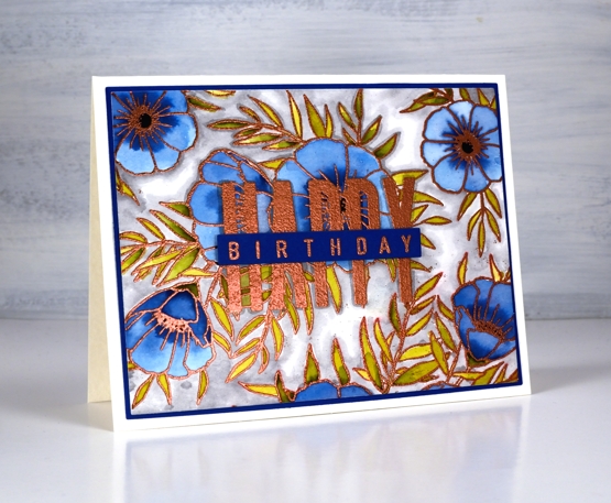
Even as my flowers fade and disappear I am still inspired to make floral cards. I’ve teamed up with the Foiled Fox today to share a blog post here and over there. If you are looking for all the creative process details pop over to the Foiled Fox blog. Today’s card features the C&9 ‘all the birthdays’ set again. It has only been in my house a week or so and already it has helped me out several times. Having one set with at least ten different ways to stamp happy birthday is a winner. There are probably more than 20 combinations when you look at all the separate word stamps and single letters in the set.
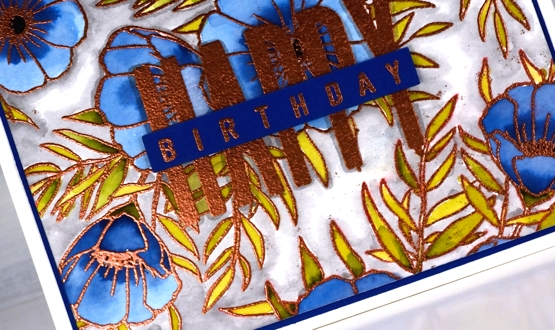
I wanted to combine a background image with a sentiment and ended creating my own background by repeat stamping with two stamps from the Concord & 9th ‘meadow blossoms’ set. Before heating the panel I stamped the word HAPPY from the new C&9 ‘all the birthdays’ set. I embossed with copper powder then coloured with ink from Papertrey ink cubes. The ink cubes are very juicy so I often smoosh them on my glass mat then pick up ink with a paint brush.
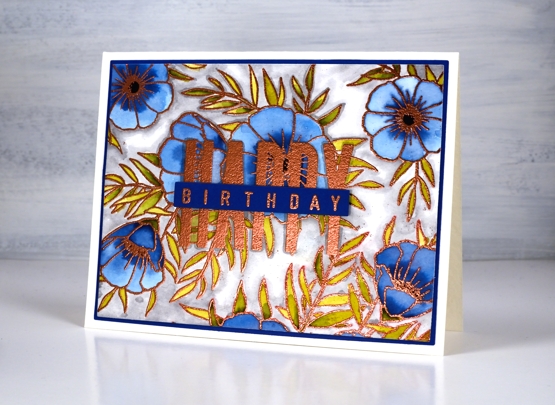
I filled the background with a grey zig clean color real brush pen and blended it with water. To complete the card I matted with with the dark blue cardstock I keep reaching for and finished the sentiment on a strip of the same blue. Having this new birthday set has got my birthday card production back on track. I have no excuses for not sending out birthday cards. Thank you Foiled Fox!
Supplies
All the Birthdays
Posted: October 7, 2020 Filed under: A2 layers, Additional A2 layers, all the birthdays, CAS, Concord & 9th, nesting squares, Waffle Flower | Tags: Concord & 9th, gel press, gel printing, Ranger archival inks, ranger embossing powders, Tsukineko Versafine inks, Waffle Flower dies, WOW embossing powders 4 Comments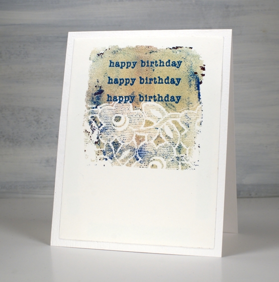
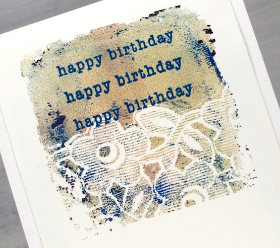
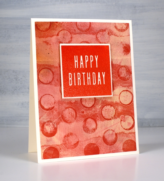
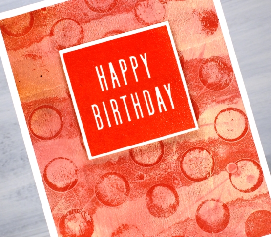
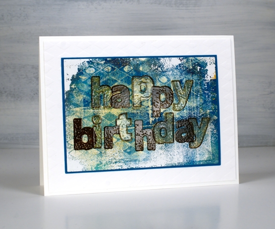
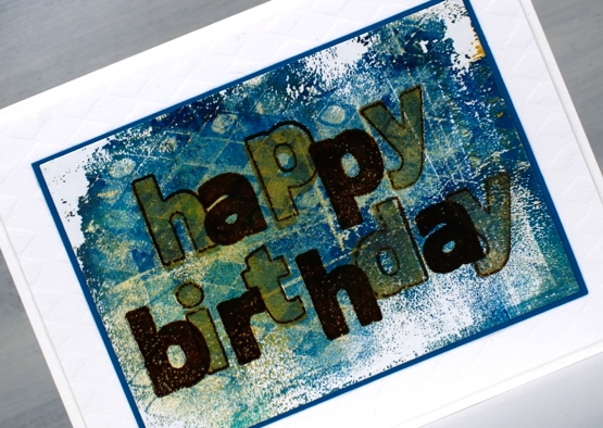
I made a short stack of birthday cards yesterday with a new Concord & 9th set, ‘All the Birthdays’. I pulled out several prints from earlier gel printing sessions and chose some which would work as panels for birthday cards.
On the card above I used ranger blue embossing powder and the card below versafine tulip red was the perfect match for my printed background.
Some were printed using the petite set A gel presses so they were already shaped as squares. Others I cut from larger prints. I used stencils and lace to make the prints and a range of acrylic paints.
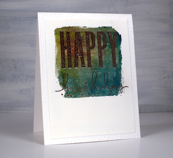
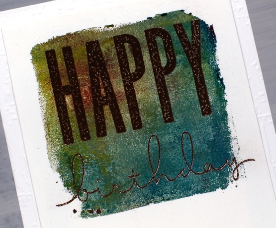
One of the stamp combinations from the C&9 ‘all the birthdays’ is a pair of stamps that overlap to spell ‘happy birthday’; there are outline stamps that frame the solid letters also. That is what I used on the card below with gold and brown inks then clear embossing powder.
I also added some texture to a few of the card bases or mats with embossing folders and stencils.
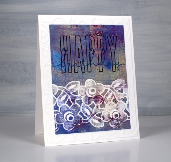
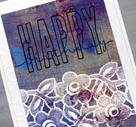
The printed panel below included such pretty blues and purples I wanted to match them in the sentiment so I stamped with archival dusty concord and faded jeans then, before the ink dried embossed in clear powder.
The card below features rose gold embossing powder; it looks a little darker than expected on this panel, maybe because of the depth of colour in the print.
I really enjoyed pairing sentiments from the C&9 set with my leftover gel prints. I did have some embossing challenges though; I’m just not an embossing champion. Stray powder, over heating, underheating, even when I use a powder tool and preheat the heat tool I still make mistakes. This lot took me all afternoon but I am very happy with them and I’m pleased to have boosted my birthday card stash. Now if I can just remember to send them…
Supplies