Floral Birthday
Posted: October 29, 2021 Filed under: all the birthdays, companions, Concord & 9th, Penny Black | Tags: Fabriano Watercolour Paper, Penny Black stamps, Ranger Distress stains 10 Comments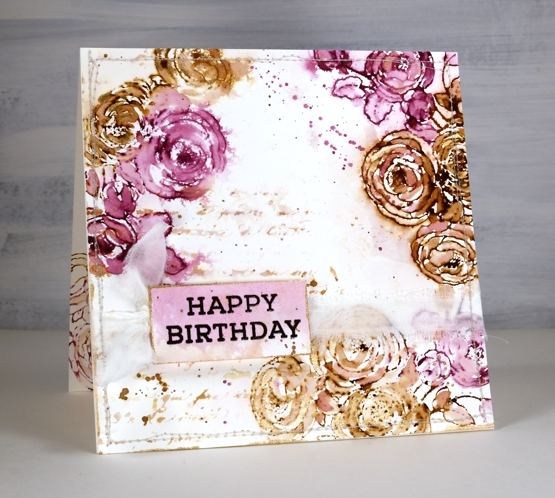
In my last post I shared a Christmas card featuring loose watercolour; the style of this card is even looser and was done with a few of the distress stain daubers I still have in my stash. Although I used techniques I’d devised years ago, this card was inspired by a card I saw on Pinterest recently. I followed the link and read through the whole post on the Tattered Nest Designs blog and combined some of her techniques with mine to create this very vintage floral birthday card.
I worked on hot pressed watercolour paper with gathered twigs and seedless preserves distress stains. I still have those two colours in the daubers but you could use ink pads or spray stains on a glass mat or craft mat to get similar results. Check out the Tattered Nest post to read how she did it with spray stains. I inked the PB ‘companions’ stamp with both distress stains and stamped on the corners of my watercolour paper panel. I dried the stain with a heat tool then started blending loosely with water and a paintbrush. If the ink was too intense I would use more water or dab it with a paper towel, if too pale I would add more stain with the paintbrush.
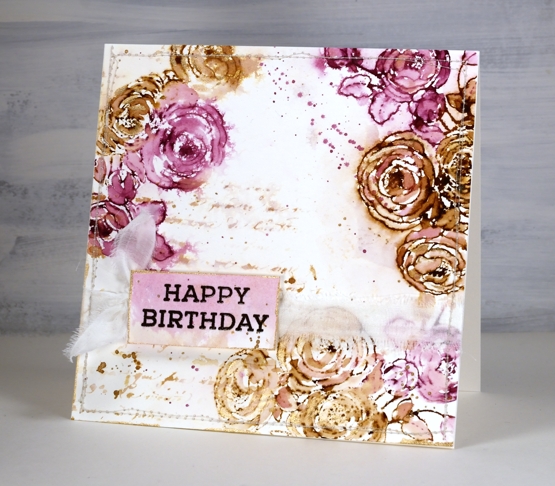
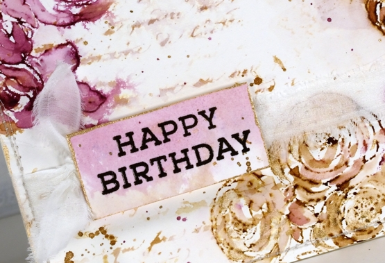
Once the flowers were loosely blended I inked the PB script background stamp with the same inks, spritzed it and stamped off on scrap paper. I spritzed it again with water before stamping a diluted print on the panel. You can see I also added splatter and created a sentiment on a small piece coloured with the same inks.
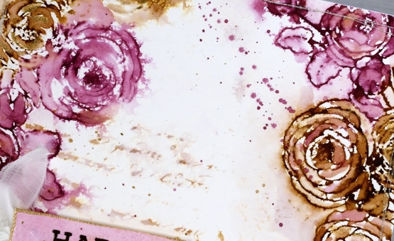
To finish the card I added splatter and some extra painting with rose gold pearlescent paint. You can see the gold border around the little tag in the close up above. Inspired by the Tattered Nest projects I sewed around the edge of the panel and then tore a strip of fabric to make a frayed ribbon sash.
Progress continues on my new online class; I’ve been gazing at the computer screen for days. I’m excited to share it with you very soon!
Supplies
(Compensated affiliate links used when possible)

Gel print backgrounds – stripes and grid
Posted: July 20, 2021 Filed under: companions, Finetec paints, gel press, mountain magic, Penny Black | Tags: gel press, gel printing, Penny Black stamps 9 Comments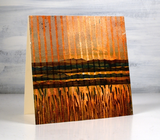
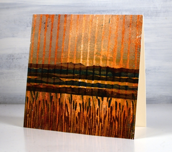
Yesterday I posted a gel printing video where I used both an egg carton and a piece of corrugated cardboard to add texture to my prints. I used a couple of the corrugated cardboard prints to make today’s cards.
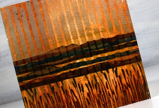
You can see how I printed this panel in the video. To turn it into a card I used a couple of new stamps from Penny Black. I stamped the mountain stamp five times in browns and blue then inked the rushes with a brown and a blue ink. I love the way it looks like a sunset or sunrise because of the background print. It wasn’t something I tried to create but a possibility I saw when looking at the prints.
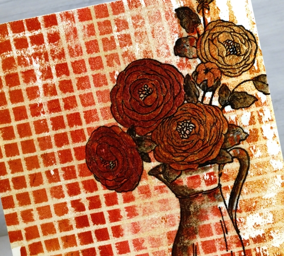
The print below was made with the same piece of corrugated cardboard pressed down on the gel press twice to create a grid pattern. You can see the process in yesterday’s video. I decided to stamp flowers on it as an experiment. I knew it might be too much pattern but I wanted to try. I stamped and embossed the Penny Black ‘companions’ stamp in versafine clair nocturne ink and it looked bold just as an outline.
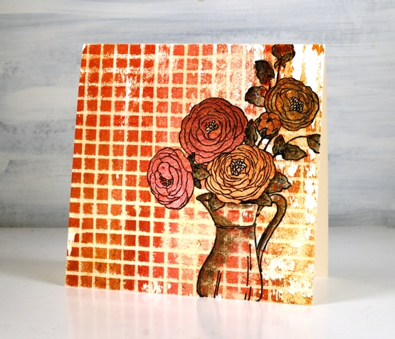
By painting inside the flowers I was able to separate them from the background enough to make them a feature not a competitor with the very busy grid pattern. I used a couple of layers of pearlescent paint on the flowers but quite diluted pearlescent black on the leaves and jug.
Tell me what ‘recycled’ items you have used for gel printing. I am keen to print with ‘all the things’! To be honest gel printing is top of my list of techniques right now. I hope you enjoyed the two recent gel printing videos. I will definitely make more. Tomorrow I have a couple of cards made from the piece of cardstock I used to clean my brayer. I showed a glimpse of it at the end of the video.
See you soon.
Supplies
(Compensated affiliate links used when possible)
Companions & a winner
Posted: May 24, 2021 Filed under: Classes, companions, Karin brushmarkers, online class, Penny Black | Tags: Karin brushmarkers, online class, Penny Black stamps 5 Comments
I have a video and a prize winner to share today but first thank you for participating in the giveaway. I really enjoyed reading what your favourite flower stamps are and I’m planning to go back and read through again and feature some of them in upcoming posts. Several of you named stamps that have been on the blog recently, some of which feature in the new online class FLORAL FAVES. Others mentioned older classics which I hadn’t thought about in a while. Dancing Daisies came up several times so I pulled it out and made a sample for the class. But without further ado let me announce the winner of a registration in my new FLORAL FAVES class!
Denise Bryant
Gorgeous card! I love the design and colors! The effect of the layering to frame the design is so pretty!
My favorite flower stamp is Penny Black’s ‘Together’. It reminds me of the agapanthus plants my grandmother grew in her yard.
Congratulations, Denise, I will be in touch by email.
Another stamp mentioned among the favourites was PB companions which features in today’s card.
After watercolouring on bristol cardstock I can recommend it. I wouldn’t choose it over hot pressed watercolour paper but it worked well and is more of a bright white, if you like that for your stamping.
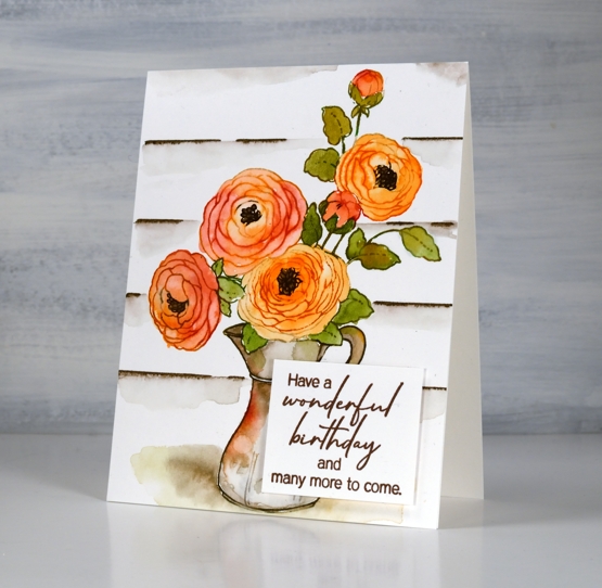
Flowers continue to my focus right now as I proof read for the 15th time and put the finishing touches on the lessons in the FLORAL FAVES class ready for Wednesday (when the lessons will be available). I also planted more flowers in the garden over the weekend. I transplanted the morning glories I grew from seed; they look rather spindly but they started out that way last year and ended up a big success.
Supplies
(Compensated affiliate links used when possible)
Companions
Posted: April 21, 2021 Filed under: companions, Penny Black | Tags: distress markers, Papertrey ink, Penny Black stamps, Ranger Distress inks, Tsukineko Versafine inks 6 Comments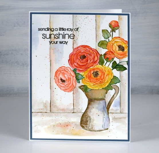
Today’s jug of flowers is yet another lovely floral from the new Penny Black ‘Delight’ release. I went for something of a vintage effect with this one by painting the jug in muted brown and grey tones and adding some woodwork in the background.
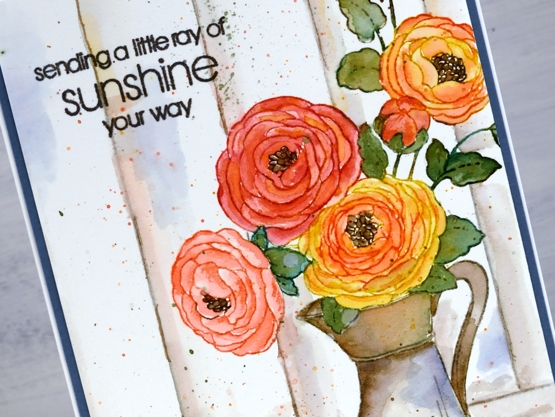
To begin I stamped the whole image on hot pressed watercolour paper in papertrey soft stone ink. I chose mustard seed and abandoned coral distress inks to make colour blends to paint all the flowers and buds. I used a mix of pine needles and forest moss inks for the leaves and stems then stamped and painted the flower centres with gathered twigs ink. For the look of an old metal or ceramic jug I used pumice stone and gathered twigs inks doing some restamping and blending with both inks to define and fill the jug.
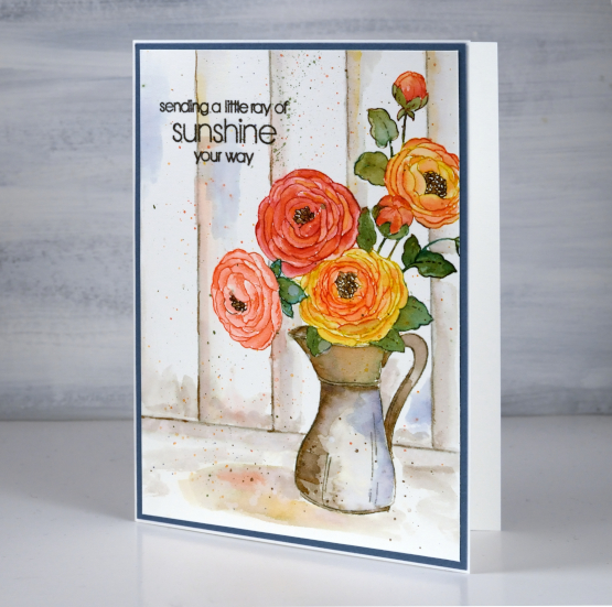
Once the jug and flowers were complete I painted a shadow underneath with pumice stone ink then dropped some of the flower and jug colours into the wet shadow. To ground the image I ruled both a base line then vertical ‘wood panel’ lines with a t-ruler in pumice stone ink. I used pumice stone ink to paint shadow and shading on the wood then realised I needed another colour to lift the whole vintage toned panel. I chose chipped sapphire ink to add some blue to the panels and the jug as it is the complement to yellow mustard seed ink used on the flowers. It definitely made a difference so I stayed with the blue in choosing a dark blue cardstock to frame the panel. (I demonstrate how I make colour choices for stamping and painting in my online class COLOUR CLUES) I finished the card with by adding splatter and a sentiment from the new PB ‘thinking of you’ set.
Supplies
(Compensated affiliate links used when possible)