Frames in frames
Posted: March 24, 2025 Filed under: A2 layers, AALL & Create, Additional A2 layers, Echidna Studios, gel press, grafix, snowflake digital stamp set, Waffle Flower | Tags: digital stamps, Echidna Studios, gel press, Waffle Flower dies 3 Comments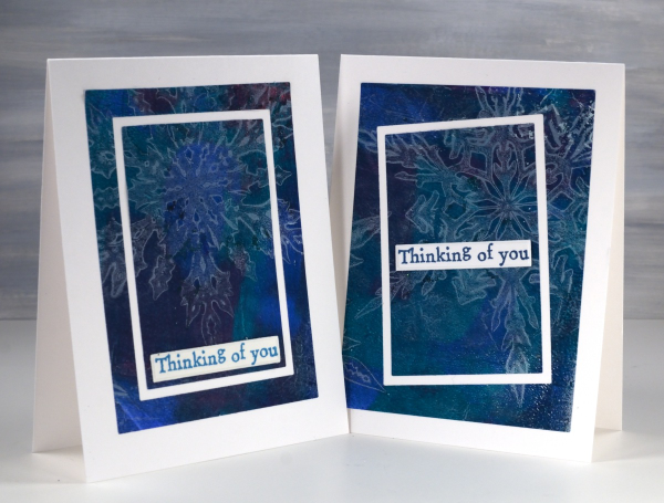
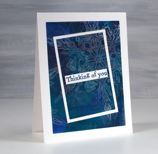
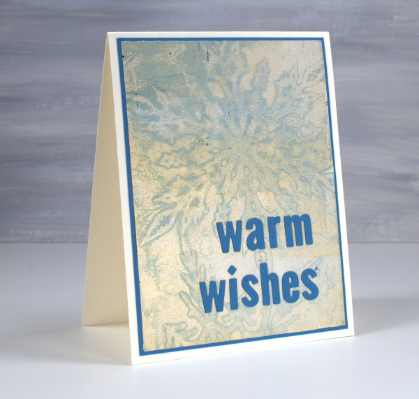
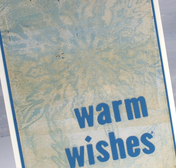
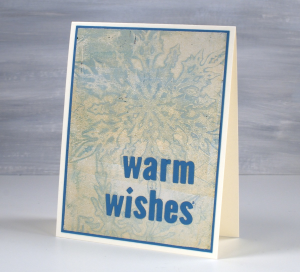
As I write this post I realise that these cards feature snowflakes when probably all you want to see is flowers! Nevertheless I see snow falling outside this morning; it’s not over yet where I live. I used snowflake masks cut from Grafix matte duralar using my cricut and the digital snowflake set from Echidna Studios.
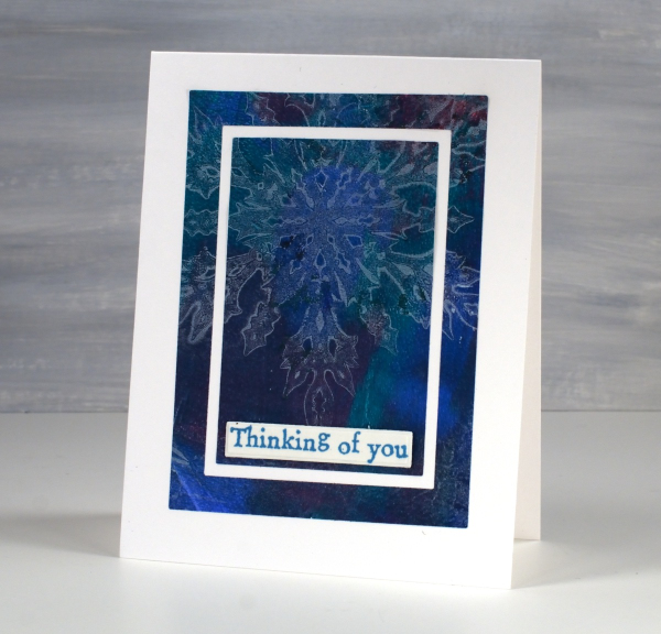
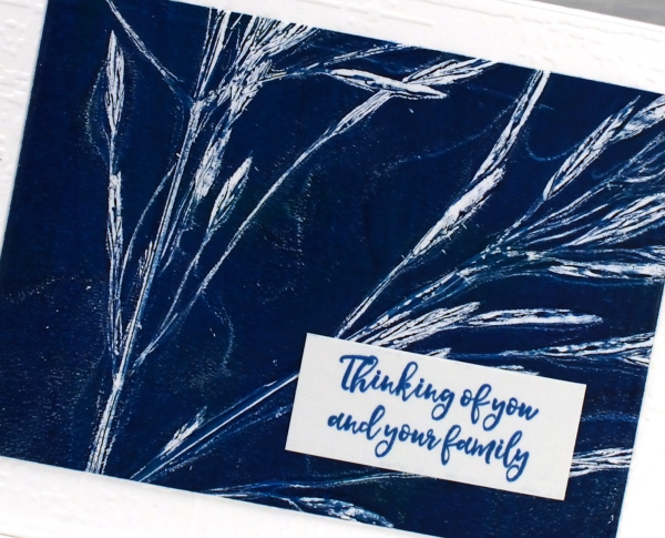
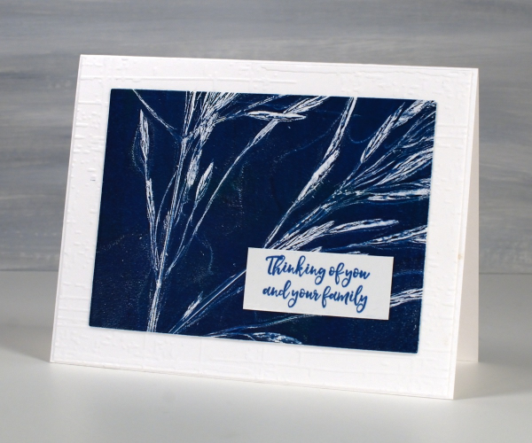
In my mind this post is more about the layouts than the images. I have featured the frame in frames idea before as a way to feature a large patterned panel but add some extra interest as you do so. I used the Waffle Flower A2 layer dies to cut my frames and cut all three rectangles at one time taping dies to panel to plate to keep everything in place.
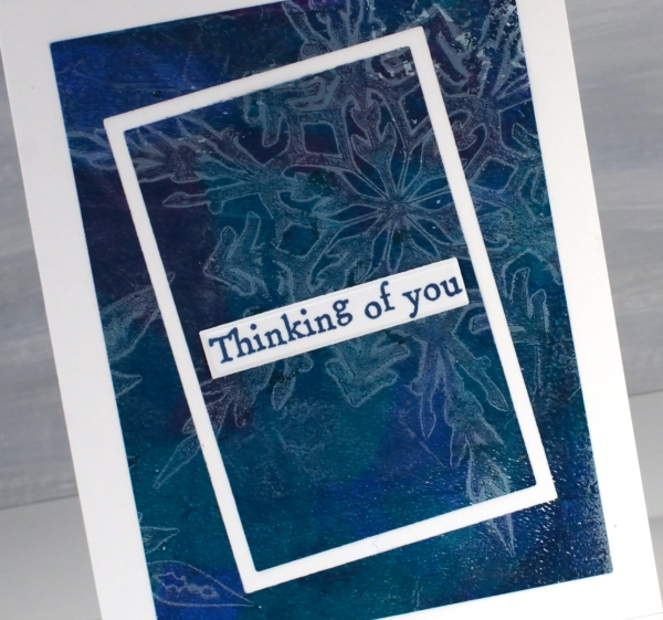
On one card I kept the frames parallel to each other but on the one above I offset the two centre dies for a wonky look. The print is a gel print created with a white snowflake layer then lifted with a mixed layer of blue, turquoise and red paint. I expected the mixed layer to be much bolder but I’m happy the paints blended into a muted mix. The sentiments are from the AALL & Create ‘everyday sentiments’ set.
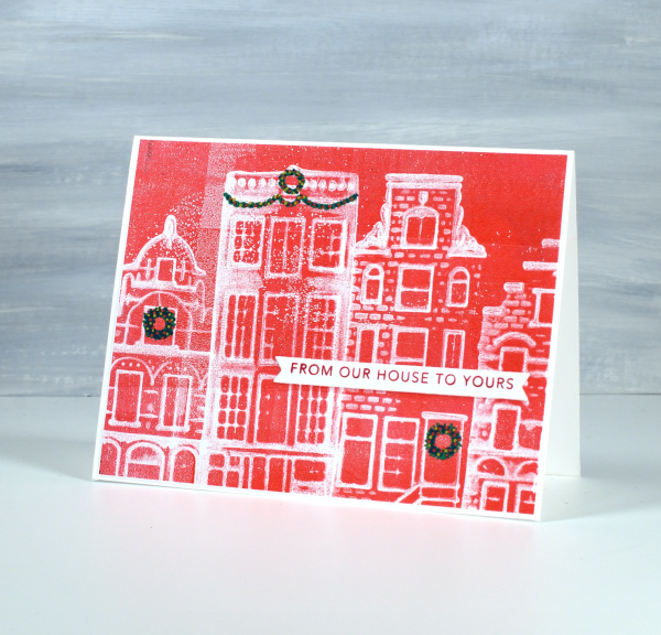
From my House to Yours
Posted: January 29, 2025 Filed under: gel press, online class, Taylored Expressions | Tags: gel press, gel printing, online class, Taylored Expressions 3 Comments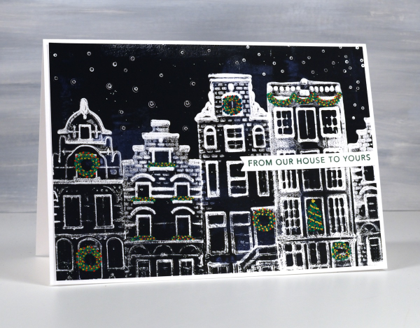
I know it is a month since Christmas but I’ve been waiting to share these last few designs with you. Because of the Canadian postal strike this black & white card arrived in Australia just last week!
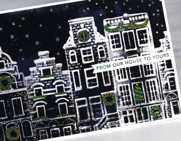
You might find these designs a bit familiar if you happen to own any of the china houses that KLM airlines once gave away on flights or if you have collected similar houses when travelling in the Netherlands. I got together with a friend to do some gel printing and we printed four of her little houses on the gel plate to create Dutch themed Christmas cards.
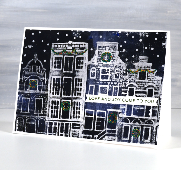
It took some trial and error to work out the best technique but it turned out that pressing the houses firmly into the paint covered gel plate worked well, as more texture appeared in the final print. If you are looking for an introductory gel printing class I have an online one called Gel Print Journey. Although it doesn’t include little Dutch houses it is full of ideas for what to print and how to get different effects. In honour of these cute cards I just created a discount code for Gel Print Journey which will give you 40% off until the end of February. Just use the code GELPRINT2025 at check out for the discounted price.
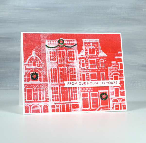
I drew the little wreaths and swags on afterwards with posca paint pens then added sentiments from Taylored Expressions Simple Strips Christmas stamp. I am always looking out for new things to print. Leave me a comment if you’ve had some great gel printing discoveries.
Rustic Snowflakes
Posted: January 20, 2025 Filed under: AALL & Create, Echidna Studios, gel press, snowflake digital stamp set | Tags: AALL & Create, Echidna Studios, gel press, gel printing 2 Comments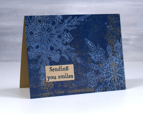
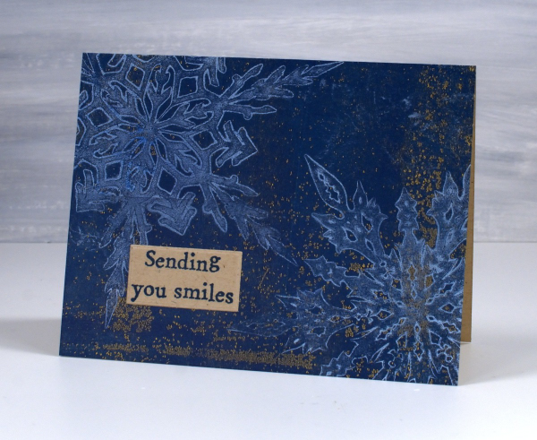
Another snowflake print for you because, of course I didn’t stop at one or two! There are six different snowflakes in the Echidna Studios ‘snowflake digital stamp set‘ so the gel printing possibilities are definitely endless. I created snowflake masks using the Cricut and Grafix matte duralar.
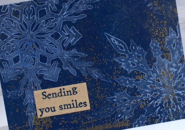
I hope to soon make a video showing my process but to put it briefly, I cover the gel plate in a layer of white paint, lay the masks on top and then remove paint using some tissue paper which lifts paint all around and within the patterned mask. I remove the masks, let the paint dry then pull the print on kraft paper with dark blue paint. The combination of white, blue and kraft is rustic and beautiful in my opinion. The quirky sentiment is another from the AALL & Create ‘everyday sentiments’ set.
I have some Australian family visiting this week so I plan to be playing with real snow not gel printed snow! Have a great week.
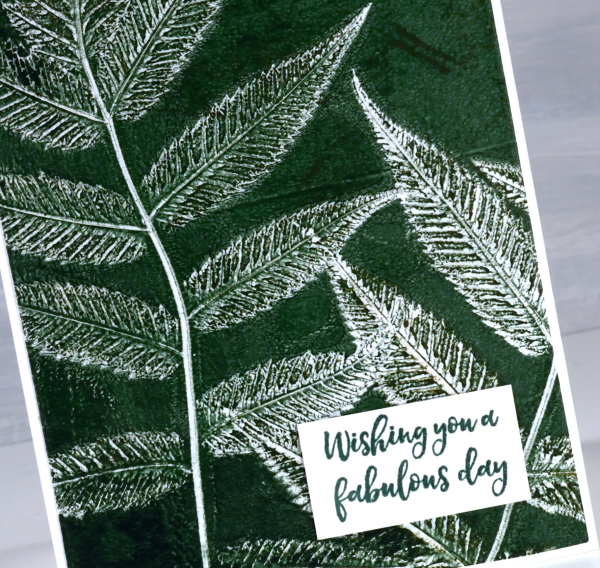
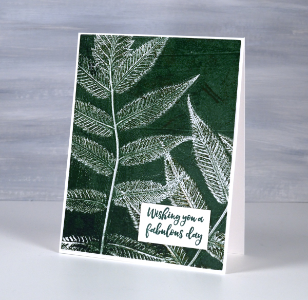
Snow on snow on snow
Posted: January 13, 2025 Filed under: cricut, Echidna Studios, gel press, grafix, My Favorite Things, snowflake digital stamp set | Tags: cricut, Echidna Studios, gel press, gel printing, grafix 6 Comments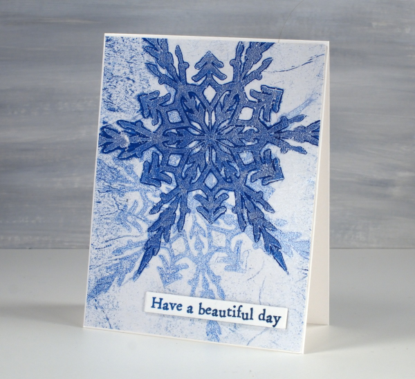
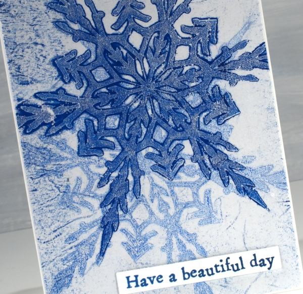
Today’s cards were gel printed using snowflake masks I cut on the cricut using the Snowflake Digital Stamp Set from Echidna Studios. I love how detailed these snowflakes are; there are six in the set and I have printed them, foiled them, cut them and now gel printed with them.
I remember when I first saw the six pointed detail of a snowflake that had landed on me. It is not always possible but occasionally the flakes are very distinct and separate instead of in clumps and I am always amazed by their beauty.
I cut my stencils from Grafix matte dura-lar as it is semi-transparent and light weight. On the panel above I made a pale print with blue and white then, after it had dried created a dark print on the plate which I pulled on the same paper but with a transparent medium (either transparent white paint or more likely matte medium). The little sentiment is from AALL & Create ‘everyday sentiments’ set.
On this second card I used a pale blue paint which didn’t give me a very bold print but pulling it with gold paint created a soft shimmery effect.
Always looking for the matchy-matchy, I found a scrap of cardstock in the same blue tone and cut a mat and sentiment using MFT little lowercase letter dies.
City Buildings gel print
Posted: January 10, 2025 Filed under: city buildings, gel press, The Crafters Workshop | Tags: gel press, gel printing, Penny Black stamps, The Crafter's Workshop 3 Comments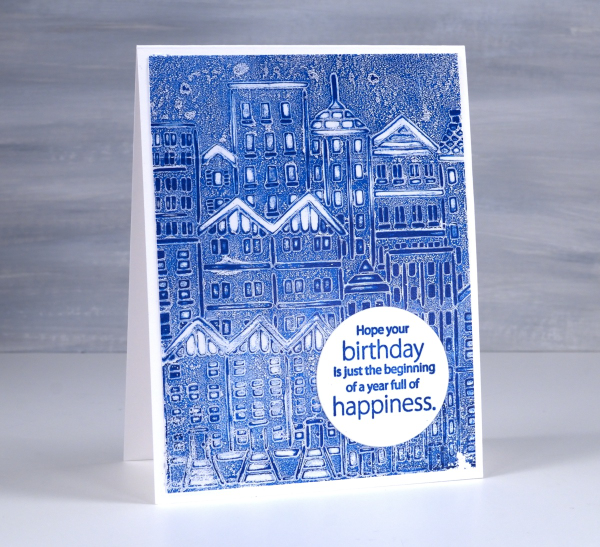
Quite a simple gel printed card but the freshness of blue and white seems to lend a brightness to it. I used the TCW ‘city buildings’ stencil on a gel plate with blue paint.
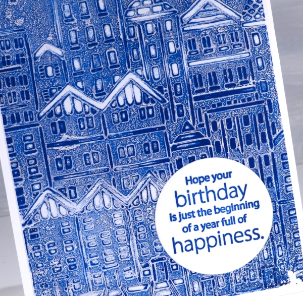
My most used technique with stencils on the gel plate is to lay the stencil on the paint covered plate, remove paint from the spaces in the stencil with tissue paper then pull the print with another layer of paint.
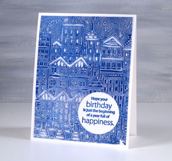
When I looked through my tray of sentiments I found this one already stamped in blue on a circle. The colour is a perfect match so I was pretty happy. The circle is a nice contrast to all those angles and lines. The sentiment comes from the Penny Black ‘better with age‘ sentiment set. This post includes affiliate links from Foiled Fox. If you buy through these links I receive a small commission at no extra cost to you.
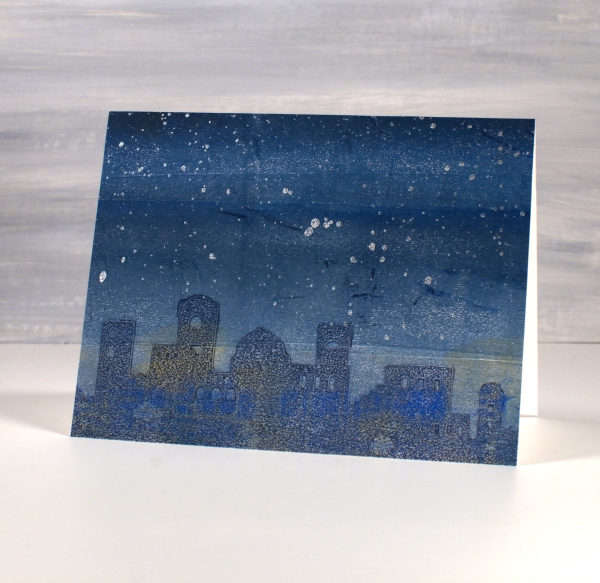
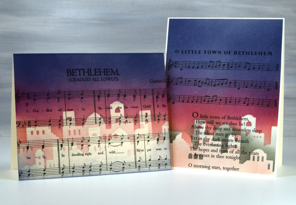
Bethlehem Mask
Posted: December 4, 2024 Filed under: Bethlehem skyline, Echidna Studios, Finetec paints, gel press, gelli plate | Tags: Echidna Studios, Finetec artist mica watercolour paint, gel press, gel printing 4 Comments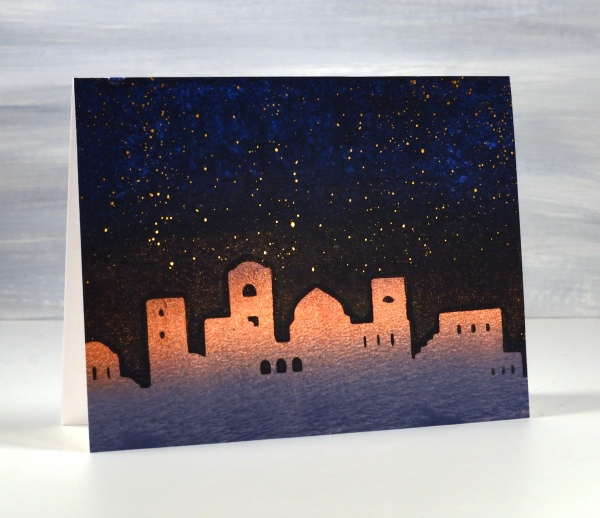
It’s been quite a while since the gel plates have been out of their tins but I was able to do a few prints recently to turn into Christmas cards. I cut a stencil using the Bethlehem Skyline digital cut file from Echidna Studios. To create the scene above I gel printed a blended grey, copper and blue panel. Next I brayered black onto the plate then lay the Bethlehem mask (cut on the Cricut) on the black before pressing the three coloured panel down on the plate. Once I had put the card together I splattered bronze watercolour paint in the sky as stars.
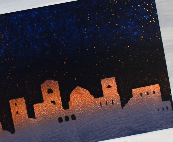
The panel below is less distinct as I pressed the mask into a layer of Paynes grey paint on the gel plate, removed all paint around the mask then lifted it to reveal a shadowy Bethlehem. Once it was dry I brayered blue and gold paints over the top before pulling the print. Once again I added metallic paint splatter to sky, this time lunar silver.
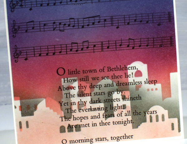
In a similar style to the carol and stencil cards I shared last week I used the Bethlehem mask cut from Matte Dura-lar to blend a scene on two carol panels cut from vintage carol books.
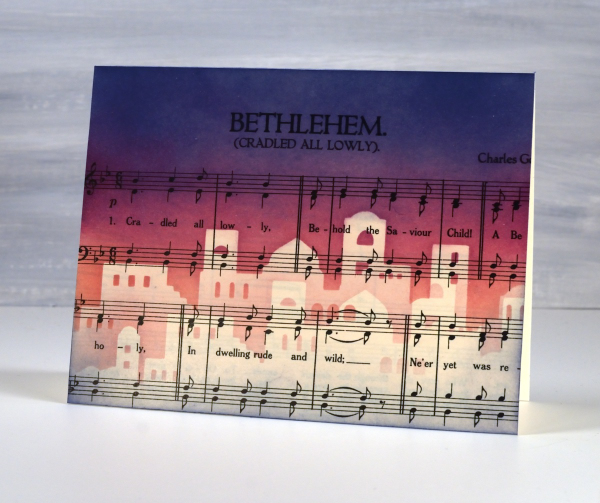
I blended pale peony over the top edge of the mask then switched to seedless preserves, then to chipped sapphire at the top of the panel. To add depth to the buildings I lifted the mask and positioned it below the first silhouette blended with either pink or grey ink
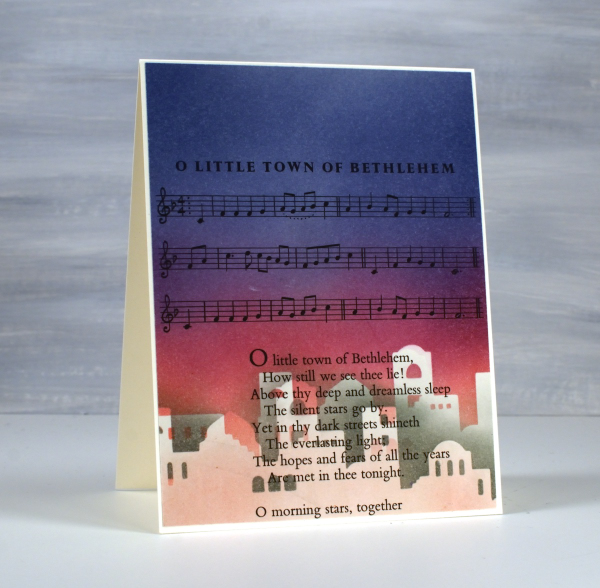
Once again no need for sentiments on the front but I will stamp a message inside.
To see more cards made with this digital set click here. The set includes two versions of the silhouette plus a outline image for printing. Today’s post features affiliate links to The Foiled Fox. If you buy through these links I receive a small commission at no extra cost to you.
What I like about Gel Printing
Posted: October 31, 2024 Filed under: Branch 9 die, gel press, Moda Scrap, online class | Tags: gel press, gel printing, online class, Penny Black creative dies 3 Comments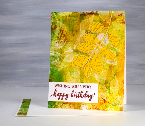
I think you already know I like gel printing: I’ve made that very clear! This card includes many of the reasons I enjoy it. There is a lot of layering, colour and imperfections in the print on this card and that often happens when gel printing. I didn’t strategically add grazes of red paint to the gel plate; they were left there from a previous print. They add so much that I chose to match the sentiment to those ‘leftovers’.
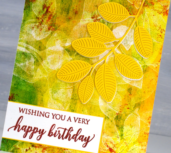
The leaves on the top of the panel are definitely die cut but the leaves on the print were added using my homemade stamp. I have quite a few homemade gel printing stamps; I don’t worry about cleaning the paint out of the stamp and I use scraps of cardstock and fun foam to make them very cheaply.
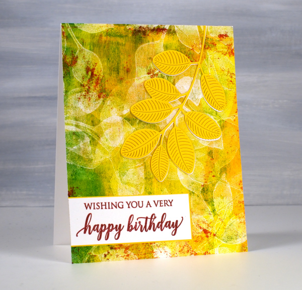
Gel printing is full of surprises; some of my favourite prints are not ones I carefully planned, they are ghost prints or partial prints, what some would call ‘fails’. There is often beauty in the texture, leftover paint and pale patterns of these prints. This card was made from a print demonstrated in my online class ‘Gel Print Journey‘ an introductory gel printing class. I created a 40% off discount coupon for the class if you are interested. Just use the coupon code SURPRISE at checkout anytime before the end of November. This post includes affiliate links from Foiled Fox. If you buy through these links I receive a small commission at no extra cost to you.
Green leaf print
Posted: October 10, 2024 Filed under: Darkroom Door, gel press, gelli plate | Tags: Darkroom Door stamps, gel press, gel printing 3 Comments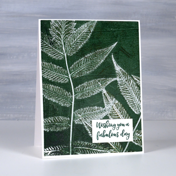
More leaf prints on the blog! Yes, I have a few more leaf print projects to share before I move into Christmas cards. To see the technique for this type of print pop over to my youtube channel and take a look at my last two videos. This plant is called false spirea and it prints very clearly showing all those lovely veins on the back of the leaves.
I’ve been playing with colour mixing when using acrylics and watercolours and it is definitely worth experimenting. Adding a little black to a bright green paint gave me a deeper and darker green as shown on this card.
I used this card as a birthday card yesterday as the sentiment from Darkroom Door is useful for any special day. I’ve been thinking that the leaves are late in changing this year. What is it like where you are? We are now seeing some nice reds, yellows and oranges around. Of course after the leaves change they fall so that’s another task coming up in the next few weeks.
Grass Print Sympathy cards
Posted: August 28, 2024 Filed under: Alexandra Renke, gel press | Tags: Alexandra Renke, gel press, gel printing, gelli plate 2 Comments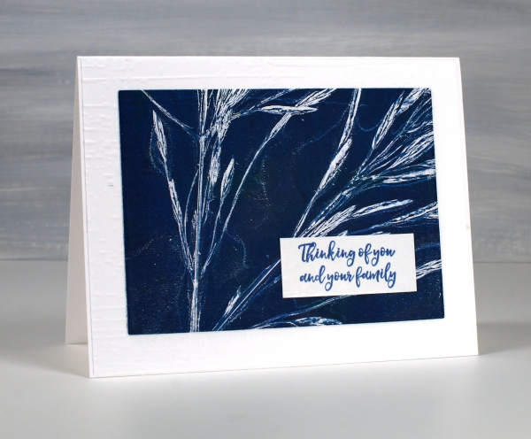
As I mentioned in my last post life has been busy with different crafting lately (children’s crafts for camp) so I am sharing more botanical gel prints from earlier in the summer.

I filmed a short video for this one; it’s the same process I used with the lacy leaves but this time with long stalks of grass.
It is good to pick the grass before it gets too dry, that way the seeds don’t separate from the stalk and end up in the paint or on the print.

Once again I turned the 5″x 7″ print into sympathy cards and embossed a background for both cards using the ‘exposed brick’ embossing folder from Stampin Up. For the card above I cut tags using lovely stitched edge tag dies from Alexandra Renke.
As summer is drawing to a close I will mention that I keep the grasses and flowers that I have used for gel printing for a few more months. The layers of paint hold them together making it possible to continue to do botanical gel printing for a little longer.
This post includes affiliate links from Foiled Fox. If you buy through these links I receive a small commission at no extra cost to you.
Gel Printed Cornflower & Grasses
Posted: August 21, 2024 Filed under: Darkroom Door, gel press, Waffle Flower | Tags: Darkroom Door stamps, gel press, gel printing, Waffle Flower dies 10 Comments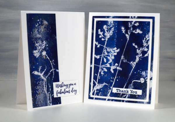
Arting and crafting has looked a bit different for me recently. This week I am ‘Professor Paint’ doing crafts each day with the children at our church day camp. There has been quite a bit of prep and experimenting going on over the past weeks. I made the sign for my ‘Art Lab’ at camp using gel prints but the crafts we’ve been doing haven’t involved gel printing at all. We have done some watercolouring with paint and water soluble markers though.
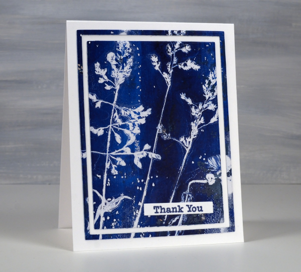
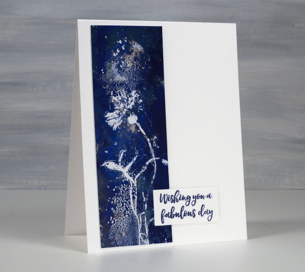
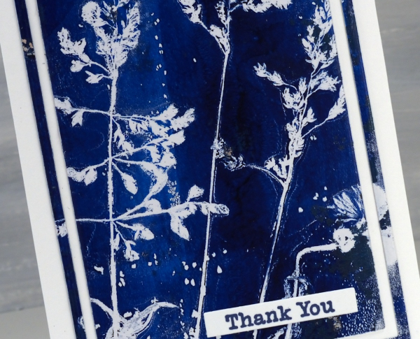
The two cards shown today were both made from one print. I don’t always take time to plan the layout of a botanical print so some prints look balanced and others don’t. I ended up cutting the cornflower image off the side of the full print to make the card below and left the grasses together to make the card above.
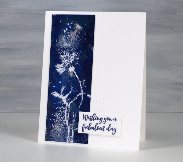
The print was definitely not perfect. You can see on the card above some odd texture from the paint. I thought it looked a bit like a spray of water above and below the cornflower.
I don’t remember which paints I used but it looks like either two blues or a blue and a black.
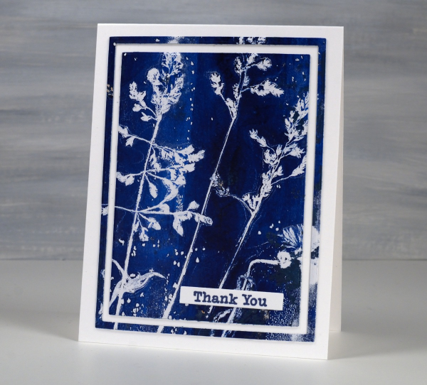
I’ve made a few cards lately using the framing technique above. I use three nesting dies to cut a large rectangle panel, then another inside and another inside that. I leave the middle frame out of the layout but could save it for another card or a strip on an envelope perhaps. The sentiments are from Darkroom Door. The printing technique used was the one shown in my last short video.