
Caravan Christmas
Posted: December 26, 2025 Filed under: Taylored Expressions | Tags: Taylored Expressions 2 Comments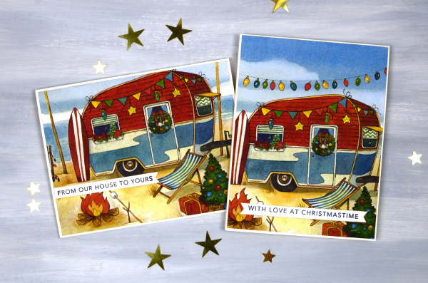
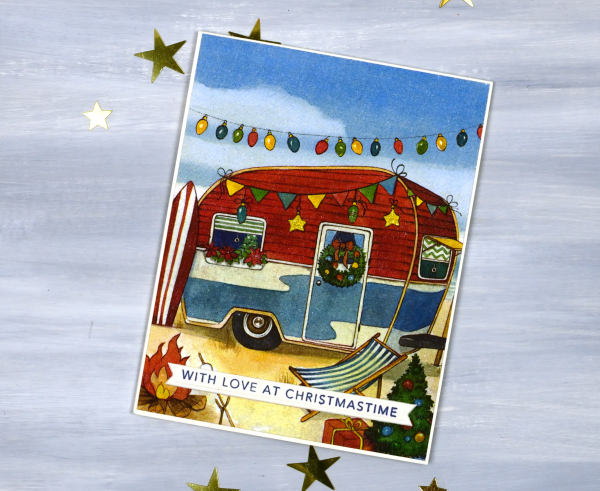
This year I ended up making way more cards using paper napkins than I first expected and to my surprise received one yesterday from a friend who had taken a similar path. Great minds and all that…
I would happily give credit to the artist responsible for today’s cute scene but the packaging from the German company IHR product does not included the designer’s name. Despite what you might think I didn’t buy these napkins when I was in Australia earlier this year, I bought them in a little town in Quebec. I was so surprised to see them in Wakefield, in summer, very far from places that might celebrate Christmas on the beach in a caravan with a surfboard handy!
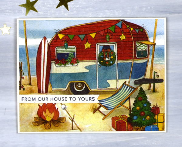
I sent one of these cards to my dad, of course because his experience with caravans goes way back to the one his father built. My brother and sister-in-law also received one because they are keen caravan travelers. The other two I gave to Canadians because they have heard me talk about the contrast of Australian and Canadian Christmas traditions.
The meaning of Christmas however does not change according to the seasons. I am grateful to have always celebrated the birth of my savior at Christmas. What a gift God has given us.
2 for 1 cards
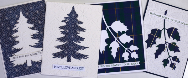
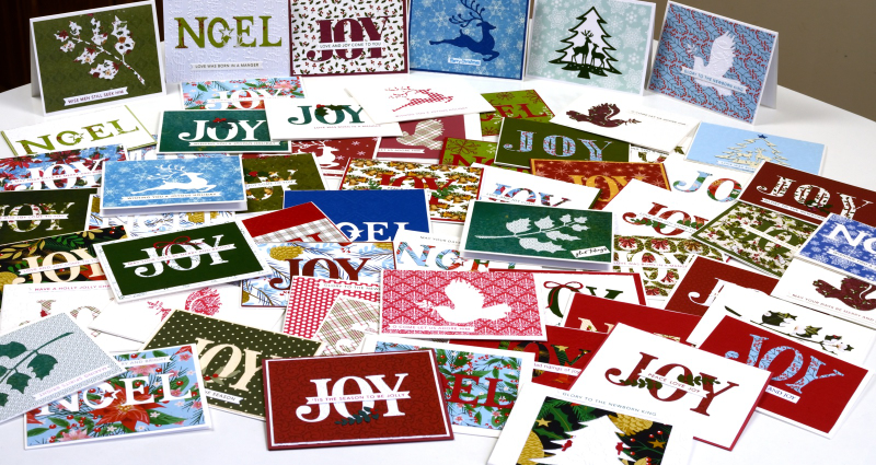
Posted: November 24, 2025 Filed under: Penny Black, Taylored Expressions | Tags: Penny Black creative dies, Penny Black stamps, Taylored Expressions 6 Comments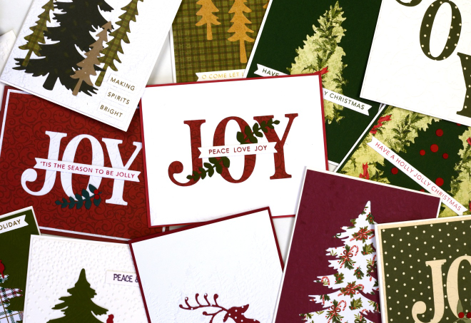
Here are some of the ‘2 for 1’ cards a group from our church made on Saturday. I had a couple of friends help with prep and running the event and it was a fun creative time. Of course there were snacks, laughter and plenty of conversation.
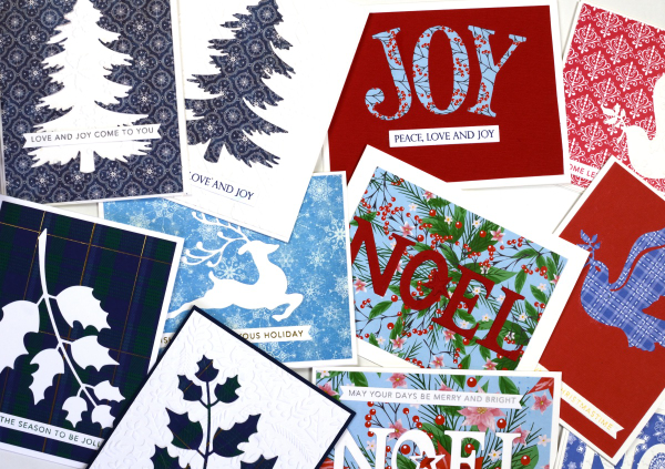
The ‘2 for 1 technique’ in this case required the maker to cut an image or word out of patterned paper and turn the positive and the negative piece into two separate cards. To add some texture and pattern we had coloured and embossed backgrounds to choose from.
I have run this event before and there is always some creative free styling when participants see the supplies available. I get inspired watching everyone create. I wanted one photo of all the cards but my kitchen table was crowded with just half so I divided them into landscape and portrait orientation.
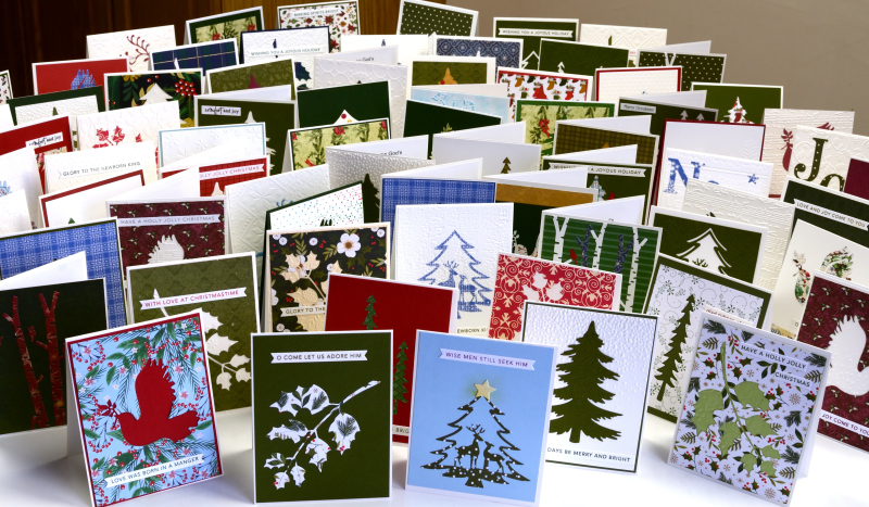
Thank you to the twenty three people who participated before and during the event. I hope the residents at the nursing home will enjoy the pretty cards and message.
Shimmery Foliage
Posted: October 14, 2025 Filed under: Airy, Dies, Finetec paints, Leaflets, Leaves, Penny Black, Taylored Expressions | Tags: Fabriano Watercolour Paper, Finetec artist mica watercolour paint, Penny Black creative dies, Taylored Expressions 2 Comments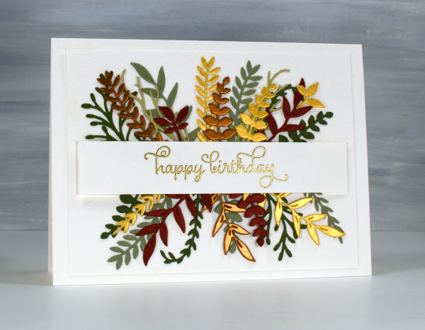
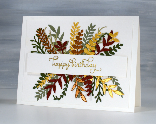
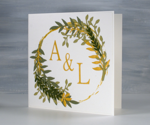
Recently a friend and I got together and worked on wreath style wedding cards. Mine is featured further down in this post. After my friend left I used some of the die-cut foliage leftovers to make her a birthday card. You can see a few matte green leafy branches plus more cut from gold, bronze and reddish shimmer cardstock. I arranged it all either side of a stamped and embossed banner. This sort of a card takes a while to arrange in a balanced way so once I had it looking good I took a photo so I would be able to glue it all down again in the same way.
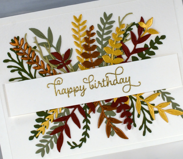
All the die-cutting was done with Penny Black foliage dies from a variety of sets. The curly twirly birthday sentiment is from the Taylored Expressions set, ‘In & Out Birthday’ embossed in gold powder
To make the wreath card I began by stamping a rough circle using gold watercolour paint on a jar lid. It was the lid of the lentil jar so yes, I had to wash it carefully before it was returned to the jar.
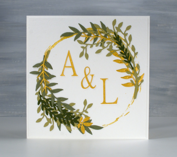
I arranged die-cut foliage around the gold circle not with perfect symmetry but I aimed for balance.
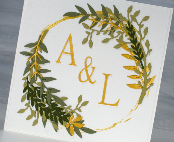
I cut the A, & and L on the cricut using the Linux Libertine Display G font. Both cards were made on cold pressed watercolour paper which has a nice creamy colour and soft texture.
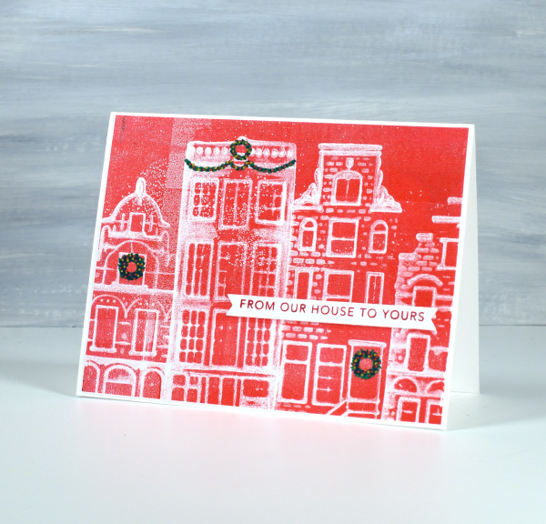
From my House to Yours
Posted: January 29, 2025 Filed under: gel press, online class, Taylored Expressions | Tags: gel press, gel printing, online class, Taylored Expressions 3 Comments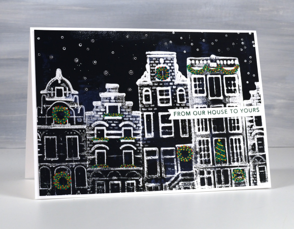
I know it is a month since Christmas but I’ve been waiting to share these last few designs with you. Because of the Canadian postal strike this black & white card arrived in Australia just last week!
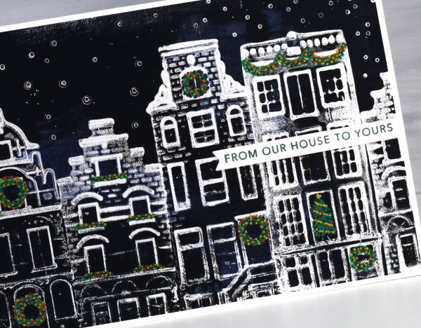
You might find these designs a bit familiar if you happen to own any of the china houses that KLM airlines once gave away on flights or if you have collected similar houses when travelling in the Netherlands. I got together with a friend to do some gel printing and we printed four of her little houses on the gel plate to create Dutch themed Christmas cards.
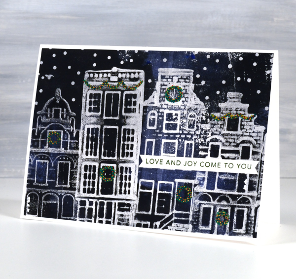
It took some trial and error to work out the best technique but it turned out that pressing the houses firmly into the paint covered gel plate worked well, as more texture appeared in the final print. If you are looking for an introductory gel printing class I have an online one called Gel Print Journey. Although it doesn’t include little Dutch houses it is full of ideas for what to print and how to get different effects. In honour of these cute cards I just created a discount code for Gel Print Journey which will give you 40% off until the end of February. Just use the code GELPRINT2025 at check out for the discounted price.
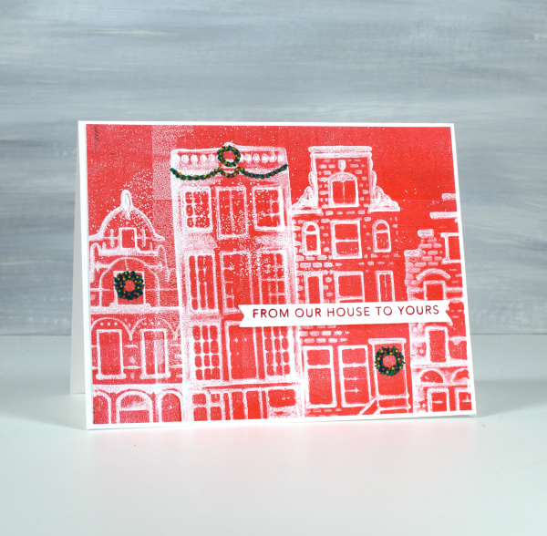
I drew the little wreaths and swags on afterwards with posca paint pens then added sentiments from Taylored Expressions Simple Strips Christmas stamp. I am always looking out for new things to print. Leave me a comment if you’ve had some great gel printing discoveries.
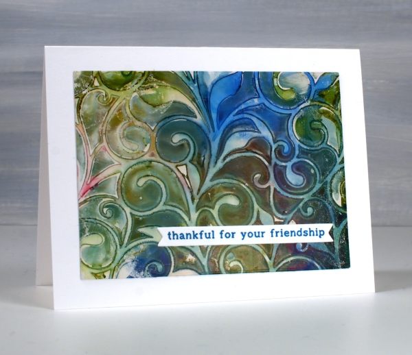
Speckled Leaf Trails
Posted: May 30, 2024 Filed under: Alcohol Ink, gel press, Lavinia, leaf trails stencil, Taylored Expressions | Tags: Alcohol Ink, gel press, gel printing, Lavinia, Taylored Expressions 2 Comments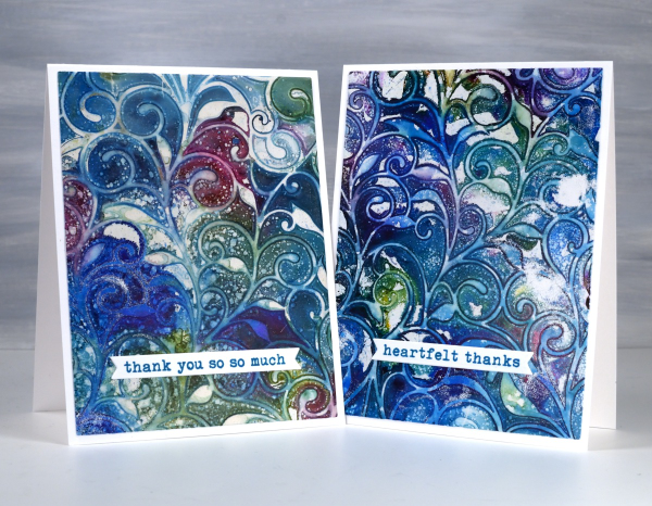
If this design looks familiar it’s because I posted a couple of similar cards a few weeks back. They featured the same pretty Lavinia stencil, ‘leaf trails’.
The difference between the cards is partly the colours but more significantly today’s cards feature splatter! You know how I feel about splatter. I always say if a project doesn’t seem quite finished, add some splatter.
The panels on these cards were made with alcohol inks on a gel plate. I dropped three or four alcohol inks on the plate along with some isopropyl alcohol to help the inks move and blend. I dropped the leaf trails stencil on top and let the inks dry. Once the ink on the plate was dry I splatted some isopropyl alcohol over the design, waited a minute and lifted the stencil. I used white acrylic paint to pull the print on heavy cardboard then added Taylored Expressions sentiments to complete the cards. This post includes an affiliate link from Foiled Fox. If you buy through these links I receive a small commission at no extra cost to you. And remember, if in doubt, add some splatter!
Blue & Green Leaf Trails
Posted: May 7, 2024 Filed under: Alcohol Ink, gel press, Lavinia, leaf trails stencil, Taylored Expressions | Tags: Alcohol Ink, gel press, gel printing, Lavinia, Taylored Expressions 5 Comments
There are many ways to use stencils on the gel plate, one being with alcohol inks rather than acrylic paint. When I use alcohol inks I do pull the print with acrylic paint but most of the colour you see is from the initial layer of alcohol inks.
You can lay the stencil down then add alcohol inks or do it the other way round, dropping the stencil onto the wet alcohol ink. Some gel-printers add a layer of hand sanitiser first but that isn’t what I did to make these prints. I’m not 100% sure but I believe I lay the stencil down on top of a layer of alcohol ink for these prints. I use some isopropyl alcohol to help the inks move further and facilitate some blends between colours. I also use an air blower to push the ink around and speed up the drying process.
The pretty twirly patterns are from the Lavinia ‘leaf trails’ stencil. Lavinia has lovely organic stencils which often feature in my gel prints. I can’t remember the exact alcohol inks I used but the technique works with all sorts of colour combos so pick your faves. No surprise to see blue in my mix. I have mentioned before that I often gel print on printer paper but these panels I pulled with thick cardstock so when it came to making cards I just cut some rectangles from the print and added them to white card bases along with sentiments from Taylored Expressions.

Floral Collage Cards
Posted: April 8, 2024 Filed under: A Pocket Full, Collage cards, Dies, Penny Black, Taylored Expressions, this way | Tags: collage, Darkroom Door stamps, Penny Black creative dies, Penny Black stamps, Taylored Expressions 2 Comments
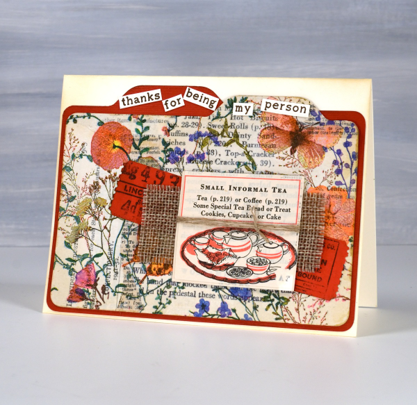
The collage and ephemera cards just keep coming. Today’s cards feature old book page collage overlaid with one layer of a floral napkin. I have a few collaged ‘mini masterboards’ made so I can cut elements or backgrounds out when I need them. For the card above I picked the rusty orange from the napkin to be the accent colour.
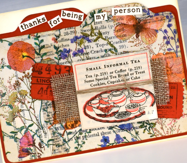
I recently bought a notch punch so I can create file dividers of any size; in the card above I made the blank orange one a little larger to show behind the floral & collage one. I added tickets stamped and die-cut, a scrap of hessian and a cut out from an old Betty Crocker ‘Good and Easy Cook Book‘!
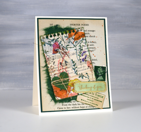
On the second card I used an aged book page as the background and added the paper napkin layer to the mini notebook page with some mulberry paper for framing and contrast. The little green postage stamp is real and the vintage label is stamped.
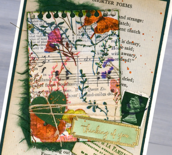
For the recent collage cards I have pulled out some supplies that I’d almost forgotten, the pretty label border stamps, the mulberry paper and the ‘office’ type dies from Penny Black are in the current rotation.
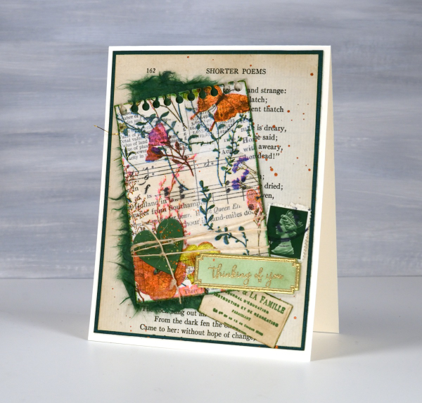
The file dividers on the card below remind me of a recipe card box which is why it ended up with the little recipe book snippet on it. The sentiment is from Taylored Expressions ‘Simple Strips – Thanks’ but I chopped it up to add to the file tabs.
This post includes affiliate links from Foiled Fox and Scrap’n’Stamp . If you buy through these links I receive a small commission at no extra cost to you.
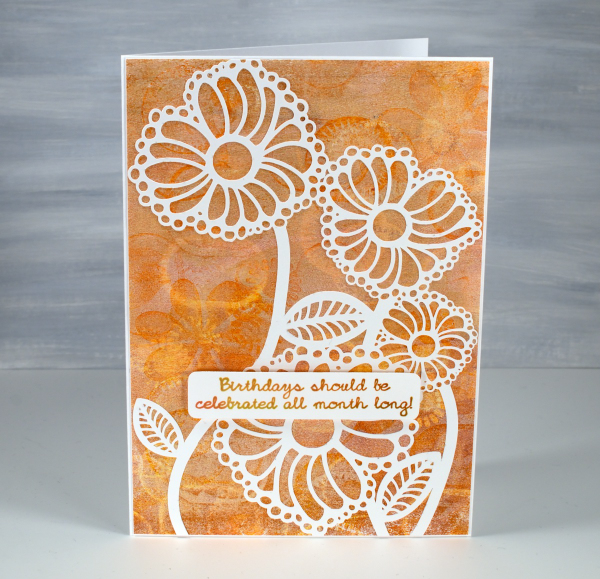
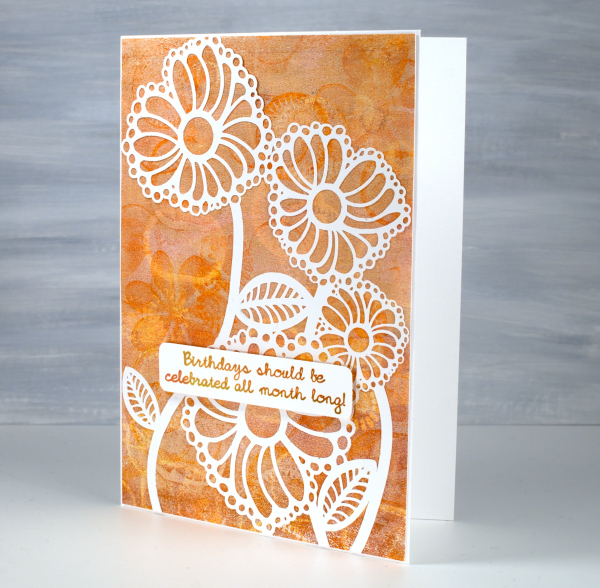
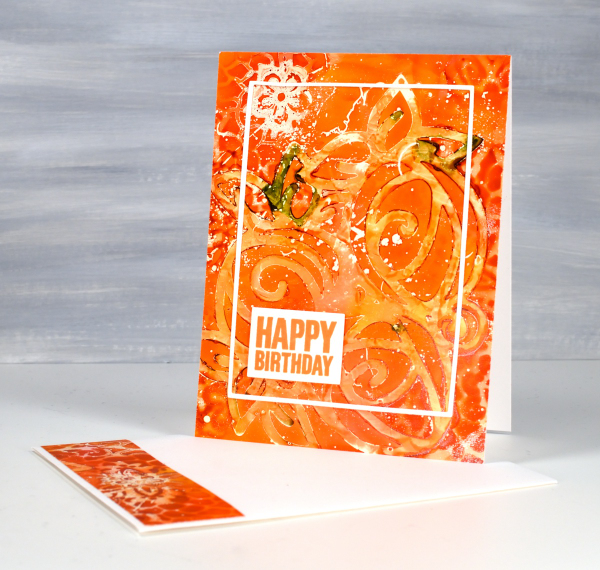
Bubble Flowers
Posted: February 29, 2024 Filed under: bubble flowers, cricut, Echidna Studios, gel press, grafix, Taylored Expressions | Tags: cricut, Echidna Studios, gel printing, grafix, Taylored Expressions 3 Comments
Aren’t these happy flowers? The design is called ‘bubble flowers‘ for obvious reasons and is one of mine. I was inspired by a vintage brooch. The digital design is available in the Echidna Studios etsy store and can be cut on a digital cutting machine as I have for today’s cards. It can also be printed, foiled and cut as a stencil for blending or gel printing. Do you get the idea you’ll be seeing more of the bubble flowers?
I cut the bubble flowers from thin white cardstock and you can probably tell there are some tiny cuts necessary. If I went much smaller than this I started to lose some of the bubbles so I kept it big enough for a 5″x7″ card.
The backgrounds for both cards are gel prints. The multicoloured one above was created with alcohol inks then pulled with white acrylic paint. It was so pretty I didn’t want to cut it up or cut it down, hence the large card with a layer over the top.
The second background panel was all done with acrylic paints and a selection of objects to add texture. I can see one of my die-cut stamps, some chocolate tray shapes, lid shapes and other found textures. I cover a wide range of techniques in my Gel Print Journey class and I think this might have been a print I did just as we finished filming. All my online classes are currently on sale 40% off by using the code LEAPYEAR40 at checkout or by simply clicking the link above.
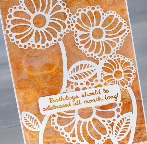
Because the bubble flowers are a delicate and detailed cut-out I used Grafix Artist Tac to glue them down. Once I had pressed the image onto the background I ran it through my die-cutting machine to burnish it. (quicker than doing it by hand). The sentiment is one I totally agree with and is from Taylored Expressions ‘In & Out Birthday’ set. Thank you for your lovely messages about our family’s February festivities; it was fun to share them with you in my previous post.
Roses Stencilled
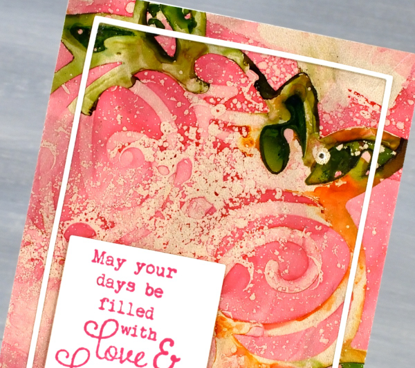
Posted: January 29, 2024 Filed under: Alcohol Ink, Echidna Studios, gel press, Roses digital stamp set | Tags: Alcohol Ink, Darkroom Door stamps, Echidna Studios, gel press, gel printing, Taylored Expressions 2 Comments
Last week I featured the Roses digital stamp set from Echidna Studios by cutting the rose trio from cardstock with my cricut. I have also cut dura-lar stencils with the same digital files. I cut them in different sizes for gel printing, blending or working with alcohol inks. To create both the pink and the orange panel I used alcohol inks on a gel plate and either dropped the rose trio stencil on top of the alcohol inks or lay the stencil down on the gel plate then added the inks. Both techniques work but by adding the alcohol ink after the stencil you have a bit more control of your ink placement. But you know alcohol inks; they kind of have a mind of their own.
On the card above you can see two patterns. The roses stencil was laid down on the inked gel plate first so you can see the whole design. The Finnabair/Prima ‘floral net’ stencil was laid over the top so there are snatches of that pattern around the edges where it made contact with the alcohol inks. If you are interested in using alcohol inks on the gel plate, check out my video here.
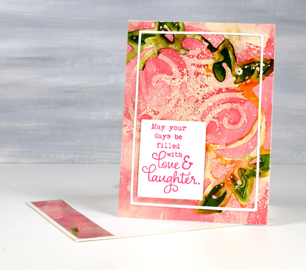
You can see from the photo at the top of the post that the pink one is a smaller card; it’s 5″ x3¾. This print doesn’t include a second stencil pattern but does have some isopropyl alcohol splatter adding interest. The sentiment is from Taylored Expressions ‘In & Out Birthday’ set.
The sentiment below is from the Darkroom Door ‘Happy Birthday‘ set.
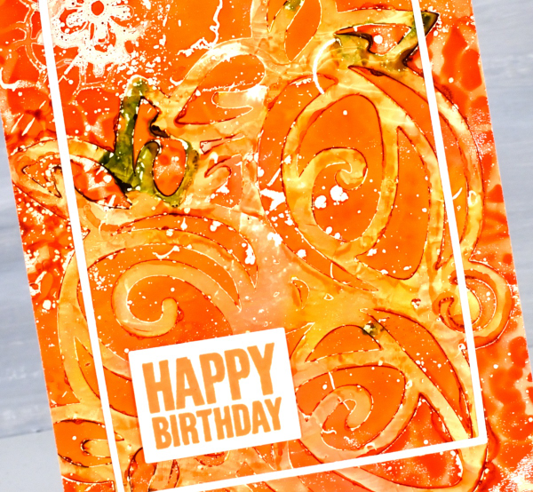
I used Waffle Flower A2 layers and Additional A2 layers die sets to cut the narrow border frames. These two sets have been so useful for cutting out panels and sentiments and adding very neat and correctly sized mats.

I’ll be back tomorrow to show you my project from Craft Roulette. Thank you to those of you who tuned in on youtube. It was lovely to have you there. Today’s post features affiliate links to The Foiled Fox. If you buy through these links I receive a small commission at no extra cost to you.
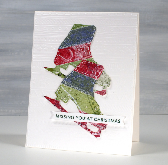
Collage Skates
Posted: December 13, 2023 Filed under: Dies, gel press, let's skate, Penny Black | Tags: gel press, gel printing, Penny Black creative dies, Taylored Expressions 1 Comment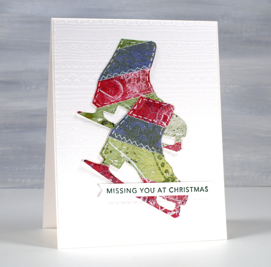
This was one of last year’s Christmas cards made during my collage Christmas card class. All the strips of colour are from gel prints. If you look closely you can see some grungy texture and pattern. None of the prints were amazing by themselves but when combined I quite liked the mix and pattern.
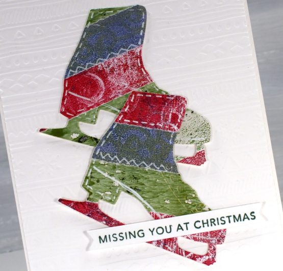
I used the Penny Black die set ‘let’s skate’ to cut two skates from the collage panel then popped them up on an embossed panel and added a Taylored Expressions sentiment from her ‘simple strips’ Christmas stamp.
I made many collage cards last year because I have so many gel prints to collage and many dies that worked for cutting. There were trees, bells, stars, poinsettia, stockings, baubles and more trees! I hope this is another idea you’ll try with your gel prints or any patterned papers or tapes. Washi tapes work well because the adhesive is already there!


