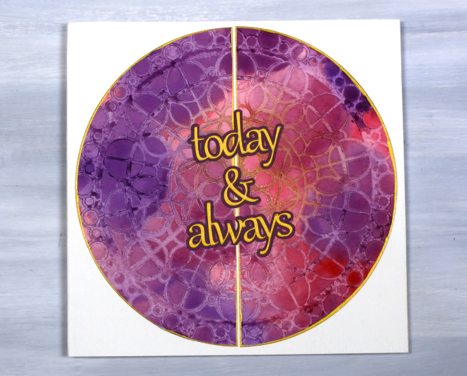
Today & Always
Posted: May 14, 2026 Filed under: beaded mandala, cricut, The Crafter's Workshop, Watercolour | Tags: Fabriano Watercolour Paper, Stencils, The Crafter's Workshop 2 Comments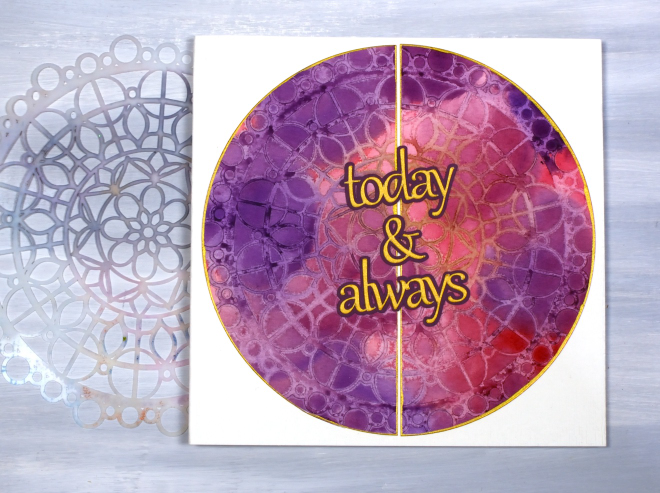
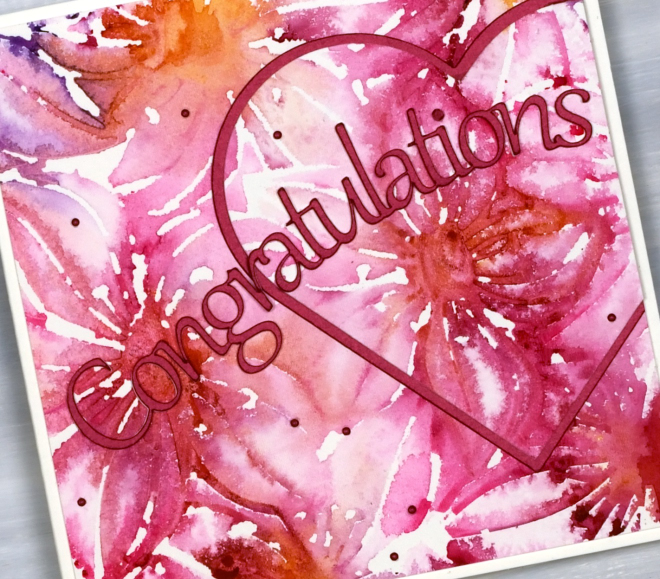
I have turned yet another stencil & watercolour print into a card, this time a wedding card featuring a large circle print made with the The Crafter’s Workshop ‘beaded mandala’ stencil.
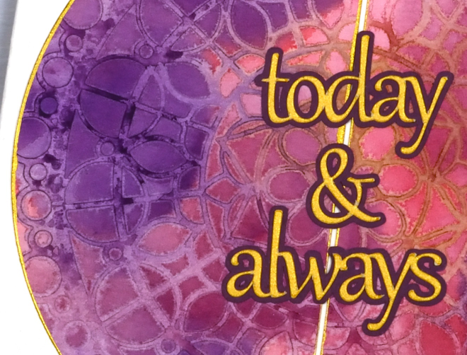
Most of the stencil print is paler than the surrounding blended watercolour painting because my technique involved spritzing the stencil to cover it with water before pressing it onto the painted panel. The water on the stencil dilutes the paint. I can’t remember for certain but I probably weighted the stencil down with a large acrylic block and let it dry for quite some time, maybe overnight. In the close up above you can see an area of the stencil print is a mustard colour, that was a happy accident due to the stencil not being clean! It prompted me to choose gold cardstock for the circle border and the sentiment cut on the cricut.
Thanks for dropping by. I think there will be several more stencil and watercolour projects to share but I do hear the gel plate calling me, so stay tuned!
Leafy Vines
Posted: May 11, 2026 Filed under: AALL & Create, The Crafter's Workshop, Watercolour | Tags: AALL & Create, Fabriano Watercolour Paper, The Crafter's Workshop 4 Comments
I have a stack of stencil+watercolour prints to turn into something and it appears that this ‘leafy vines’ stencil from The Crafters Workshop was a favourite during my preparations and workshops. I’ve turned one panel into a card and have six more panels to work with. I used a variety of techniques to create the panels including painting through the stencil as shown on this card.

Painting through the stencil didn’t give me a sharp complete representation of the stencil but it did give me a loose and impressionistic design with lovely soft blends from bluegreen to green to mustard. I matted with dark green cardstock and stamped an AALL & Create sentiment in green to complete the card.

Below are some more panels completed using the same stencil but different techniques. A few of them will become cards I imagine but I’m not sure with the blotchy one bottom right; not my favourite!

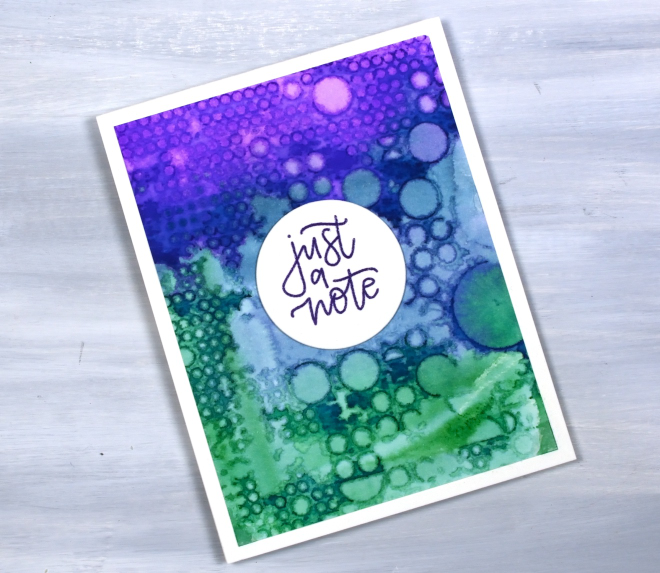
Totally Dotty
Posted: May 6, 2026 Filed under: AALL & Create, Classes, Concord & 9th, many mandalas, totally dotty stencil | Tags: AALL & Create, Classes, Concord & 9th, Fabriano Watercolour Paper, Stencils 4 Comments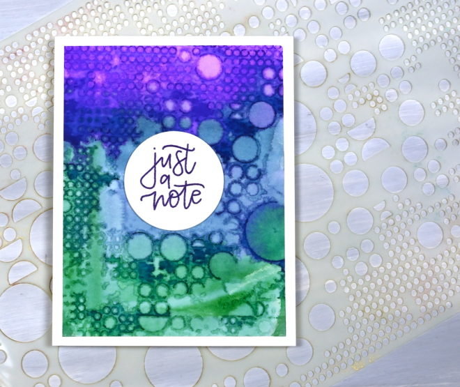
This stencil is appropriately called ‘totally dotty.’ It is a big stencil from AALL & Create and is cool for gel printing, alcohol inks and as it turns out, watercolour as well.
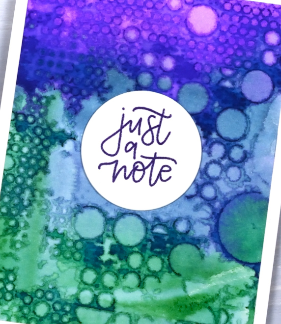
I have done quite a few stencil prints lately both in preparation for and during my recent workshops. I used different watercolour mediums including distress stains which provide quite saturated colour as you can see in the panel above. Pressing the painted panel on the stencil or vice versa can create very funky and distinct patterns as well as subtle dreamy ones. This panel ended up very distinct except for an area in middle. Not a problem as you can see; I stayed with the dotty theme and stamped my C&9 ‘many mandalas‘ sentiment on a circle for the centre.
This post includes an affiliate link from Scrap’n’Stamp . If you buy through this link I receive a small commission at no extra cost to you.
Roses Stencil in Blue
Posted: April 7, 2026 Filed under: Brusho, Classes, cricut, Echidna Studios, grafix, Roses digital stamp set, Watercolour | Tags: Fabriano Watercolour Paper, Brusho, Classes, grafix, Echidna Studios, Stencils 3 Comments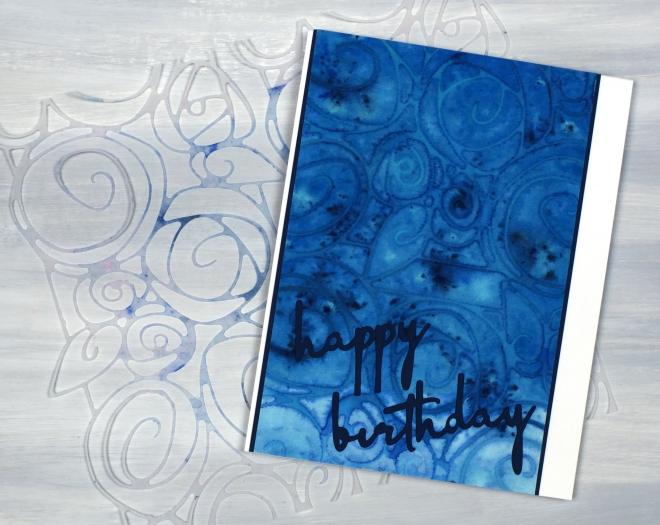
I’m continuing to enjoy my stencil and watercolour experimenting, this time featuring a stencil I designed myself and cut on the cricut. The stencil is made from two sections from a rose border digital design which is part of a trio of rose themed images available in the Echidna Studios etsy store. To create more of a square stencil I joined two parts of the border design together in cricut workspace before cutting them from Grafix matte dura-lar. I know many people don’t use cricuts or digital cutting machines but the technique would work with any fine line stencil.
I painted the panel in blue paint before dropping the stencil on top, then added brusho powder and some spritzes of water. I am continuing to finalise techniques for my Stencils & Watercolour workshop here in Ottawa and this was one of the panels I created on watercolour paper. (there is one space left in the Monday workshop and several spaces in the Saturday workshop)
The sentiment was also cut on the cricut from the navy cardstock which also frames the stencil print. I know the cricut can be used for many things but my favourite use for it is definitely stencils! Looking at the photos as I write this I notice I did not glue the tittle over the ‘i’ in birthday. I had better try and find it!
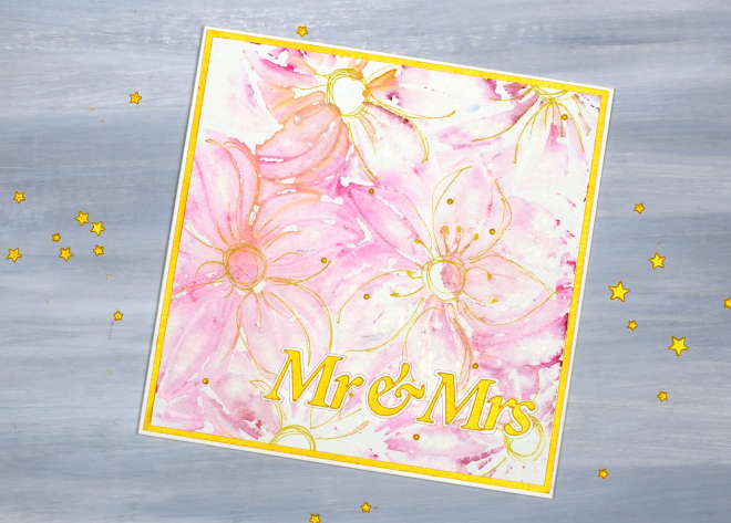
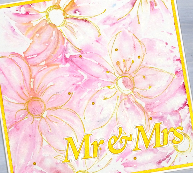
Stencil & Watercolour wedding cards
Posted: March 27, 2026 Filed under: Classes, clematis burst stencils, Creative Expressions, cricut, Watercolour | Tags: Fabriano Watercolour Paper, Classes, cricut, Stencils 2 Comments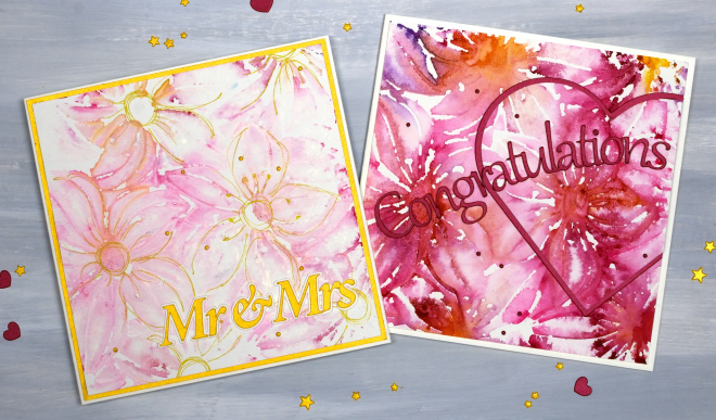
I’ve been creating quite a few patterned panels using stencils and watercolour while designing a workshop. There have been many experiments and most, but not all, have turned out quite well. You can see in the photo below the Creative Expressions square ‘Clematis Burst’ stencil beside two panels. The bright one on the left was the first impression and the one on the right the second impression using paint remaining on the stencil.
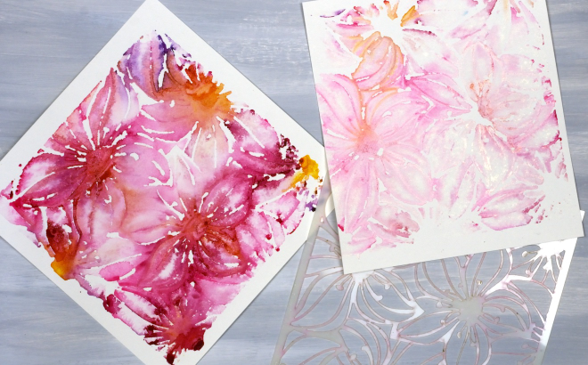
As I never seem to have any wedding cards on hand when someone asks for one I decided to make both panels into wedding cards, one bold and one subtle. I cut the sentiments on the cricut and also the large red heart

When you look closely you can see both ‘prints’ are loose and a bit messy but I don’t mind the impressionistic look!
I used a gold gel pen to add definition to the flowers on the lighter print, not every petal but enough to make sure they looked like flowers!
I am teaching a Stencils & Watercolour workshop here in Ottawa in late April and early May, you can find all the details on the CLASSES page.
Inspiration and Conversation
Posted: February 24, 2026 Filed under: Hand painted, sennelier watercolours | Tags: Fabriano Watercolour Paper, Hand painted, sennelier watercolours 18 Comments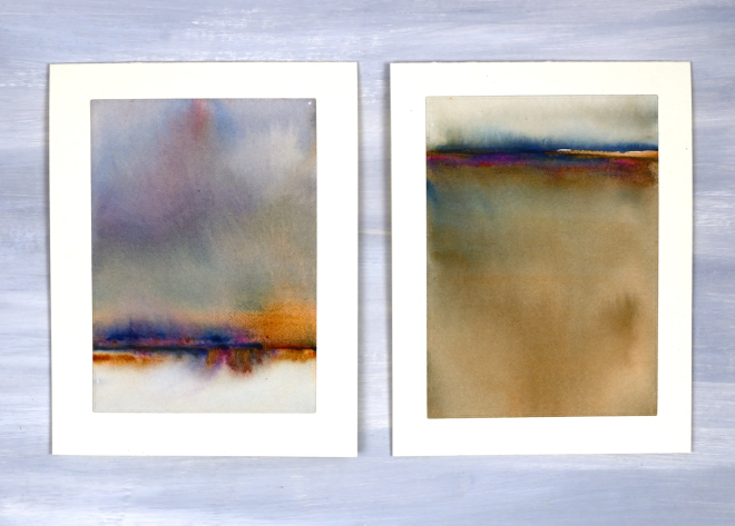
Today I wanted to have a bit of a chat with you, my readers, and especially take a few sentences to tell you how much I appreciate you. Some of you I have met but many of you I have not. Despite not having met in person I feel that we have formed a community and it is a very friendly and generous one. I took a break from the blog last year for several months and when I returned I was very encouraged by the comments and messages I received. Yes, it was nice to be missed, but more importantly it was lovely to see people engaging in discussion about techniques and materials. Many of you are kind enough to say you learn from my posts; I am so glad you do, but I also learn from you when you take the time to suggest products, methods and artists to check out.
Some of you have told me it is not as straight forward to comment these days. I’ve noticed this and I’m not sure why. I really enjoy hearing from you and read every comment and message I receive.
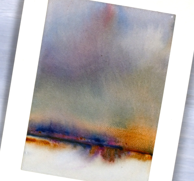
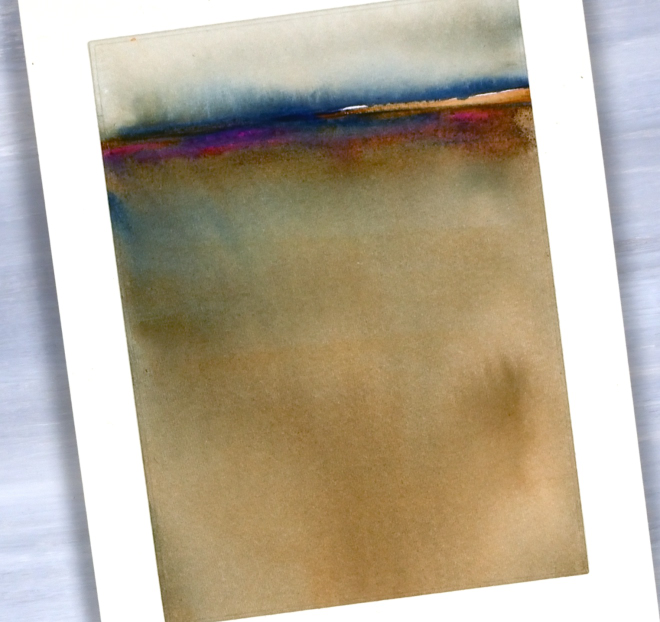
Today’s cards are inspired by the art of Claudia Drexhage. I encourage you to check out her website or instagram as her paintings are stunning and you will see where I got the idea for today’s abstract landscapes. I have only dipped my little toe into this technique but hopefully I’ll go in further in the future. One thing I find interesting about it is the way the abstract landscape can be seen one way and also turned upside down. I can’t remember which way I painted these panels originally but when I turned them into cards this week I decided I liked one with a big sky and the other with a big foreground. What do you think?
Thank you again for dropping in today and being part of this community. I look forward to seeing a few of you soon at some artsy get-togethers I am hosting but for those who don’t live close I look forward to seeing your inspiring creations if you share them on the interwebs or hearing from you in the comments or contact me button. Your encouragement and friendship mean a lot to me!
It’s been snowing
Posted: January 8, 2026 Filed under: Brusho, cricut, Darkroom Door, Echidna Studios, snow flakes, snowflake digital stamp set | Tags: cricut, Darkroom Door stamps, digital stamps, Echidna Studios, Fabriano Watercolour Paper 4 Comments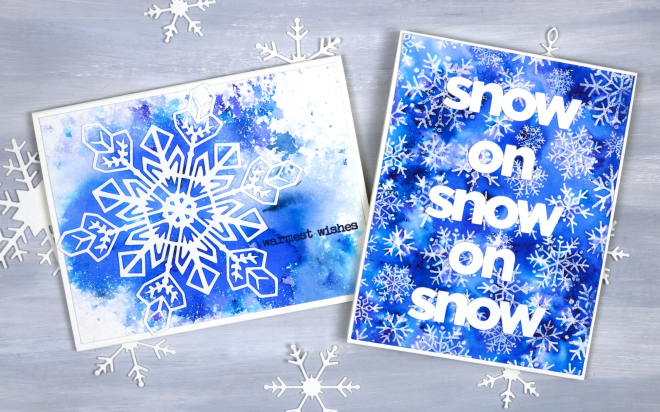
It’s been snowing quite a bit around here and we’ve had some very cold nights. A few of those nights happened to be while our furnace was not working but it’s fixed now and all is warm and cosy again! I am sending these out to a couple of friends who will totally get the snowy themed greetings, people who know about the beauty and length of a Canadian winter.
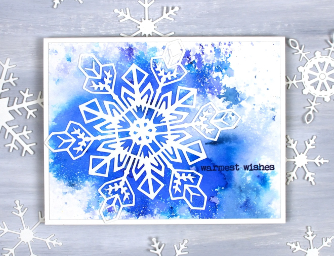
Believe it or not I did not create these cards at the same time but I’m pretty sure I ended up using the same supplies. The single snowflake card above was made with a watercolour panel I made years ago when experimenting with brusho. I probably sprinkled the brusho on watercolour paper then spritzed it with water until I was happy with the result. Even after you are happy with the result it can change as the paper and paint dry. I liked the panel so much I hoarded it, waiting for the right design. I am trying not to do that so much any more as I am very keen to Use What I Have (UWIH does not make a catchy acryonym so I am still playing with the category title). I paired the panel with one of my daughter’s snowflake designs available in the Echidna Studios etsy store as a print or cutting file. There are 6 snowflake designs in the set and I think they are beautiful.
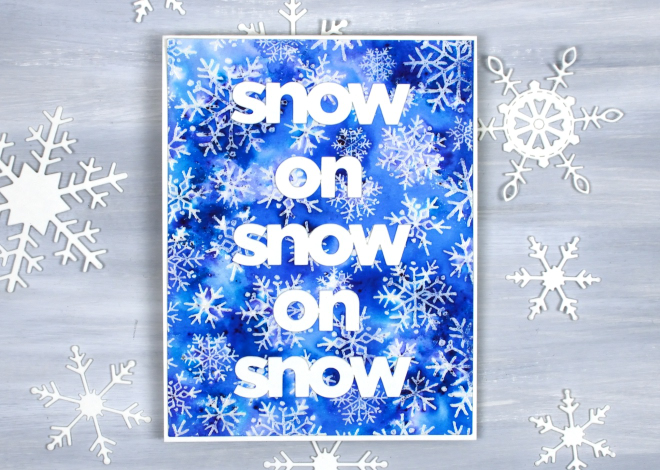
The second card was also made with brusho but I sprinkled it over an embossed panel. I embossed the Darkroom Door snow flakes background stamp with clear powder then covered it with brusho watercolour. I cut the words with my cricut to get a size that would show up on the busy background. Happy New Year and thank you for dropping in here.
Watercolour trees & skies
Posted: December 23, 2025 Filed under: Penny Black, ski lodge embossing folder, Spellbinders | Tags: Fabriano Watercolour Paper, Penny Black stamps, Spellbinders 1 Comment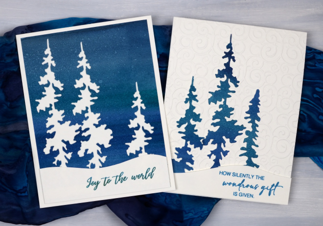
Here are a few more watercolour Christmas cards I made this year. I painted a large panel of watercolour paper in blues and greens blended together to create a striped mix of tones. From the large panel I cut background rectangles a bit smaller than my card bases and trees of different heights to arrange against embossed white skies. I don’t know the name of the tree die set as I borrowed it from a friend. I really like the non-symmetrical trees featured on the cards above.
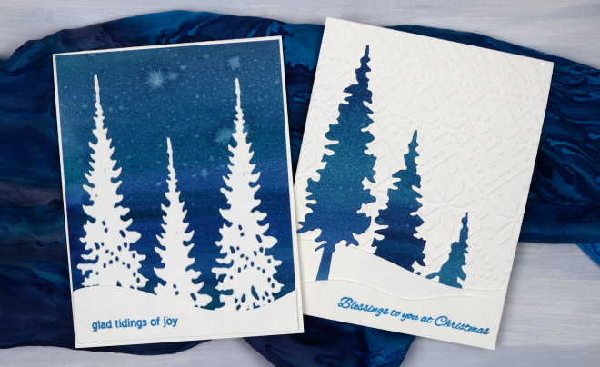
To create the snow banks I cut curved hill shapes, sometimes one, sometimes two per card. The cards were all finished with Penny Black sentiments. I have sent most of my cards but there are a few that will be new year greetings. Last week the snow was gradually disappearing around here as we had warmer temperatures and rain. This week it’s a different story; it’s been snowing for days.
Birds on Birches
Posted: December 9, 2025 Filed under: beneath the birches, Dies, Penny Black, sennelier watercolours, winter trees | Tags: Fabriano Watercolour Paper, Penny Black creative dies, Penny Black stamps, sennelier watercolours 3 Comments
In case you were wondering I have done some watercolouring for Christmas cards this year; it’s not all napkin art. I created a batch of cards for a friend which included either watercolour skies or watercolour trees.
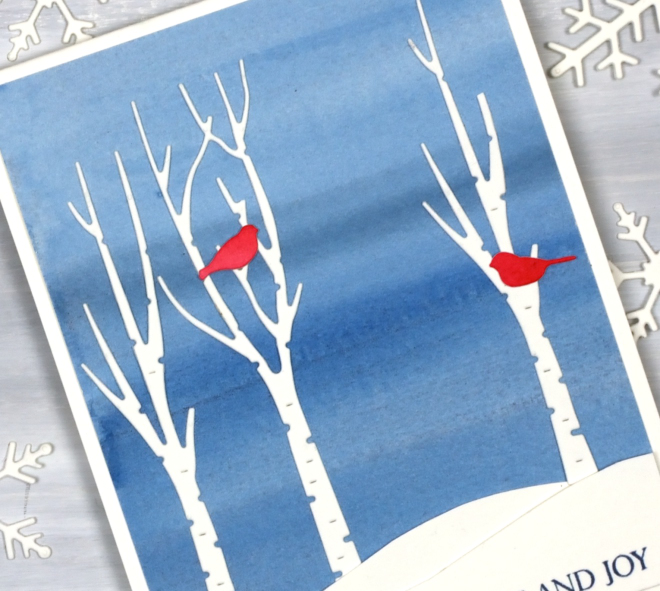
I painted a blended sky with a couple of different blues then added hand-cut snowbanks and die-cut trees and birds from the Penny Black sets, ‘beneath the birches‘ and ‘winter trees‘.
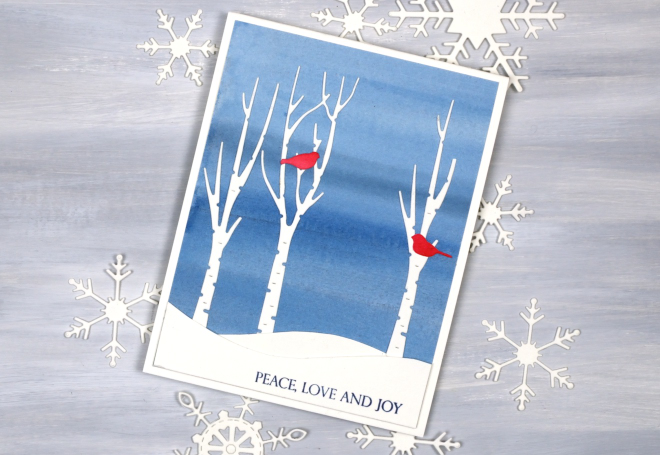
This would be a simple card to make in multiples by painting a large sheet of watercolour paper to divide into sky panels then add the white and red elements. The greeting is from the PB ‘Christmas sentiments‘ set. How is your Christmas card sending going? I sat in a waiting room yesterday and wrote about eight cards instead of reading a book or scrolling so that advanced me through my list a little.
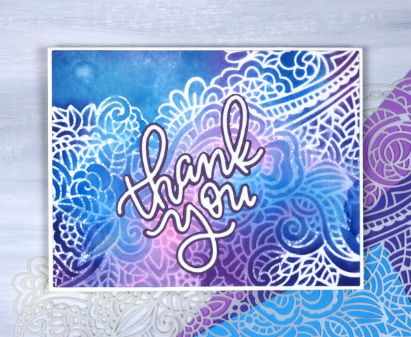
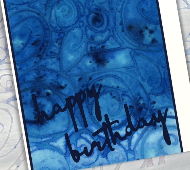
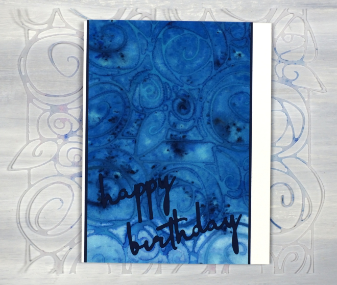
Stencilled Tendrils
Posted: November 14, 2025 Filed under: AALL & Create, twirling tendrils stencil | Tags: AALL & Create, Fabriano Watercolour Paper 3 Comments
I would call this a watercolour/inkblending/stencil mashup which is probably not the catchiest name! Regardless of the name, I like the result. I used blending brushes to blend three distress inks through the beautiful ‘twirling tendrils’ stencil from AALL & Create.
Salty ocean, chipped sapphire and seedless preserves will always be up there with my all time faves so I blended them onto hot press watercolour paper through the delicate stencil. After blending I gently spritzed water over the panel so come of the ink would move into the surrounding area. In places it reminds me of the crackled lines you get with batik.
I chose the layered sentiment because it mimicked the curls of the stencilling but was bold enough to stand out over the busy pattern.