The Stitched card
Posted: January 15, 2026 Filed under: My Favorite Things, Stitching | Tags: Mixed Media, My Favorite Things 8 Comments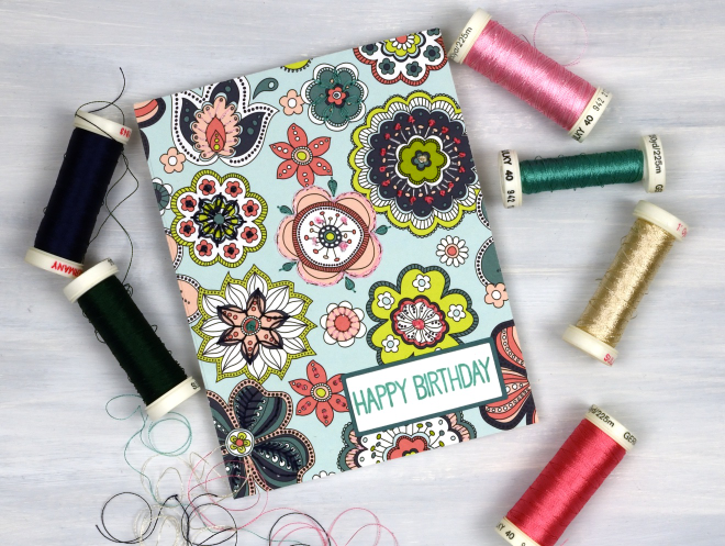
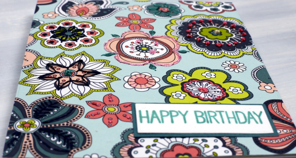
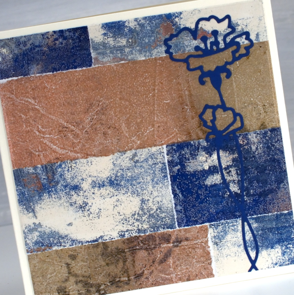
I decided to try something new. I’ve done hand embroidery before, but not on cards. I’ve stitched on cards before but with a sewing machine. This panel was my practice for another project but as you can imagine it takes a while to hand embroider on cardstock so I turned it into a card despite the mistakes I made.
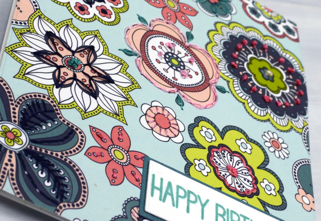
The patterned paper is from a paper pad; it had a bit of weight but I ironed fusible interfacing to the back to make it stiffer and less likely to tear. I used machine embroidery thread in a double strand but I think I will try some hand embroidery thread because it might be a bit thicker and show up a little more.
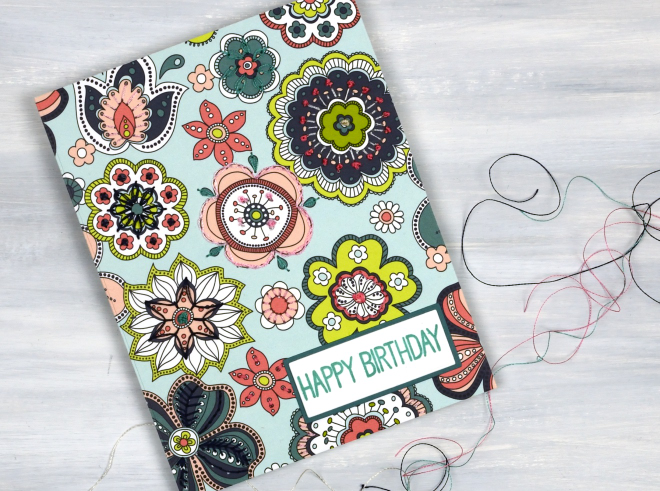
I used the patterns on the flowers as my guide for stitching. I didn’t stitch on every flower or on every part of a flower. I used French knots (some a bit rough!), daisy stitch and plenty of simple straight stitches covering lines on the patterned paper. The sentiment is from the MFT Birdie Brown greetings galore set.
Grafix Window Journal – Video
Posted: July 29, 2024 Filed under: Alcohol Ink, cricut, grafix, mixed media journal | Tags: Alcohol Ink, Art Journal, grafix, grafix craft plastic, Mixed Media, Ranger Alcohol Ink 1 Comment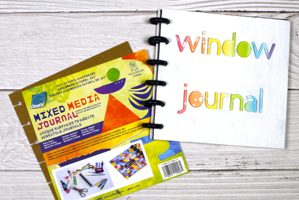
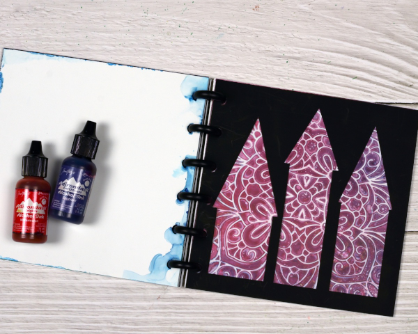
I’ve featured the Grafix Mixed Media Journal in videos a few times. I’ve made a swatch book for alcohol inks and markers and a sample book for alcohol ink techniques. Both books are good for reference. Today’s post and video feature the mixed media journal as a ‘window journal. I have added pages in pairs of black and white using the handy disc system. I have cut windows in the black pages and created alcohol ink patterns on the white pages.
You can configure the Grafix mixed media journals however you like as the pages and covers are available in separate packs or as a complete journal with different types of pages. Check out the video below to see how I put my window journal together.
You could create a window journal in many ways. I have added colour and pattern to only one side of the white pages but it would be fun to add a design on both sides so you could see the pattern through the window before the pattern and the window after.

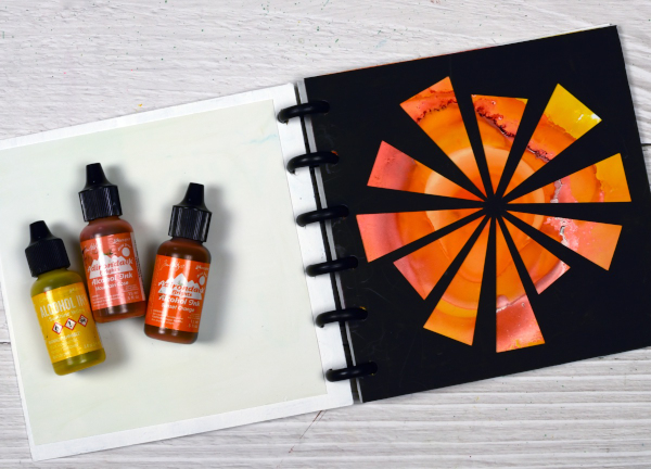
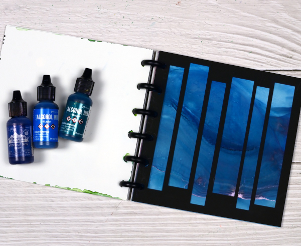
You can see in the video that I reworked the ‘ocean’ page shown below several times. That is the beauty of white craft plastic; it is possible to take the page back to white or just dilute the ink with isopropyl alcohol and move it into a new pattern.
The final page in the book features a stencil design with alcohol inks, so simple but so effective. I cut all the windows on my Cricut using free shapes available in Cricut design space but you could cut them with dies or with a craft knife.
To see my other videos featuring the Grafix Mixed Media journal click the following links: Swatch book Swatch book cover Technique book
Greenery Collage Cards
Posted: April 3, 2024 Filed under: Collage cards, Darkroom Door, Dies, Finetec paints, gift card pocket, global postmarks, Leaves, measuring tape, Mixed Media, paris postcard, Penny Black, Tim Holtz, wild flowers #1 | Tags: collage, Darkroom Door stamps, Finetec artist mica watercolour paint, Mixed Media, Penny Black creative dies, Penny Black stamps, Tim Holtz 6 Comments
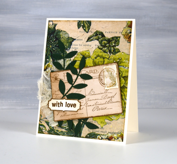
Continuing with the collage theme I have three cards featuring greenery from a paper napkin. I know people have been creating with paper napkins for years but I am new to the game. I have a small collection of pretty paper napkins to use on cards, book covers and journal pages. The green ones featured here are large dinner napkins found at Winners, probably in that tempting ‘just before the checkout’ area!

I glued the printed layer of the napkin over book pages to make my main panels and aged the edges with green and brown inks. I created a couple of little vintage postcards with the Paris postcard stamp, a background with the Measuring Tape stamp, sentiments and postmarks all from Darkroom Door.
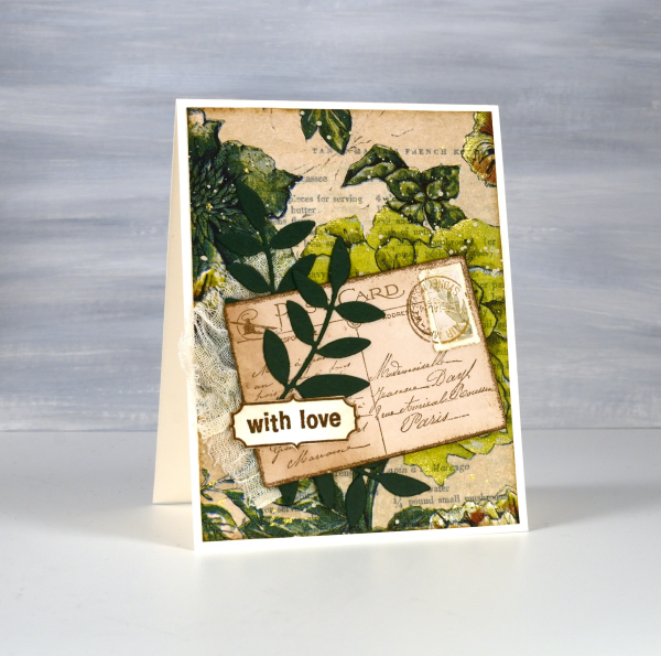
Once again I used some cute dies from Penny Black to cut tickets, file divider, tag and leaves adding blending around the edges for the vintage look.
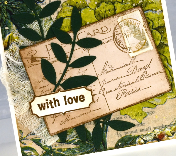
The scrap of cheesecloth, the lace and the grosgrain ribbon were all found around here, maybe the ribbon is actually vintage; it looks a bit discoloured from age which meant it co-ordinated well.

The lovely Queen Anne’s lace die is from the Tim Holtz ‘wildflowers #1 set.
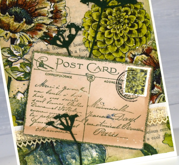
I did make my own little postage stamps for the postcards because I’m still in love with faux postage. These ones had to be quite small so I didn’t use a die I just punched tiny holes with a needle to perforate the edges. You can see a bit of splatter here and there with ivory paint and there are touches of gold watercolour paint on the petals of a few flowers too!
This post includes affiliate links from Foiled Fox and Scrap’n’Stamp . If you buy through these links I receive a small commission at no extra cost to you.
Vintage Collage Cards
Posted: April 1, 2024 Filed under: Collage cards, Darkroom Door, Dies, gift card pocket, handwritten ledger, Mixed Media, number medley, Penny Black, Tagged | Tags: Darkroom Door stamps, Mixed Media, Penny Black creative dies, Ranger archival inks 6 Comments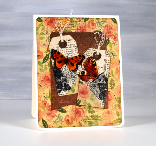
I’ve recently fallen down an vintage ephemera rabbit hole and emerged to make some of my own backgrounds and elements. There are companies that make beautiful co-ordinating ephemera, papers, chipboard pieces, etc. but I am committed to ‘using what I have’ so I’m pulling from old books, calendars, greeting cards, sewing patterns and scrapbooking paper along with a few handy tools.
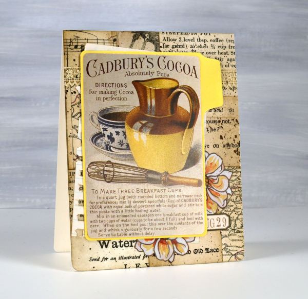
I’m not going to list every die, ink or paper but I will mention some of my favourite resources. The old books that I am removing pages from include music books, dictionaries, atlases, novels, poetry and recipe books. I also have some lovely papers and vintage pages that friends have given me, so it is fun putting them to use.

The inks I reach for are the distress brown tones from Ranger, not always the dye inks, but often the archival inks as they don’t dilute or smudge when I add glue or stamp on glossy paper.

I have a bunch of background stamps and sets from Darkroom Door which give me vintage style text, patterns and elements including but not limited to the ‘handwritten ledger‘ and ‘number medley‘.

I found amongst my Penny Black dies a file folder, notebook page, several tags, tickets, pockets and decorative borders. I also treated myself to a corner rounding punch that punches in three different sizes and of course the postage stamp die set I’ve featured a few times recently.
I pulled out twine, ribbon and lace for finishing touches and some vintage butterfly cut-outs that were all joined together by little tabs. I have had them for years ever since I inherited my mother’s teaching resources. You can seem them in the close up below.

Now just in case you are worried, I am not ripping pages out of beloved old books, but I am putting to use some books I inherited and don’t have a personal attachment to. Anne, Heidi, Jo March, Jane, Ratty and Mole are all safe! Old calendars, diaries, magazines and greeting cards are fair game because honestly, I’ve held onto some of them for a very long time. This post includes affiliate links from Foiled Fox and Scrap’n’Stamp . If you buy through these links I receive a small commission at no extra cost to you.
Family celebrations
Posted: February 27, 2024 Filed under: Ciao Bella, Darkroom Door, global postmarks, rice papers | Tags: Ciao Bella, Darkroom Door stamps, Mixed Media 9 Comments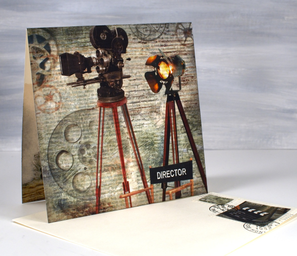
We recently enjoyed an exciting weekend as a family celebrating a birthday and a premiere. I used rice papers, sheet music and dictionary pages to create two custom cards. If you have done any of my online classes you might know my son is a videographer. He filmed my five classes for me but most of his time is spent on very different projects. Over the last few years he has been working on his first movie length documentary. It premiered in Ottawa a couple of weeks ago and our family along, with an excited crowd, were blown away by ‘City Limits: Ottawa’s Hip Hop History’.

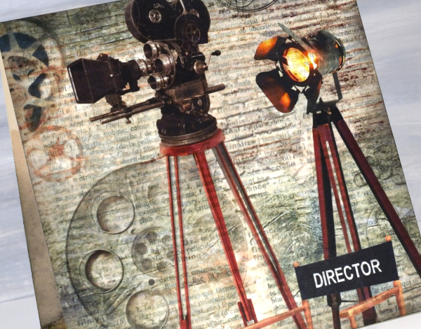
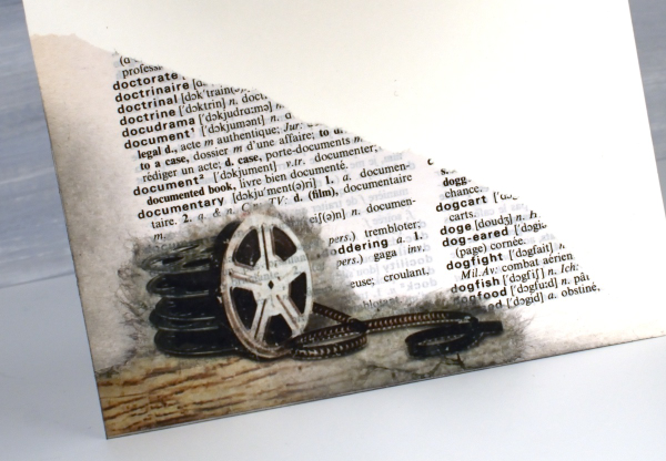
I had a lovely time creating a celebratory card using a sheet of Ciao Bella’s rice paper. I have a little stash of Ciao Bella papers that I hadn’t dipped into and this was definitely the right occasion. The paper is aptly called ‘The director‘. I cut a large section to be the card front, tore a corner featuring film reels to go inside and transformed two small bits into faux stamps for the envelope. I am a little obsessed with faux stamps at present and like to make them realistic with the Darkroom Door global postmarks stamp set.
I used a couple of dictionary pages to add to the overall theme. Behind the projector panel is a dictionary page featuring the word ‘film’ and you can see the torn section of the ‘documentary’ page below.
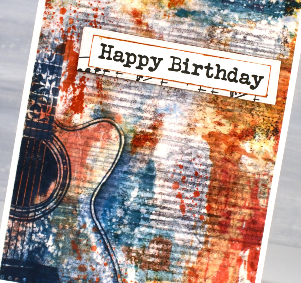
We celebrated my husband’s birthday the same weekend and I paired the CiaoBella blue note cards rice paper panel this time with sheet music, being that my husband is a guitarist. The rice paper already had a tiny music print on it but the music paper I glued behind had a larger staff. I used it inside the card and under the greeting as well.
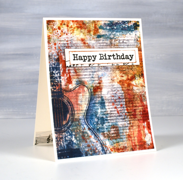
And yes, he did sight read the little segment I glued inside the card; he’s a musician!
This post includes affiliate links from Ecstasy Crafts where you can find these beautiful rice papers and many more. If you buy through these links I receive a small commission at no extra cost to you.
Roses on gel printed collage
Posted: January 25, 2024 Filed under: Echidna Studios, gel press, Mixed Media, Roses digital stamp set | Tags: Echidna Studios, gel press, gel printing, Mixed Media, Penny Black stamps 3 Comments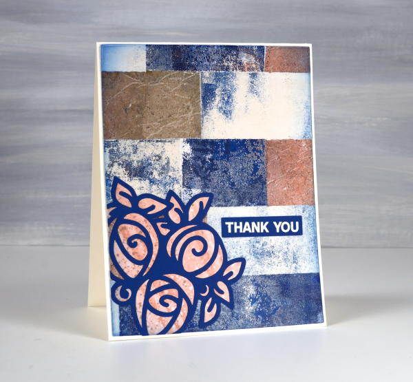
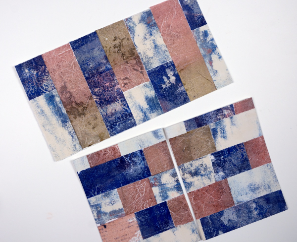
Unsurprisingly I have built up quite a supply of gel prints. Recently I turned a bunch of them into collaged panels. You can see in the photo below the simple collage I created by gluing torn strips of three different prints in a brick-like arrangement. To make things easy I tore the strips the width of my ruler so they are all 1¼” wide.
Once I trimmed the collage panel to card sized pieces I chose a trio or roses that I designed for printing and cutting and cut it from blue cardstock using my cricut. It is one of three designs in a set called ‘Roses‘ which is available in the Echidna Studios etsy store.

When you cut a design on the cricut or with a die you often have inside pieces you can discard or use to fill in the cut out shape. I cut the rose trio from dark blue and from pink patterned paper then saved the inside pieces from the pink to inlay the blue outline.

I added embossed sentiments from the Penny Black set ‘ever thanks‘ and some embossing around one of the panels with Ranger rose gold embossing powder.
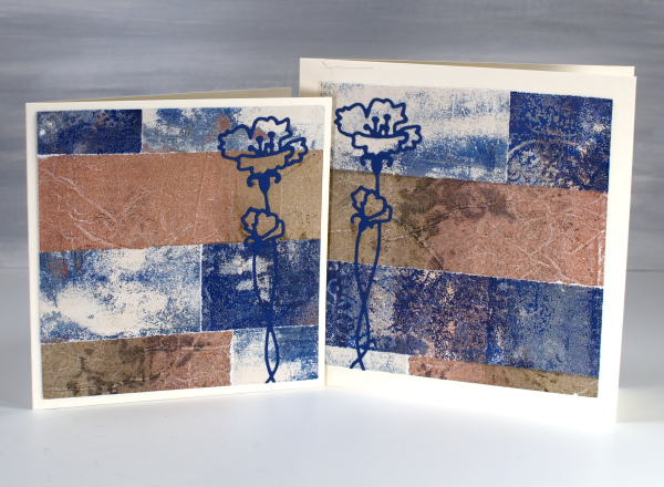
I was able to cut two smaller square panels which I also make into cards featuring the Penny Black die, ‘harmonious’. When you look at the gel prints themselves they don’t look all that fancy but when combined this way I really like the play of colours and textures.
I created a few more A4 panels from collaged gel prints and they are waiting for inspiration. I will share them here once I have a plan for them. Today’s post features affiliate links to the following companies. If you buy through these links I receive a small commission at no extra cost to you. The Foiled Fox & Scrap’n’Stamp.
The Wheels are Always Turning
Posted: August 25, 2022 Filed under: 6"x 6" journal, Art Journal, Ciao Bella, clockwork stencil, mechanical dies | Tags: Art Journal, Ciao Bella, Mixed Media, Tim Holtz 3 Comments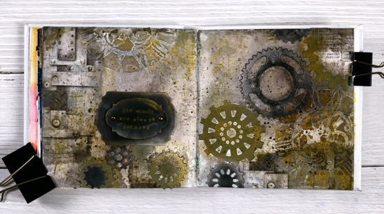
Not a leaf, tree or flower in sight on this journal page but it was made my me, just in case you are wondering. The day I created this page I claimed to have come over all Tim Holtzish; you can probably see the connection.
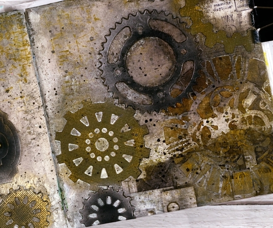
I began with a few strips of Ciao Bella rice paper glued to the left and right edges of the the journal pages. Over the rice paper I added texture paste through the Tim Holtz ‘clockwork’ stencil then filled the rest of the background with brown and black distress inks and sprays.
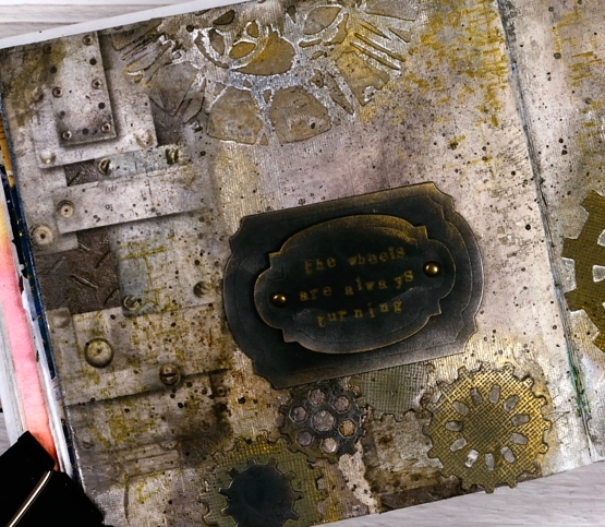
I cut a stack of gears from black and olive cardstock then arranged them both flat and stacked across the pages. The stars of this double page spread for me were the Finnabair metallic waxes. I applied them over the gear die-cuts and the stencilled clockfaces creating metallic edges and highlights. Adding old silver wax over black cardstock transforms it immediately.
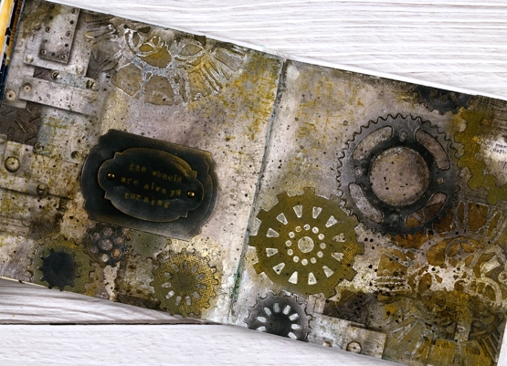
To complete the page I cut a couple of labels from black cardstock and rubbed wax on the edges. I used some little typewriter letters stamps to stamp, ‘the wheels are always turning’. When it comes to art journal pages and creating in general, my wheels are indeed always turning. Hope you have a creative day!
(Compensated affiliate links from Foiled Fox, Scrap n Stamp and Ecstasy Crafts)
Art Journal variations on a theme
Posted: July 27, 2022 Filed under: Art Journal, Mixed Media, silhouette birds, Tim Holtz | Tags: Art Journal, Mixed Media 7 Comments
The three journals featured in today’s post are getting quite full. One contains only projects completed during my art journal adventure workshops and the other two have a mix of workshop pages and other experiments and explorations. I have enjoyed art journalling for years but in the last twelve months it has captured more of my interest. Possible techniques or layouts continue to pop into my head waiting for a chance to be tried in the newer 6″x 6″ Ranger journals or the 6″x 9″ Fabriano journals I started years ago.
Sometimes I design a page especially with the art journal adventure in mind. Other times I look through the journals and decide to feature a technique, theme or mixed media material. By the time I have tried the page once or twice then completed fresh ones during the workshops I have four or five pages made with the same theme or technique. I am not keen to make the same thing more than once so I am always thinking about different ways to approach each page.
The five spreads featured today started with the one below (featured in more detail in a previous blog post). The technique remained the same for at each workshop, but the shapes, colours and layout varied from one session to the next.
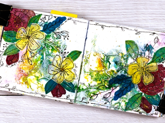
Of course not only are my pages different from each other but every page in the class is unique and I am always inspired by the colour choices, additional elements and different approaches each participant takes. Inspiration abounds. Can you tell I am enjoying myself?
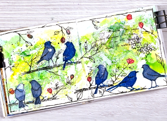
Supplies
(Compensated affiliate links used when possible)
Off to School journal page
Posted: July 15, 2022 Filed under: Alcohol Ink, Darkroom Door, Mixed Media, scratches, tickets | Tags: Art Journal, Darkroom Door stamps, Mixed Media 15 Comments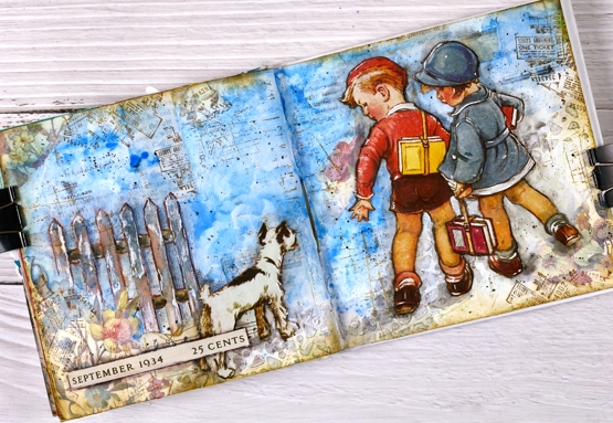
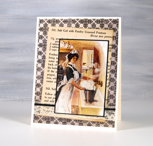
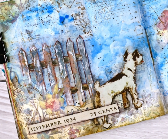
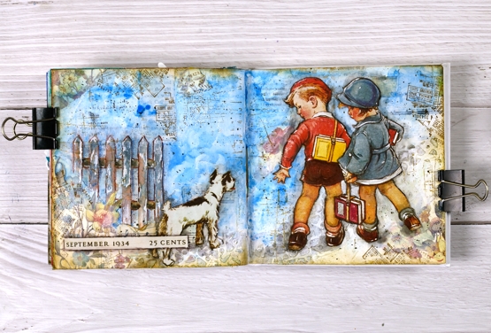
Some of you might recognise the artwork on this journal page. I have saved calendars, magazines, greeting cards and diaries over the years and now that I am creating collages and journal page spreads they are coming into their own. Quite a few years back I saw a calendar featuring covers from Good Housekeeping magazines of the 1920’s and 30’s. I thought the covers were delightful and bought two of the calendars. I enjoyed it during the year then tucked it away for future inspiration.
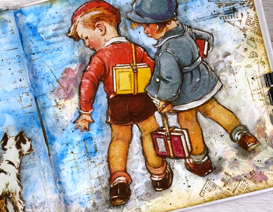
The calendar images are larger than the 6″x 6″ pages in the journals I am currently using so I chose a painting where I could cut out components and create a smaller scene. I cut the two children and the dog and glued them onto a collaged and painted background. I used floral paper mainly around the edges, blue paint for the background. The fence and cobble stone path were created with texture paste through a stencil. I used a few different Darkroom Door stamps to add vintage details across the page.
I did have to do more fussy cutting than I usually care to but these sweet images were worth it. Once they were glued down I used a black marker to go round the edges of the cut outs and immediately smudged the ink with my fingers or a damp brush. It’s a technique I have seen Vicky Papaioannou do many times on her journal pages. I used a white gel pen to add highlights, another trick from Vicky.
If you want to see what the original artwork by Vernon Thomas, just search good housekeeping magazine with the date I have added to the bottom left corner of my page.
Supplies
(Compensated affiliate links used when possible)
Coffee art journal page
Posted: June 9, 2022 Filed under: Art Journal, coffee time, Darkroom Door, Mixed Media | Tags: Art Journal, Darkroom Door stamps, Mixed Media, Ranger archival inks 8 Comments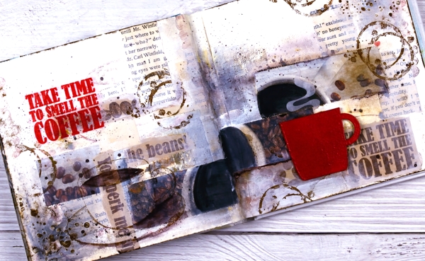
I’ve been having a delightful time in my art journals and in the Art Journal Adventure workshops. We have gone in three different directions so far and the next one is coffee or tea themed. You can see an example of a tea themed page on my classes page and here is my first coffee page.
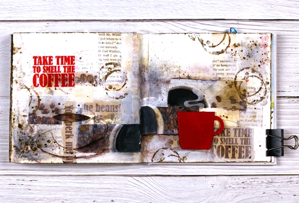
It doesn’t show up in the photo but the red cup is embossed and glossy and I want one just like it in real life! I used distress embossing glaze for both the words and the cup then had to create a visual triangle in red, do you see it?
I am currently not a coffee drinker which actually makes the quote all the more apt for me. I love the aroma! For Christmas I gave my husband a coffee subscription and each month the coffee comes in a cardboard package which smells delightful as does the mailbox !
If you are interested in joining in the art journal adventure please check out my Classes page where you will see the next two sessions or click on the Crop A While classes page.
Supplies
(Compensated affiliate links used when possible)