Vintage Butterfly Journal page
Posted: August 8, 2023 Filed under: 49 and Market, 6"x 6" journal, Art Journal, Curators Adverts, gel press | Tags: Art Journal, gel press, gel printing 4 Comments
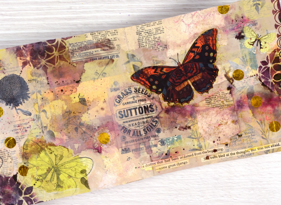
I recently completed this spread in my Ranger 6″x6″ kraft journal. The background or base of my page is covered in collage so by the time the page was finished very little of the kraft colour showed through.
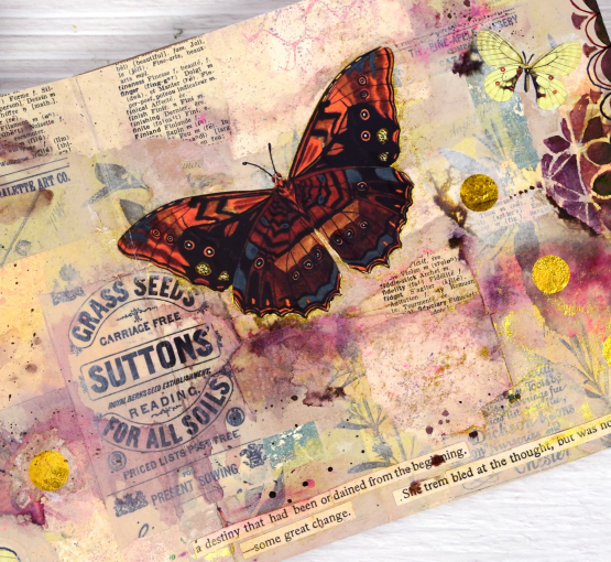
When I started this page I didn’t have a plan but I did have patterned papers on my table. I had some pink, yellow and apricot coloured gel print scraps, some yellow-green tissue paper printed with botanical images and as always, some vintage book pages. Some of the gel printed scraps were left over from the cards I featured in a post last week. I glued down the gel print scraps in no particular arrangement then began gluing the green tissue over the top. I have some fancy washi tape called ‘Curators Adverts‘ which is 4″ wide and covered in black-on-cream ads. I tore some pieces of that and added them over the paper collage.

The collaged page sat on my desk for several weeks before I resumed by adding acrylic paint in pale neutral tones including sand and old ivory. The paint began to tie the page together but it was still lacking a focal point. I flipped through the DK Bees, Birds and Butterflies Sticker Anthology and chose a few pale yellow butterflies which I added to the bottom left and top right corner.

You know I love splatter on my cards and journal pages so I added some droplets of dark brown ink, then spritzed it to dilute and move it around the page. The brown ink diluted to burgandy and pink tones which made me go back to the sticker anthology in search of a bolder butterfly. Once I had added it to the page I worked with walnut stain distress ink and Parker writing ink to add scallop patterns by hand and through the beaded mandala stencil.
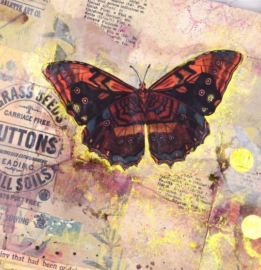
Final touches included some gold polka dot tissue paper, some sentences cut from book pages and sparkly gold watercolour paint. I really like the warm pinky brown tones of this page with some subtle yellow and green appearing sparingly. The vintage ad for grass seed is also a nice feature, centered but not the main attraction.
Collage is a favourite technique for me when beginning journal pages, how do you like to get started on a fresh new spread?
Time Art Journal page
Posted: March 6, 2023 Filed under: 6"x 6" journal, Art Journal, Darkroom Door, diamonds, gel press, ransom alphabet, starry night, Stencils | Tags: Art Journal, Darkroom Door stamps, Darkroom Door stencils, gel press, gel printing 4 Comments
This journal page is unlike many of my other pages but contains some of my favourite papers and techniques. What you can’t see is the design I started underneath about a year ago. It had the look of a watercolour sunset but everytime I flipped to that page I didn’t know what to do with it; eventually I covered it up completely.
This is the same as the 6″x6″ watercolour paper journal I use in my Art Journal Adventure workshops. The clock and the starry sky background are gel prints. I did them quite a while ago but because of their size I didn’t know how to use them. The clock was 7″ across before I cut it. It’s an image transfer from a Tiffany’s catalog which arrived at my house for no reason. I don’t have anything from Tiffany’s but I can tell you the images in that catalog are perfect for gel print image transfers! The starry sky was also a large print made with large stencils from Darkroom Door. I could have cut up the panel for cards but I wanted to keep it together if possible. I did end up tearing it into two pieces before gluing it to the page. The galaxy type strip from left to right covers the area where the two pieces meet.
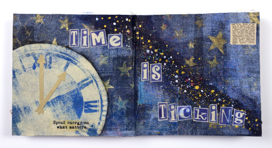
The theme of time is not meant to bully me into being busy, more to remind me that time is precious and why not use it wisely. I printed the letters for the phrase on the rice paper leftovers from the cut out clock using the Darkroom Door ransom alphabet set. That little definition in the corner is from a little palm sized dictionary bought second hand for collage.
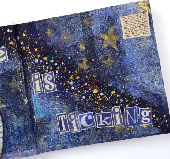
The splatter on the black gesso strip is finetec pearlescent paints which tie in with the gold metallic printing on the star gel print. Considering the double page was uninspiring for so long, I’m quite happy with how it turned out.

(Compensated affiliate links from Foiled Fox, Scrap n Stamp)
Tea, Coffee, Art Journalling?
Posted: February 28, 2023 Filed under: 6"x 6" journal, Art Journal, Background Stamps, coffee time, Cup of tea, Darkroom Door, Dies, Gazette, Penny Black, Script, Time, What's in your cup, World Map | Tags: Art Journal, Darkroom Door stamps, Penny Black creative dies, Penny Black stamps, Ranger Distress inks 2 Comments
Today I am posting a few pages from last year’s Art Journal Adventure workshops. I taught seven different ‘episodes’ last year and one month the theme was coffee and tea. I did a few pages before the sessions and then created a different page during each class. I don’t like replicating the same spread in my art journal so each one had a different colour scheme and style.

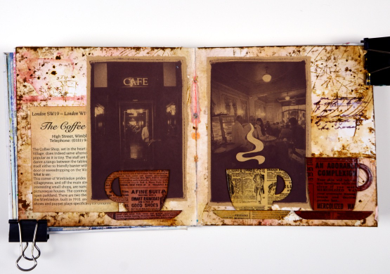
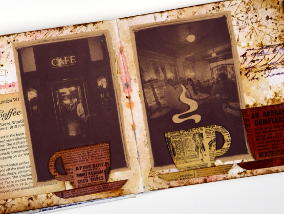
Even though I am more of a herbal tea drinker than a coffee drinker I ended up creating three coffee themed pages and two tea themed. You can see the first coffee themed page here. As you can see from the three spreads featured here I use a variety of techniques, papers and elements in my pages. The common technique on these pages is a watercolour background and the common element is the chipboard cups. Both the coffee themed pages feature photos from an old coffee themed diary. In both cases I took my colour scheme from the photo and added browns.
This tea themed page could also be called ‘these are a few of my favourite teas!’ I used packaging from boxes and sachets, embossed the teacups to match and add snippets from old books and magazines.
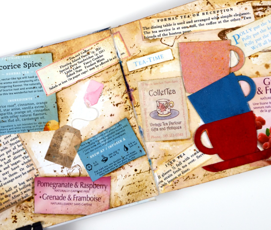
These pages show how I gather elements and papers from here, there and everywhere when creating a page. I used inks, embossing powders and glazes, stamps and stencils for these pages but I also used an old diary, packaging, pages from a vintage recipe book, and old teabags!
I almost didn’t finish this last spread but once I had stamped then glazed the cute chipboard cups I knew I had to finish. Now I want a mug with vintage newsprint on it!
Art Journal Adventure for 2023 kicks off this week. There is still space in the Friday class and the Monday class. We will be creating with semi- transparent papers.
(Compensated affiliate links from Foiled Fox, Scrap n Stamp)
The Wheels are Always Turning
Posted: August 25, 2022 Filed under: 6"x 6" journal, Art Journal, Ciao Bella, clockwork stencil, mechanical dies | Tags: Art Journal, Ciao Bella, Mixed Media, Tim Holtz 3 Comments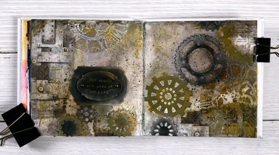
Not a leaf, tree or flower in sight on this journal page but it was made my me, just in case you are wondering. The day I created this page I claimed to have come over all Tim Holtzish; you can probably see the connection.
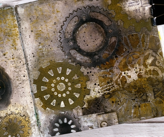
I began with a few strips of Ciao Bella rice paper glued to the left and right edges of the the journal pages. Over the rice paper I added texture paste through the Tim Holtz ‘clockwork’ stencil then filled the rest of the background with brown and black distress inks and sprays.
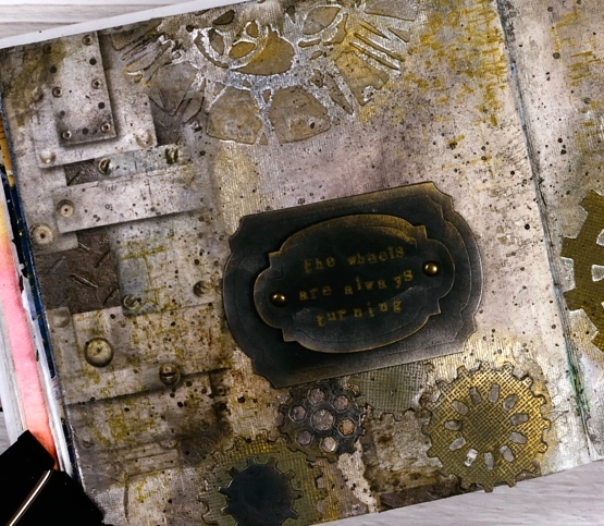
I cut a stack of gears from black and olive cardstock then arranged them both flat and stacked across the pages. The stars of this double page spread for me were the Finnabair metallic waxes. I applied them over the gear die-cuts and the stencilled clockfaces creating metallic edges and highlights. Adding old silver wax over black cardstock transforms it immediately.
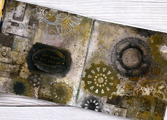
To complete the page I cut a couple of labels from black cardstock and rubbed wax on the edges. I used some little typewriter letters stamps to stamp, ‘the wheels are always turning’. When it comes to art journal pages and creating in general, my wheels are indeed always turning. Hope you have a creative day!
(Compensated affiliate links from Foiled Fox, Scrap n Stamp and Ecstasy Crafts)
Winter Tree art journal page
Posted: January 13, 2022 Filed under: 6"x 6" journal, A blizzard, Art Journal, Darkroom Door, Dies, French Script, Mixed Media, Snowflake trio, snowflakes | Tags: Art Journal, Darkroom Door stamps, Mixed Media, Penny Black creative dies 12 Comments
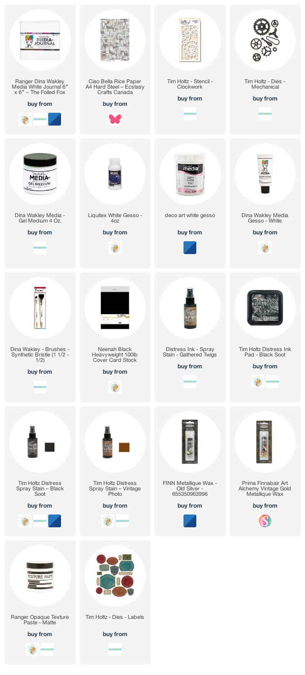
I continue to create and experiment in my 6×6 art journal, definitely inspired by the current season and view. When I started this page I had a technique in mind but no picture in my head of how it might turn out. I couldn’t be happier with the end result!

I am trying a range of techniques and methods in my art journals because that is what they’re for and because I have a series of workshops coming up this year (temporarily postponed until restrictions change). On this spread I started by layering and gluing torn papers on the pages. I pulled blue pieces from my considerable stash of papers, some old (Penny Black 6×6 packs) and some new (decorative rice paper) along with Dina Wakley printed white collage paper. After gluing the strips here and there I added modeling past through a stencil and let that dry.
Over the papers and paste I painted white gesso and then a couple of blues from Dina Wakley’s acrylic selection. You can see some of the patterns show through from the papers and in real life you can also see the texture from the stencilled paste. I added stamping in blue and white with Darkroom Door background stamps, ‘snow flakes’ and ‘French Script’.
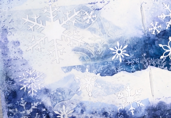
I had started the page with a vague idea of adding a picture from a Christmas card or magazine. In choosing the tree picture you see included I fell down a rabbit hole of memories going through boxes of saved cards! I have saved cards since childhood and I was sorting and reading for quite a while. I didn’t open every single card but I found some adorable and hilarious cards made by my children and some I taught in school, I also found many sweet notes in cards from my parents, aunts, uncles and grandparents. The picture I chose of the single tree on a snowy hill was in a Christmas card from a sweet friend.
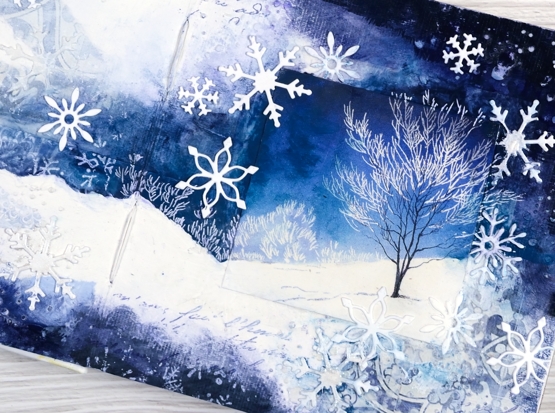
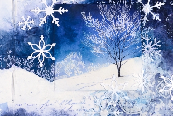
It is worth noting at this point that I didn’t plan this layout or have this card on hand when I started the painting so the colours did not match perfectly. You know how I feel about the matchy-matchy so I ended up adding paint to the sky around the tree to make the blue a bit more purply and less aqua. I also extended the scene by turning a white area that was already on the page into a clearly defined snowy hill. I used a white gel pen to add more foliage to carry the scene off the little square onto my page. I finished off the page with some die cut Penny Black snowflakes.
I know that is a lot of description that would be better understood with video footage but it didn’t happen this time. As I continue to make pages I will try to capture some of them on film.
Do you save the cards you are given? Do you put them to use making something new? Just wondering…
Supplies
(Compensated affiliate links used when possible)