
Vintage Collage Cards
Posted: April 1, 2024 Filed under: Collage cards, Darkroom Door, Dies, gift card pocket, handwritten ledger, Mixed Media, number medley, Penny Black, Tagged | Tags: Darkroom Door stamps, Mixed Media, Penny Black creative dies, Ranger archival inks 6 Comments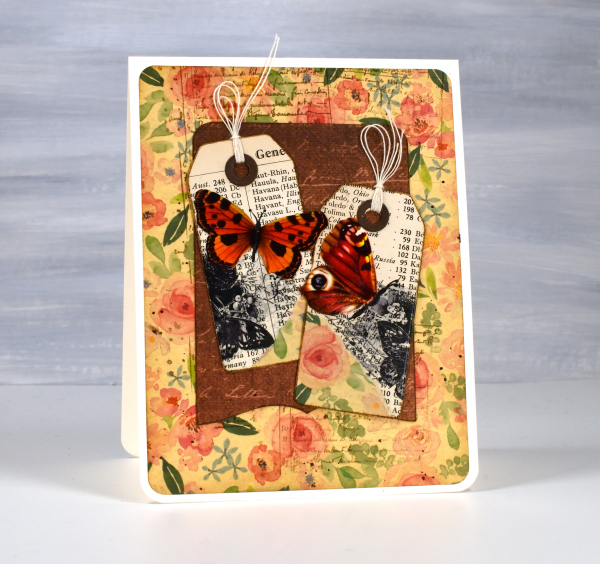
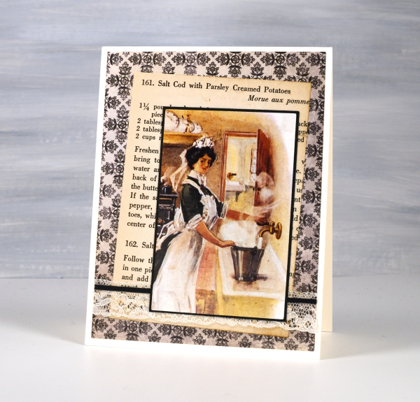
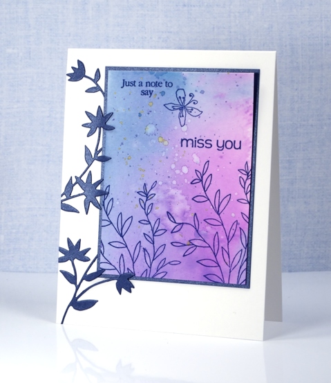
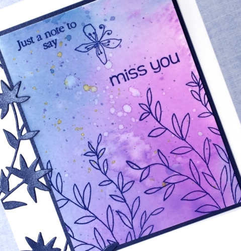
I’ve recently fallen down an vintage ephemera rabbit hole and emerged to make some of my own backgrounds and elements. There are companies that make beautiful co-ordinating ephemera, papers, chipboard pieces, etc. but I am committed to ‘using what I have’ so I’m pulling from old books, calendars, greeting cards, sewing patterns and scrapbooking paper along with a few handy tools.
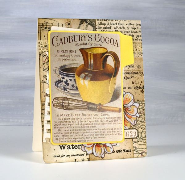
I’m not going to list every die, ink or paper but I will mention some of my favourite resources. The old books that I am removing pages from include music books, dictionaries, atlases, novels, poetry and recipe books. I also have some lovely papers and vintage pages that friends have given me, so it is fun putting them to use.

The inks I reach for are the distress brown tones from Ranger, not always the dye inks, but often the archival inks as they don’t dilute or smudge when I add glue or stamp on glossy paper.

I have a bunch of background stamps and sets from Darkroom Door which give me vintage style text, patterns and elements including but not limited to the ‘handwritten ledger‘ and ‘number medley‘.

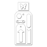
I found amongst my Penny Black dies a file folder, notebook page, several tags, tickets, pockets and decorative borders. I also treated myself to a corner rounding punch that punches in three different sizes and of course the postage stamp die set I’ve featured a few times recently.
I pulled out twine, ribbon and lace for finishing touches and some vintage butterfly cut-outs that were all joined together by little tabs. I have had them for years ever since I inherited my mother’s teaching resources. You can seem them in the close up below.

Now just in case you are worried, I am not ripping pages out of beloved old books, but I am putting to use some books I inherited and don’t have a personal attachment to. Anne, Heidi, Jo March, Jane, Ratty and Mole are all safe! Old calendars, diaries, magazines and greeting cards are fair game because honestly, I’ve held onto some of them for a very long time. This post includes affiliate links from Foiled Fox and Scrap’n’Stamp . If you buy through these links I receive a small commission at no extra cost to you.
Blooming Blue Again
Posted: July 6, 2022 Filed under: blooming, Dies, how sweet, Penny Black, Tagged | Tags: Penny Black creative dies, Penny Black stamps, Ranger archival inks, Ranger Distress inks 11 Comments
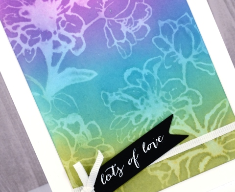
I’m still having fun with PB ‘blooming’ stamp. Once again I used blue inks but this time the combo was chipped sapphire and blueprint sketch. When blended I got blues and purples but not the pinks that seedless preserves provided. If you read my last post you might remember I unintentionally ended up with brown centres. This time I made sure I inked with fossilized amber and wild honey to create yellow centres.
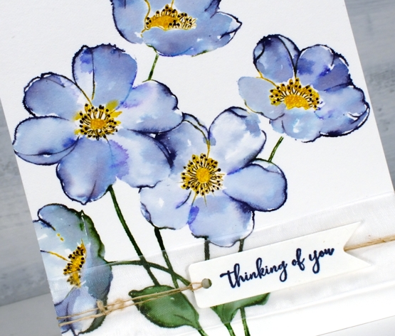
I worked in the stamp positioner to make this panel and did all the green and blue inking and stamping first. I left the centres un-inked so I could add them after the petals were stamped, blended and dry. I don’t mind some blending but I didn’t want the blue and yellow to get too close and blendy because that would mean green centres. Once the yellow centres dried I used a black gel pen to add stamen.
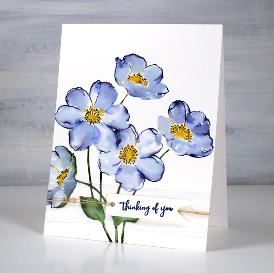
I wanted to gussy this one up a little but still keep the clean look so I used a small piece of organza ribbon across the base of the panel then stamped on a banner die cut and tied it on with twine.
Supplies
(Compensated affiliate links used when possible)
Grape Hyacinths
Posted: May 16, 2022 Filed under: Darkroom Door, Dies, fine flowers vol 2, Penny Black, Tagged | Tags: Darkroom Door stamps, Penny Black creative dies, Ranger Distress inks 7 Comments
My garden seems to have lost its grape hyacinths; I used to have quite a few that would pop up year after year but I only saw a couple this year.
We had three days above 30°C last week so there is plenty happening in the garden. The crab apple is blossoming and the last of the daffodils are hanging on. I bought some annuals and started filling pots yesterday.
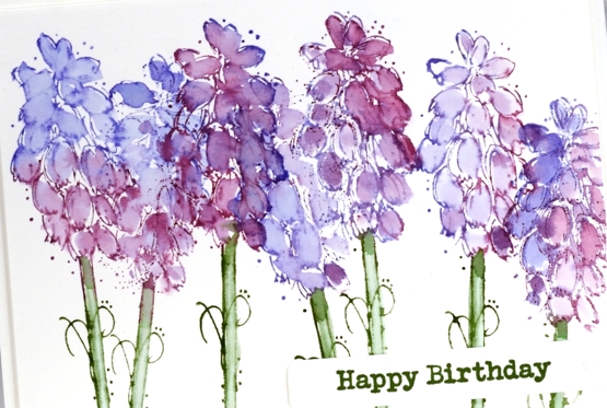
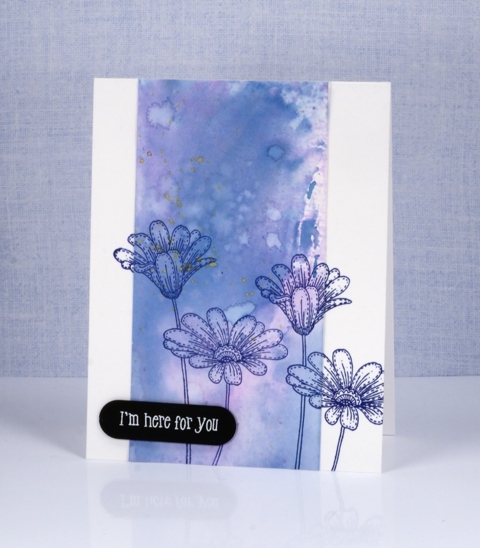
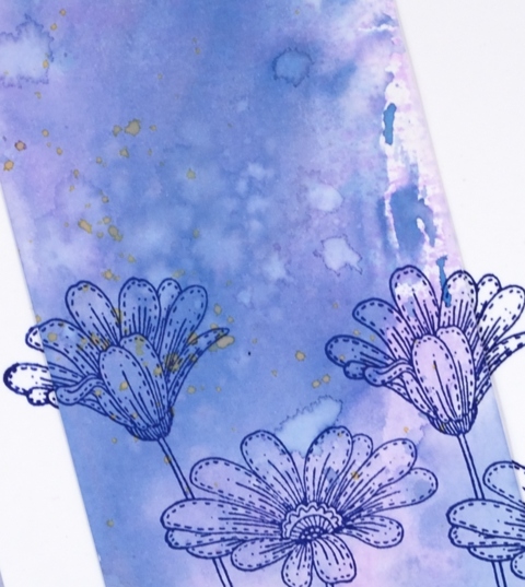
The stamp featured is from the Darkroom Door set ‘fine flowers vol 2’ designed by Godelieve Tjiskens. I inked the petals with seedless preserves and blueprint sketch distress inks then blended with water after stamping. The stems are rustic wilderness distress and the sentiment rustic wilderness archival.
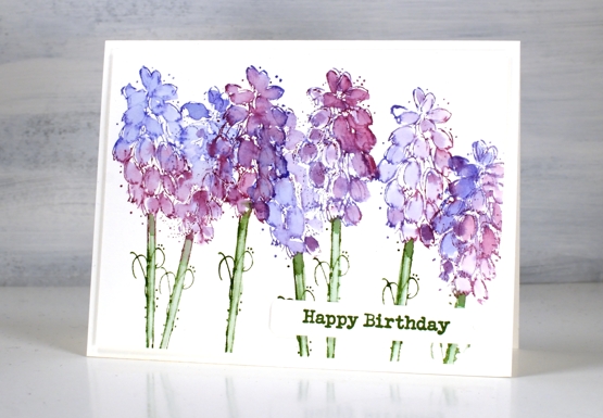
Hope you are enjoying some colour in the world around you; perhaps you’re seeing warm tones if you are in the southern hemisphere.
Supplies
(Compensated affiliate links used when possible)
Three colour brusho video
Posted: April 9, 2020 Filed under: Brusho, flutterby, Penny Black, Tagged, Tutorial, Watercolour | Tags: Brusho, Faber-Castell Polychromos Colour Pencil, Fabriano Watercolour Paper, Penny Black creative dies, Penny Black stamps, Tutorial, video 7 Comments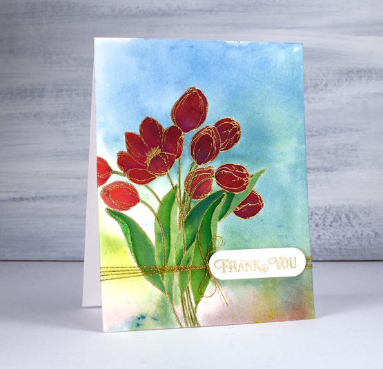
A while back I posted three cards all painted with the same three brusho paint colours and my Welsh friend, Karen requested a video. Well this is it, a different stamp and three different colours (Brusho sunburst lemon, prussian blue, rose red) but the same technique. Here is the one that prompted the video request.

As with the card above I embossed the outline stamp, ‘flutterby’ in gold powder then swiped up a brusho background by sprinkling brusho on my glass mat then spritzing water over it to activate the powders and turn them into liquid watercolour paint. From there I moved onto painting petals and leaves with individual colours and secondary colours. Take a look at the video and you will see what I mean.
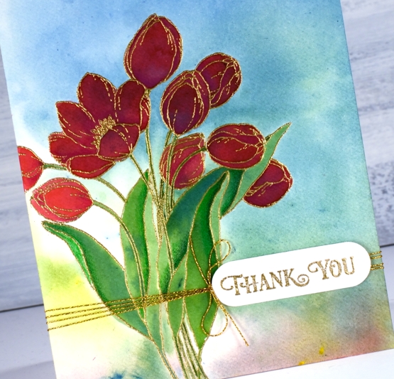
After all the painting was done I added some extra shading in shadow areas with Faber-Castell polychromos pencils and some gold thread detail. The sentiment is from PB ‘banner sentiments’ gold embossed and die cut with a die from the PB ‘tagged’ set.
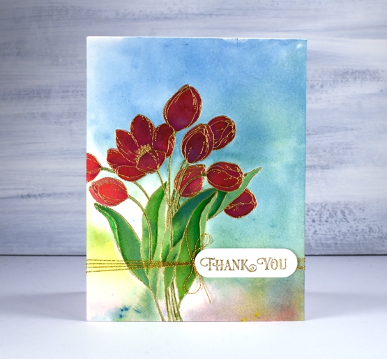
One of the things I like about this technique is the way the background works with the painted images even though the are painted right over the top of a multicoloured panel. The colours work because they are the same colours and because the background is not too bold. You can see in the tulip on the left what the true colour of the rose red brusho is, but the ones that are painted over the blue background still look red, just a deeper red perhaps in shadow not full sun.
Happy Easter my friends. Stay home, stay healthy, stay hopeful and maybe try a new art or craft technique!
Supplies
Time for tea
Posted: November 6, 2019 Filed under: Cup of tea, Tagged, teacups | Tags: Darkroom Door stamps, Penny Black creative dies, Ranger Distress inks 10 Comments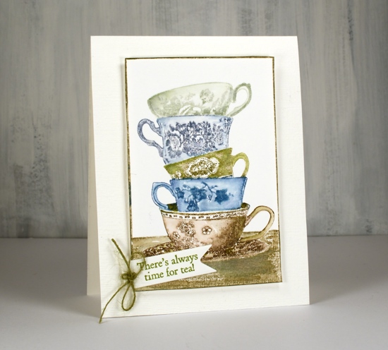
I love this little stack of teacups from Darkroom Door. I have some pretty teacups that belonged to my Nanna, some from my Grandma and some from my mother. I don’t often use them because I like a much bigger cup of tea but I love having them. There are intricate details on the cups on this stamp but I have chosen not to colour the patterns individually, instead colouring each cup a different colour. I kept my colour scheme muted sticking with inks I have been using to stamp forests and trees lately.
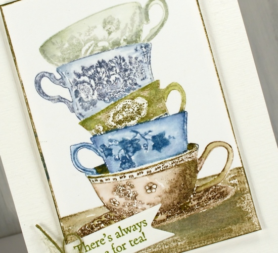
I used a stamp positioner so I could ink one cup at a time. I kept a wet cloth handy to wipe off any ink that ended up on the adjacent cups. after stamping I blended the stamping with a damp brush to gently spread ink into the cup but not dilute the pretty patterns.
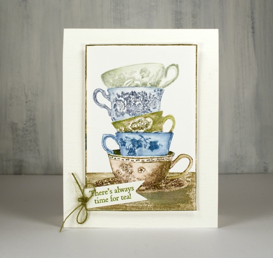
The stamp has its own frame so I trimmed with scissors right next to the frame and ran a peeled paint marker along the edge to make sure it was all inked. I chose my sentiment from another DD tea themed set, ‘Cup of tea” and cut it out with a PB tag die. I had hemp twine which exactly matched so I added a little bow to the tag. The stamped panel is popped up on adhesive backed foam on a textured cardbase.
Hope you have time for tea today, unless of course you are all about the coffee, but that’s a card for another day!
Supplies
Butterfly Garden
Posted: April 3, 2019 Filed under: butterfly garden, Penny Black, Tagged | Tags: Peerless Transparent Watercolors, Penny Black creative dies, Penny Black stamps, Ranger Distress inks, Tsukineko Versafine inks 3 Comments
Butterfly garden is a new transparent set from Penny Black with a nice mix of butterflies, leaves and flowers. I chose to watercolour the butterflies first then mask them before adding background foliage. I stamped the top butterfly in shabby shutters distress ink, the middle in broken china and the bottom one in dusty concord on hot pressed watercolour paper.
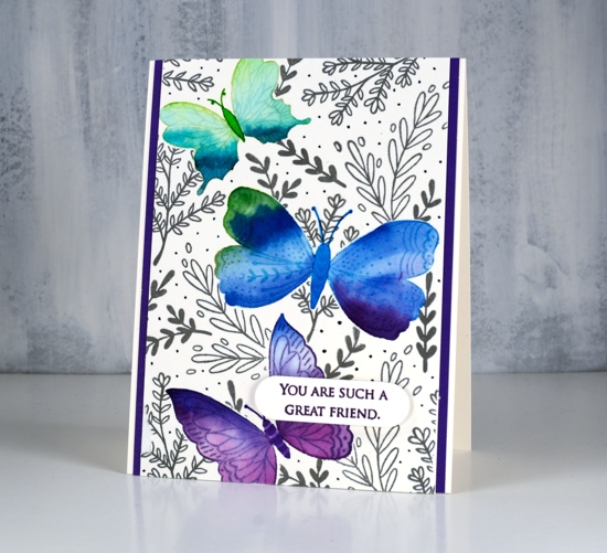
I used peerless watercolours to fill each butterfly with colour starting with a light green then blending to darker greens to fill the wings. I then added green first to the middle butterfly and blended into blue and a little bit of purple. The last one I blended from blue to purple. I stamped them again on masking paper, cut them out and covered the watercolouring before stamping leaves all over the panel in morning mist versafine clair ink. As I wanted to fill the panel with lots of stamping I used acrylic blocks so I could easily turn the stamps around to fit them in all the spaces. I drew little dots in grey marker to fill the background even more.
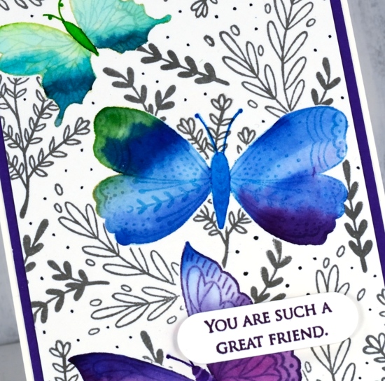
To finish the card I matted with purple cardstock, stamped a sentiment from the PB grateful sentiments set in monarch versafine clair, die cut it and popped it up with Gina K’s dimensional tape which adds just a little height without being too bulky.
Supplies
Snow trails
Posted: November 20, 2018 Filed under: snow trails, Tagged | Tags: Peerless Transparent Watercolors, Penny Black stamps 7 Comments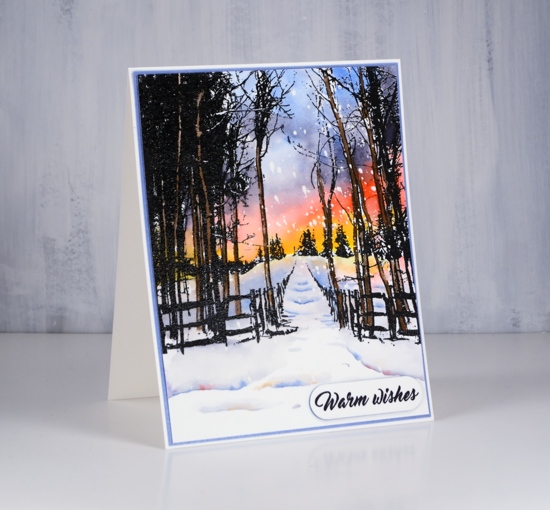
We’ve had some beautiful skies lately, the heavens declaring the glory of the Lord. I decided to add bold colour to this beautiful ‘snow trails’ stamp from Penny Black for a similarly dramatic sky. To begin I embossed the stamp on hot pressed watercolour paper then splattered masking fluid over the panel.
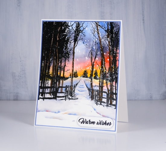
I painted the sky from yellow up adding a colour at a time and blending each into the next. I used my peerless watercolours for all the painting and they blended beautifully. I decided to paint the tree trunks that were not already black in brown, that way I did not have to preserved white ‘birch’ trunks as I painted in the sky. I used the same colours but more diluted to paint colour on the snow and create shadows along the path and in the foreground. Once dry I removed the masking fluid to reveal the falling snow.
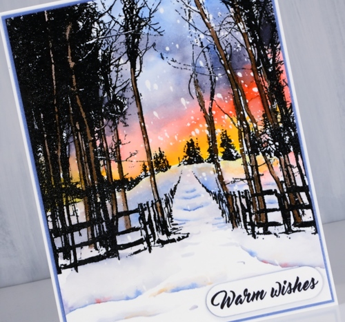
The popped up sentiment in the corner became a necessity when I botched the sentiment directly on the painted panel. I framed the panel in blue and attached it to a natural white card base. Can’t wait to paint another of these panels; it is such a peaceful scene.
Hope you are having a peaceful day.
Supplies
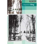
Stamps: snow trails
Die: tagged
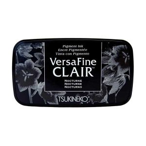
Ink: versafine clair nocturne
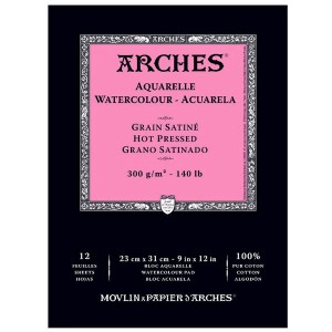
Paper: hot pressed watercolour paper, blue shimmer paper
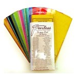
Paint: peerless transparent watercolours
Also: clear embossing powder
![]()
Bliss birds
Posted: July 22, 2017 Filed under: happy bliss, Tagged | Tags: distress oxide inks, Fabriano Watercolour Paper, Hand lettering, Penny Black creative dies, Penny Black stamps 7 Comments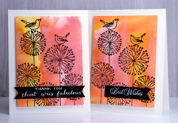
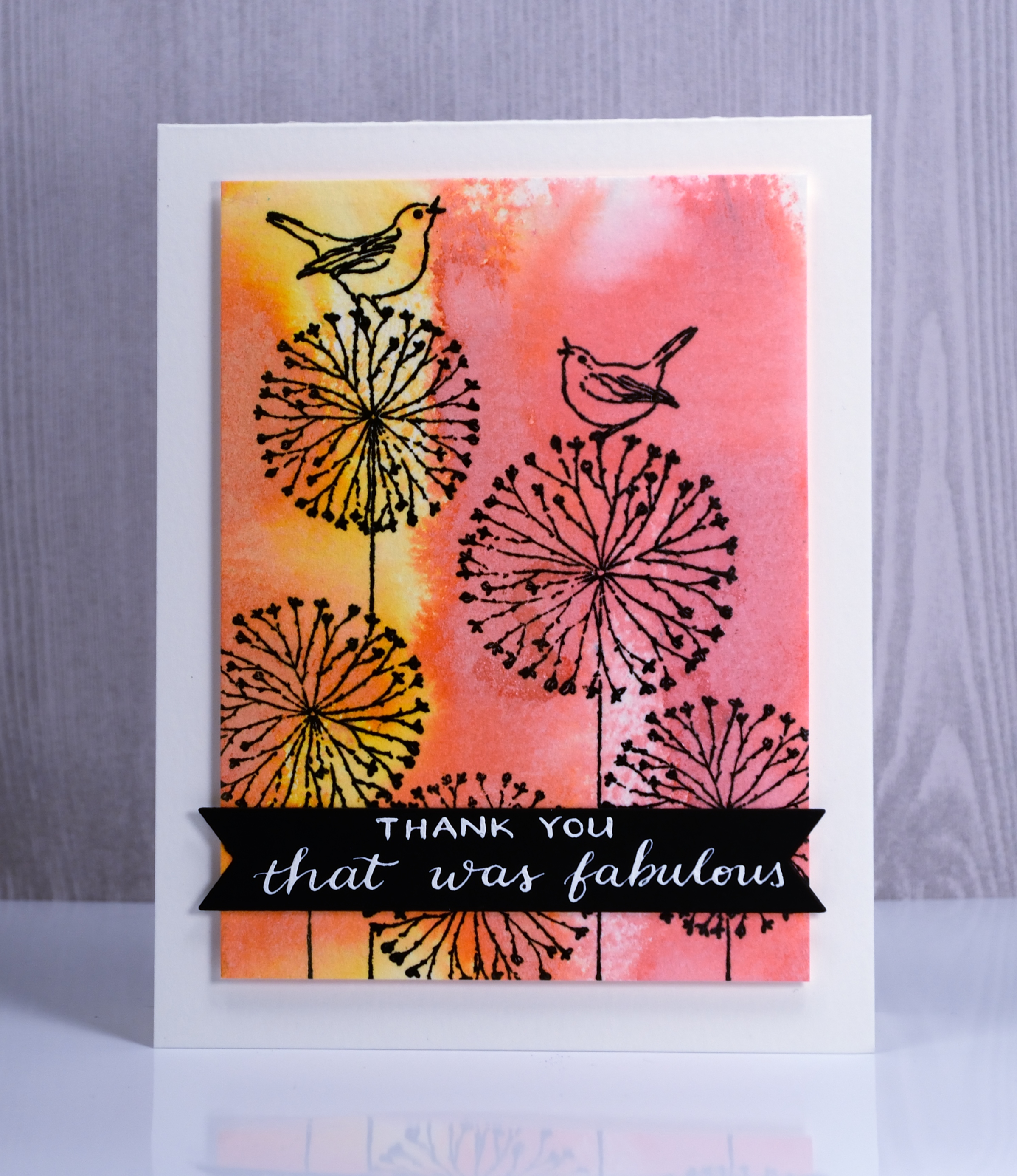
I have a couple of distress oxide backgrounds to share today, topped with a whimsical line stamp from Penny Black. To create the backgrounds I applied spiced marmalade and worn lipstick diox inks to watercolour paper then spritzed them enough to make the colours blend but not so much as to flood the colour off the page.
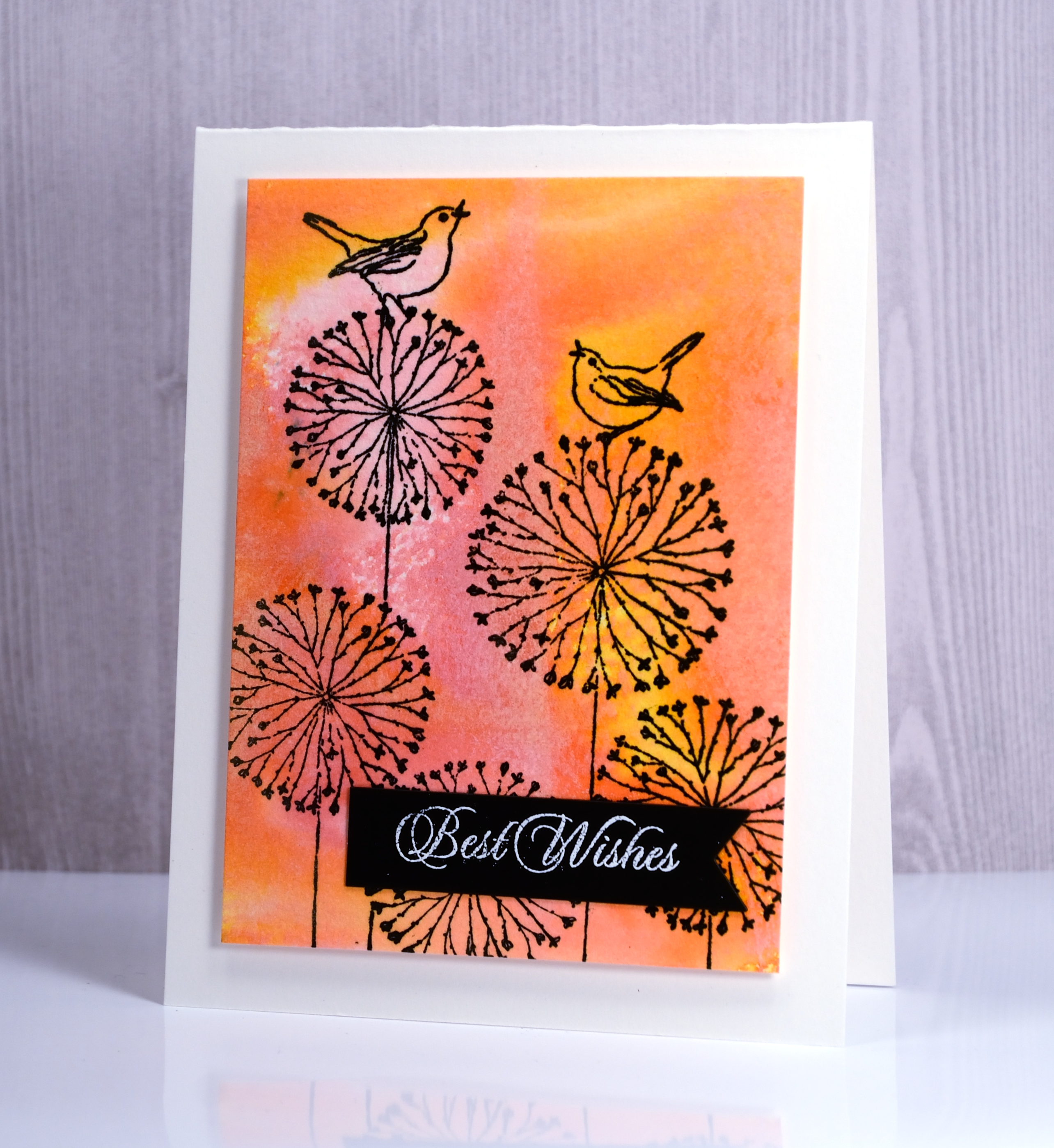
I stamped the ‘happy bliss’ stamp in versafine onyx black ink over the coloured background and popped up the panels on white card bases. I die cut the little black banners and added a stamped sentiment on one and a handlettered phrase on the other.
Hope you are having a fabulous day.
Supplies
Stamps: Happy Bliss (PB)
Dies: Tagged, Shades (PB)
Pens: Exclusive Calligraphy nib holder (Foiled Fox)
Ink: Spiced marmalade & worn lipstick distress oxide inks (Ranger) Versafine onyx black ink (Tsukineko)
Papers: hot pressed watercolour paper, Neenah epic black and solar white cardstock
Ink: DrPh Martins bleedproof white for calligraphy
Distress oxide trials – Desaturation
Posted: May 3, 2017 Filed under: Effulgent, Feathery, full of glee, Tagged | Tags: distress oxide inks, Penny Black creative dies, Penny Black stamps 15 Comments
Can you tell I like the way ‘distress oxide trials’ sounds like an significant chemical experiment? That’s why I called today’s post ‘desaturation’ rather than just ‘stamping with water! The effect does come, however, from stamping with water. I think it is my favourite technique so far. I began by blending the inks onto hot pressed watercolour paper. They do blend nicely on neenah classic crest paper but they blend even better on watercolour paper. By blending I mean sponging ink onto the paper, also called inking by some crafters.
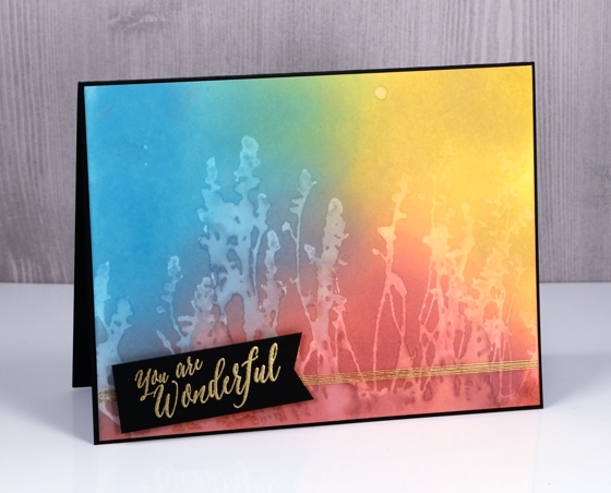
For the these three cards I sponged three colours onto the paper and overlapped them to get nice soft blended colours. The sponging doesn’t take long, it doesn’t leave marks shaped like the edge of your applicator and it creates intense colour.
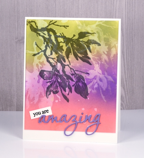
After sponging my colours over the whole panel I put the panel into my MISTI, positioned my stamp then spritzed it with water. All the stamps used for these cards are red rubber; (slapstick cling from Penny Black, names listed below) I haven’t tried with clear stamps yet. The stamp just has to hold onto the water for the technique to work.
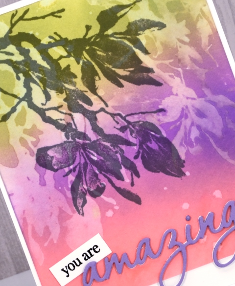
After stamping a water print onto the blended colour, I lifted the stamp and dabbed a paper towel over the print. It left a pale image on the coloured panel.
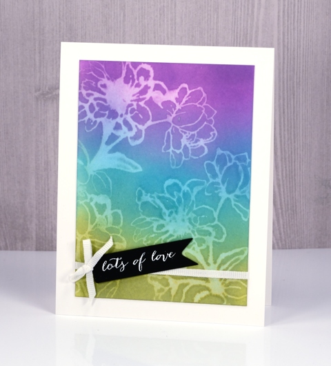
It’s not a really sharp image but it is definitely recognisable and I love the look.
The trials are not over but if you are looking for a technique to start with try some sponging; the finish is so rich and creamy. Then if you are feeling scientific try some desaturation as well. If you have thought of a technique you’d like me to try please leave me a comment below.
Supplies
Stamps: full of glee, feathery, Effulgent, stitched flowers, happy snippets (PB)
Die: tagged, omg (PB)
Inks: worn lipstick, broken china, fossilized amber, wilted violet, peeled paint distress oxide inks (Ranger) versamark, versafine onyx black & smokey gray (Tsukineko)
Papers: hot pressed watercolour paper, neenah solar white, neenah epic black, violet cardstock
Also: gold & white embossing powder, white ribbon, gold thread
The distress oxide trials
Posted: April 28, 2017 Filed under: Flower Frolic, Penny Black, stitched flowers, Tagged | Tags: distress oxide inks, Penny Black creative dies, Penny Black stamps, Tsukineko Versafine inks 14 Comments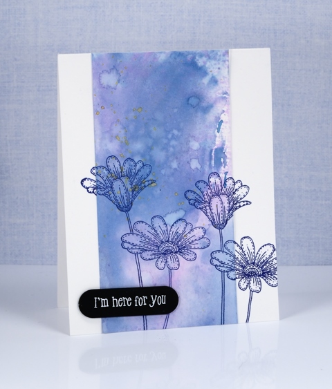
The trials have begun. Shauna at The Foiled Fox sent me some distress oxide inks to try. I have been intrigued by the videos and projects I’ve seen around the place so was keen to play with them myself. I started by mixing some diluted ink on a craft mat then swiped different papers through it. I chose bristol cardstock, hot pressed watercolour paper and neenah solar white 110lb cardstock.
The card above features the bristol cardstock. It picked up the colour well, the inks blended and the watermarks from splattering made nice light patches with dark edges. I used two main colours, a pink and a blue (what a surprise!) then I splattered a little yellow at the end of my experimenting.
The panel below is made from the hot pressed watercolour piece. The results were very similar but the blending was even smoother between the colours.
I chose not to make a card from the sample on neenah solar white. It worked but the colours did not blend or spread as nicely in my opinion. These are just the beginning of my experiments of course and only three colours but there is more to come. The inks blended just as beautifully as the original distress inks but dry opaque or semi opaque, perfect for a solid background.
Supplies:
Stamps: delicate flowers, stitched flowers, happy snippets
Dies: flower frolic, tagged
Inks: faded jeans, worn lipstick, fossilized amber distress oxide inks (Ranger) versafine majestic blue (Tsukineko)
Papers: hot pressed watercolour paper, bristol paper, stardream blue cardstock, black cardstock


