
Three colours – Poppy time
Posted: January 15, 2020 Filed under: Avery Elle, Brusho, fluttering friends, My Favorite Things, Penny Black, Poppy Time, simple sentiments | Tags: Brusho, My Favorite Things, Penny Black creative dies, Penny Black stamps 8 Comments
This is the last of the three colour panels I did with sandstone, lemon and ost blue brusho. I think this one might be my favourite because of the sky behind the poppy. Of course I was not really responsible for that pretty sky, it was the magic of brusho! I embossed the PB ‘poppy time’ stamp in gold powder on hot pressed watercolour paper first. Next I sprinkled the three colours of brusho on craft mat and spritzed it with water. I didn’t sprinkle too much powder; it is easier to add more colour than to take it away. I swiped the panel through the wet activated brusho and set it flat to dry. I can’t remember if I dabbed colour away or moved some with a paintbrush (I made this card a while ago)

With the background taken care of I mixed some green from the sandstone & ost blue and painted the bud, stems and seed pod. I the petals with sandstone and lemon from a palette then sprinkled salt on top to get some texture.

Once again I used a sentiment from MFT ‘fluttering friends’; I really like the clean lines of the font and the size too. The sentiments fit perfectly in strips cut with the Avery Elle simple sentiment strips.
Thanks for joining me in this mini series on using a limited palette. I have enjoyed reading your comments and hope you are trying it yourself. Please let me know if you do. If you just joined me today here are the other two cards made with this simple colour scheme.


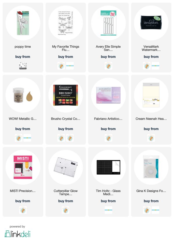
Supplies


Oh, Heather, this is just beautiful! You’ve got that Brusho thing down! I don’t have any but this look could inspire some other mediums that have that color combination. I love it!
All three of your cards using these colors are beautiful, Heather, but this is my favorite too. I love the movement of the color in the background and the texture of the flower! Very clever to use salt with the flower! This is certainly another one of your masterpieces!
Another fabulous card Heather. Lighter than the first one in the series and more delicate than the second. Amazing how such different results can be had with just three colours of Brusho, which often is unpredictable, in experienced hands I think it is a topic for another tutorial video, when you have time.
Absolute perfection! When I first saw this, I just “sighed”…so very lovely and so appropriate for a “Thinking of you” card. This is indeed my favorite…
Your cards are works of art!
This beauty really does give the impression of being outdoors because of the lovely background.
Oh my this is gorgeous!
[…] A while back I posted three cards all painted with the same three brusho paint colours and my Welsh friend, Karen requested a video. Well this is it, a different stamp and three different colours (Brusho sunburst lemon, prussian blue, rose red) but the same technique. Here is the one that prompted the video request. […]