
Three colours – Poppy time
Posted: January 15, 2020 Filed under: Avery Elle, Brusho, fluttering friends, My Favorite Things, Penny Black, Poppy Time, simple sentiments | Tags: Brusho, My Favorite Things, Penny Black creative dies, Penny Black stamps 8 Comments
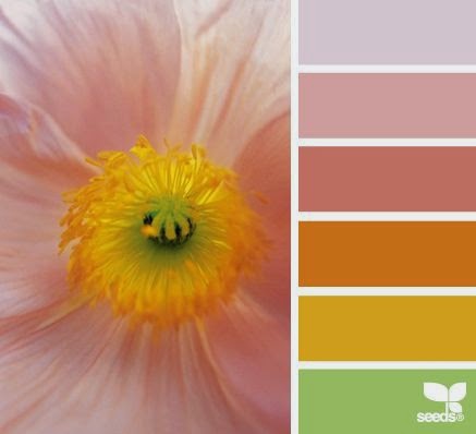
This is the last of the three colour panels I did with sandstone, lemon and ost blue brusho. I think this one might be my favourite because of the sky behind the poppy. Of course I was not really responsible for that pretty sky, it was the magic of brusho! I embossed the PB ‘poppy time’ stamp in gold powder on hot pressed watercolour paper first. Next I sprinkled the three colours of brusho on craft mat and spritzed it with water. I didn’t sprinkle too much powder; it is easier to add more colour than to take it away. I swiped the panel through the wet activated brusho and set it flat to dry. I can’t remember if I dabbed colour away or moved some with a paintbrush (I made this card a while ago)

With the background taken care of I mixed some green from the sandstone & ost blue and painted the bud, stems and seed pod. I the petals with sandstone and lemon from a palette then sprinkled salt on top to get some texture.

Once again I used a sentiment from MFT ‘fluttering friends’; I really like the clean lines of the font and the size too. The sentiments fit perfectly in strips cut with the Avery Elle simple sentiment strips.
Thanks for joining me in this mini series on using a limited palette. I have enjoyed reading your comments and hope you are trying it yourself. Please let me know if you do. If you just joined me today here are the other two cards made with this simple colour scheme.


Supplies
Poppy quarters
Posted: January 25, 2017 Filed under: Poppy Time, Twirls | Tags: Brusho, liquid metals, Penny Black creative dies, Penny Black stamps 5 Comments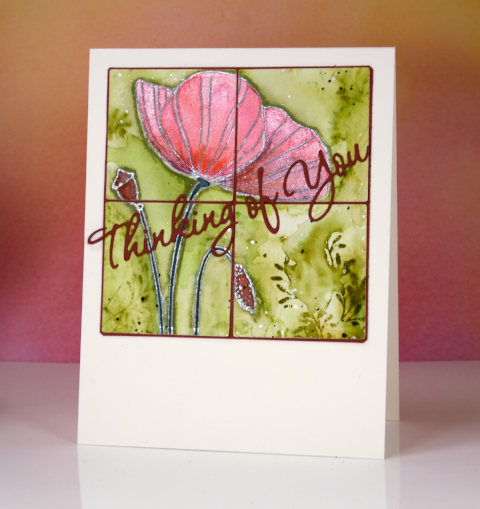
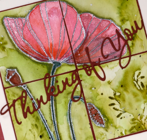
This poppy panel was left as an extra from a class I taught last year. I didn’t want to create the class card again so I divided the poppy image into quarters using square dies.
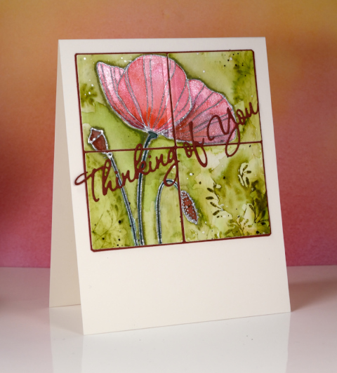
I layered the quarters on a burgandy mat and also die cut a sentiment which matched the deepest red in the poppy, seed pod and bud. The poppy itself was embossed in silver then painted with a mix of brusho and liquid metals so it has a shimmery look when tilted to the light. The green background was made by stamping one of the ‘twirls’ stamps in peeled paint distress stain then painting over it to dilute and spread the green around the poppy.
Won’t be long now before the poppies appear, only four or five months!
Supplies
Stamps: Poppy Time, Twirls (Penny Black)
Die: Wishes (PB) Shapeabilities squares (Spellbinders)
Inks: versamark (Tsukineko) peeled paint distress stain (Ranger)
Paints: brusho (Colourcraft) platinum liquid metal (Ken Oliver)
Cardstock: Fabriano cold pressed watercolour paper, Red cardstock
Also: silver embossing powder
Pink Poppy Time
Posted: January 23, 2016 Filed under: Fresh, Poppy Time | Tags: Fabriano Watercolour Paper, Penny Black stamps, Ranger Distress stains 13 Comments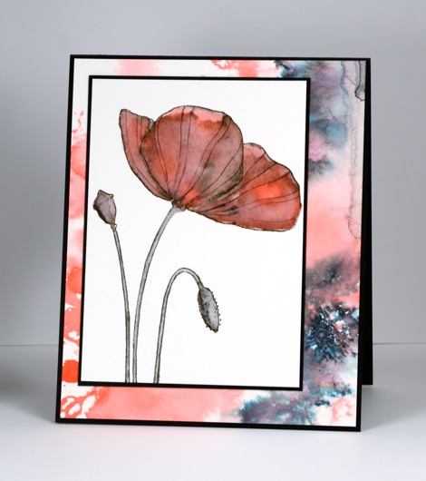
I don’t often add more than one mat or layer to a stamped panel but it was fun co-ordinating a patterned panel with the focal image. By working on two panels at once I was able to create one very controlled image panel along with a loose background one.
The single poppy I stamped in black soot ink then drew over a few of the outlines with the ‘elegant writer’ pen. When I started filling the poppy with pink stain the black ink bled into the pink giving it the watermarked grungy look. To create the patterned paper behind the panel I stamped the ‘Fresh’ poppy stamp in pink stain, added some detail with the elegant writer pen again and then flooded the panel with a spritzer. The pink spread and the black bled into black, pink and green.
I doubt you will start seeing oodles of layers on my cards; there are talented card makers who do that so well. From time to time however it is fun to get fancy with a few extra layers. Speaking of layers (or lack of)there is one day left to enter the One Layer Simplicity challenge for January. Even if you can’t squeak in with a card, check out the cool’sky inspired’ cards linked up there.
Supplies
Stamps: Poppy Time, Fresh (Penny Black)
Inks: Elegant Writer pen (Speedball) Black soot distress ink, Worn Lipstick distress stain (Ranger)
Cardstock: Fabriano cold pressed watercolour paper, Black cardstock
Poppy Painting
Posted: July 18, 2015 Filed under: Poppy Time | Tags: Bister, color burst, Fabriano Watercolour Paper, Kuretake Zig clean color real brush markers 14 Comments
More bister, this time in combination with color burst powder and zig clean color real brush pens. This panel of poppies was almost tossed because at one point it looked a mess. I stamped two poppies using a pink zig pen to ink the stamp. I filled the outline in using both the pen and some pink colour burst powder. I also painted the stems in green but it all looked a bit dull and I wasn’t sure how to add interest. I decided to lose some of the definition by spritzing the whole thing with water. The poppies bled in all directions and it really wasn’t an improvement at all! I set it aside and worked on something else while it dried. When I came back to it I decided to add another partial poppy as well as the bud and seed head. I painted loose leaf shapes and added green and blue bister powder around the bottom and top of the panel. To sharpen the poppy images a little I painted darker colours below the edges and added the veins back in.
Those poppies keep finding their way onto my cards; I don’t know how it happens…
Supplies:
Stamps: Poppy Time (Penny Black)
Inks: Color Burst & Bister watercolour powders
Cardstock: Fabriano cold pressed watercolour paper
Also: Zig clean color real brush markers
A Burst of Bister
Posted: June 24, 2015 Filed under: Bister, Poppy Time | Tags: Bister, Kuretake Zig clean color real brush markers, Penny Black stamps 12 Comments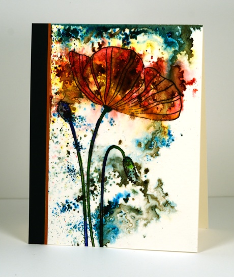
This is my first creation using bister. A friend shared her set of powders with me a week ago and I made several panels exploding with colour and have turned only one into a card. When I was experimenting with the pigment powders I stamped the large ‘Poppy Time’ stamp on a couple of pieces of cold pressed watercolour paper and left two more pieces blank. I then spritzed water on the panels and started dropping bister into the water using a very very small paintbrush. Because I had poppies already stamped on two panels I tried to drop bister colours in appropriate areas. On the blank panels I was more random with the powders and I ended up liking those panels better. I have my own set of powders now and I am looking forward to trying some more techniques.
I did learn that it is best to walk away and let the pigments powders do their magic. It helps to have a packet of Honey & Dijon mustard chips on hand to distract you at that point. To turn the panel above into a card I used a couple of my zig clean colour real brush markers to add extra colour to the stamped images. I trimmed the panel and attached it to a card base with two strips of co-ordinating card stock.
Supplies:
Stamps: Poppy Time (Penny Black)
Inks: Versafine Onyx Black (Tsukineko), Bister pigment powders
Cardstock: Canson cold pressed watercolour paper
Also: Zig clean color real brush markers
One Layer Simplicity: Shades of Summer
Posted: August 1, 2014 Filed under: CAS, Coloured pencil, One-Layer Simplicity challenge, Poppy Time | Tags: CAS, Faber-Castell Polychromos Colour Pencil, Penny Black stamps, Tsukineko Memento inks 14 Comments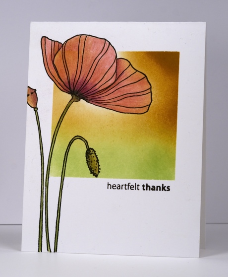
Susan is hosting the new One Layer Simplicity Challenge and she has chosen six gorgeous summer colour palettes to inspire us. I chose the one below which was a challenge as I don’t often combine pinks and yellows.
I just did a big clean up and reorganization of my craft area and in doing so found the card base above with the square already masked and the green sponging started. I sponged more of the square in memento peanut brittle. I then removed the mask and stamped the poppy in versafine onyx black. I decided to use my coloured pencils for the poppy because I had the colours in the photo. I blended one colour pencil over another rather than using a blending fluid or blender pencil.
Also entered in Inkspirational Challenge to use markers or pencils
Supplies:
Stamps: Poppy Time, Amazing (Penny Black)
Inks: Versafine Onyx Black, Memento New Sprout, Peanut Brittle (Tsukineko)
Also: Faber-Castell Artist Polychromos Colour Pencils
One Layer Poppy
Posted: May 3, 2014 Filed under: One-Layer Simplicity challenge, Poppy Time, Sun Catcher | Tags: CAS, Fabriano Watercolour Paper, Penny Black stamps, Penny Black stencils, Ranger Distress stains, Tsukineko Memento inks 20 Comments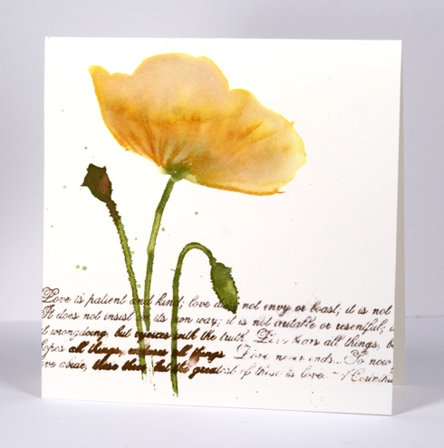
The new One Layer Simplicity Challenge is to make a card with flowers on it. There is already a gorgeous array of floral inspiration on the blog and you have until May 24th to add yours. The current Mod Squad challenge is to make a one-layer card so my poppy card meets the criteria there also.
To create this watery poppy I positioned the ‘Sun Catcher Stencil’ then painted the flower head in water. While it was very wet I added both Mustard Seed and Victorian Velvet Distress stains to the water and blended them with a paintbrush. I used the co-ordinating ‘Poppy Time’ stamp to stamp the stems, bud and seed head then used a paintbrush to immediately fill them with distress stains. By this stage the poppy head had dried a bit so I inked some of the stamp with ink to add a few veins to define the petals. I added the verses from 1 Corinthians in a mix of Memento ink and distress stain allowing some to blur and some to bleed. The piece of watercolour paper already had two ink drops on it so I carefully added a few more rather than going overboard with the flicking technique I have been using lately.
Thanks for dropping by. I hope you enjoy the rest of your weekend.
Edited to add: If you are interested in an “Introduction to Stamping” class there are a few spaces left in the class I am teaching at “Crop-A-While” in Orleans on Thursday May 8th. Please click on the store link for more details and contact the store to register.
Supplies:
Stamps: Poppy Time, Love Chapter (PB)
Stencil: Sun Catcher
Inks: Memento Rich Cocoa (Tsukineko) Vintage Photo, Mustard Seed, Victorian Velvet, Peeled Paint Distress Stains & Wild Honey, Peeled Paint Distress inks (Ranger)
Cardstock: Fabriano 100% cotton hot pressed watercolour paper


