By the Garden Gate
Posted: March 28, 2024 Filed under: Echidna Studios, garden fence, Inktense pencils, Stampin Up | Tags: digital stamps, Echidna Studios, Inktense, Kuretake Zig clean color real brush markers, Stampin Up 5 Comments
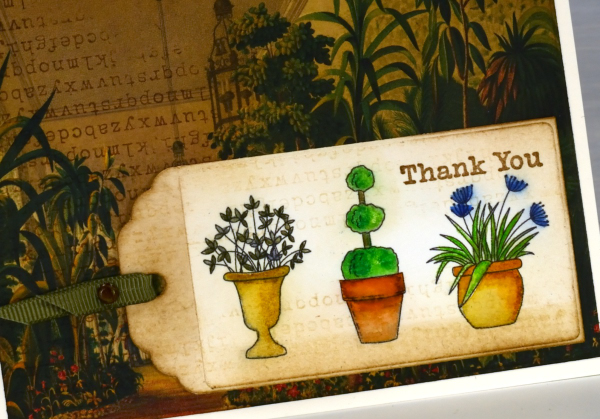
The Garden Fence set is an Echidna Studios digital stamp set that I designed and my daughter digitised. The set includes a gate, three pots and a grass & flowers image. Each image is stackable which means you can arrange your own garden design with pots and gate beside each other, behind each other or even on top of each other if that sounds fun!
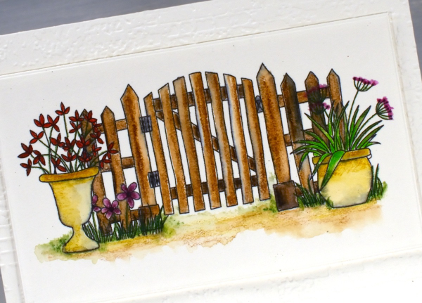
Both the gate scene above and the individual pots on the tag shown later in this post were printed on hot press watercolour paper on an ink jet printer. In the past I have always printed on a laser printer but my daughter recently bought a second hand printer to test some colour printing of our designs. We printed some black outline images to see how they were to watercolour.
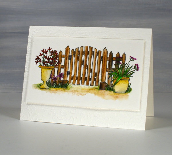
The gate design above I coloured with inktense watercolour pencils and blended the ink with water and a very fine brush. The ink from the printer did bleed a bit so you can some some grey tones here and there. Because I used very little water I was able to keep the bleeding to a minimum. I received the lovely ‘exposed brick‘ embossing folder for my birthday from a couple of friends who know just what I like. It seemed an appropriate background for the slightly aged garden gate.
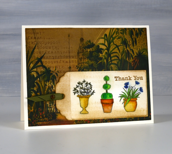
On this little tag I used a mix of inktense pencils and Zig clean color real brush markers; again there was some bleeding when I added water but no so much as to make me stop colouring and blending. All that to say if you have an ink jet printer it might be worth printing and watercolouring some images just to see how it goes.
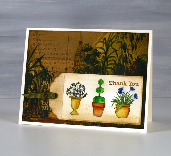
I’ve been making some vintage style collage cards lately (I’ll share them on the blog soon) so I decided to find a book page as background for my watercoloured tag. I blended vintage photo and antique linen inks around the background and tag and added some typewriter alphabet stamping on both. Unfortunately I stamped the alphabet upside down on my background but I continued with my card anyway! I like the pairing of old fashioned conservatory with modern little pots just for fun.
I’ve featured the Garden Fence set before; take a look here and here. This post includes affiliate links from Foiled Fox and Scrap’n’Stamp . If you buy through these links I receive a small commission at no extra cost to you.
Leaf Background Stamp
Posted: September 12, 2023 Filed under: Echidna Studios, leaf background | Tags: Echidna Studios, Fabriano Watercolour Paper, Kuretake Zig clean color real brush markers, Ranger Distress inks 3 Comments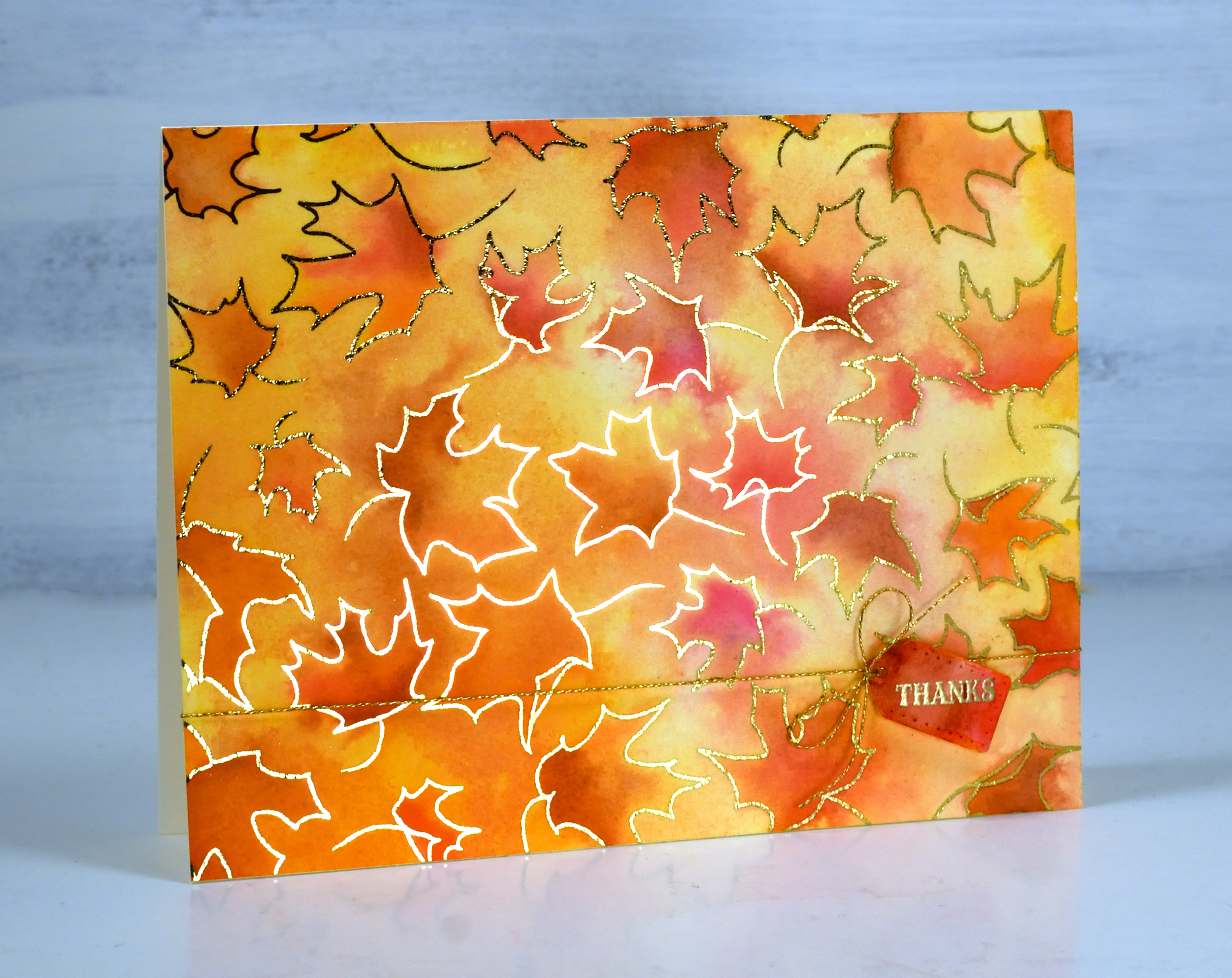
Just because I’m posting an autumn leaf card doesn’t mean I have given up on summer. If you know me you know I hold on until the end. But just in case you would like to be prepared here is a simple but eye-catching card to use during fall or especially for thanksgiving. The leaf background is a single digital stamp from Echidna Studios printed on watercolour paper then foiled with gold foil.
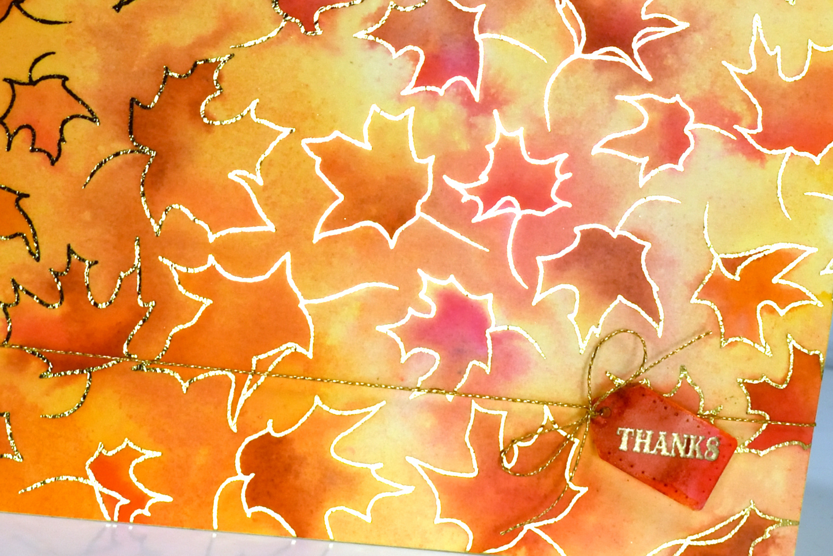
It is always hard to photograph a foiled card but somehow I managed to get quite a bit of the foiled shine in this photo. I watercoloured with fired brick, spiced marmalade and scattered straw distress inks and added some extra depth with zig real brush markers.
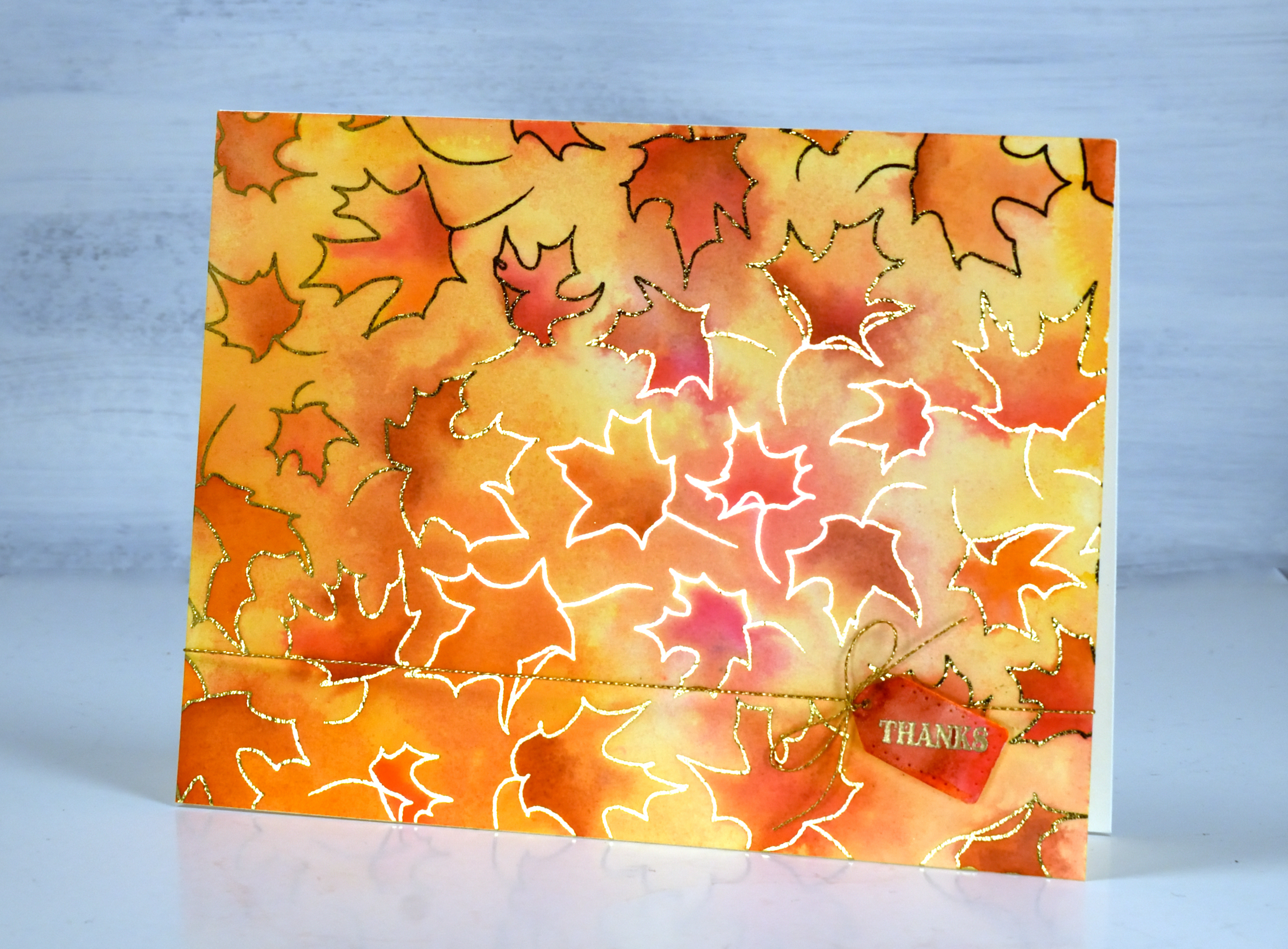
The little tag is from the Penny Black ‘gift card pocket die set’ paired with both a gold sentiment and cord to add even more shine. As I’ve mentioned before you can print the digital stamps any size you want so you could have larger leaves to colour or teeny tiny ones!
(Compensated affiliate links from Foiled Fox & Scrap n Stamp)
Vintage Beetle
Posted: June 5, 2023 Filed under: vintage beetle | Tags: Echidna Studios, Fabriano Watercolour Paper, Kuretake Zig clean color real brush markers 3 Comments
Isn’t she a beauty? This digital stamp ‘vintage beetle‘ is one from a new set in the Echidna Studios etsy store. My daughter took a photo of a VW beetle convertible recently and turned it into this digi stamp. There is stamp in the set. I haven’t coloured it yet but it is a cute rear view.
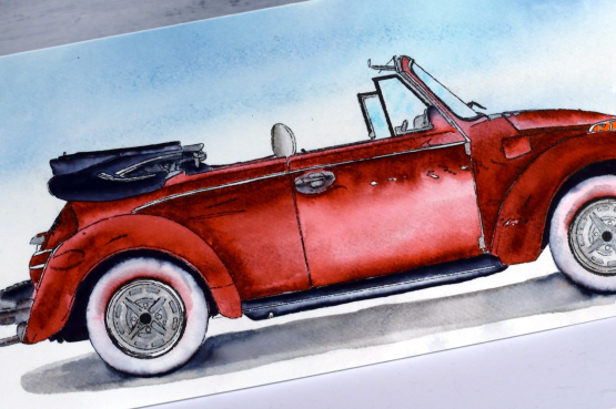
I rarely make slimline cards but this stamp definitely called for one. I think it would make a delightful fathers’ day card. It isn’t fathers’ day until September in Australia which has caught me off guard many times! I printed the car on hot pressed watercolour paper using the ‘manual feed’ and ‘heavyweight settings’ that pop up on the computer. I then created a very soft watercolour background by smooshing lost shadow and uncharted mariner ink on my glass mat, spritzing it with water to dilute and move it then swiping my watercolour panel through the ink.
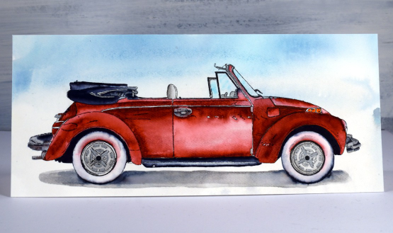
I used mainly Zig clean color real brush pens to watercolour the car along with Kuretaki metallic silver on the hubcaps and black Koi coloring brush pen for the black watercoloured sections. For some fine black lines I use F-C Pitt artist pens. I do have a weakness for markers, especially waterbased ones so it was good to put some to work on this card.
Just between you and me I am pretty pleased with the way it turned out and would now like to take a little drive in one! Hope your Monday is off to a good start.
(Compensated affiliate links from Foiled Fox & Scrap n Stamp)
Close-up Blooms
Posted: May 10, 2023 Filed under: bud & bloom, Echidna Studios | Tags: Echidna Studios, Fabriano Watercolour Paper, Kuretake Zig clean color real brush markers, Penny Black stamps 6 Comments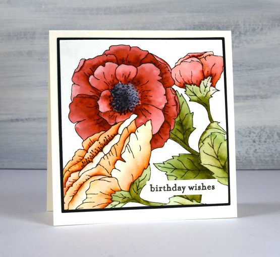
You’ve seen this digital stamp once before on my blog but it is much bigger this time. I printed it on hot pressed watercolour paper at a size that would fill the square card front. The set is called ‘bud & bloom‘ and this is just one of the three images in the set.
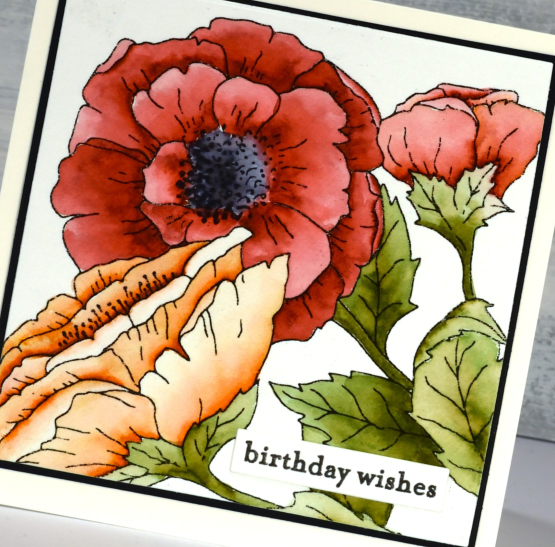
A bigger image fills the card front beautifully and is easier to colour. I enjoyed colouring this one while relaxing on the couch. I used zig clean color real brush pens which are highly pigmented. I was able to add intense colour to one side of the petals then blend it out with a waterbrush. It is easy to add a bit more ink if needed or add a different colour just by touching the tip of the brush pen to a wet area on the petal. The zig pens are easy to control and mine are lasting very well.
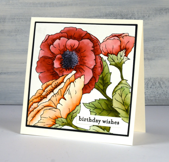
This time I kept the background clean and added a little Penny Black sentiment. If you haven’t visited the Echidna Studios etsy store lately pop over and see what’s new. There are a bunch of new stencil designs ready for cutting from a plastic film for stenciling or from cardstock to add to a card front.
(Compensated affiliate links from Foiled Fox & Scrap n Stamp)
Birthday Garden Gate
Posted: April 13, 2023 Filed under: Echidna Studios, garden fence | Tags: Echidna Studios, Fabriano Watercolour Paper, Kuretake Zig clean color real brush markers, Penny Black stamps 3 Comments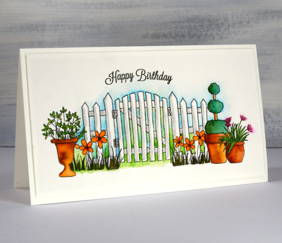
This is the second card I’ve made with the Echidna Studios ‘garden fence’ set of digital stamps. On the first card the images were smaller to fit on an A2 card and the arrangement was a little different. These digital images are great fun to work with as they are not transparent so when I position each pot it masks what ever is behind it.
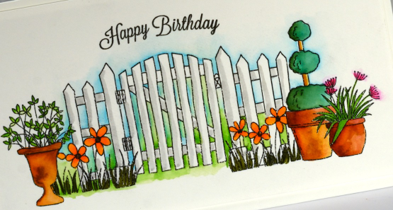
I printed the image on hot pressed watercolour paper then did all the colouring with zig clean color real brush pens. Those pens are juicy! I added only small dabs of ink to the foliage and flowers and blended it with a waterbrush. I blended blue and green between all the fence posts to make the white pop and added a line of grey as shadow.
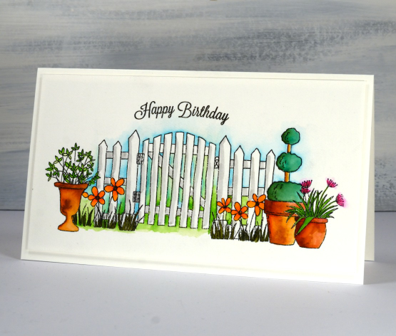
The sentiment is from an old faithful Penny Black set, banner sentiments. The curve of the stamp fitted nicely over the curve of the gate. The finished card is 7¼” x 4⅛” which is not a standard size I know. I will either make a custom envelope or put it in a slightly larger one.
Most of my garden is out from under the snow now so not too long before I can be working with real pots not digital ones!
(Compensated affiliate links from Foiled Fox, Scrap n Stamp)
Beach Squares
Posted: June 3, 2022 Filed under: seaside, Simply Graphic | Tags: Kuretake Zig clean color real brush markers, Simply Graphic 7 Comments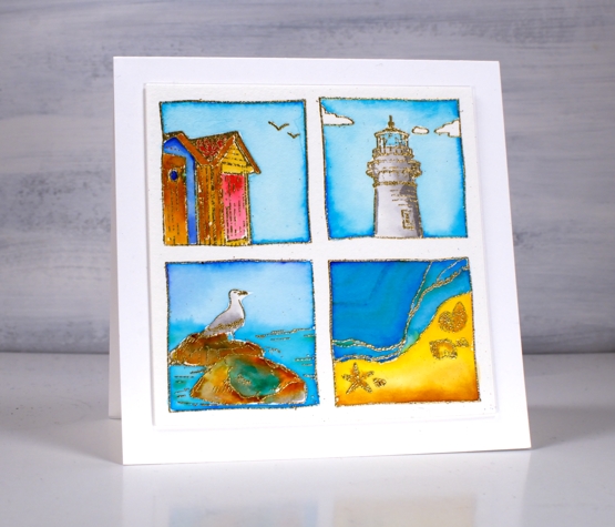
I am having fun with the Foiled Fox again today showing you all four stamps from the Simply Graphic’s seaside set. I used the lighthouse and the beach huts stamps in Wednesday’s cards. Today I arranged all four stamps in the stamp positioner then stamped with versamark on cold pressed watercolour paper before embossing in gold powder.
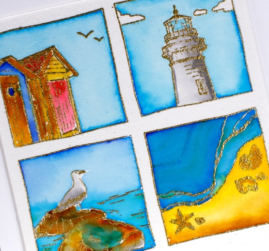
I used zig clean color real brush pens for all the colouring in the squares. The pens are highly pigmented so a little dab goes a long way. It doesn’t matter so much the exact colours I used to paint the squares but I took care to repeat the same colours in more than one square so the group looks cohesive. I used the same blues in all four squares, yellow in three of the squares and grey on the lighthouse and the bird. (Zig pens used: light blue, cobalt blue, blue, green, yellow, light brown, brown, light gray, carmine red)
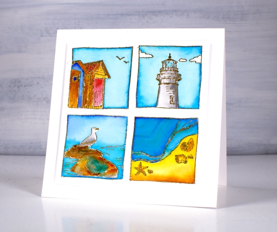
Once all the colouring was done I popped up the square panel on a few pieces of cardstock then attached to a 4¾” square cardbase. Make sure you pop over to the Foiled Fox blog and shop for inspiration and more lovely clean designs from Simply Graphic.
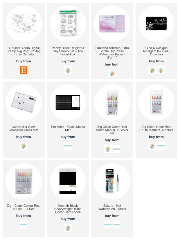
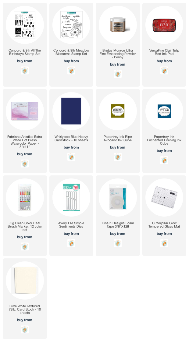
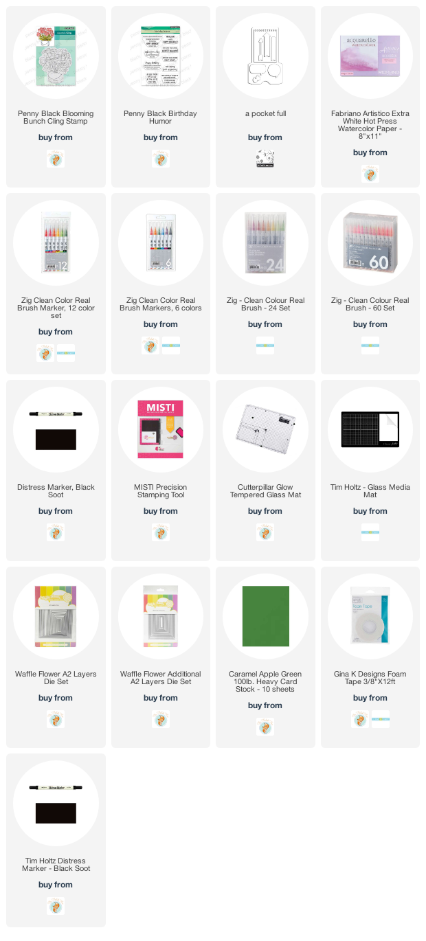
Supplies
(Compensated affiliate links used when possible)
Blossom birthday
Posted: October 16, 2020 Filed under: all the birthdays, Brutus Monroe, Concord & 9th, meadow blossoms, Papertrey Inks | Tags: Concord & 9th, Fabriano Watercolour Paper, Kuretake Zig clean color real brush markers, Papertrey ink 4 Comments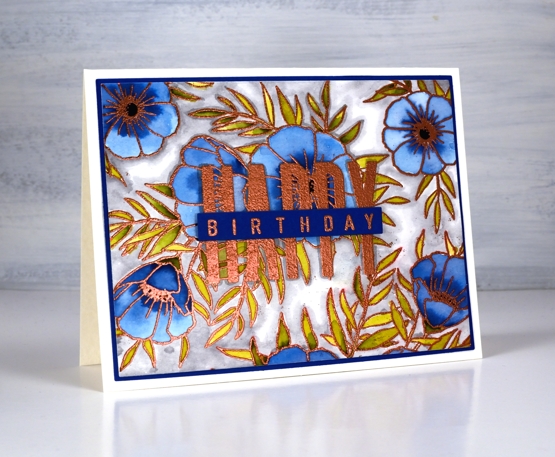
Even as my flowers fade and disappear I am still inspired to make floral cards. I’ve teamed up with the Foiled Fox today to share a blog post here and over there. If you are looking for all the creative process details pop over to the Foiled Fox blog. Today’s card features the C&9 ‘all the birthdays’ set again. It has only been in my house a week or so and already it has helped me out several times. Having one set with at least ten different ways to stamp happy birthday is a winner. There are probably more than 20 combinations when you look at all the separate word stamps and single letters in the set.
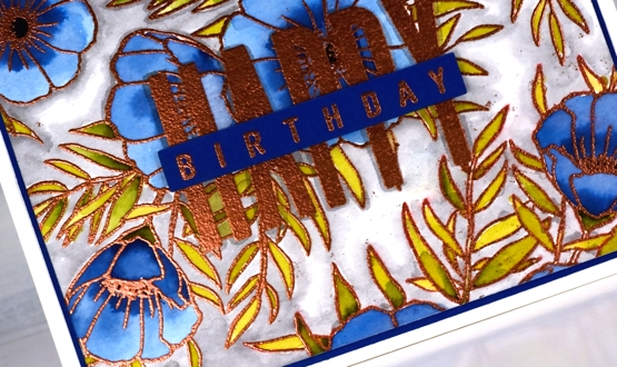
I wanted to combine a background image with a sentiment and ended creating my own background by repeat stamping with two stamps from the Concord & 9th ‘meadow blossoms’ set. Before heating the panel I stamped the word HAPPY from the new C&9 ‘all the birthdays’ set. I embossed with copper powder then coloured with ink from Papertrey ink cubes. The ink cubes are very juicy so I often smoosh them on my glass mat then pick up ink with a paint brush.
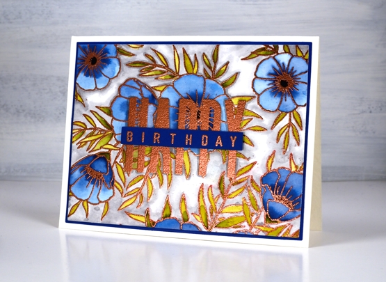
I filled the background with a grey zig clean color real brush pen and blended it with water. To complete the card I matted with with the dark blue cardstock I keep reaching for and finished the sentiment on a strip of the same blue. Having this new birthday set has got my birthday card production back on track. I have no excuses for not sending out birthday cards. Thank you Foiled Fox!
Supplies
Birthday tulips
Posted: June 15, 2020 Filed under: blooming bunch, Penny Black | Tags: Kuretake Zig clean color real brush markers, Penny Black stamps, Waffle Flower dies 6 Comments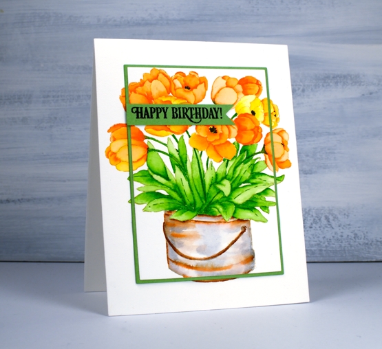
Are all your tulips gone? None of mine flowered this year, not even the faithful two that predated our move into this house! I have planted quite a few over the years but I believe they became squirrel lunches. These ones are coloured with zig clean colour real brush pens. I chose an orange and a yellow then coloured some in just orange, one just yellow and a few with a mix of the two pens. The whole image was first stamped in antique linen distress ink which is so good for no-line colouring.
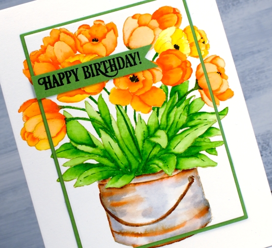
Once again I really enjoyed painting the bucket to give it an aged look with a mix of grey and brown pens. I drew the black centres in after colouring.
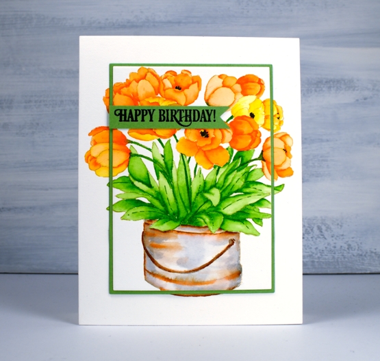
To frame the tulips I used two dies, a smaller one from the Waffle Flower A2 layer dies to cut the stamped panel and the other from Waffle Flower additional A2 layers to cut a very narrow green ⅛” mat.
The sentiment is from PB ‘birthday humor’ set but I stamped only part of the phrase and cut it with a die from the PB ‘pocket full’ die set.
Supplies
Winter Garden
Posted: October 21, 2019 Filed under: Penny Black, winter garden | Tags: Kuretake Zig clean color real brush markers, Penny Black stamps 2 Comments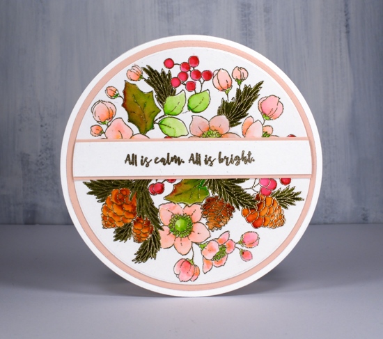
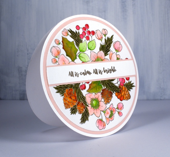
If you haven’t seen the incredible artistry of Peet Roeven you need to click over to her blog right now. Her attention to detail and precise fussy cutting is impressive. My card today is inspired by a recent card of Peet’s, mine is nowhere near as detailed as hers but I was able to show off this pretty ‘winter garden’ stamp in a circular setting just as she did. I never think of doing circle cards but the stamp is circular so it does make sense and Peet’s beautiful card nudged me to give it a try.
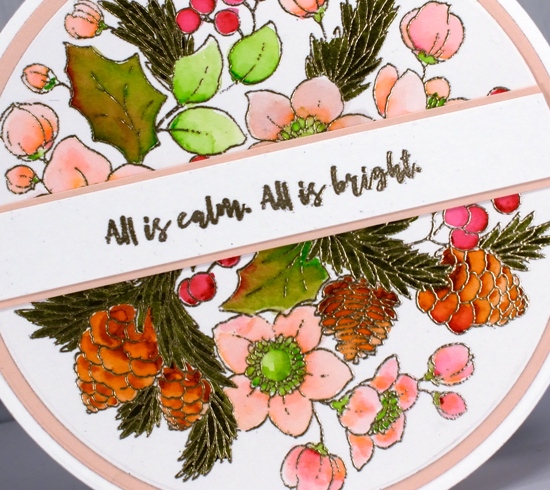
I worked on Koh-I-Noor Bristol Smooth Bright White Paper and embossed the image in platinum embossing powder. I was keen to see how the Zig clean color real brush pens worked on bristol as many artists prefer bristol to watercolour paper for the zig pens. The results were very pleasing the pens blend beautifully on bristol. I wanted pale pink flowers and tried light pink and tea rose then ended up using both for a blend from the slightly bolder pink to the paler tea rose. The berries I coloured with wine red, the rounded leaves with light green and the holly leaves with a blend of wine red and light green. I used brown for the pine cones and blended it with water for variation in depth. The needle leaves are olive green. The zig pens are very highly pigmented so a little goes a long way. I was able to colour the elements on the panel by applying a small about of ink then blending it to fill the space with a wet brush.
I die cut the image with a large circle die, used the next size up for the pale pink mat and the next size for two circles to form the card base. The back of the card base has a score line less than a centimeter (half inch) from the top so the card can be opened without the patterned panel having to bend at all. I also cut a very small margin off the bottom of the back panel so the card would stand upright on a small flat section. I embossed the sentiment from PB ‘Christmas Sentiments’ set, matted it then die cut with a circle die so it would line up with my circle panels.
What is the most unusual shape you have used for a card? I have to admit it is just about always rectangles and squares for me.
Supplies

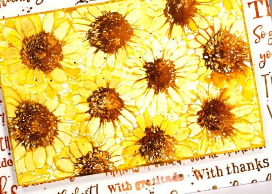
Gerberas
Posted: September 11, 2019 Filed under: Darkroom Door, gerberas, mesh | Tags: Darkroom Door stamps, Kuretake Zig clean color real brush markers, Ranger Distress inks 3 Comments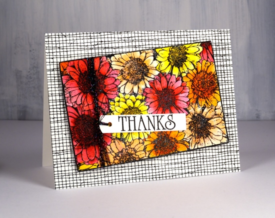
This pretty bunch of gerberas is one of the newest stamps from Darkroom Door. I would have shown it to you sooner but it arrived from Australia two days after I left to go to Australia! The inspiration for this colour scheme once again came from a simple web search. A photo popped up with pink, red, apricot and orange gerberas massed together. So that’s what I did.
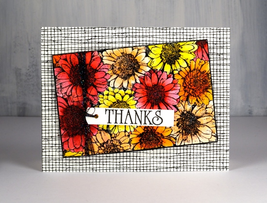
I stamped in black ink and embossed in clear powder on hot pressed watercolour paper then used zig clean color real brush markers for colouring. I started each flower by colouring around the centre with the marker then blended out the colour with a brush and water. I was able to add more with the markers as needed. To give the flowers even more pizaazz I gave them all a layer of clear wink of stella. (the red and pink ones then got a coat of micro glaze because I kept touching them and getting pink and red stains on things that were not meant to be pink or red!) I wanted to mount the flowers on a background but didn’t want it to fight with the focal panel. The DD mesh stamp worked beautifully and reminds me of the decorative mesh that is sometimes wrapped around cut flowers.
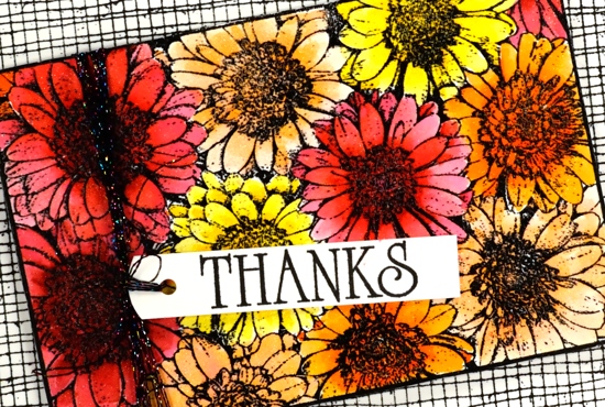
I stamped a sentiment from the large DD ‘thank you’ set and threaded some sparkly black thread through the tag and round the panel. A friend gave me a stash of metallic threads recently and they are coming in handy for a little subtle sparkle.
For the second card I went with a more country style look. All the gerberas feature the same fossilized amber, vintage photo and rusty hinge colour scheme with the two brown inks used also to create a background. I stamped the whole gerbera stamp in fossilized amber distress ink first then inked the centres in rusty hinge. I blended each petal with water and did the same with the centres then inked one side of the flower centres in vintage photo to add some dimension.
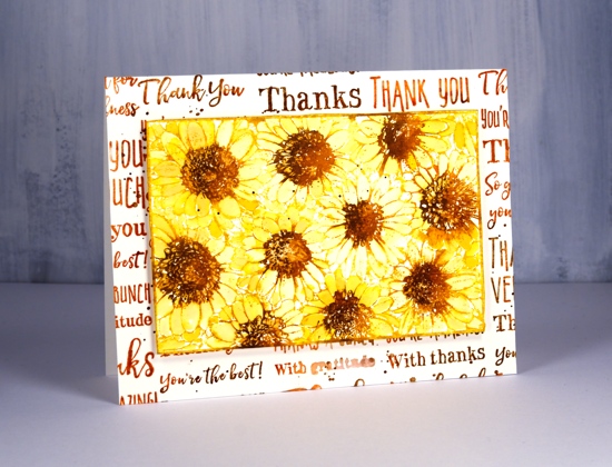
I tried a woodgrain background but it was too dark. By choosing to stamp the ‘thank you’ sentiment strip several times more of the cream background showed through. I inked the sentiment strip in vintage photo and rusty hinge distress inks and spritzed it lightly before each print. The result was blended and sometimes smudgy words. I gave both the flower panel and the background the splatter treatment then popped the gerberas up on a foam rectangle.
Gerberas are pretty classy flowers I think, they always seem to stand out in a bouquet.