Florals on Black
Posted: May 21, 2024 Filed under: Concord & 9th, fine line florals, meadow blossoms, online class, Penny Black, radiant | Tags: Concord & 9th, Finetec artist mica watercolour paint, online class, Penny Black stamps 6 Comments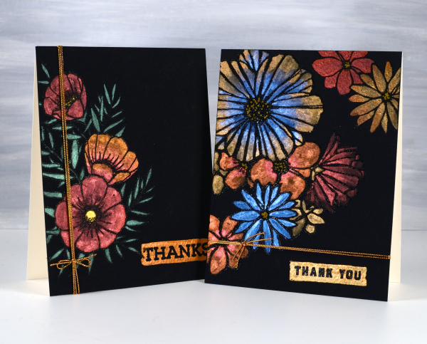
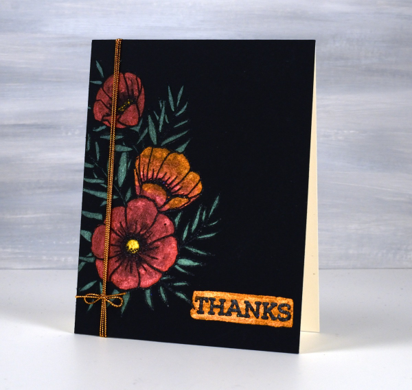
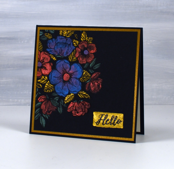
I haven’t used this eye catching technique in a while but I really should try it more often. These two cards were made as part of my Floral Faves online class, a lesson about using metallic watercolours on black watercolour paper. Maybe black watercolour paper has been around for a long time but when I first found it several years ago I was very keen to try it.
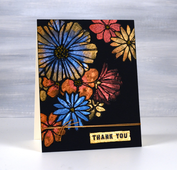
As you can imagine the paints need to be somewhat opaque to show up on black. I use Coliro and Finetec metallic watercolours (two names but all made by Finetec). I have also been given some Beam metallic watercolours which I will try out soon. I used Stonehenge Black watercolour paper for these cards and it worked well. It is very soft so I am careful if using tape on the edges as it lifts the surface off. I just work on a piece slightly larger than I need so I can trim it down to size after painting. I recently bought some of the Van Gogh brand so I will report back once I have tried it.
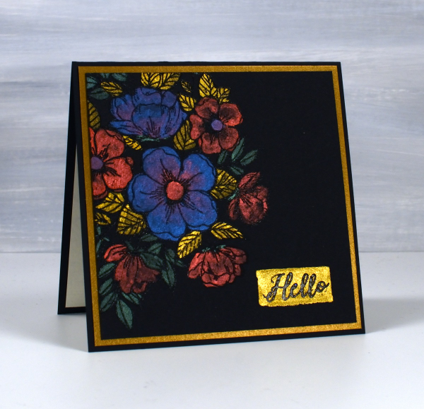
All these designs were made with embossed outlines making it easier to stay inside the lines. One feature of these cards that I quite like and need to remember to incorporate is the little painted strip where I embossed a sentiment over the top. It’s a trick that doesn’t have to be used only on a black background; I could paint a strip on any colour then emboss on top of it. For the cards featured today I used Penny Black ‘radiant’ set and Concord & 9th ‘fine line florals’ and ‘meadow blossoms’
If you have metallic watercolours let me know in the comments your favourite ways to use them.
Blossom birthday
Posted: October 16, 2020 Filed under: all the birthdays, Brutus Monroe, Concord & 9th, meadow blossoms, Papertrey Inks | Tags: Concord & 9th, Fabriano Watercolour Paper, Kuretake Zig clean color real brush markers, Papertrey ink 4 Comments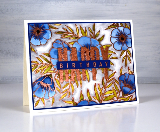
Even as my flowers fade and disappear I am still inspired to make floral cards. I’ve teamed up with the Foiled Fox today to share a blog post here and over there. If you are looking for all the creative process details pop over to the Foiled Fox blog. Today’s card features the C&9 ‘all the birthdays’ set again. It has only been in my house a week or so and already it has helped me out several times. Having one set with at least ten different ways to stamp happy birthday is a winner. There are probably more than 20 combinations when you look at all the separate word stamps and single letters in the set.
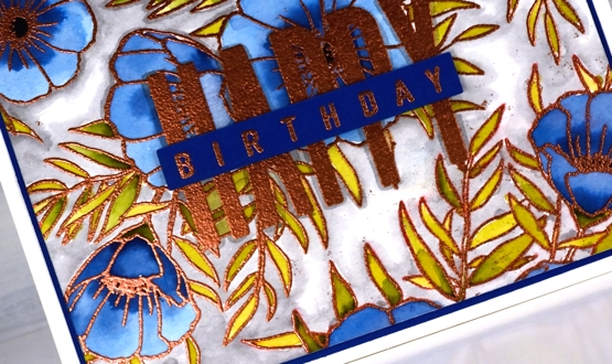
I wanted to combine a background image with a sentiment and ended creating my own background by repeat stamping with two stamps from the Concord & 9th ‘meadow blossoms’ set. Before heating the panel I stamped the word HAPPY from the new C&9 ‘all the birthdays’ set. I embossed with copper powder then coloured with ink from Papertrey ink cubes. The ink cubes are very juicy so I often smoosh them on my glass mat then pick up ink with a paint brush.
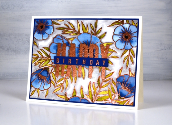
I filled the background with a grey zig clean color real brush pen and blended it with water. To complete the card I matted with with the dark blue cardstock I keep reaching for and finished the sentiment on a strip of the same blue. Having this new birthday set has got my birthday card production back on track. I have no excuses for not sending out birthday cards. Thank you Foiled Fox!
Supplies
Meadow Blossoms with Inktense
Posted: May 6, 2020 Filed under: Concord & 9th, Inktense pencils, meadow blossoms | Tags: Concord & 9th, Inktense 6 Comments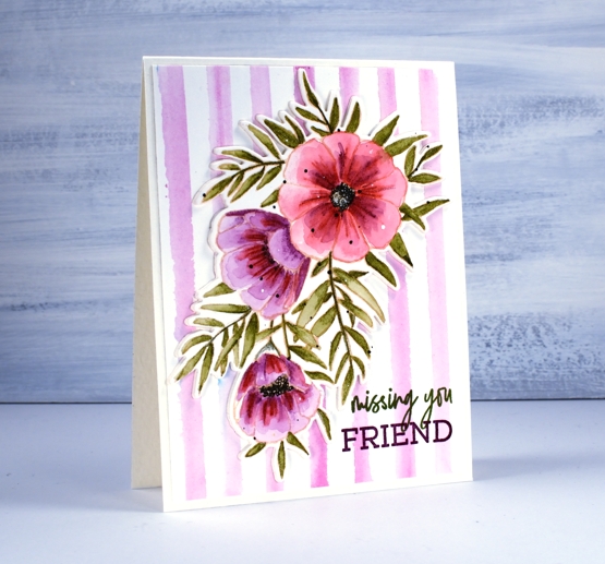
I’ve coloured these pretty ‘meadow blossoms’ from Concord & 9th a few times now, this time cutting them out with the co-ordinating die. I stamped the large spray of flowers in Gina K’s skeleton amalgam ink which is beige. I used inktense pencils for the watercolouring including the back panel of stripes. Inktense pencils are watersoluble but unlike some watercolour pencils they are permanent once dry. Many other watercolour pencils are not permanent meaning they will continue to move and dilute whenever liquid is added. One type is not better than another but they need to be used differently.
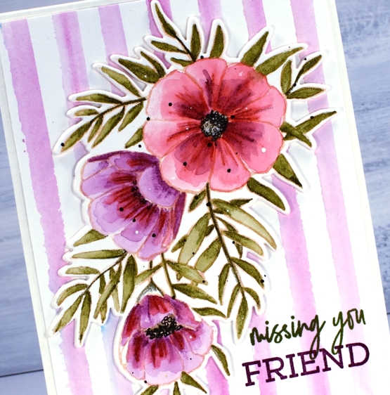
I used hot pressed watercolour paper for both layers and, although hot pressed is quite smooth it still has texture so you can see some of the pencil shading on the flowers where I first coloured with the pencils on dry paper. The pencil lines diluted once I painted over the top with water but not completely becoming part of the detail of the design. As the inktense are permanent once dry I decided to layer colour on the petals. Some I started with purple, the large one I did the base colour in red. To paint the leaves I coloured only a small amount, painted with water to fill the leaf or just picked up colour from one leaf to complete another one. I did switch to a black fineliner to do the flower centres and add some black dots. I used white paint to add some white dots.
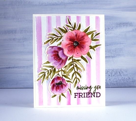
I decided to create my own striped background for the die cut using the fuchsia pencil. Rather than drawing on the background panel directly I pulled colour from the pencil tip onto my glass mat with a wet brush and painted loose stripes on a piece of watercolour pencil using a t-ruler to keep them parallel. As sometimes happens on my work table there seemed to be some stray brusho floating around so I ended up with some random blue spots! Popping up the floral panel seemed like a good idea so I used a technique Jennifer McGuire recently suggested in one of her videos. Rather than pop up a panel on foam tape or a foam cut out just die cut a few extra layers of cardstock and stack them up. I cut two extra die-cuts each with stick-it adhesive on the back and layered them under the painted one. I played with the idea of popping up part of the sentiment but ended up stamping in two different inks instead.
The inktense pencils used: chilli red 500, leaf green 1600, red violet 610, ink black 2200, fuchsia 700
Supplies
Meadow blossoms
Posted: April 27, 2020 Filed under: Concord & 9th, Inktense pencils, meadow blossoms, Peerless watercolours, Penny Black | Tags: Concord & 9th, Fabriano Watercolour Paper, Inktense, Peerless Transparent Watercolors, Penny Black creative dies, Penny Black stamps 6 Comments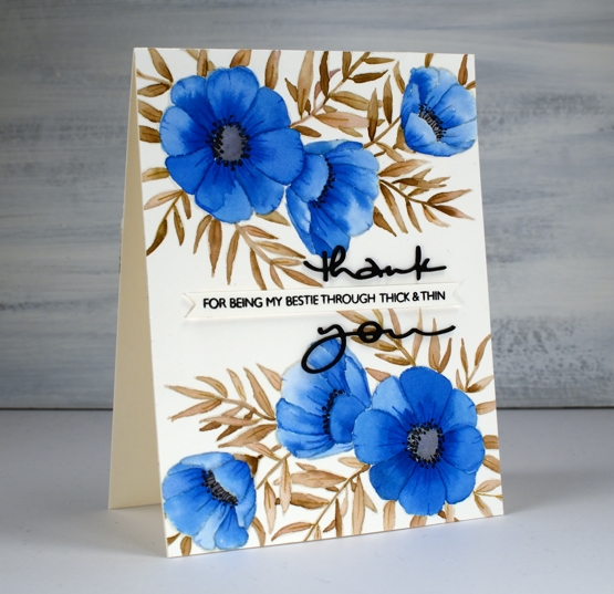
I attended a class not too long ago taught by my clever friend, Liane, where we used paint chips to make cards. Some paint chips have colours from the same family displayed but others have colour combinations that are suggestions when painting and decorating a room. I used one such card to choose the colours for this blue floral card. The paint chip featured colours called nautica, blizzard and tahini. I found similar colours on my peerless watercolour palette and did some no-line watercolour.
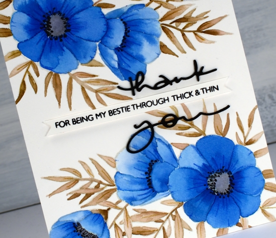
I started by stamping C&9 ‘meadow blossoms’ floral stamp in Gina K ‘whisper’ ink. The ink is a pale beige/grey dye ink which disappeared nicely as I painted with peerless watercolour paint over the top. I worked on non adjacent petals so the paint and water would not bleed from one area to the next. On the largest flowers I painted a dab of ‘Alice blue’ paint then blended it with water to fill the petal.
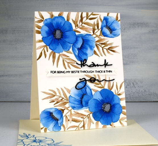
On the smaller flowers I switched the order and painted each petal with water first then dabbed in some blue paint. The second method resulted in slightly paler flowers. I painted all the leaves and stems in ‘warm sepia’ and the flower centres in ‘pearl grey’. Once all the paint was dry I used two inktense pencils to add veins and shading to the leaves and petals. I painted black dots in the flower centres then drew tiny stems to the dots with a very fine tip black pen. The black thank you die cut is from the PB ‘many thanks’ die set cut from black cardstock and stacked for extra dimension. I think it works well either side of the cute phrase from the PB ‘million thanks’ set which is stamped in nocturne black on a strip cut with the Taylored Expressions ‘simple strips’ die.
If you are stuck for a colour combo try some paint chip inspiration; I don’t think I would have thought up the blue, brown, grey combo without the inspiration on the chip. And call your bestie!
Supplies
Meadow blossoms gone tropical
Posted: April 15, 2020 Filed under: Inktense pencils, meadow blossoms, Peerless watercolours | Tags: Concord & 9th, Gina K inks, Inktense, Peerless Transparent Watercolors 9 Comments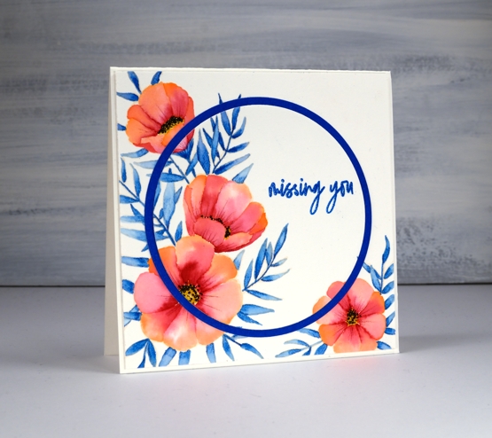
I am over on the Foiled Fox blog today sharing these pretty flowers from Concord & 9th and some no-line watercolour. Make sure you head over there for more details, then take a little stroll through the inspiration on their blog.
It wasn’t my intention to create a tropical looking card but that is absolutely what happened wouldn’t you agree? I chose three colours, geranium pink and alizarine pink from my set of Peerless watercolours and sea blue from my Inktense pencil set. All three colours ended up being bolder than I expected. I stamped flowers from the C&9th ‘meadow blossoms’ set in Gina K’s amalgam ink, ‘barely there’ which is a pale buttery colour, great for no-line watercolour.
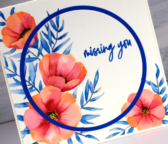
There are various methods for no-line watercolour; here I painted water on each petal first then dropped in a little geranium pink at one end of the petal and alizarine pink at the other then blended the two. The leaves I did by colouring one end of each leaf with the inktense pencil before blending blue into the whole leaf. I also used an inktense yellow, to fill the flower centres and a pink to add veins to the petals after painting. I added little black dots to the flowers with a fine tip pen
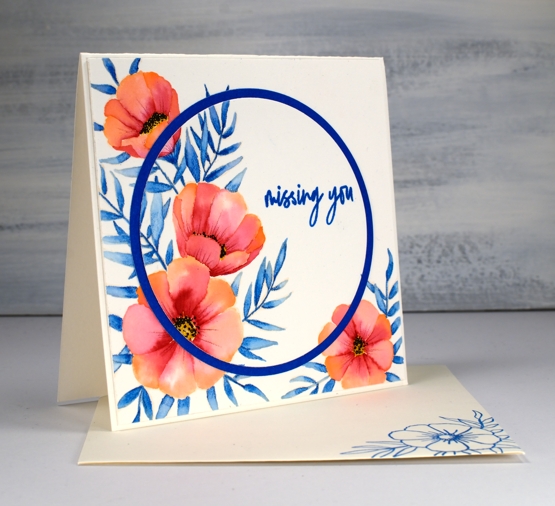
I embossed the sentiment from the same C&9 set and did some die cutting with nesting circles to add a little interest with a co-ordinating blue cardstock. I hope you enjoyed this little taste of the tropics; as I write this post it is snowing outside. Yep, a little April snow, just to keep us guessing.
As always I love connecting with you in the comments below or over on the Foiled Fox blog.
Supplies