
Meadow blossoms gone tropical
Posted: April 15, 2020 Filed under: Inktense pencils, meadow blossoms, Peerless watercolours | Tags: Concord & 9th, Gina K inks, Inktense, Peerless Transparent Watercolors 9 Comments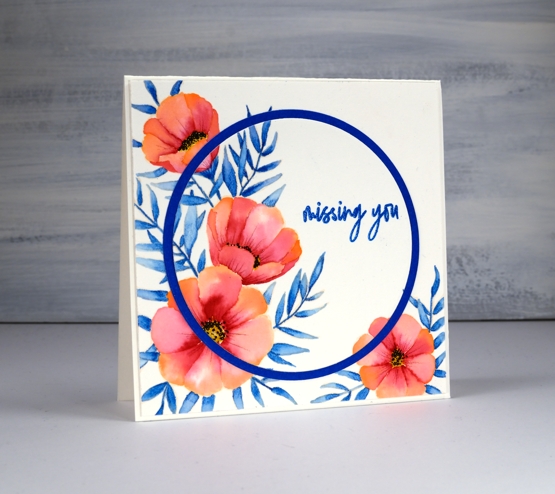
I am over on the Foiled Fox blog today sharing these pretty flowers from Concord & 9th and some no-line watercolour. Make sure you head over there for more details, then take a little stroll through the inspiration on their blog.
It wasn’t my intention to create a tropical looking card but that is absolutely what happened wouldn’t you agree? I chose three colours, geranium pink and alizarine pink from my set of Peerless watercolours and sea blue from my Inktense pencil set. All three colours ended up being bolder than I expected. I stamped flowers from the C&9th ‘meadow blossoms’ set in Gina K’s amalgam ink, ‘barely there’ which is a pale buttery colour, great for no-line watercolour.
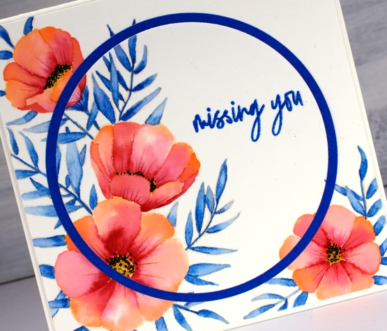
There are various methods for no-line watercolour; here I painted water on each petal first then dropped in a little geranium pink at one end of the petal and alizarine pink at the other then blended the two. The leaves I did by colouring one end of each leaf with the inktense pencil before blending blue into the whole leaf. I also used an inktense yellow, to fill the flower centres and a pink to add veins to the petals after painting. I added little black dots to the flowers with a fine tip pen
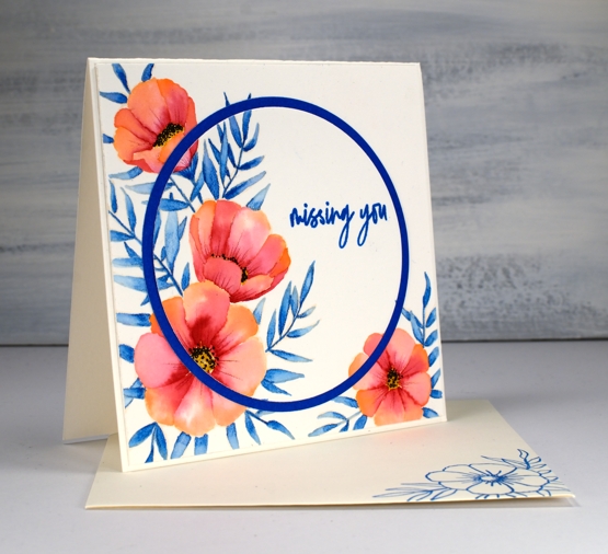
I embossed the sentiment from the same C&9 set and did some die cutting with nesting circles to add a little interest with a co-ordinating blue cardstock. I hope you enjoyed this little taste of the tropics; as I write this post it is snowing outside. Yep, a little April snow, just to keep us guessing.
As always I love connecting with you in the comments below or over on the Foiled Fox blog.
Supplies


I so appreciate you ideas. I have a similar style and love watercolor and florals. Need some additional masculine card ideas.
So appreciate your inspiration!
Thank you Renee for getting in touch with such encouraging words. I agree, I need some additional masculine card ideas too. I will keep that in mind as I plan and create. Take care.
Once again you had me looking at stamps through a different lens. I love the idea of using flower stamps as if they were in a different setting. Now I am thinking of peachy tulips, purple cosmos, and glittery anything. Thank you for the ongoing inspiration.
This is so pretty! The blue and white remind me of Holland and the flowers almost look like tulips.I love it.
Such a pretty look Heather and the coral coloured flowers look fantastic with the rich blue leaves, and the die cut circle really adds another dimension. x
Beautiful and bright, Heather! A wonderful lift for a dreary day!
This beautiful card is both tropical and dramatic. The circle just emphasises the sentiment. It’s a joy.
So beautiful and refreshing!
GORGEOUS, I love how the circle frame highlights the sentiment portion!