By the Garden Gate
Posted: March 28, 2024 Filed under: Echidna Studios, garden fence, Inktense pencils, Stampin Up | Tags: digital stamps, Echidna Studios, Inktense, Kuretake Zig clean color real brush markers, Stampin Up 5 Comments
The Garden Fence set is an Echidna Studios digital stamp set that I designed and my daughter digitised. The set includes a gate, three pots and a grass & flowers image. Each image is stackable which means you can arrange your own garden design with pots and gate beside each other, behind each other or even on top of each other if that sounds fun!
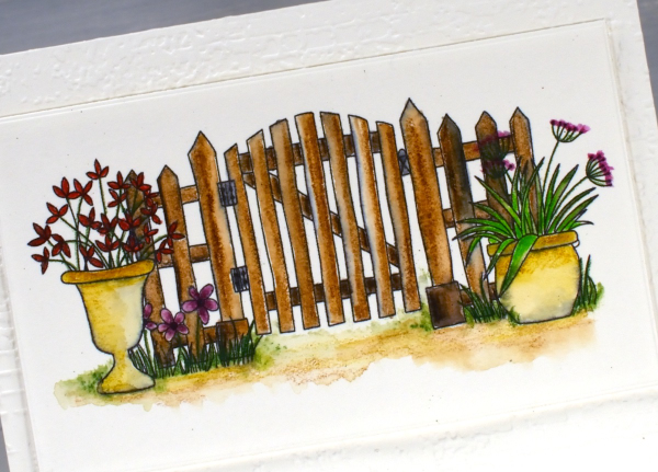
Both the gate scene above and the individual pots on the tag shown later in this post were printed on hot press watercolour paper on an ink jet printer. In the past I have always printed on a laser printer but my daughter recently bought a second hand printer to test some colour printing of our designs. We printed some black outline images to see how they were to watercolour.
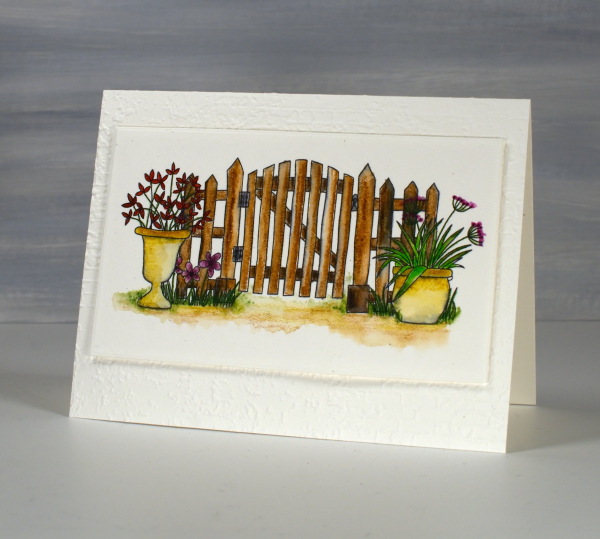
The gate design above I coloured with inktense watercolour pencils and blended the ink with water and a very fine brush. The ink from the printer did bleed a bit so you can some some grey tones here and there. Because I used very little water I was able to keep the bleeding to a minimum. I received the lovely ‘exposed brick‘ embossing folder for my birthday from a couple of friends who know just what I like. It seemed an appropriate background for the slightly aged garden gate.
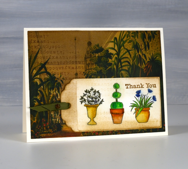
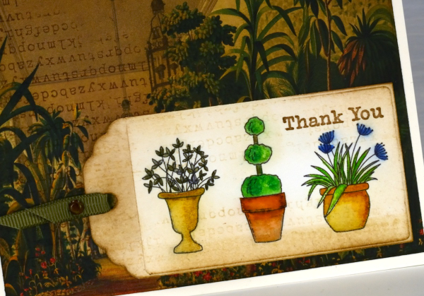
On this little tag I used a mix of inktense pencils and Zig clean color real brush markers; again there was some bleeding when I added water but no so much as to make me stop colouring and blending. All that to say if you have an ink jet printer it might be worth printing and watercolouring some images just to see how it goes.
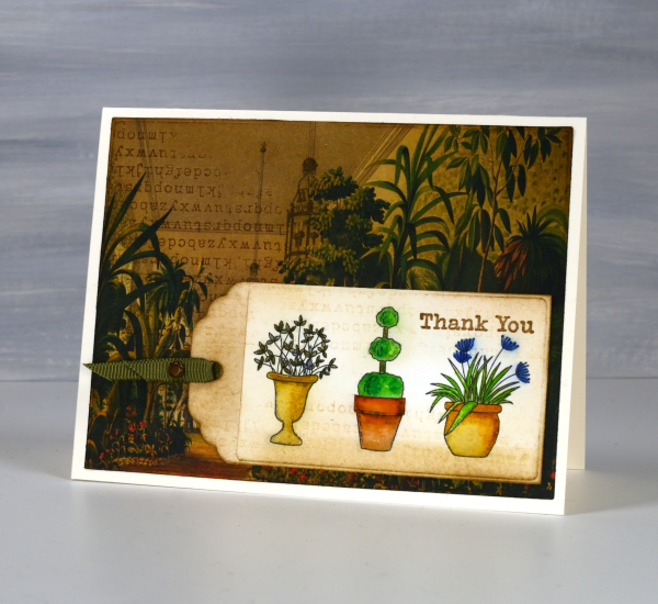
I’ve been making some vintage style collage cards lately (I’ll share them on the blog soon) so I decided to find a book page as background for my watercoloured tag. I blended vintage photo and antique linen inks around the background and tag and added some typewriter alphabet stamping on both. Unfortunately I stamped the alphabet upside down on my background but I continued with my card anyway! I like the pairing of old fashioned conservatory with modern little pots just for fun.
I’ve featured the Garden Fence set before; take a look here and here. This post includes affiliate links from Foiled Fox and Scrap’n’Stamp . If you buy through these links I receive a small commission at no extra cost to you.
At the Garden Gate
Posted: March 24, 2023 Filed under: Echidna Studios, garden fence, Inktense pencils | Tags: digital stamps, Echidna Studios, Inktense, Penny Black stamps 5 Comments
This little front fence is a new digital stamp from Echidna Studios. It’s a set of five images that you can arrange yourself. Each image is opaque (or stackable) which means when you arrange them before printing you can put the plants in front of the fence and in front of each other. The five stamps are the fence, the triple topiary, the flowers in the grass, the flowers in the pot and another pot not featured on this card.
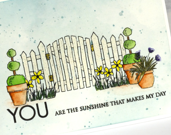
I had great fun arranging these images to create this little scene. After finalising the scene I printed it on hot pressed watercolour paper and coloured the images with Derwent inktense pencils. I use inktense pencils it two ways; sometimes I colour directly on the paper then blend with a wet paintbrush, other times I pick up ink from the sharpened tip of the pencil with a paintbrush and then paint.
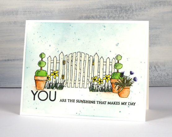
After colouring the pots and the plants I had to decide how to colour the fence and gate because it wasn’t going to stand out if I left it white. The problem was that I wanted a white picket fence. I ended up colouring the fence and gate with an embossing pen then embossed with Ranger weathered white embossing powder which is textured and creamy coloured. It’s subtle but it does make the fence stand out a little. I coloured the hinges with a gold gel pen.
To add some sky I blended speckled egg distress ink here and there, then splattered some over the scene. The sentiment is from Penny Black’s ‘only you’ set and all the links can be found below.
Thank you to all of you who have left such kind messages about my daughter’s digital design etsy store. Thank you to those who have popped over to purchase some of her digital stamps. We would both love to see what you have done with the images. You can attach an image when you comment in the store or even use the contact button to send her a message.
(Compensated affiliate links from Foiled Fox, Scrap n Stamp)
Floral Focus in pencil
Posted: July 5, 2021 Filed under: Brutus Monroe, floral focus, Heather lowercase die set, Inktense pencils, Pink Fresh studio | Tags: brutus monroe embossing powder, Inktense, Pink Fresh studio 7 Comments
Last week I shared a card featuring the Pinkfresh Studio background stamp, ‘floral focus‘ watercoloured with Karin Markers. Today I have another card with the same stamp but pencil coloured this time using Derwent inktense pencils. At some point I should do pencil colouring on white or cream cardstock again but I am still in love with the look of pencil on kraft. Inktense pencils are watersoluble but you can also use them as traditional pencils with no water added, that’s what I did here.
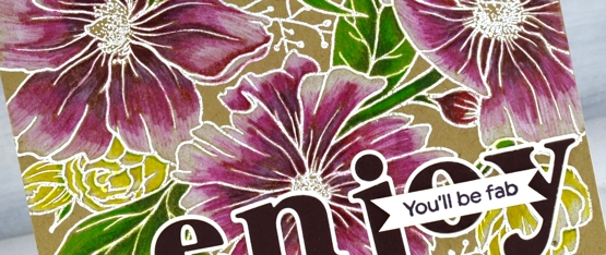
I embossed the background stamp in white powder, another technique that looks great on kraft cardstock then used the inktense pencils to fill the flowers and leaves. The flowers are coloured with red violet, fuchsia and antique white. The leaves and stems I did with felt green and apple green and the small flowers are coloured with sun yellow and antique white.
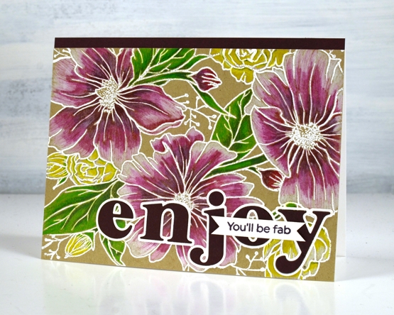
To finish the card I added a strip of violet cardstock and cut letters from the same cardstock with the Pinkfresh ‘Heather lowercase letter’ dies. The little sentiment is from PF set ‘scripted bold sentiments. You might think this is an odd pairing of sentiments; I was thinking it would suit someone starting something new, some encouragement along with a reminder to enjoy the experience.
Supplies
(Compensated affiliate links used when possible)
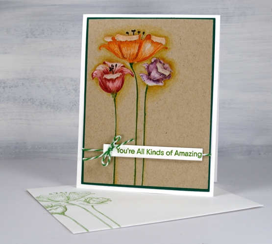
Sweet Centrepiece
Posted: April 1, 2021 Filed under: Inktense pencils, sweet centerpiece | Tags: Inktense, Penny Black stamps, Ranger archival inks 9 Comments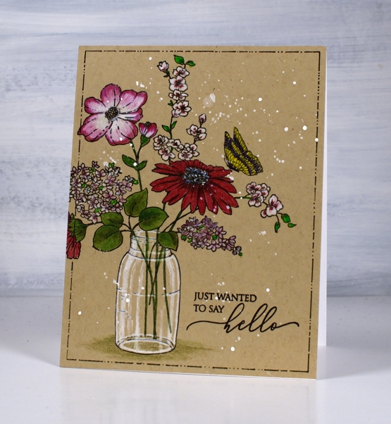
I’m really enjoying pencil on kraft cardstock right now; the colours pop more than you might think on a brown base. This line image from Penny Black is called ‘sweet centerpiece’, cardstock is Bazzill kraft and the pencils are Derwent inktense.
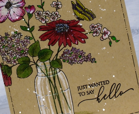
I stamped the image off to the side of the panel in archival jet black ink and coloured with a mix of purples and purply-pinks. Some flowers have a base of white with pinks and purples over the top, others have pink first with white blending over the top. The large daisy is a mix of deep red with shading of burgandy. I used three different greens, blending two at a time to get variety on the different plants.
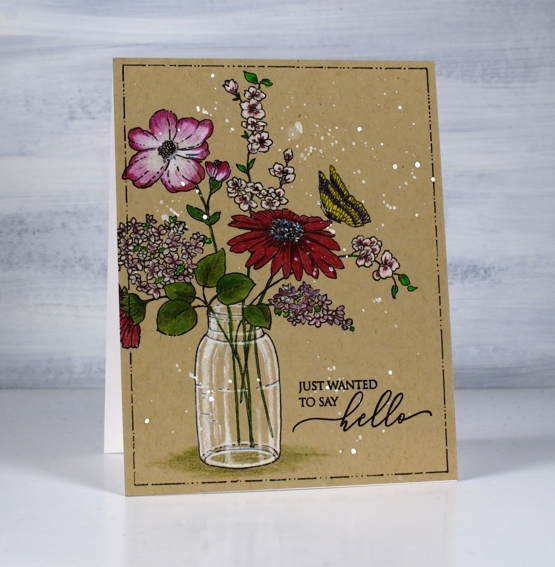
I used a black micron pen to redraw a few lines that were muted by the coloured pencil and also drew a dots & dashes frame around the panel with the same fine tip pen (I used a rectangle frame die as a guide). I splattered some hydrus white paint over the panel before adding the sentiment from PB ‘magical friendship stamped archival jet black.
Wishing you joy and hope this Easter.
Supplies
(Compensated affiliate links used when possible)
Pencil Florals
Posted: September 10, 2020 Filed under: Anything but basic friendship, fine line floral, Inktense pencils, My Favorite Things | Tags: Inktense, My Favorite Things 9 Comments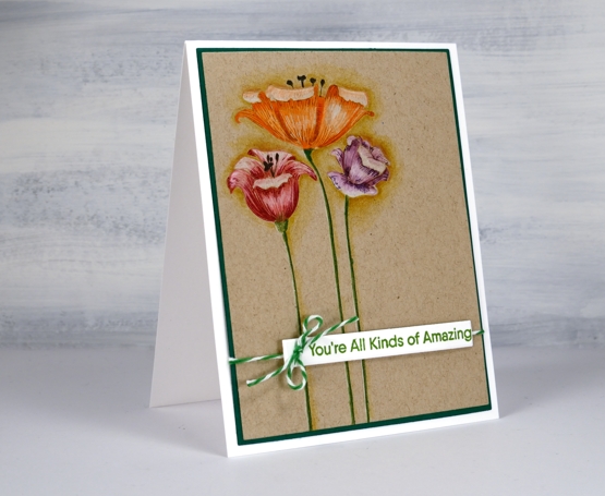
These sweet and quirky flowers are from the My Favorite Things set, ‘fine line floral’. I’m sharing this card and process over on the Foiled Fox blog today and hope you will join me there.

There is a lot of fine line detail (as the name suggests) in the flower heads so they look good stamped with a detail ink. I decided to do some pencil colouring first but was able to add detail over the top with some stamping after all the colouring was done.
All three flowers are part of one stamp so I stamped in antique linen ink on kraft cardstock to do some no-line pencil colouring. I used inktense pencils which are water-soluble but can be used without water too. All the petals are coloured with a mix of white and a colour, blending the two with white to soften the transitions. I kept the panel in my stamp positioner the whole time I was colouring which made it possible to stamp the fine detail over the top. To add the fine detail I used distress markers and just shaded lightly on the stamp towards the base of the petals and at the top. I was pleasantly surprised to see how the detailed lines popped with just that extra bit of stamping.
I did some shading around the flowers to lift them a little and then added a sentiment from the MFT ‘Anything but basic friendship’ set with some twine to match the stems.
All the bits and pieces to create this card are available in the delightful Foiled Fox online store and their blog is overflowing with inspiration. See you over there!
Supplies
No-line watercolour Magnolias -video
Posted: September 2, 2020 Filed under: Inktense pencils, magnolia blossoms, My Favorite Things, Tutorial | Tags: Gina K inks, Inktense, My Favorite Things, Tsukineko Versafine inks 11 Comments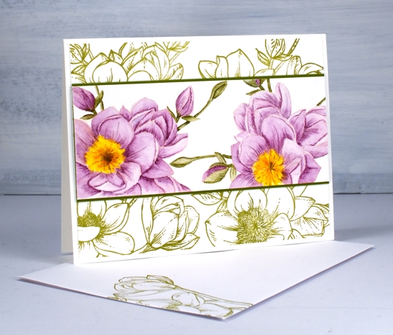
This is a card which changed shape and style several times before it turned into the design you see above. The watercoloured flowers and the green stamped flowers are from the same MFT ‘magnolia blossoms’ set.
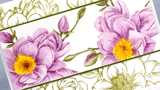
I almost didn’t keep making the video as I made mistakes and alterations but the point of the video was the no-line colouring not the card layout so I kept going. I used Gina K’s ‘barely there’ amalgam ink to stamp the flowers; the ink is a pale peach colour which almost disappeared with both the purple and the green watercolouring. I used Derwent Inktense pencils for the no-line watercolour shading an area lightly and minimally before blending the ink to fill the petal or leaf.
My initial layout for the painted panel involved both stamps from the set but you see in the video a series of unfortunate events caused me to slice up the first panel, add another flower and come up with the layout you see below.
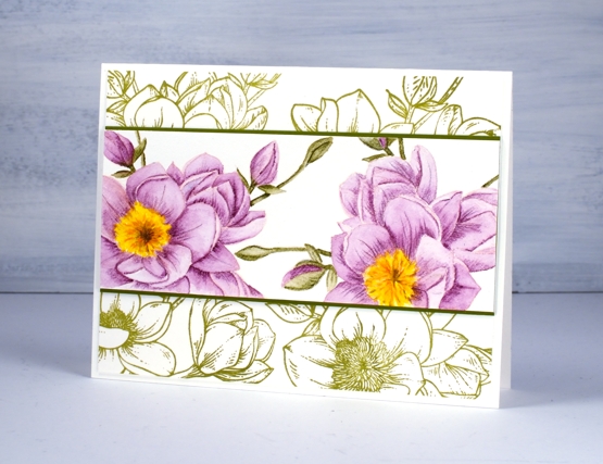
One thing I didn’t initially plan was the simple green stamping behind the coloured panel but I’m glad I tried it. These stamps are definitely stunning when left uncoloured in their simple outline beauty.
Supplies
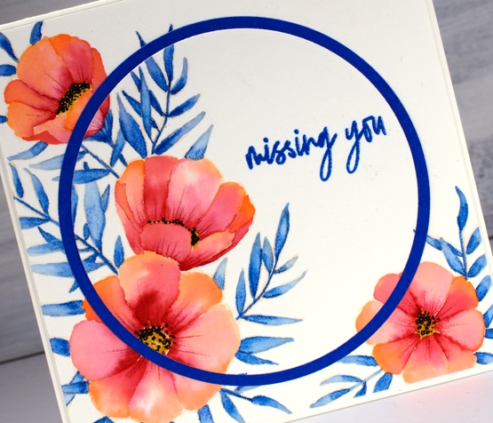
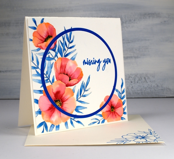
Meadow Blossoms with Inktense
Posted: May 6, 2020 Filed under: Concord & 9th, Inktense pencils, meadow blossoms | Tags: Concord & 9th, Inktense 6 Comments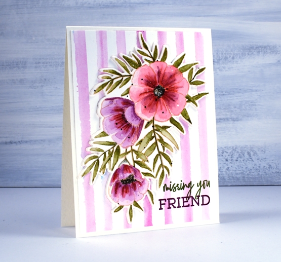
I’ve coloured these pretty ‘meadow blossoms’ from Concord & 9th a few times now, this time cutting them out with the co-ordinating die. I stamped the large spray of flowers in Gina K’s skeleton amalgam ink which is beige. I used inktense pencils for the watercolouring including the back panel of stripes. Inktense pencils are watersoluble but unlike some watercolour pencils they are permanent once dry. Many other watercolour pencils are not permanent meaning they will continue to move and dilute whenever liquid is added. One type is not better than another but they need to be used differently.
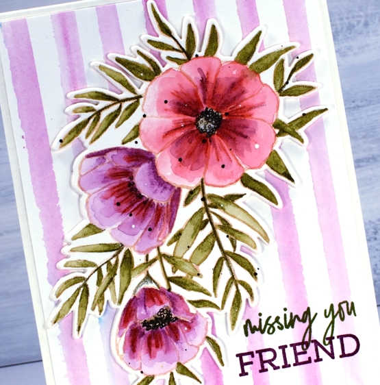
I used hot pressed watercolour paper for both layers and, although hot pressed is quite smooth it still has texture so you can see some of the pencil shading on the flowers where I first coloured with the pencils on dry paper. The pencil lines diluted once I painted over the top with water but not completely becoming part of the detail of the design. As the inktense are permanent once dry I decided to layer colour on the petals. Some I started with purple, the large one I did the base colour in red. To paint the leaves I coloured only a small amount, painted with water to fill the leaf or just picked up colour from one leaf to complete another one. I did switch to a black fineliner to do the flower centres and add some black dots. I used white paint to add some white dots.
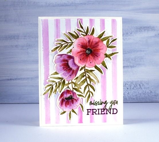
I decided to create my own striped background for the die cut using the fuchsia pencil. Rather than drawing on the background panel directly I pulled colour from the pencil tip onto my glass mat with a wet brush and painted loose stripes on a piece of watercolour pencil using a t-ruler to keep them parallel. As sometimes happens on my work table there seemed to be some stray brusho floating around so I ended up with some random blue spots! Popping up the floral panel seemed like a good idea so I used a technique Jennifer McGuire recently suggested in one of her videos. Rather than pop up a panel on foam tape or a foam cut out just die cut a few extra layers of cardstock and stack them up. I cut two extra die-cuts each with stick-it adhesive on the back and layered them under the painted one. I played with the idea of popping up part of the sentiment but ended up stamping in two different inks instead.
The inktense pencils used: chilli red 500, leaf green 1600, red violet 610, ink black 2200, fuchsia 700
Supplies
Meadow blossoms
Posted: April 27, 2020 Filed under: Concord & 9th, Inktense pencils, meadow blossoms, Peerless watercolours, Penny Black | Tags: Concord & 9th, Fabriano Watercolour Paper, Inktense, Peerless Transparent Watercolors, Penny Black creative dies, Penny Black stamps 6 Comments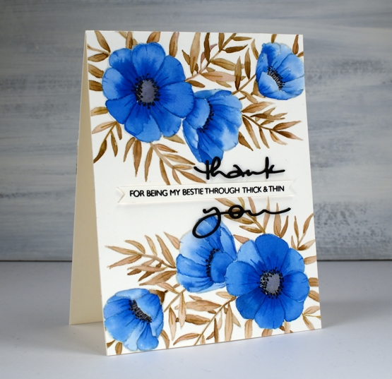
I attended a class not too long ago taught by my clever friend, Liane, where we used paint chips to make cards. Some paint chips have colours from the same family displayed but others have colour combinations that are suggestions when painting and decorating a room. I used one such card to choose the colours for this blue floral card. The paint chip featured colours called nautica, blizzard and tahini. I found similar colours on my peerless watercolour palette and did some no-line watercolour.
I started by stamping C&9 ‘meadow blossoms’ floral stamp in Gina K ‘whisper’ ink. The ink is a pale beige/grey dye ink which disappeared nicely as I painted with peerless watercolour paint over the top. I worked on non adjacent petals so the paint and water would not bleed from one area to the next. On the largest flowers I painted a dab of ‘Alice blue’ paint then blended it with water to fill the petal.
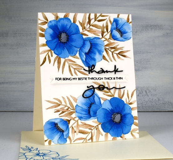
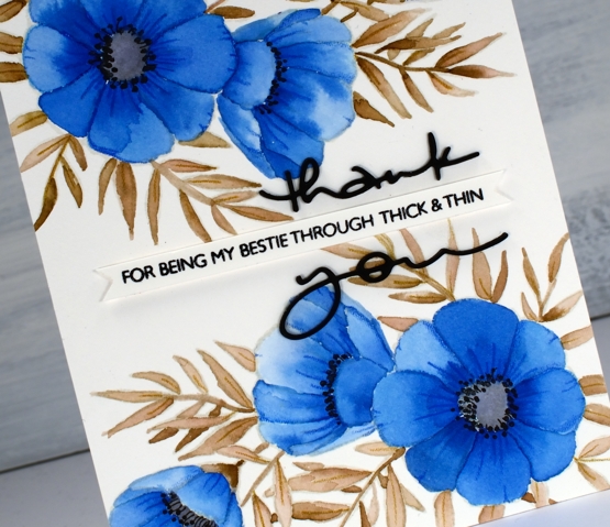
On the smaller flowers I switched the order and painted each petal with water first then dabbed in some blue paint. The second method resulted in slightly paler flowers. I painted all the leaves and stems in ‘warm sepia’ and the flower centres in ‘pearl grey’. Once all the paint was dry I used two inktense pencils to add veins and shading to the leaves and petals. I painted black dots in the flower centres then drew tiny stems to the dots with a very fine tip black pen. The black thank you die cut is from the PB ‘many thanks’ die set cut from black cardstock and stacked for extra dimension. I think it works well either side of the cute phrase from the PB ‘million thanks’ set which is stamped in nocturne black on a strip cut with the Taylored Expressions ‘simple strips’ die.
If you are stuck for a colour combo try some paint chip inspiration; I don’t think I would have thought up the blue, brown, grey combo without the inspiration on the chip. And call your bestie!
Supplies
Meadow blossoms gone tropical
Posted: April 15, 2020 Filed under: Inktense pencils, meadow blossoms, Peerless watercolours | Tags: Concord & 9th, Gina K inks, Inktense, Peerless Transparent Watercolors 9 Comments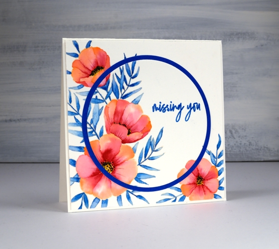
I am over on the Foiled Fox blog today sharing these pretty flowers from Concord & 9th and some no-line watercolour. Make sure you head over there for more details, then take a little stroll through the inspiration on their blog.
It wasn’t my intention to create a tropical looking card but that is absolutely what happened wouldn’t you agree? I chose three colours, geranium pink and alizarine pink from my set of Peerless watercolours and sea blue from my Inktense pencil set. All three colours ended up being bolder than I expected. I stamped flowers from the C&9th ‘meadow blossoms’ set in Gina K’s amalgam ink, ‘barely there’ which is a pale buttery colour, great for no-line watercolour.
There are various methods for no-line watercolour; here I painted water on each petal first then dropped in a little geranium pink at one end of the petal and alizarine pink at the other then blended the two. The leaves I did by colouring one end of each leaf with the inktense pencil before blending blue into the whole leaf. I also used an inktense yellow, to fill the flower centres and a pink to add veins to the petals after painting. I added little black dots to the flowers with a fine tip pen
I embossed the sentiment from the same C&9 set and did some die cutting with nesting circles to add a little interest with a co-ordinating blue cardstock. I hope you enjoyed this little taste of the tropics; as I write this post it is snowing outside. Yep, a little April snow, just to keep us guessing.
As always I love connecting with you in the comments below or over on the Foiled Fox blog.
Supplies
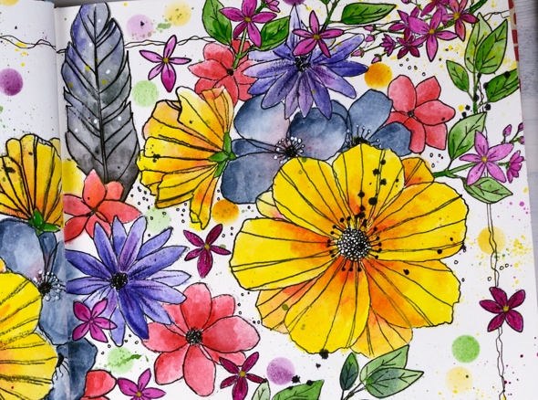
Fine floral journal page
Posted: April 17, 2019 Filed under: Art Journal, Concord & 9th, dots and hearts, Feathered stamp set, fine line florals, Inktense pencils, songbird | Tags: Art Journal, Concord & 9th, Fabriano art journal, Inktense 5 Comments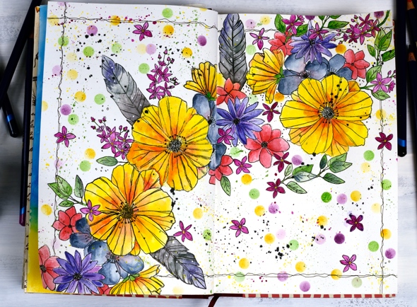
I’ve been experimenting in my journal again featuring some new and old stamps from Concord & 9th. Once again I had an idea in my head and although this does not look like my original idea, I’m very happy with the vibrant look of the massed flowers. I haven’t put any words on this page yet and possibly wont. Now if you are not an art journal type of person, hang in there, I have cards made with the new ‘fine line florals’ set coming over the next few weeks.
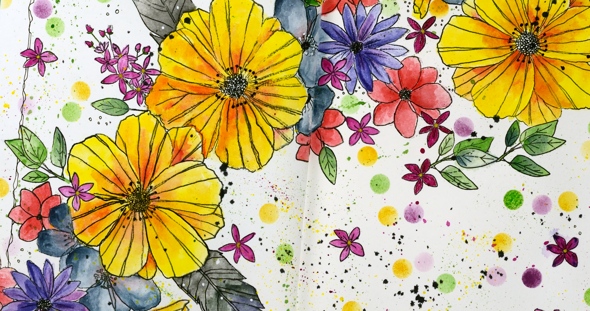
As I mentioned last time a couple of my journals do not have watercolour pages, this one is drawing paper. Sometimes I paint my pages with gesso or absorbant ground before I start or glue other papers to the page. I’ve also glued two pages together a few times to make sure liquids don’t soak through the page. The glued pages are very bulky and bumpy though so I don’t think I’ll keep that up. With this page I wanted to see if I could add watercolouring to an untreated page without it soaking through, breaking down the page or seeping outside the stamped images. Even though I love watercolouring with distress inks or stains I thought they might be too wet. I decided instead to used inktense pencils as I hoped to get vibrant colour with limited water. I tried picking up colour from the pencil lead with a wet brush and painting it into my stamped images as well as colouring the image with the pencil then adding the water over the top. I preferred the look of the former method. When I coloured directly on the page it was more likely that I would end up with shading lines or the colour would seep outside the stamping once I added water. I did get some paint soaking through the next page of the journal so I’ll cover that up with my next spread.
The big flowers are part of a large multiflower stamp from the new C&9 set, fine line florals. I stamped it three times on my journal double page but the page doesn’t sit flat so I was not able to get perfect prints. I was using the fiskars stamp press on the flatter right hand page but used my hand to press the stamp on the bumpy left hand page and tried to do the stamping across the centre of the two pages in two steps while masking the left then right. I kept going even with my patchy stamping and used micron pens to add in missing lines and trace over the pale stamping. I wondered whether the lines I added would be obvious but once all the colour was added it was hard to tell the difference between the stamped and the hand drawn outlines.
The other stamps in my floral explosion are a feather from the C&9 ‘feathered’ set and leaves, flowers and little sprays from the C&9 ‘songbird’ set. I did several layers of colour on the large flowers, letting it dry after each one but just one layer on the leaves, little flowers and feathers. The dots were distress inks sponged through a homemade die cut vellum stencil made with C&9 ‘dots and hearts’ die.

I also did quite a bit of splattering by flicking a wet brush across the lead of the inktense pencils. I added black outlines as I did the watercolouring but when all the painting was finished I went over the centre of the flowers drawing little circle centres with the micron pens and adding little white dots here and there with a white gel pen. To frame the spread I drew a squiggly frame with in black then added some black soot distress stain splatter here and there.
I had fun with this spread and learnt a few things along the way. Hope you are having a great day; thanks for spending some of it here on my blog.