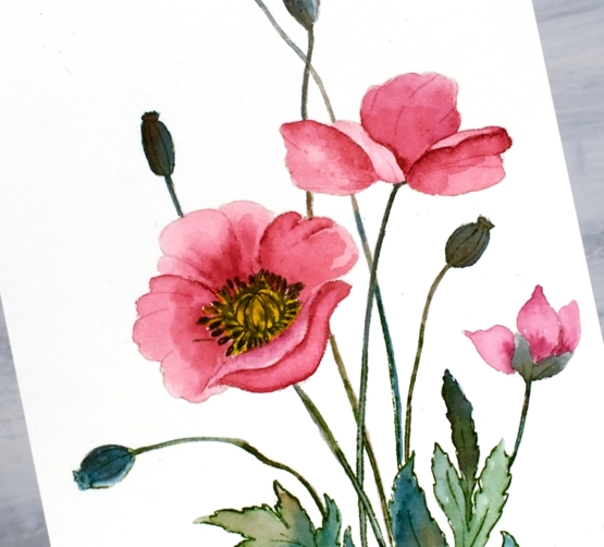
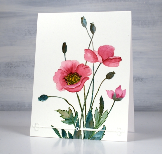
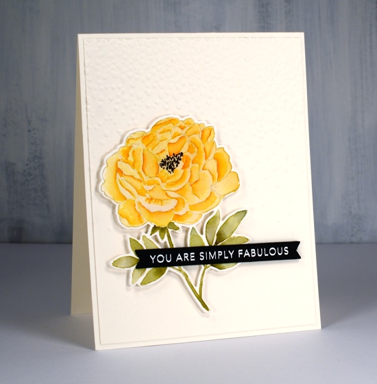
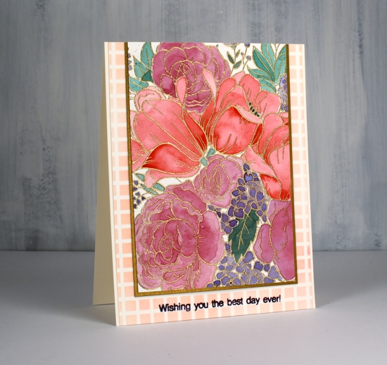
It seems that Penny Black always includes a poppy or two in a spring release. This large stamp is called ‘brilliant’ and I think the mix of flowers, leaves and seed heads is just lovely. I chose to do no-line watercolour with soft stone ink and peerless paints.
I stamped the large image in Papertrey Ink ‘soft stone’ then worked with rose red, mountain green, golden yellow and warm sepia peerless paints. If you haven’t heard of Peerless Watercolour paints take a look at the video I made about them a few years back.
I wondered about adding background pattern or blended ink but left it clean except for the simple ‘vintage touch’ die-cut. The vintage touch set has two fancy banners as well as two dies that cut negative space banner patterns. I finished off the centre of the poppy with a black marker.
I am still undecided about the lack of background and sentiment; what do you think?
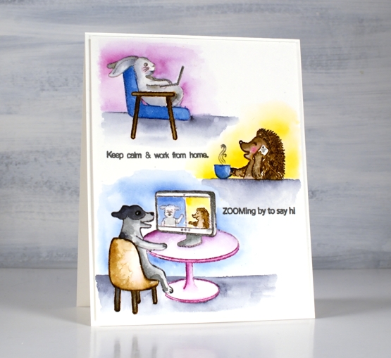
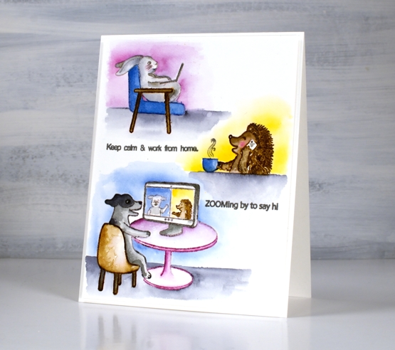
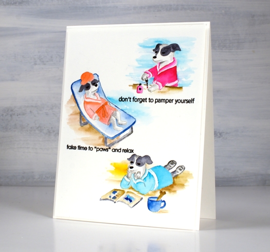
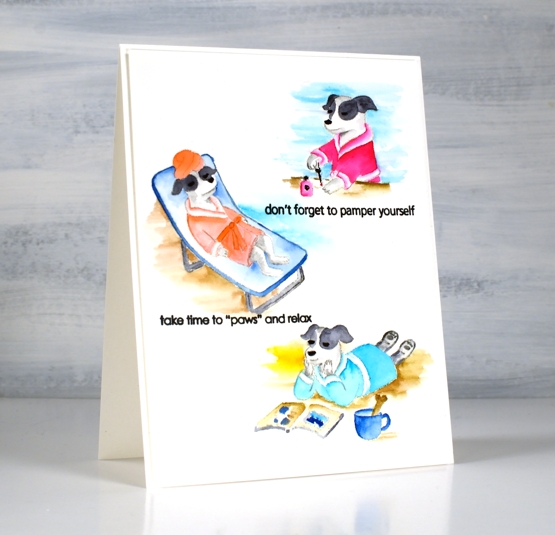
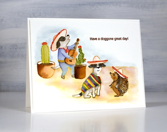
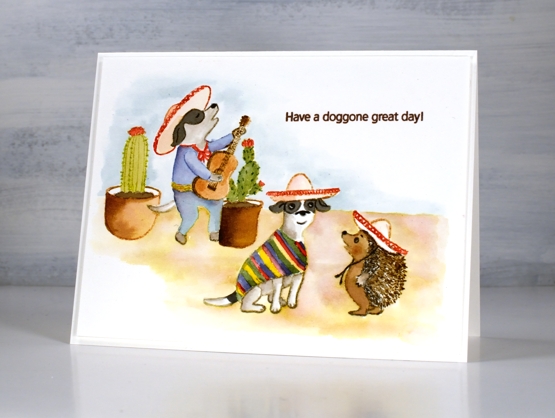
Are you surprised to see another critter post? Regular programming will resume I promise but first let’s enjoy Scooter and her friends working from home and pampering themselves!
Once again I stamped the images with Papertrey ink’s soft stone. It is great for no-line watercolour. I used Peerless watercolours to paint the little scenes concentrating on a few main colours for each card. For the hedgehog I switched to brown distress markers, easier for getting all those spikes!
If you didn’t read it in my earlier post, Penny Black is donating some of the proceeds from the Scooter release to Muttville a rescue program for senior dogs.
Hope you get to ‘paws & relax’ this weekend. It’s a long weekend here in Ontario!
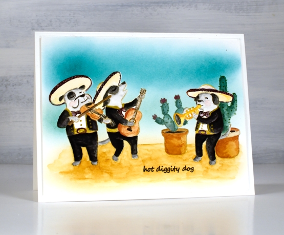
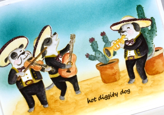
I have another cute Scooter card for you today. Once again I watercoloured, this time with distress inks. I think this is my favourite set from the release; what’s not to like about a canine mariachi band?
I stamped some images with soft stone ink then painted with distress inks. Other images, including the hedgehog I stamped in brown distress inks and blended them to fill the image. I painted the background with distress inks smooshed and diluted on my glass mat.
The second card I stamped in antique linen distress inks and stamped on masking paper also so I could create the scene with cacti in the background and one musician behind another.
I painted with peerless watercolour paints and added gold details with a gel pen. I used the masks a second time so I could blend ink over the background.
These Scooter scenes were definitely a departure from my nature (and book) themed projects but as a friend said to my yesterday, ‘always good to step out of your comfort zone!’
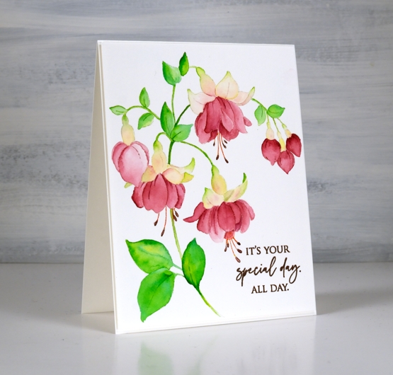
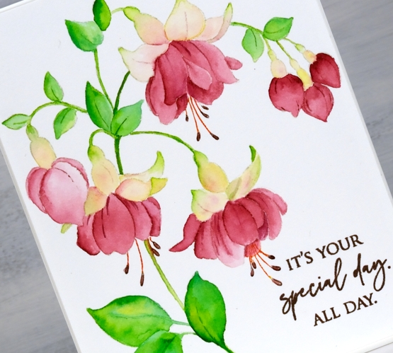
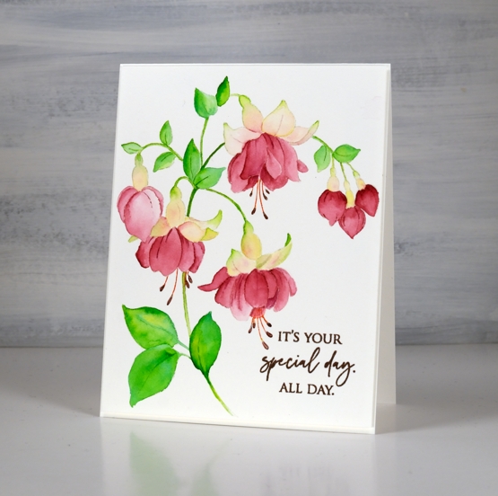
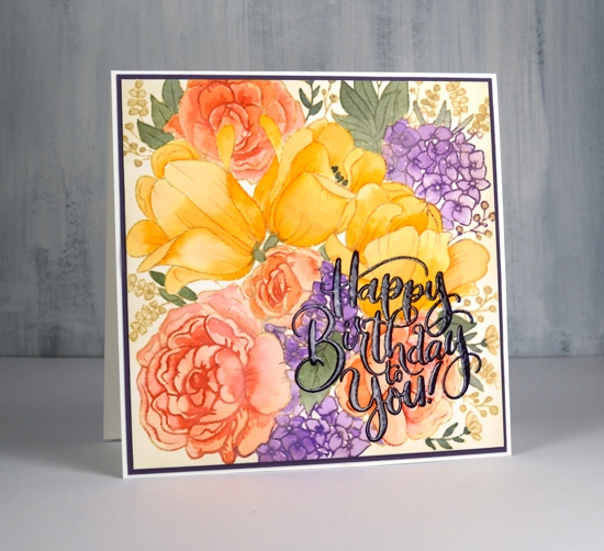
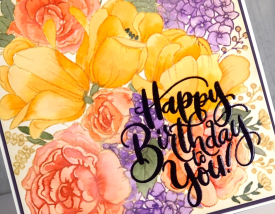
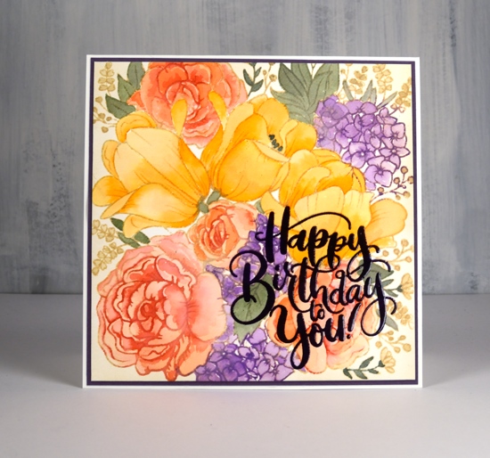
This gorgeous stamp from Penny Black is called captivating; it’s a single large stamp which fills a card front and lives up to its name. Before painting I did a quick search on my phone and used a reference photo as inspiration. Fuchsias can be a single colour or two toned; I chose pink and white using Peerless watercolours and a few no-line watercolour techniques.
Peerless watercolour paints blend beautifully; they actually advertise as ‘self blending’ so the soft transitions from dark to light on the leaves and petals shine with this kind of paint. After stamping in papertrey soft stone ink I used a couple of greens for the leaves and a single red for the lower petals which I diluted as I blended to add depth and variation. The upper petals have a little yellow, green and pink but not much as I wanted them to appear white.
I posted yesterday about my new online class Floral Faves. I use the Captivating stamp in the no-line watercolour lesson covering the process from beginning to end.
It’s a collaboration day with The Foiled Fox, so I am over on their blog and sharing here at home too. Make sure you pop over there to learn more about today’s card process and products.
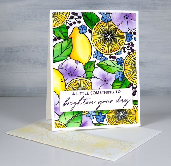
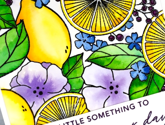
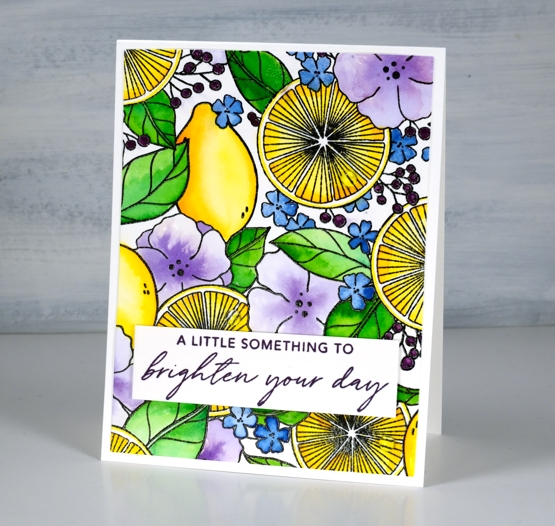
Isn’t this a bright happy image? I know it’s partly the colours I chose but I think it is also the mix of lemons, leaves and flowers. It’s a glimpse of summer and that is definitely welcome! The stamp is called ‘lemon lush’ and it is a large 6″x6″ from Pinkfresh Studio. I’ve used two thirds of it for this rectangle card but I’ll be showing you the whole square image on another card soon.
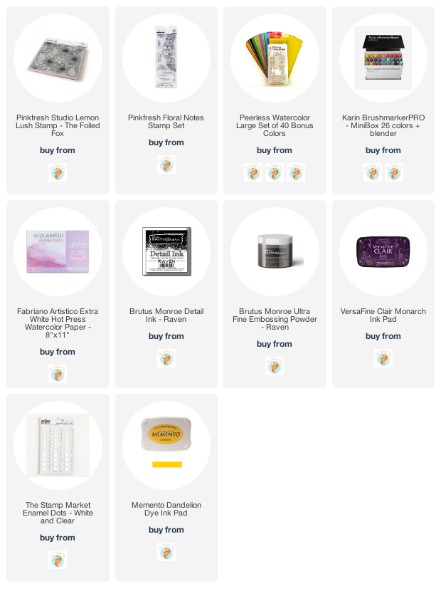
I stamped the rubber stamp on hot pressed watercolour paper in raven black ink and embossed in raven powder (both from Brutus Monroe). For the watercolouring I used Peerless watercolours. I watercolour with quite a few different products so sometimes the Peerless paints sit on the shelf feeling forgotten. Once I bring them out however, I remember just how beautifully they blend and what gorgeous colours are available. If you haven’t heard of Peerless watercolours paints they are an old, old company and the paint is in pieces of thick paper. I use a wet brush to pick up paint to use on my project.
When painting the cut lemons I used a yellow and a light orange paint, for the whole lemons I used the same plus darker orange tones to get depth and shadow. I used two greens for the leaves, a blue for the tiny flowers and violet for the large flowers. To fill in the berries I switched to a purple Karin brushmarker. The sentiment is from Pinkfresh Studio’s ‘floral notes’ set stamped in monarch versafine clair. I stamped the flap of my envelope too with memento dandelion ink. If you take a close look at the second photo you will see some clear dots glued to the lemon halves, those droplets of juice might just be my favourite part of the card! Thanks for joining me today and thank you Foiled Fox for sending me this stunning stamp to create with.
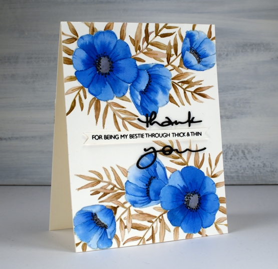
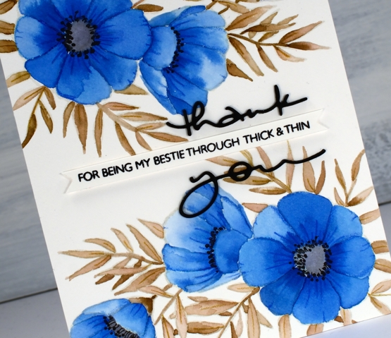
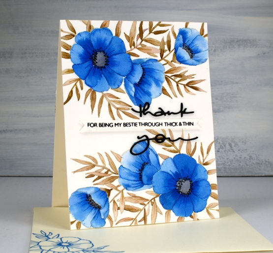
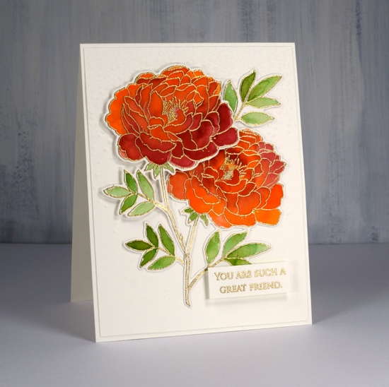
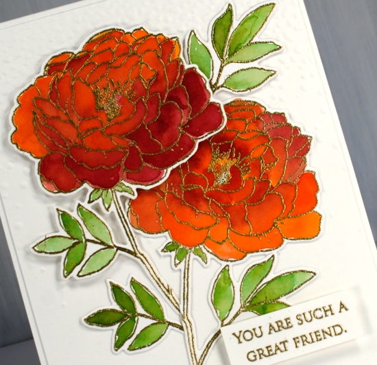
I attended a class not too long ago taught by my clever friend, Liane, where we used paint chips to make cards. Some paint chips have colours from the same family displayed but others have colour combinations that are suggestions when painting and decorating a room. I used one such card to choose the colours for this blue floral card. The paint chip featured colours called nautica, blizzard and tahini. I found similar colours on my peerless watercolour palette and did some no-line watercolour.
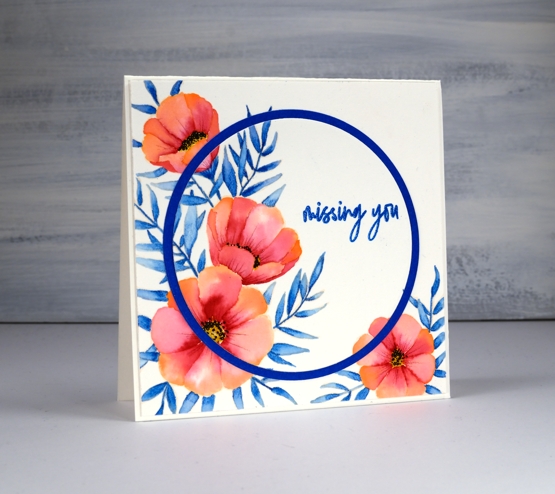
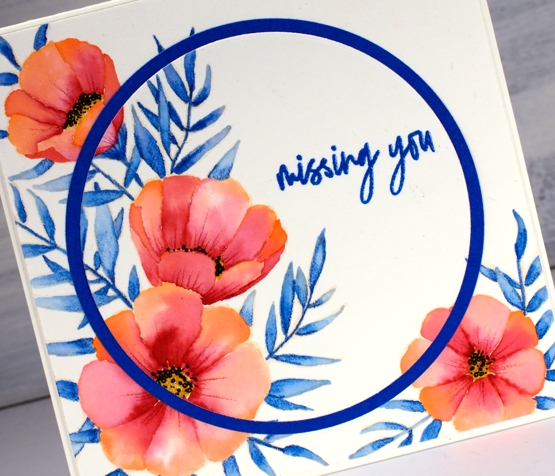
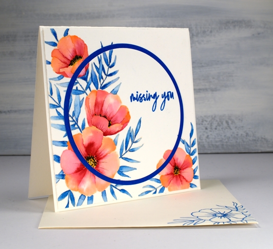
I started by stamping C&9 ‘meadow blossoms’ floral stamp in Gina K ‘whisper’ ink. The ink is a pale beige/grey dye ink which disappeared nicely as I painted with peerless watercolour paint over the top. I worked on non adjacent petals so the paint and water would not bleed from one area to the next. On the largest flowers I painted a dab of ‘Alice blue’ paint then blended it with water to fill the petal.
On the smaller flowers I switched the order and painted each petal with water first then dabbed in some blue paint. The second method resulted in slightly paler flowers. I painted all the leaves and stems in ‘warm sepia’ and the flower centres in ‘pearl grey’. Once all the paint was dry I used two inktense pencils to add veins and shading to the leaves and petals. I painted black dots in the flower centres then drew tiny stems to the dots with a very fine tip black pen. The black thank you die cut is from the PB ‘many thanks’ die set cut from black cardstock and stacked for extra dimension. I think it works well either side of the cute phrase from the PB ‘million thanks’ set which is stamped in nocturne black on a strip cut with the Taylored Expressions ‘simple strips’ die.
If you are stuck for a colour combo try some paint chip inspiration; I don’t think I would have thought up the blue, brown, grey combo without the inspiration on the chip. And call your bestie!
I am over on the Foiled Fox blog today sharing these pretty flowers from Concord & 9th and some no-line watercolour. Make sure you head over there for more details, then take a little stroll through the inspiration on their blog.
It wasn’t my intention to create a tropical looking card but that is absolutely what happened wouldn’t you agree? I chose three colours, geranium pink and alizarine pink from my set of Peerless watercolours and sea blue from my Inktense pencil set. All three colours ended up being bolder than I expected. I stamped flowers from the C&9th ‘meadow blossoms’ set in Gina K’s amalgam ink, ‘barely there’ which is a pale buttery colour, great for no-line watercolour.
There are various methods for no-line watercolour; here I painted water on each petal first then dropped in a little geranium pink at one end of the petal and alizarine pink at the other then blended the two. The leaves I did by colouring one end of each leaf with the inktense pencil before blending blue into the whole leaf. I also used an inktense yellow, to fill the flower centres and a pink to add veins to the petals after painting. I added little black dots to the flowers with a fine tip pen
I embossed the sentiment from the same C&9 set and did some die cutting with nesting circles to add a little interest with a co-ordinating blue cardstock. I hope you enjoyed this little taste of the tropics; as I write this post it is snowing outside. Yep, a little April snow, just to keep us guessing.
As always I love connecting with you in the comments below or over on the Foiled Fox blog.
I have coloured this lovely flower a few times lately but I realised I hadn’t posted it all on my blog. I did some no-line colouring with the stamp which took a while due to the number of petals, but still produced a nice result which I’ll share at the end of this post. This weekend I decided to emboss the flower instead and paint it with peerless watercolours. I must say this technique was faster and less fiddly than the no-line petal by petal approach. I embossed two of them and painted them side by side with the same three paint colours. Peerless paint blends beautifully on the paper, in this case hot pressed watercolour paper, and I was able to add royal crimson over the top of flesh tint and vice versa until I was happy with the coverage and blending. The leaves were painted in olive green. I think I’ve mentioned before how much I love the quality, depth and blending of peerless watercolours.
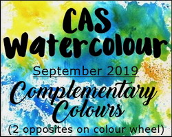
I used the co-ordinating die to cut out both flowers then arranged them on top of a ‘snowfall/speckles’ embossing folder background. I snipped a few of the leaves off and rearranged them to balance the composition. I also glued some pieces directly to the background and popped other pieces up on dimensional foam. The sentiment is from the grateful sentiments set and is embossed and popped up also. Because my orange/pinkish combo is opposite green on the colour wheel this card is a match for the current CAS watercolour challenge, a challenge I love but rarely get my act together to enter!
Here is a similar design I completed as part of my no-line watercolour class. I stamped in antique linen distress ink and used a selection of distress inks as ‘paint’. The sentiment is from a clever Taylored Expressions stamp and die combo.
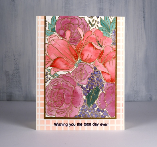
Hello and welcome to Studio Katia 3rd Anniversary Blog Hop! You should have arrived here from May Sukyong Park‘s blog. I am excited to be celebrating with Studio Katia and to be featuring this gorgeous stamp, ‘Floral Garden‘. It’s a beauty and perfect for a range of different techniques. This new release includes 5 new Clear Stamp Sets and 1 set of Coordinating Dies, 1 new Stand Alone Creative Die, 2 new Stencils and lots of new Embellishments!
I used the emboss resist technique for one panel and no-line colouring for another. The stamp is a large square so I had the option of creating a big square card or a smaller rectangle card with a portion of the stamped design. I embossed the outline stamp in gold powder on hot pressed watercolour paper then did all the painting with my Sennelier watercolours. I’ve talked about colour choices on the blog before especially about keeping the colour count low to keep things looking cohesive.
I started by painting the tulips in red straight from the pan but all the other colours are mixed, usually with a bit of the original red, that way they work well beside each other. I used a green paint mixed with a little red, a purple/red mix on the roses then a blue/purple mix on the tiny flowers.
I trimmed the panel down and matted it with gold cardstock to match the embossing then layered it on a panel stenciled with festive berries ink through the SK grid stencil . I added a sentiment in dusty concord archival ink using a little stamp from the new ‘Its your birthday‘ set.
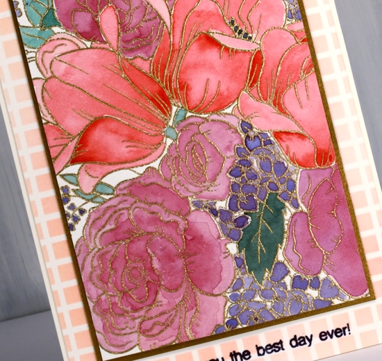
The no-line watercolour panel I stamped in antique linen on hot pressed watercolour paper. I used distress inks as paint by pressing them face down on my glass mat. I used wild honey and carved pumpkin inks for the tulips then mixed some wild honey with festive berries for the roses. As I kept my panel in the stamp positioner while painting I was able to ink the roses lightly with festive berries after I’d done some painting and re-stamp the outline for added definition. I painted the little flowers in wilted violet ink and over-stamped with the same ink so the outlines would be a little darker. I used two greens (iced spruce and bundled sage) for the leaves mixing them into darker and lighter tones. The tiny bell flowers around the edges are painted in antique linen. I also blended antique linen around the edges of the panel.
The sentiment is from the same ‘It’s your birthday’ set and I love that pretty lettering! I stamped in monarch versafine clair ink, clear embossed then stamped again in versamark and embossed once more in clear powder to make it extra shiny. Thanks for joining me today; keep reading for all the ways to win during this blog hop which runs today and tomorrow. Studio Katia has provided a $25 gift certificate for me to give away. Just leave a comment below to be in the running.
For more chances to win visit all the stops along the hop. Your next stop is with the wonderful Laura Bassen. If you get lost you can find the full hop list below or visit Studio Katia Blog!
There will be a $25 Gift Certificate offered at each stop of the Blog Hop
To celebrate Studio Katia is giving away TWO $50 CAD Gift Certificates every day of the Blog Hop! Winners will be chosen randomly from comments left on Studio Katia Blog.
All comments must be left by Saturday, June 22nd, 2019 21:59 PM EST.
All winners will be announced on Sunday, June 23rd, 2019 on the Studio Katia Blog.
Ready to get hopping? Here’s the complete Blog Hop List:
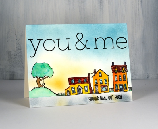
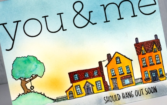
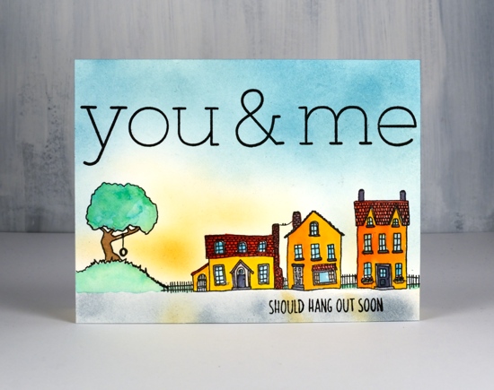
This wonderful new C&9 alphabet stamp set arrived a few days ago and, oh the possibilities! I had only a little time to play with it today so I pulled out the delightful ‘city stacks’ stamps, also from Concord & 9th. I stamped in versafine onyx black ink and watercoloured with my peerless watercolour paints. Versafine is a pigment ink so it won’t react with water when I start painting over it.
The sky and the road I blended onto the panel with makeup brushes which was quite a bit quicker than painting it. I used broken china, scattered straw and wild honey distress inks for a sunrise look.
When I laid out the letters in my stamp positioner I wondered how long it would take me to get them lined up. I got them right on the second attempt! I slipped in a piece of acetate to do a trial stamping, realigned the few that needed it and then the next attempt was just right. The serifs at the top and bottom of the letters make it easy to line them up on the grid of my stamp positioner lid. Yay! I used part of a stamp from the ‘city stacks’ set to finish the sentiment at the bottom of the panel.
You’ll be seeing these letters again, and again. Count on it. And there are dies too, I didn’t use them on this card but it won’t be long.