Pencil Poppies
Posted: April 29, 2022 Filed under: brilliant, Coloured pencil, Gouache, Penny Black | Tags: Faber-Castell Polychromos Colour Pencil, Gouache paints, Penny Black stamps 10 Comments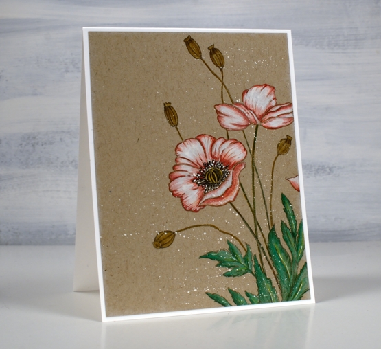
Today’s pencil and gouache technique was inspired by a beautiful card recently posted by Debby Hughes. Debby did a video of her process so if you are interested you can pop over to her youtube channel and follow her directions like I did.
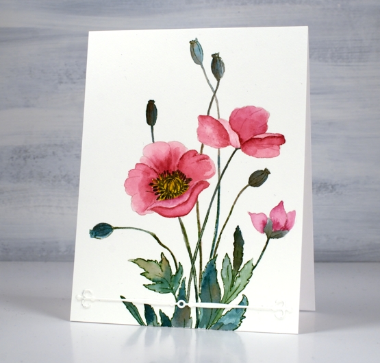
I used a different stamp, ‘brilliant’ from Penny Black but the other supplies and technique are the same as Debby’s. I stamped on kraft cardstock with pumice stone ink, painted inside the petals with white gouache then did all the colouring with Faber Castell Polychromos pencils.
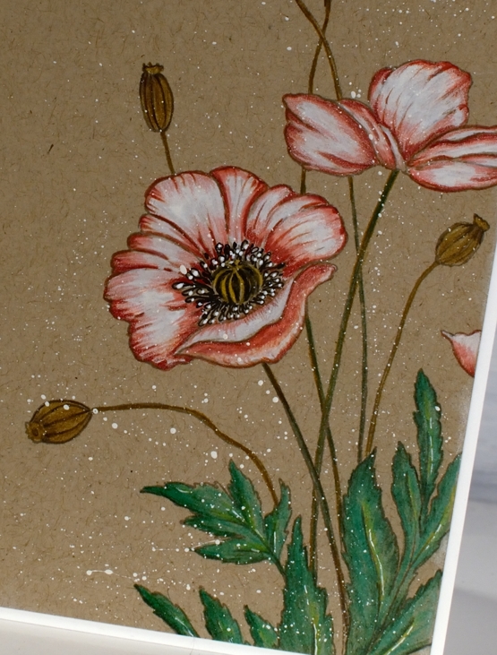
When I first stamped the ‘brilliant’ poppy stamp I used Papertrey ink soft stone ink which is my current favourite for no-line watercolour techniques. It stamped well on the kraft cardstock but when I looked at it ten minutes later it had faded quite a bit. It would be fine for someone whose eyesight is perfect but mine is not so I stamped in pumice stone distress which gave me a bit more contrast.

Debby’s technique included painting the petals in white gouache then colouring over the top. I hadn’t tried it before but I will do it again in the future. It worked very well and took the place of my previous method which was colouring in white pencil first then adding colours over the top before blending again in white. Painting with gouache first gave me a base which happens to also be a nice matte surface to colour over. I finished the design with some white gouache splatter as Debby did. So basically I am saying, ‘ do what she did!’ Thank you Debby for a great technique tutorial.
The polychromos pencils I used were: white, medium flesh, medium cadmium red, raw umber, emerald green, pine green, naples ochre and walnut brown.
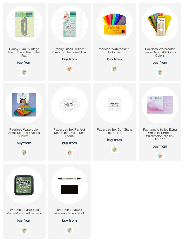
Supplies
(Compensated affiliate links used when possible)
Brilliant
Posted: March 16, 2022 Filed under: brilliant, Peerless watercolours, Penny Black, vintage touch | Tags: Papertrey ink, Peerless Transparent Watercolors, Penny Black creative dies, Penny Black stamps 18 Comments
It seems that Penny Black always includes a poppy or two in a spring release. This large stamp is called ‘brilliant’ and I think the mix of flowers, leaves and seed heads is just lovely. I chose to do no-line watercolour with soft stone ink and peerless paints.
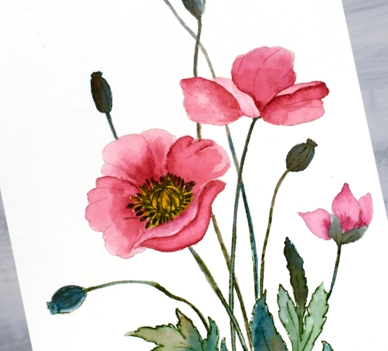
I stamped the large image in Papertrey Ink ‘soft stone’ then worked with rose red, mountain green, golden yellow and warm sepia peerless paints. If you haven’t heard of Peerless Watercolour paints take a look at the video I made about them a few years back.
I wondered about adding background pattern or blended ink but left it clean except for the simple ‘vintage touch’ die-cut. The vintage touch set has two fancy banners as well as two dies that cut negative space banner patterns. I finished off the centre of the poppy with a black marker.
I am still undecided about the lack of background and sentiment; what do you think?
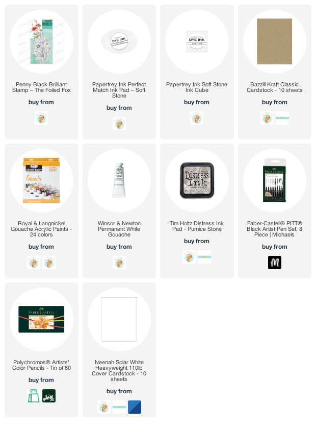
Supplies
(Compensated affiliate links used when possible)